Appetite UI Symbol
Appetite UI

Design in Figma.
Ship in your app.

A mobile design system that reaches the code. Change one token and the whole file follows, including the native iOS and Android components.

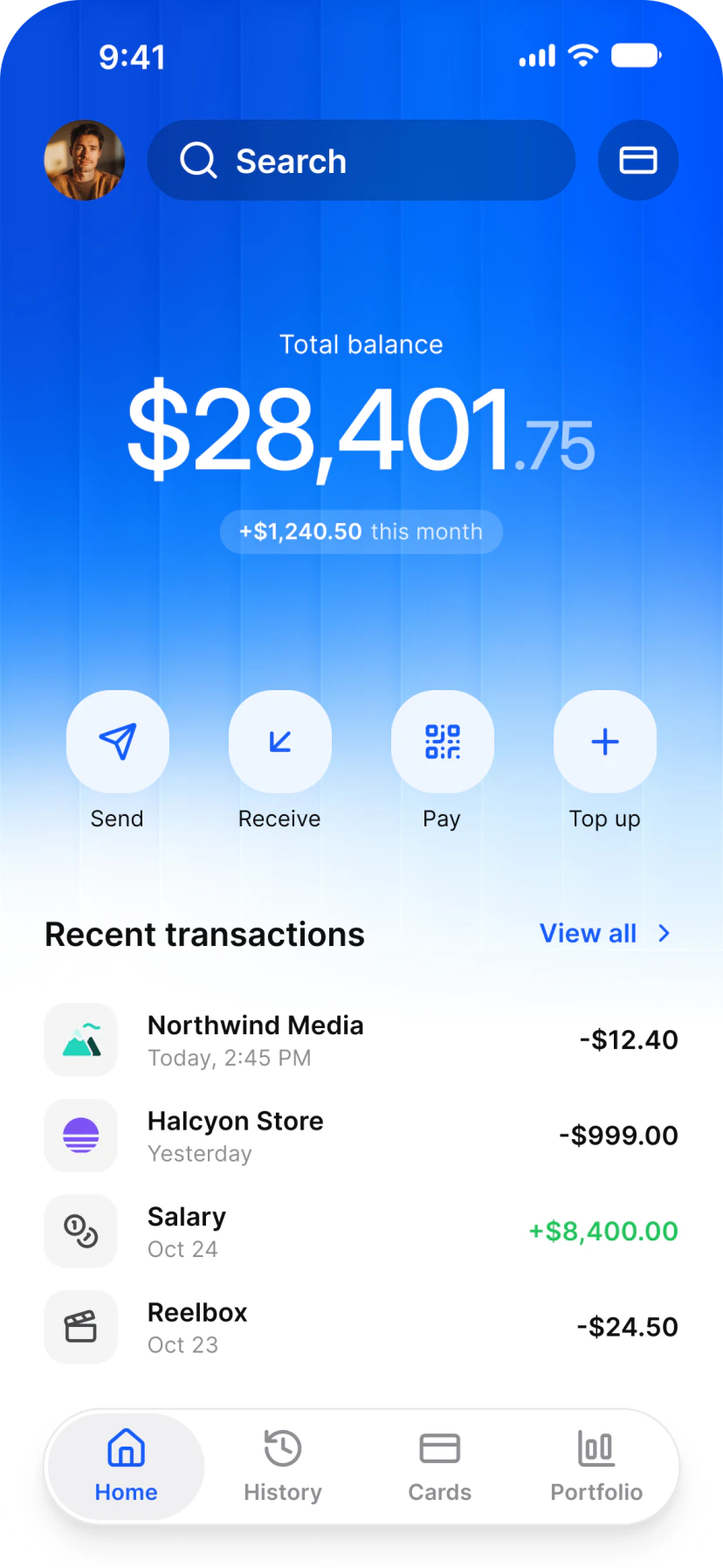
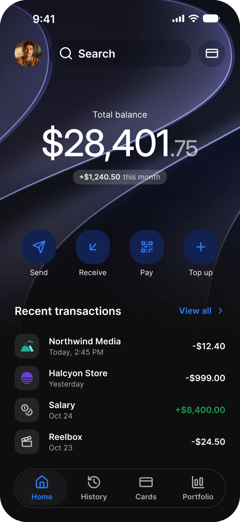
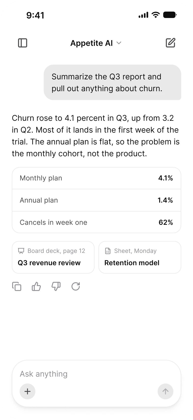
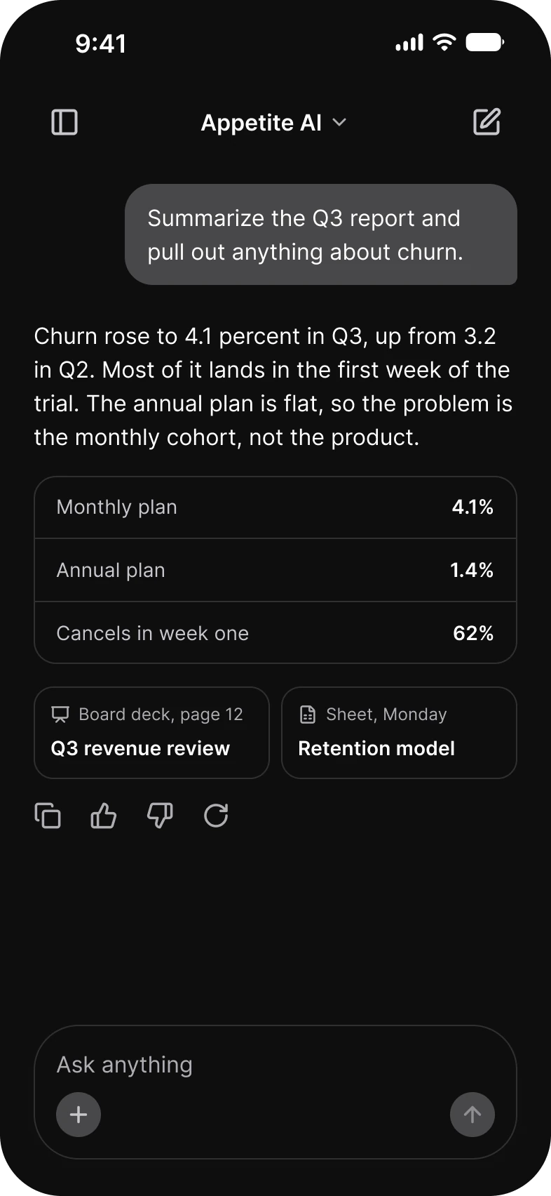
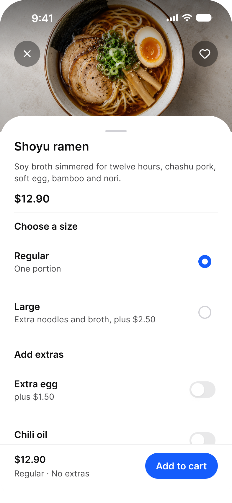
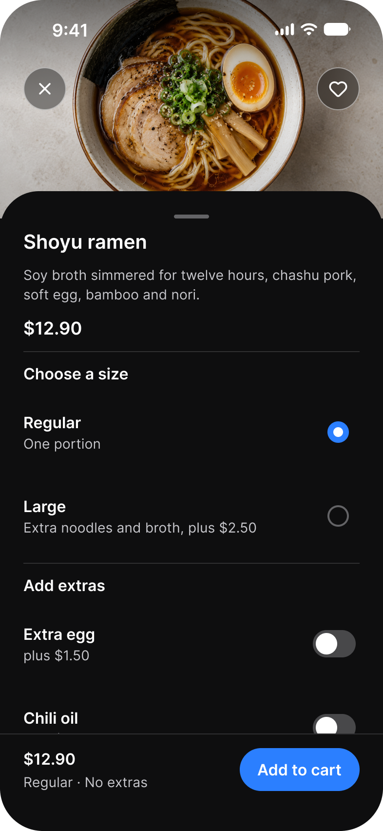
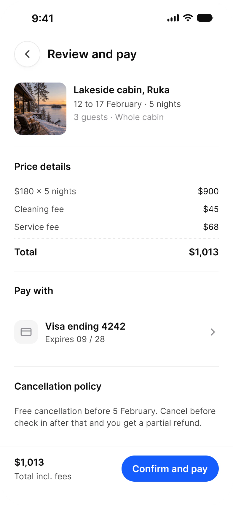
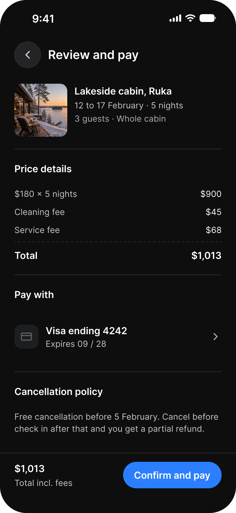
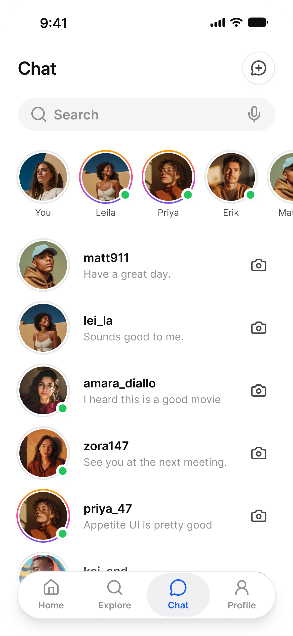
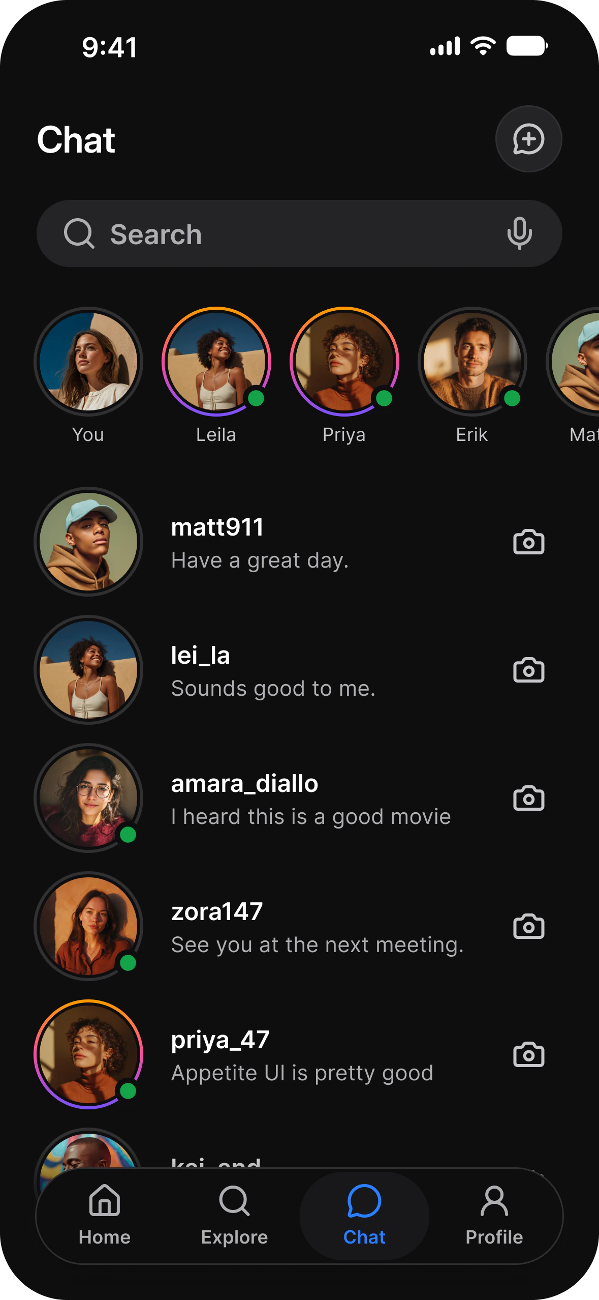
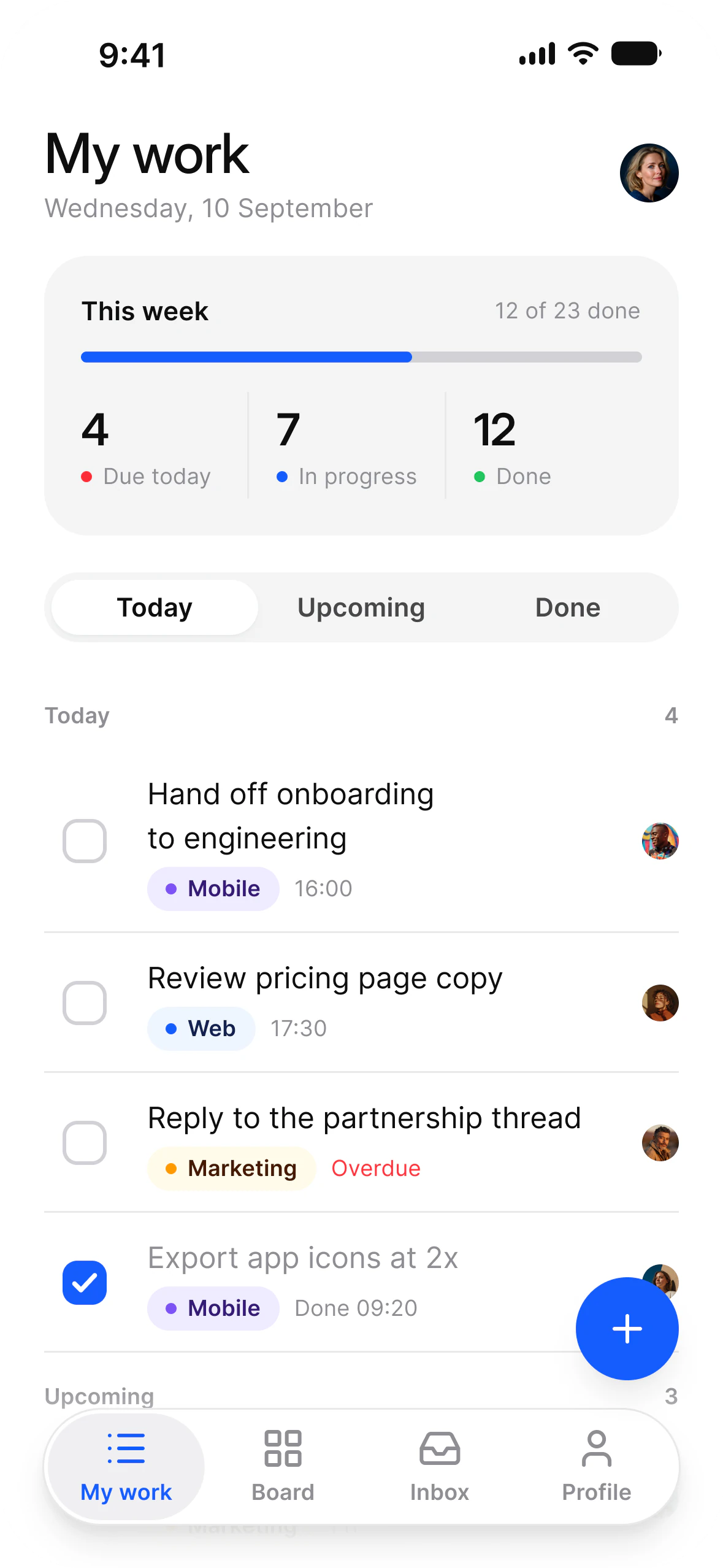
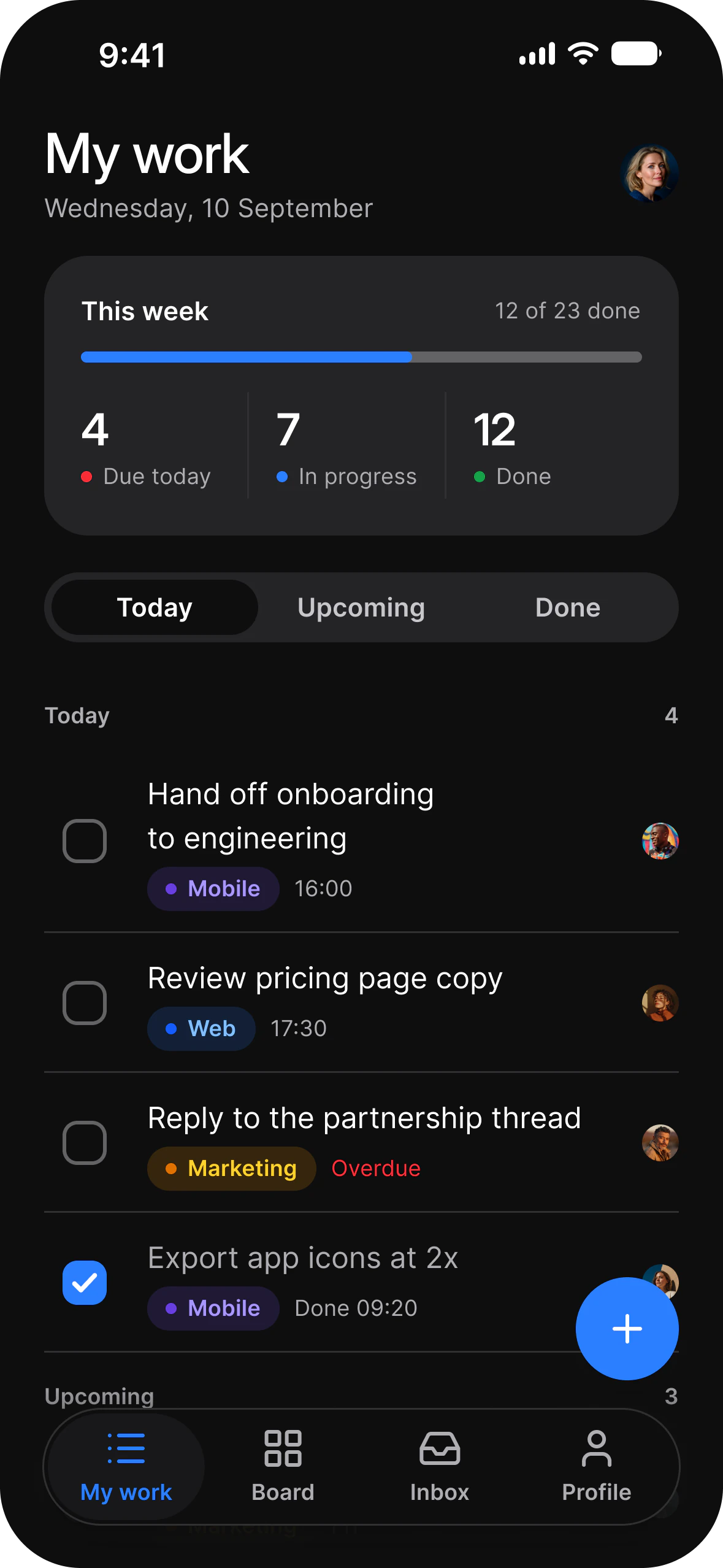
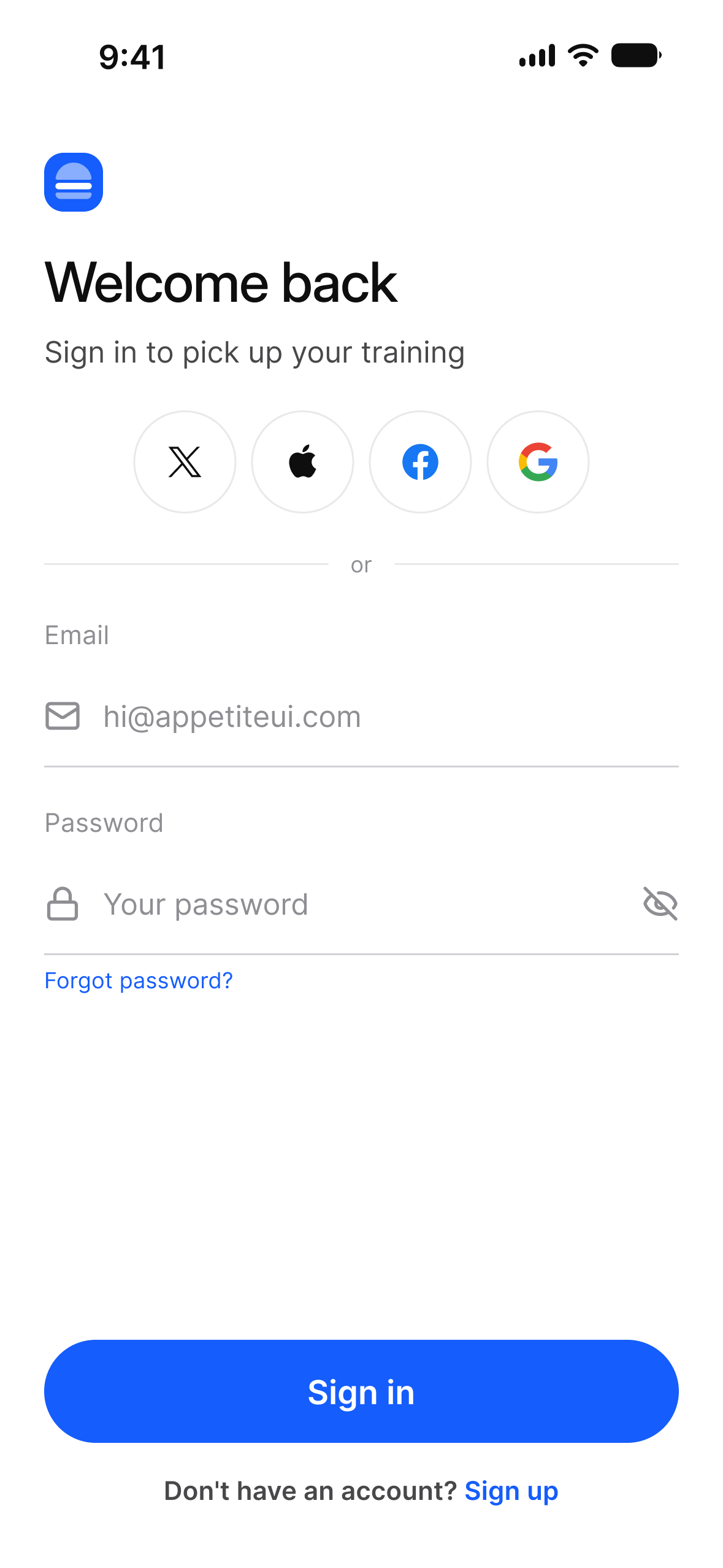
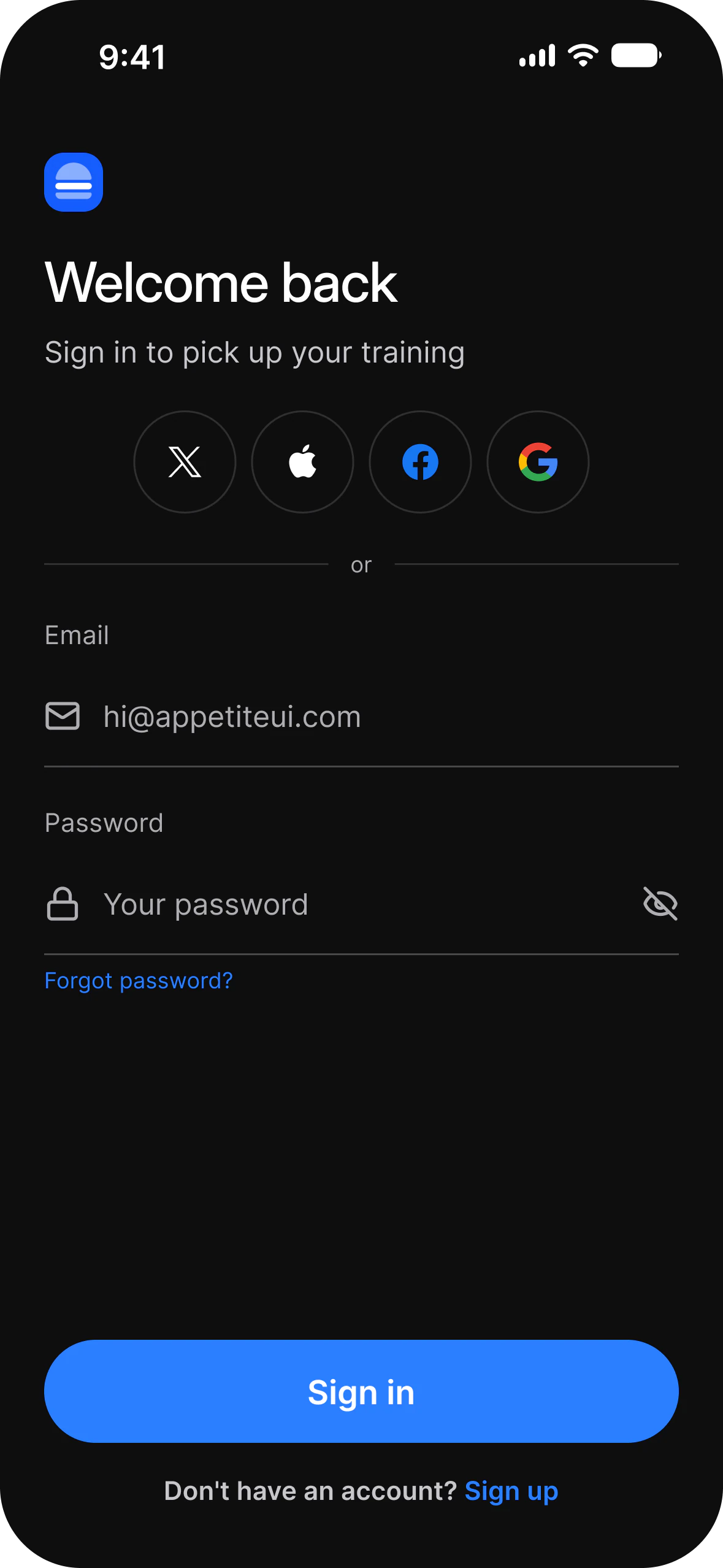
Multiplatform screen, light modeMultiplatform screen, dark mode
Previous app typeFitnessNext app type
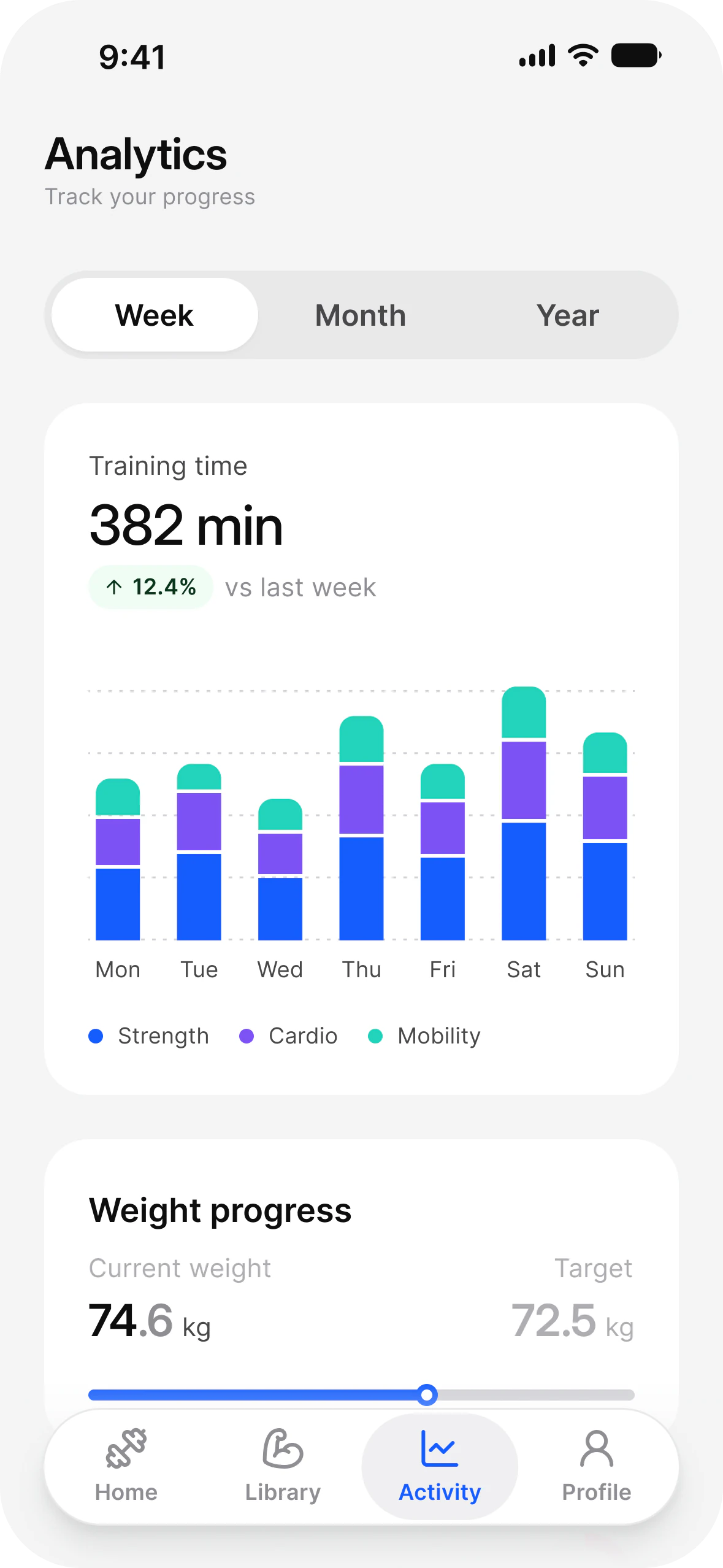
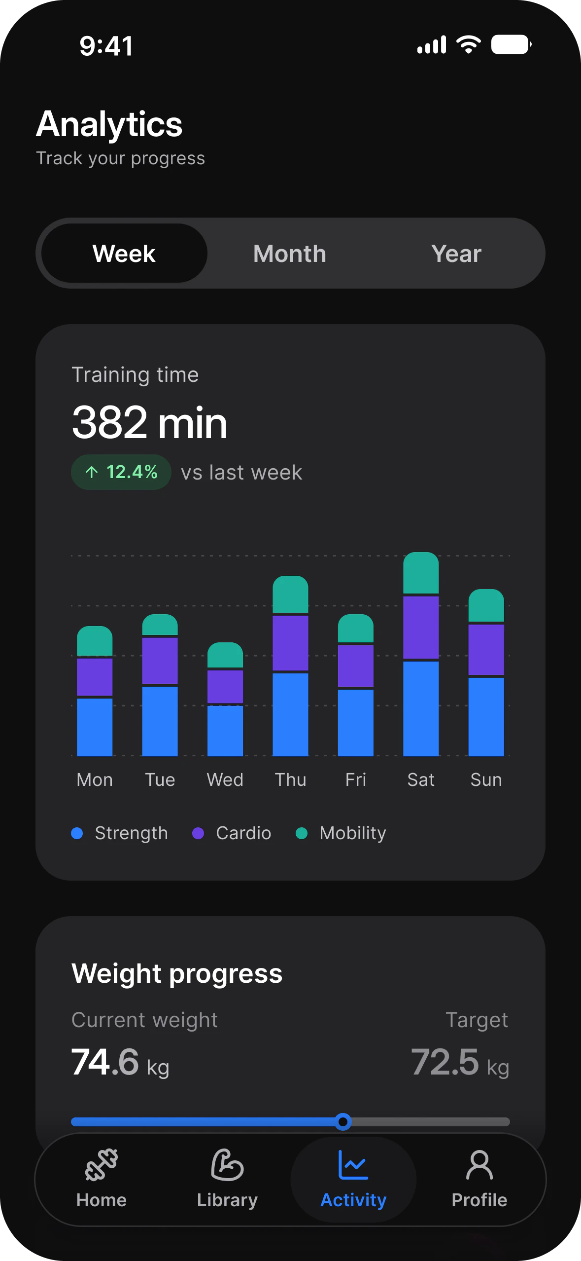
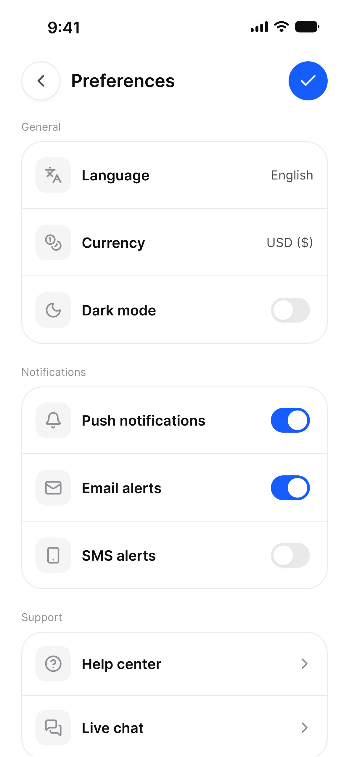
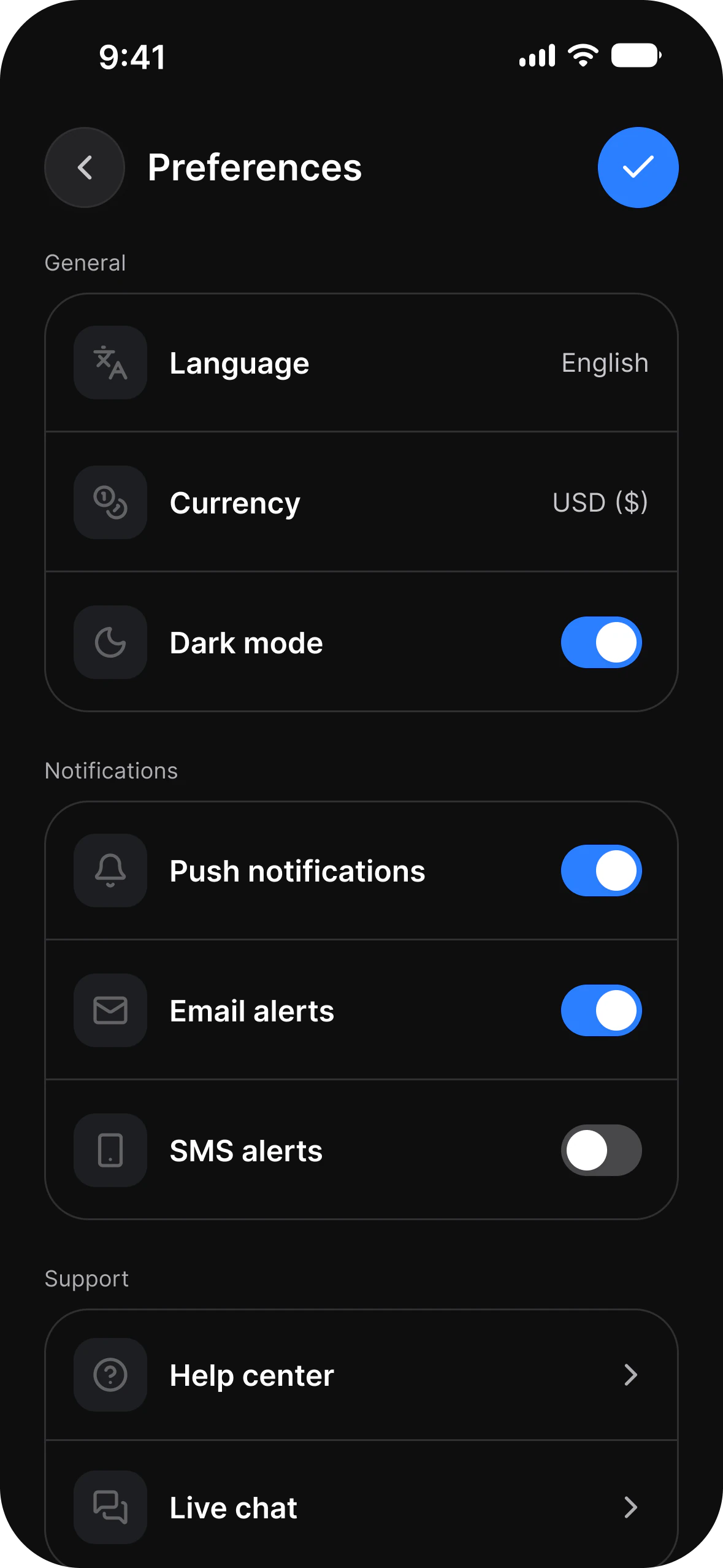
Onboarding, light modeOnboarding, dark modeSettings, light modeSettings, dark modeEmpty state, light modeEmpty state, dark modeFinance, light modeFinance, dark modeFitness, light modeFitness, dark modeSocial, light modeSocial, dark mode
Changelog 2.3

Branded platform components, tokens that ship as code, and Motion Foundations.

Full changelog
Architecture

One source of truth. Everything you need. A rebrand is one edit, not a sweep across every screen.

One brand color change moving through every component

Tokens

Rebrand in minutes

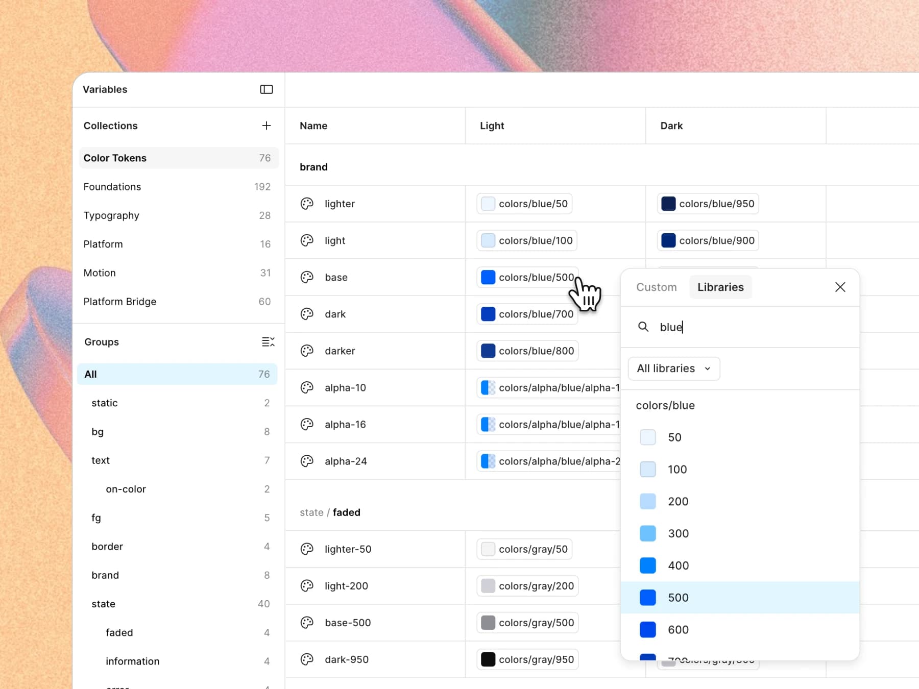
Change the brand color once. Every component, both platform mirrors, light and dark, follow it. You do not reopen a single screen.

Real application screens built directly on the system

Apps examples

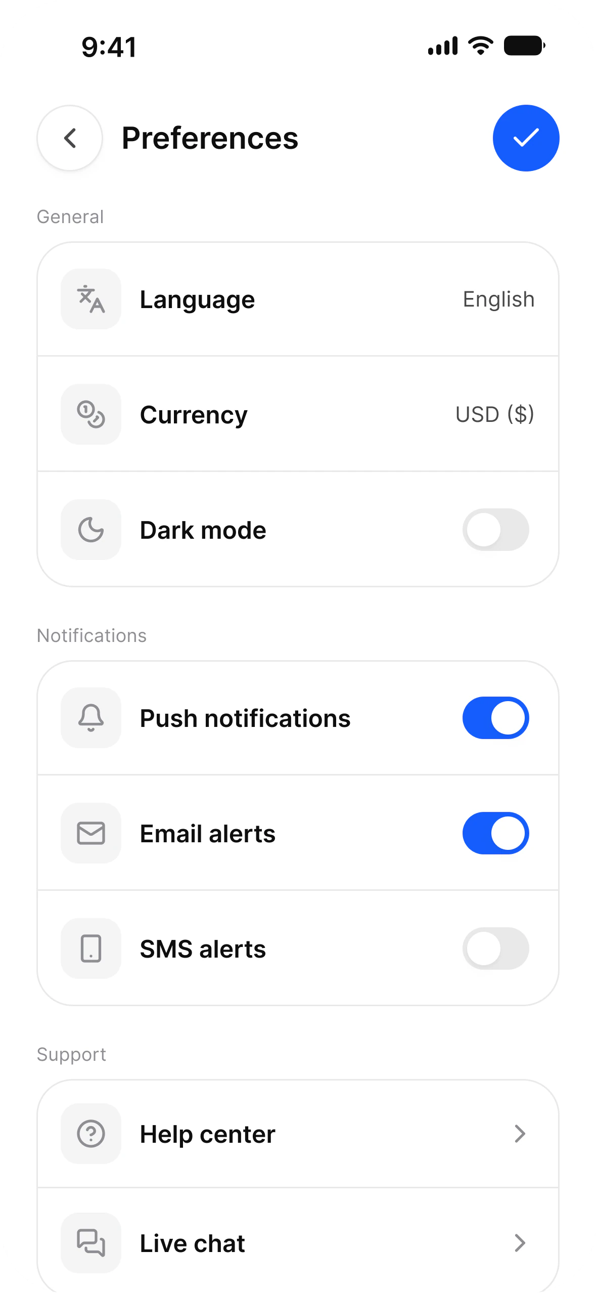
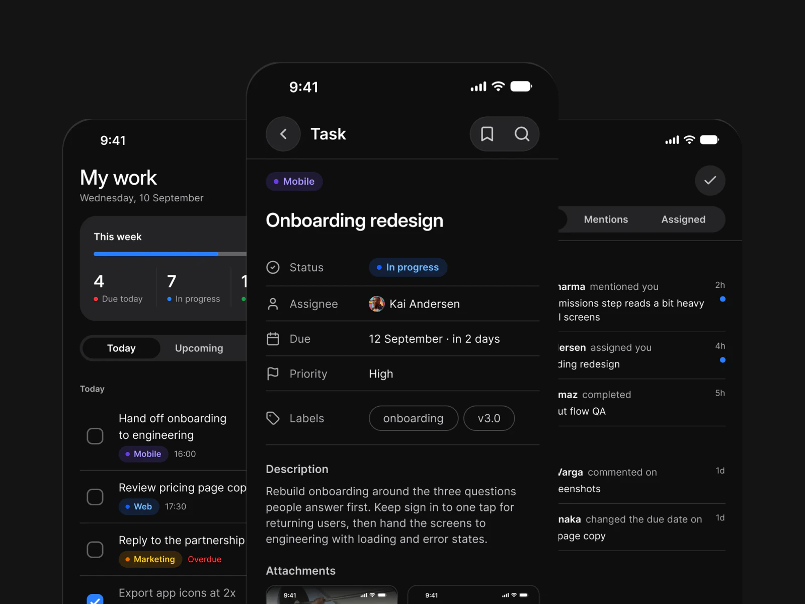
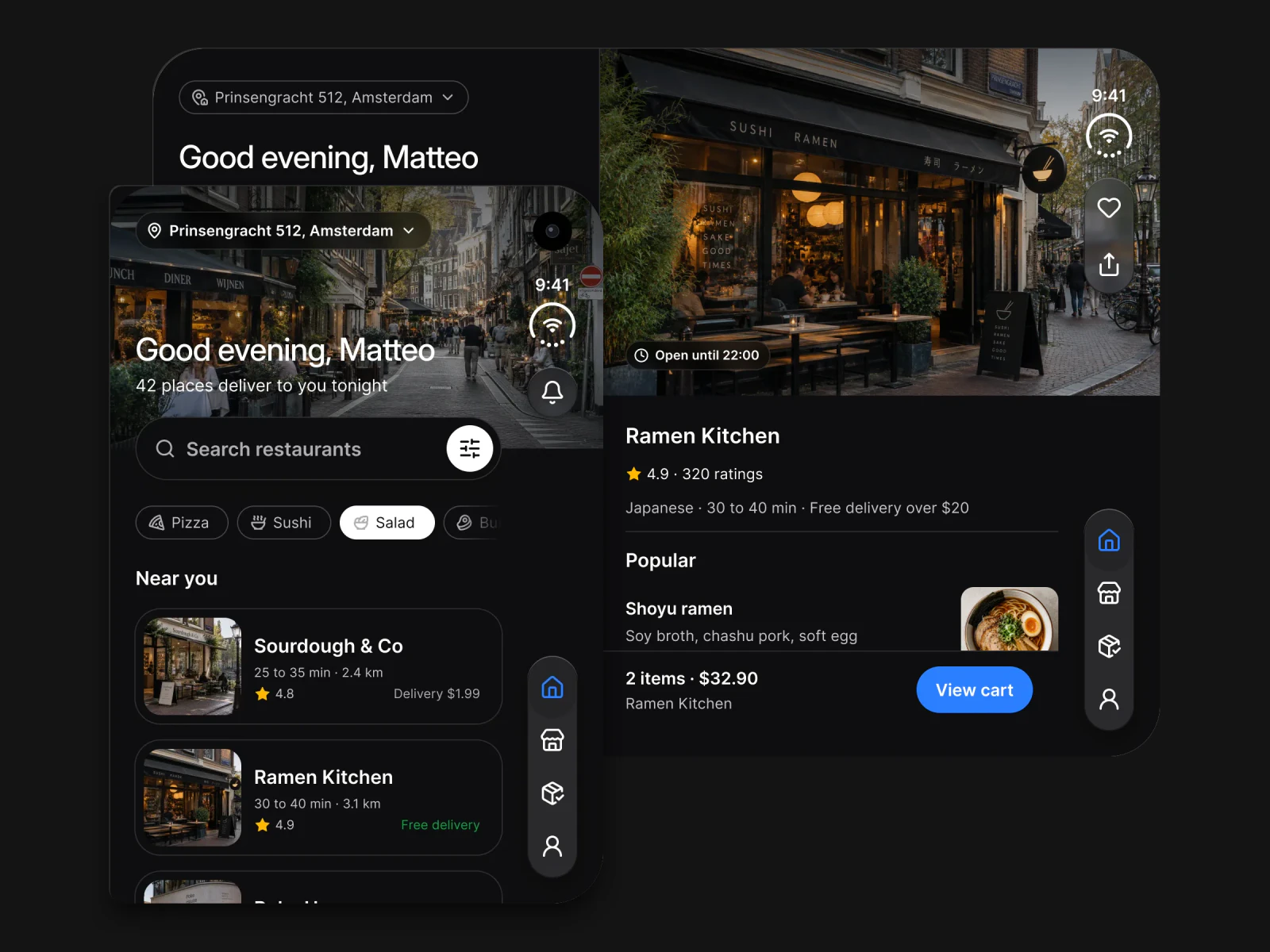
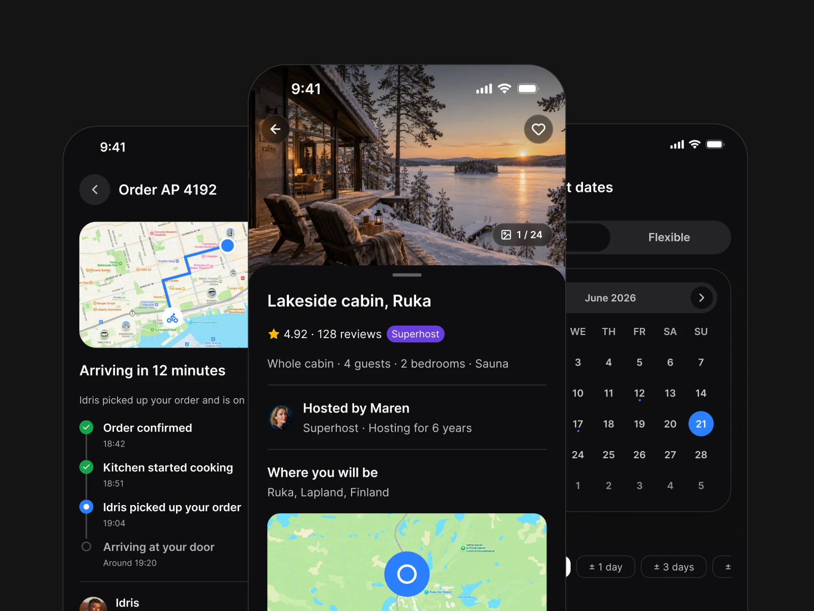
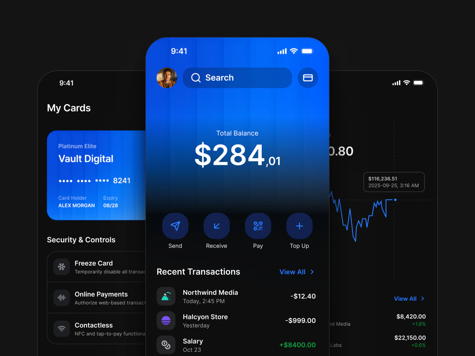
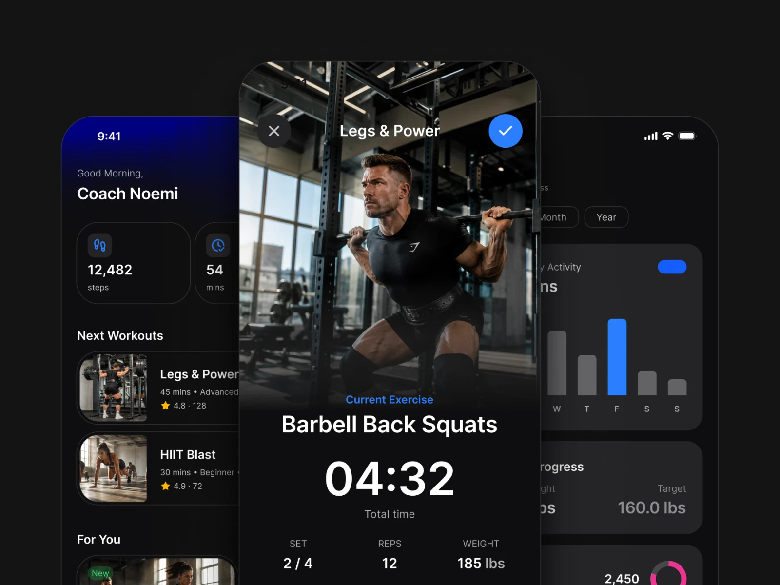
Ready-to-use screens

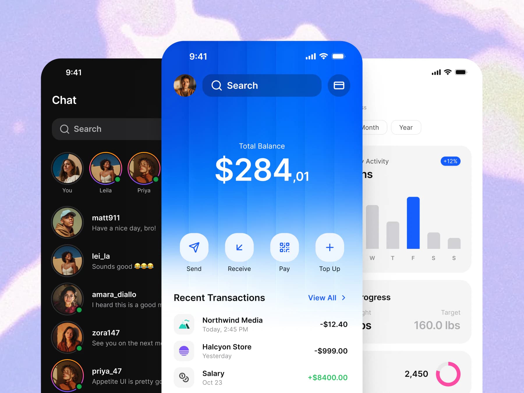
Real app screens built directly on the system. Token-connected, component-accurate starting points.

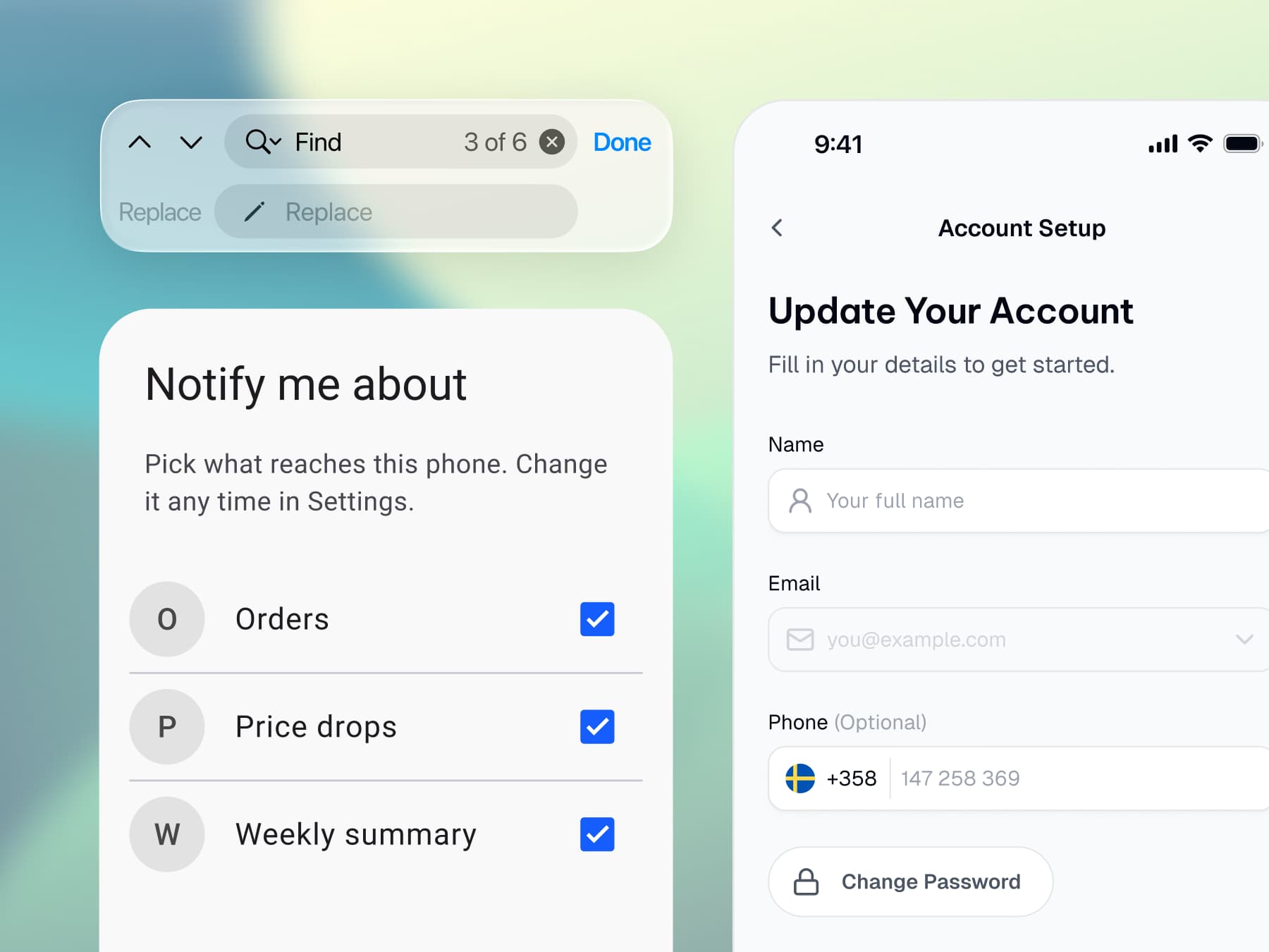
Apple and Material conventions living in one file

Platforms

Ship both platforms

Apple and Material conventions live together. No second library, no translation step.

The token package installed in a developer project

Code handoff

Hand off without a spec
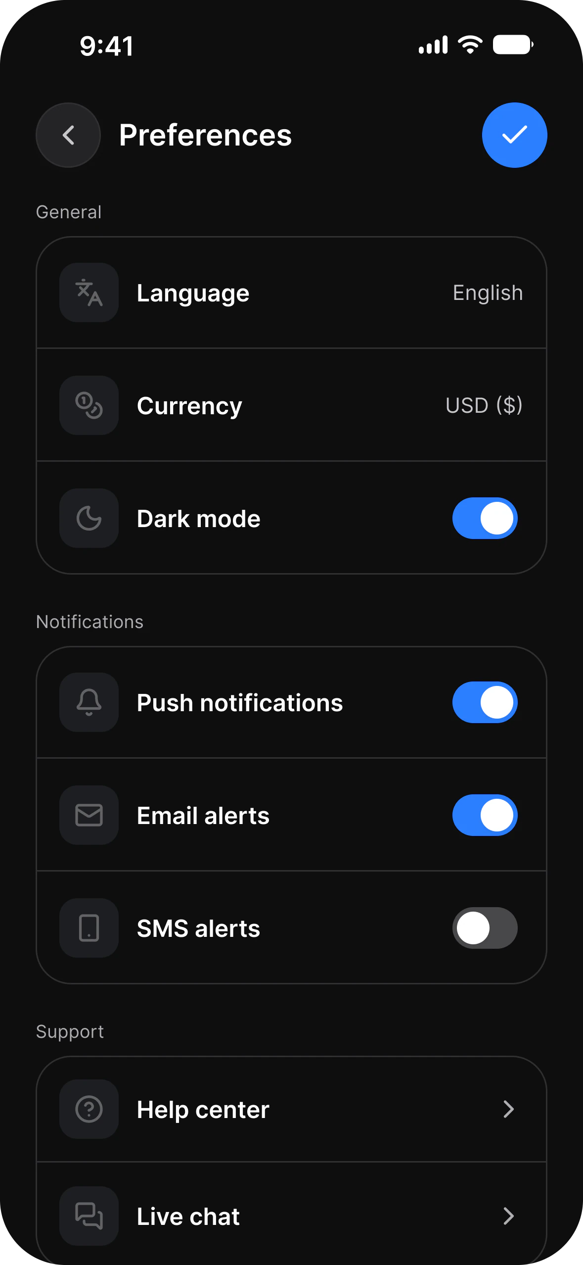
Your developer installs the token package and reads the exact values you designed with.

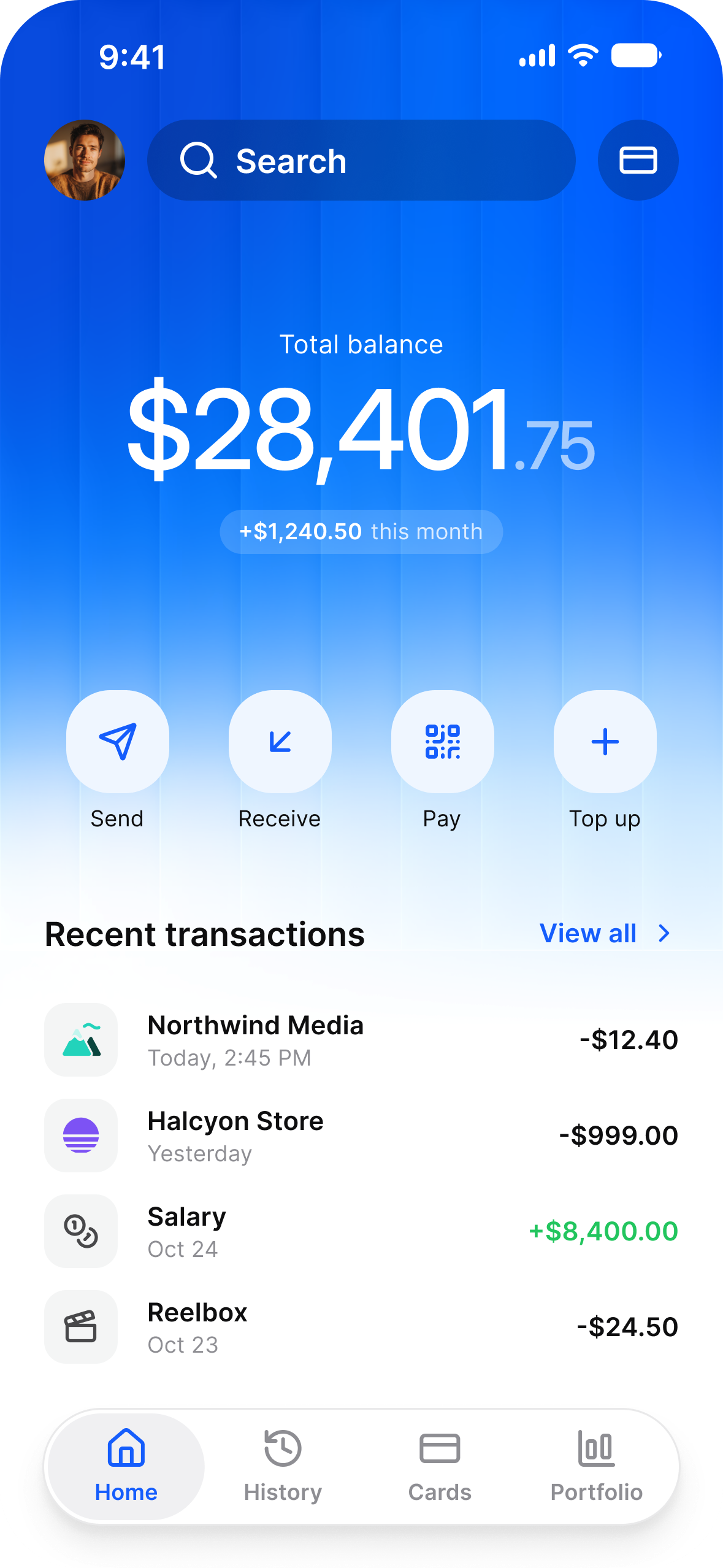
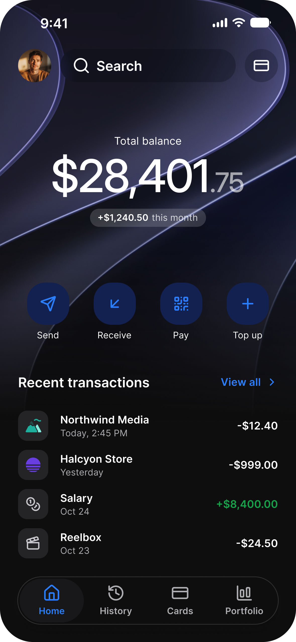
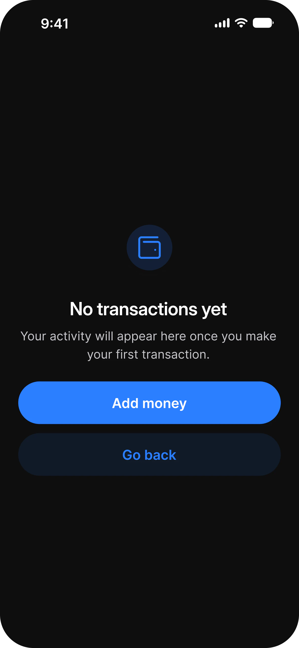
The same screen in light and dark mode

Dark mode

Get dark mode

Every component already has it, because color is a token and tokens have two modes.

The same screen in light and dark mode

AI agents

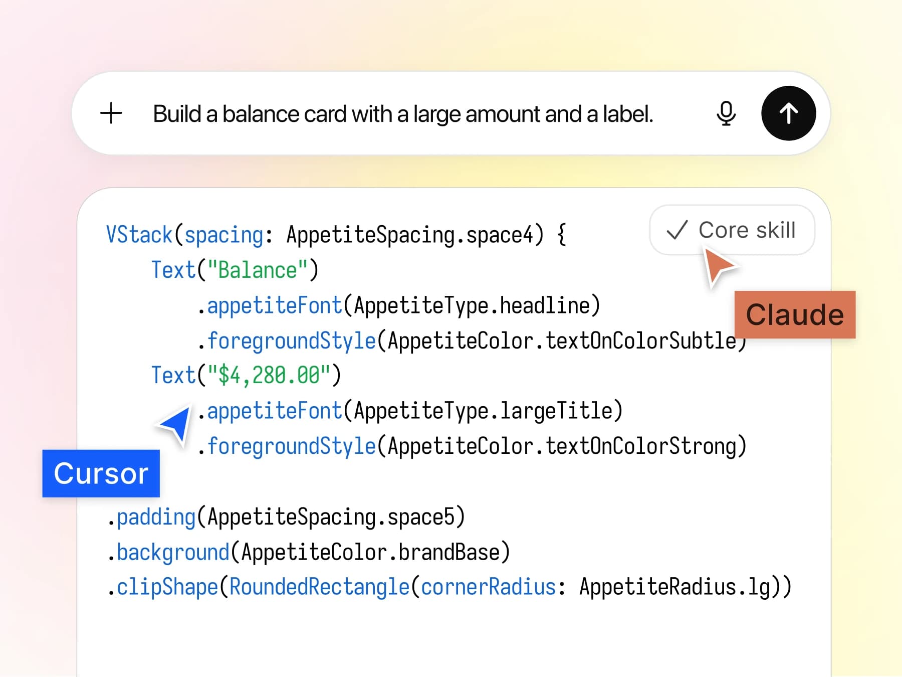
Brief an agent in one file

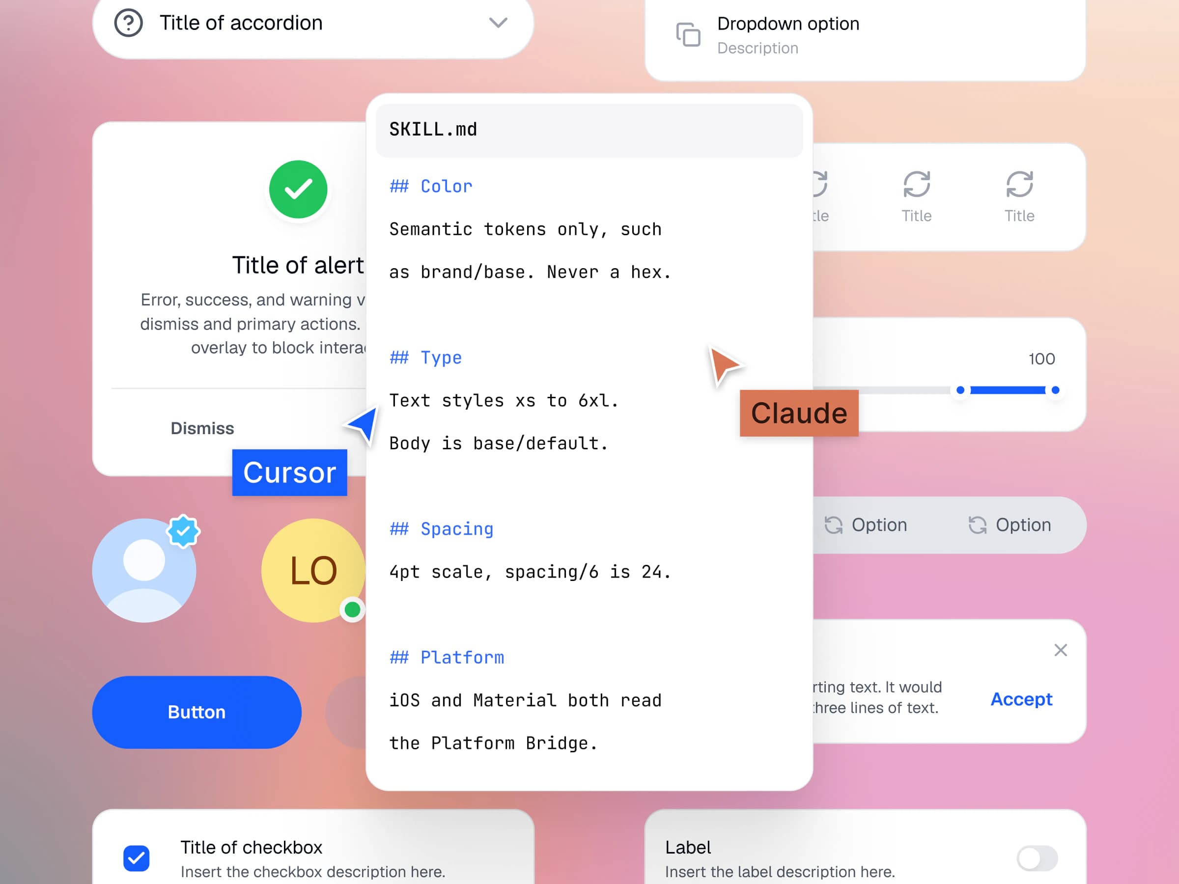
The free Core Skill tells Claude, Cursor and Figma which token to reach for.

Where it sits

Not an alternative to Apple and Material. Appetite UI is the layer every guide tells you to build by hand.

Layer 01

Your app

SwiftUI, Jetpack Compose, Flutter, or the web. They are installed from a token package, so the build cannot deviate from the design. The implementations support AI capabilities.

Layer 02

Appetite UI

Your brand as a connected token architecture, mapped onto both platform languages. This is the layer everyone tells you to build by hand.

Layer 03

Apple iOS 26 and Material 3

The platform baselines, untouched. Their accessibility behaviour and conventions stay exactly as Apple and Google intended them.

Tokens installed into the application codeThe Appetite UI token architectureThe untouched Apple and Material baselines
Workflows

Four ways to work. Changing path never means changing file.

Design once, ship both.

One neutral token set drives every screen on both platforms. Most projects start here and never need to leave.
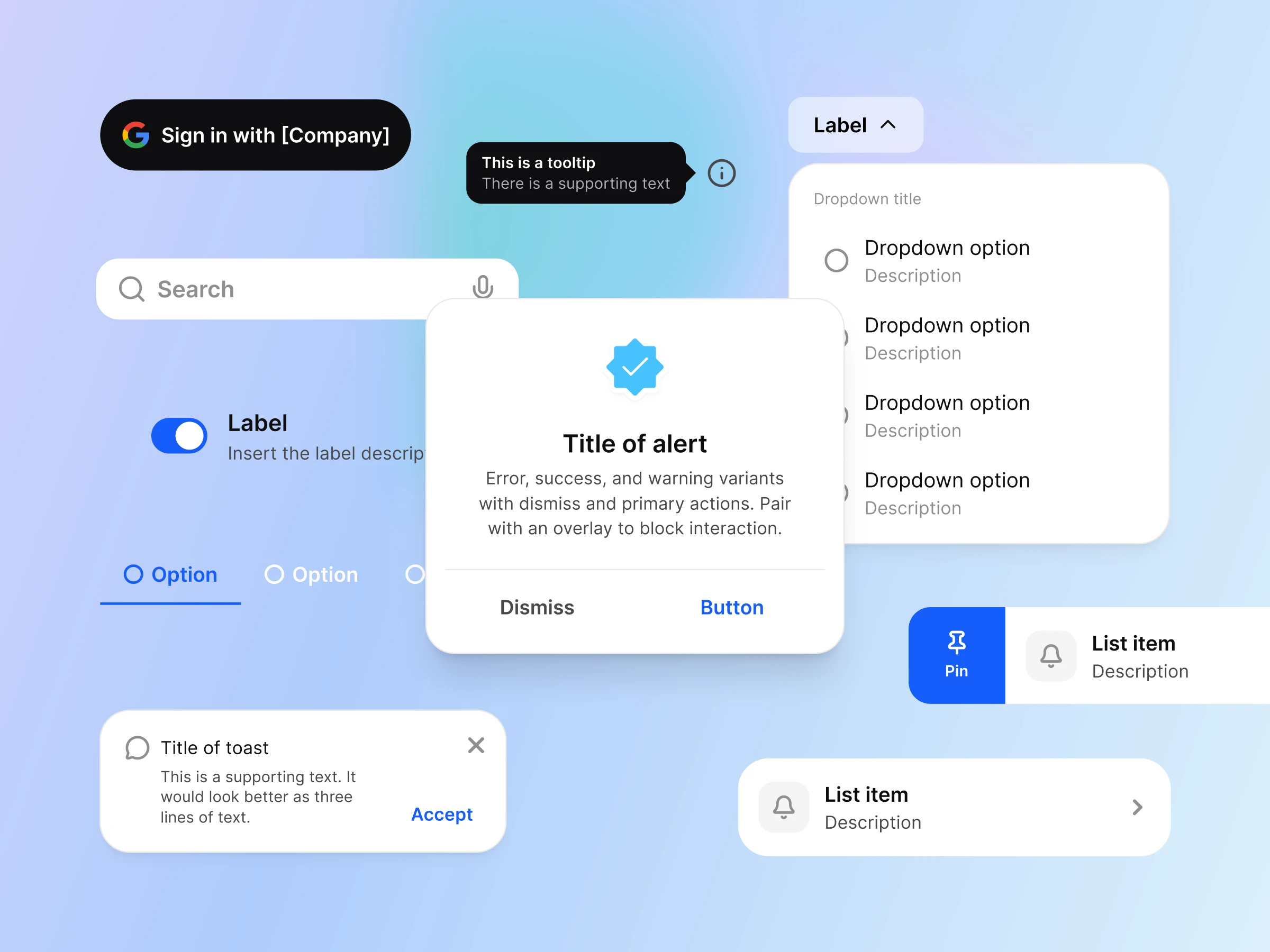
Multiplatform components in Appetite UI
Flutter standard Appetite UI Mobile Design integration
React Appetite UI Mobile Design integration

Apple conventions, your brand.

System colours keep their accessibility behaviour. Only the accent carries your brand, so nothing about the platform breaks.
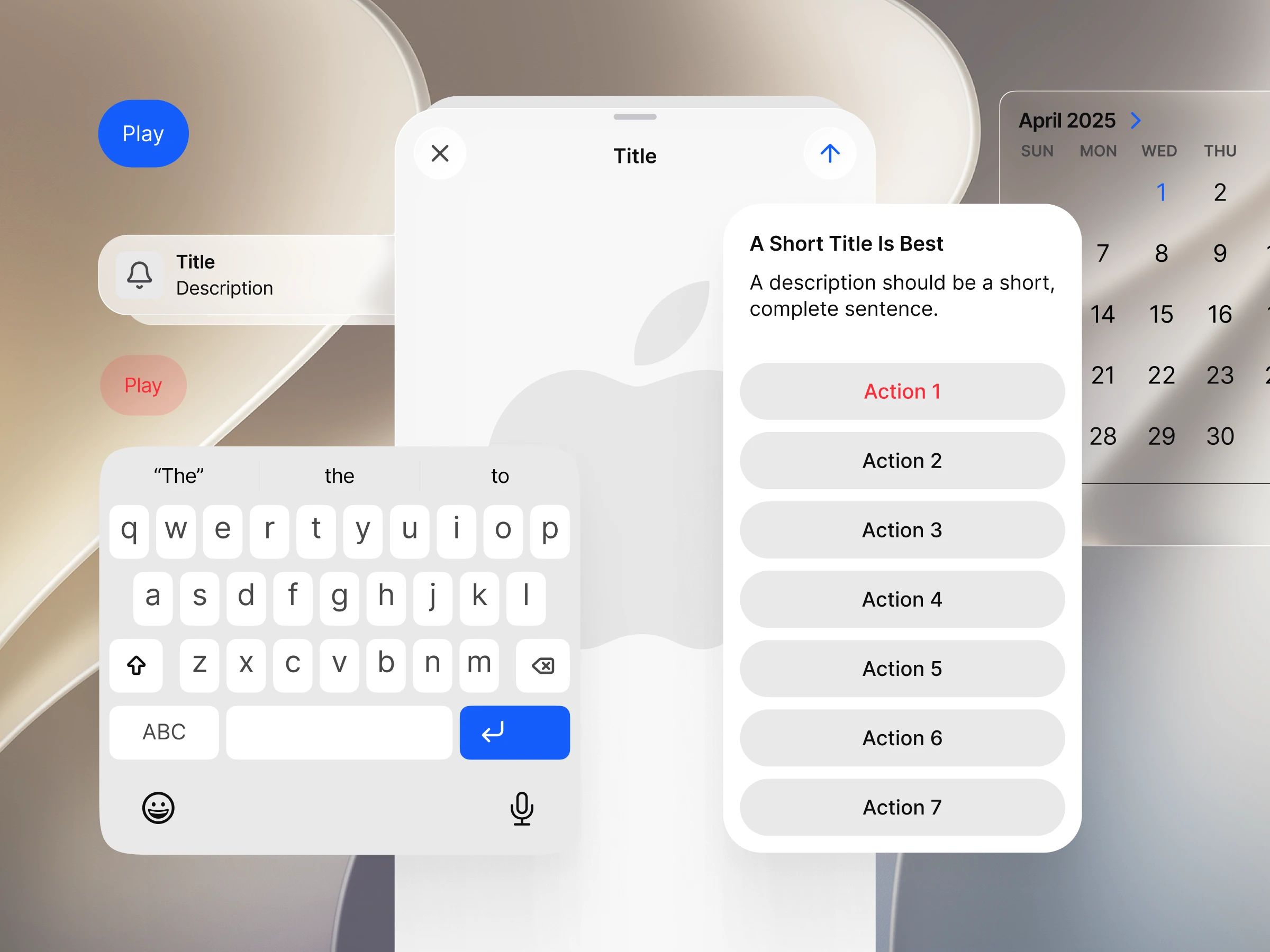
iOS components carrying the customer brand
Apple IOS Appetite UI Mobile Design integration
Swift UI Appetite UI Mobile Design integration

Material 3 with real values.

Material roles mapped to your brand, not a screenshot of the baseline. One dropdown returns the whole set to the untouched system.
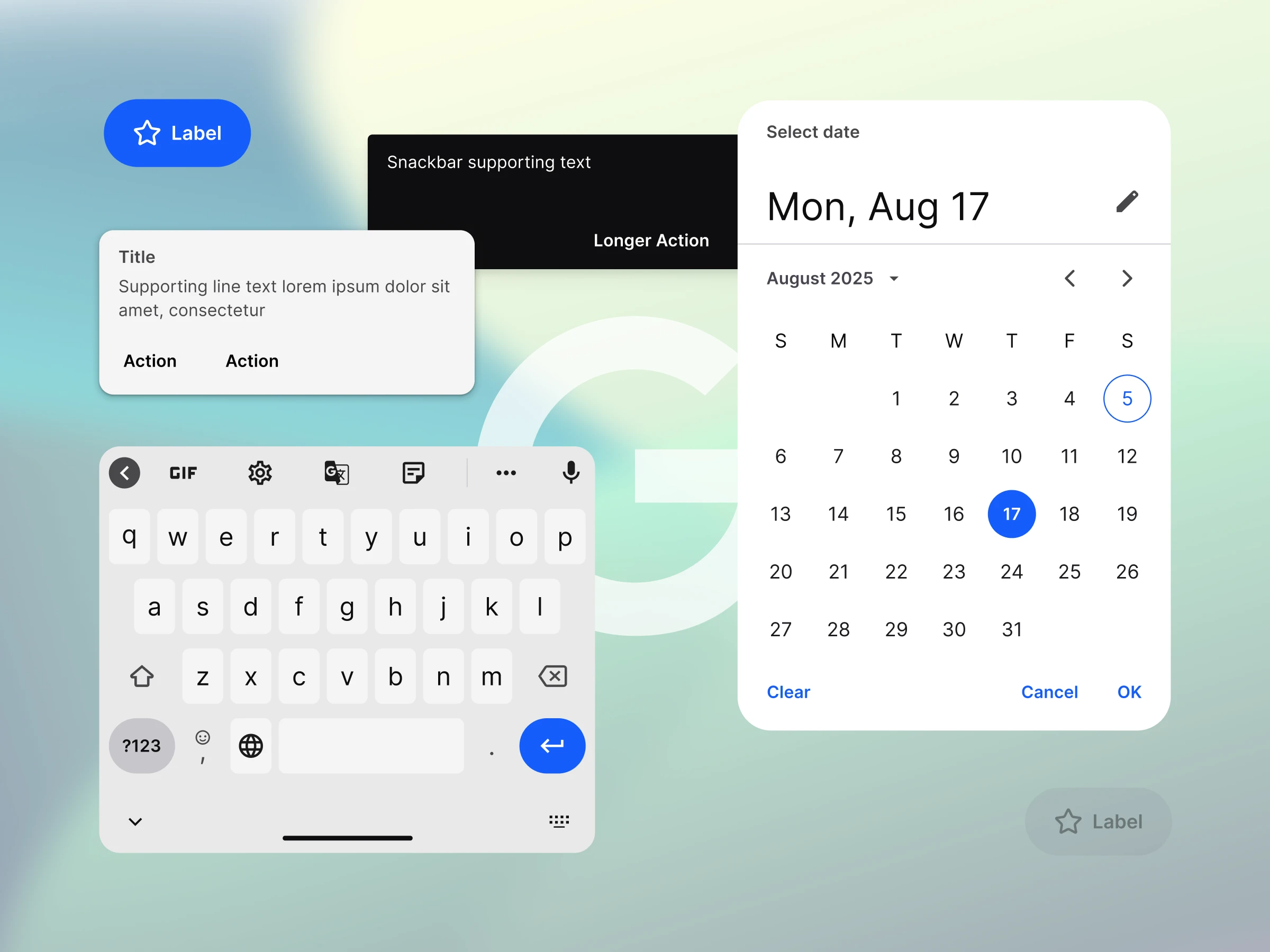
Material 3 components carrying the customer brand
Android Appetite UI Mobile Design integration
Kotlin Appetite UI Mobile Design integration

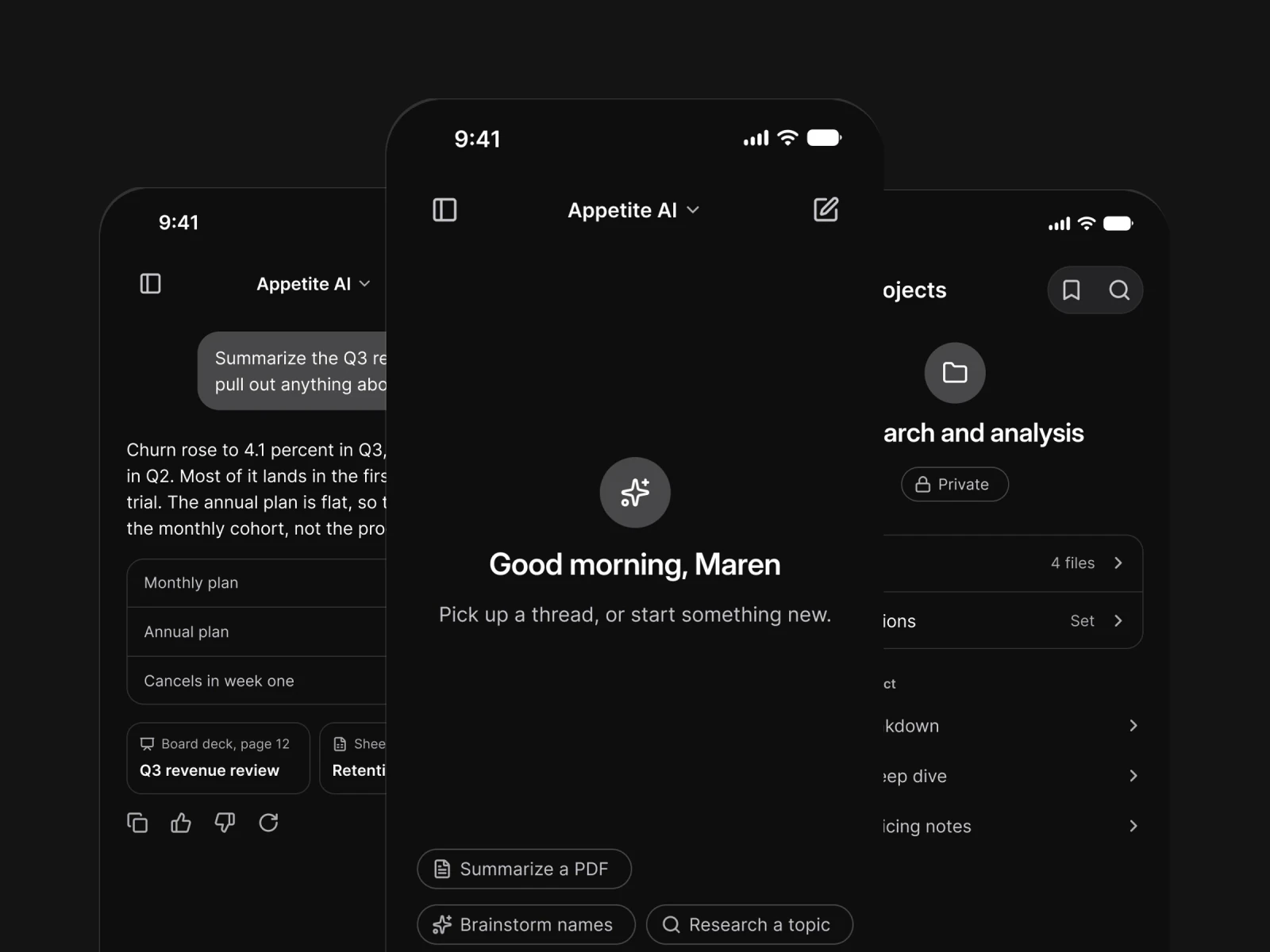
Your agent reads the same file.

The Appetite Core Skill teaches any agent which token to use and which platform pattern to pick. Free, and it works with Claude, Cursor and Figma.

AI tools reading the Appetite UI token architecture
Claude AI Appetite UI Mobile Design integration
Cursor Appetite UI Mobile Design integration
ChatGPT AI Appetite UI Mobile Design integration
Screens

Six screen groups, ready to open. All in one pack.

Onboarding
Onboarding screens from Appetite UI
Settings
Settings screens from Appetite UI
Empty State
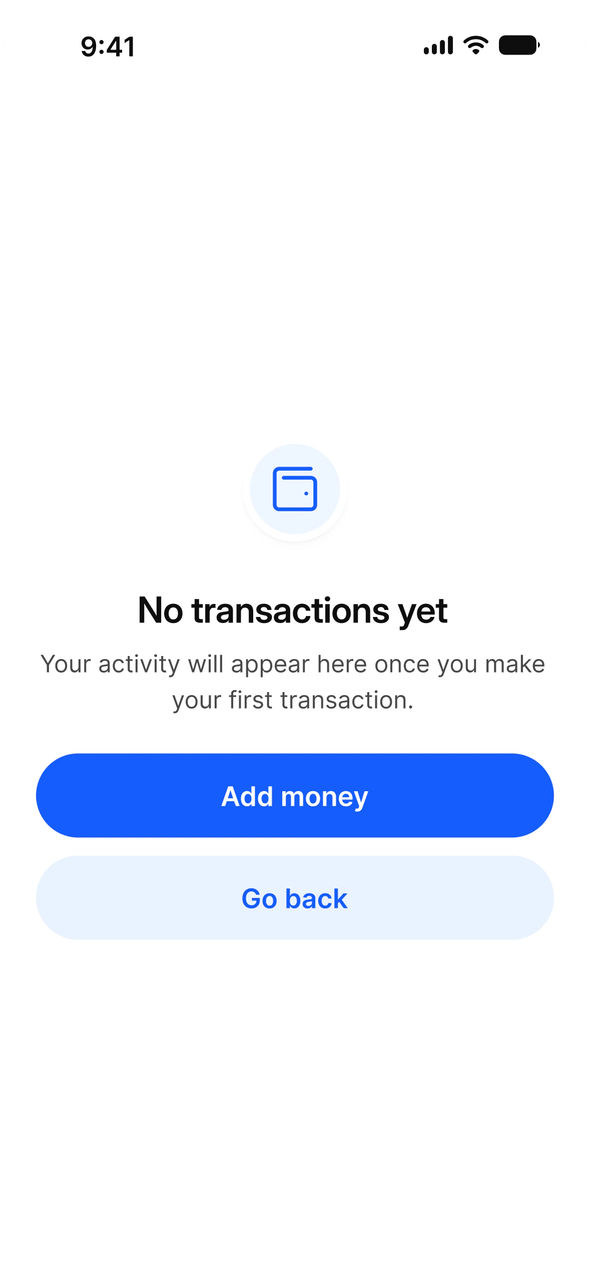
Empty state screens from Appetite UI
Finance
Finance screens from Appetite UI
Fitness
Fitness screens from Appetite UI
Social
Social screens from Appetite UI
Components

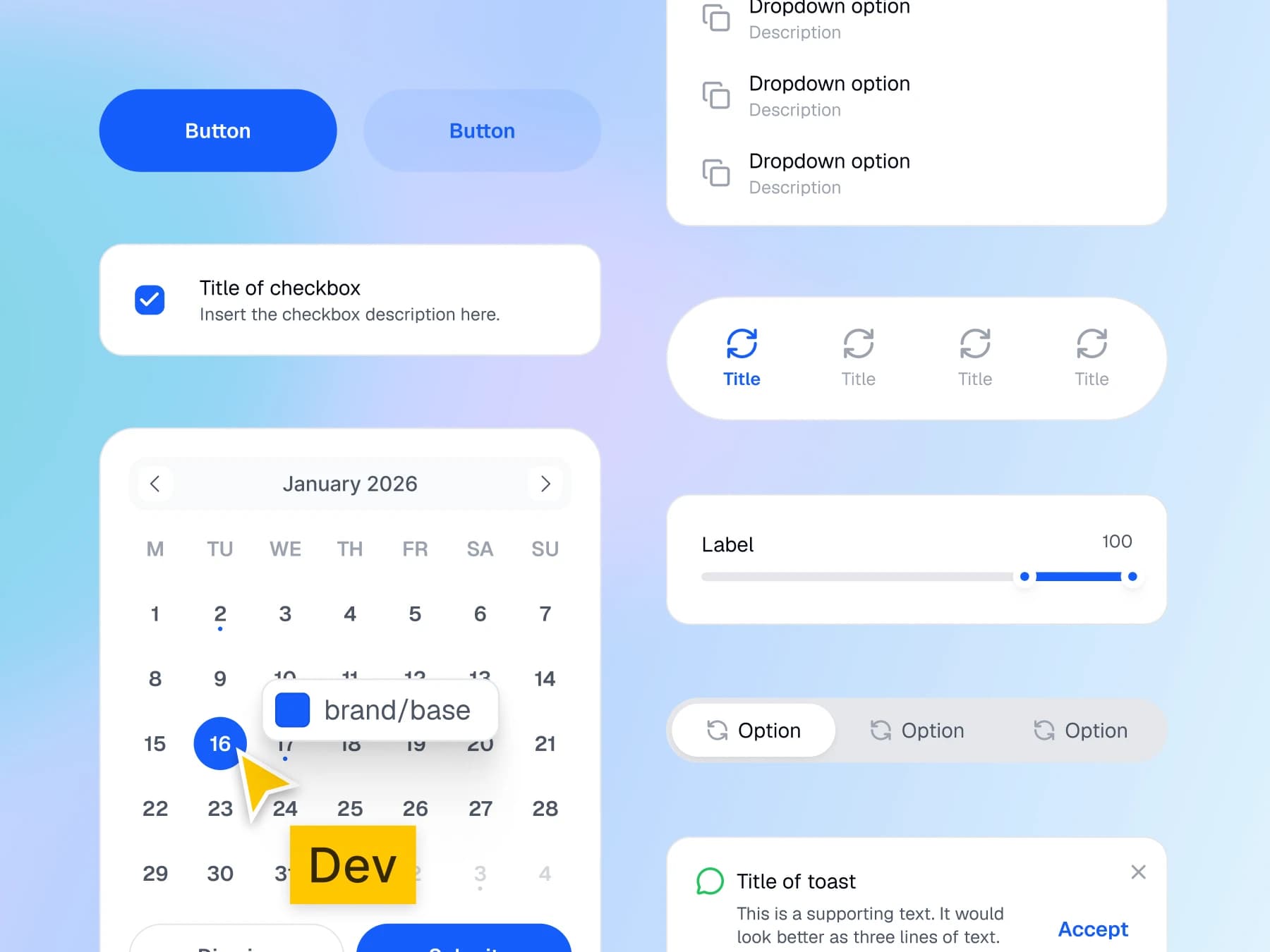
1,972 components, one architecture. Every one reads from the same tokens.

The token architecture is the real product. Everything else in the file is downstream of it.

Jacob Engelbreth

Digital Concept Developer

Free files

You may have seen this in the Figma community.

A teaser with the useful part removed is the industry standard. These are the opposite of that. Open the variables panel and the whole token chain is there, primitives resolving into semantic aliases, exactly as it works in the paid system. There are no refunds here, so the free files carry the risk instead.

See community profile
Pricing

One payment. Yours forever. No subscription and no seat maths.

Solo

$79

One designer, unlimited projects.

checkmark
The full Figma system, one architecture
checkmark
Token package
checkmark
Personal and client work, no project limit
checkmark
Every future release
Get Solo for $79

Team

$149

Up to ten seats on one shared system.

checkmark
Everything in Solo
checkmark
Ten seats sharing the same source of truth
checkmark
Shared library setup guidance
checkmark
Direct support from the maker
Get Team for $149
One-time payment, Lifetime updates and Works on the free Figma plan
FAQ

Questions worth asking. Answered by the person who built it.

Is Appetite UI a UI kit?[+]

No. A kit gives you components. A system gives you the decisions underneath them. Spacing, radius, elevation, type scale and color are defined once as tokens, and every component reads from those tokens. Change a token and the whole system moves with it. That is the reason your file is still consistent six months in.

Is Appetite UI suitable for large products?[+]

Yes, and the reason is architecture rather than volume. Large products fail design systems in two places: a rebrand and a second platform. Appetite UI holds both. Color, spacing, radius, elevation and type live in 6 token collections and 401 variables, so a brand change is one edit rather than a sweep across screens. Both platform languages sit in the same file, so adding iOS or Android is not a second library. Every component already carries light and dark. The Team license covers ten seats on one shared source of truth, and every future release is included, so the system does not age out from under you.

Should I use this instead of the Apple UI Kit?[+]

Use both. Every guide tells you to start from the Apple and Material kits and build your own system on top of them. Appetite UI is that layer, already built. The platform baselines stay untouched, including their accessibility behavior, and your brand sits inside them.

How is this different from a free Figma Community file?[+]

A free file gives you a sample of components and stops at the surface. Appetite UI gives you the connected layer underneath: a full primitive to semantic token architecture, dark mode on every component, both platform languages in one place, application screens, motion tokens and installable code output.

Do I need a paid Figma plan?[+]

No. Appetite UI works on the free Figma plan. A paid plan is only needed if you want Figma's own team library features.

Can I use it for client work?[+]

Yes. Personal, client and commercial projects, unlimited. What you cannot do is resell, sublicense or redistribute the system, or share the file outside your licensed team. The license sets out the full terms. The Solo license covers one designer, so design teams and agencies need the Team License.

What does tokens ship as code actually mean?[+]

One W3C DTCG source generates CSS, SwiftUI, Jetpack Compose and Flutter. Your developer installs the package and reads the exact values you designed with, so the build cannot drift from the design. The SwiftUI output emits Dynamic Type anchors rather than point sizes, and the Compose output includes a ready Material 3 typography object.

Will this still be updated next year?[+]

Yes. Appetite UI has shipped continuously since launch and 2.3 is current. Every future version is included in what you already paid. The changelog is on this page so you can judge the pace yourself rather than take a promise.

Can I try it before buying?[+]

Yes. Start with the free files on Figma Community. They use the same architecture at a smaller scale, so you can open the variables panel and see exactly how the system is built before you spend anything.

Start designing. Build faster. Look better.

One-time payment  |  Lifetime updates  |  Works on the free Figma plan