
Checkbox
Checkbox is a small square that toggles between checked and unchecked, allowing multiple selections in a single set.
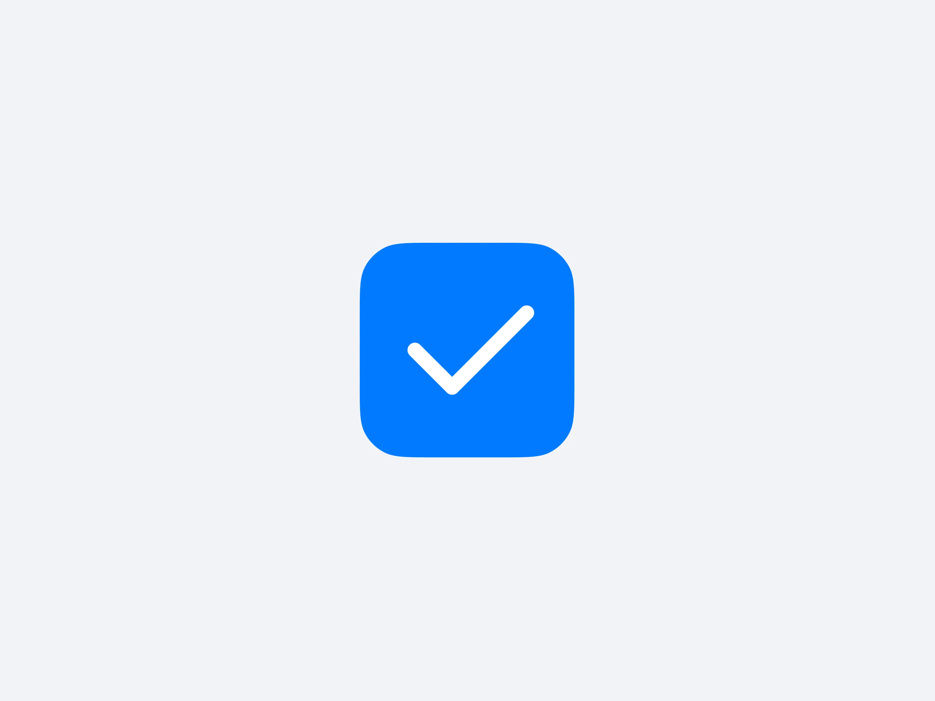
A checkbox is a small square that toggles to display a checkmark when selected, allowing multiple options to be chosen simultaneously. Each box typically has a label describing what it stands for, making it obvious which items the user has picked.
They shine when the interface calls for a flexible set of selections, such as filtering product tags or marking multiple items for an action. Because each can be on or off, checkboxes offer a clear, straightforward approach to multi-select tasks.