
Navigation Bar
Navigation Bar is a horizontal area typically at the top of a screen containing a page title and potential back or action buttons.
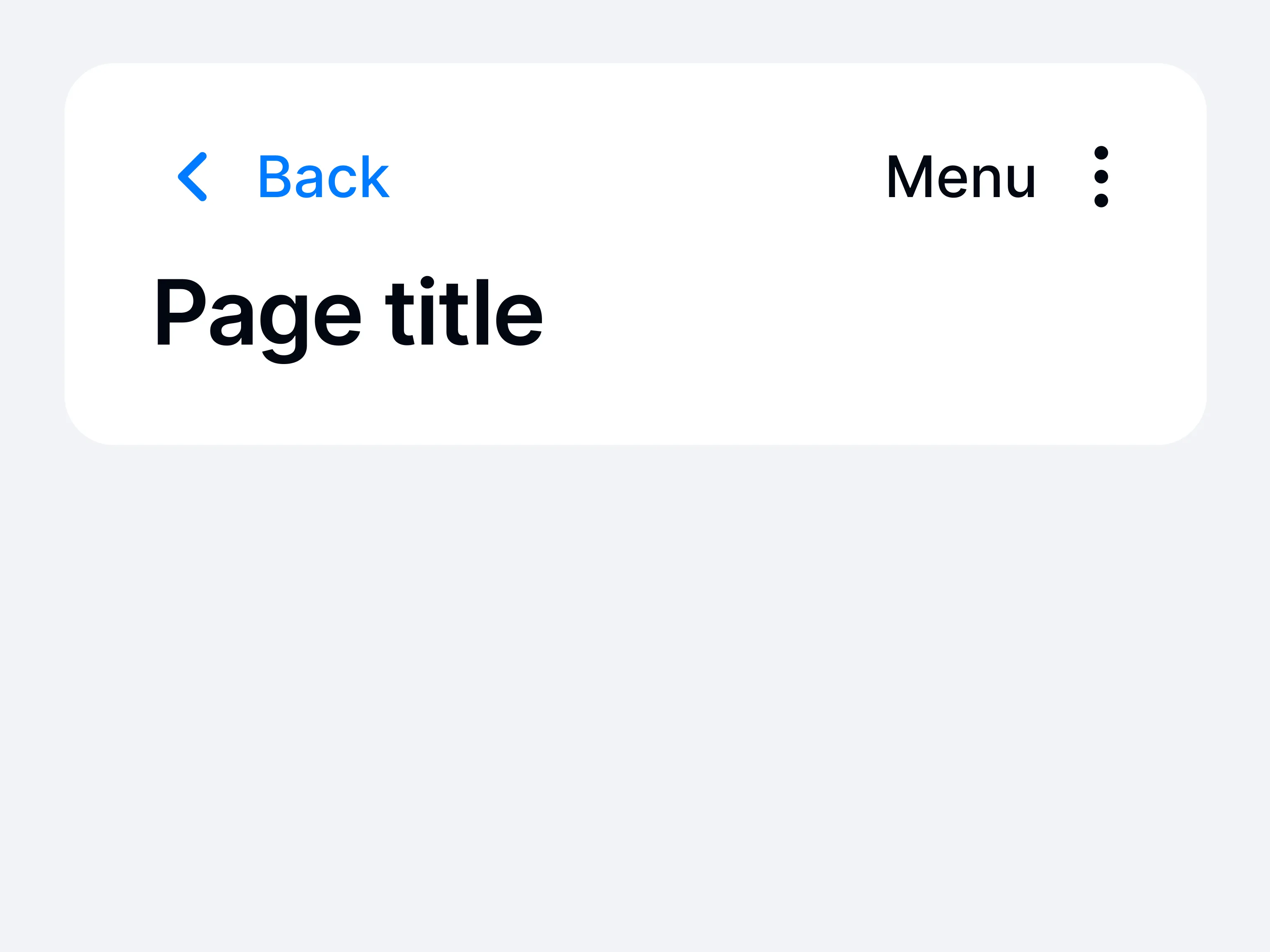
A navigation bar is typically placed at the top of the screen, hosting the current view’s title and optional controls like “back,” “edit,” or “done.” By consistently indicating both where the user is and how they can move up or down in the hierarchy, it reduces confusion.
With the navigation bar, multi-level structures become easier to traverse. Users can quickly switch contexts, confirm the screen’s purpose, or return to a parent view. This standard layout fosters consistency, so new pages feel familiar and aligned with overall app flow.