2.4
September 2026, current
iOS layer completed
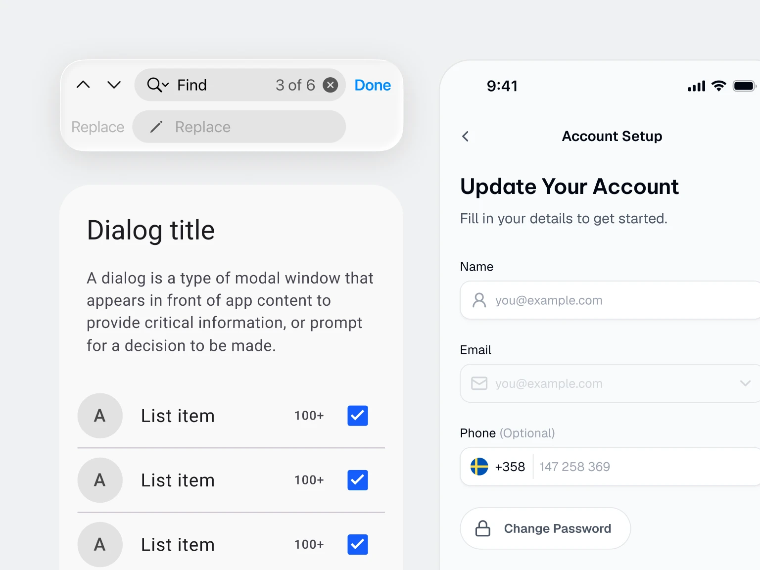
Tab Bar, Toolbar, List, Text Field, Segmented Control, Stepper, Slider, Progress, Menu, Contextual Menu, Pop-up Button and Page Control added. Keyboard and Toggle rebuilt to Apple's measurements.
Liquid Glass on Apple's own recipe
Two stacked layers carrying the real refraction, edge and lift values, split into a surface tier and a control tier. Action rows take a flat system fill, which is what Apple actually ships.
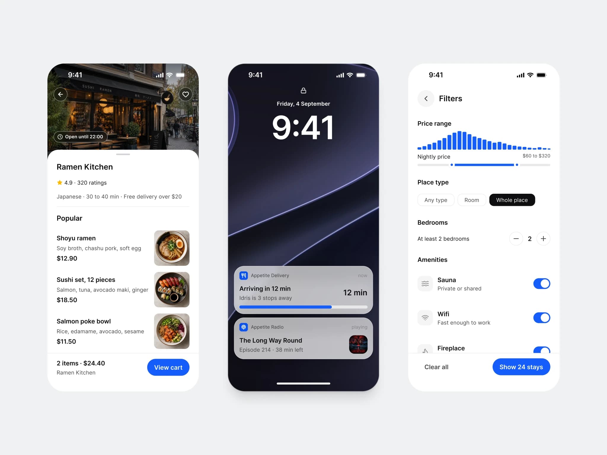
Dynamic Island, Live Activity and Widget
Three new pages. Compact, minimal and expanded island, six Live Activity layouts with Lock Screen presentations, and widgets in three families across Default and Glass.
Material 3 layer completed
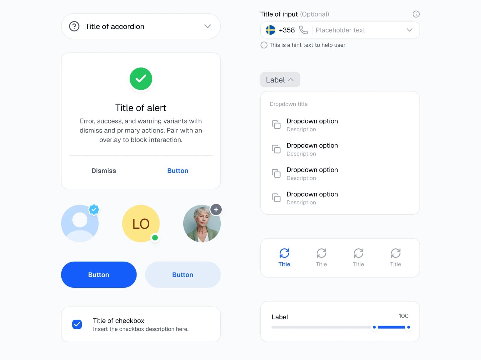
Switch, Checkbox, Radio, Card, FAB, Extended FAB, Icon Button, Chip, Text Field and List Item at the published Material measurements, plus Top App Bar and Navigation Bar. State layers on nine sets.
Platform Bridge covers shape and type
Corner and typography scales for both platforms alongside color, with SwiftUI, Compose and CSS syntax on every role. The Mode variant is gone from the iOS sets, so one switch drives dark mode across the whole file.
Three app flows, AI, Booking and Foodie
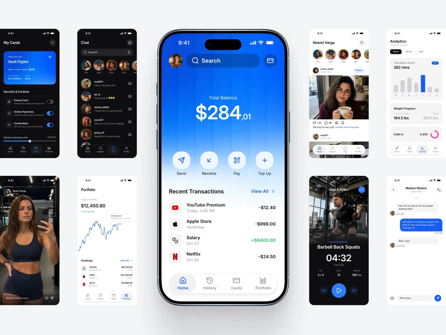
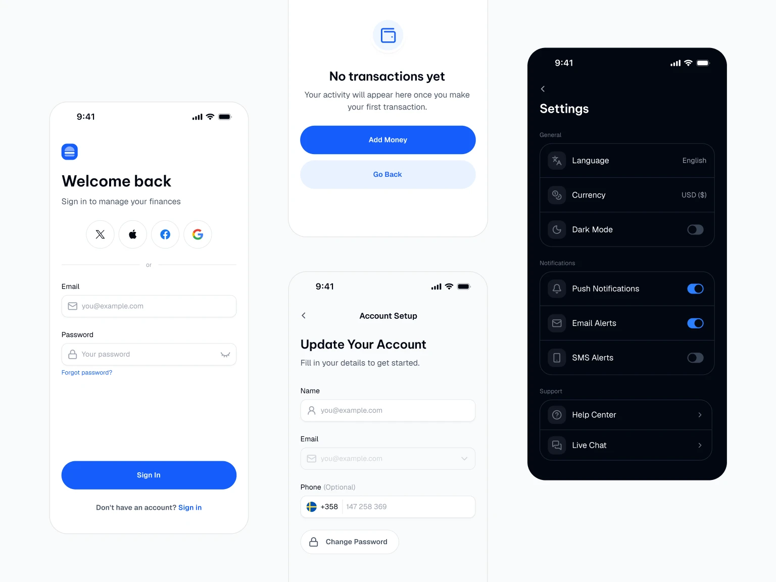
Thirty three screens in light and dark. AI covers chat, tools, image generation, projects and instructions. Booking runs search to confirmation, Foodie runs home to order tracking.
New components
AI Message, Prompt Composer, Navigation Drawer and Drawer Item, Text Area, Stepper, Price row, Rating score, and overlay Button and Badge for controls that sit on photography. Search gains a Hero style for a floating search over a photographic header.
Every declared property now works
A sweep of every component set found twelve properties that were declared but bound to nothing, Chip's close button and Top Bar's title among them. All fixed, with the value on every existing instance preserved.
Examples on every component page
Boards showing the component at work inside a real screen rather than the parts laid out in a row. Component sets sit on a grid, and every set carries a description.
Token and icon hygiene
138 raw variables left the property pickers, so only semantic tokens show. Icon stroke weight now scales with icon size across the whole file.