Where it fits
The layer between the platform kits and your brand.
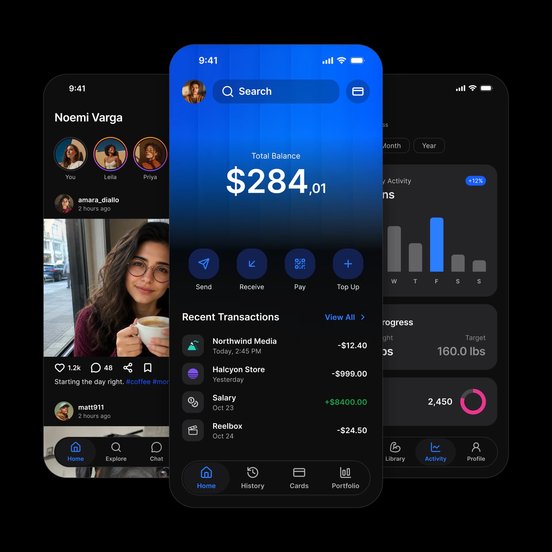
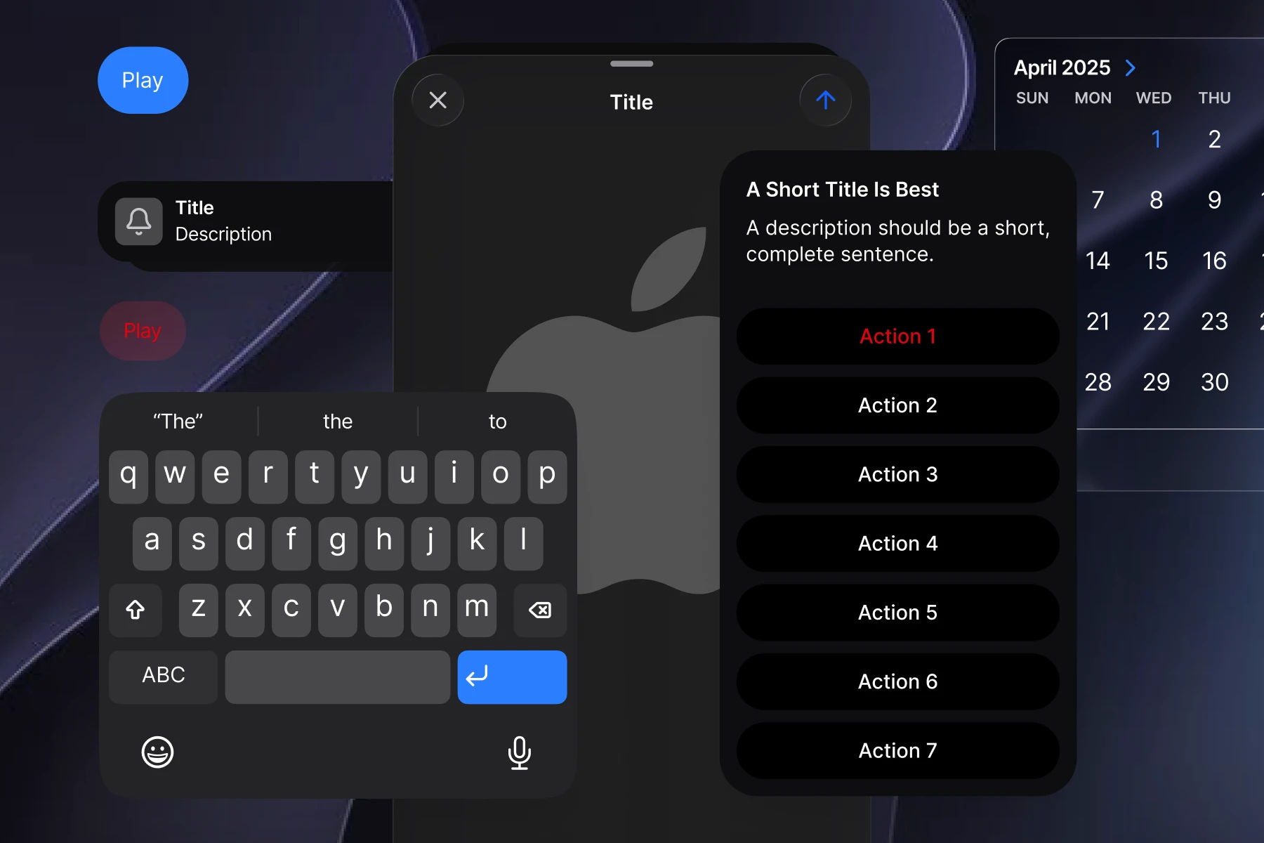
Apple's and Google's kits each cover one platform, and neither carries your brand. Appetite UI is that layer: a Figma UI kit for iOS and Android, built like a design system.
The problem
Mobile design is harder than it looks.
Then it gets harder. None of this shows up on the first screen. It shows up on the fortieth, when the file has been through two people and one brand change.
Mobile is the hardest surface.
Consistency does not survive speed.
What stops being your problem.
Three moments where a design file starts costing you time.
Before
 Search
Total Balance
$28,401.75
+$1,240.50 this month
- Send
- Receive
- Pay
- Top Up
Recent Transactions
View All- Northwind MediaToday, 2:45 PM−$12.40
- Halcyon StoreYesterday−$999.00
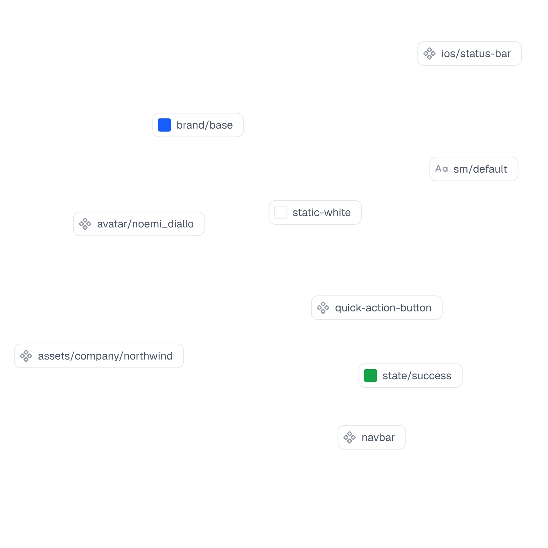
colors/blue/500becomescolors/purple/500brand/base, one edit
After
SearchTotal Balance
$28,401.75
+$1,240.50 this month
- Send
- Receive
- Pay
- Top Up
Recent Transactions
View All- Northwind MediaToday, 2:45 PM−$12.40
- Halcyon StoreYesterday−$999.00
Brand change
One color change, every screen reopened
Second platform
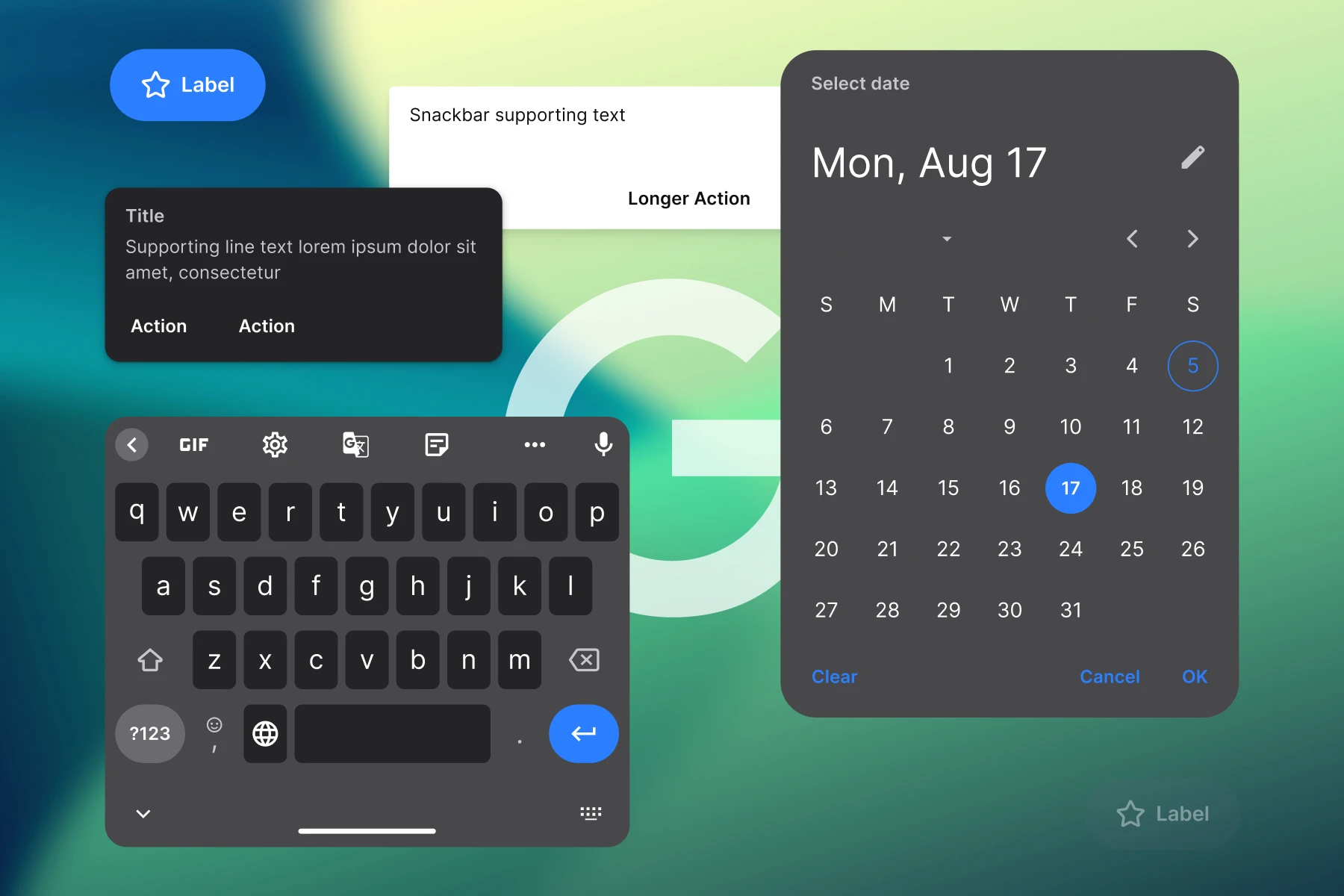
The second platform drifts first
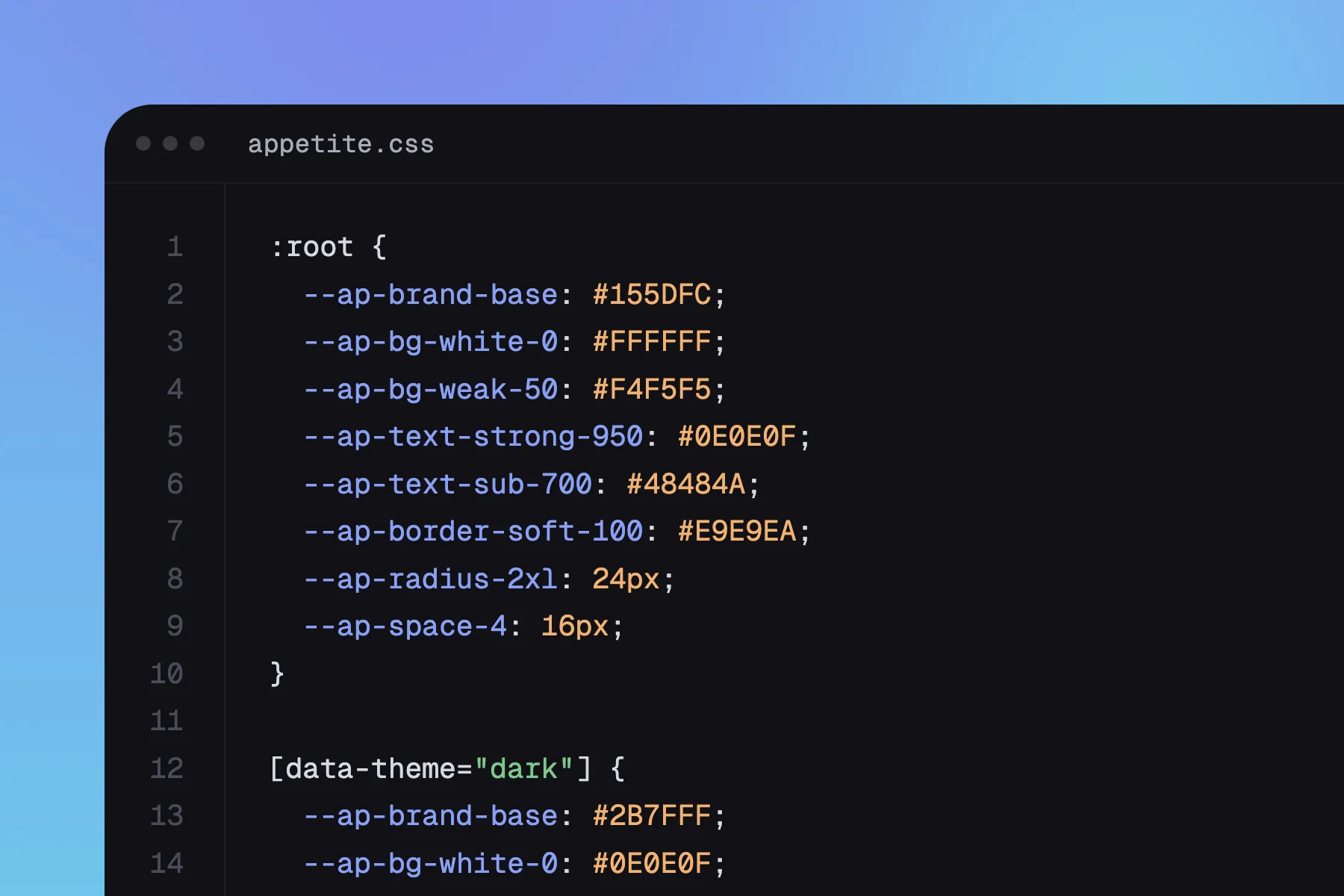
Code
Reach the code
One system. Every ship path.
One file sits under every way you ship: native, cross platform or through an agent.
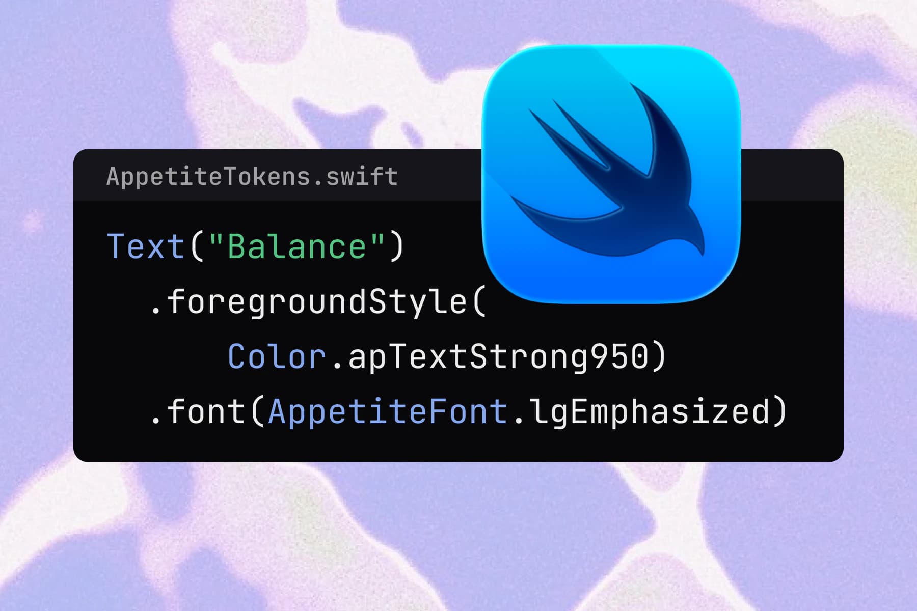
Native iOS
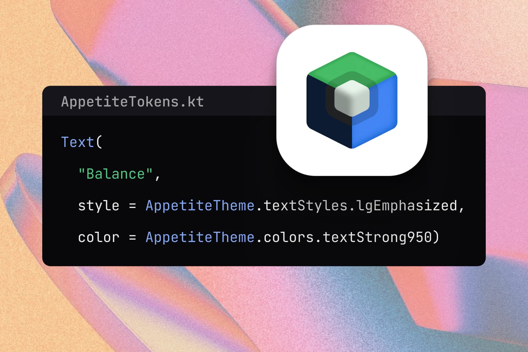
Native Android
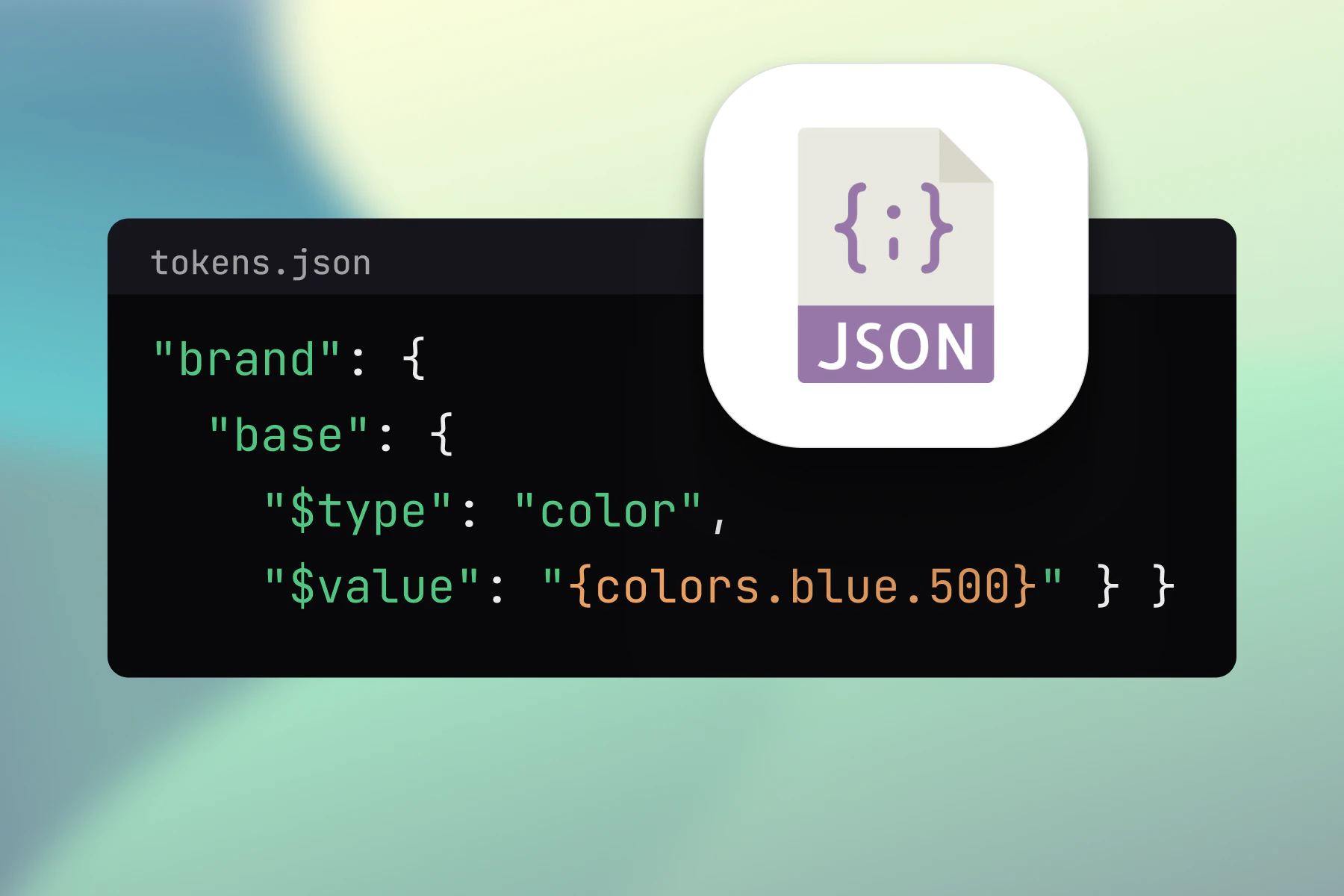
Cross platform
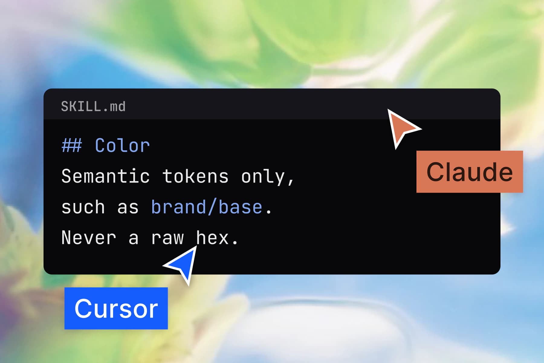
AI tools
Buy this when the file has to outlive the first version of it.
When the architecture pays for itself, and when it does not.
You are building for a phone.
The brand will change.
A developer wants values, not a document.
Dark mode is not optional.
Skip it when
You are building for the web. A web system will serve you better and cost you less time.
You want a pile of screens to copy from rather than a system to build on.
Your team already runs a mature design system of its own.
Who uses it
Designers and developers who already shipped with it.
I now design systems and apps much faster and more efficiently. A great investment and a foundation for good app designs.
 Bára LiškováUI Designer
Appetite UI has helped us develop mobile apps much faster and more efficiently.
 Jan DoanUX Designer
The outputs I get from our designer are more understandable for development. I recommend it.
 Braňo StupákApp developer
Built with Figma Variables, linking primitives and semantic tokens the way a real design system should. Lean by design, with only the tokens you actually need.
 Jakub EngelbrethDigital Concept Developer
Your next rebrand is one edit.
One-time payment, Lifetime updates, Unlimited client projects