Comparison
Where will it ship? That picks the kit.
Apple's kit for iOS alone, Google's Material 3 kit for Android alone, a web kit for a browser, a Flutter kit for a Flutter codebase. Appetite UI when one app ships on iOS and Android from one token source.Every kit checked on its own site on
The field
Each kit in its own words.
What each kit says it is, what ships beside its Figma file, and when it is the right pick. Nothing here is ranked.
| Kit | What it says it is | Beside the Figma file | Pick it when |
|---|---|---|---|
| Appetite UIThis file | A Figma UI kit for iOS and Android, built like a design system. | The DTCG token source and its SwiftUI, Jetpack Compose, Flutter and CSS outputs, in the file you buy. The outputs carry the values; your developers keep their own components. | One app ships on iOS and Android, or your brand has to sit on top of the system. |
| One platform each | |||
| Apple's iOS and iPadOS 27 UI kitFigma Community, from Apple | Components for all common controls and views, for iPhone and iPad design comps and user flows. | Not stated on its site. | You ship on iOS only and want Apple's exact components. |
| Google's Material 3 Design KitFigma Community, from Google | An introduction to Material Design 3, with styles and components to help you get started, built to work with the Material Theme Builder plugin. | Not stated on its site. | You ship an Android app on Google's baseline. |
| Mobile kits | |||
| Dynamic Layerdynamiclayer.io | A mobile app UI kit and component library. | Flutter code for the components. | You build in Flutter and want the components as code. |
| Setproduct Mobile Xsetproduct.com | "iOS & Android app templates", "based on iOS specs adopted for 8dp Android grid". | Not stated on its site. | You want iOS and Android app templates to start from. |
| Web kits | |||
| Untitled UIuntitledui.com | A Figma UI kit and a React component library. | React components, built with React Aria and styled with Tailwind CSS. | You ship a web app, a dashboard or a marketing site. |
| AlignUIalignui.com | A design system, "Design and development perfectly aligned", with an "Up-to-date Figma file synced with code library". | React components, styled with Tailwind CSS. | You build a web product in React and Tailwind CSS. |
Read on each kit's own page on . Each row says what that page says and goes no further: this site states no price, count or rating of another product.
Before you pick
Answer these before you open a file.
Each answer rules out part of the table, this file included.
Platform
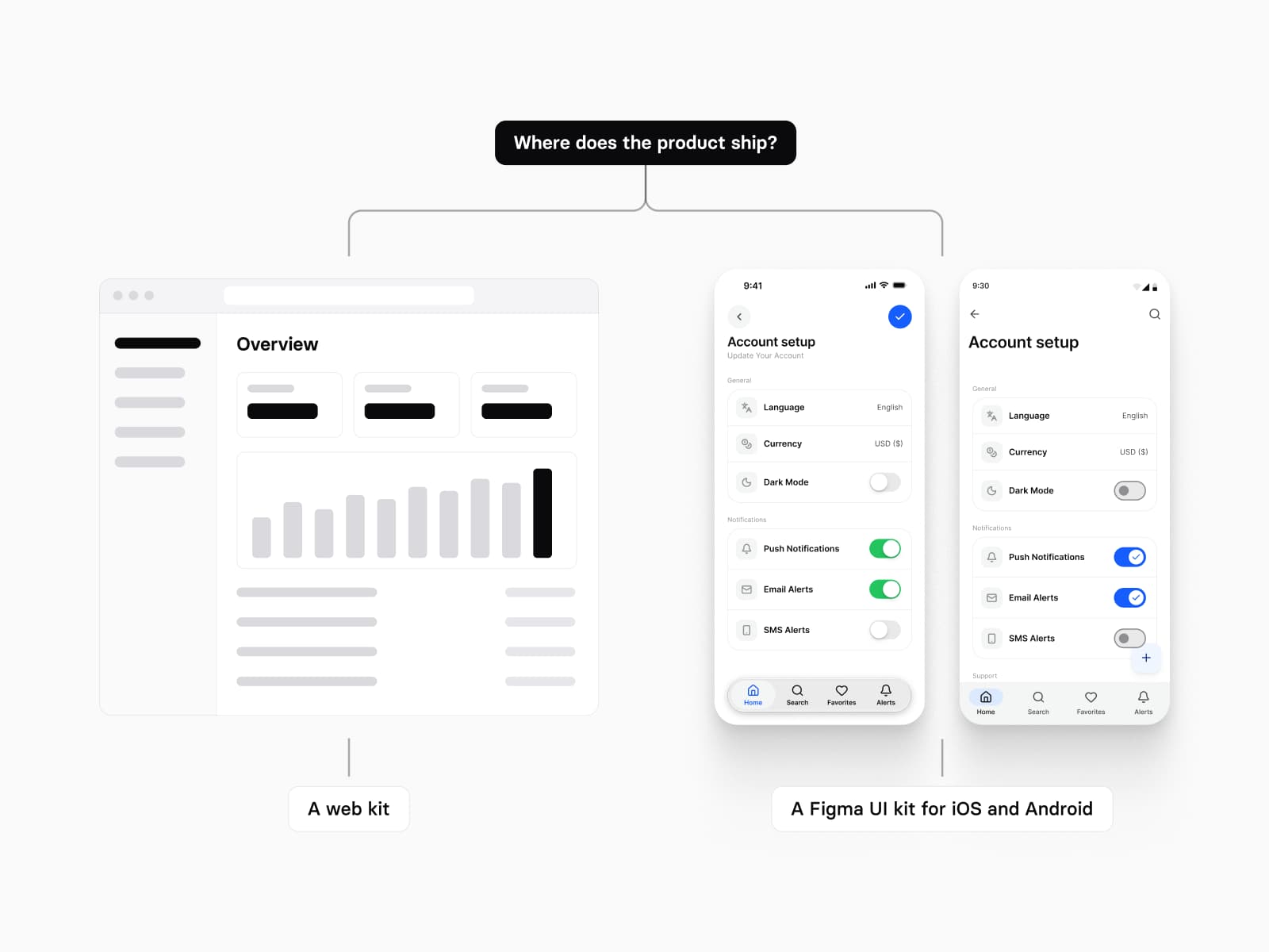
A phone or a browser?
For a browser, take a web kit and stop comparing. For one phone platform, its official kit is the baseline. For both from one file, you need both conventions in it.
Brand
Will the brand change?
It usually does. Count the places you edit when it changes; if the answer is more than one, the file will drift.
Handoff
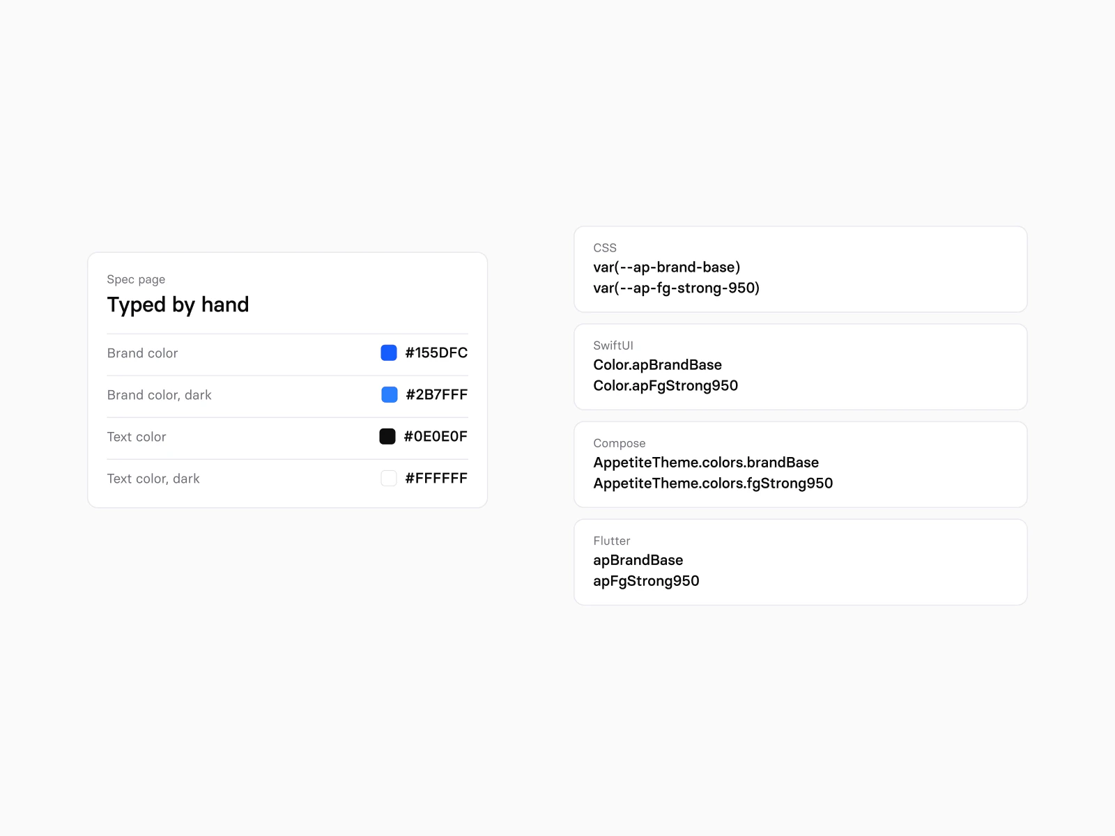
Values or a document?
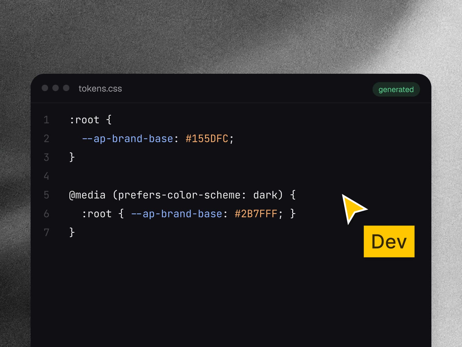
A specification gets retyped, and every retyped value is a place design and build can disagree. Tokens exported to SwiftUI, Compose, Flutter and CSS reach the build as they are.
Fit
Where this file is the wrong buy.
Buy something else
When a different file is the better answer.
You are building for the web. A web system will serve you better and cost you less time.
You want a pile of screens to copy from rather than a system to build on.
Your team already runs a mature design system of its own.
Buy this one
When the architecture pays for itself.
You are building for a phone.
iOS, Android or both. Everything in the file was drawn at phone widths.The brand will change.
Two token levels keep the change to one edit.Your developer wants the values.
Tokens arrive as SwiftUI, Compose, Flutter and CSS, so nobody retypes a hex into a stylesheet.Dark mode ships on day one.
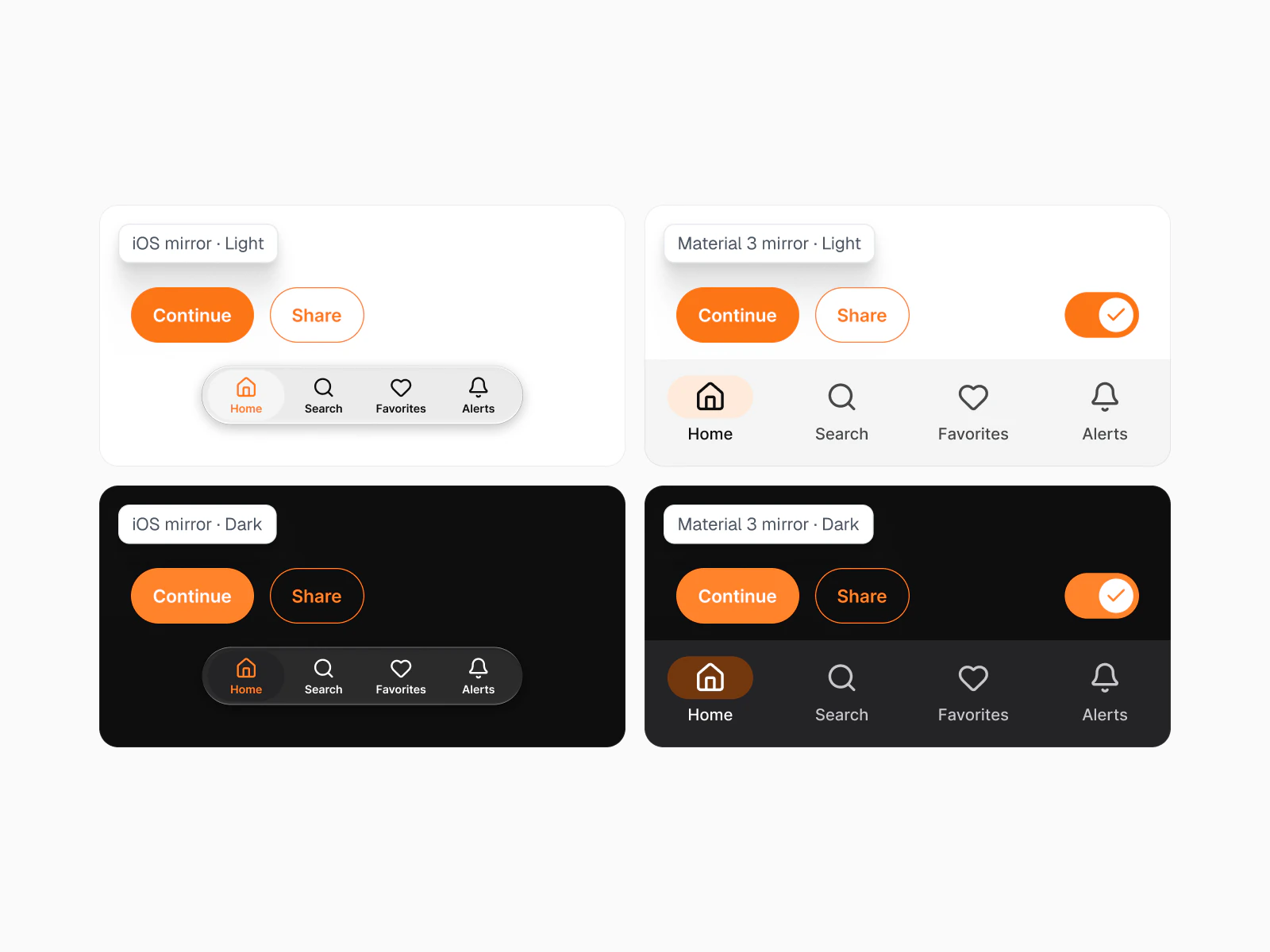
Every component carries both modes through the same semantic tokens.
Open the read-only Figma preview before you decide either way. It is the whole file, which is the one part of this a comparison page cannot show you.
Keep reading
The pages behind the table.
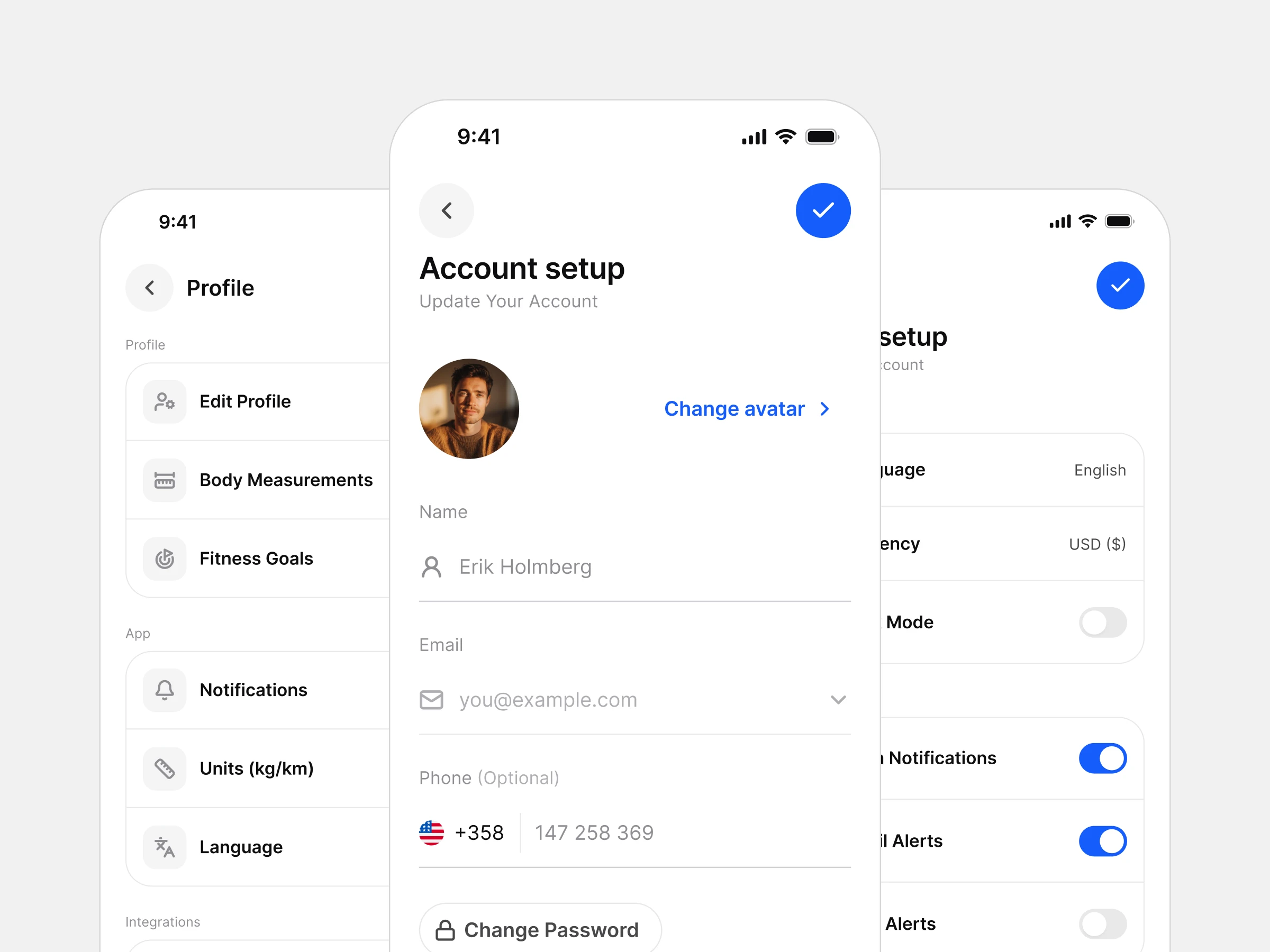
Side by side
Appetite UI and Untitled UI
Side by side
Appetite UI and Dynamic Layer
The longer answer
The best Figma UI kits for mobile apps in 2026
Your next rebrand is one edit.
One-time payment, Lifetime updates, Unlimited client projects