The best Figma UI kits for mobile apps in 2026
Apple's kit for iOS only, Google's Material 3 kit for Android only, one token source for both. Eight Figma UI kits for mobile apps, sorted by the app you ship.

On this page
The best Figma UI kit for a mobile app depends on where the app ships. For an app that runs only on iPhone and iPad, start from Apple's iOS and iPadOS 27 UI kit; for an app that runs only on Android, start from Google's Material 3 Design Kit. Both are free and official, and each covers one platform. For one app on iOS and Android, pick a kit that keeps both platforms on one token source. Appetite UI is a Figma UI kit for iOS and Android apps, built like a design system. One token source drives Apple and Material components in light and dark mode, and exports to SwiftUI, Jetpack Compose, Flutter and CSS.
I design Appetite UI, so one entry on this list is mine; read it knowing that. Every other kit is described in its maker's own words, quoted from its own page on September 24, 2026, and linked under Sources. There are no counts, ratings or prices of anybody else's product here, only whether a file is free, because prices change and are the maker's to state.
Every kit looks finished on its cover. The differences show up later, in three moments most apps go through: the brand color changes, a second platform is added, and a developer asks for the values. Run these checks on a kit's own page, and in its free file if it has one, before you pick it.
| Check | What to look for |
|---|---|
| Platforms | iOS, Android or both, named on the kit's own page. The two disagree on bars, sheets, the primary action and touch targets. |
| Light and dark | Variable modes, component variants or duplicated frames. The phone's system setting switches the appearance, so every screen needs both. |
| A rebrand | Open the variables panel and follow one color. Held once, it moves every screen; held per component, it is a sweep. |
| Beside the file | Component code, token values or nothing. A developer who receives values does not retype them. |
| License | The license linked from the file. Apple's names the platforms it covers; section 2A is quoted below. |
| Updates | The date on the file page, or a changelog. Apple overhauled its kit for iOS 27; Material 3 Expressive updated app bars, buttons and navigation bars. |
For what a variable mode does that a duplicated frame cannot, see Dark mode with Figma variables, not duplicate frames.
| Kit | Built for, in its maker's words | Beside the Figma file |
|---|---|---|
| Apple's iOS 27 kit | "iPhone and iPad design comps and user flows" | A Sketch version; SF Symbols separately |
| Google's Material 3 kit | "Use this design kit for Jetpack Compose" | Compose code snippets, per its changelog |
| Appetite UI | iOS and Android apps, both in one file | Token values for SwiftUI, Compose, Flutter and CSS |
| Xela UI | "desktop & mobile apps in Figma & Flutter" | React, Flutter, SwiftUI and Compose components, as a bundle |
| Dynamic Layer | "iOS, Android or hybrid apps" | "Flutter code for the components" |
| Setproduct Mobile X | "Android & iOS applications" | Not stated on its site |
| Nucleus UI | "From mobile apps to web UI kits" | Not stated on its site |
| Untitled UI | "modern UI and web design" | React components, as Untitled UI React |
Checked on , against each product's own public pages.
Apple describes it in one sentence: "Apple's iOS and iPadOS 27 UI kit for Figma helps you quickly and easily create highly accurate iPhone and iPad design comps and user flows." It contains, in Apple's words, "components for all common controls and views, design templates, text styles, color styles, and materials", and for this release it "was fully overhauled to support iOS and iPadOS 27 changes including updates to Liquid Glass, layout, sidebar colors, scroll edge effects, and more." Apple announced the 27 design kits on June 23, 2026, and the Figma Community file shows an update on September 15, 2026. It is free on Apple's Design Resources page, for Figma and for Sketch.
It is Apple's own drawing of Apple's controls, so for an iPhone-only app it is the file everything else gets compared against. The file asks you to "install the latest version of SF Symbols before using this library", and its Figma Community page links the License Agreement for Apple Design Resources, whose section 2A reads:
"you are granted a limited, non-transferable, non-exclusive license to use the Apple Design Resources solely for creating mock-ups of user interfaces designed for use in software products that run only on Apple's macOS, iOS, watchOS, tvOS, and/or visionOS operating system software"
License Agreement for Apple Design Resources, LYL142, 06/21/2023, read September 24, 2026.
Pick it when you ship on iOS only and want Apple's exact components.
Google introduces its kit as "a comprehensive introduction to the design system, with styles and components to help you get started", and the latest entry in the changelog on its Figma Community page, version 1.25 of May 19, 2026, is direct about the platform: "Material Android is Compose-first. Use this design kit for Jetpack Compose." The same entry adds slots to sheets, cards, navigation rails, lists, menus, dialogs and tabs. Material 3 Expressive reached the kit in May 2025 with button groups, the FAB menu, the split button and the loading indicator.
Theming runs through a plugin. The kit is "built to work with the Material Theme Builder Figma plugin", and the plugin's own instructions say that Create Theme will "generate a theme (material-theme) and Material Design tokens as Figma styles". Your brand arrives as a generated set of styles.
Pick it when you ship an Android app on Google's baseline.
This is the entry I make, so here is what it does and what it does not.
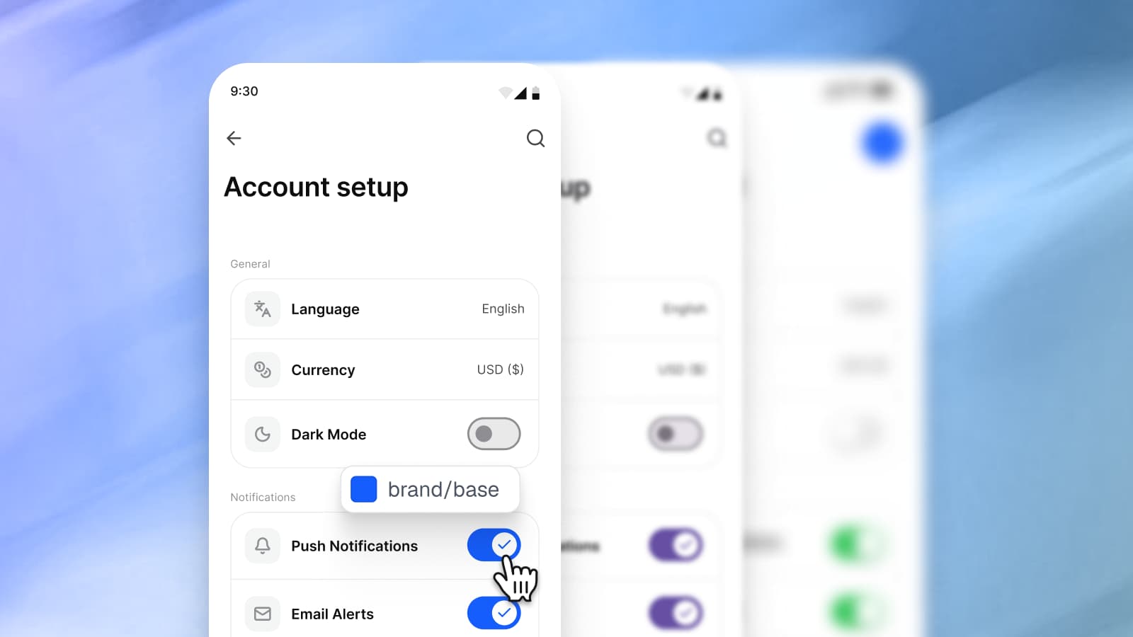
Appetite UI puts Apple and Material components in one Figma file and binds both to the same tokens. The Platform Bridge holds 112 variables: 52 Apple slots and 60 Material slots for color, shape and type size. In Brand mode each slot points at your tokens, so iOS/tintColor and M3/sys/color/primary end on the same brand primitive, and one edit moves an iOS screen and an Android screen together. In System mode the same slots return the values Apple and Google publish, so you can hold a screen against the official baseline without redrawing it. Light and Dark are two modes on the same semantic tokens, and the file runs on 544 variables in 6 collections.
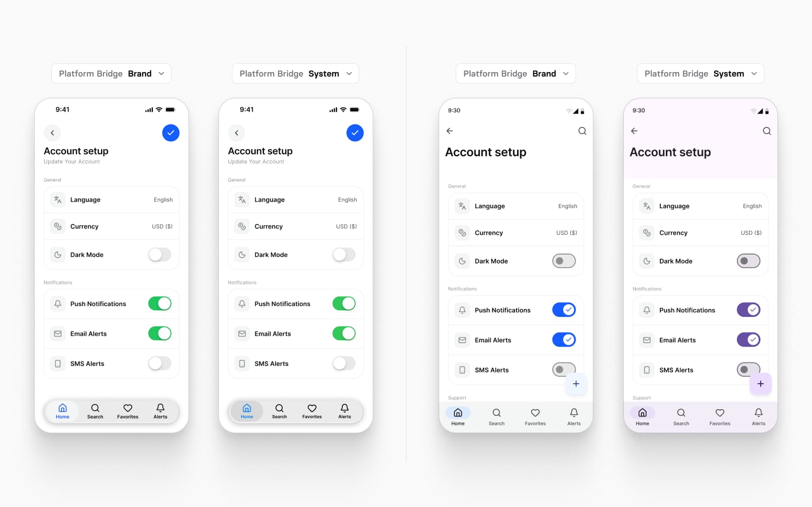
The token source is one file in the W3C Design Tokens format, and its SwiftUI, Jetpack Compose, Flutter and CSS outputs come in the file you buy (code output). Those outputs are values, not component code: colors, spacing, type and motion, ready for the components your developers build; How one Figma token becomes SwiftUI, Compose, Flutter and CSS follows one token through all four. The app screens for finance, booking, fitness, social and AI apps are assembled from the same components in light and dark, and the Core Skill, included with the file, tells an AI agent which token to reach for.
What it leaves out: no Apple artwork, SF Symbols or San Francisco typeface (the file is drawn in Inter with Lucide icons), and nothing for the web. You can check all of it before paying: the full file has a read-only preview, and the docs state every token and component.
Pick it when the same app also ships on Android, or when your brand has to sit on top of the system. An app on one platform today works too: the other mirror reads the same tokens and waits in the file.
If your developer wants the components themselves as code, two kits sell them beside the Figma file. Xela UI calls itself a "Xela UI kit for Figma & Flutter", made "to craft perfectly shaped desktop & mobile apps in Figma & Flutter", and its design and code bundle comes "with Figma, React, Flutter, SwiftUI & Jetpack Compose components included". The Figma file itself is described as a "Customizable & adjustable dashboard design system" with a "Toggle between dark & light". Of the kits on this list, it is the one that sells components for SwiftUI and for Jetpack Compose.
Dynamic Layer puts it as "Build mobile apps faster with Figma & Flutter": "Ready-made Figma components, app templates and Flutter code so you can start app projects without building everything from scratch." Its page lists "Automatic Dark Mode", offers "polished iOS and Android screen templates", describes the kit as "Built for Claude Code workflows", and has a free preview "with selected components". More in Alternatives to Dynamic Layer for Figma mobile design, and the two side by side on Appetite UI vs Dynamic Layer.
Dynamic Layer pairs Figma with Flutter code. Appetite UI stays code-agnostic: the same tokens export to SwiftUI, Compose, Flutter or CSS.
Pick Xela UI when you want coded components for several frameworks at once. Pick Dynamic Layer when the app is built in Flutter and you want its components as code.
Setproduct names its kit "Figma Mobile X UI kit - iOS & Android app templates" and says it "Fits for Android & iOS applications". Its platform approach is one sentence: "Templates are based on iOS specs adopted for 8dp Android grid." Dark mode is a "Dark theme made with Variants", "Easy to toggle theme for each component", which in Figma means each component carries a light and a dark variant that you set per instance, where a variable mode switches a whole frame at once.
UI8 sells "premium UI kits for websites, mobile apps, and dashboards", browsable by app type: finance, fitness, food, travel and more. A screen kit gives you screens. Appetite UI gives you the screens and the system underneath them.
Pick one when you need a specific app type on screen quickly, drawn out screen by screen.
Nucleus UI calls itself "The All-in-one Figma Design System and UI Kit", with templates "From mobile apps to web UI kits for dashboards, e-commerce, and marketing pages". Its library comes preconfigured with "colors, typography, effects styles, spacing, and radius variables", and its page says "Built-in variables make switching between light and dark mode easy." What ships beside the file is not stated beyond a "Developer-friendly" heading that says the kit is "Built with production in mind", and the page does not name iOS or Android conventions.
Pick it when one kit has to cover an app and the website around it.
Untitled UI titles itself "Figma UI Kit and React Component Library" and describes "Everything you need for modern UI and web design". Its React library is "built with Tailwind CSS and React Aria", and its Figma kit switches to dark mode with "color variables" in its PRO VARIABLES version. Untitled UI is built for web apps, dashboards and marketing sites. Appetite UI is built for iOS and Android apps. Teams that ship a web product and an app sometimes use both; the short comparison and Appetite UI vs Untitled UI for a mobile app, screen by screen go through where each one stops.
Pick it when you ship a web app, a dashboard or a marketing site.
| Your app | Start with | Why |
|---|---|---|
| iOS only, Apple's exact look | Apple's iOS and iPadOS 27 UI kit | Apple's own components, updated with the platform |
| Android only, on Google's baseline | Google's Material 3 Design Kit | Made for Jetpack Compose, themed with Material Theme Builder |
| One app on iOS and Android, one brand | Appetite UI | Both platforms on one token source, with a switch back to each baseline |
| iOS today, Android on the roadmap | Appetite UI | The Material mirror reads the same tokens when Android arrives |
| Flutter, with components as code | Dynamic Layer or Xela UI | Both sell Flutter code for their components |
| SwiftUI or Compose components as code | Xela UI | Sells SwiftUI and Jetpack Compose components |
| Screens of one app type to start from | Setproduct Mobile X or an app kit on UI8 | Finished screens of that app type |
| A web app, dashboard or marketing site | Untitled UI | Built for the web, with React components |
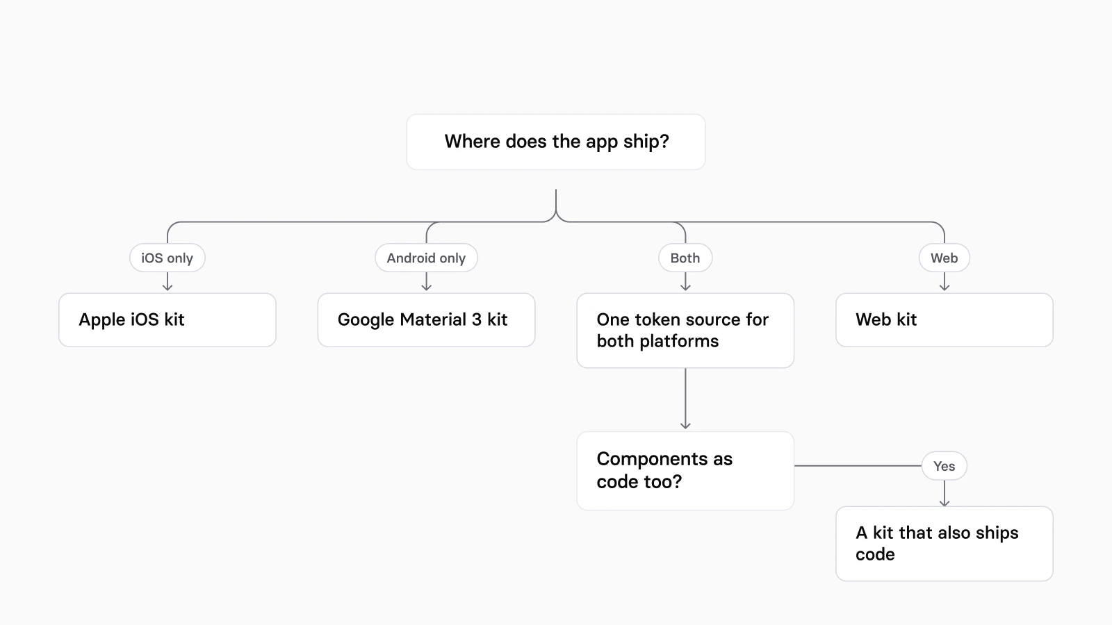
For the same decision with every alternative on one page, see Appetite UI alternatives, and for how the two official kits differ from a kit that holds both, Apple's iOS kit, Google's Material 3 kit or Appetite UI: which to start from. What changes per component between the platforms is in iOS vs Material 3: what changes per component, and the workflow for one app on both in How to design one app for iOS and Android in Figma. The platforms page shows the two mirrors side by side, and pricing lists what the file includes.
What is the best free Figma UI kit for iOS?
Apple's iOS and iPadOS 27 UI kit. Apple publishes it free on its Design Resources page for Figma and Sketch, and the Figma Community file was updated on September 15, 2026. For Android, the free official kit is Google's Material 3 Design Kit. Appetite UI is paid, and its read-only preview shows the whole file before you buy.
Is there a Figma UI kit for both iOS and Android?
Yes. Appetite UI puts Apple and Material components in one file on one token source, with a Brand mode for your brand and a System mode for each platform's own values. Setproduct describes Mobile X templates as "based on iOS specs adopted for 8dp Android grid", and Dynamic Layer offers "polished iOS and Android screen templates" with Flutter code.
Which Figma UI kits include SwiftUI, Jetpack Compose or Flutter code?
Xela UI sells a design and code bundle with React, Flutter, SwiftUI and Jetpack Compose components, and Dynamic Layer ships Flutter code for its components. Google's Material 3 Design Kit added Jetpack Compose code snippets to the file. Appetite UI ships its tokens as SwiftUI, Jetpack Compose, Flutter and CSS values; the components themselves are drawn in Figma for your developers to build.
Do Figma UI kits work on the free Figma plan?
Not fully. A Figma UI kit that switches light and dark, or platforms, with variable modes needs a paid Figma plan for those switches. Figma's help says: "Anyone on Education, Professional, Organization, and Enterprise plans can create and use modes for variables." Appetite UI's Light and Dark, Brand and System, and its platform metrics are variable modes, so switching them needs one of those plans. On the Material 3 kit's page, Google's Material Design team says Material Theme Builder "will not be able to edit any variables if you are not on a professional, organization or enterprise plan".
How often should a mobile UI kit be updated?
A mobile UI kit should be updated with every platform release at least. Apple announced its iOS, iPadOS and macOS 27 design kits on June 23, 2026, and updated the iOS file on September 15, 2026; Google's Material 3 kit logged version 1.25 on May 19, 2026. Appetite UI shipped releases in February, May, June, August and September 2026, listed on the changelog. Check the date on a kit's own page before you buy it.
Should I build my own design system instead of buying a kit?
Build your own if the system is the product you sell. Start from Appetite UI if the app is. A kit that already binds Apple and Material components to tokens saves the work that repeats in every mobile project: both platform mirrors, dark mode and the token export.
- Apple Design Resources, read September 24, 2026
- iOS and iPadOS 27, Apple's UI kit on Figma Community, read September 24, 2026
- Design kits for iOS, iPadOS, and macOS 27 are here, Apple Developer News, read September 24, 2026
- License Agreement for Apple Design Resources, PDF, read September 24, 2026
- Material 3 Design Kit, Google's kit on Figma Community, read September 24, 2026
- Material Theme Builder, Figma plugin, read September 24, 2026
- Start building with Material 3 Expressive, Material Design, read September 24, 2026
- Xela UI kit for Figma & Flutter, Setproduct, read September 24, 2026
- Dynamic Layer, read September 24, 2026
- Figma Mobile X UI kit, Setproduct, read September 24, 2026
- Nucleus UI, read September 24, 2026
- UI kits, UI8, read September 24, 2026
- Untitled UI, read September 24, 2026
- Modes for variables, Figma Learn, read September 24, 2026