iPhone Duo
Both iPhone Duo displays, already drawn.
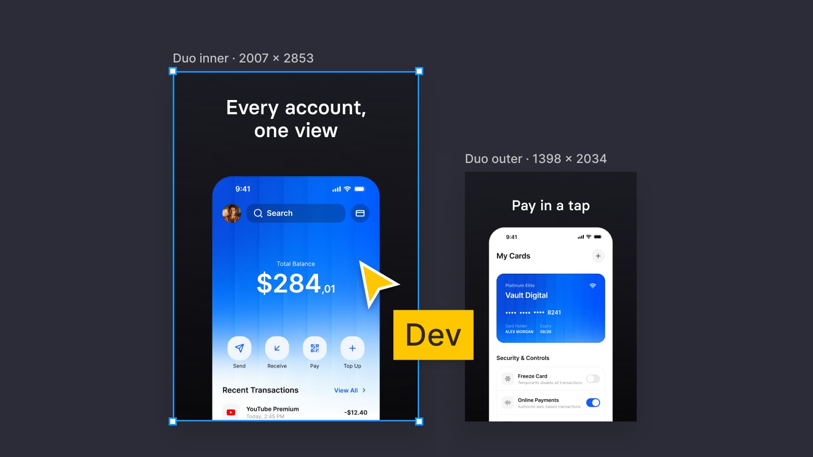
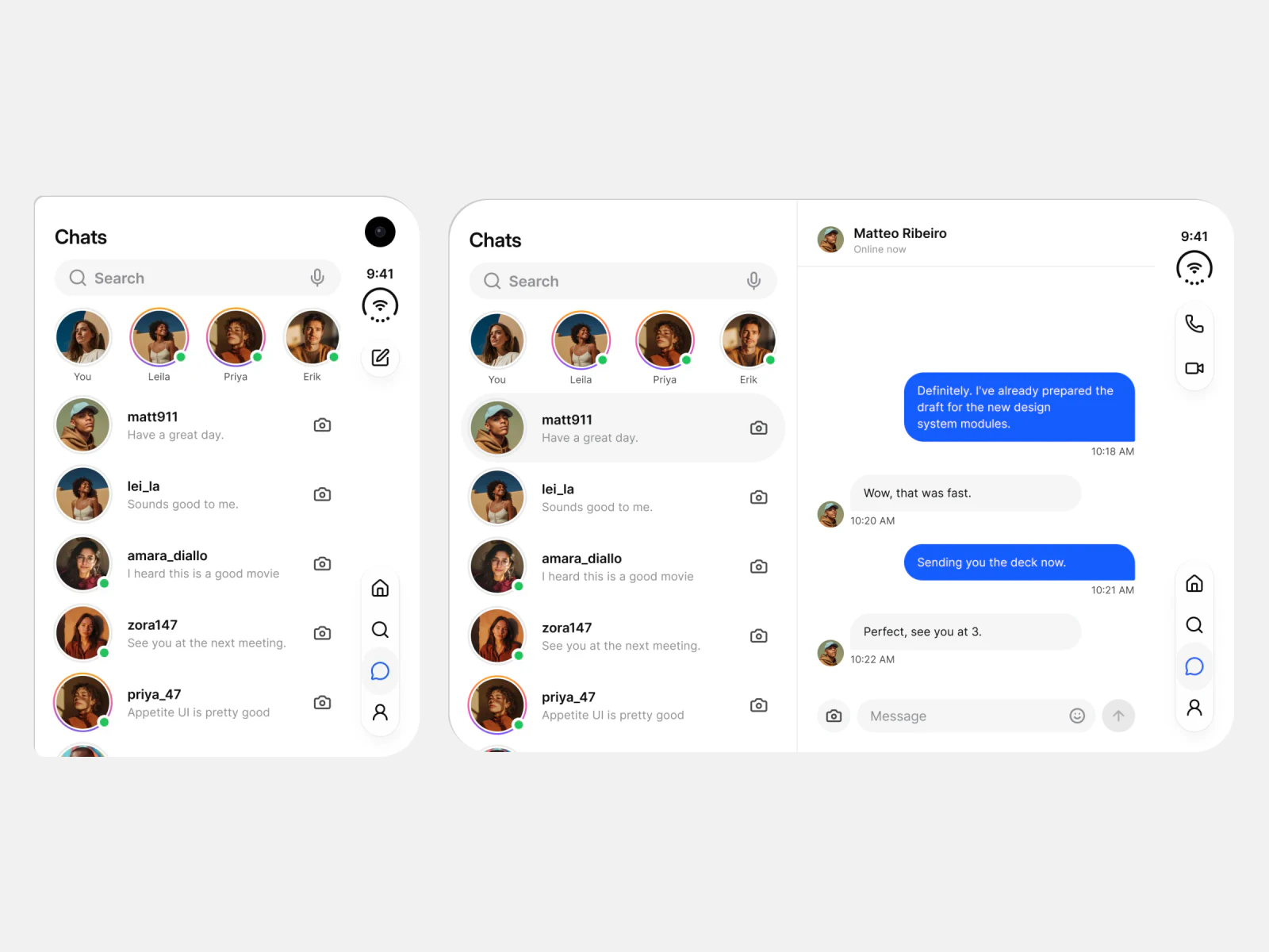
A Figma UI kit for iOS and Android apps, built like a design system. It draws 8 apps for the outer and the inner display of iPhone Duo, each with the vertical rail and one variable mode per display.
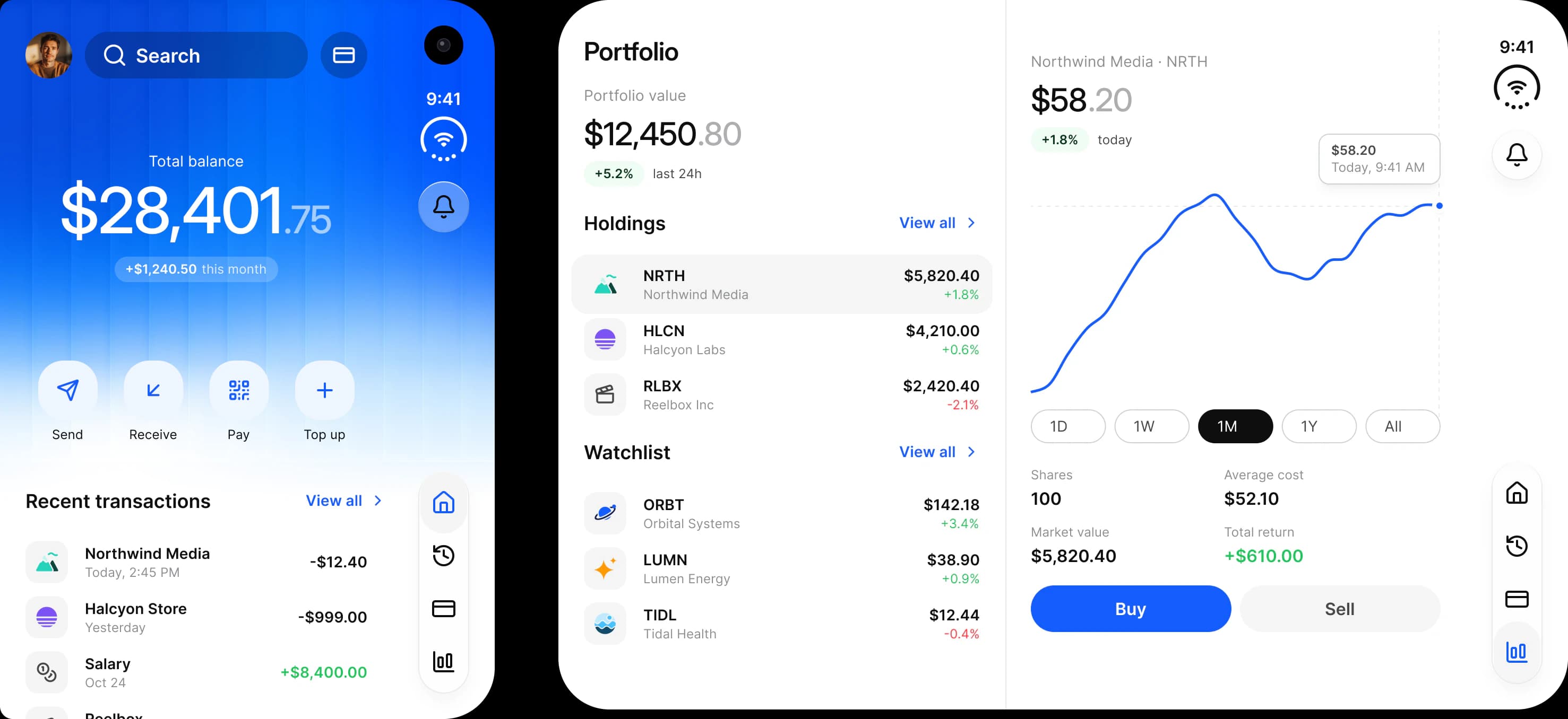
What is drawn
What changes between the displays is already in the file.
Apple announced iPhone Duo on September 9, 2026. Pre-orders open on October 16, and it ships on October 23 with iOS 27.1.
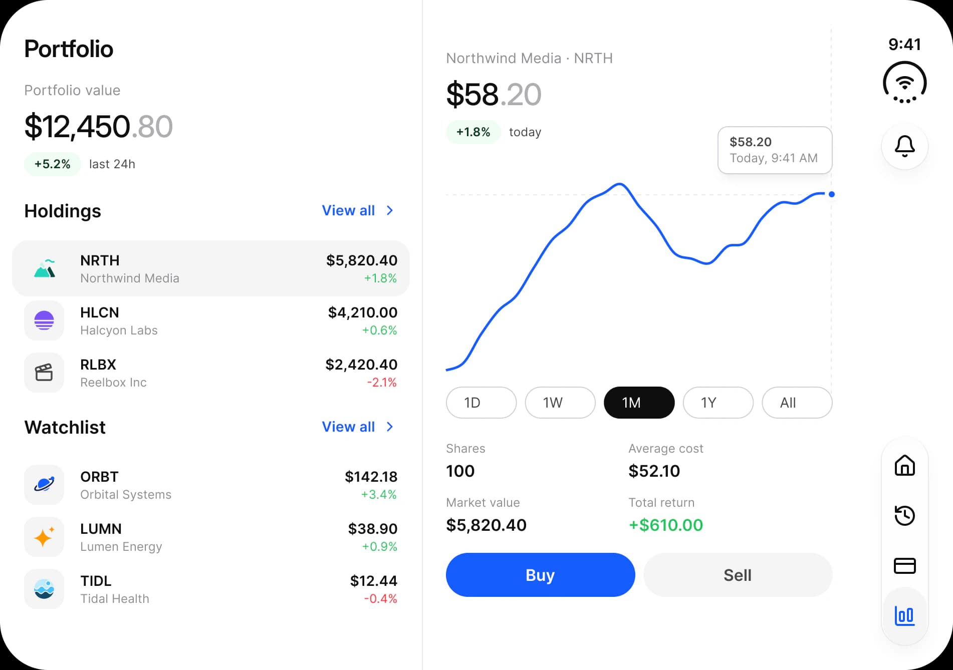
Frames
466 × 678 and 951 × 669
The outer display and the inner display open flat, in points, on the frames Apple's own kit draws. Held upright, the inner display is 669 × 951.
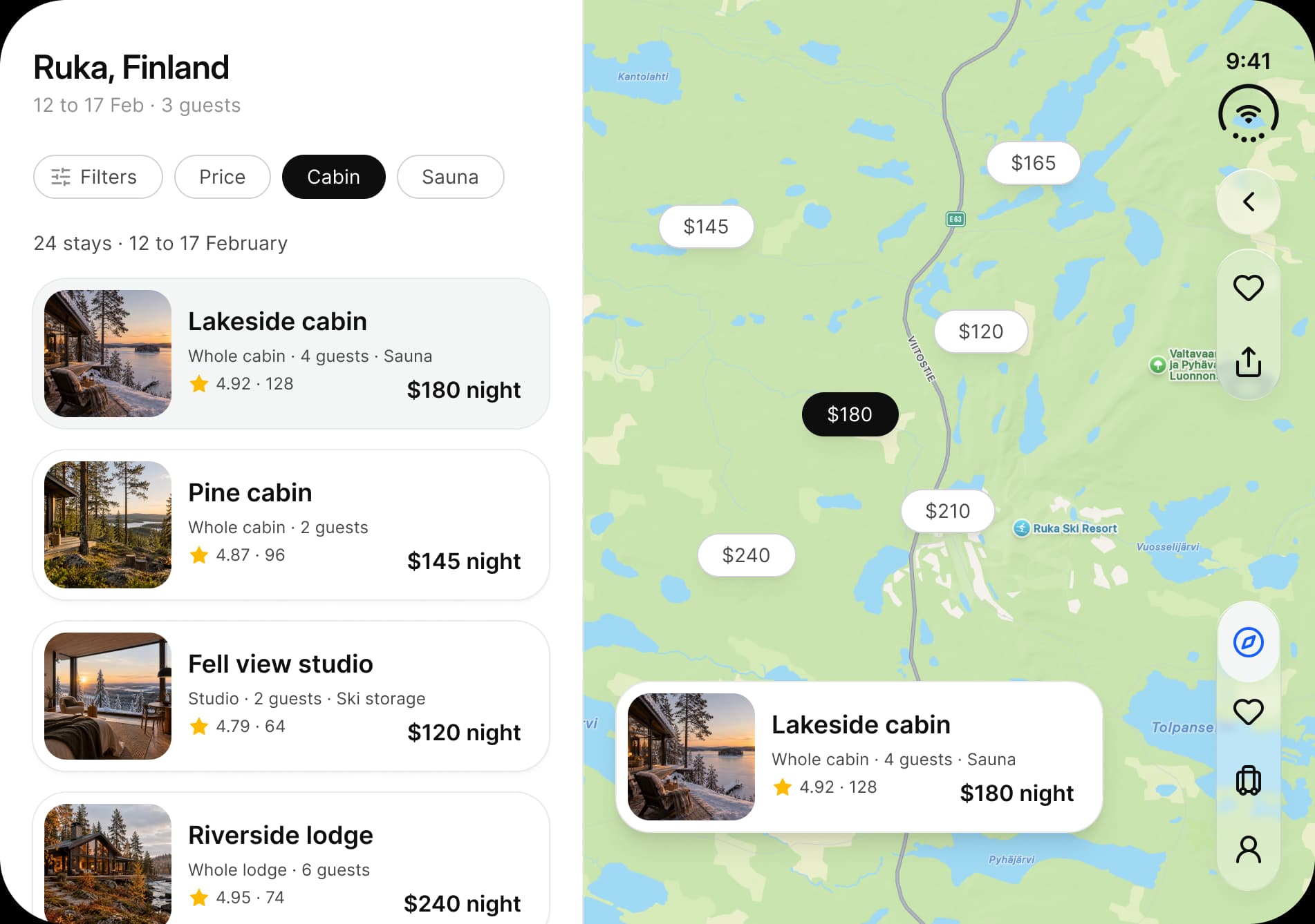
Rail
A vertical bar, not a bottom bar
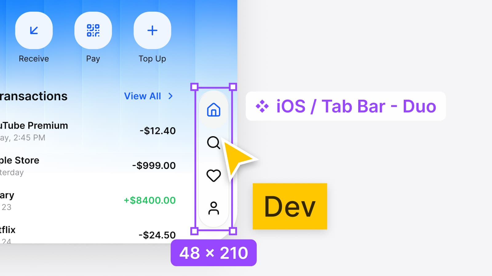
The status bar, toolbar and tab bar stack on the trailing edge. Status Bar - Duo is 48 × 86, Tab Bar - Duo 48 × 210 with four tabs, and the touch target stays 44.
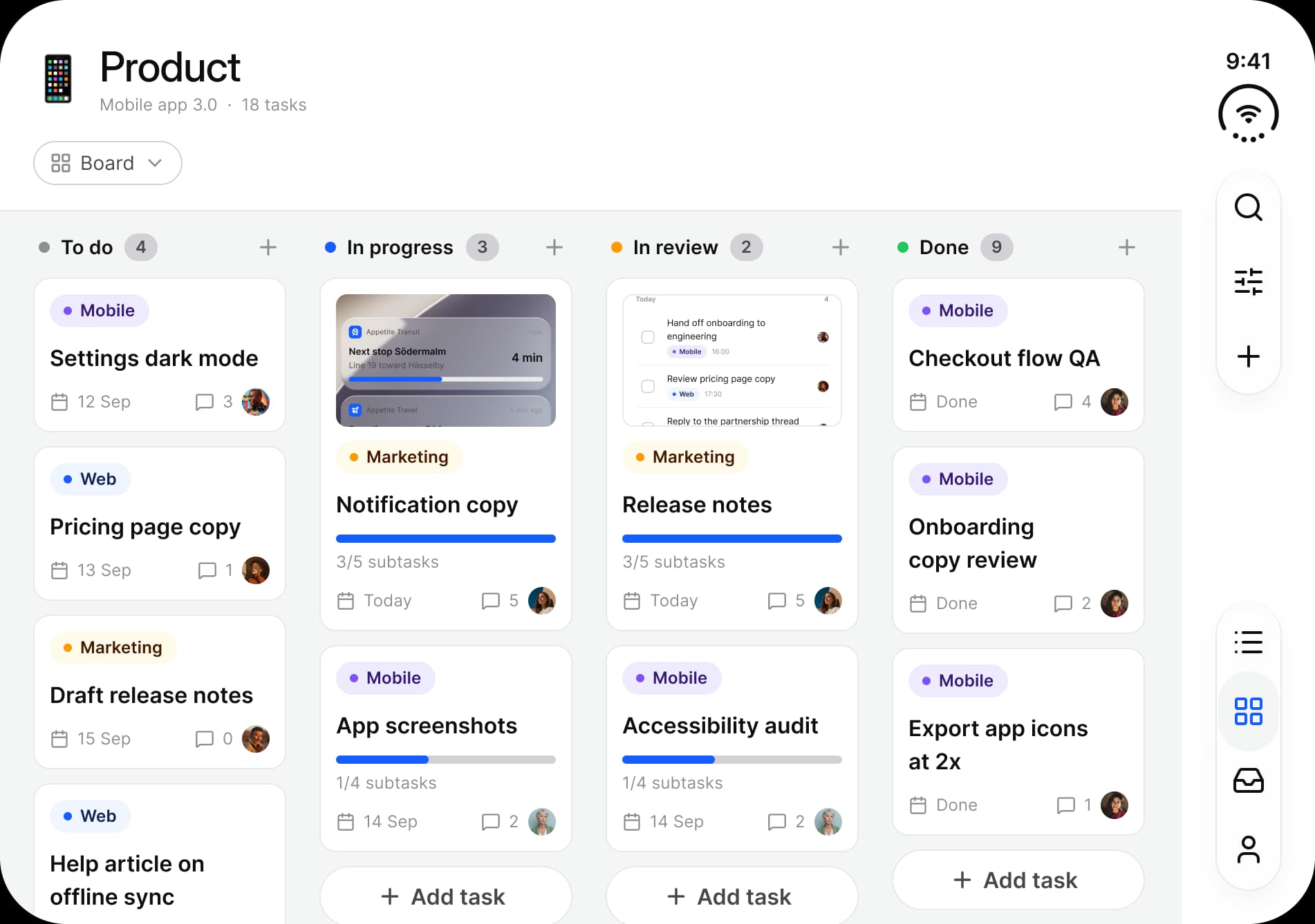
Variables
One mode per display
The modes ios-duo-outer and ios-duo-inner of the Platform collection change the column count and the sidebar width. Color, type and radius stay shared, so a rebrand moves both displays.
The figures
Two frames you design, read from the file.
Points are the screenshot pixels divided by three, the same arithmetic Apple's kit draws its frames with. The derivation, in full.
- Outer display, in points
- 466 × 678Outer display, in points5.4-inch, closed
- Inner display open flat, in points
- 951 × 669Inner display open flat, in points7.6-inch, 669 × 951 upright
- Apps drawn for both displays
- 8Apps drawn for both displaysLight and dark, one rail and one set of tokens
Side by side
The same Duo rows for both files.
Apple's iOS and iPadOS 27 kit is the official starting point for iOS. This is what each file holds for iPhone Duo.
| Criterion | Appetite UIThis file | Apple's iOS and iPadOS 27 kitFigma Community |
|---|---|---|
| Frames | 466 × 678 outer, 951 × 669 inner, for every app. | 466 × 678, 951 × 669 and 669 × 951 on example frames, plus an Inner (Folded) state. |
| Space the rail reserves | 96 points at the bar edge, a design reserve. | 84 points at the bar edge: 48 plus 12 inside and 24 outside. |
| Vertical tab bar | 2 to 4 tabs, 48 × 110 to 210. | 2 to 5 tabs, 48 × 110 to 260, minimized 48 × 48. |
| Switching displays | Two modes of the Platform collection, so one component reflows when its frame switches. | No variable mode for iPhone Duo: its Duo frames are drawn. |
| Finished app screens | 8 apps drawn for both displays, in light and dark. | Example frames of the system, not apps. |
| Android | Material 3 mirror in the same file, on the same tokens. | Not part of the kit. |
| Use it if | The same app also ships on Android, or your brand has to sit on top of the system. | You ship on iOS only and want Apple's exact components. |
Apple's column: the frame, rail and bar figures are read from the kit's own file on (version 27.1.0), and the Figma Community page, updated September 15, 2026, was read again on . Apple's license limits the kit to mock-ups of interfaces for software that runs only on Apple's operating systems. The full comparison has the rest.
Read on
The numbers behind the frames.
Your next rebrand is one edit.
One-time payment, Lifetime updates, Unlimited client projects