Updated
iPhone Duo
iPhone Duo has two displays, so each of the eight apps is drawn twice: once for the 466 x 678 outer display and once for the 951 x 669 inner display. A vertical control rail replaces the status bar and the bottom bars, and the same Appetite UI components and tokens draw both displays.
Updated
On this page
Preview
Eight apps, each laid out for the outer display and for the inner display, in light and dark. Each pair shares one rail, one set of components and one set of variables, so a rebrand moves both displays at once.




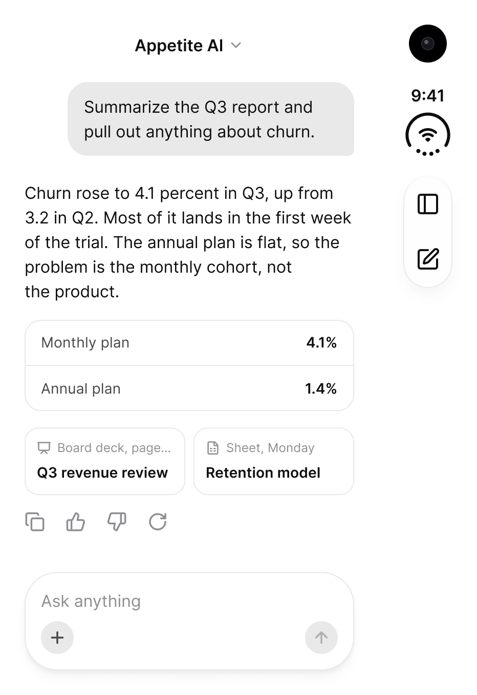
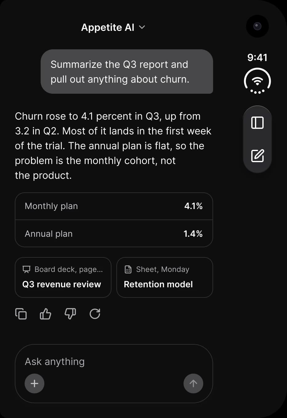
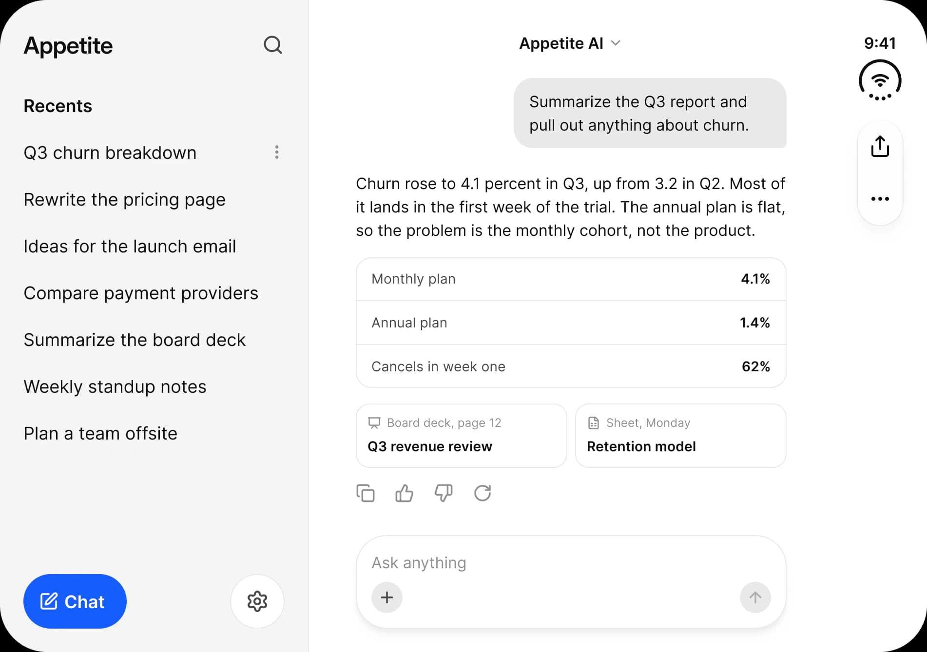
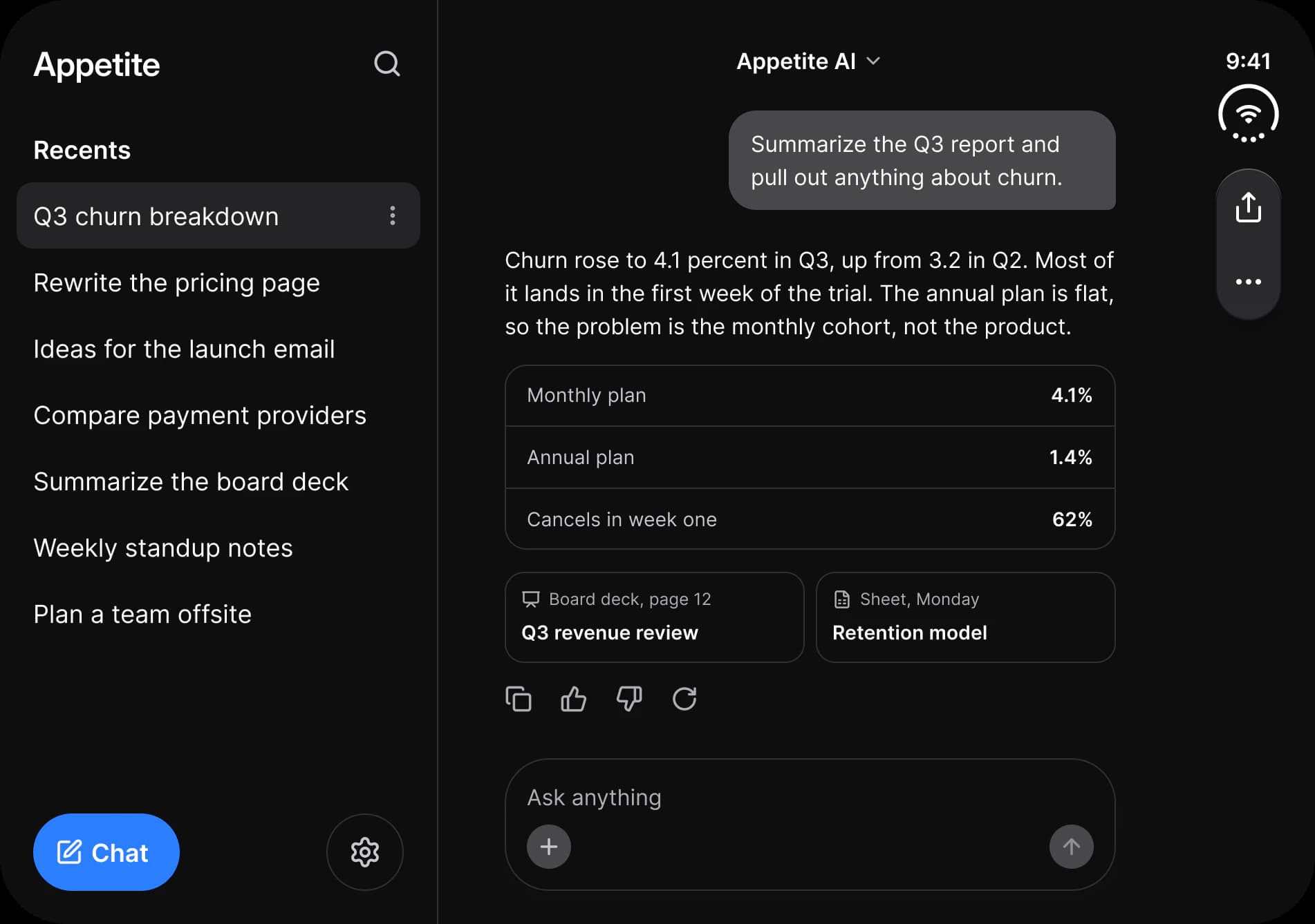
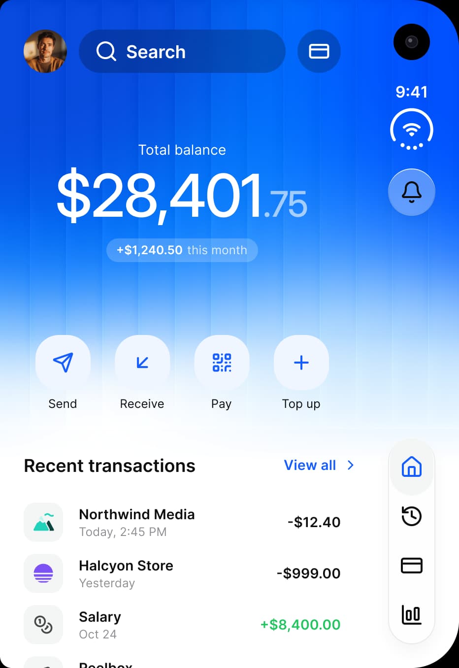
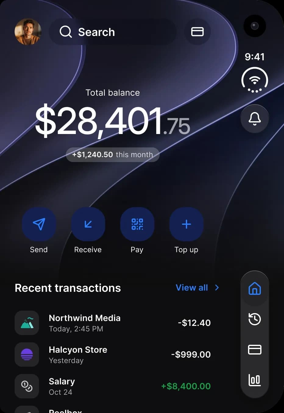
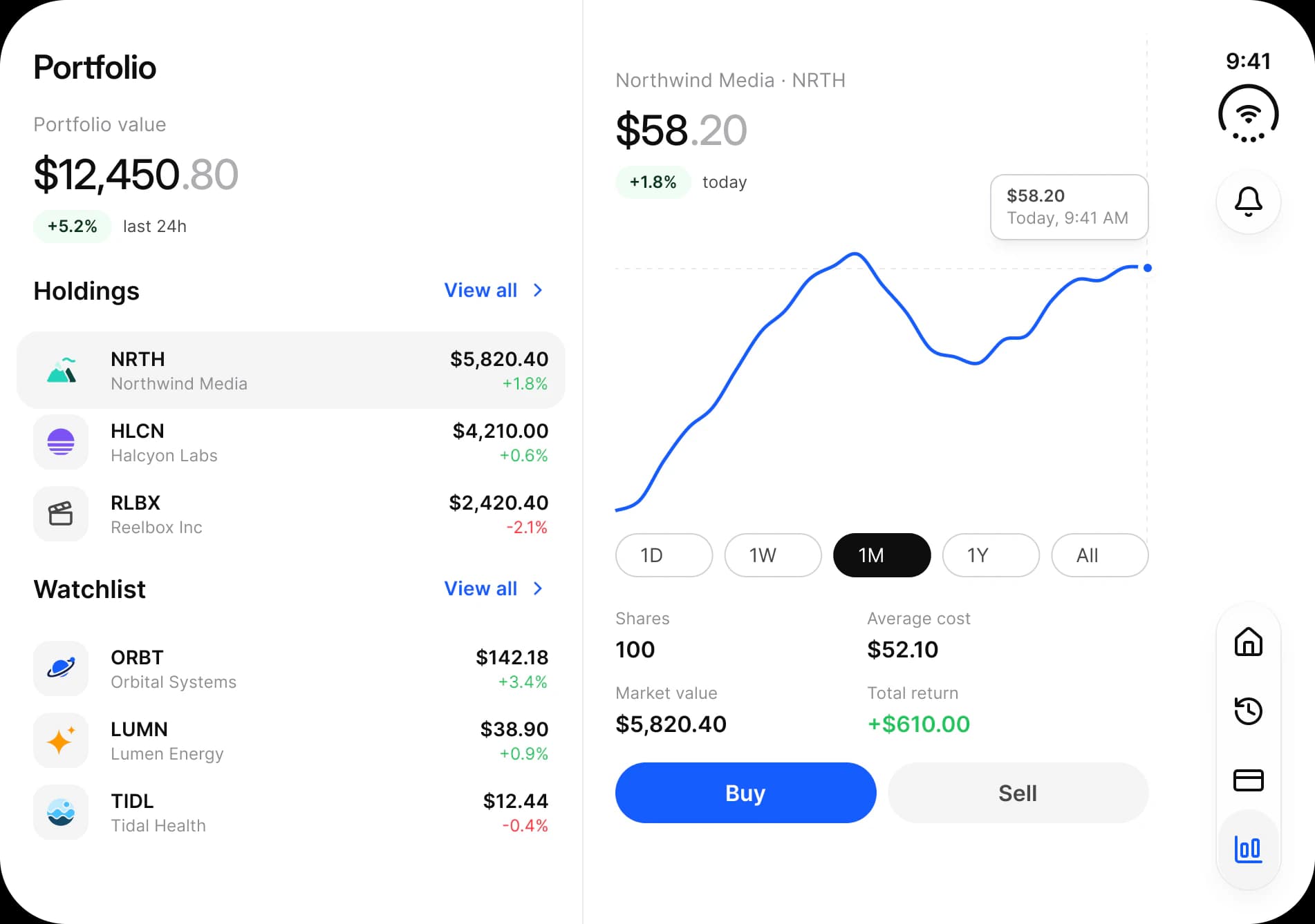
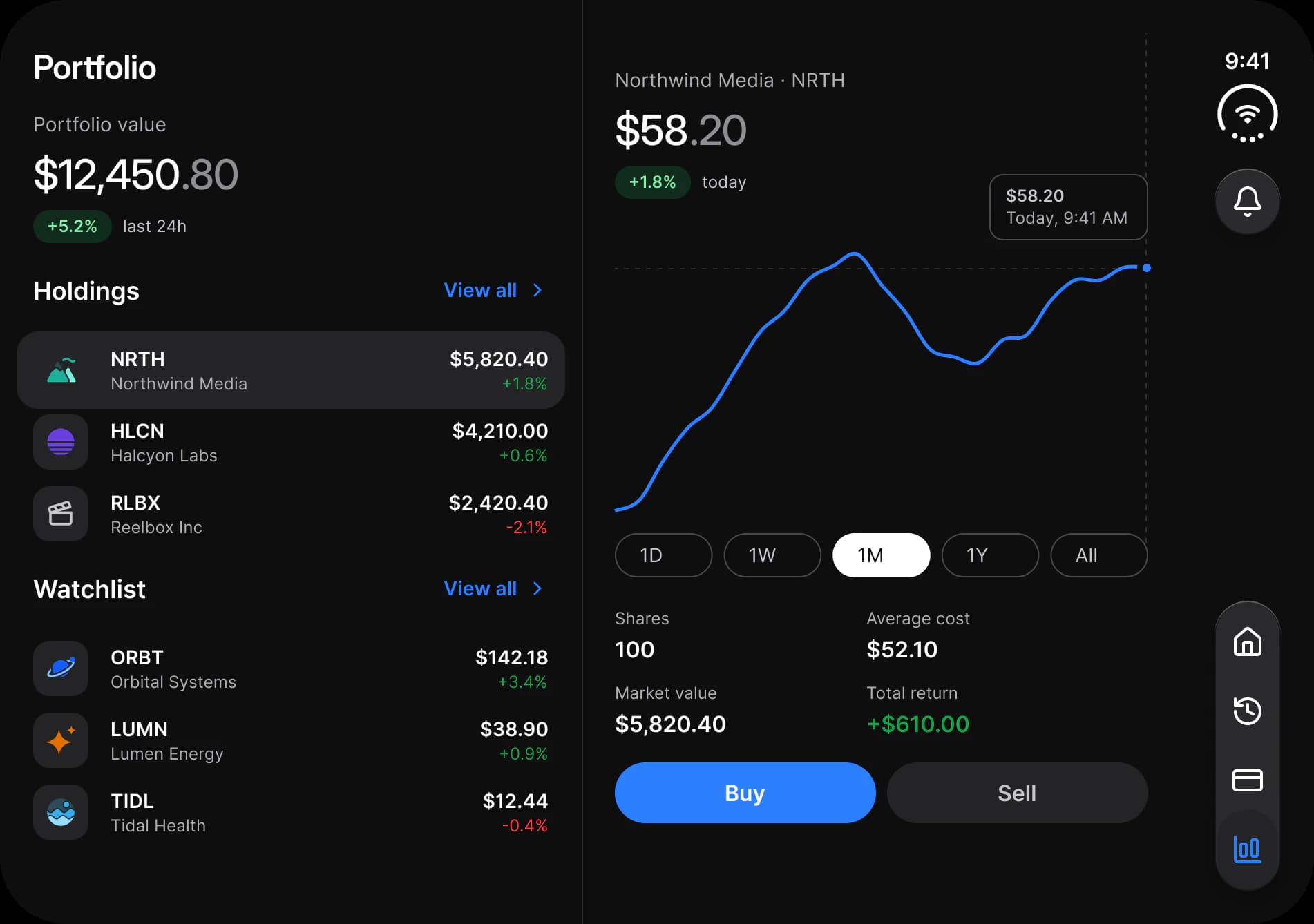
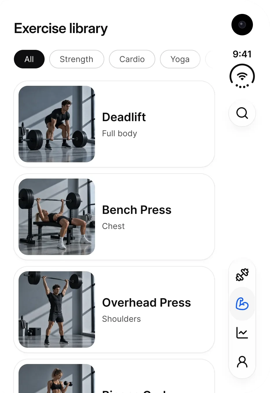
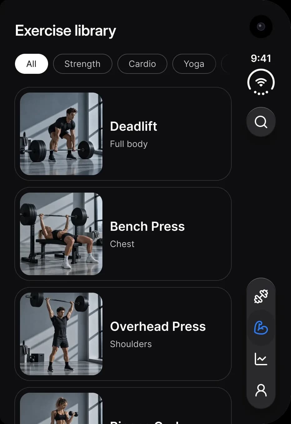
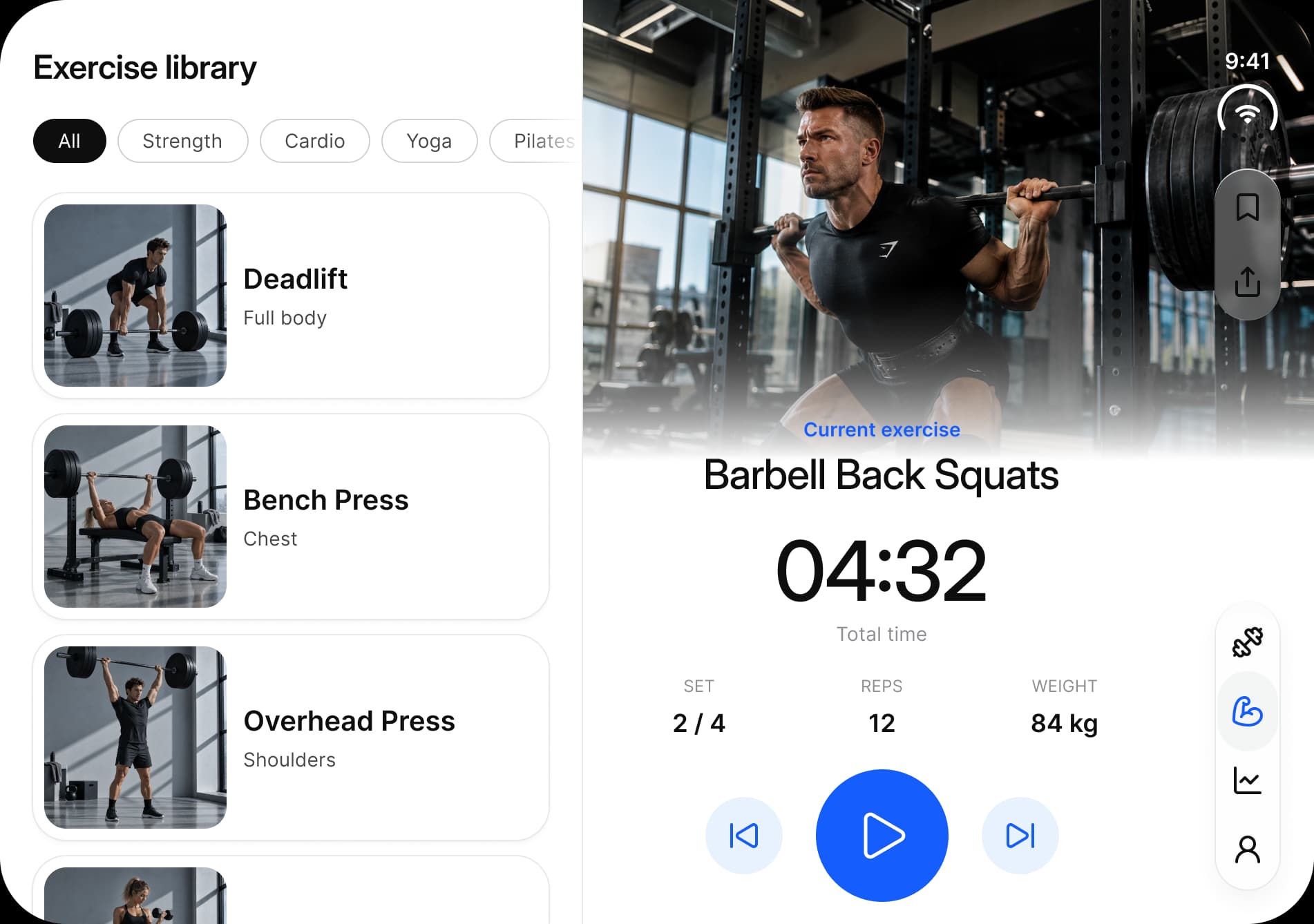
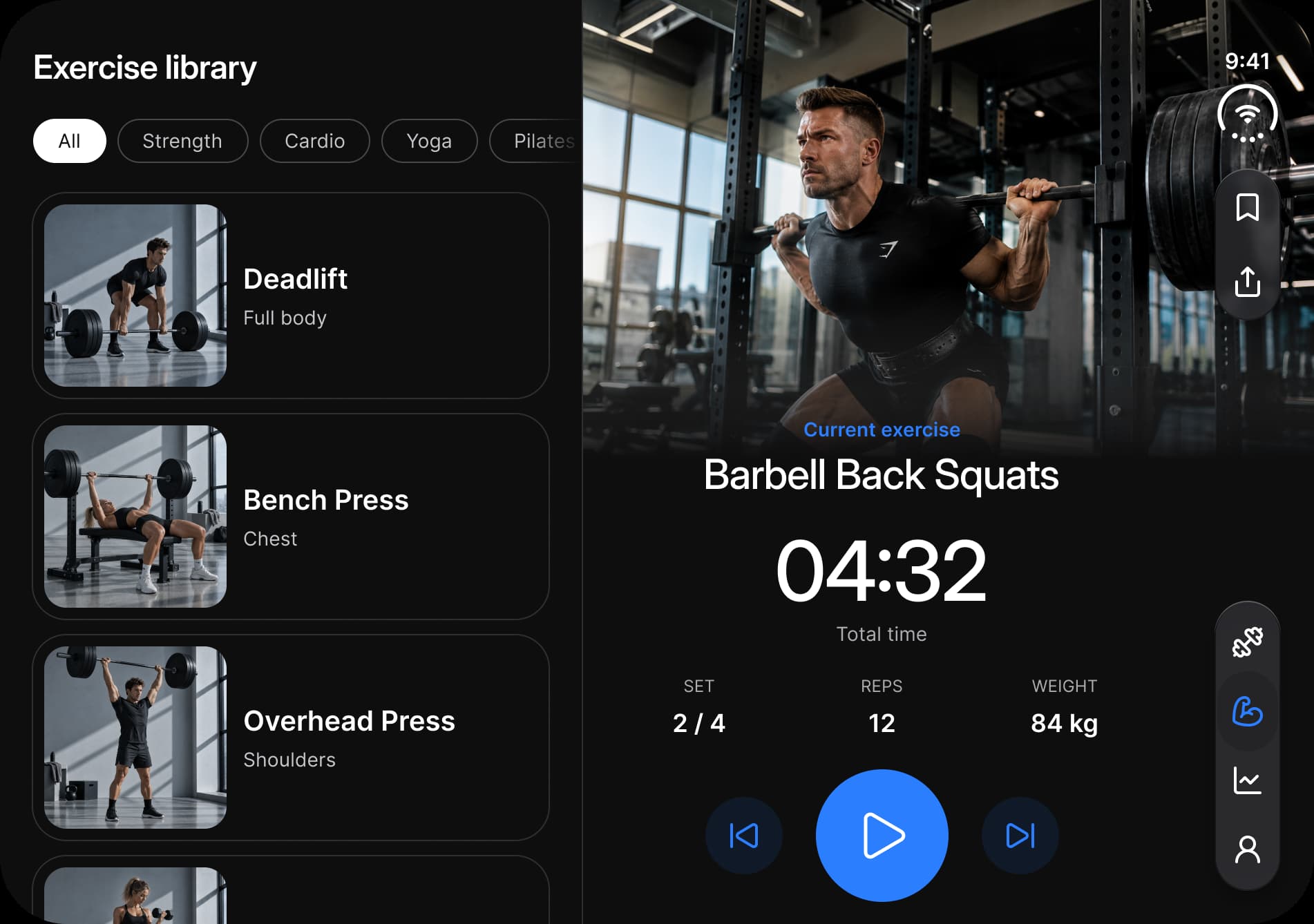
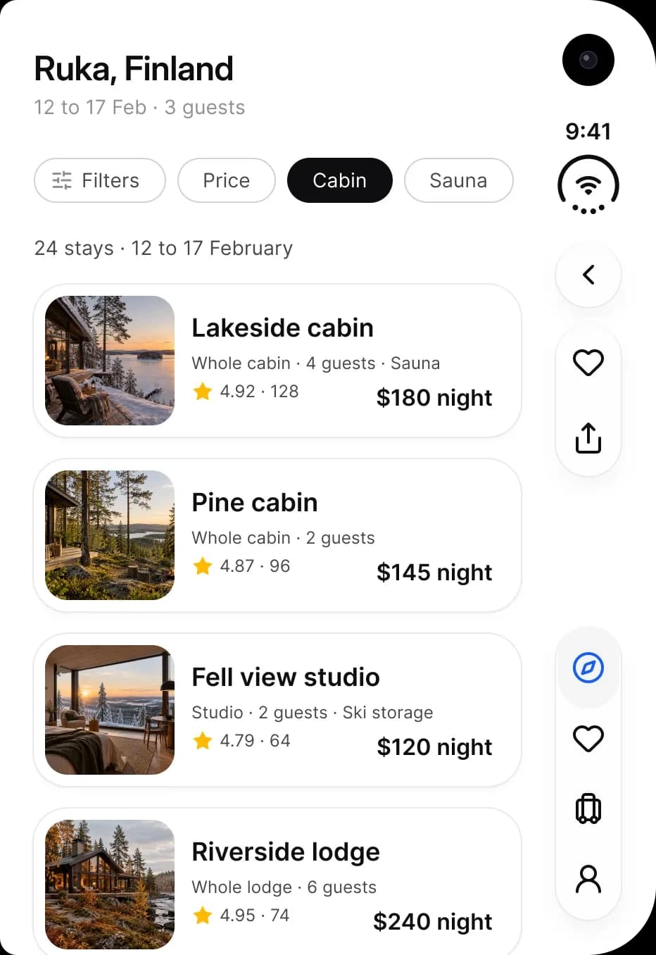
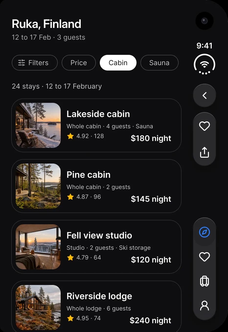
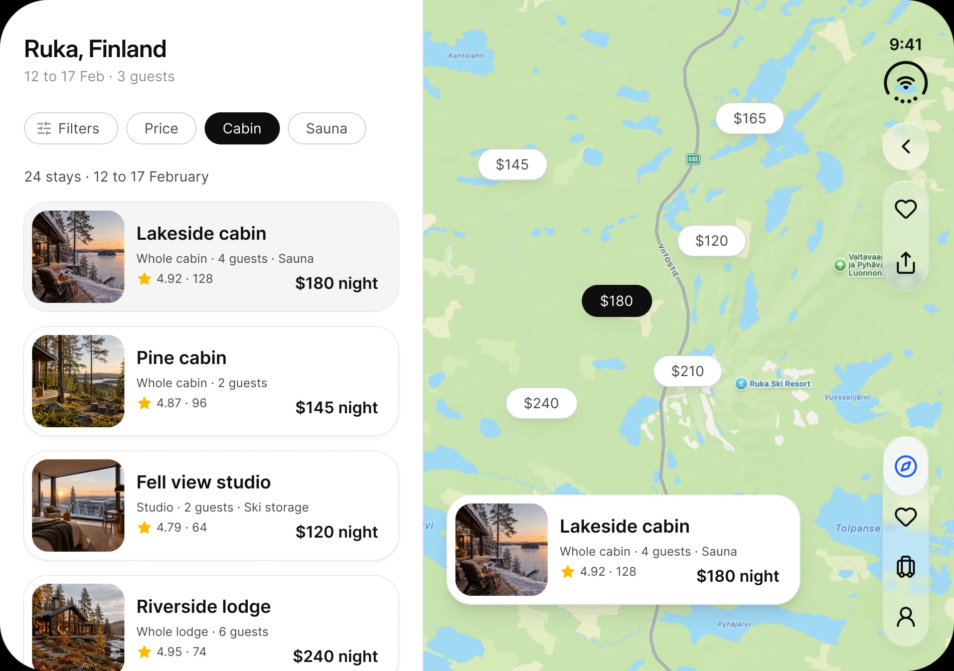
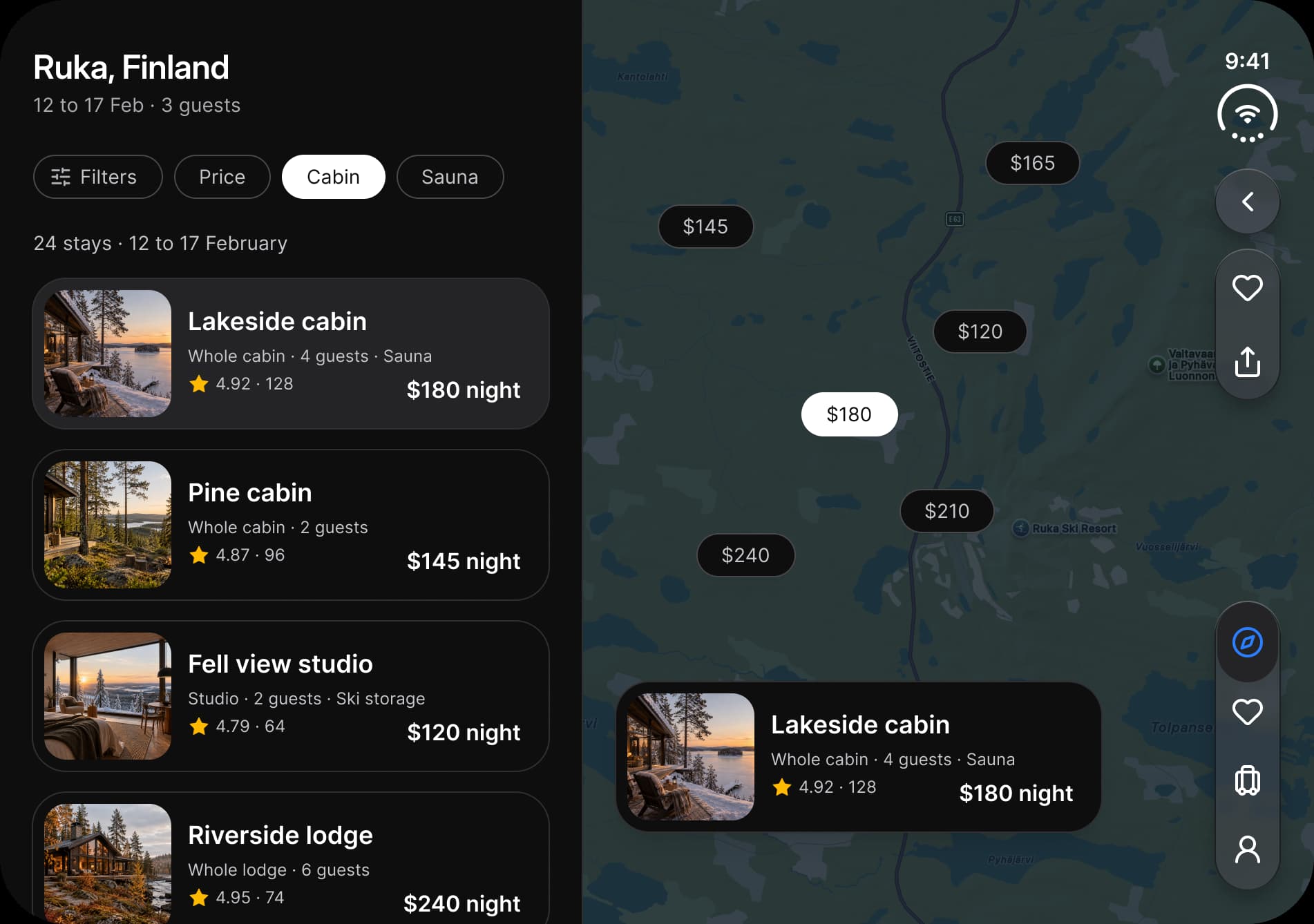
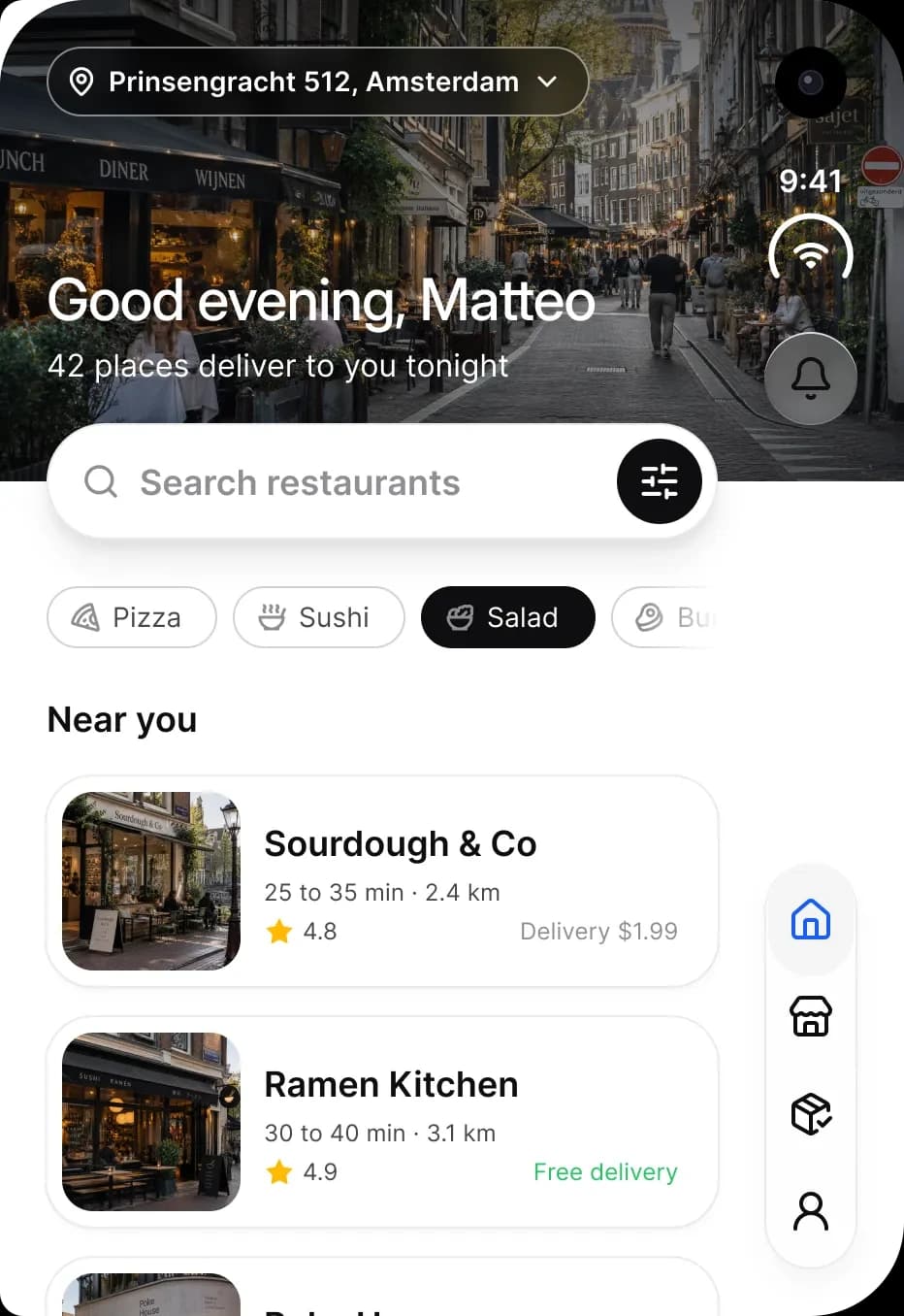
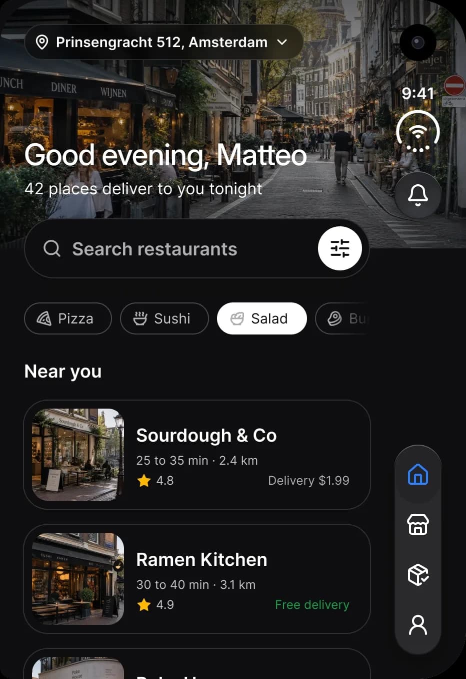
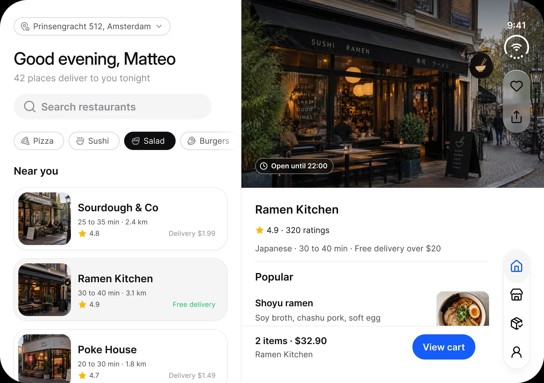
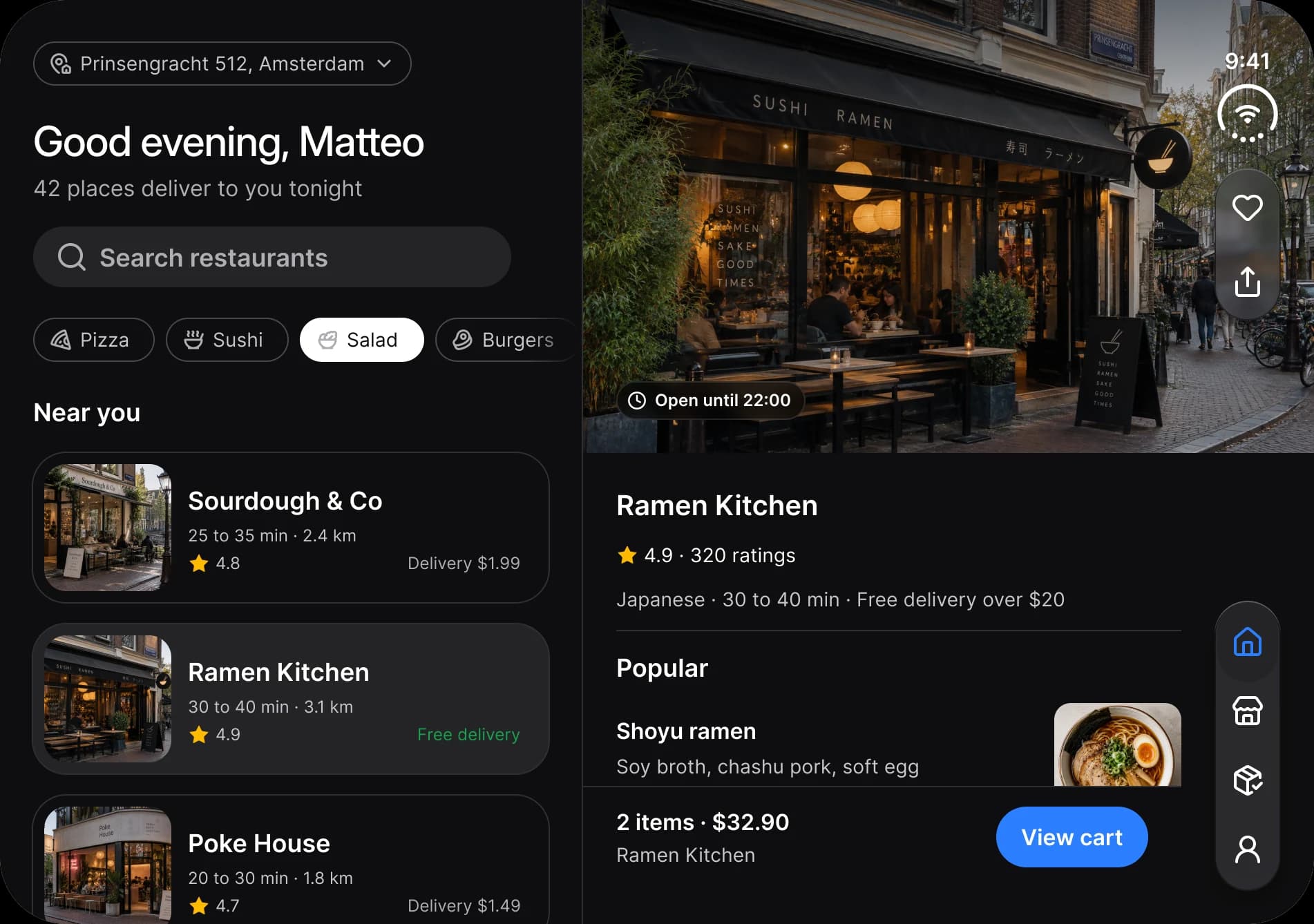
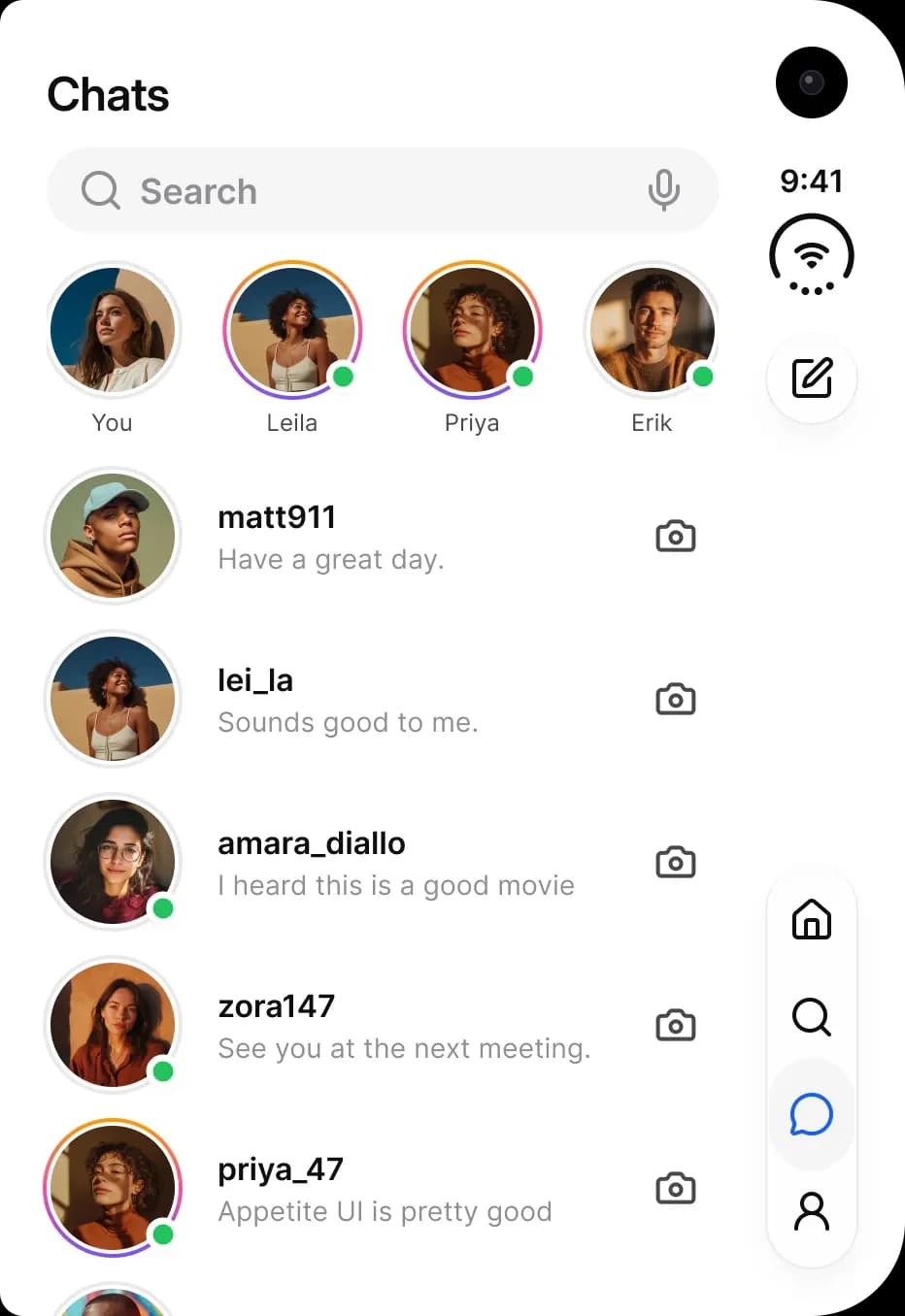
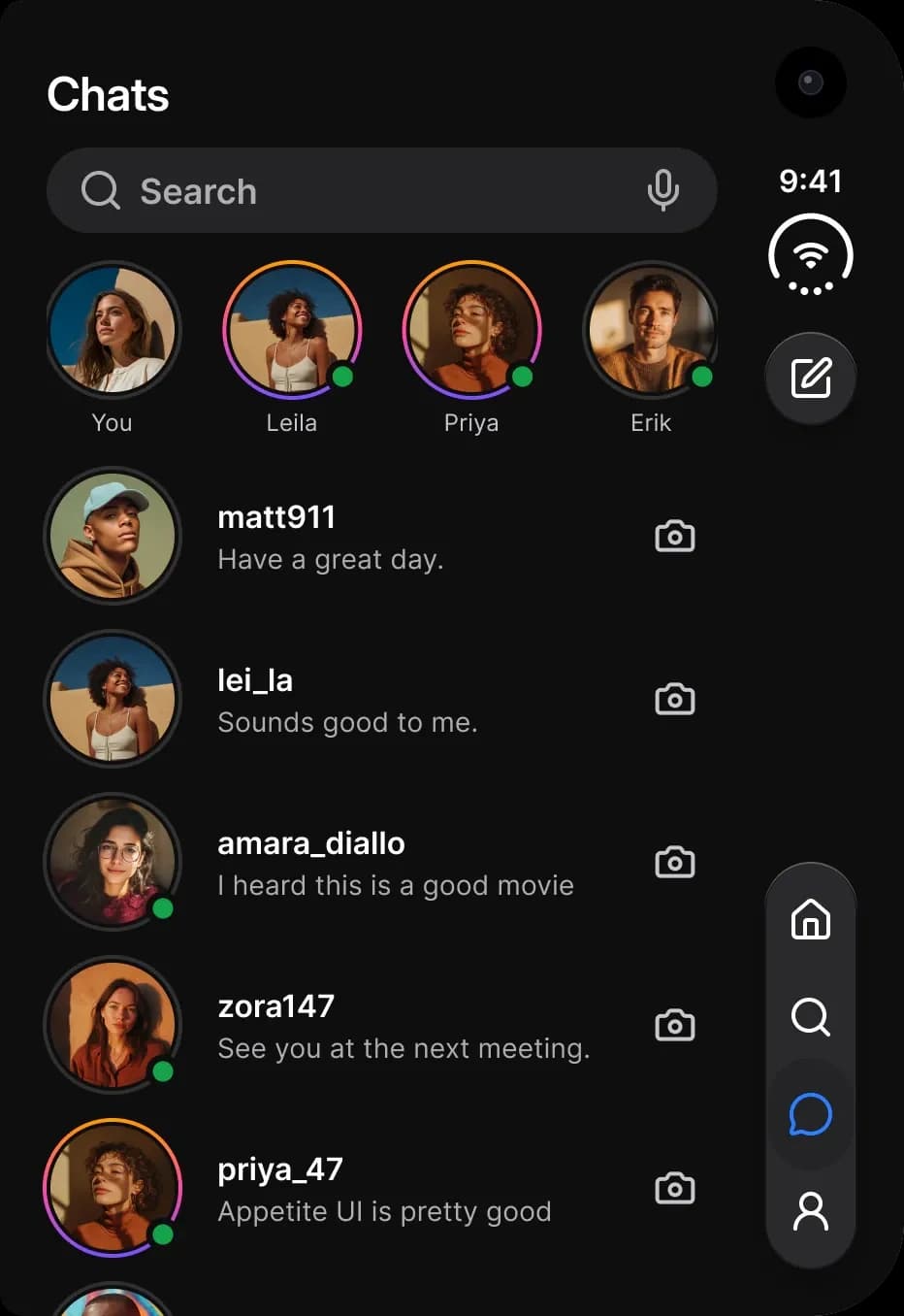
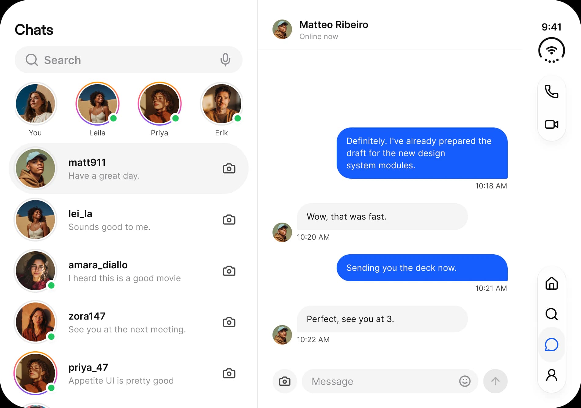
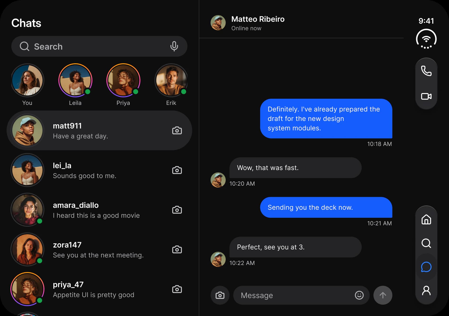
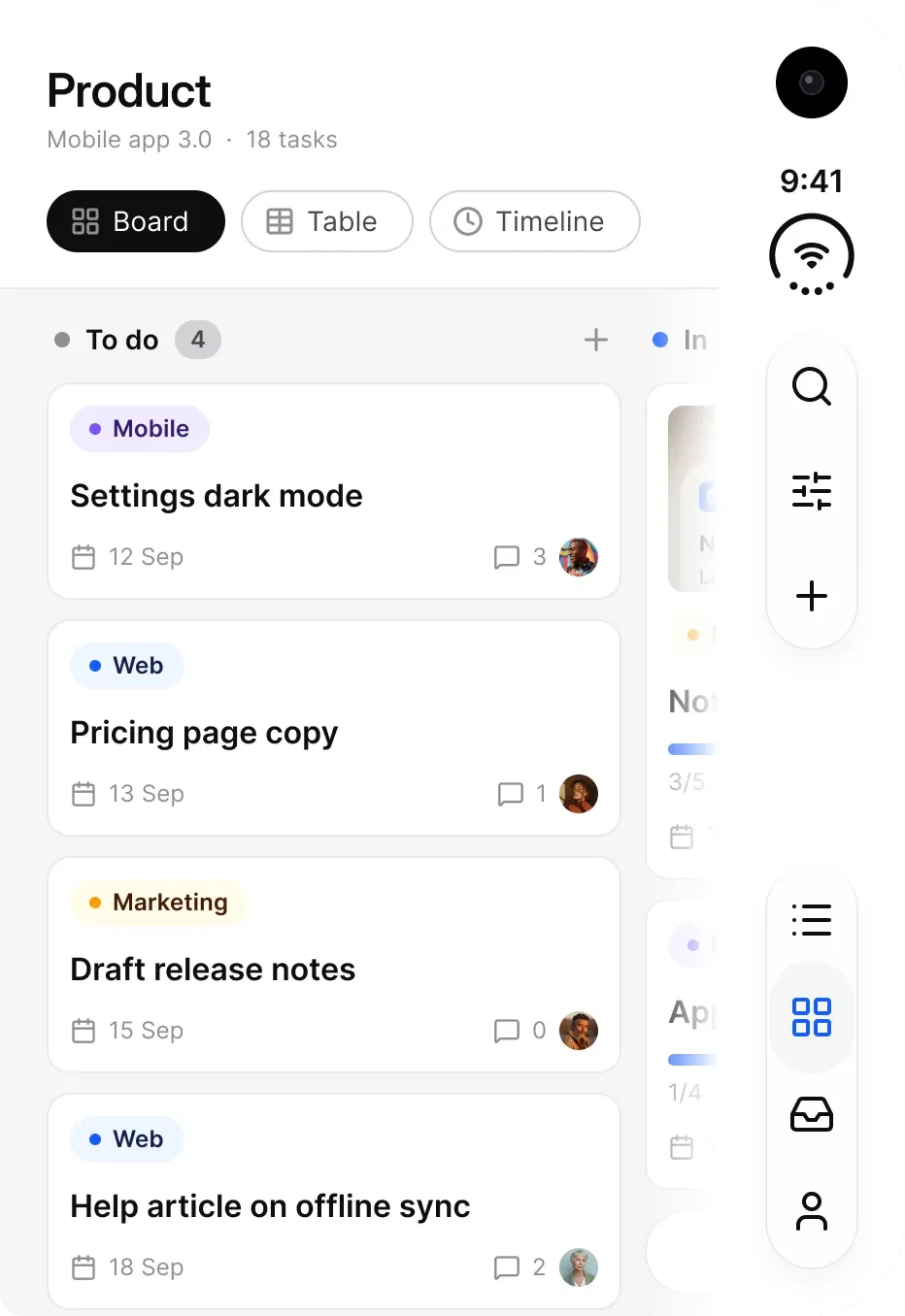
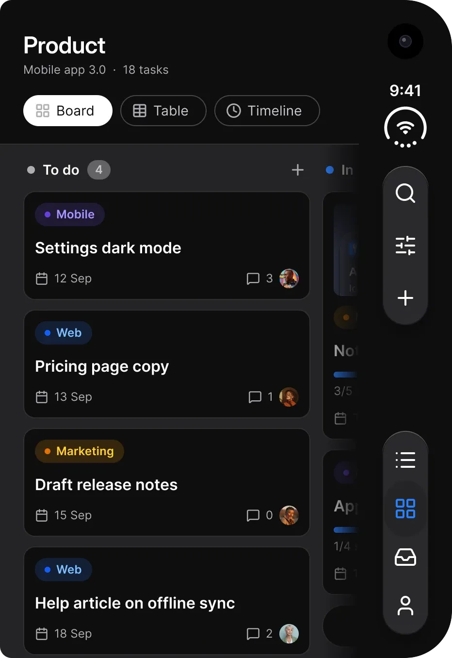
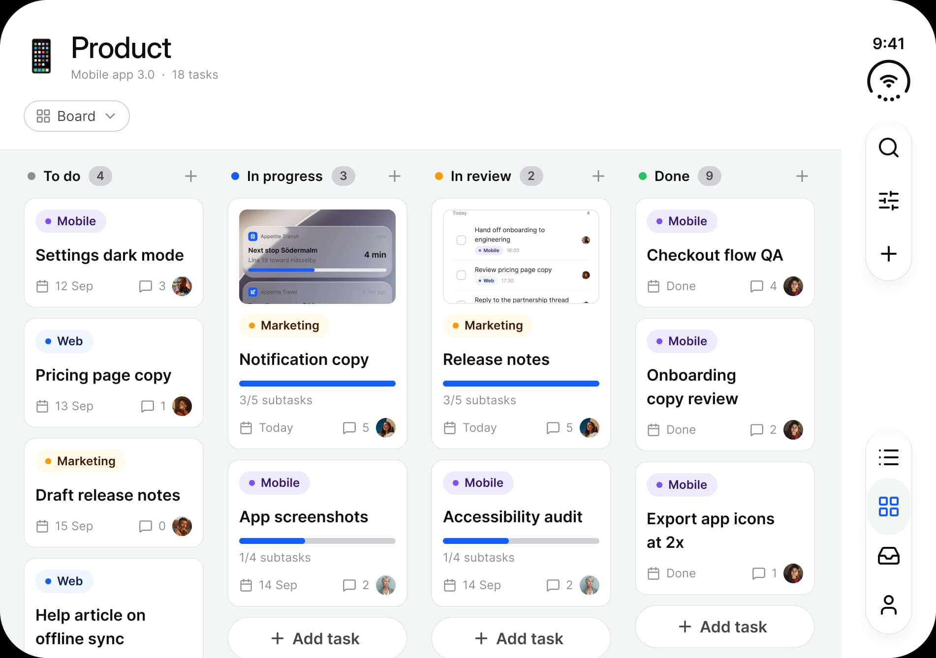
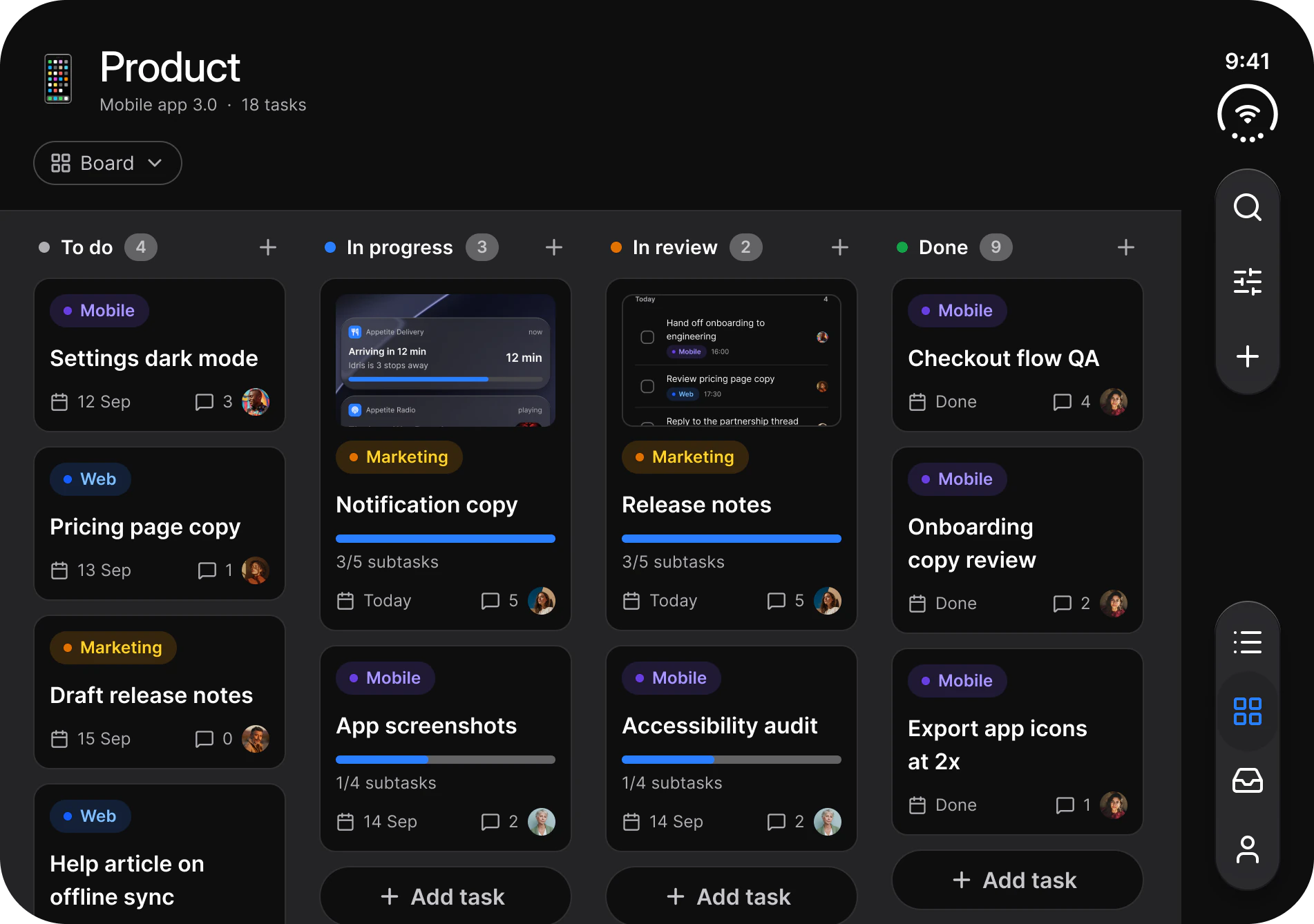
Apple's guidelines describe how iPhone Duo behaves: controls move to the vertical axis and the layout adapts to the display that is open. The point sizes on this page are working values from the Appetite UI Figma file, not an Apple specification. Each frame sets its modes explicitly. The dark frames add Color Tokens = Dark to Platform = ios-duo-outer or ios-duo-inner, so a frame dropped into another file arrives in the theme it was drawn in.
Read from the iPhone Duo page of the Appetite UI Figma file on October 2, 2026.
How is iPhone Duo different from iPhone?
On iPhone Duo the status bar, toolbar and tab bar leave the horizontal axis and stack in a 96 point rail at the trailing edge, and the inner display adds a sidebar and a split view. On iPhone the status bar sits at the top and the tab bar at the bottom.
| Aspect | iPhone | iPhone Duo |
|---|---|---|
| Display | One, 393 x 852 in the other app screens | Two, outer 466 x 678 and inner 951 x 669 |
| Status bar | Top edge, 402 wide, 59 high on ios-md and 62 on ios-lg | In the rail, 48 x 86, time over a status mark |
| Tab bar | Bottom edge, 402 x 95, two to five labeled tabs | In the rail, 48 wide, two to four tabs, icons only |
| Toolbar | Top edge, 402 x 84, two to five items | In the rail, 48 wide, a back button over one to three actions |
| Bottom bar height | 49 | 0 |
| Safe areas | Top 59 or 62, bottom 34, trailing 0 | Top 24, bottom 24, trailing 96 |
| Sidebar | None | Outer display none, inner display 262 wide in the Platform collection |
On the inner display held in portrait, Apple's guidelines keep horizontal bars. Use the standard iOS / Tab Bar and iOS / Toolbar there, and iOS / Status Bar - Duo in its Compact layout at the top. The inner frames on this page show the display in landscape, 951 wide, which is the pose that uses the rail. For the phone counterparts of each part, see the iOS mirror.
Read from the Platform collection, modes ios-md, ios-lg, ios-duo-outer and ios-duo-inner, and from the iOS Status Bar, Tab Bar and Toolbar sets, on October 2, 2026.
How does an app change between the two displays?
The outer display holds one pane beside the rail. The inner display holds two: a list or sidebar on the left and a detail pane on the right, with the same rail on the trailing edge.
| App | Outer display, content 370 wide | Inner display |
|---|---|---|
| Onboarding | Welcome: photo, headline, Get started | Photo pane 421 wide beside a Create account form 530 wide |
| AI | One conversation with the composer, two toolbar buttons | Recents sidebar 316 wide beside the conversation 634 wide |
| Finance | Dashboard: balance, quick actions, transactions | Holdings and watchlist 421 wide beside a position with a chart 530 wide |
| Fitness | Exercise library | Library 421 wide beside the running exercise 529 wide |
| Booking | List of stays | List 421 wide beside a map with price pins 529 wide |
| Foodie | Home: search, cuisines, nearby restaurants | Restaurant list 421 wide beside the restaurant page 529 wide |
| Social | Chats and stories | Chat list 421 wide beside the conversation 529 wide |
| Tasks | Board with two columns in view, three views | One board across the display, four columns, 855 wide beside the rail |
The detail pane runs under the rail, so a pane and the rail add up to more than the display. Dividers are 1 wide.
Pane widths are the top level frames of the light inner frames in the Appetite UI Figma file, read on October 2, 2026.
How is the control rail built?
The rail is a 96 point strip on the trailing edge of both displays. Its groups are 48 wide and sit 24 in from the top, the bottom and the edge: the status mark and the toolbar on top, the tab bar at the bottom.
| Group | Component | Width | Height | What it holds |
|---|---|---|---|---|
| Top | iOS / Status Bar - Duo, Rail | 48 | 86 | The time over the 46 point status mark |
| Top | iOS / Toolbar - Duo | 48 | 106, 168 or 222 | A back button in a 48 capsule, then a capsule of one to three actions at 36 with 18 between |
| Bottom | iOS / Tab Bar - Duo | 48 | 110, 160 or 210 | A glass capsule of two to four tabs, 48 cells, 6 padding above and below, 2 between |
The status mark is a 240 degree battery arc, stroke 3, with Wi-Fi inside it and four signal dots in the opening. It is drawn from the status bar's own vectors in fg/strong-950, so it follows light and dark. The selected tab is a 44 x 58 capsule filled with iOS/systemFill and its icon takes iOS/tintColor; the other tabs use iOS/label. The bars use the liquidGlass/Regular effect style.
Touch targets: platform/min-touch-target is 44 in both Duo modes. Tab cells are 48 wide, and _Duo / Glass Group draws 44 point targets. The toolbar action buttons are 36 inside the capsule, so give each of them a 44 point hit area in code. The outer frames also carry a camera cutout above the rail, a drawing aid that is not part of the kit.
Measured from the Duo sets on the Status Bar, Toolbar and Tab Bar pages of the Appetite UI Figma file on October 2, 2026.
Which components have a Duo version?
The rail has a Duo version of each of its parts, and Keyboard, List and Sheet each have one for the larger panels. The rail parts are placed on these screens. Keyboard, List and Sheet are published on their own component pages and are not placed here.
| Component | Set id | Page | Variants | Outer | Inner |
|---|---|---|---|---|---|
iOS / Status Bar - Duo | 15489:59 | Status Bar | Rail 48 x 86, Compact 92 x 48 | 8 | 8 |
_Duo / Status mark | 15020:34 | Status Bar | One, 46 x 46 | 8 | 8 |
iOS / Toolbar - Duo | 15036:337 | Toolbar | Actions 1, 2, 3 | 7 | 7 |
iOS / Tab Bar - Duo | 15036:29817 | Tab Bar | Tabs 2, 3, 4 | 6 | 6 |
_Tab Bar Item - Duo | 15024:597 | Tab Bar | State Default, Selected, 48 x 48 | 24 | 24 |
_Duo / Glass Group | 15488:101 | Toolbar | Orientation x Items, 48, 92 or 136 long | 0 | 0 |
iOS / Keyboard - Duo | 15500:203 | Keyboard | Inner landscape 934 x 218, Outer 450 x 258 | 0 | 0 |
iOS / List - Duo | 15499:7967 | List | Rows 2, 3, 4, 669 wide | 0 | 0 |
iOS / Sheet - Duo | 15500:39669 | Sheet | One, 652 x 802 | 0 | 0 |
| Set | Property | Type | Options | Default |
|---|---|---|---|---|
iOS / Status Bar - Duo | Layout | Variant | Rail, Compact | Rail |
iOS / Status Bar - Duo | Time | Text | Any string | 9:41 |
iOS / Toolbar - Duo | Actions | Variant | 1, 2, 3 | 1 |
iOS / Tab Bar - Duo | Tabs | Variant | 2, 3, 4 | 2 |
_Tab Bar Item - Duo | State | Variant | Default, Selected | Default |
_Tab Bar Item - Duo | Icon | Instance swap | Any icon | house |
_Duo / Glass Group | Orientation | Variant | Horizontal, Vertical | Horizontal |
_Duo / Glass Group | Items | Variant | 1, 2, 3 | 1 |
_Duo / Glass Group | Icon 1 to Icon 3 | Instance swap | Any icon | One icon each |
iOS / Keyboard - Duo | Display | Variant | Inner landscape, Outer | Inner landscape |
iOS / List - Duo | Rows | Variant | 2, 3, 4 | 2 |
Counts are instances on the eight light frames of each display, placed directly or nested inside another component, read on October 2, 2026.
Which Platform variables change in the Duo modes?
Two modes of the Platform collection, ios-duo-outer and ios-duo-inner, change five variables against ios-lg: both safe areas, the trailing safe area, the bottom bar height and, on the inner display only, the sidebar width. The other variables carry their ios-lg values.
| Variable | ios-lg | ios-duo-outer | ios-duo-inner |
|---|---|---|---|
grid/safe-area/top | 62 | 24 | 24 |
grid/safe-area/bottom | 34 | 24 | 24 |
grid/safe-area/trailing | 0 | 96 | 96 |
platform/bar/bottom-height | 49 | 0 | 0 |
platform/duo/sidebar-width | 0 | 0 | 262 |
platform/duo/device-corner | 48 | 48 | 48 |
platform/duo/pane-corner | 26 | 26 | 26 |
platform/min-touch-target | 44 | 44 | 44 |
| Grid style | Columns | Margin | Gutter | Rows |
|---|---|---|---|---|
ios-lg | 4 | 16 | 16 | Top 62, bottom 34 |
ios-duo-outer | 4 | 16 | 16 | Top 24, bottom 24 |
ios-duo-inner | 6 | 16 | 16 | Top 24, bottom 24 |
The last three rows of the variable table hold the same value in all four iOS modes. On Duo the status bar and the tab bar leave the horizontal axis, so the top and bottom safe areas stop being hardware clearance and become 24 point content margins. grid/safe-area/trailing is the rail: 96 on both Duo modes and 0 everywhere else. The frames on this page bind the top safe area 29 times, the trailing safe area 13 times and the device corner 48 times. The corner is 48 on all four corners of the inner display and on the two right corners of the outer display, and dimensions/radius/lg, 12, on the two left corners of the outer display.
For the whole collection see Platform Bridge and the iOS mirror.
Read from the Platform collection and the 5 local grid styles of the Appetite UI Figma file on October 2, 2026. Binding counts are for the eight light frames of each display.
What are the Apple and Material 3 counterparts?
Apple's own parts are the iOS Status Bar, Tab Bar, Toolbar, Keyboard, List and Sheet, and each Duo version is a vertical or wider variant of one of them. Material 3 and Android have no iPhone Duo counterpart, and Appetite UI draws no Material 3 version of any Duo set.
| Appetite UI component | iOS counterpart | Material 3 counterpart | What differs |
|---|---|---|---|
iOS / Status Bar - Duo | iOS / Status Bar, 402 x 59 or 62 | M3 / Status Bar, 412 x 52 | Vertical, 48 x 86, time over a 46 point mark instead of a 402 wide row |
iOS / Tab Bar - Duo | iOS / Tab Bar, 402 x 95, Tabs 2 to 5 | M3 / Navigation bar, 412 x 80, Items 3 to 5 | Icons only, 2 to 4 tabs, 48 wide, no Minimized and no Search Role |
iOS / Toolbar - Duo | iOS / Toolbar, 402 x 84, Items 2 to 5 | None. M3 / Top app bar is a top bar | Vertical, a back button over one to three actions, 48 wide |
iOS / List - Duo | iOS / List | M3 / List Item | An inset group 669 wide with 2 to 4 rows of 68 |
iOS / Keyboard - Duo | iOS / Keyboard, 402 x 400 | M3 / Keyboard | Inner landscape spans the open device at 934 x 218, Outer is 450 x 258 |
iOS / Sheet - Duo | iOS / Sheet | M3 / Bottom sheet, M3 / Side Sheet | One component sized 652 x 802 for the inner panel |
The nearest Material 3 idea to the inner display is an adaptive layout, a list beside a detail pane with a navigation rail at the wider window sizes. An Android foldable starts from the android mode and the M3 / Navigation bar, because Appetite UI draws no adaptive layout for Material 3.
Counterpart sizes read from the iOS and Material 3 pages of the Appetite UI Figma file on October 2, 2026.
Which tokens do the iPhone Duo frames use?
Every color on the rail resolves through a variable, which makes the dark row a mode switch. The frames pin Color Tokens and Platform and leave Platform Bridge on Brand.
| Token | Where it lands | Light | Dark |
|---|---|---|---|
fg/strong-950 | The time and the status mark | #0E0E0F | #FFFFFF |
iOS/label | Icons of the unselected tabs | #0E0E0F | #FFFFFF |
iOS/tintColor | The icon of the selected tab | #155DFC | #2B7FFF |
iOS/systemFill | The capsule behind the selected tab | #F4F5F5 | #242427 |
bg/white-0 | The fill of every frame | #FFFFFF | #0E0E0F |
dimensions/radius/full | Capsules of the toolbar, the tab bar and the selection | 9999 | 9999 |
dimensions/radius/lg | The two left corners of the outer display | 12 | 12 |
platform/duo/device-corner | The other corners of both displays | 48 | 48 |
dimensions/icon/stroke | The stroke of the rail icons | 2 | 2 |
In System mode iOS/label reads #000000 and #FFFFFF, iOS/tintColor reads #007AFF and #0A84FF, and iOS/systemFill reads #787880 at 16 and 36 percent. See Platform Bridge.
Values are the Brand mode of Platform Bridge, read on October 2, 2026.