Updated
Tasks
Ten task manager screens in light and dark: a personal queue, one list shown as a board, a table and a timeline, and the task, project, inbox, search and filter screens around it. Every control is an instance of an Appetite UI component, so one token change moves every screen.
Updated
Preview
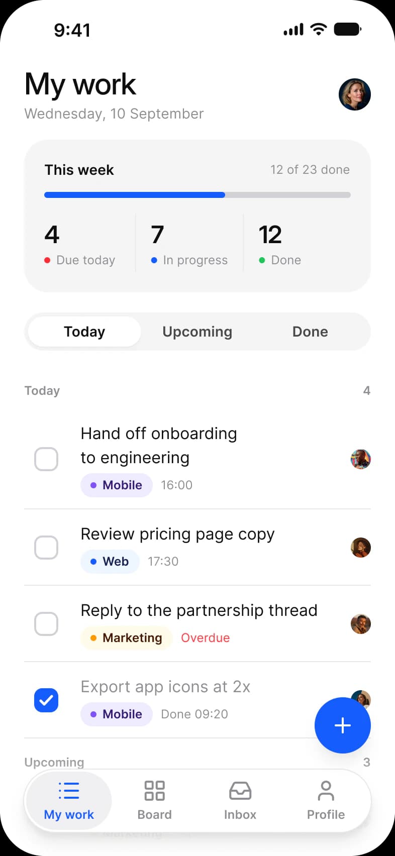
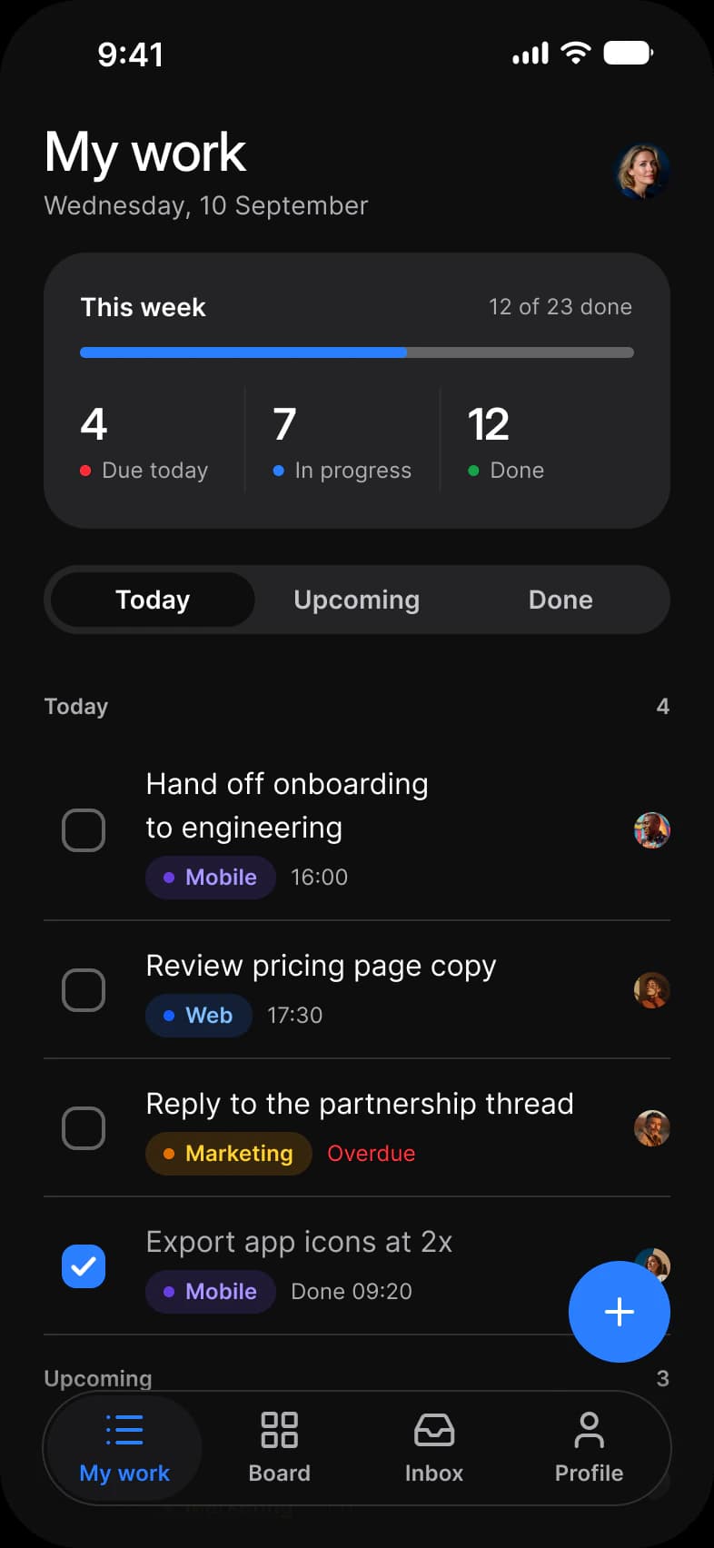
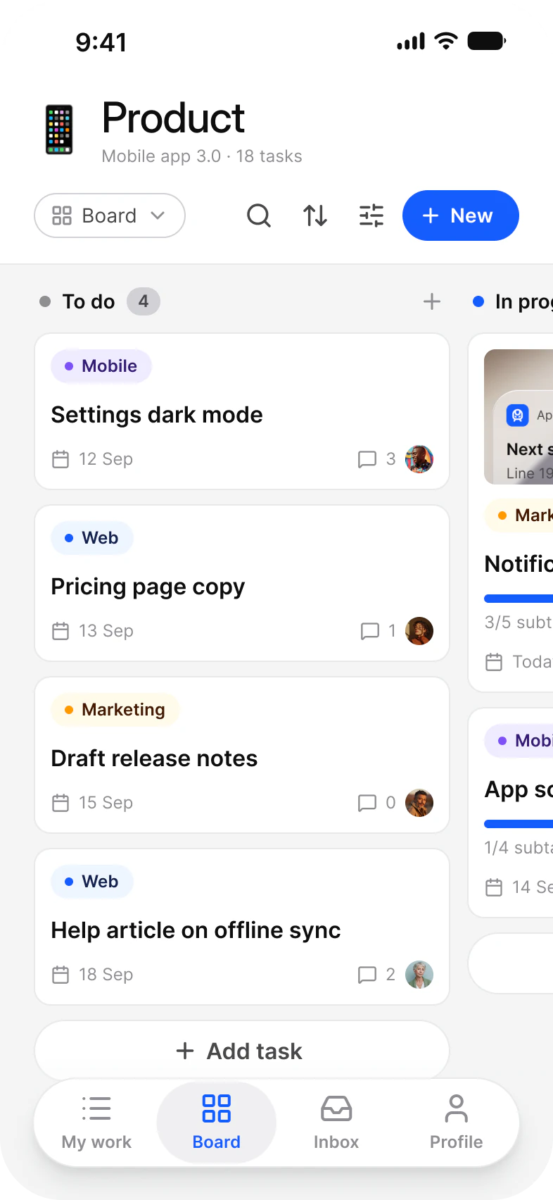
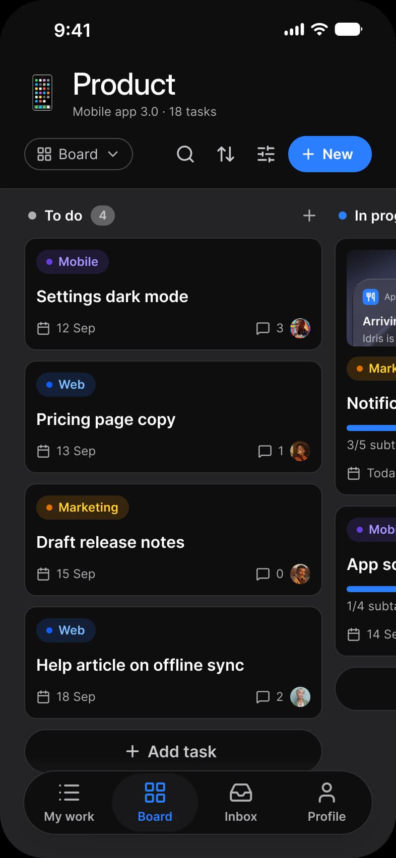
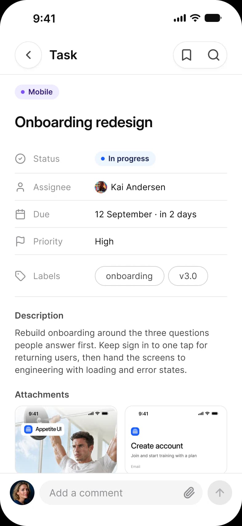
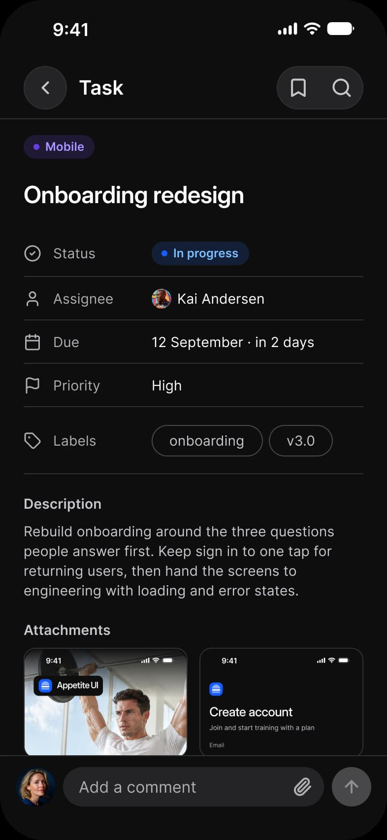
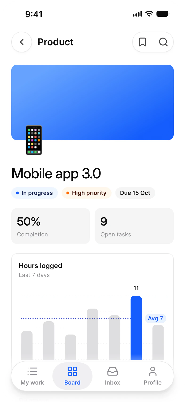
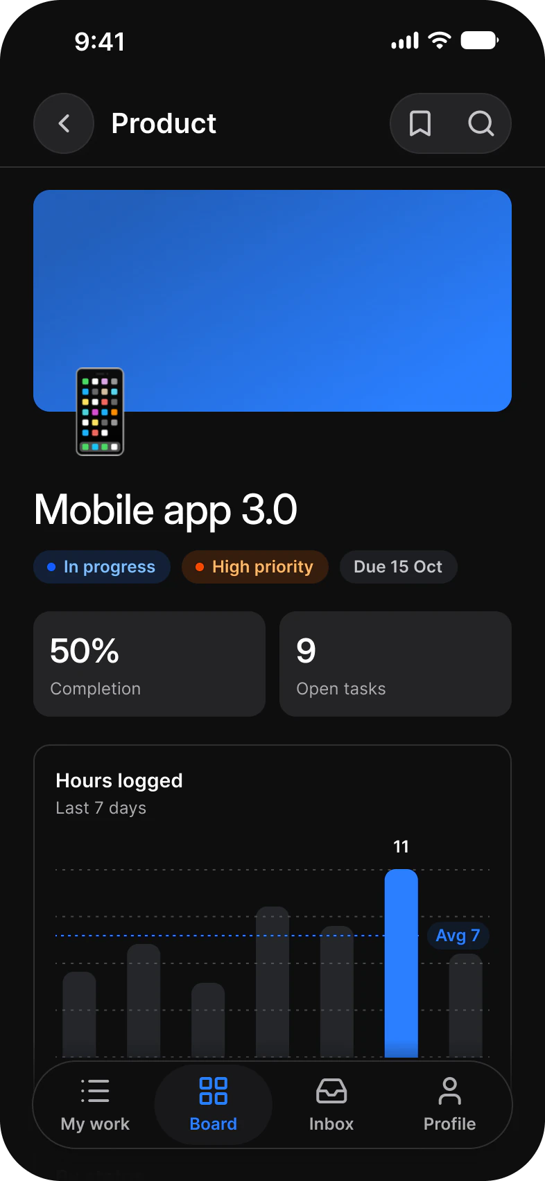
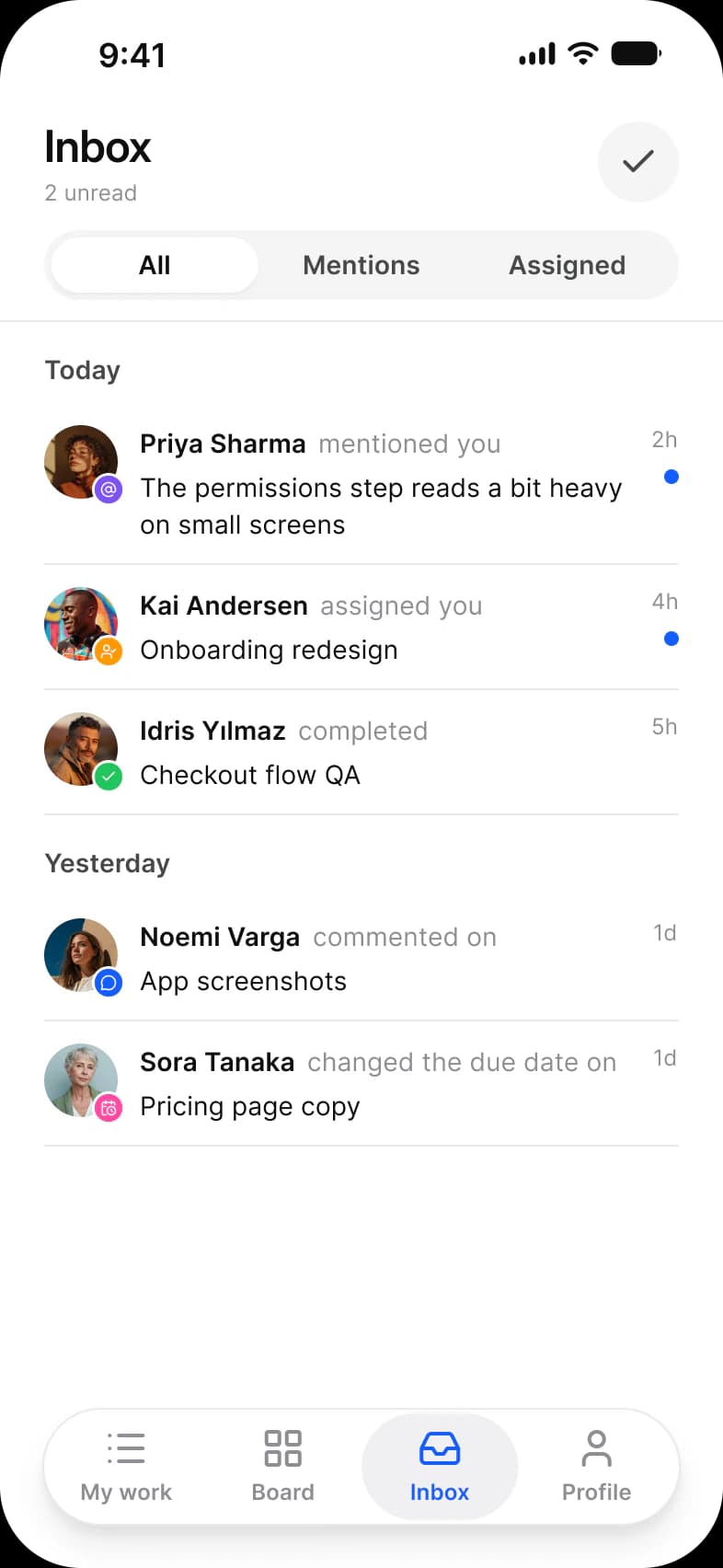
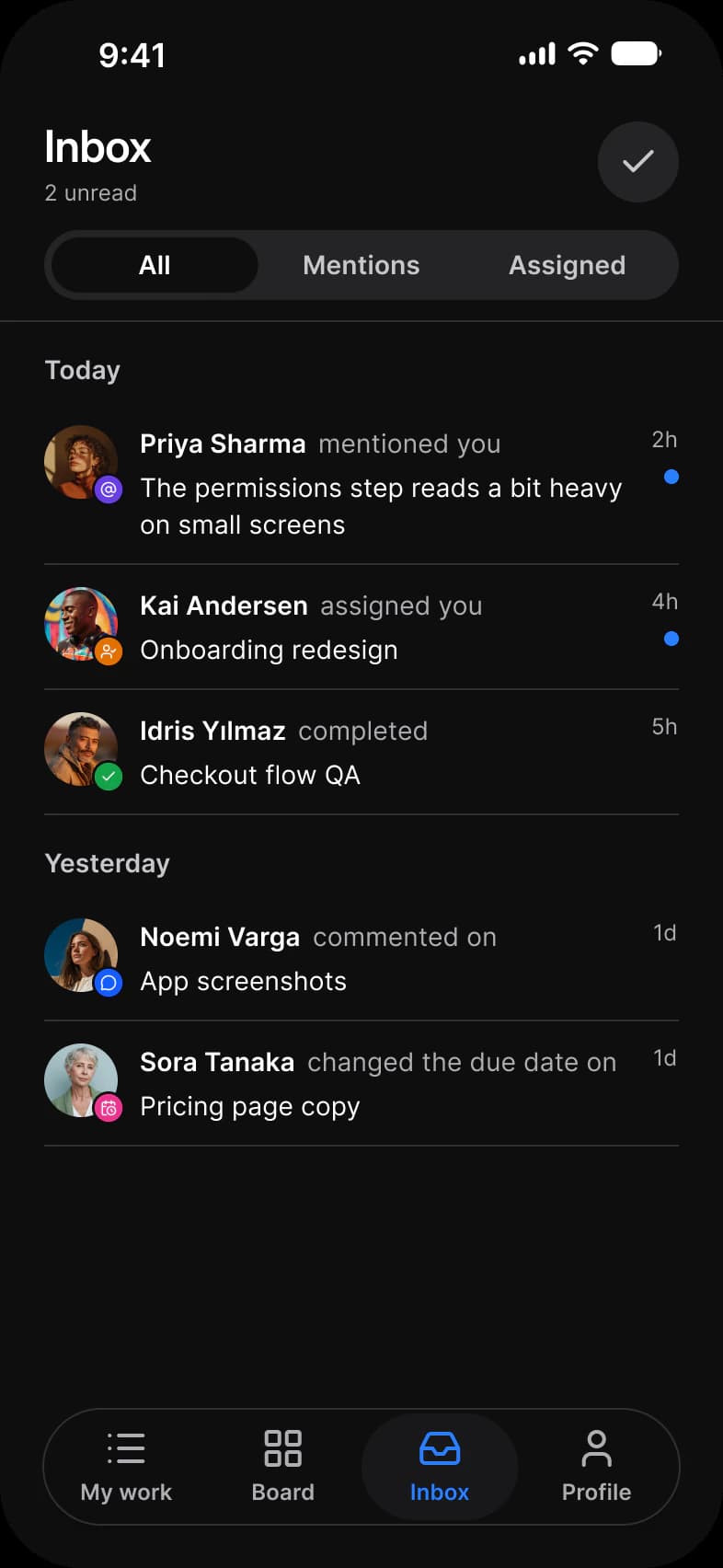
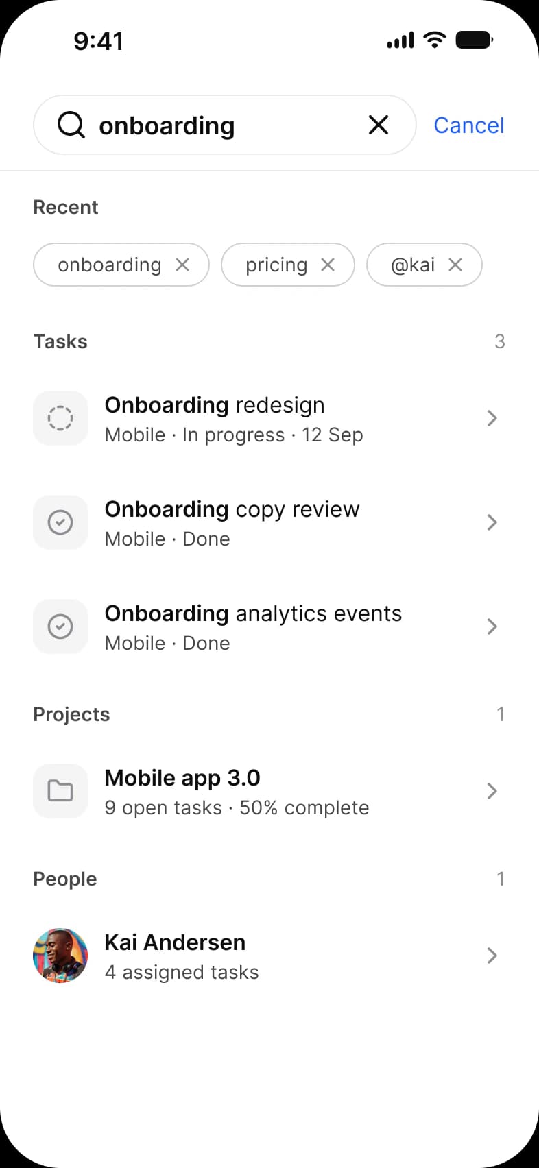
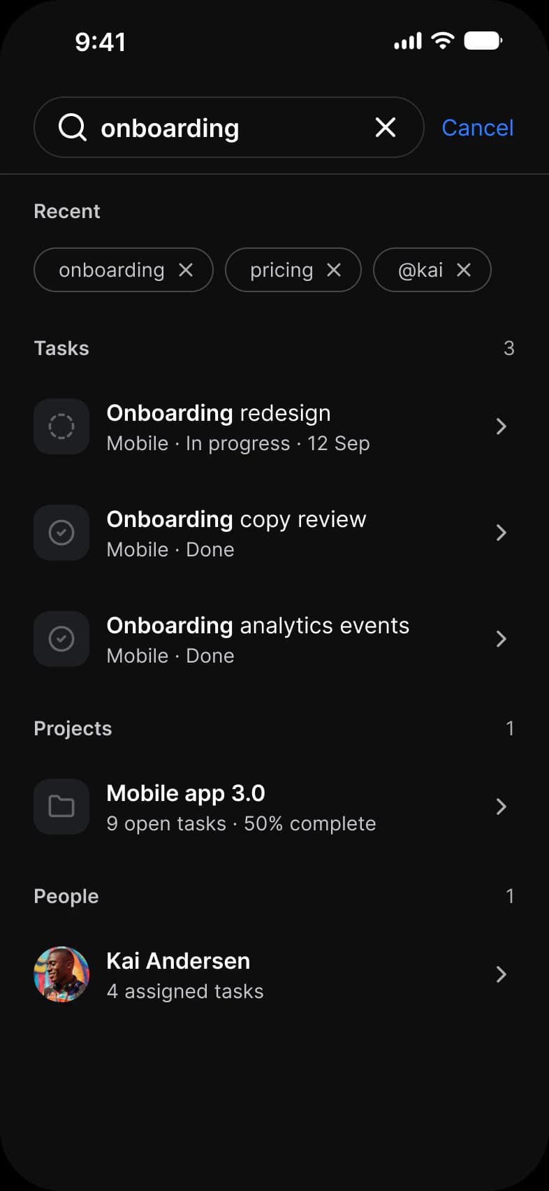
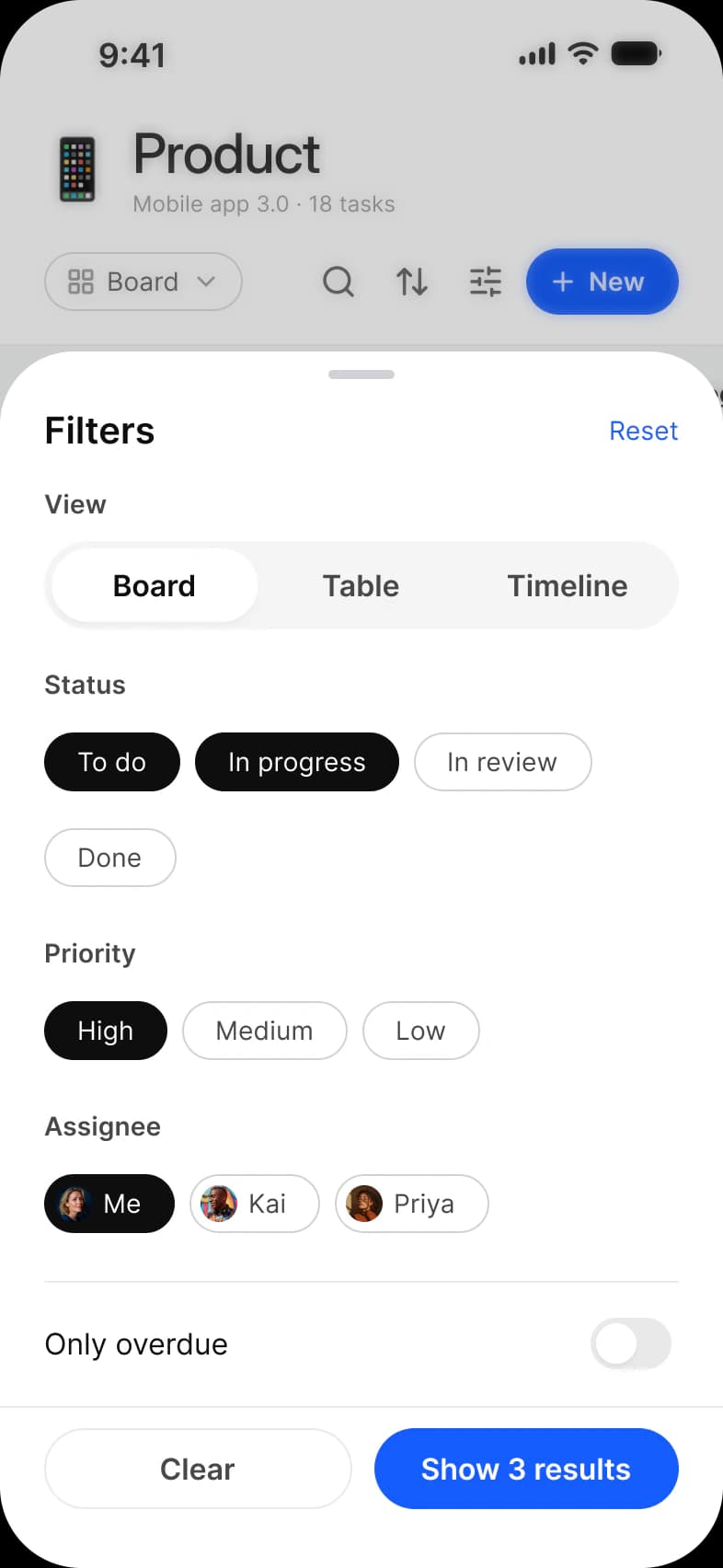
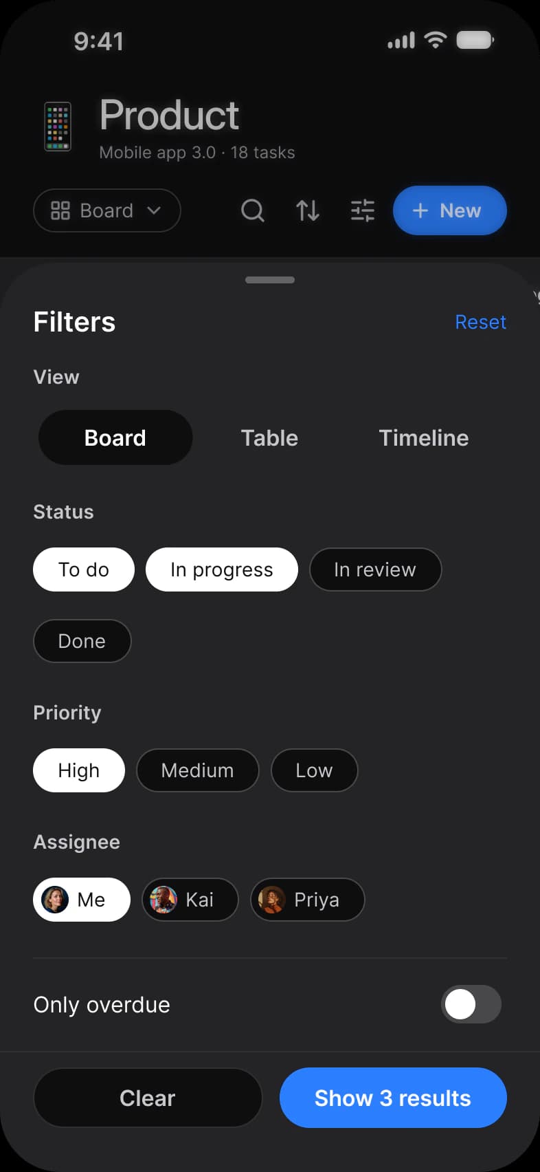
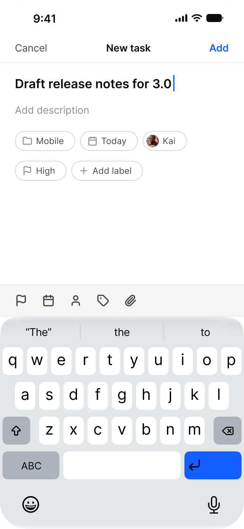
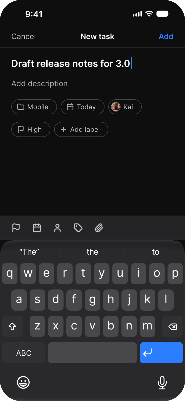
Ten screens for one task manager app. My work, Board, Table and Timeline show the same list of tasks four ways, Task and Project go one level deeper, and Inbox, Search, Filters and New task close the loop. Each screen is drawn in Light and in Dark.
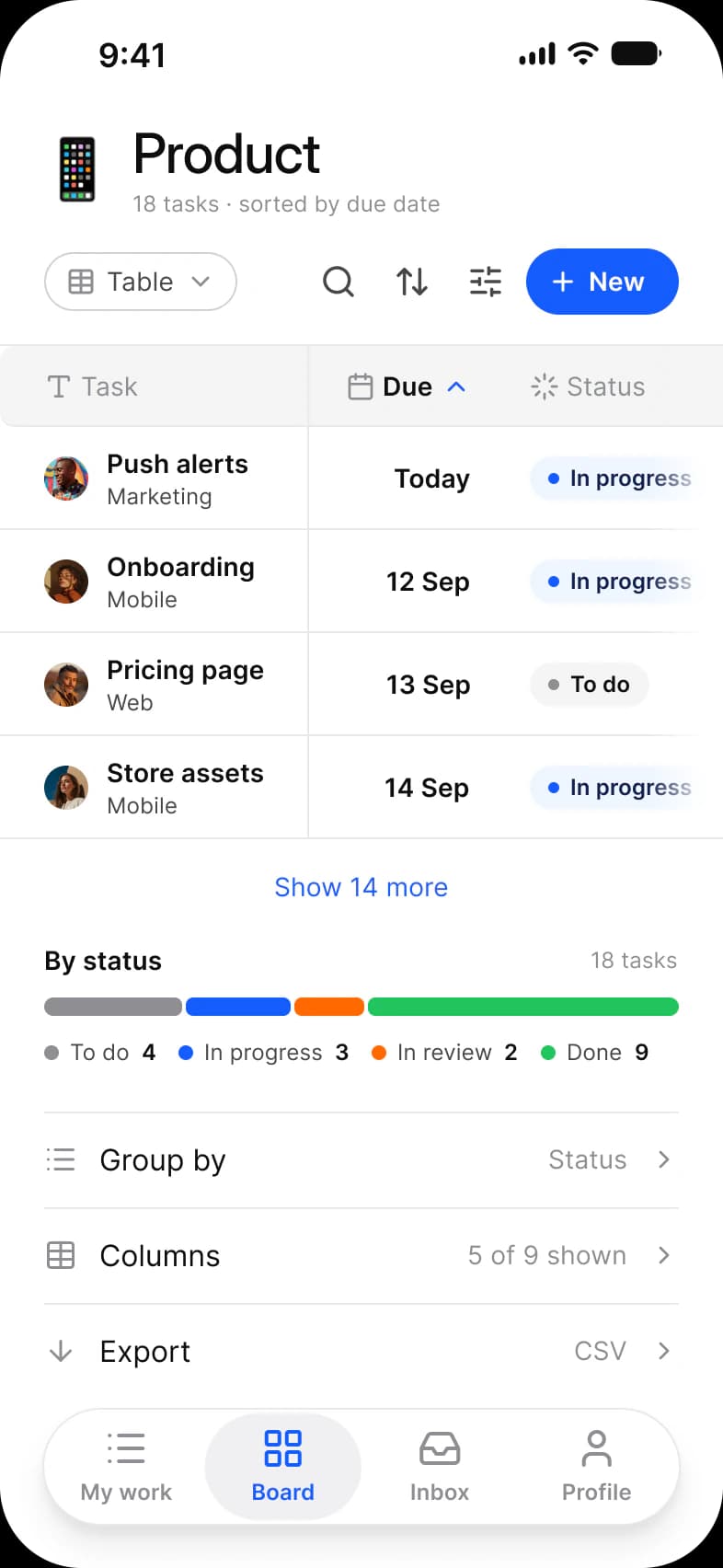
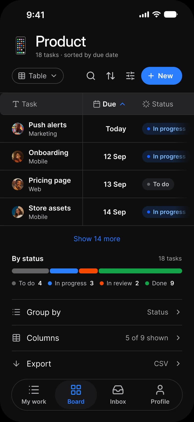
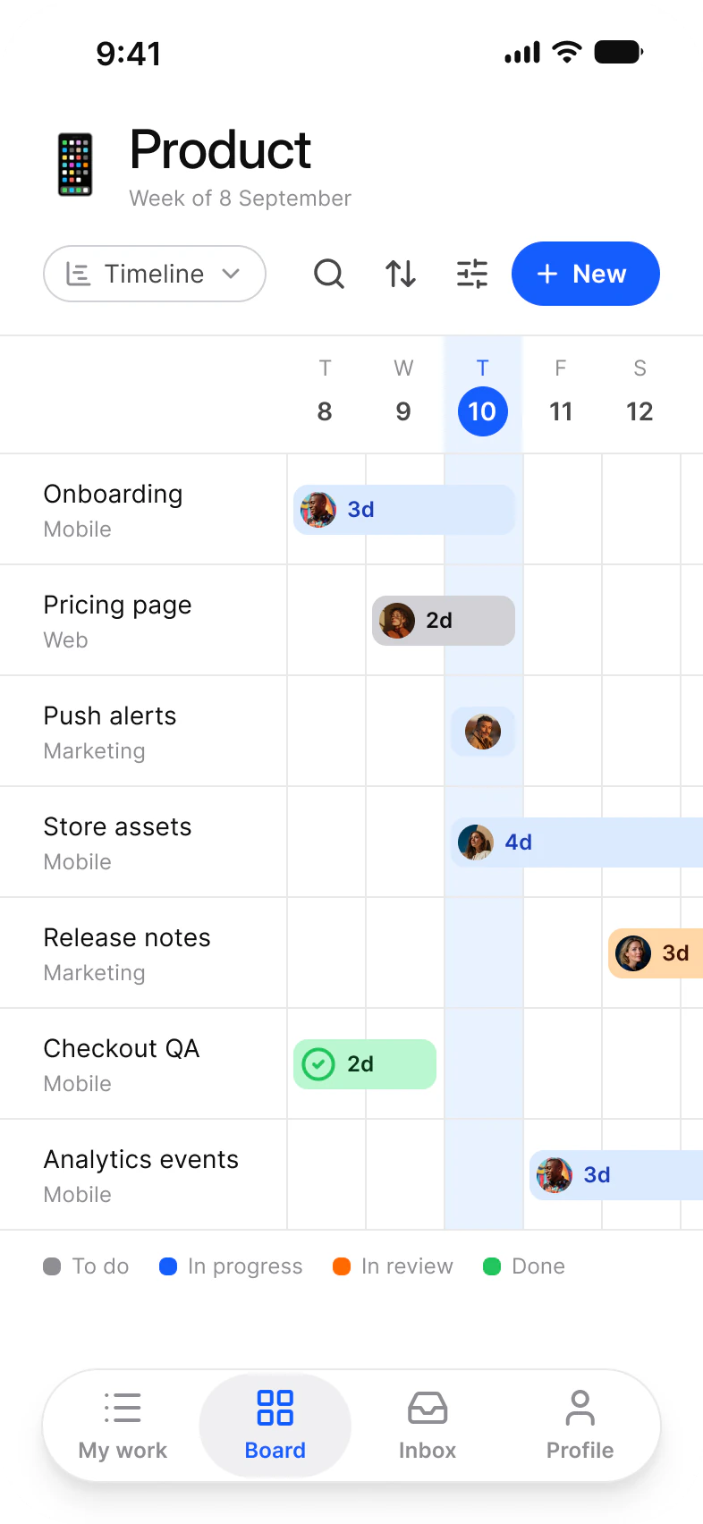
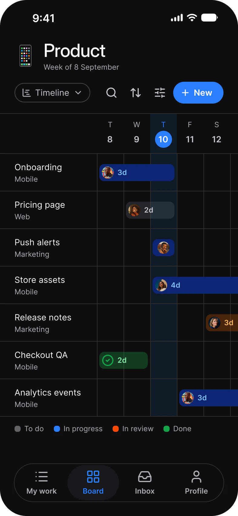
| Screen | What it shows | Built from |
|---|---|---|
| My work | The personal queue: a week summary, a Today, Upcoming and Done switch, task rows | Avatar, Badge, Checkbox, Segmented Control, Floating Action Button, Navigation |
| Board | The Product project as columns of task cards | Badge, Avatar, Button, Chip |
| Table | The same tasks as rows with Due and Status, plus a status split | Table, Button, Chip |
| Timeline | The same tasks as bars across a week | Avatar, Button, Chip |
| Task | One task: fields, description, attachments, a comment field | Top Bars, Badge, Chip, Avatar, Checkbox, Composer |
| Project | Completion, open tasks and hours logged | Top Bars, Key Value Row, Chart, Badge, Avatar group |
| Inbox | Notifications grouped by day | Segmented Control, Avatar, Button |
| Search | Recent searches and results grouped by type | Search, Chip, List |
| Filters | A sheet of filters over the Board | Chip, Segmented Control, Toggle, Button |
| New task | A title, property chips and the keyboard | Chip, Keyboard |
What does a task manager flow need from a component library?
One list that can be drawn several ways, a row that carries status, owner and date, and a short loop around it to filter, search and add.
A task manager needs a view switcher, a row or card for one task, a way to tick it off, a table for the dense view, a sheet for filters and a composer for new work. In this set the row is Badge, Avatar and Button, the view switcher is a Chip, and the loop is Task, Inbox, Search, Filters and New task. All of it is the library as it ships.
| Need | Component | Where it appears |
|---|---|---|
| Name the view and switch it | Chip, Segmented Control | Board, Table and Timeline toolbars, the View row on Filters |
| Show status, label and owner on one task | Badge, Avatar | Every list screen |
| Tick a task off | Checkbox | My work, Task |
| Read many tasks at once | Table | Table |
| Chart progress and hours | Chart | Project |
| Narrow the list | Chip, Segmented Control, Toggle, Button | Filters |
| Find a task, project or person | Search, List | Search |
| Write a task or a comment | Composer, Keyboard | Task, New task |
| Move around the app | Navigation, Top Bars | Six screens carry the tab bar, Task and Project a top bar |
On iOS the minimum touch target is 44 pt. The frames pin Platform to ios-md, where platform/min-touch-target reads 44, so that is the size a tap target on these screens starts from. Android would read 48.
Which components carry the Board, Table and Timeline views?
Board is cards of Badge, Avatar and Button. Table is the Table component with the same three inside its cells. Timeline is Avatar on bars over a grid drawn by hand.
The three views share one toolbar: a Chip that names the view, then search, sort and filter Buttons and a New Button. They also share one status set, To do, In progress, In review and Done, which names the Table status split, the Timeline legend and the Status chips on Filters. Switching view changes the body of the screen and nothing above it.
| View | Screen | Built from | Drawn by hand |
|---|---|---|---|
| Board | Board | Badge 9, Avatar 9, Button 8 (four in the toolbar, one Add task per column), Chip 1, the calendar and message-square icons 9 each | Four status dots in the column headers |
| Table | Table | Table 1 with five header cells and twenty cells, Badge 4, Avatar 4 and Button 4 inside the cells, Button 4 in the toolbar, Chip 1 | Four dots in the status legend |
| Timeline | Timeline | Avatar 7 on seven task bars, Button 4, Chip 1 | One Today column, seven day lines and four legend swatches |
The frames hold more than the pictures show. The Board scrolls sideways, so its third and fourth column sit past the frame edge, and the Table carries five columns of which three are in view. Filters is the Board with a sheet over it: a bg/scrim fill dims the Board, and the sheet adds a Segmented Control, ten Chips and two Toggles. That is why Filters holds the most placed instances of any screen, 66 against 52 on Board.
What are the Tasks screens built from?
Every instance on the ten light frames, counted once, by the component it comes from. The dark row holds the same instances, so each number is per row.
236 instances sit directly on the frames: 174 are Appetite UI components from 21 component sets, and 62 are Lucide icons with 12 different names. Another 262 sit inside those. Placed counts an instance that is not inside another instance. Nested counts one that is. A component is counted by its set name, so every Button variant is a Button, and an icon is any instance named in lowercase. Hidden layers count, and so do layers past the frame edge.
| Component | Placed | Nested | Where |
|---|---|---|---|
| Avatar | 39 | 20 | Placed on My work 6, Board 9, Timeline 7, Task 3, Inbox 5, Filters 9. Nested in the Table cells, the Project avatar group, the Task composer, Search, New task and the Filters assignee chips |
| Badge | 29 | 4 | Placed on My work 5, Board 9, Task 3, Project 3, Filters 9. Nested in the Table status cells |
| Button | 27 | 11 | Placed on Board 8, Table 4, Timeline 4, Inbox 1, Filters 10. Nested in the top bars, the floating button and the Table action cells |
| Chip | 24 | 0 | Board, Table and Timeline 1 each, Task 2, Search 3, New task 5, Filters 11 |
| Status Bar | 10 | 0 | Every screen |
| Checkbox | 10 | 0 | My work 5, Task 5 |
| Navigation | 6 | 0 | My work, Board, Table, Timeline, Project, Inbox |
| Emojis | 5 | 0 | The project mark on Board, Table, Timeline, Project and Filters |
| List | 5 | 0 | The five result rows on Search |
| Key Value Row | 4 | 0 | Project |
| Segmented Control | 3 | 0 | My work, Inbox, Filters |
| Top Bars | 2 | 0 | Task, Project |
| Toggle | 2 | 0 | Filters |
| Floating Action Button | 1 | 0 | My work |
| Table | 1 | 0 | Table |
| Composer | 1 | 0 | Task |
| Chart, Chart / Bar | 1 | 0 | Project |
| Chart, Chart / Donut | 1 | 0 | Project |
| Avatar group | 1 | 0 | Project |
| Search | 1 | 0 | Search |
| Keyboard | 1 | 0 | New task |
| Lucide icons | 62 | 101 | Placed on Board 22, Filters 22, Table 6, Task 5, New task 5, Timeline 1, Project 1. Nested in toolbars, tab bars, chips and the Search field |
Of the nested instances, 35 are Avatar, Badge and Button, 126 are helper parts of larger components, and icons make up the other 101.
| Part | Nested | Inside |
|---|---|---|
| Navigation labels | 24 | Navigation, four labels on each of six bars |
| Table header cells, cells and cell contents | 45 | Table: 5 header cells, 20 cells and 20 contents of five kinds, four rows each |
| Keyboard background, layouts, autocorrection, keys and space | 35 | iOS Keyboard, 31 of them keys |
| Segmented control selectors | 9 | Segmented Control, three on each |
| Chart columns and grid | 8 | Chart / Bar, 7 columns and 1 grid |
| Avatar status marks | 5 | Avatar, on the five Inbox rows |
Not everything is an instance. 41 shapes are drawn by hand, all of them rectangles and ellipses and none a vector or a line. Seventeen are status and unread dots, twelve are the Timeline grid, Today column and legend swatches, and twelve are the fade and surface pair behind the tab bar on six screens. Each is bound to a variable or, for the fade, a gradient.
Counted on October 2, 2026 with a Plugin API script over the ten light frames of the Tasks page in the Appetite UI Figma file. An icon is an instance named in lowercase, a Lucide name from the shared icon page. No third party asset is placed on these screens.
Which tokens do the Tasks screens use?
No solid paint on these frames is a raw hex. Each fill and stroke resolves through a variable, which makes the dark row a mode switch.
The ten light frames hold 1,195 solid fills and strokes bound to 57 different variables, and none is unbound. Photographs and the tab bar fade are the only fills that are not a solid color. The frames themselves bind the fg/ text and icon variables, while the components placed on them bind the matching text/ variables for their labels.
| Token | Where it lands | Paints |
|---|---|---|
fg/strong-950 | Screen titles, task names, primary icons | 162 |
fg/soft-500 | Dates, counts, captions, inactive tab labels and icons, the To do dot on Board and Filters | 210 |
fg/sub-700 | Description text and toolbar icons | 88 |
bg/white-0 | The screen and its cards | 116 |
bg/weak-50 | Panels such as the This week card, the metric tiles and the segmented control track | 22 |
border/soft-100 | Row hairlines and card outlines | 132 |
border/sub-200 | Outlines such as Chip and checkbox borders | 25 |
brand/base | New button, active tab, progress fill, the highlighted day | 55 |
chart/series-1 | The peak column of Hours logged | 1 |
chart/soft | The six other Hours logged columns | 6 |
state/feature/base-500, lighter-50, dark-950 | Mobile label: dot, fill and text of a Badge | 12, 11, 11 |
state/information/base-500, lighter-50, dark-950 | Web label and the In progress status | 11, 10, 10 |
state/away/base-500, lighter-50, dark-950 | Marketing label | 9, 8, 8 |
state/warning/base-500 | The High priority dot, the In review dot, split segment and swatch on Table and Timeline, one donut segment | 6 |
state/success/base-500 | Done dots, the Table split segment and Timeline swatch, one donut segment, the Inbox avatar mark | 10 |
state/faded/base-500 | To do dots, split segment and swatch on Table and Timeline, one donut segment, the icons of the Search results | 10 |
state/error/base-500 | The Due today dot and the Overdue label | 2 |
bg/scrim | The dim behind the Filters sheet | 1 |
| Style | Uses | Screens |
|---|---|---|
xs/default | 105 | 8 |
sm/default | 89 | 10 |
xs/emphasized | 80 | 8 |
sm/emphasized | 68 | 9 |
base/emphasized | 38 | 4 |
base/default | 17 | 6 |
2xl/emphasized | 8 | 4 |
3xl/emphasized | 6 | 6 |
xl/emphasized | 4 | 4 |
lg/emphasized | 1 | 1 |
dropShadow/xs | 18 | 5 |
dropShadow/lg | 7 | 6 |
backdropBlur/sm | 1 | 1 |
| Collection | Modes | What it drives here |
|---|---|---|
Color Tokens | Light, Dark | Every paint above, pinned on each frame |
Platform | ios-md, ios-lg, android, ios-duo-outer, ios-duo-inner | Status bar and platform metrics, pinned to ios-md |
Foundations | Default | Spacing, radius and control sizing |
Typography | Default | The 10 text styles above |
Platform Bridge | Brand, System | Not pinned on the frames, so the default mode applies |
Motion | Default | Not used on these screens |
Paints are every visible solid fill and stroke on the ten light frames, inside instances included, counted by bound variable name on October 3, 2026. Where a token appears as both a fill and a stroke the two counts are added. A text layer that mixes two styles counts once for each.