Updated
Empty State
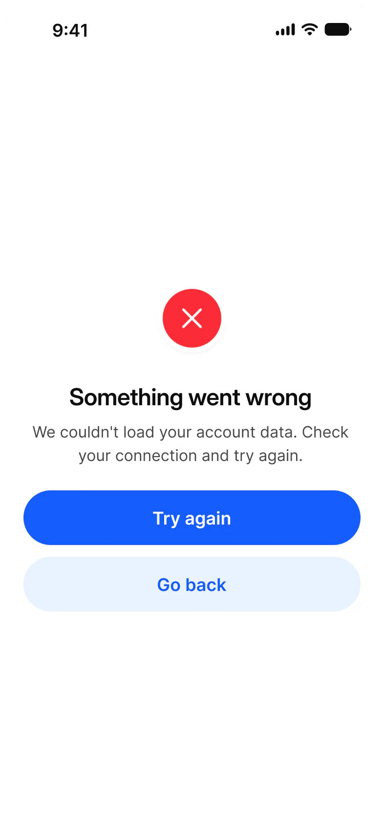
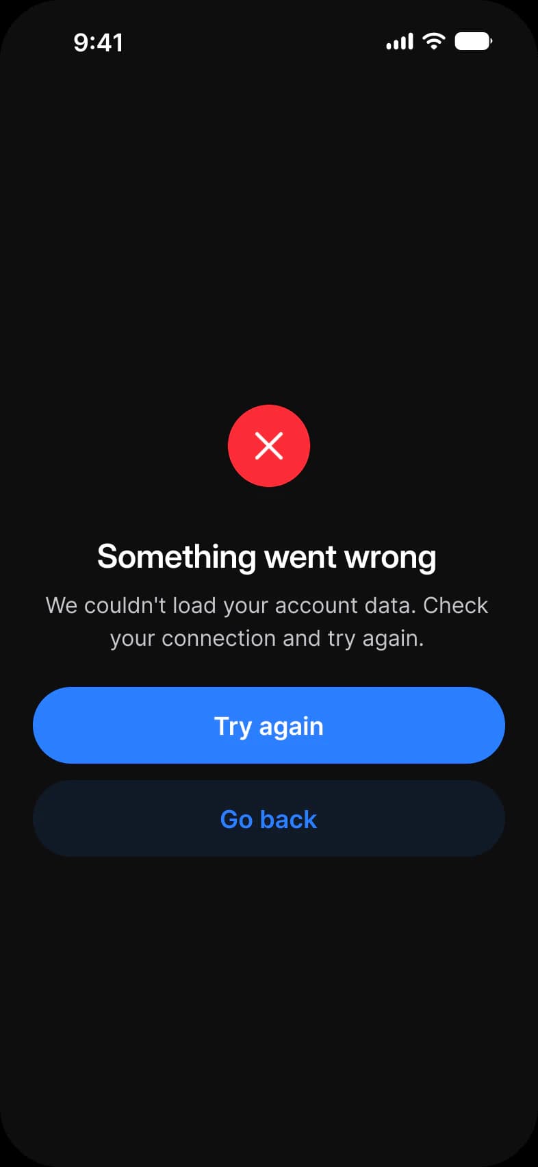
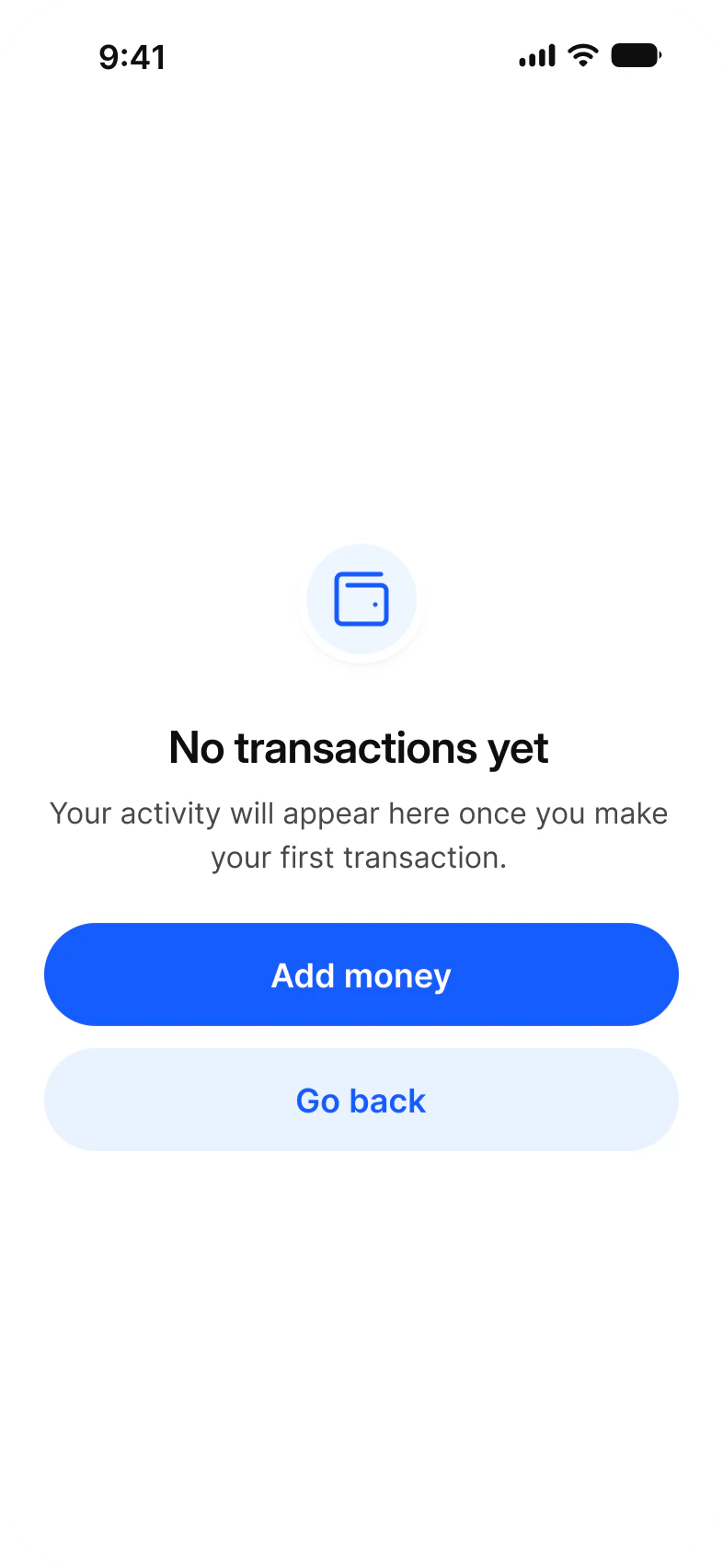
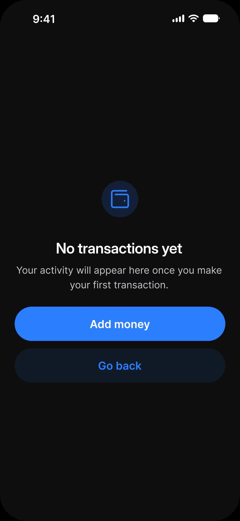
An empty state app UI kit for Figma: a failed load and a first use state for a finance app, drawn light and dark. Each is a status badge, a headline, one line of support, a filled Button and a quiet one. Error takes its badge from a component and Add money draws its own.
Updated
Preview
Two screens for the moments a product usually leaves blank. One thing went wrong, one thing has not happened yet, and both are laid out from the same parts as every other screen in the system.
| Screen | What it shows | Built from |
|---|---|---|
| Error | A request failed and the user can retry or go back | Status Bar, _Alert Status, Button |
| Add money | Nothing has happened yet and one action fixes that | Status Bar, Button, a wallet-minimal icon in a hand drawn badge |
Each screen is drawn in Light and in Dark, with Color Tokens set on the frame itself. The dark screens are the same instances resolved against the other mode.
What are the Empty State screens built from?
9 instances across the two screens. This is the smallest set of screens in the library, and it uses the same parts as every other screen.
9 instances are counted, 8 placed directly on the frames and 1 nested. Placed counts an instance that is not inside another instance. Nested counts one that is. A component is counted by its set name, and an icon is an instance named in lowercase. The dark row holds the same instances as the light row.
| Component | Placed | Nested | Where |
|---|---|---|---|
| Button | 4 | 0 | Both screens, one filled and one quiet |
| iOS / Status Bar | 2 | 0 | Both screens |
| _Alert Status | 1 | 0 | Error only, drawn at 80 x 80 |
| Lucide icons | 1 | 1 | The x inside _Alert Status on Error, and the wallet-minimal glyph at 36 x 36 on Add money |
Add money reports no nested instance at all, which shows where its badge came from. On Error the x is nested because it sits inside _Alert Status. On Add money the wallet glyph sits at the top level because the circle around it was drawn by hand.
Counted on October 2, 2026 with a Plugin API script over the two light frames of the Empty State page in the Appetite UI Figma file.
Which component should draw an empty or error state?
Empty State for a whole state, _Alert Status for the badge alone.
Use Empty State, a component with a Type of Info, Error or Success, a Title, a Body, an optional second action and an Icon Swap for the glyph. These two screens do not place it: Error places the _Alert Status badge and Add money draws its badge by hand. Booking Trips empty and Foodie Cart empty place Empty State, see Booking and Foodie.
| Property | Type | Options | Default |
|---|---|---|---|
Type | Variant | Info, Error, Success | Info |
Title | Text | Any text | No transactions yet |
Body | Text | Any text | Your activity will appear here once you make your first payment. |
Show secondary | Boolean | On, off | On |
Icon Swap | Instance swap | Any icon | The Info glyph |
The badge on its own is _Alert Status. It has one axis, Type, with four options, and each option is 64 x 64 in the component.
| Type | Glyph | Use it for |
|---|---|---|
Error | x | A request failed and the user can retry |
Warning | exclamation | Something needs attention before it fails |
Success | check | A task finished and the screen has nothing left to show |
Verified | check | An identity or account is confirmed |
Pick the type from what the user is meant to feel.
On Add money the badge is a frame holding two ellipses, a 70 x 70 named Stroke filled with bg/white-0 and a 60 x 60 named BG filled with state/information/lighter-50, around a wallet-minimal icon. The Type axis of _Alert Status fixes the glyph per type, so it cannot show a wallet. Empty State solves that with its Icon Swap. Four rectangles named Divider, each 345 x 179 and filled with bg/white-0, sit at the top and bottom of both screens and center the content. They are spacers with a fill, whatever their name says.
Which tokens do the Empty State screens use?
Every solid fill and stroke on these two frames resolves through a variable, so the badge drawn by hand survives the mode switch too.
The two light frames hold 34 solid fills and strokes, spread over 9 different variables, and none is unbound. The badge fill on Add money resolves through state/information/lighter-50, a pale blue in Light and a 16 percent blue in Dark, which is why the dark badge reads as a deep navy.
| Token | Where it lands | Paints |
|---|---|---|
fg/strong-950 | Status Bar glyphs | 10 |
bg/white-0 | The screens, the four Divider rectangles, the Stroke ellipse and the _Alert Status ring | 8 |
brand/base | The filled Button fills, the quiet Button labels and the wallet-minimal glyph | 5 |
static/static-white-0 | The filled Button labels and the x in _Alert Status | 3 |
text/strong-950 | The headline | 2 |
text/sub-700 | The line of support | 2 |
brand/alpha-10 | The quiet Button fill | 2 |
state/error/base-500 | The red circle of _Alert Status | 1 |
state/information/lighter-50 | The BG ellipse behind the wallet glyph | 1 |
| Style | Uses | Screens |
|---|---|---|
lg/emphasized | 4 | 2 |
2xl/emphasized | 2 | 2 |
base/default | 2 | 2 |
| Collection | Modes | What it drives here |
|---|---|---|
Color Tokens | Light, Dark | Every paint above, pinned on each frame |
Platform | ios-md, ios-lg, android, ios-duo-outer, ios-duo-inner | Status bar and platform metrics, pinned to ios-md |
Foundations | Default | The 345 content width and the block spacing |
Typography | Default | Headline and supporting line |
Platform Bridge | Brand, System | Not pinned on the frames, so the default mode applies |
Motion | Default | Not used on these screens |
Paints are every visible solid fill and stroke on the two light frames, inside instances included, counted by bound variable name on October 2, 2026.
Which patterns do these screens show?
The same screens by what they do, beside the other apps of the kit, with the iOS and Material values of each pattern.
- All appsEmpty state screens
Start from these screens.
Every frame on this page is part of the Appetite UI file, drawn from its components and bound to its variables, so one brand edit moves every screen in light and dark.
The file holds 589 variables in 6 collections and exports its token values to SwiftUI, Jetpack Compose, Flutter and CSS. Solo covers one designer and Team up to ten people. You pay once and keep lifetime updates. Price goes up Nov 1
The read-only Figma preview opens the whole file, every screen and every variable, before you buy.