Updated
Onboarding
An onboarding app UI kit for Figma: a welcome screen, two sign in layouts and a sign up screen, drawn light and dark from components already in the library. Change Button or Text Input once and all 4 screens follow.
Updated
Preview
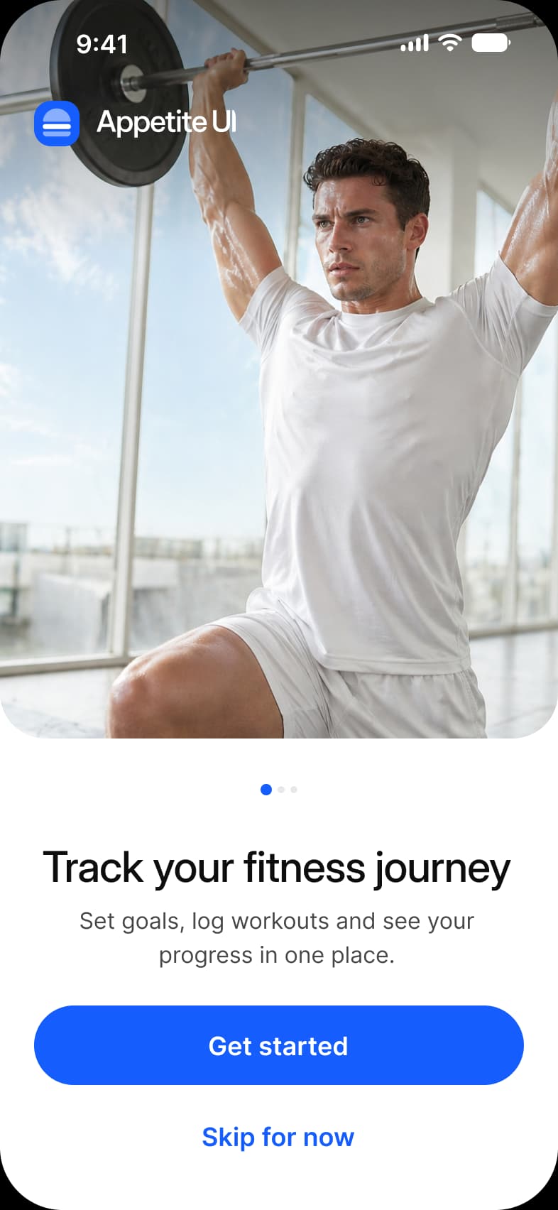
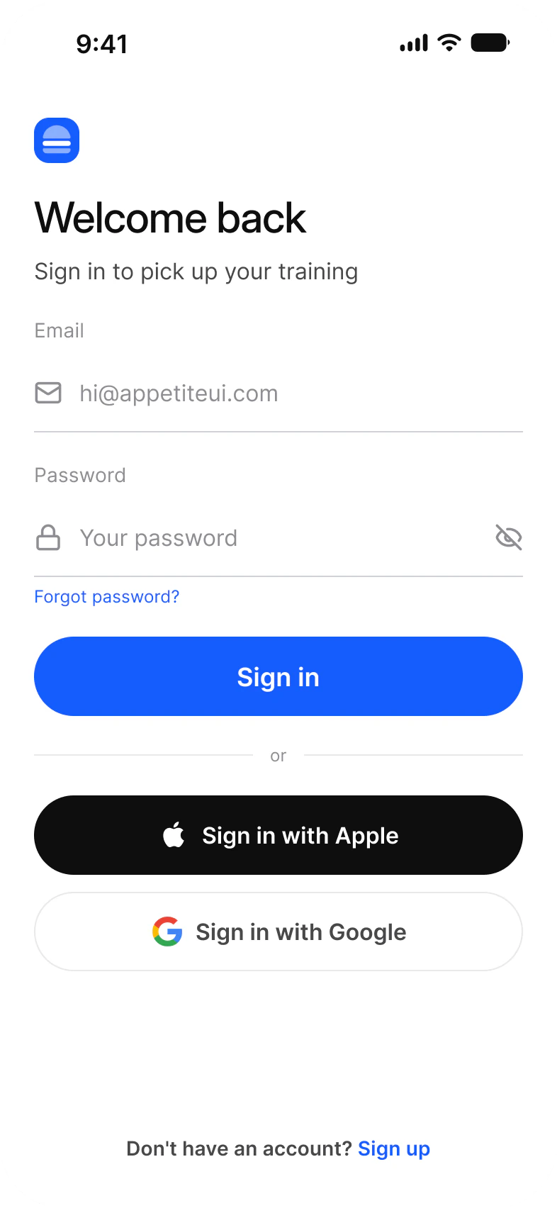
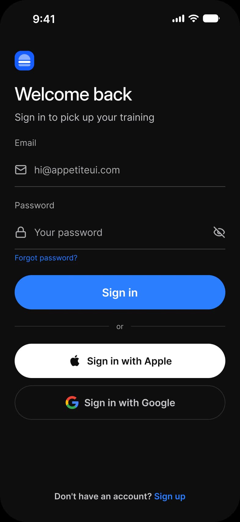
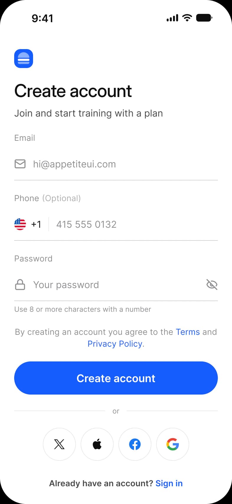
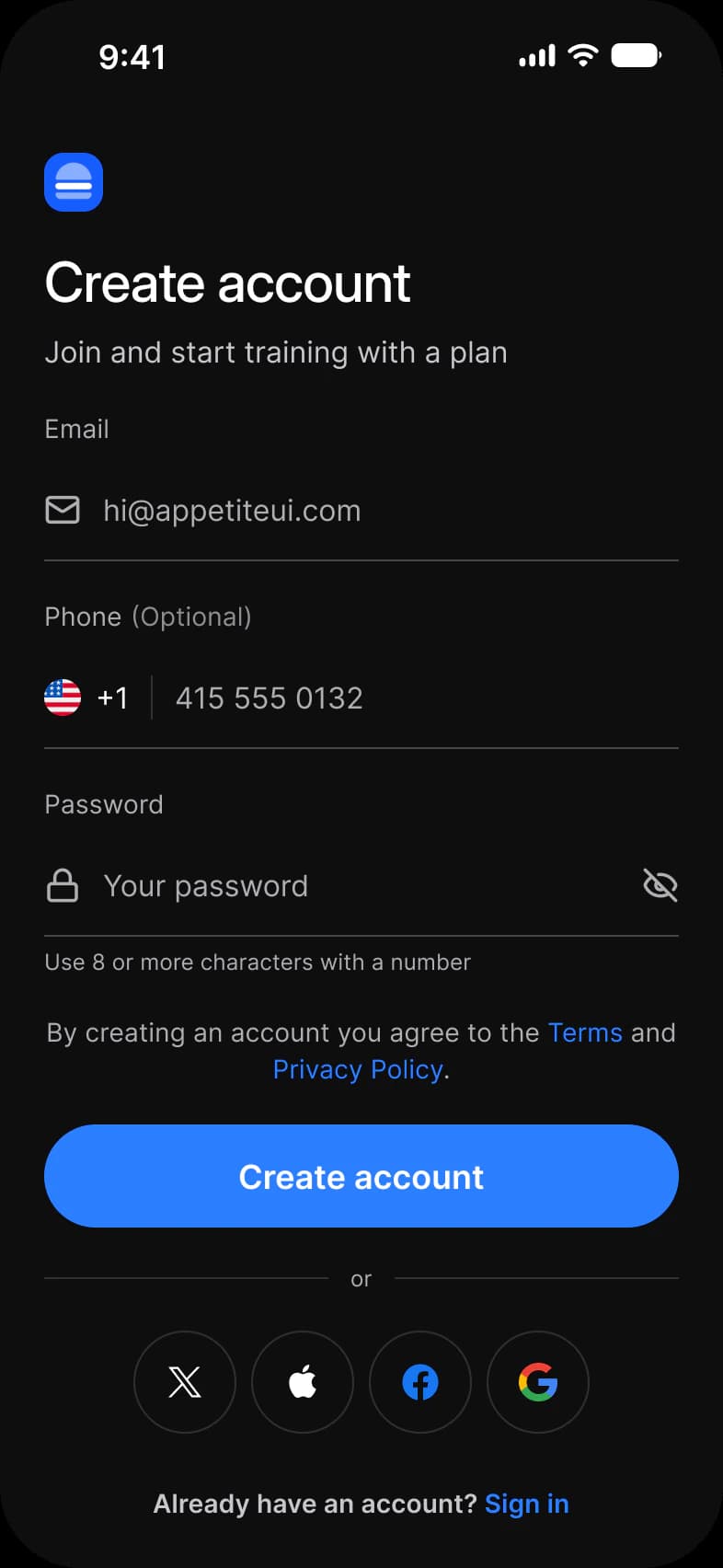
Welcome, Sign In with social buttons first, Sign In with the form first, and Sign Up. Together they take a new user from first launch to a signed in account.
| Screen | What it shows | Built from |
|---|---|---|
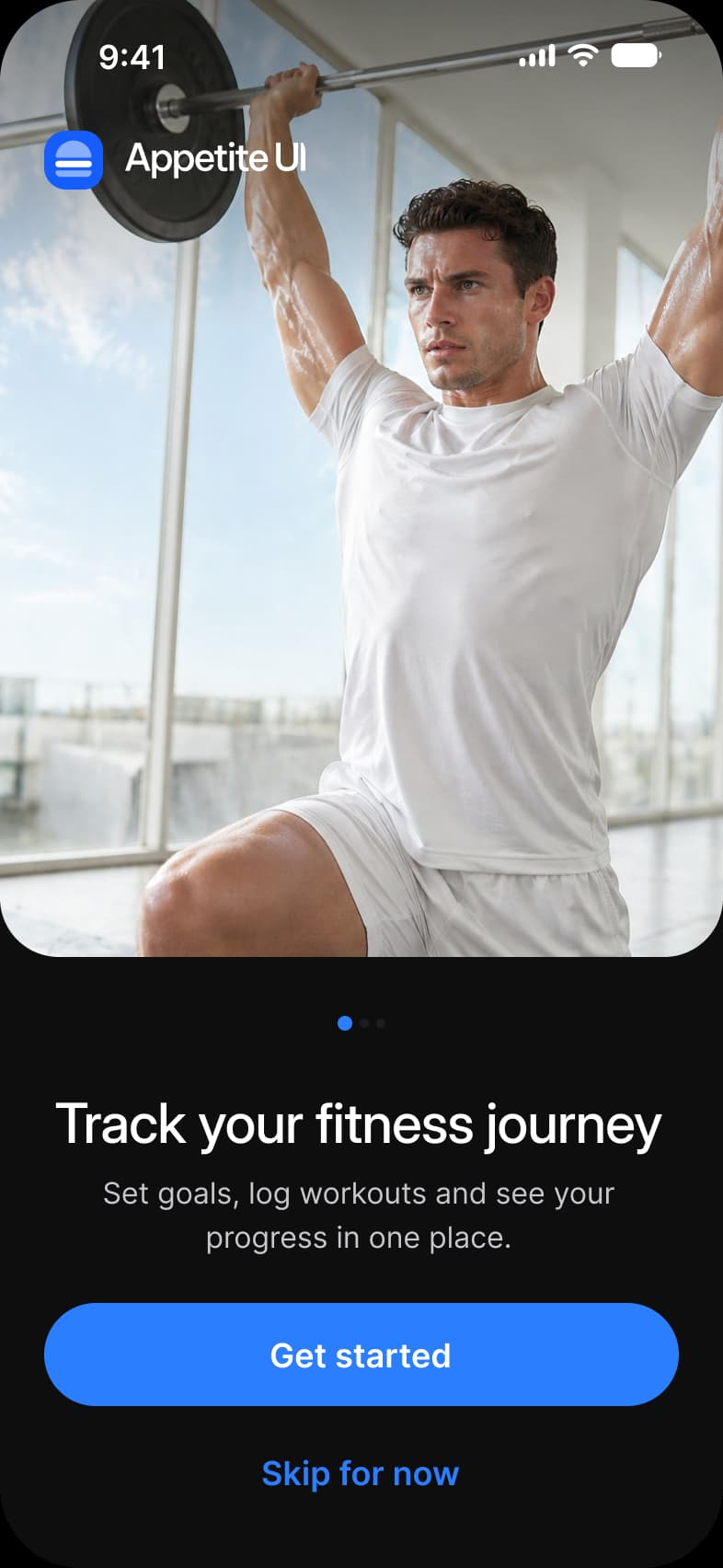
| Welcome | A photograph with the logo on it, a headline, pagination dots and a way in or past | Status Bar, Logo, Pagination, Button |
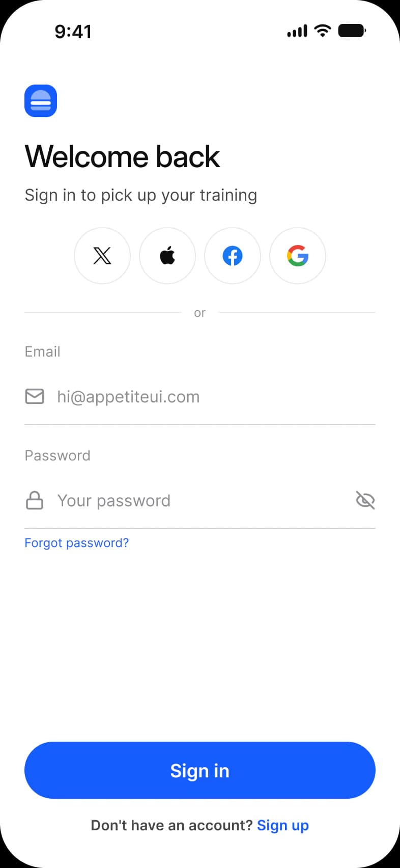
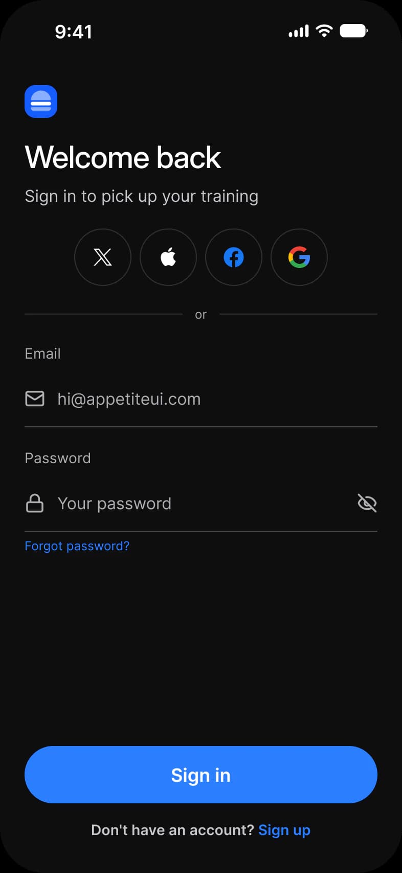
| Sign in, social first | Four round provider buttons above the email and password form | Logo, Social Button, Divider, Text Input, Button |
| Sign in, form first | The form and a Sign in button, then Apple and Google as wide buttons | Logo, Text Input, Button, Divider, Social Button |
| Sign up | Email, an optional phone number and a password with a hint, the Terms line and four provider buttons | Logo, Text Input, Button, Divider, Social Button |
Each screen is drawn in Light and in Dark, with Color Tokens set on the frame itself. The dark screens are the same instances resolved against the other mode, so a rebrand in the variables moves both rows. Onboarding is also drawn for the outer and inner display of iPhone Duo, see iPhone Duo screens.
How do the two Sign In layouts differ?
Social first leads with four round provider buttons. Form first leads with the email and password fields.
Social first puts four round Social Buttons directly under the headline and pins the Sign in button to the bottom edge, so the form sits in the middle of the screen. Form first starts with the email and password fields and a Sign in button right under them, and moves Apple and Google to two wide Social Buttons below an or divider.
Both layouts are the same instances in a different order: one Logo, two Text Inputs, two Buttons and one Divider. Only the Social Buttons change, from 4 to 2. Switching a product from one layout to the other is a rearrangement, not a rebuild.
| Layout | Order top to bottom | Social Buttons | Sign in button |
|---|---|---|---|
| Social first | Headline, four round Social Buttons, or divider, Email and Password, Sign in | 4, glyph only | Pinned to the bottom edge, above the Sign up link |
| Form first | Headline, Email and Password, Sign in, or divider, Apple and Google | 2, with a label | Directly under the form |
The minimum touch target on iOS is 44 pt. The frames pin Platform to ios-md, where platform/min-touch-target reads 44. The android mode of the same variable reads 48 dp.
What are the Onboarding screens built from?
60 instances across the 4 screens. 36 are Appetite UI components, 9 are Lucide icons and 15 are logo, brand mark and flag assets. Every one of them reads from the same variables, which is why a rebrand moves all 4 screens at once.
37 instances sit directly on the frames and the rest sit inside them. Placed counts an instance that is not inside another instance. Nested counts one that is, which is where the three Pagination dots, every glyph and every brand mark live. A component is counted by its set name, so every Button variant is a Button, and an icon is an instance named in lowercase. The dark row holds the same instances as the light row.
| Component | Placed | Nested | Where |
|---|---|---|---|
| Social Button | 10 | 0 | Both sign in screens and Sign Up |
| Button | 8 | 0 | All four screens |
| Text Input | 7 | 0 | Both sign in screens and Sign Up |
| iOS / Status Bar | 4 | 0 | All four screens |
| Logo | 4 | 0 | All four screens |
| Divider | 3 | 0 | Both sign in screens and Sign Up |
| Pagination | 1 | 3 | Welcome, carrying three dots |
| Lucide icons | 0 | 9 | Mail, lock and eye-off in the Text Inputs of three screens |
| Assets | 0 | 11 | Apple, Google, Facebook and X marks in the Social Buttons, and the flag in the Sign Up phone field |
Three things on these screens are drawn by hand. Welcome carries the photograph as a 393 x 520 rectangle with an image fill, and a 393 x 180 rectangle named Top Background with a gradient fill over the top edge. Each Sign In screen carries a rectangle named Divider that works as a spacer, 345 x 147 on social first and 345 x 67 on form first.
Counted on October 2, 2026 with a Plugin API script over the four light frames of the Onboarding page in the Appetite UI Figma file.
Which tokens do the Onboarding screens use?
Almost every solid fill and stroke on these frames resolves through a variable. The exceptions are brand colors, which are not tokens.
The four light frames hold 131 solid fills and strokes that are bound, spread over 16 different variables. Another 32 solid paints are not bound: 12 in the Logo, 14 in the Social Button marks and 6 in the flag of the phone field, the colors of a brand and a flag. The Welcome gradient has two stops and neither is bound. The photograph is an image fill.
| Token | Where it lands | Paints |
|---|---|---|
text/soft-500 | Input labels, placeholders, the or label of a Divider and the consent line on Sign Up | 21 |
fg/strong-950 | Status Bar glyphs and the X and Apple marks | 19 |
border/soft-100 | Social Button outlines and the Divider rules | 16 |
bg/white-0 | The screen frames and the Social Button fills | 13 |
brand/base | Filled Buttons, Skip for now, the active Pagination dot, Forgot password and the Sign up, Sign in, Terms and Privacy Policy links | 13 |
static/static-white-0 | White on the photograph and on a filled Button: the Welcome status bar, Button labels, the Logo | 10 |
fg/soft-500 | Input glyphs: mail, lock and eye-off | 9 |
text/sub-700 | The supporting line under each headline and the account question before Sign up or Sign in | 8 |
border/sub-200 | The Text Input underline | 7 |
text/strong-950 | Headlines and the entered text | 5 |
colors/blue/500 | The blue tile of the Logo, a Foundations primitive bound directly | 4 |
colors/alpha/gray/alpha-16 | The two inactive Pagination dots, a Foundations primitive bound directly | 2 |
bg/strong-950, fg/white-0, text/white-0 | The black Sign in with Apple button, its mark and its label | 1 each |
text/disabled-400 | The placeholder of an empty field | 1 |
| Style | Uses | Screens |
|---|---|---|
base/default | 12 | 4 |
sm/default | 9 | 3 |
xs/default | 6 | 3 |
lg/emphasized | 5 | 4 |
3xl/emphasized | 4 | 4 |
sm/emphasized | 3 | 3 |
base/emphasized | 2 | 1 |
backdropBlur/md | 2 | 1 |
| Collection | Modes | What it drives here |
|---|---|---|
Color Tokens | Light, Dark | Every bound paint above, pinned on each frame |
Platform | ios-md, ios-lg, android, ios-duo-outer, ios-duo-inner | Status bar and platform metrics, pinned to ios-md |
Foundations | Default | Spacing, radius and control sizing, plus the two primitives above |
Typography | Default | Headline and supporting text |
Platform Bridge | Brand, System | Not pinned on the frames, so the default mode applies |
Motion | Default | Not used on these screens |
Paints are every visible solid fill and stroke on the four light frames, inside instances included, counted by bound variable name on October 3, 2026. A text layer that mixes two colors counts once for each.
Which patterns do these screens show?
The same screens by what they do, beside the other apps of the kit, with the iOS and Material values of each pattern.
- All appsSign in and sign up screens
Start from these screens.
Every frame on this page is part of the Appetite UI file, drawn from its components and bound to its variables, so one brand edit moves every screen in light and dark.
The file holds 589 variables in 6 collections and exports its token values to SwiftUI, Jetpack Compose, Flutter and CSS. Solo covers one designer and Team up to ten people. You pay once and keep lifetime updates. Price goes up Nov 1
The read-only Figma preview opens the whole file, every screen and every variable, before you buy.