Platforms
Your brand, inside iOS 26 and Material 3.
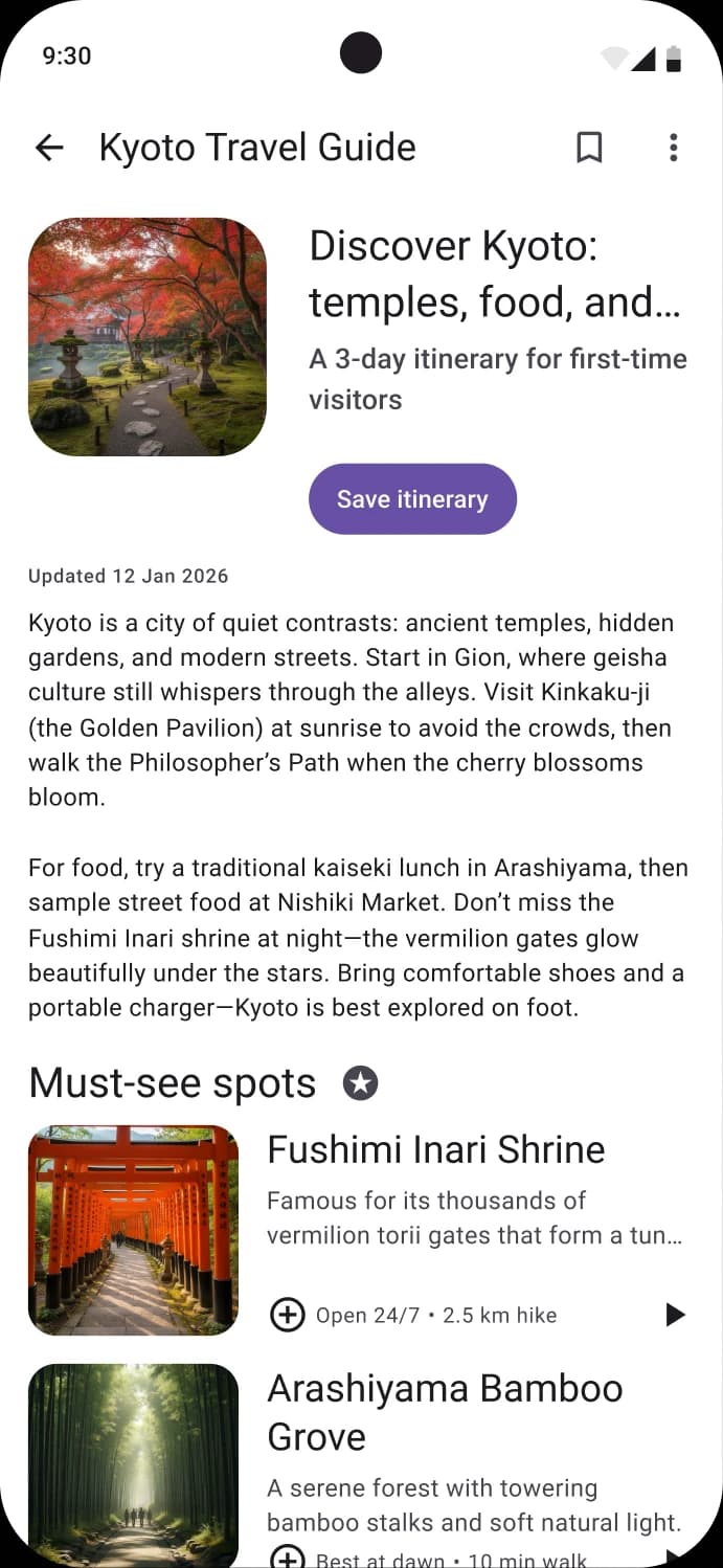
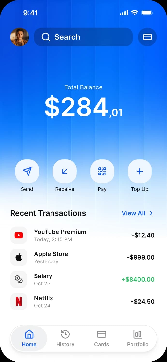
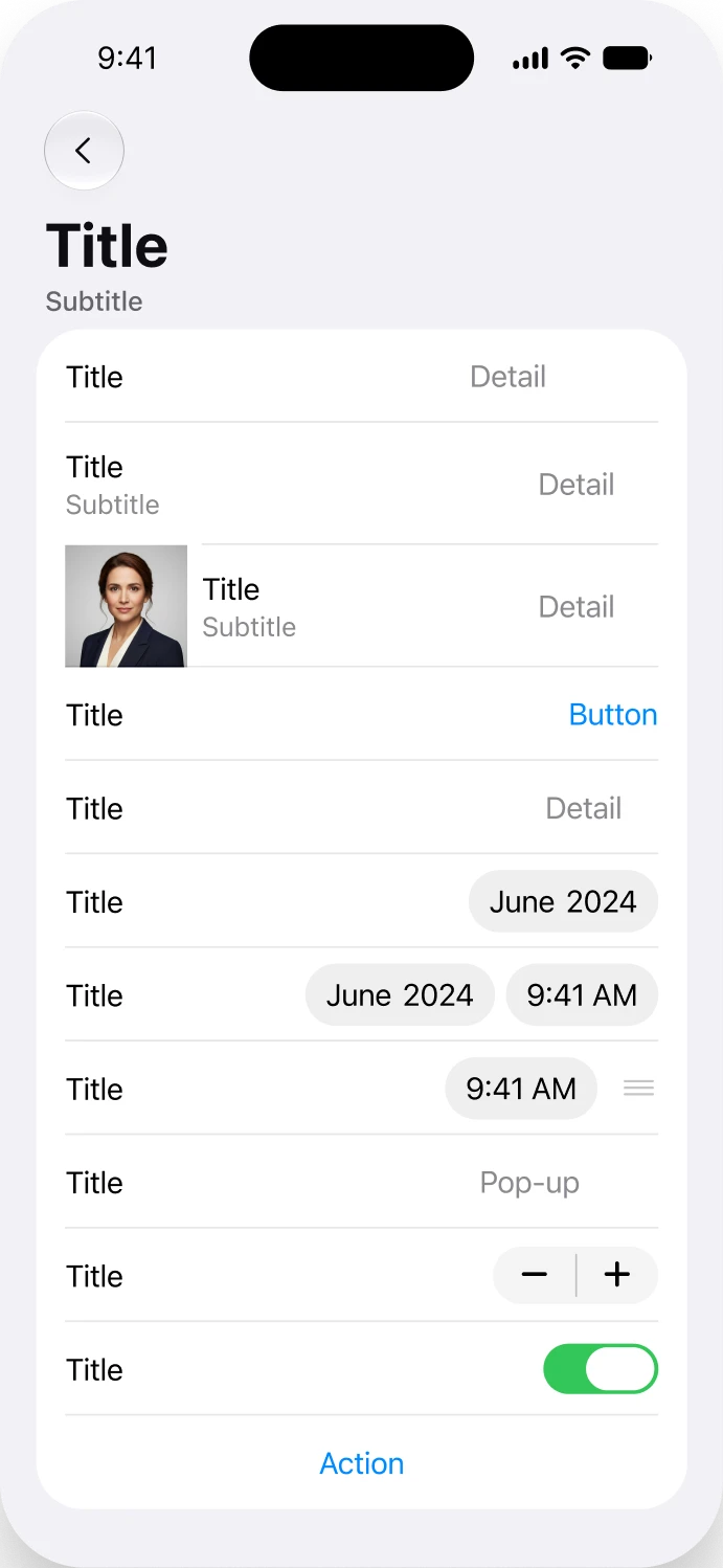
The native components are already in the file, wearing your colors and type. One dropdown puts everything back to the untouched platform baseline, so the accessibility behavior Apple and Google built stays exactly where it was.
Inside the file
The platform work is a live collection, not a folder of screenshots.
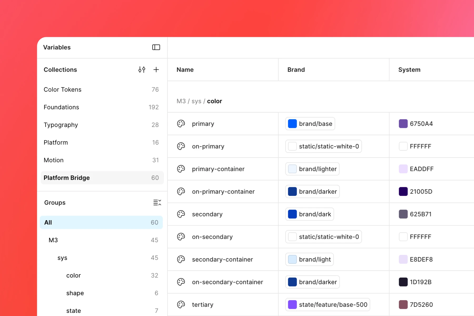
Two mirrors and the bridge between them. The mirrors bind to the bridge, never to your tokens directly, which is what makes one dropdown enough to put everything back.
Apple, iOS 26
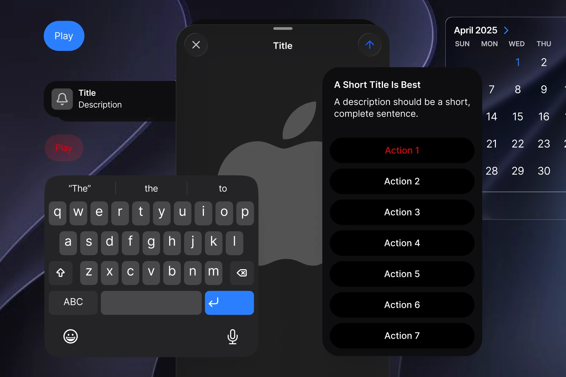
Fifteen system colors carrying real values in both modes, mapped so your accent lands where Apple intends an accent to land. Navigation, sheets, alerts and controls read from those roles rather than from a flat hex.
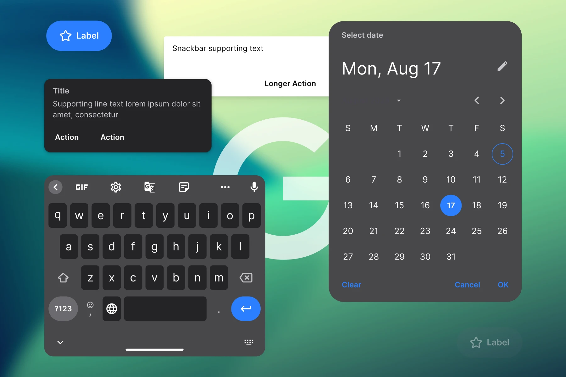
Google, Material 3
Thirty two Material color roles mapped to your brand. Material was designed to be recolored, so this mirror goes further than the Apple one and still follows the publicly documented Material conventions.
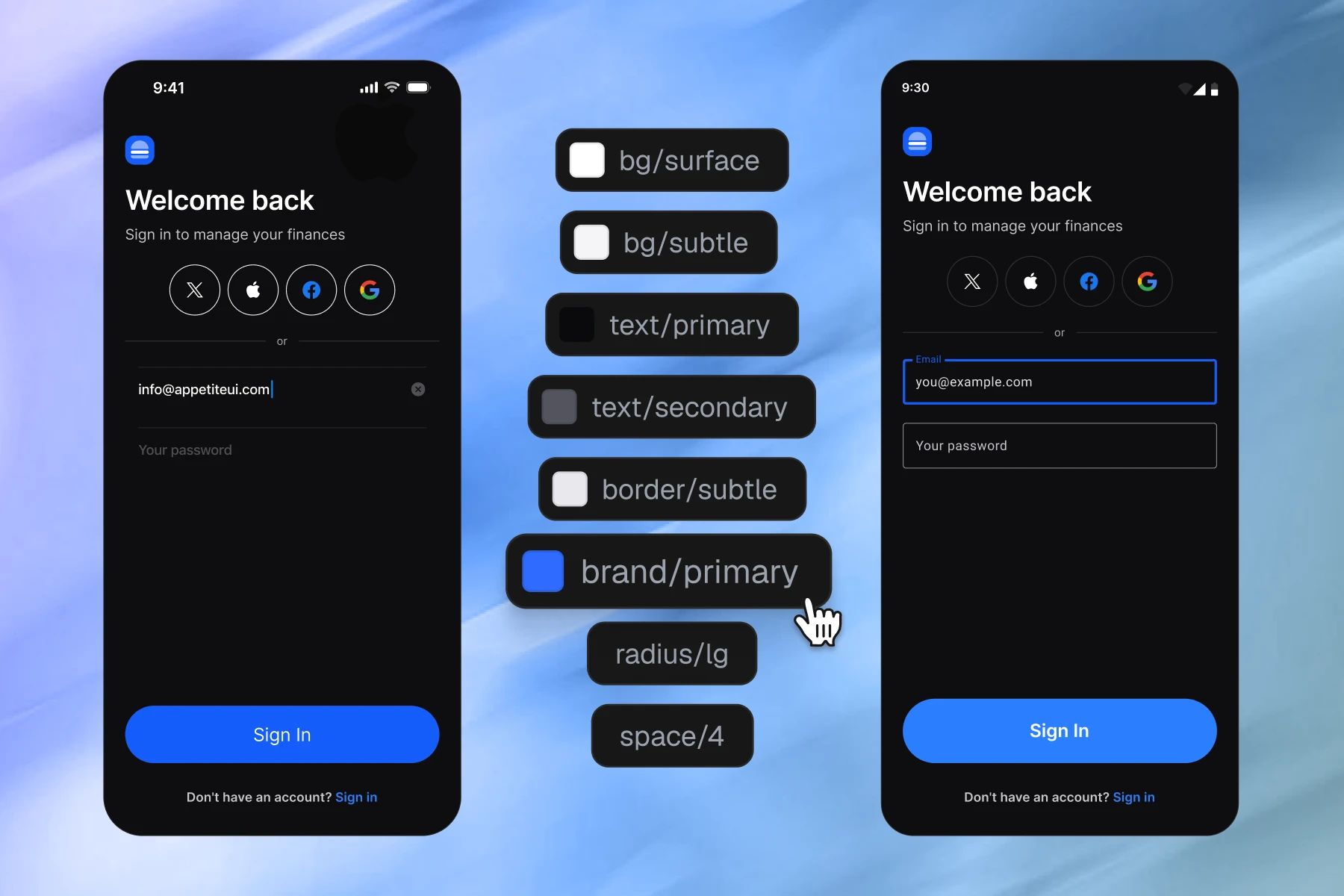
The Platform Bridge
A separate collection with two modes. Both mirrors bind to it rather than to your tokens, so switching the mode returns the whole file to the untouched platform defaults in one edit.
Limits
Where the branding stops, and why stopping is the point.
These are the places where the platform is doing work you cannot see, and taking them over would quietly break it.
System semantic colors
They shift with contrast settings, dark mode and vibrancy. Only the tint slot is safe to brand. Repainting label or background hands you an app that quietly ignores a user's accessibility preferences, and you will not see it happen on your own device.

Liquid Glass internals
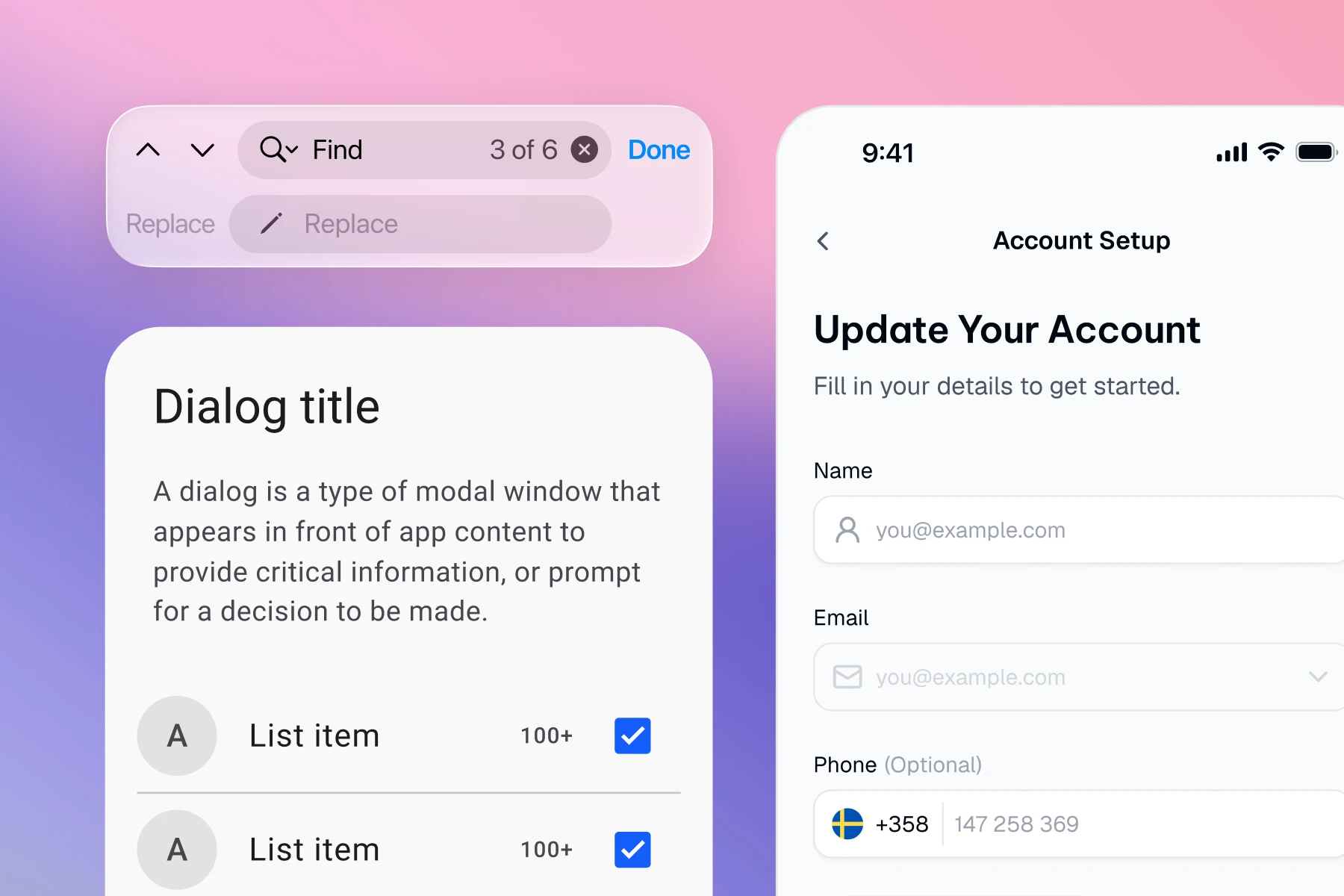
The material takes luminance and blend inputs, not a fill. A color pass over it produces something that looks correct in a static frame and wrong the moment anything moves behind it. There is no safe way to brand a material that is calculating.
Conventions and gestures
Back behavior, sheet heights, tap targets, where a primary action sits. Users learned these from the operating system, not from your product. Changing them buys you a distinctive screen and costs you a confused user, which is a bad trade every time.
Carrying real values is only worth doing if you are also honest about where they should stop.
Your next rebrand is one edit.
One-time payment, Lifetime updates, Unlimited client projects