Appetite UI Code
Ship an app that looks designed.
Appetite UI components in React Native, SwiftUI, Flutter and Jetpack Compose, with an App Starter and an agent kit. No Figma needed.
No stack yet? Start with React Native and Expo, where the App Starter lives.
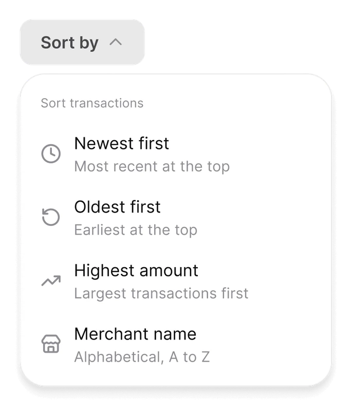
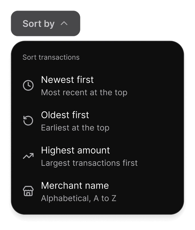
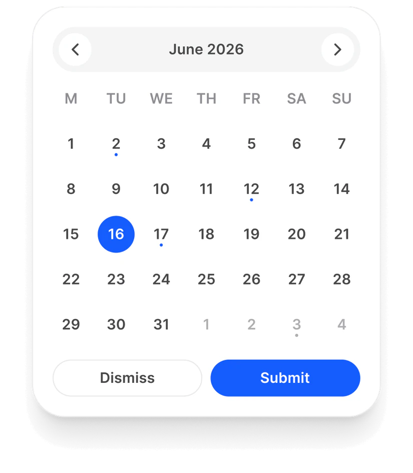
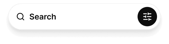
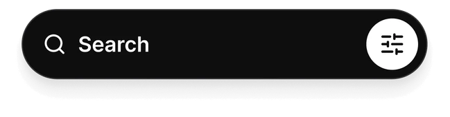
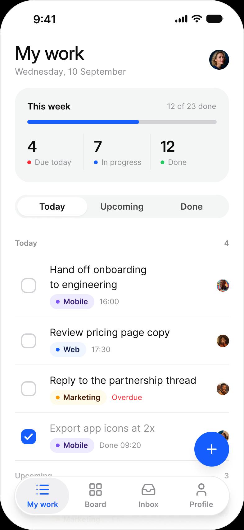
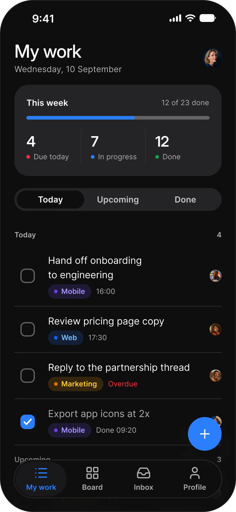
React Native: Segmented Control
// React Native
import { useState } from 'react';
import { SegmentedControl } from '@appetite-ui/SwiftUI: Segmented Control
// SwiftUI (AppetiteSegmentedControl.swift copied into the app target)
import SwiftUI
import AppetiteCore

struct RangePicker: View {
    @State private var range = "Week"

    var body: some View {
        AppetiteSegmentedControl(options: ["Day", "Week", "Month"], value: range, accessibilityLabel: "Range") { range = $0 }
    }
}
Flutter: Segmented Control
// Flutter
import 'package:appetite_ui/Compose: Segmented Control
// Jetpack Compose
@Composable
fun RangePicker() {
    var range by remember { mutableStateOf("Week") }
    AppetiteSegmentedControl(listOf("Day", "Week", "Month"), range, { range = it }, contentDescription = "Range")
}
4
Stacks: React Native, SwiftUI, Flutter and Jetpack Compose
41
Components in React Native
15
Core components in SwiftUI, Flutter and Compose
58
Expo SDK, React Native 0.88
3
App Starter flows: Tasks, Foodie and AI
Stacks
One folder per stack.
The same layout in every stack. React Native has every component. SwiftUI, Flutter and Compose start with the core set.
React Native with Expo
Folder:
react-native/Terminal cd starter npm install npx expo start41 components
SwiftUI
Folder:
swiftui/Xcode File > Add Package Dependencies > Add Local15 core components
Flutter
Folder:
flutter/Terminal flutter pub get15 core components
Jetpack Compose
Folder:
compose/build.gradle.kts implementation(project( ":components")) 15 core components
Agent kit
Your agent builds with the components.
Give Claude Code or Cursor the agent kit and a prompt. It builds the screen from Appetite UI components and tokens, with no hardcoded values.
Attach AGENTS.md and ask for the screen.
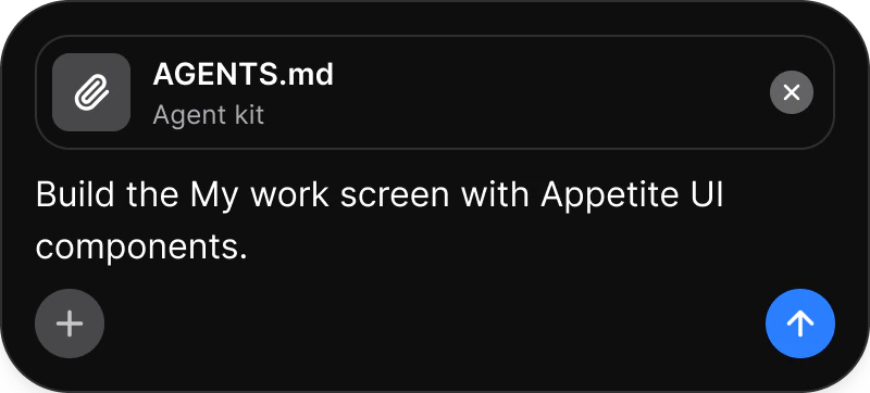
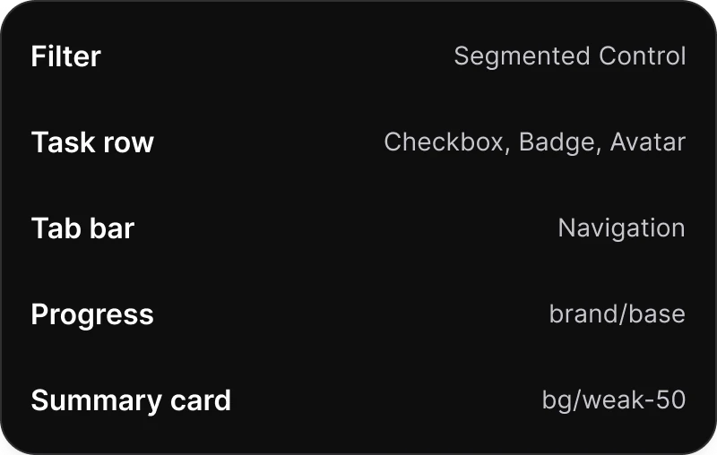
It maps the screen to components.
You get the finished screen.
App Starter
Start from working flows.
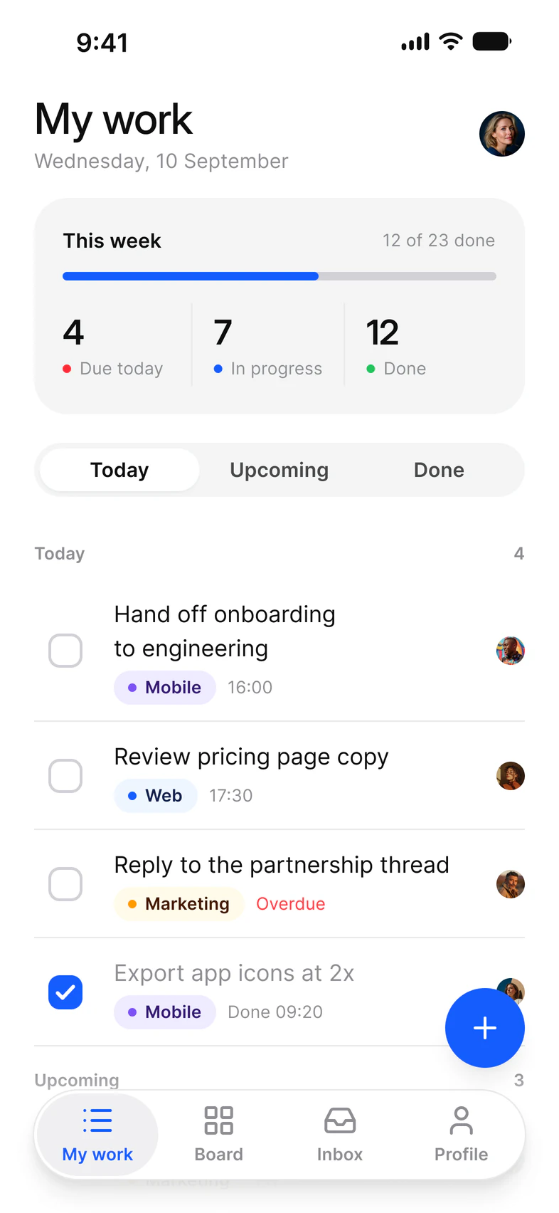
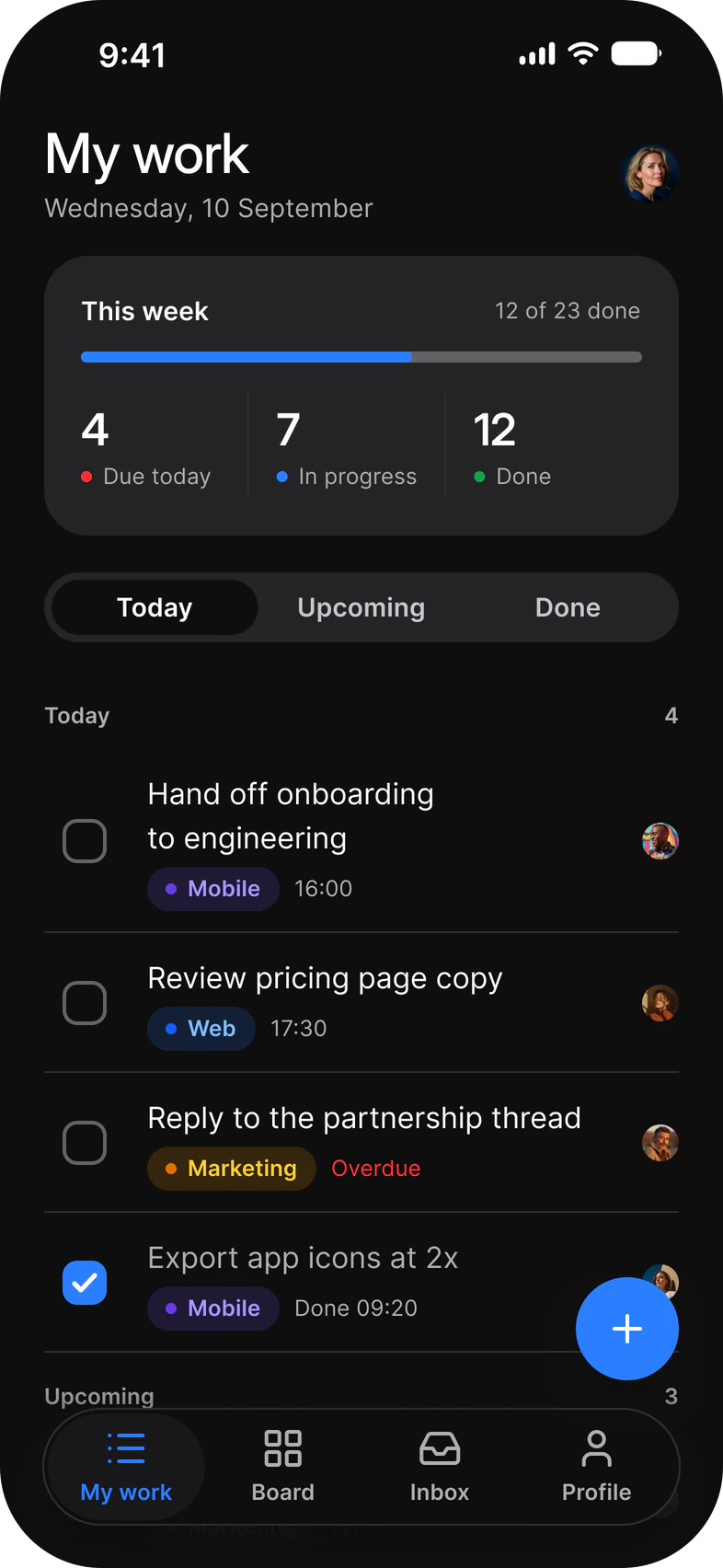
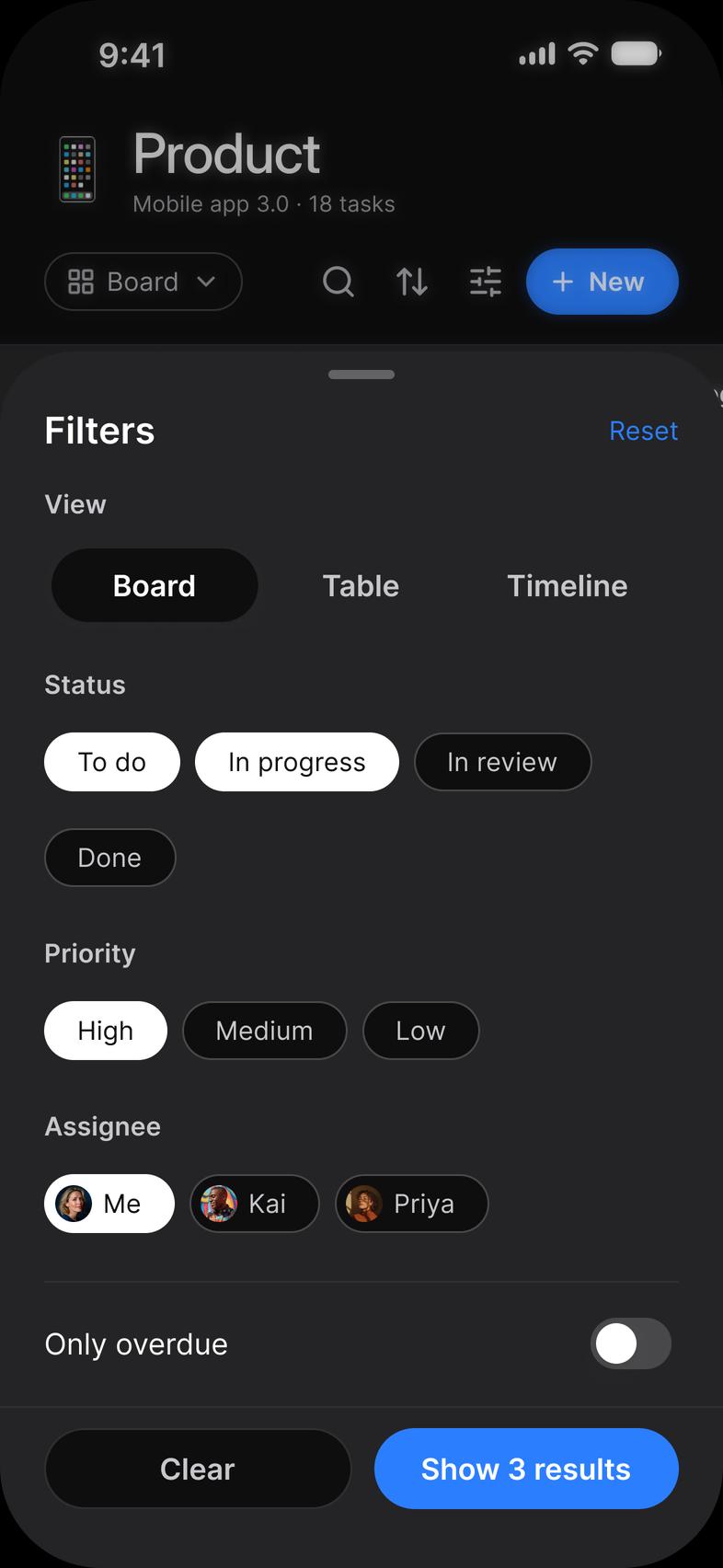
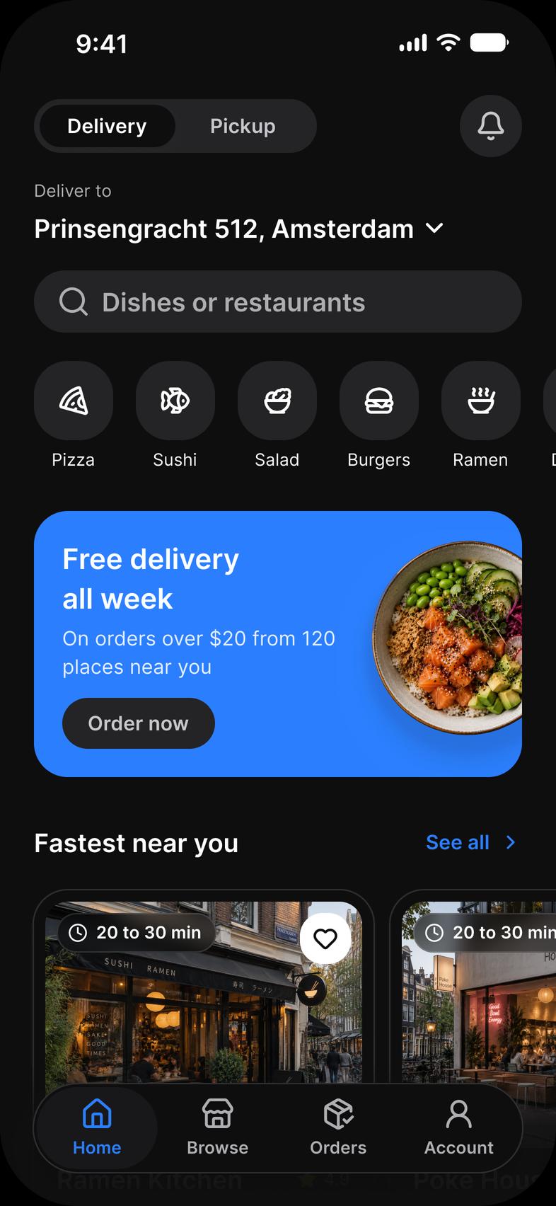
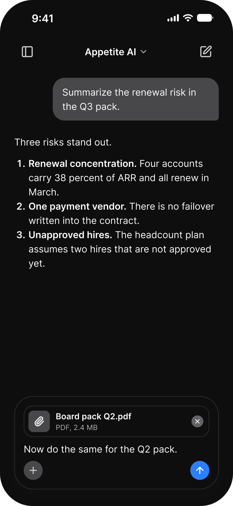
Tasks, Foodie and AI flows on Expo Router, in light and dark mode. Open the App Starter on your phone with Expo Go.
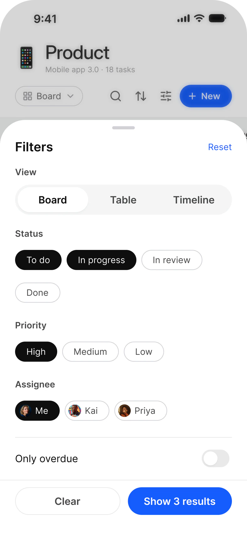
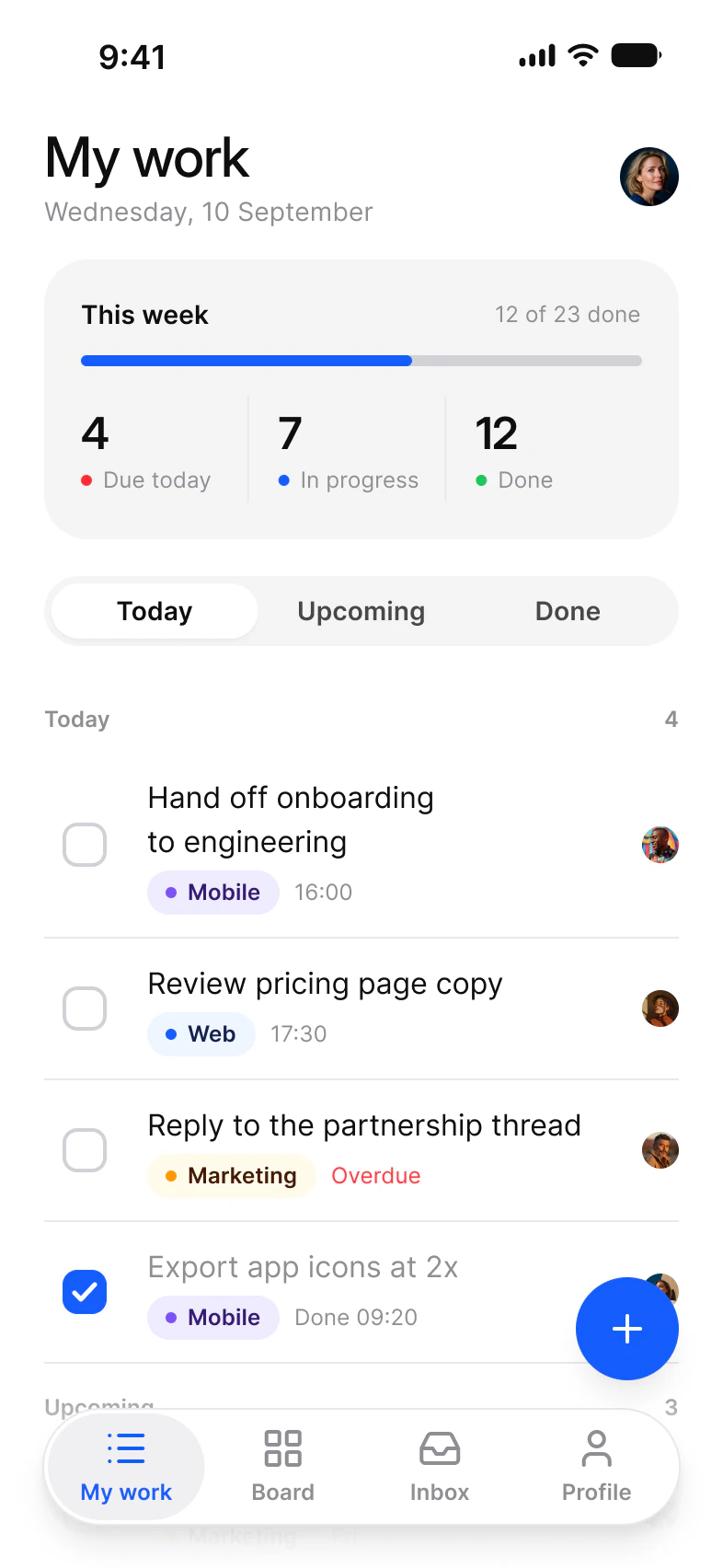
Tasks. My work, the board, a task, a new task and the filters.
- My work
- Board
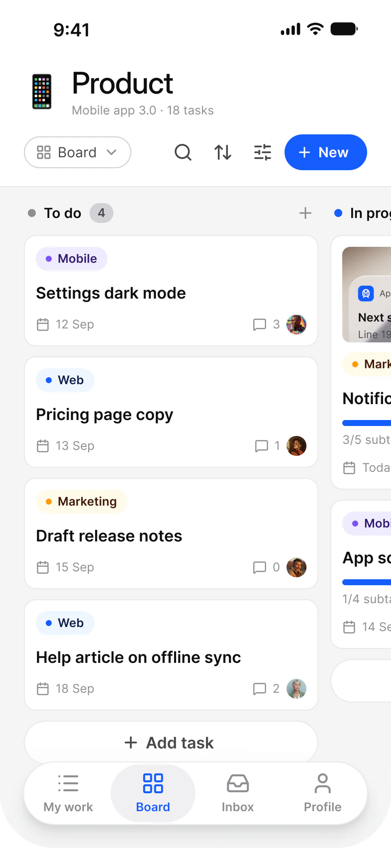
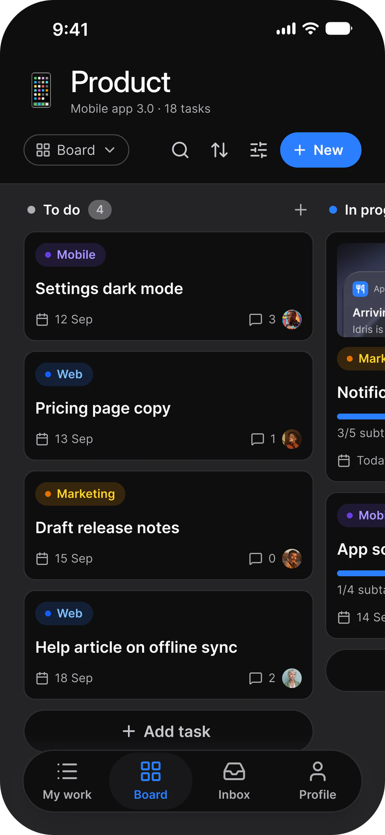
- Task
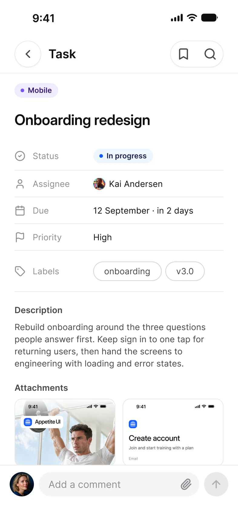
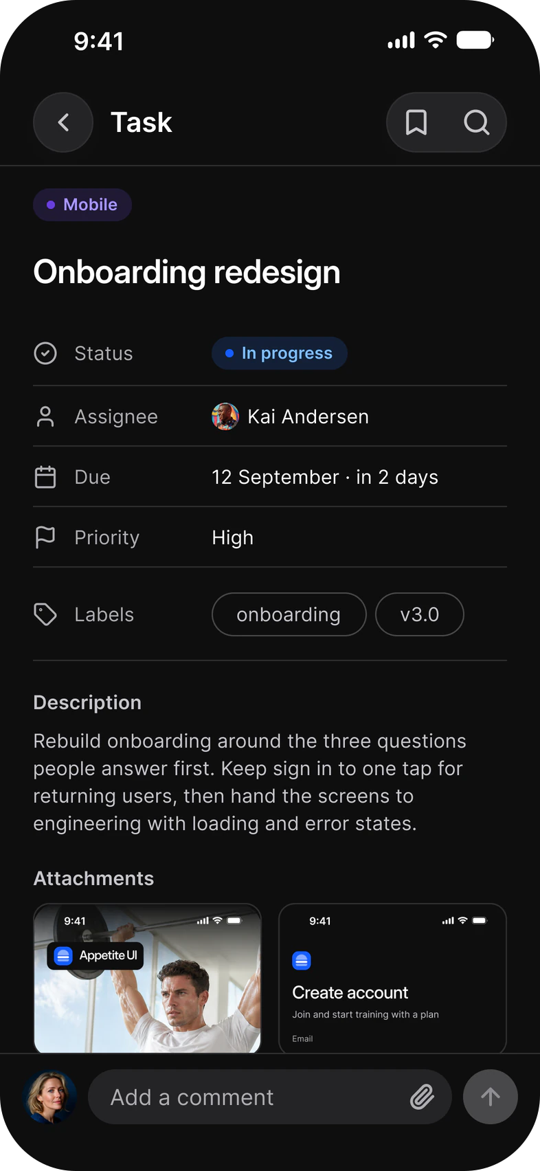
- Filters
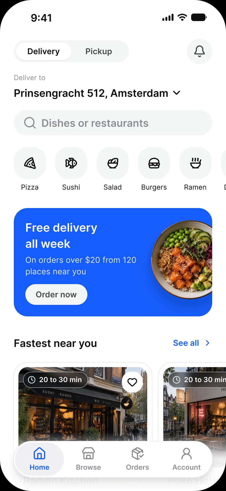
Foodie. Home, a restaurant, a dish, the cart, checkout and the courier on the way.
- Home
- Restaurant
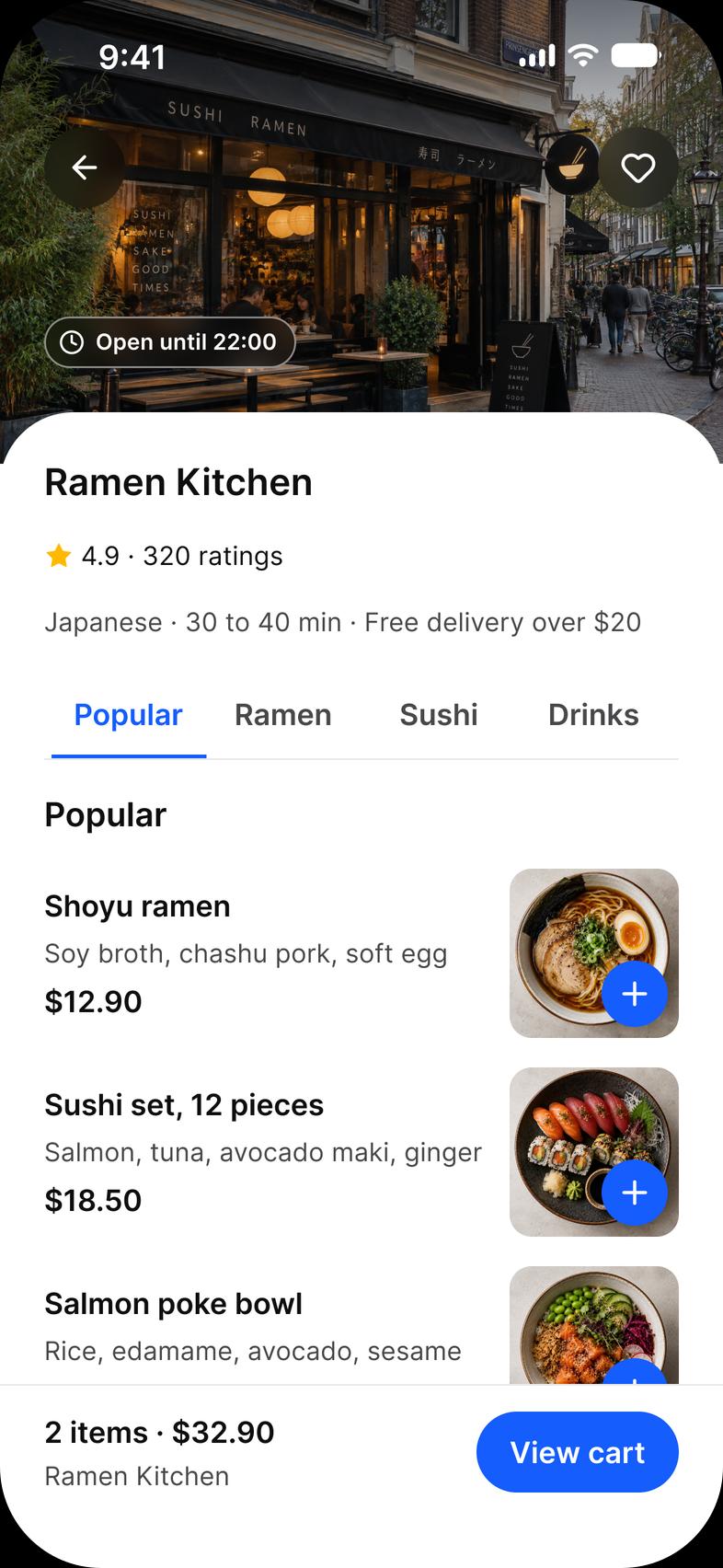
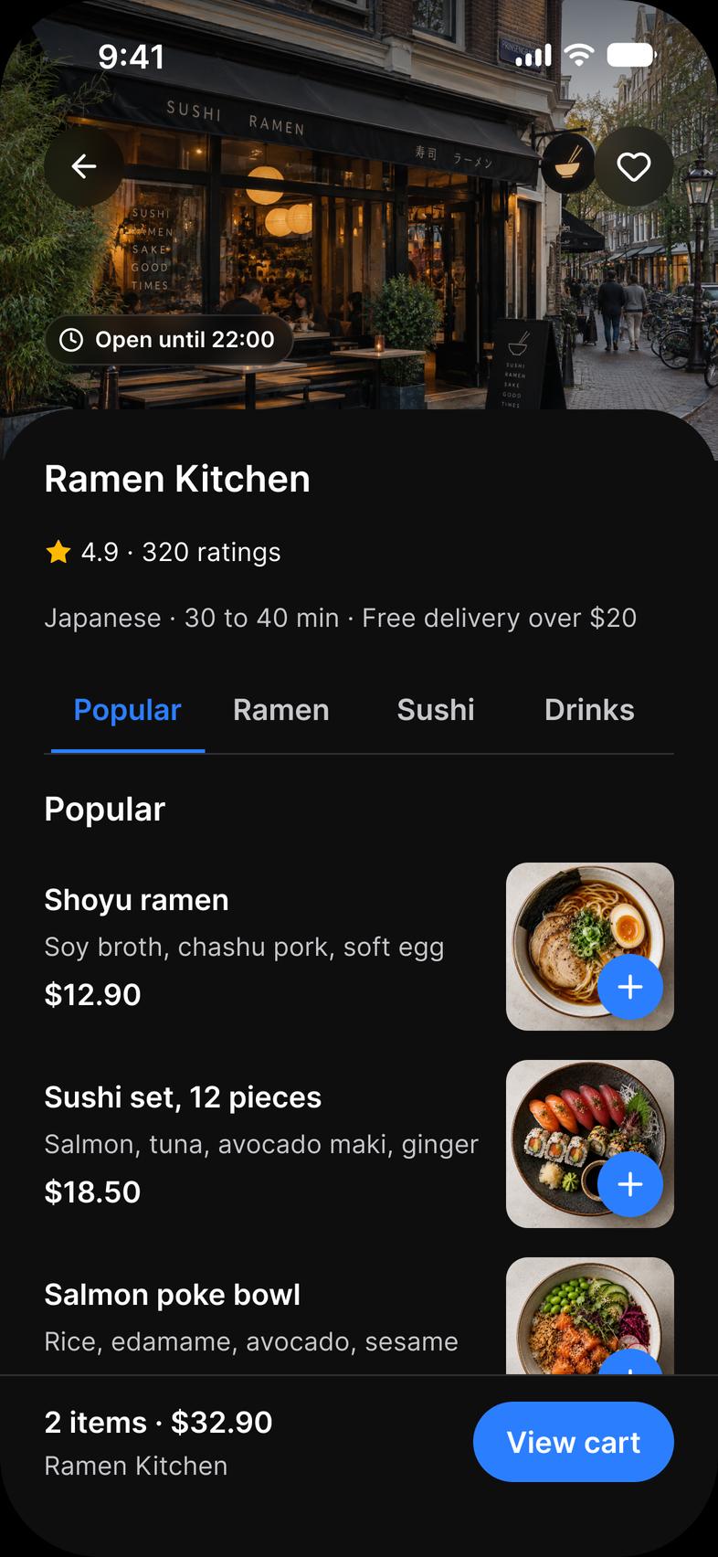
- Dish
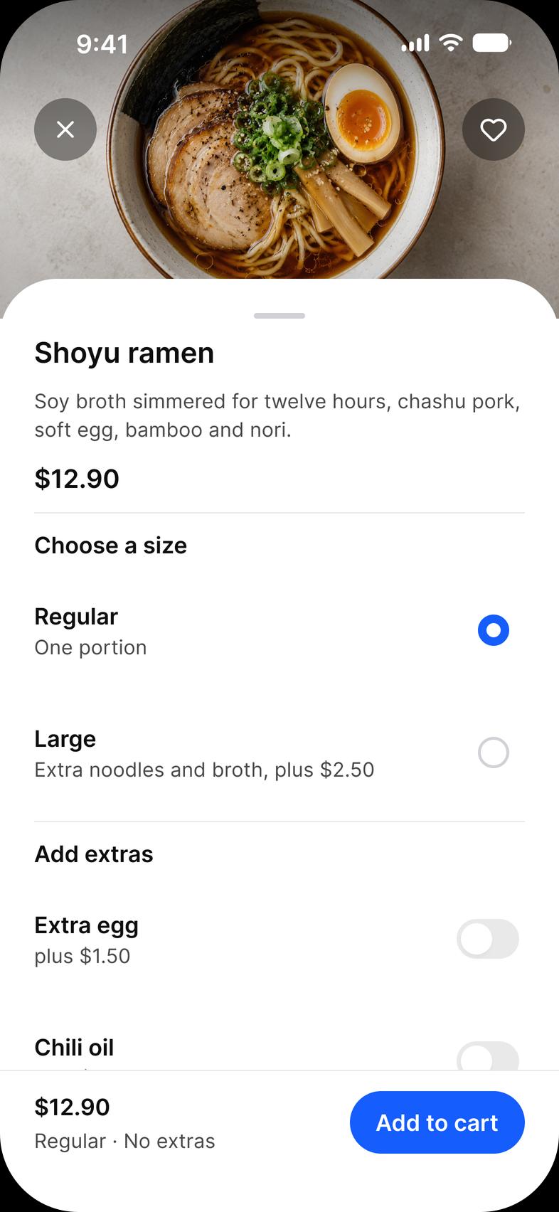
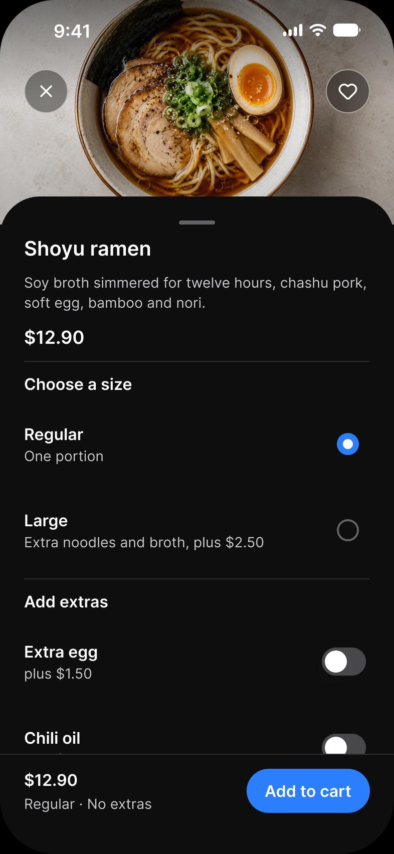
- Tracking
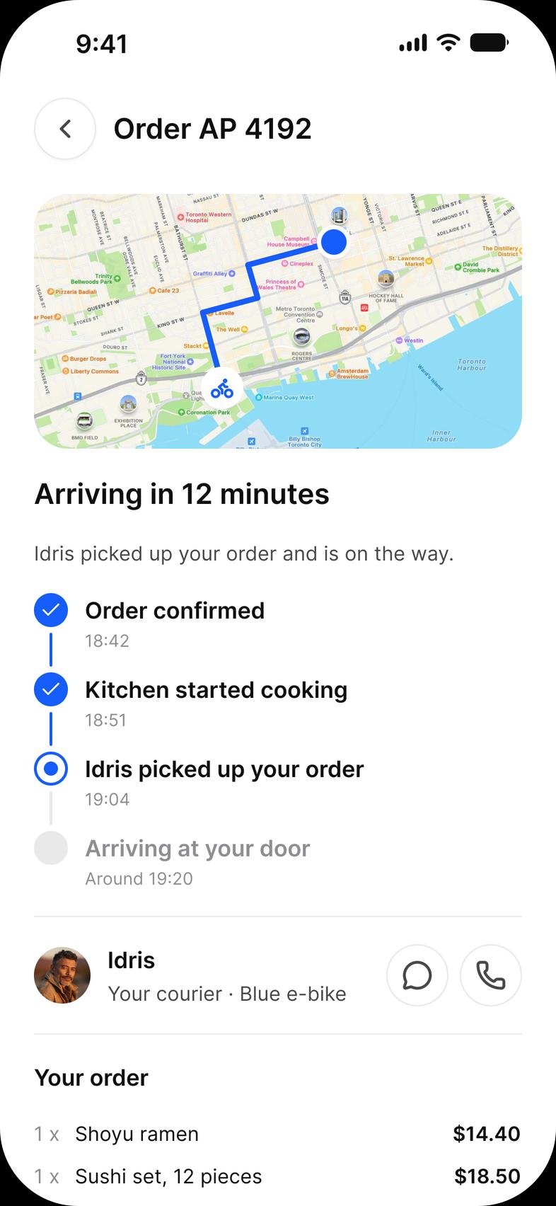
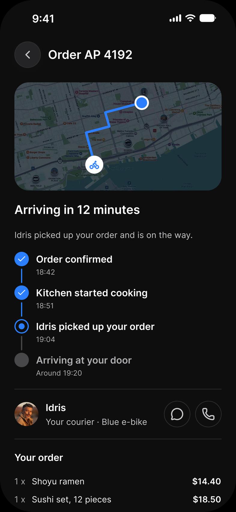
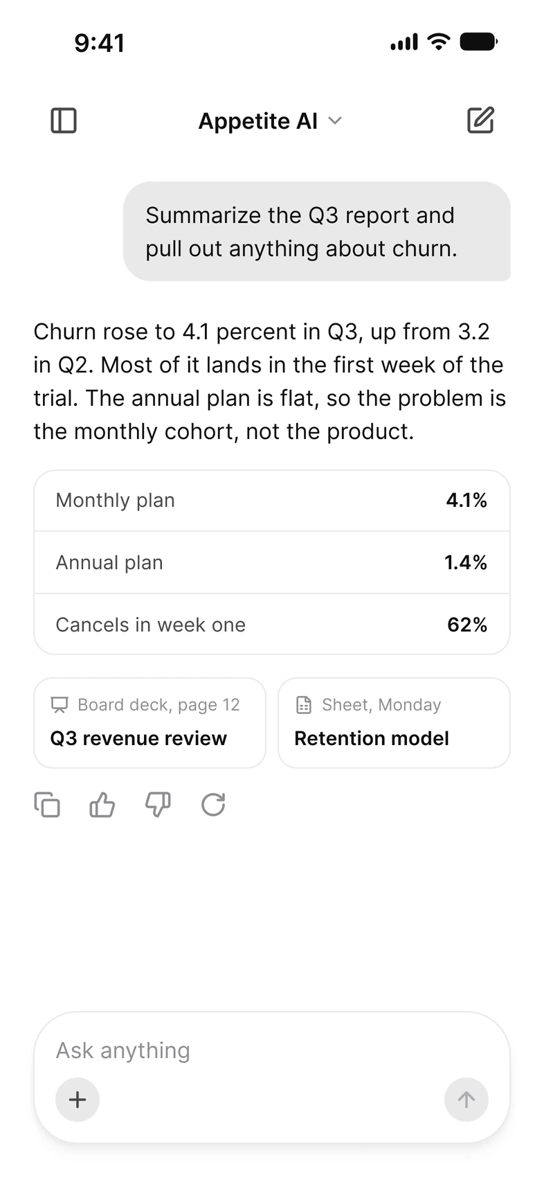
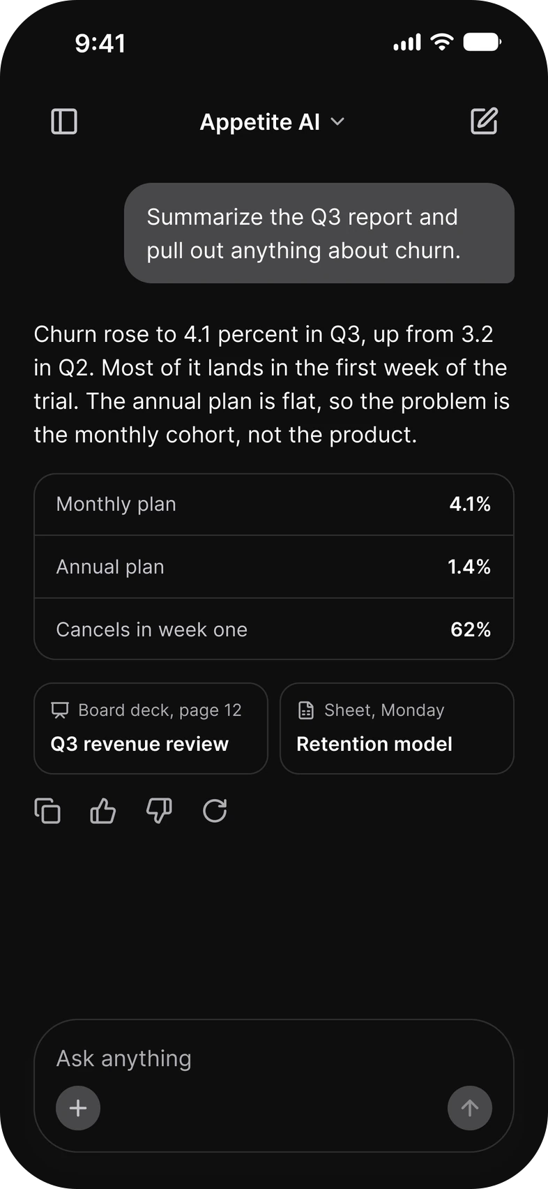
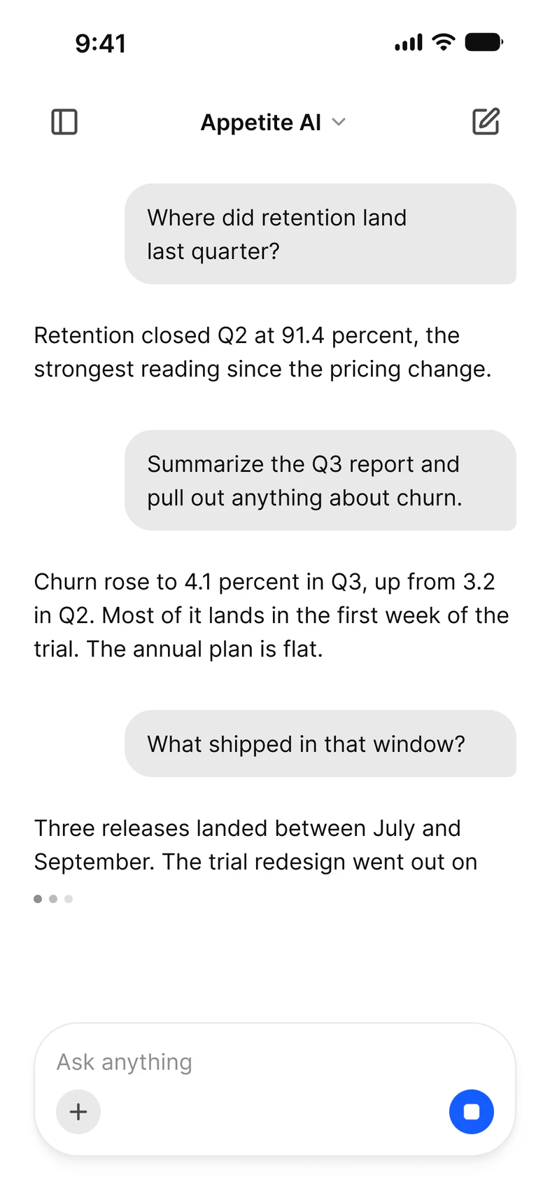
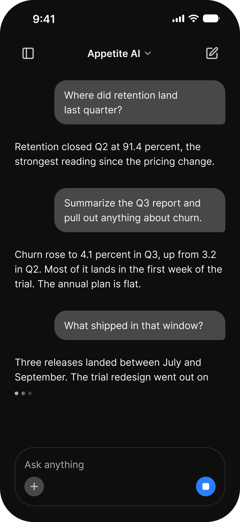
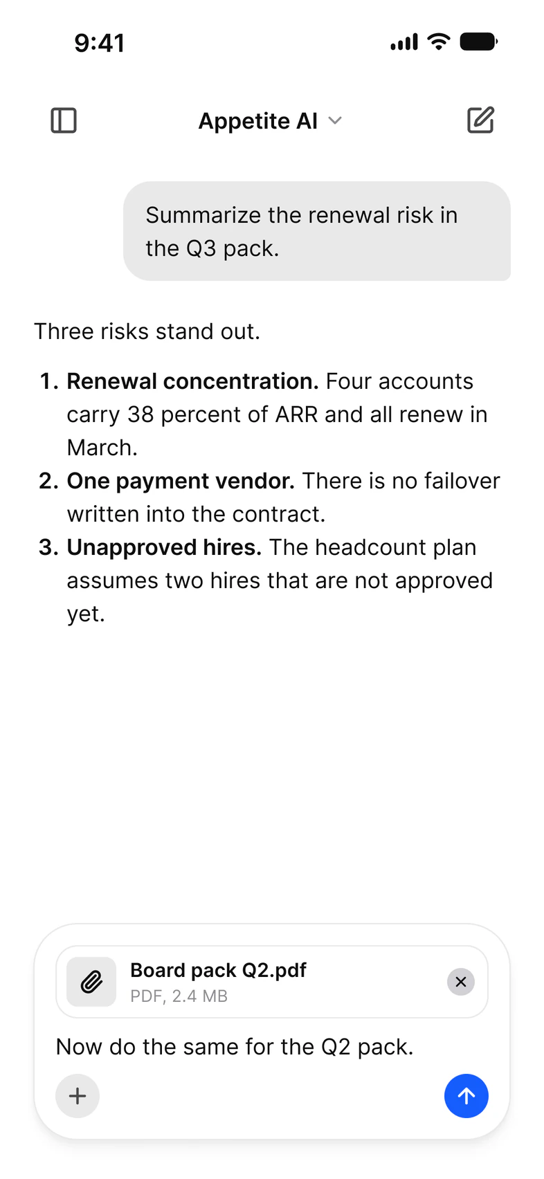
AI. A new chat, an answer with a table and sources, a streaming reply, an attachment, an error and the history.
- New chat
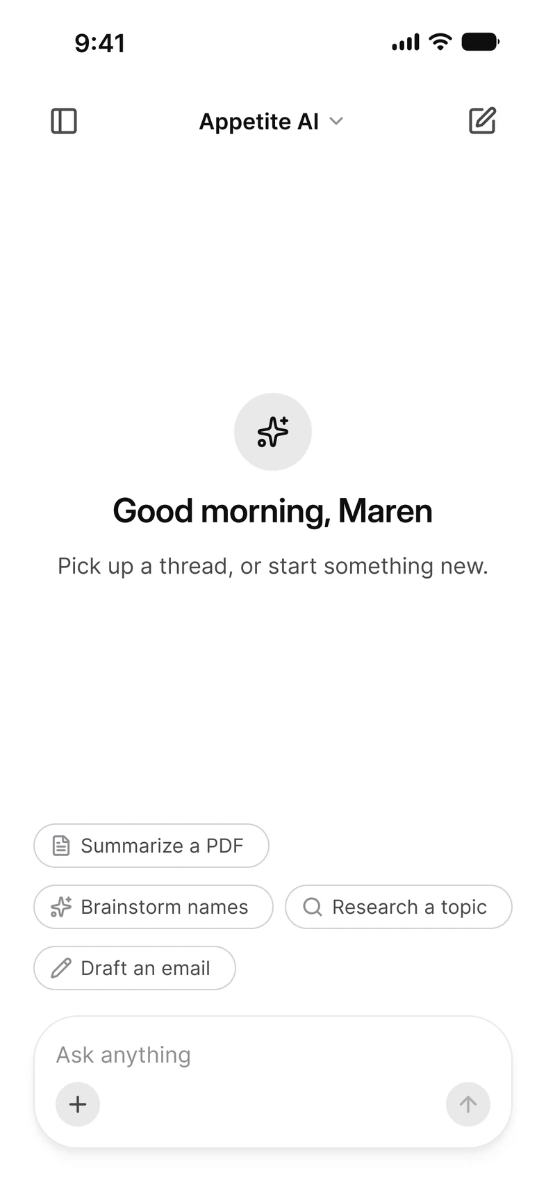
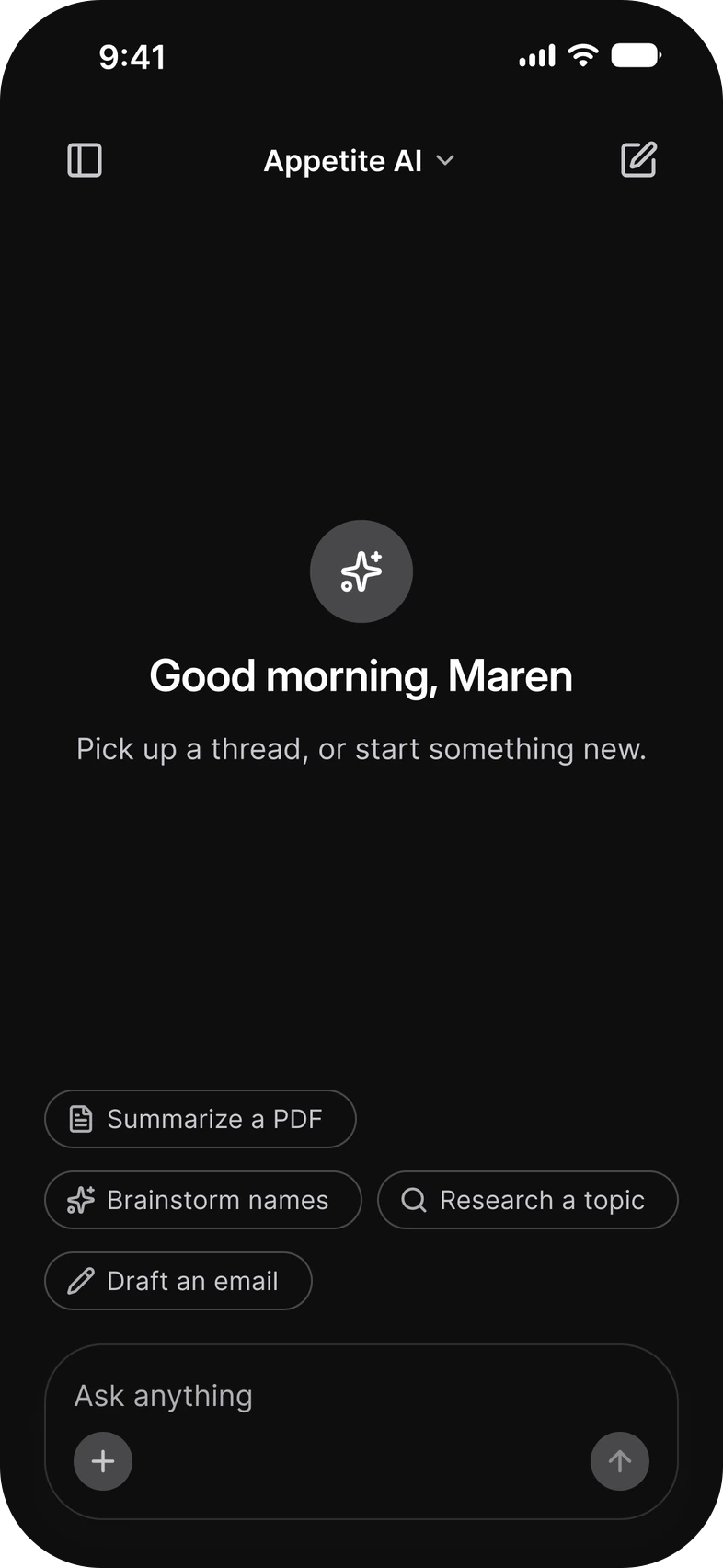
- Thread
- Generating
- Attachment
Rebrand
Rebrand in one theme file.
Set the brand color, radius and font in one theme file. Every component and the App Starter follow.
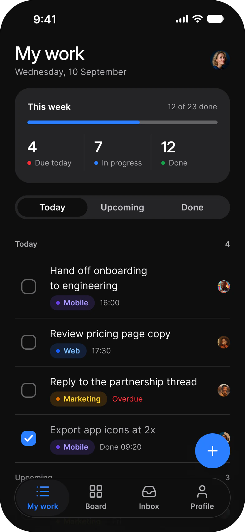
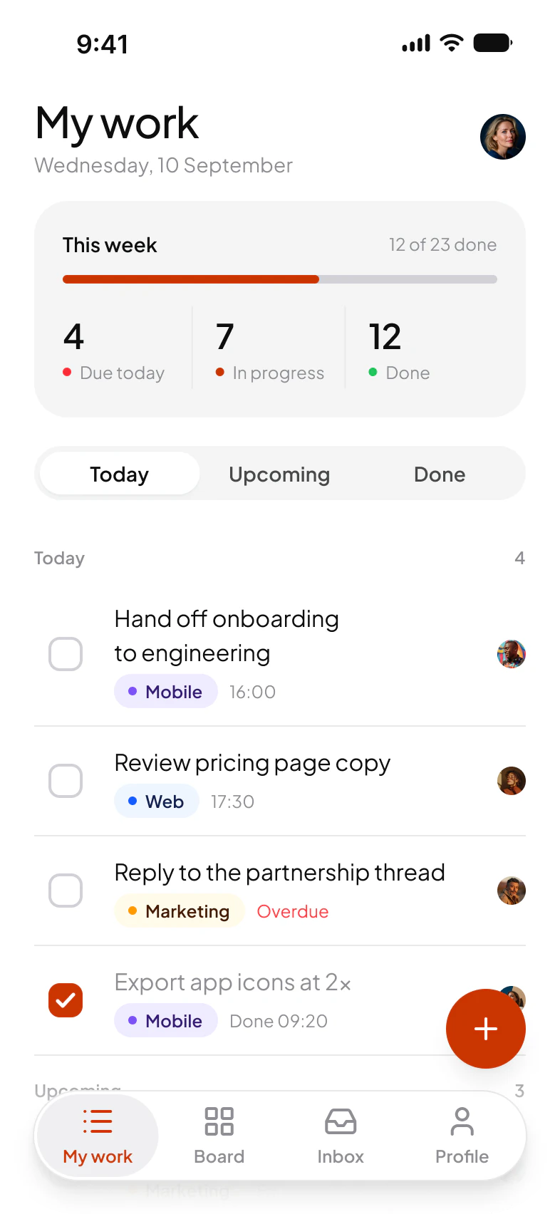
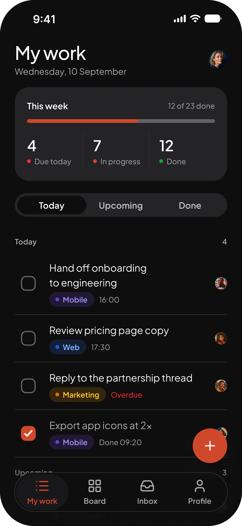
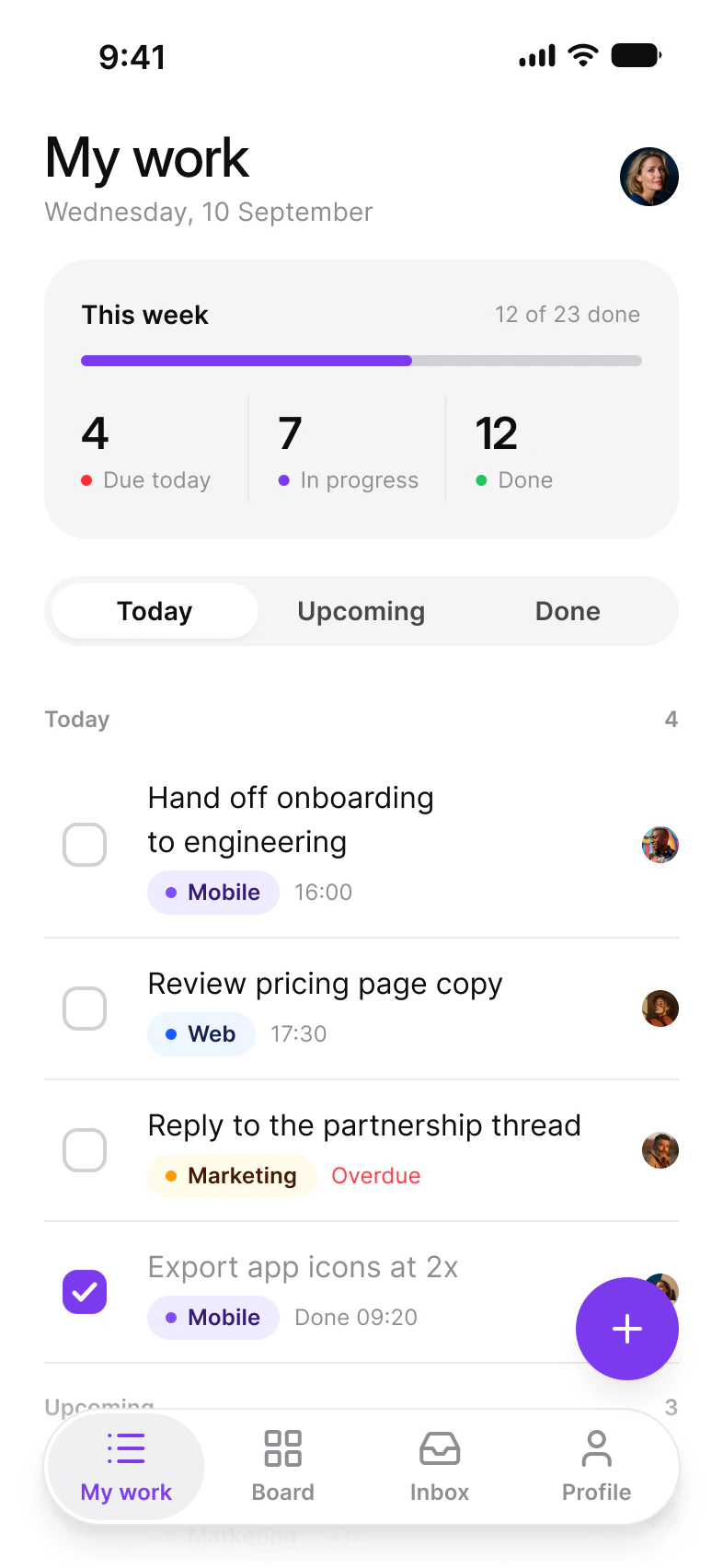
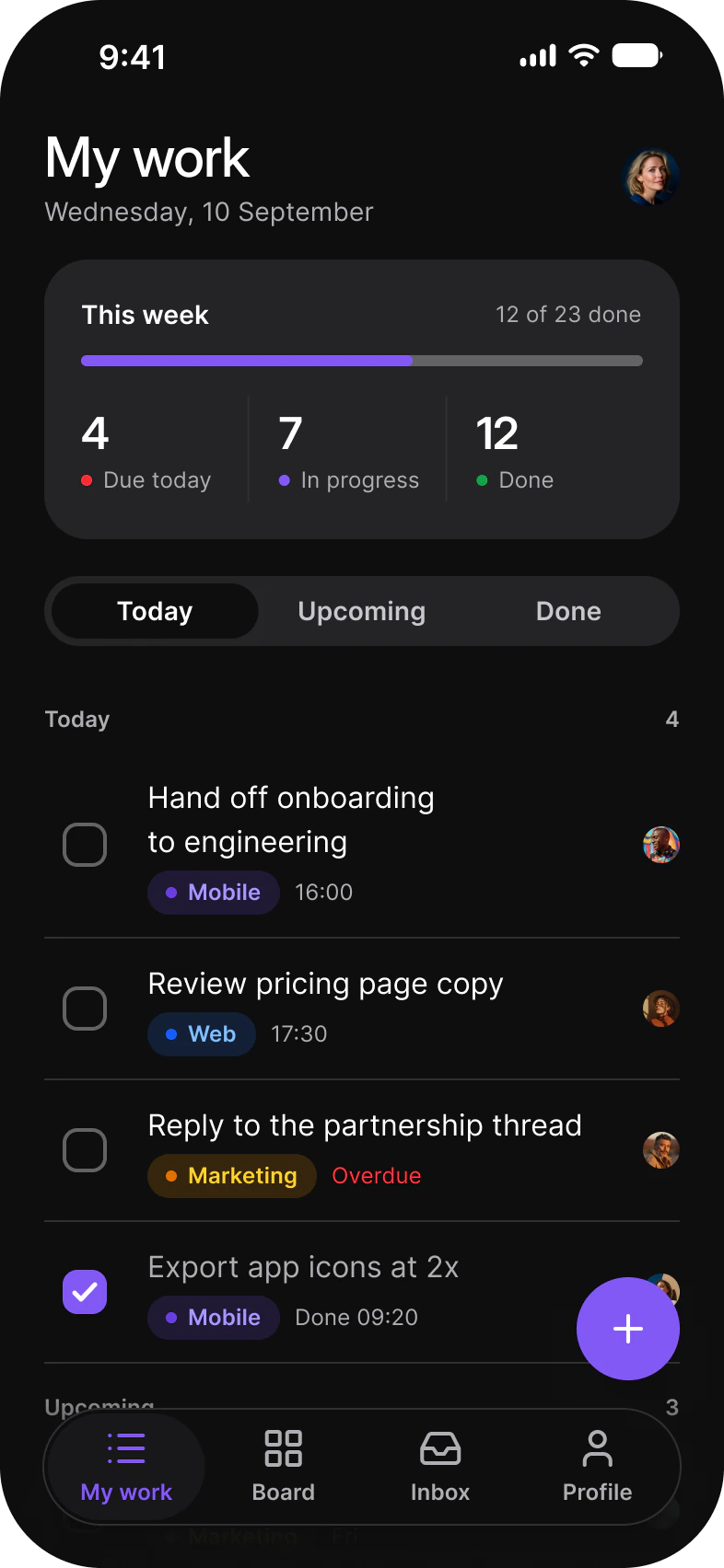
brand #CA3500font Plus Jakarta SansradiusScale 1
React Native: the brand
import type { AppetiteBrand } from '@appetite-ui/import type { AppetiteBrand } from '@appetite-ui/import type { AppetiteBrand } from '@appetite-ui/SwiftUI: the brand
let defaultBrand = AppetiteBrand(
    color: "#155dfc",
    radiusScale: 1,
    bodyFont: "Inter",
    headingFont: "Inter Display"
)

ContentView()
    .appetiteTheme(brand: defaultBrand)
let orangeBrand = AppetiteBrand(
color: "#ca3500",
radiusScale: 1,
bodyFont: "Plus Jakarta Sans",
headingFont: "Plus Jakarta Sans",
fontFiles: [
"Plus Jakarta Sans": AppetiteBrandFontFamily(
faces: [400: "PlusJakartaSans-Regular", 500: "PlusJakartaSans-Medium", 600: "PlusJakartaSans-SemiBold"],
ascender: 1.038,
descender: 0.222
),
]
)
ContentView()
.appetiteTheme(brand: orangeBrand)let violetBrand = AppetiteBrand(
color: "#7c3aed",
radiusScale: 1,
bodyFont: "Inter",
headingFont: "Inter Display"
)
ContentView()
.appetiteTheme(brand: violetBrand)Flutter: the brand
const defaultBrand = AppetiteBrand(
  color: '#155dfc',
  radiusScale: 1,
  fonts: AppetiteBrandFonts(body: 'Inter', heading: 'Inter Display'),
);

AppetiteScope(brand: defaultBrand, child: MyApp())
const orangeBrand = AppetiteBrand(
color: '#ca3500',
radiusScale: 1,
fonts: AppetiteBrandFonts(body: 'Plus Jakarta Sans', heading: 'Plus Jakarta Sans'),
fontWeights: {
'Plus Jakarta Sans': {400, 500, 600},
},
);
AppetiteScope(brand: orangeBrand, child: MyApp())const violetBrand = AppetiteBrand(
color: '#7c3aed',
radiusScale: 1,
fonts: AppetiteBrandFonts(body: 'Inter', heading: 'Inter Display'),
);
AppetiteScope(brand: violetBrand, child: MyApp())Compose: the brand
val DefaultBrand = AppetiteBrand(
    color = "#155dfc",
    radiusScale = 1f,
    fonts = AppetiteBrandFonts(body = "Inter", heading = "Inter Display"),
)

AppetiteTheme(brand = DefaultBrand) { MyApp() }
val OrangeBrand = AppetiteBrand(
color = "#ca3500",
radiusScale = 1f,
fonts = AppetiteBrandFonts(body = "Plus Jakarta Sans", heading = "Plus Jakarta Sans"),
fontFamilies = mapOf(
"Plus Jakarta Sans" to FontFamily(
Font(R.font.plus_jakarta_sans_regular, FontWeight.W400),
Font(R.font.plus_jakarta_sans_medium, FontWeight.W500),
Font(R.font.plus_jakarta_sans_semibold, FontWeight.W600),
),
),
)
AppetiteTheme(brand = OrangeBrand) { MyApp() }val VioletBrand = AppetiteBrand(
color = "#7c3aed",
radiusScale = 1f,
fonts = AppetiteBrandFonts(body = "Inter", heading = "Inter Display"),
)
AppetiteTheme(brand = VioletBrand) { MyApp() }With Figma
Same names as the Figma kit.
Variants in the Figma file are props in the code. If your designer works in Figma, both of you read one system.


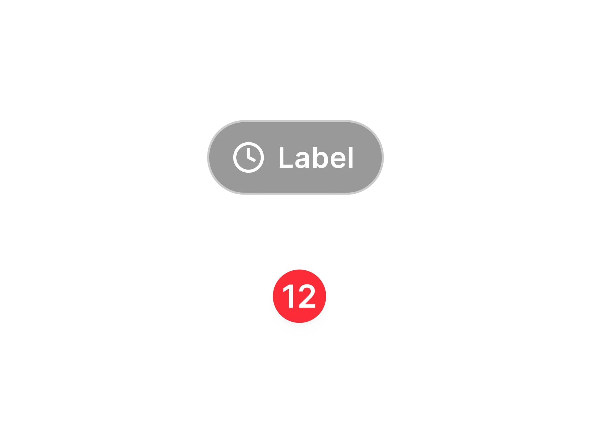
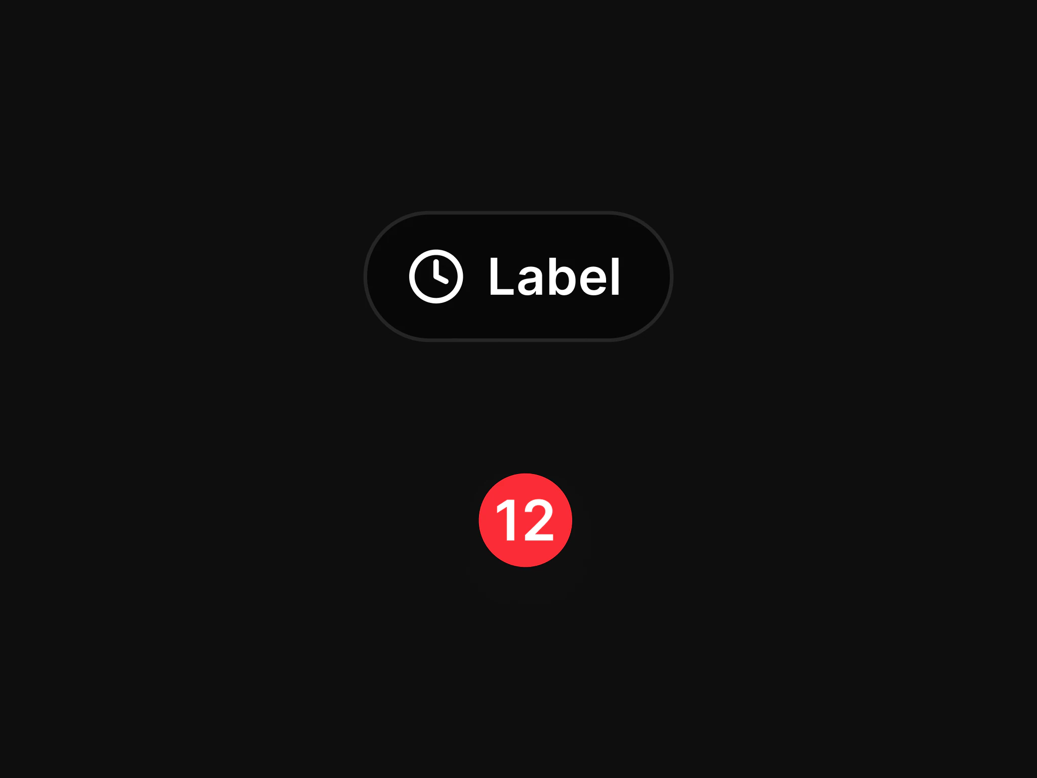
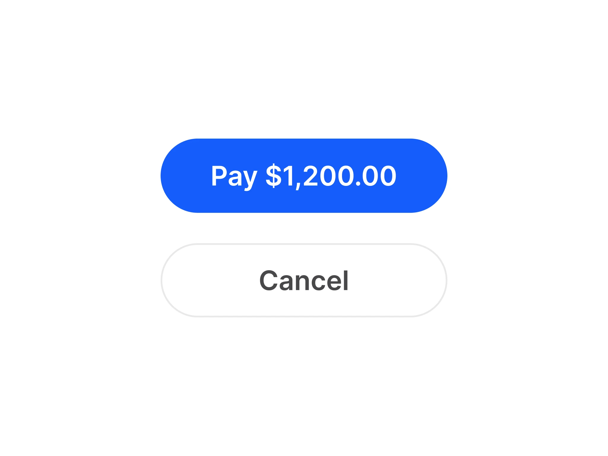

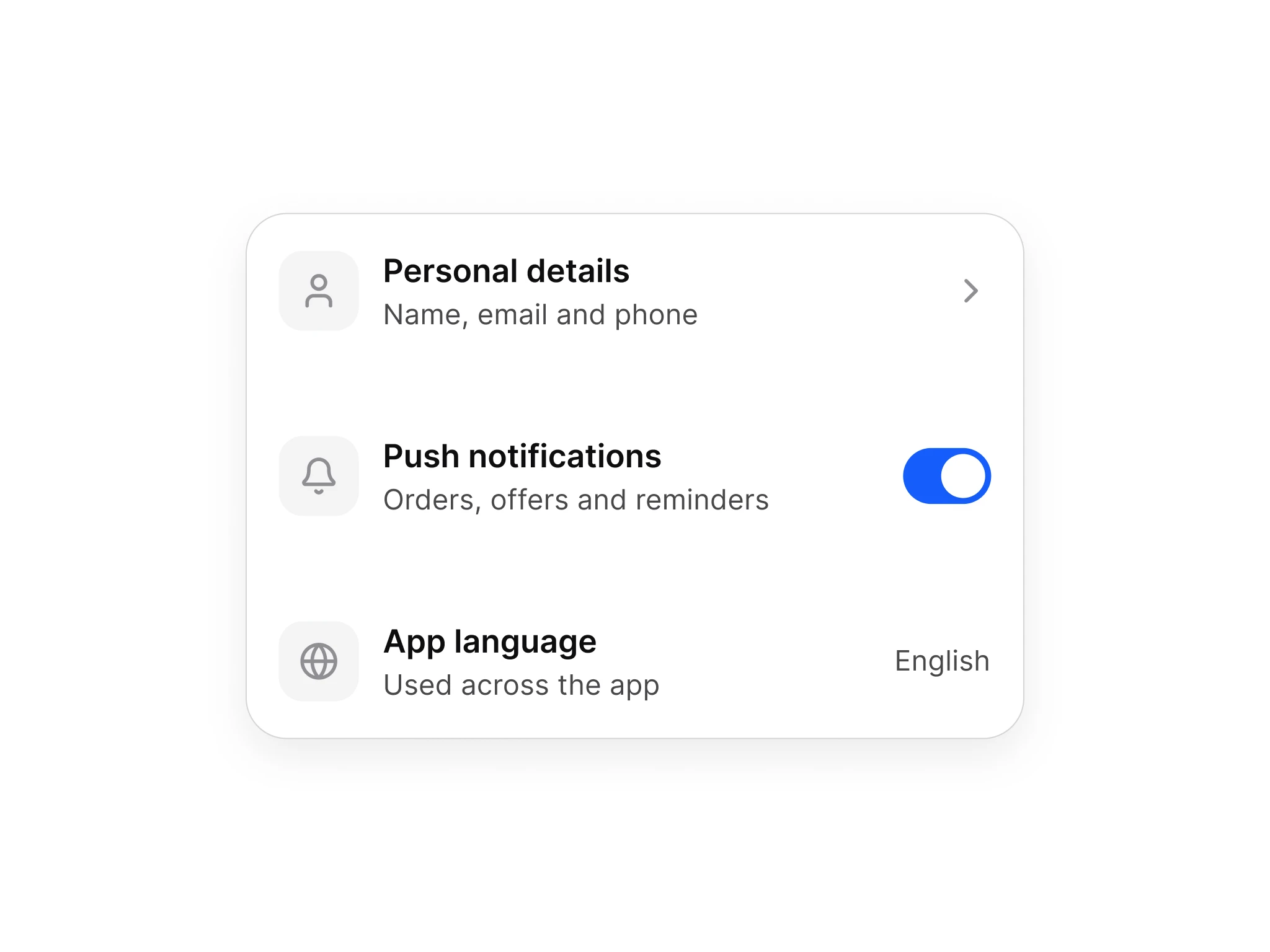
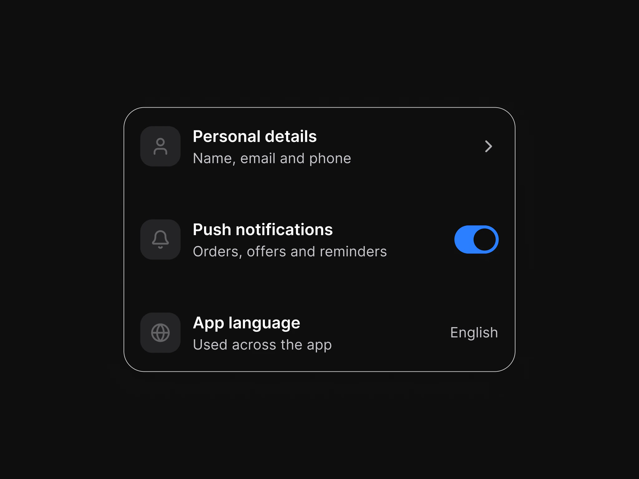
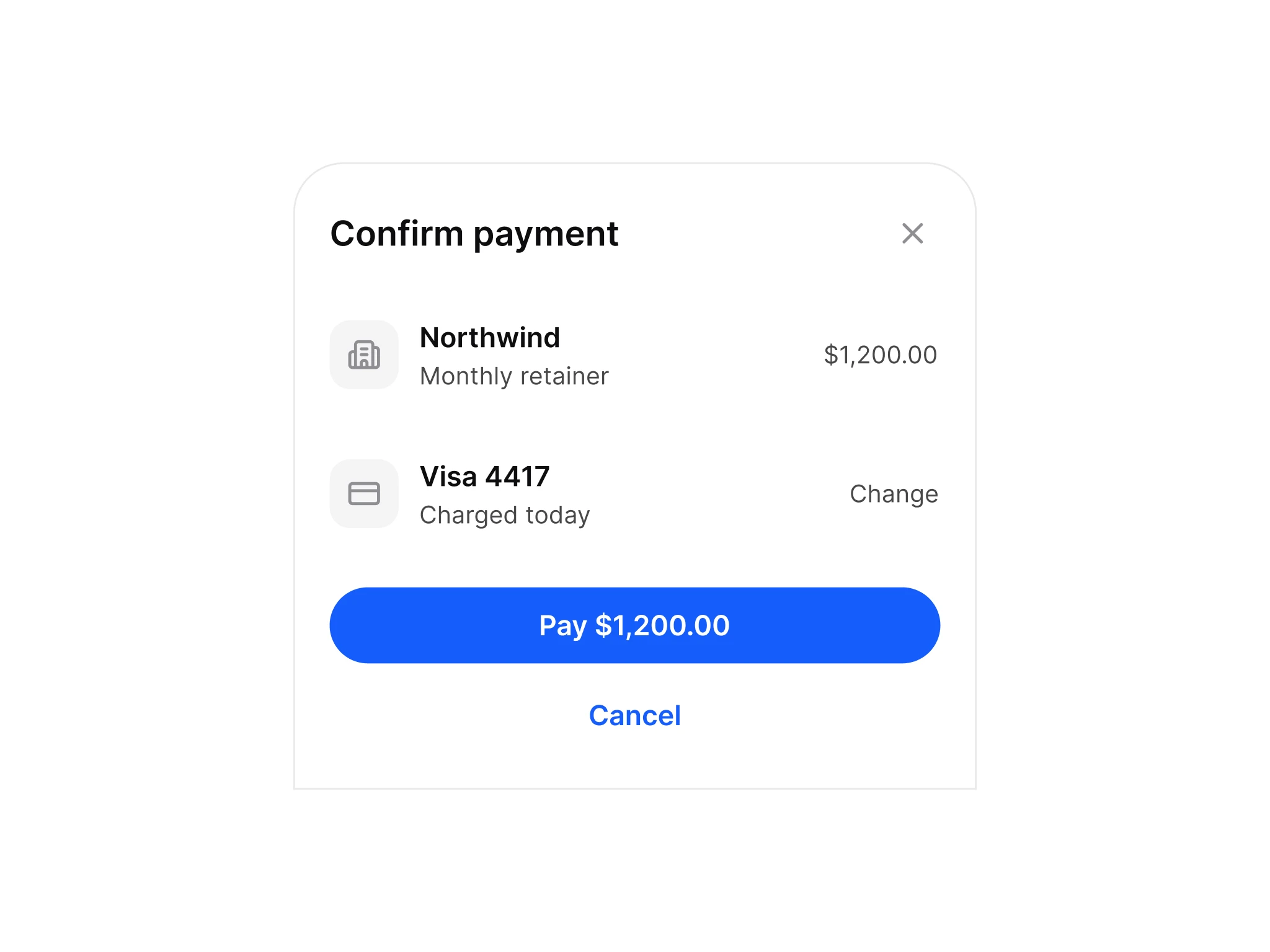
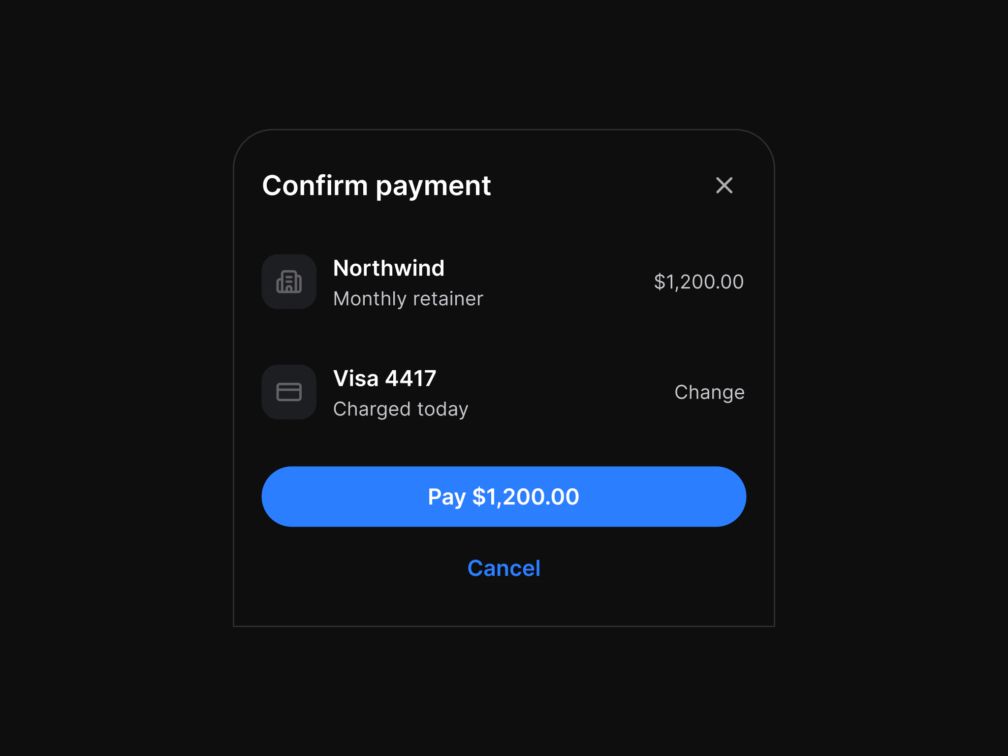
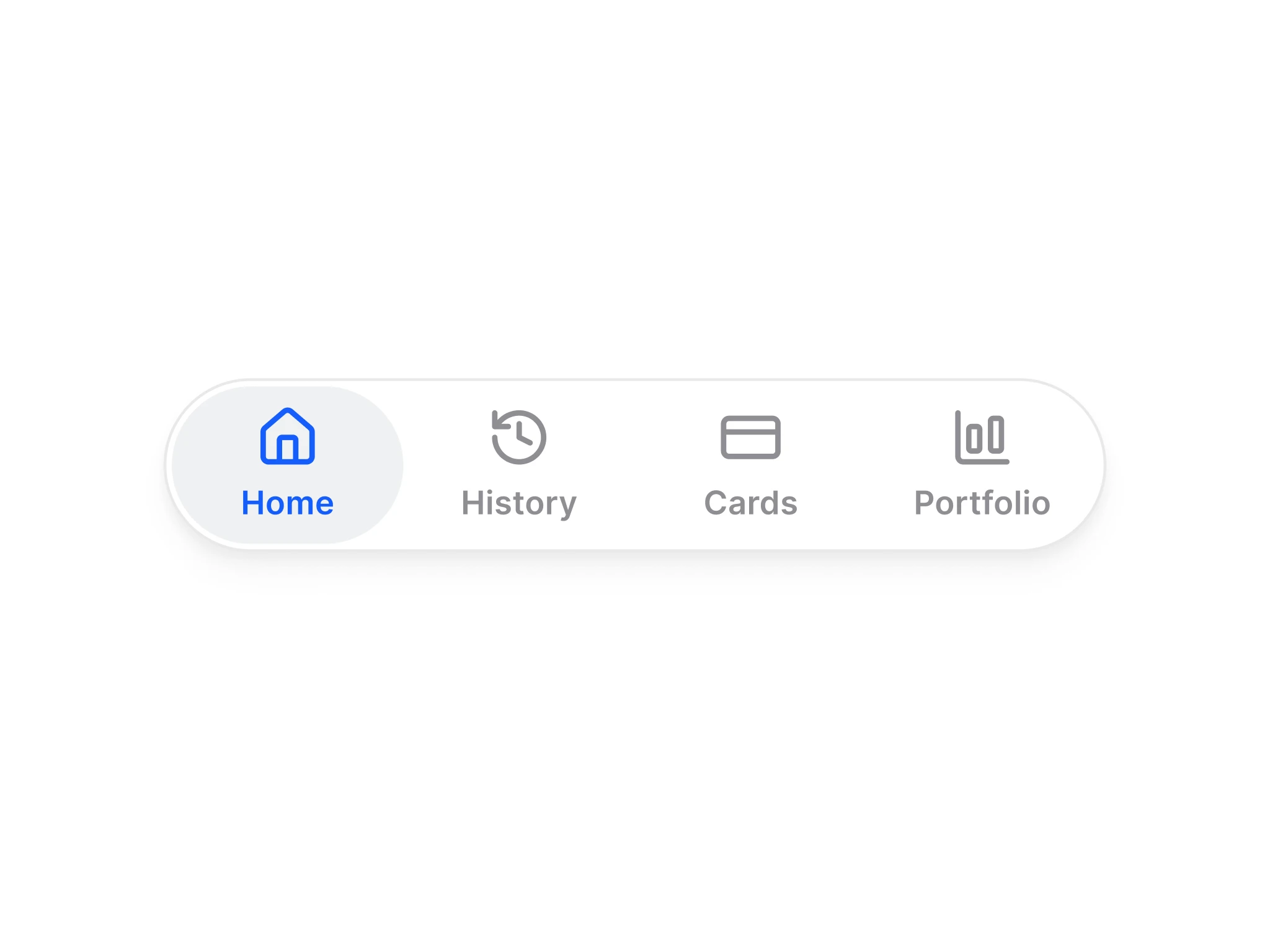
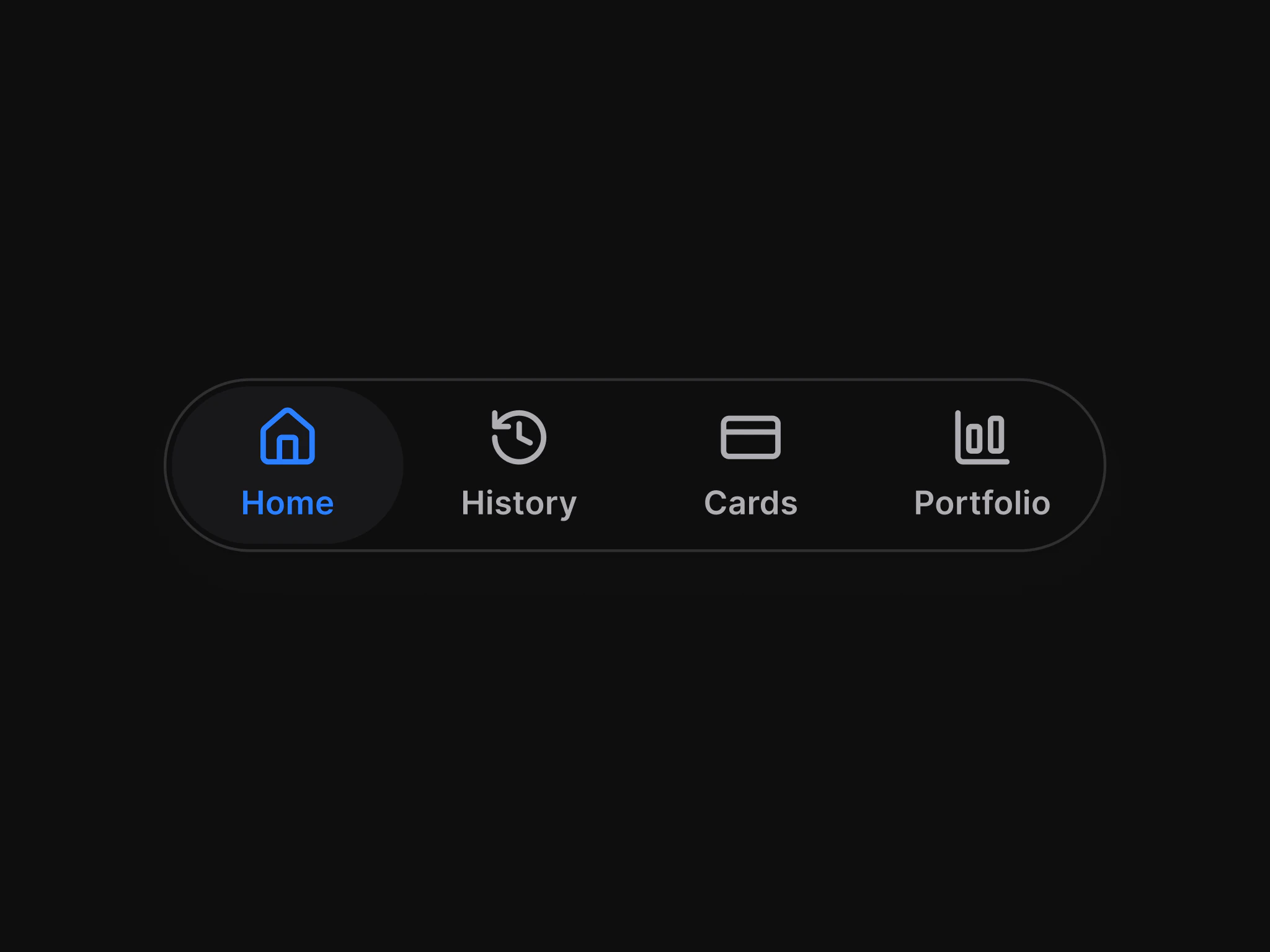



Figma: Avatar
Docs for AvatarFigma: Badge
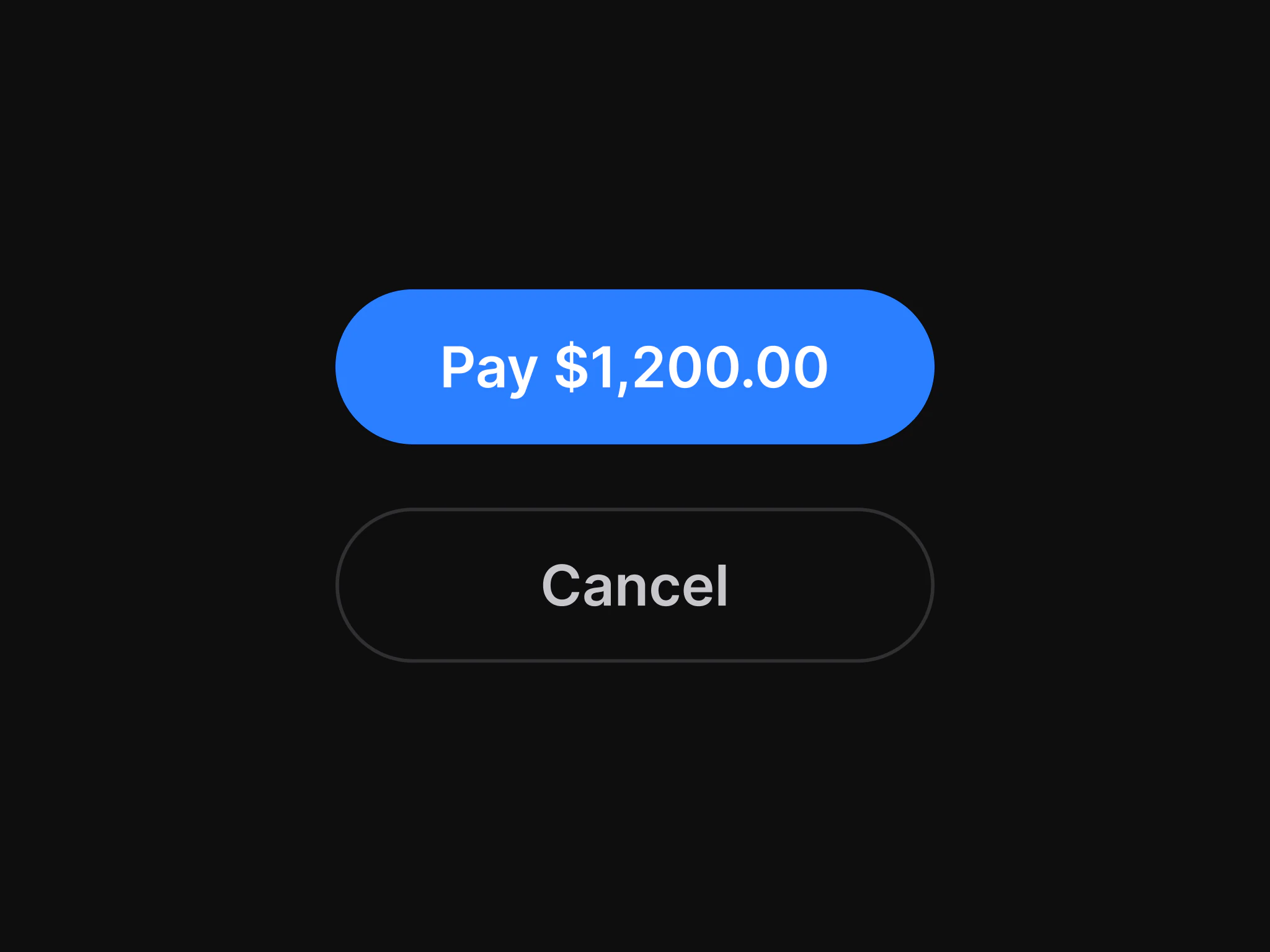
Docs for BadgeFigma: Button
Docs for ButtonFigma: Checkbox
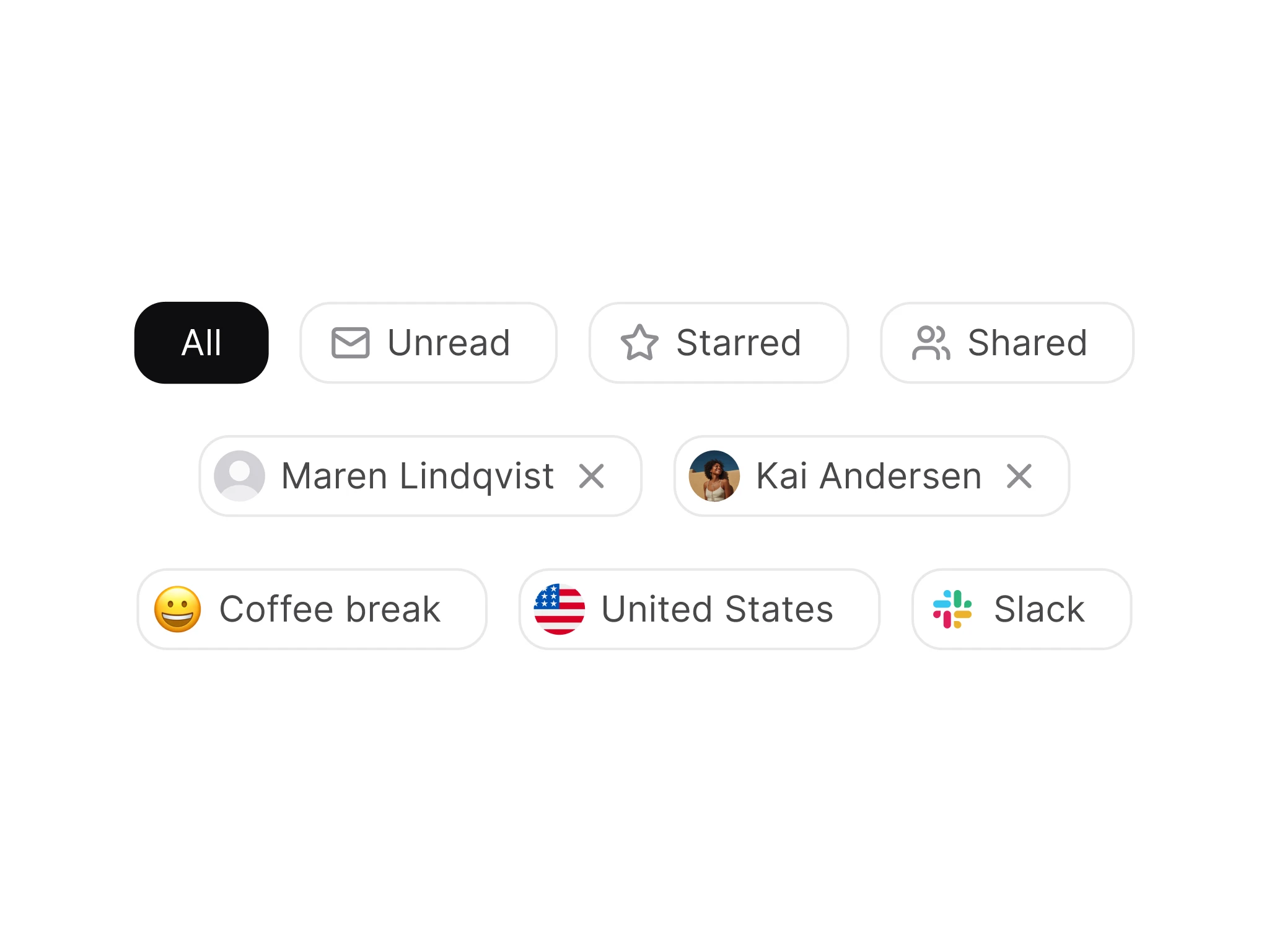
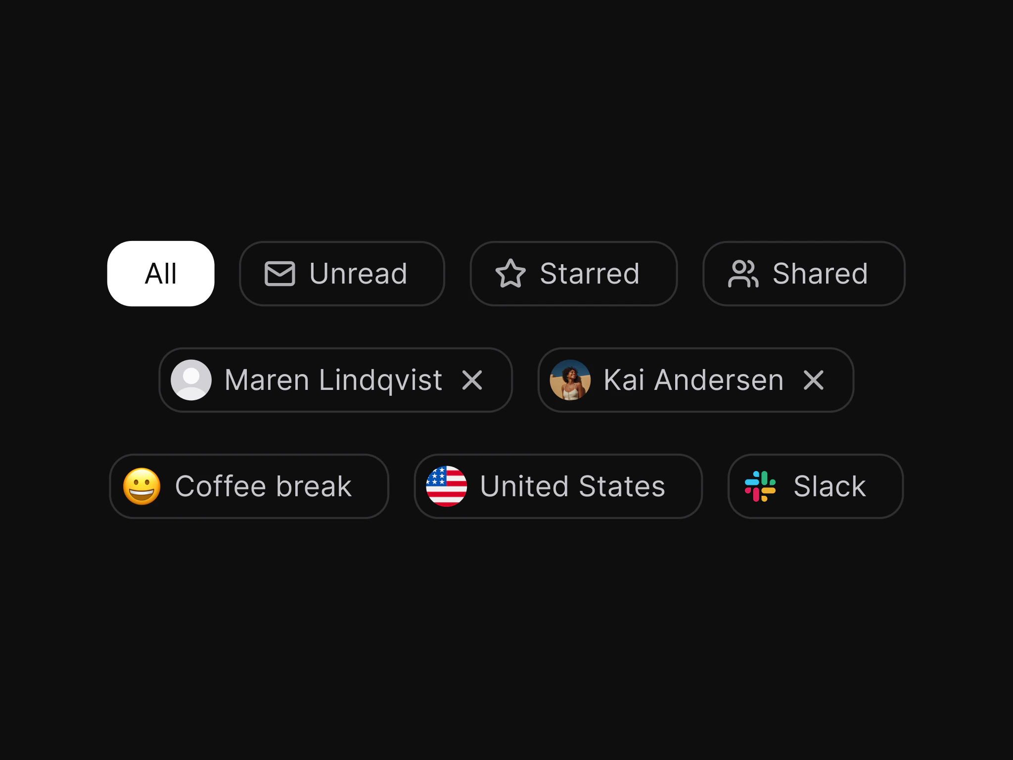
Docs for CheckboxFigma: Chip
Docs for ChipFigma: Input
Docs for InputFigma: List
Docs for ListFigma: Modal
Docs for ModalFigma: Navigation
Docs for NavigationFigma: Radio
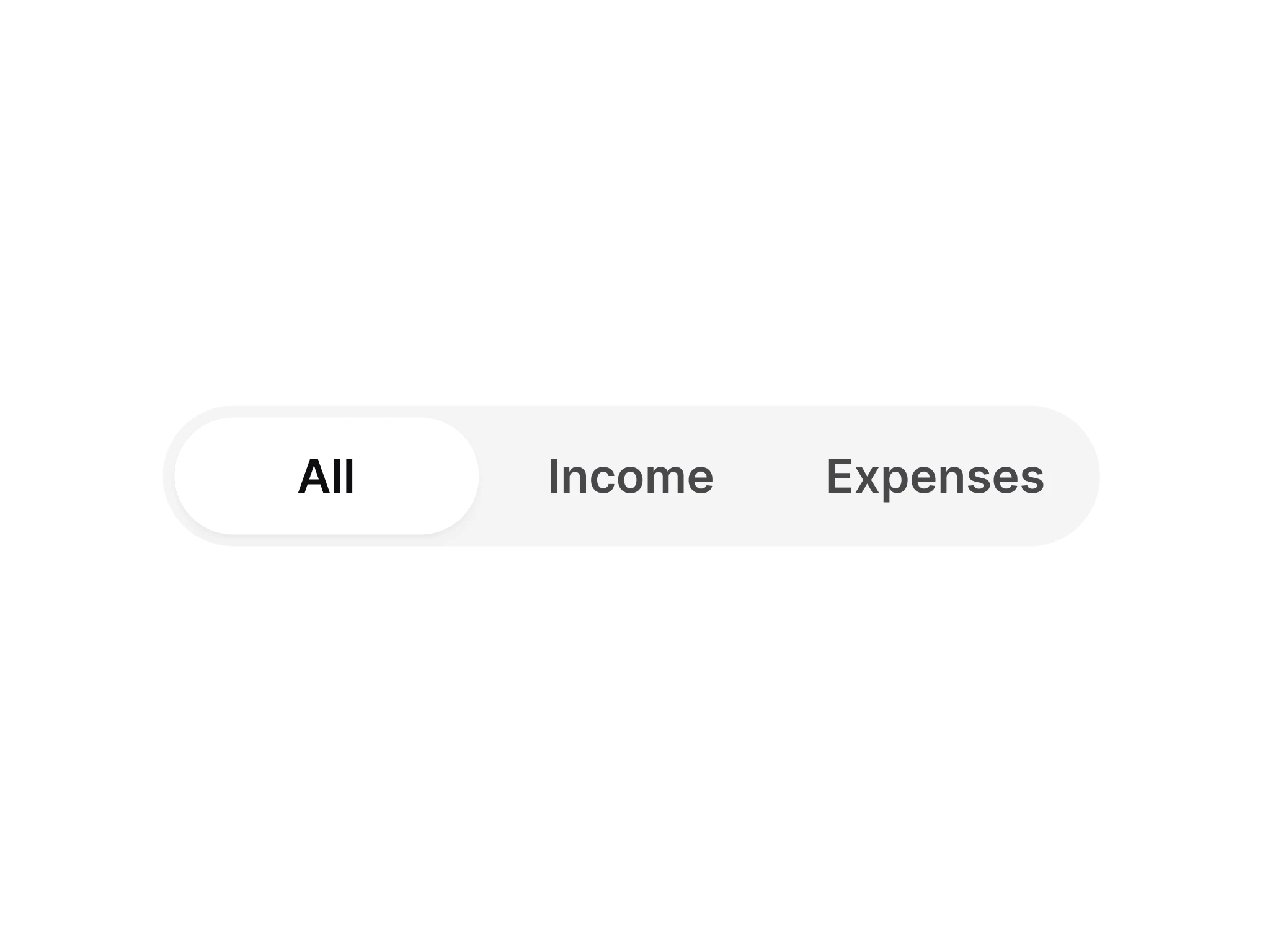
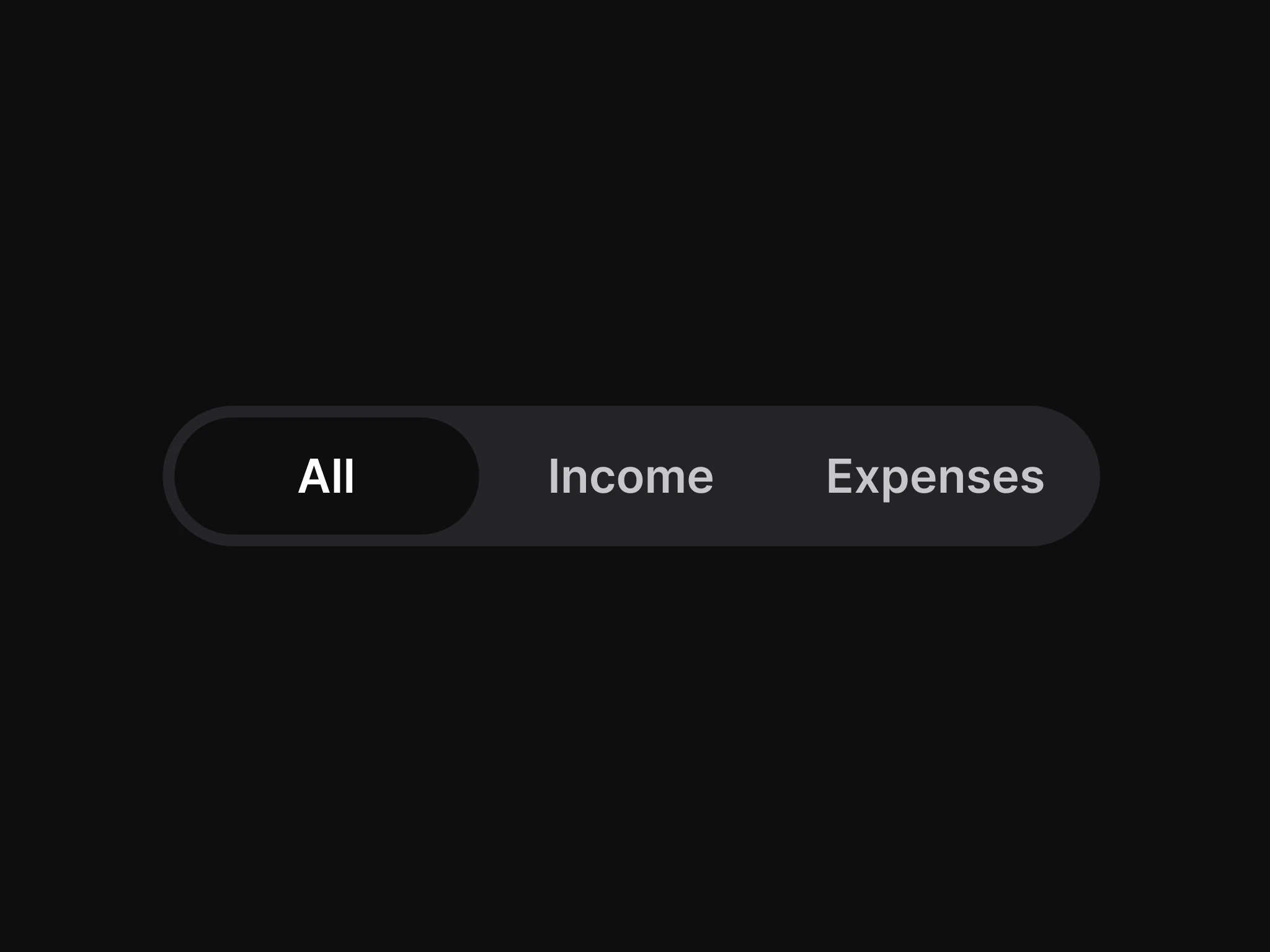
Docs for RadioFigma: Segmented Control
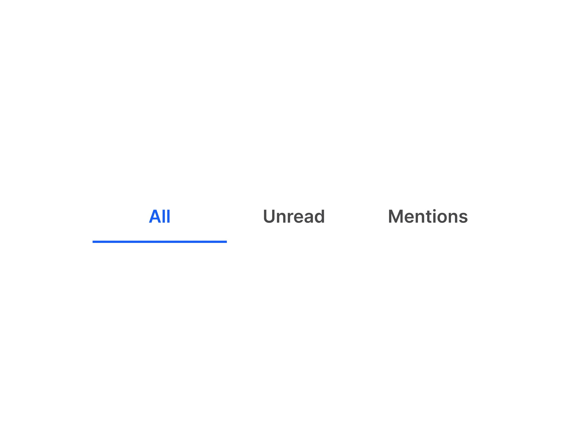
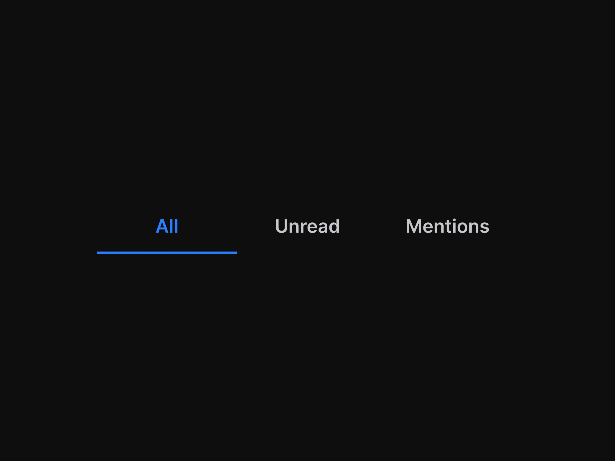
Docs for Segmented ControlFigma: Tab
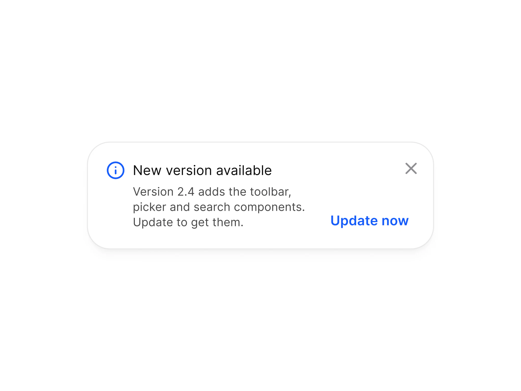
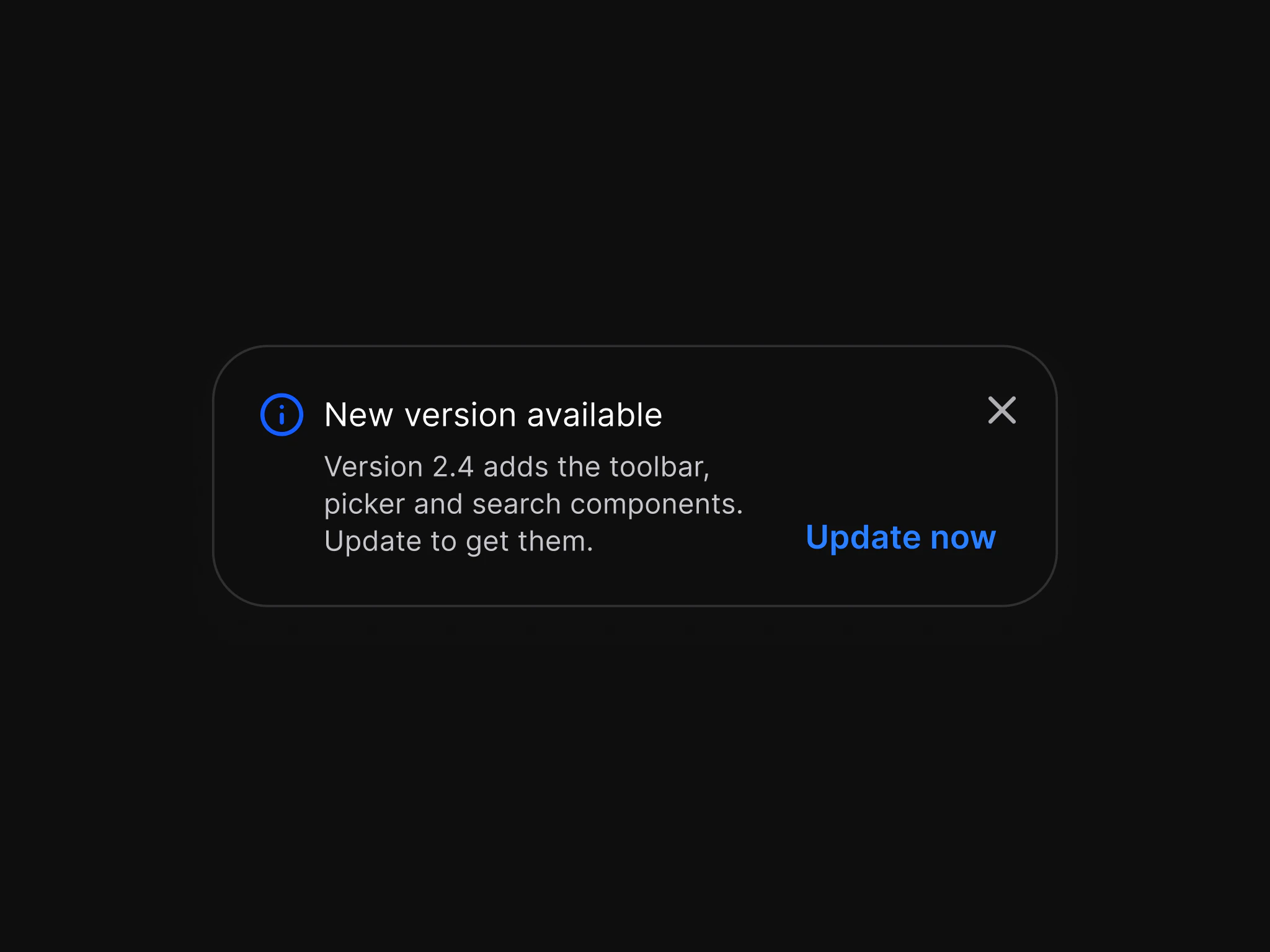
Docs for TabFigma: Toast
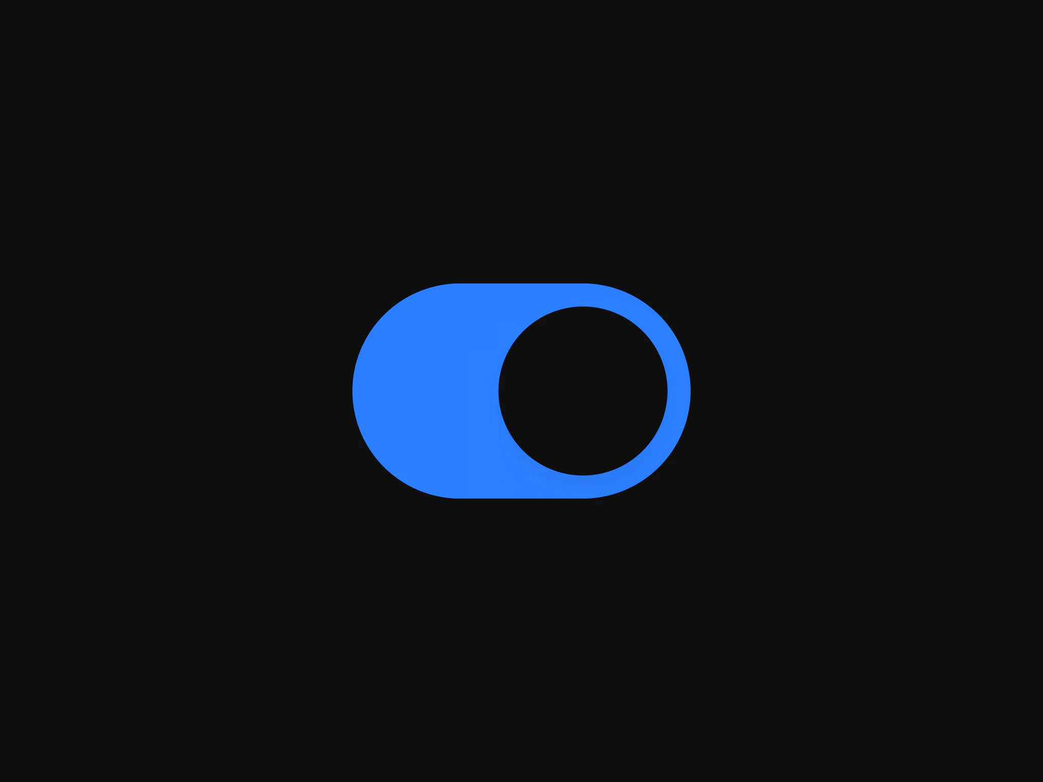
Docs for ToastFigma: Toggle
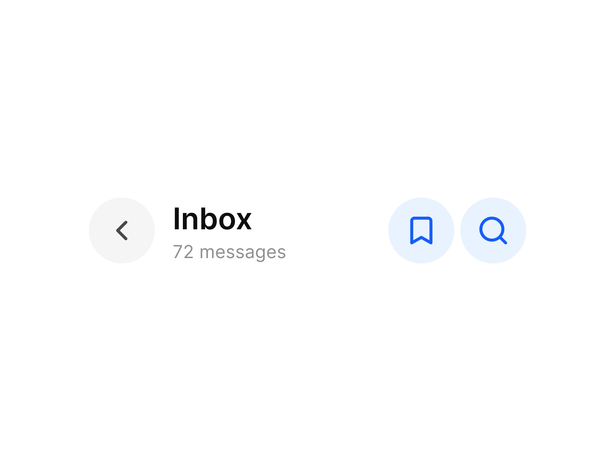
Docs for ToggleFigma: Top Bars
Docs for Top Bars- React Native
Avatar- SwiftUI
AppetiteAvatar- Flutter
AppetiteAvatar- Compose
AppetiteAvatar
- React Native
Badge- SwiftUI
AppetiteBadge- Flutter
AppetiteBadge- Compose
AppetiteBadge
- React Native
Button- SwiftUI
AppetiteButton- Flutter
Button- Compose
AppetiteButton
- React Native
Checkbox- SwiftUI
AppetiteCheckbox- Flutter
AppetiteCheckbox- Compose
AppetiteCheckbox
- React Native
Chip- SwiftUI
AppetiteChip- Flutter
AppetiteChip- Compose
AppetiteChip
- React Native
TextInput- SwiftUI
AppetiteText Field - Flutter
TextInput- Compose
AppetiteText Input
- React Native
List- SwiftUI
AppetiteList- Flutter
AppetiteList- Compose
AppetiteList
- React Native
ModalSheet- SwiftUI
AppetiteModal Sheet - Flutter
ModalSheet- Compose
AppetiteModal Sheet
- React Native
Navigation- SwiftUI
AppetiteNavigation - Flutter
Navigation- Compose
AppetiteNavigation
- React Native
Radio- SwiftUI
AppetiteRadio- Flutter
AppetiteRadio- Compose
AppetiteRadio
- React Native
SegmentedControl- SwiftUI
AppetiteSegmented Control - Flutter
SegmentedControl- Compose
AppetiteSegmented Control
- React Native
Tabs- SwiftUI
AppetiteTabs- Flutter
Tabs- Compose
AppetiteTabs
- React Native
Toast- SwiftUI
AppetiteToast- Flutter
Toast- Compose
AppetiteToast
- React Native
Toggle- SwiftUI
AppetiteToggle- Flutter
Toggle- Compose
AppetiteToggle
- React Native
TopBar- SwiftUI
AppetiteTopBar- Flutter
TopBar- Compose
AppetiteTopBar
React Native: Segmented Control
import { Avatar } from '@appetite-ui/import { Badge } from '@appetite-ui/import { Button } from '@appetite-ui/import { Checkbox } from '@appetite-ui/import { Chip } from '@appetite-ui/import { TextInput } from '@appetite-ui/import { List } from '@appetite-ui/import { ModalSheet, List } from '@appetite-ui/import { Navigation } from '@appetite-ui/import { Radio } from '@appetite-ui/import { SegmentedControl } from '@appetite-ui/import { Tabs } from '@appetite-ui/import { Toast } from '@appetite-ui/import { Toggle } from '@appetite-ui/import { TopBar } from '@appetite-ui/SwiftUI: Segmented Control
import AppetiteCore

AppetiteAvatar(.acronym(name: "Maren Lindqvist"), size: .xl, bottomStatus: .online)
AppetiteAvatar(.photo(Image("amara")), size: .xl2, accessibilityLabel: "Amara Diallo", topStatus: .verified)
import AppetiteCore
AppetiteBadge(label: "Paid", state: .success, variant: .color)
AppetiteBadge(label: "Beta", state: .feature, dot: true)
AppetiteBadge(circle: "3", state: .error, variant: .color)import AppetiteCore
AppetiteButton(text: "Pay", type: .brand, variant: .filled, size: .md, iconRight: .glyph(.arrowRight)) { pay() }
AppetiteButton(icon: .glyph(.plus), accessibilityLabel: "Add", size: .lg) { add() }
AppetiteButton(text: "Saving", loading: true) // ignores presses, VoiceOver says "Loading"import AppetiteCore
AppetiteCheckbox(checked: AppetiteCheckboxValue(on), accessibilityLabel: "Accept") { on = $0 }import AppetiteCore
AppetiteChip(text: "Design", selected: picked, onPress: { picked.toggle() })
AppetiteChip(text: "Filters", leading: .icon(.glyph(.circle)), onPress: openFilters)
AppetiteChip(text: "Celebrate", leading: .emoji("🎉"), onPress: pick)import AppetiteCore
AppetiteTextField(type: .prefix("https:/import AppetiteCore
AppetiteList(label: "Language", leadingIcon: .glyph(.globe), trailing: .text("English")) { openLanguages() }
AppetiteList(label: "Dark mode", size: .compact, trailing: .toggle(checked: dark) { dark = $0 })import AppetiteCore
AppetiteModalSheet(
title: "Notifications", subheadline: "Choose what we send you", open: open, onClose: { open = false },
primaryAction: .init(text: "Save", onPress: save), secondaryAction: .init(text: "Cancel") { open = false }
) { AppetiteList(label: "Order updates", size: .compact) }import AppetiteCore
AppetiteNavigation(items: tabs, value: tab) { tab = $0 } // two to five AppetiteNavigationItemimport AppetiteCore
AppetiteRadio(checked: on, accessibilityLabel: "Option") { on = $0 }import AppetiteCore
AppetiteSegmentedControl(options: ["Day", "Week", "Month"], value: range, accessibilityLabel: "Range") { range = $0 }
AppetiteSegmentedControl(options: ["List", "Grid"], value: layout, size: .small) { layout = $0 }import AppetiteCore
AppetiteTabs(items: [.init(key: "all", label: "All"), .init(key: "open", label: "Open")], value: tab) { tab = $0 }
AppetiteTabs(items: items, value: tab, size: .small, accessibilityLabel: "Order status") { tab = $0 }import AppetiteCore
AppetiteToast(
title: "Note archived", description: "It moves to Archive for 30 days.", state: .success,
link: AppetiteToastLink(text: "Undo", onPress: undo), onDismiss: { shown = false }
)
AppetiteToast(title: "Offline, changes sync later", type: .line, state: .warning)import AppetiteCore
AppetiteToggle(checked: on, accessibilityLabel: "Notifications") { on = $0 }import AppetiteCore
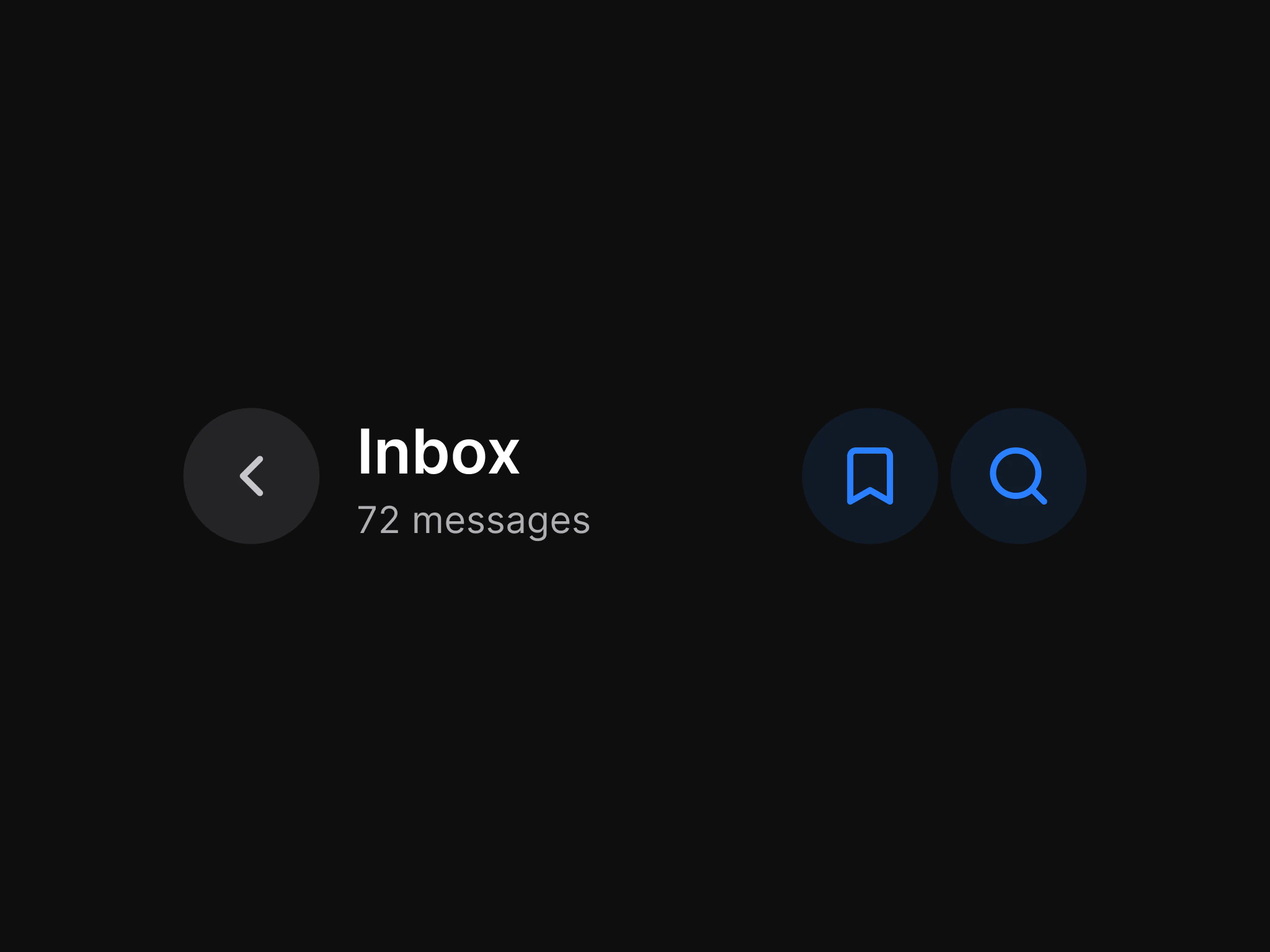
AppetiteTopBar(title: "Inbox", caption: "3 unread", actions: .secondaryActions([AppetiteTopBarAction(icon: .glyph(.search), accessibilityLabel: "Search") { search() }]))Flutter: Segmented Control
import 'package:appetite_ui/import 'package:appetite_ui/import 'package:appetite_ui/import 'package:appetite_ui/import 'package:appetite_ui/import 'package:appetite_ui/import 'package:appetite_ui/import 'package:appetite_ui/import 'package:appetite_ui/import 'package:appetite_ui/import 'package:appetite_ui/import 'package:appetite_ui/import 'package:appetite_ui/import 'package:appetite_ui/import 'package:appetite_ui/Compose: Segmented Control
import com.appetiteui.components.*

AppetiteAvatar(AvatarContent.Acronym("Maren Lindqvist"), size = AvatarSize.Xl, bottomStatus = AvatarBottomStatus.Online)
AppetiteAvatar(AvatarContent.Photo(imageBitmap), size = AvatarSize.Xl2, contentDescription = "Amara Diallo", topStatus = AvatarTopStatus.Verified)
import com.appetiteui.components.*
AppetiteBadge("Paid", state = BadgeState.Success, variant = BadgeVariant.Color)
AppetiteBadge("3", type = BadgeType.Circle, state = BadgeState.Error, variant = BadgeVariant.Color)
AppetiteBadge(type = BadgeType.Dot, state = BadgeState.Information, contentDescription = "Unread")import com.appetiteui.components.*
import com.appetiteui.core.*
AppetiteButton(text = "Save", size = ButtonSize.Md, iconLeft = AppetiteIconSlot.Named("plus"), onPress = ::save)
AppetiteButton(iconOnly = true, icon = AppetiteIconSlot.Named("x"), accessibilityLabel = "Close", onPress = ::close)import com.appetiteui.components.*
AppetiteCheckbox(checked = if (on) CheckboxActive.True else CheckboxActive.False, onCheckedChange = { on = it }, accessibilityLabel = "Accept")import com.appetiteui.components.*
import com.appetiteui.core.*
AppetiteChip(text = "Design", selected = picked, onPress = { picked = !picked })
AppetiteChip(text = "Filters", leading = ChipLeading.Icon(AppetiteIconSlot.Named("plus")), onPress = ::openFilters)
AppetiteChip(text = "Ana", leading = ChipLeading.Avatar { AvatarImage() }, onPress = ::open, onClose = { remove("Ana") })import com.appetiteui.components.*
AppetiteTextInput(value = text, onChangeText = { text = it }, label = "Email", placeholder = "you@example.com", help = "We never share it")
AppetiteTextInput(value = text, onChangeText = { text = it }, label = "Error", error = true)import com.appetiteui.components.*
import com.appetiteui.core.*
AppetiteList(label = "Language", leadingIcon = AppetiteIconSlot.Named("globe"), trailing = ListTrailing.Text("English", onPress = {}))
AppetiteList(label = "Dark mode", size = ListSize.Compact, trailing = ListTrailing.Toggle(on) { on = it })import com.appetiteui.components.*
AppetiteModalSheet(
title = "Notifications",
open = open,
onClose = { open = false },
subheadline = "Choose what we send you",
primaryAction = ModalSheetAction("Save", ::save),
secondaryAction = ModalSheetAction("Cancel", { open = false }),
) { AppetiteList(label = "Order updates") }import com.appetiteui.components.*
import com.appetiteui.core.*
AppetiteNavigation(
items = listOf(
NavigationItem("a", "Home", AppetiteIconSlot.Named("circle")),
NavigationItem("b", "Search", AppetiteIconSlot.Named("circle"), badge = true),
NavigationItem("c", "Me", AppetiteIconSlot.Named("circle")),
),
value = tab, onValueChange = { tab = it },
)import com.appetiteui.components.*
AppetiteRadio(checked = on, onCheckedChange = { on = it }, accessibilityLabel = "Option")import com.appetiteui.components.*
AppetiteSegmentedControl(listOf("Day", "Week", "Month"), range, { range = it }, contentDescription = "Range")
AppetiteSegmentedControl(listOf("List", "Grid"), layout, { layout = it }, size = SegmentedControlSize.Small)import com.appetiteui.components.*
AppetiteTabs(listOf(TabsItem("all", "All"), TabsItem("open", "Open")), value = tab, onValueChange = { tab = it })
AppetiteTabs(items, value = tab, onValueChange = { tab = it }, size = TabsSize.Small)import com.appetiteui.components.*
AppetiteToast(
"Note archived",
description = "It moves to Archive for 30 days.",
state = ToastState.Success,
link = ToastLink("Undo", ::undo),
onDismiss = { shown = false },
)
AppetiteToast("Offline, changes sync later", type = ToastType.Line, state = ToastState.Warning)import com.appetiteui.components.*
AppetiteToggle(checked = on, onCheckedChange = { on = it }, accessibilityLabel = "Notifications")import com.appetiteui.components.*
import com.appetiteui.core.*
AppetiteTopBar(
title = "Inbox", caption = "3 unread",
actions = TopBarActions.SecondaryActions(listOf(TopBarAction(AppetiteIconSlot.Named("plus"), "Add") {})),
onBack = {},
)Limits
What Code 1.0 does not do.
System chrome.
Apple and Material 3 replicas.
Every component in SwiftUI, Flutter and Compose. In 1.x
Pricing
One payment. Yours forever.
Figma
$129$97$78$59
$299$225$180$135
USD, paid once
For designing iOS and Android apps.
- Components and app screens in light and dark mode
- Apple and Material 3 in one file
- 589 variables in 6 collections
- Tokens for SwiftUI, Jetpack Compose, Flutter and CSS
- Core Skill for AI agents
Code
$79
$179
USD, paid once
For building iOS and Android apps in code.
- Every Appetite UI component in React Native
- The core components in SwiftUI, Flutter and Jetpack Compose, more in every release
- Same names and variants as the Figma file
- Tokens for every stack and CSS
- iOS and Material conventions behind one switch
- Rebrand in one theme file
- App Starter with Tasks, Foodie and AI flows
- Agent kit for Claude Code and Cursor
Code starts at $79. The price rises with every release, and every release is included.
Complete
$179
$399
USD, paid once
Figma + Code. $29 less than both, on Team $79 less.
- Everything in Figma
- Everything in Code
- Designers and developers on the same components
Still have a question?
Write to us. It lands in one inbox, read by the people who build Appetite UI.
 Contact us
Or email hi@appetiteui.com
Your next rebrand is one edit.
Change the brand color, radius and font in one theme file, and every component in your stack follows.