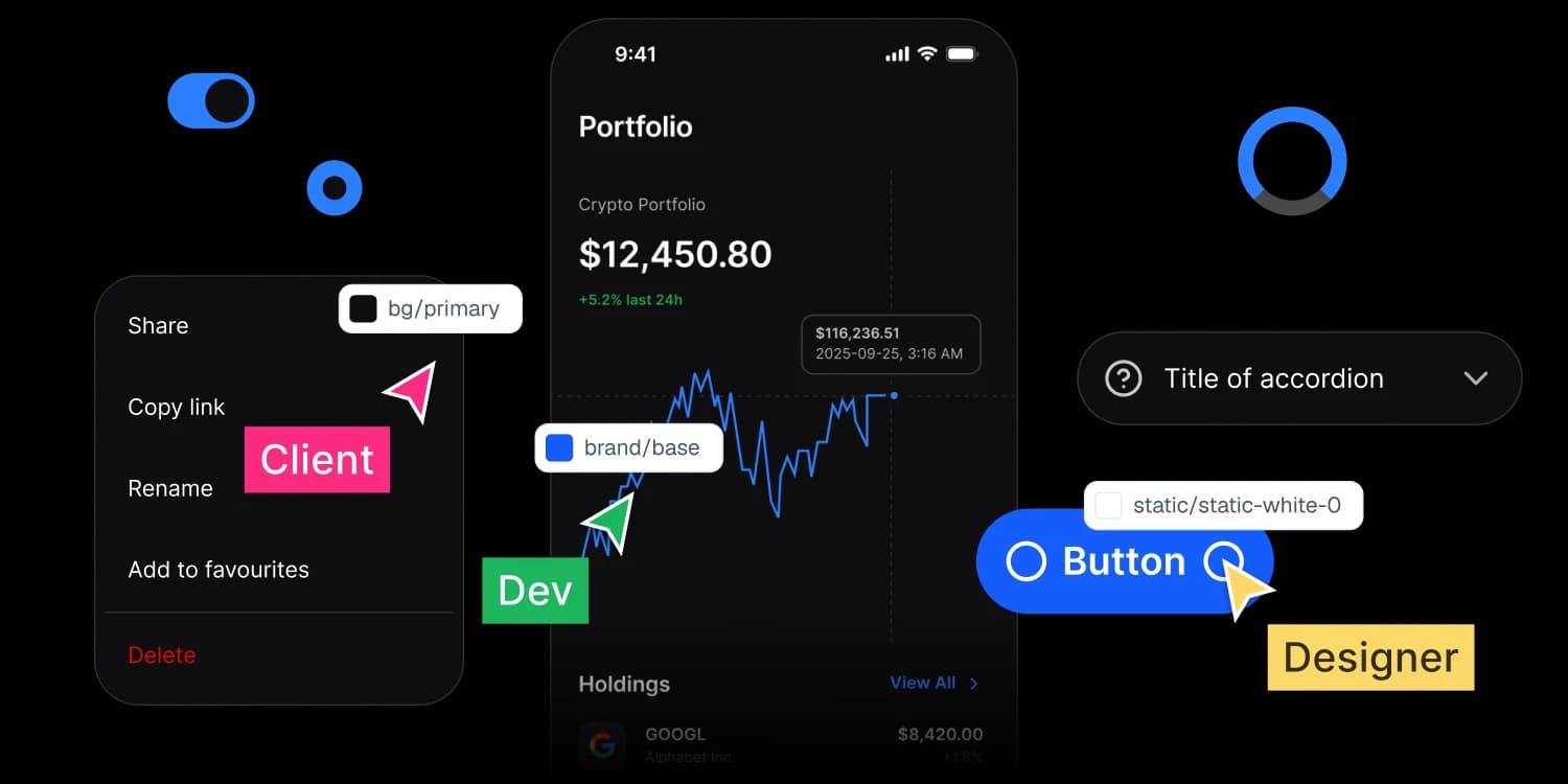
Tokens
The tokens you design with are the values that ship.
Every color, space, radius and type step lives once as a token. One source generates CSS, SwiftUI, Compose and Flutter, so nobody retypes a hex and nobody guesses a spacing step.
Architecture
Two token levels, and you only ever touch one of them.
Every design system that survives a rebrand has this shape. Most files skip the second level, which is why changing a brand color in them means opening every screen.
Level 1, primitive
Primitives are the raw scale.
- colors/bluepurple/50
- colors/bluepurple/100
- colors/bluepurple/200
- colors/bluepurple/300
- colors/bluepurple/400
- colors/bluepurple/500
- colors/bluepurple/600
- colors/bluepurple/700
- colors/bluepurple/800
- colors/bluepurple/900
- colors/bluepurple/950
Level 2, semantic
Semantic tokens are the layer above.
| Alias | Light | Dark |
|---|---|---|
| brand/lighter | colors/bluepurple/50 | colors/bluepurple/950 |
| brand/light | colors/bluepurple/100 | colors/bluepurple/900 |
| brand/base | colors/bluepurple/500 | colors/bluepurple/400 |
| brand/dark | colors/bluepurple/700 | colors/bluepurple/300 |
| brand/darker | colors/bluepurple/800 | colors/bluepurple/200 |
colors/bluepurple/500 points to brand/base
Button fill, links, focus ring
 Search
Total Balance
$28,401.75
+$1,240.50 this month
- Send
- Receive
- Pay
- Top Up
Recent Transactions
View All- Northwind MediaToday, 2:45 PM−$12.40
- Halcyon StoreYesterday−$999.00
SearchTotal Balance
$28,401.75
+$1,240.50 this month
- Send
- Receive
- Pay
- Top Up
Recent Transactions
View All- Northwind MediaToday, 2:45 PM−$12.40
- Halcyon StoreYesterday−$999.00
 One exception worth knowing. On-color tokens map to static black and static white and do not flip with the theme, because a label on a filled button stays legible in both modes only if it refuses to follow them.
Follow any token from the raw scale to the pixel it lands on.
Each row is one chain: one value, read from primitive to alias to the place it actually renders. Point at a row with a mouse, or tab to it, and the rest step back.
| Primitive | Semantic alias | Where it lands |
|---|---|---|
| colors/blue/500 | brand/base | Button fill, links, focus ring |
| colors/gray/950 | text/strong-950 | Headlines and body copy |
| colors/gray/50 | bg/weak-50 | Cards, wells, quiet surfaces |
| colors/red/500 | state/error/base-500 | Field errors and destructive actions |
| static/static-white-0 | text/on-color/strong | Labels on a filled button, both modes |
Output
Each platform gets its tokens in the language it already speaks.
A token is not useful until it arrives in a form the platform already understands. The translation is part of the build, so what lands is idiomatic rather than converted.
brand/base
Light {colors.blue.500}, Dark {colors.blue.400}, #155DFC / #2B7FFF
spacing/4
Foundations, a 4pt base, 16
motion/duration/fast
Motion, on the standard easing, 120ms
CSS custom properties
var(--ap-brand-base)
#155DFC, and #2B7FFF under the dark block
var(--ap-space-4)
16px
var(--ap-duration-fast)
120ms
Both modes as scoped blocks, ready for a class or a media query.
SwiftUI
Color
.apBrandBase Color(red: 0.082, green: 0.365, blue: 0.988)
AppetiteSpacing
.space4 16 as CGFloat
AppetiteMotion
.durationFast 0.12 seconds
Color extensions, and type on Dynamic Type anchors rather than fixed point sizes.
Jetpack Compose
AppetiteTheme
.colors .brandBase Color(0xFF155DFC)
Space4
16.dp
DurationFast
120 milliseconds
Color objects and a ready Material 3 typography object, so the theme arrives wired.
Flutter
apBrandBase
Color(0xFF155DFC)
apSpace4
16.0
apDurationFast
Duration(milliseconds: 120)
Color constants and text styles shaped for ThemeData.
 The source is W3C DTCG, a public standard rather than a private schema. It comes in the file you buy, compiled with Style Dictionary to CSS, SwiftUI, Compose and Flutter. If you ever stop using this system, your values leave with you in a format other tools can read. That is deliberate.
Your next rebrand is one edit.
One-time payment, Lifetime updates, Unlimited client projects