Updated
Finance
A finance app UI kit for Figma, drawn as screens for an iOS banking app in light and dark: a balance dashboard, transaction history, a card and its settings, a portfolio and a pay sheet with a QR code. Every control that has a component is an instance of it, so one token change moves every screen.
Updated
Preview
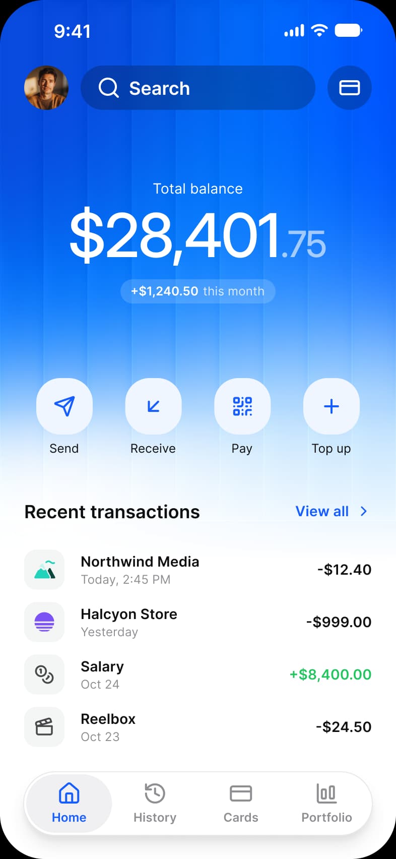
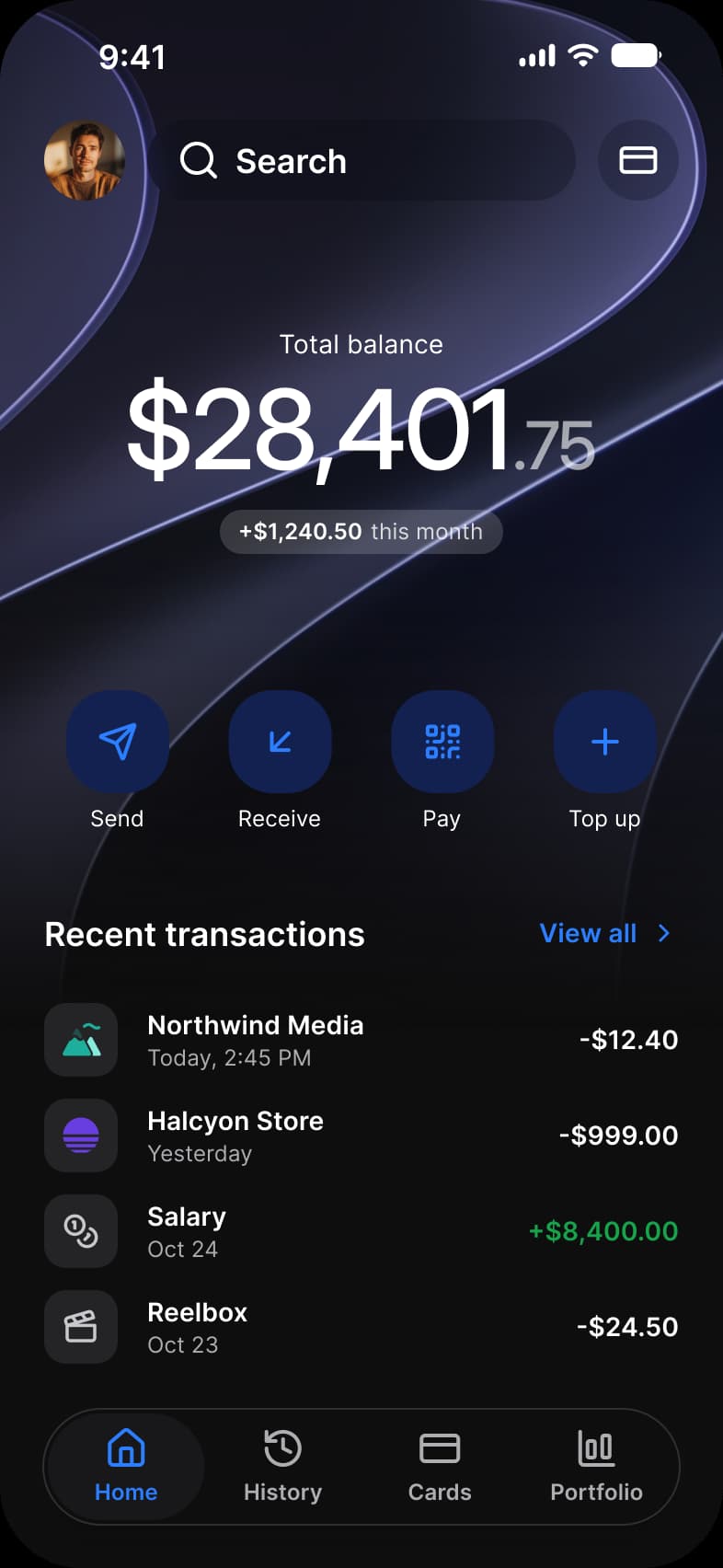
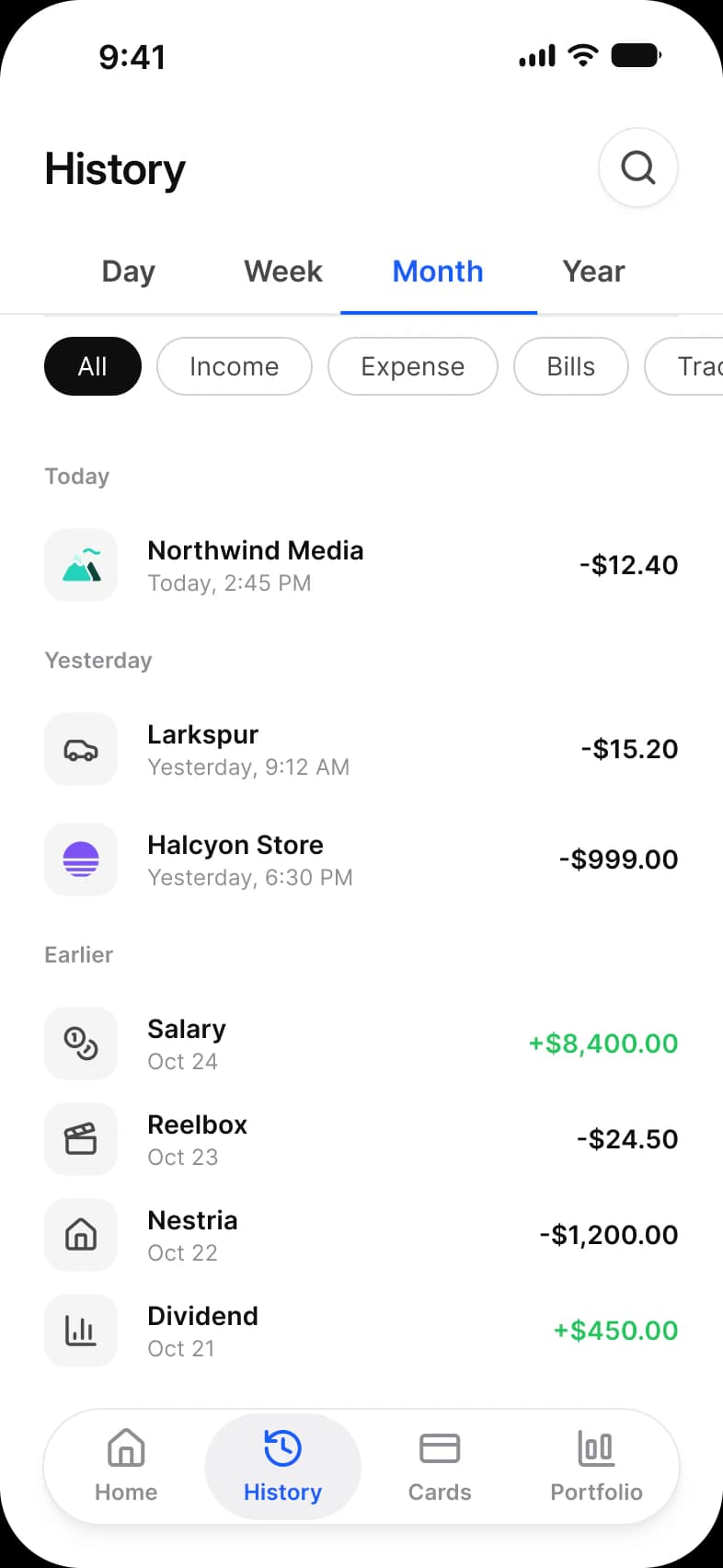
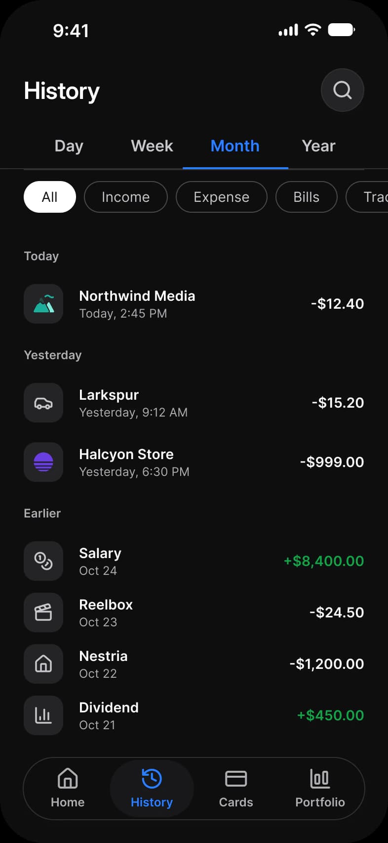
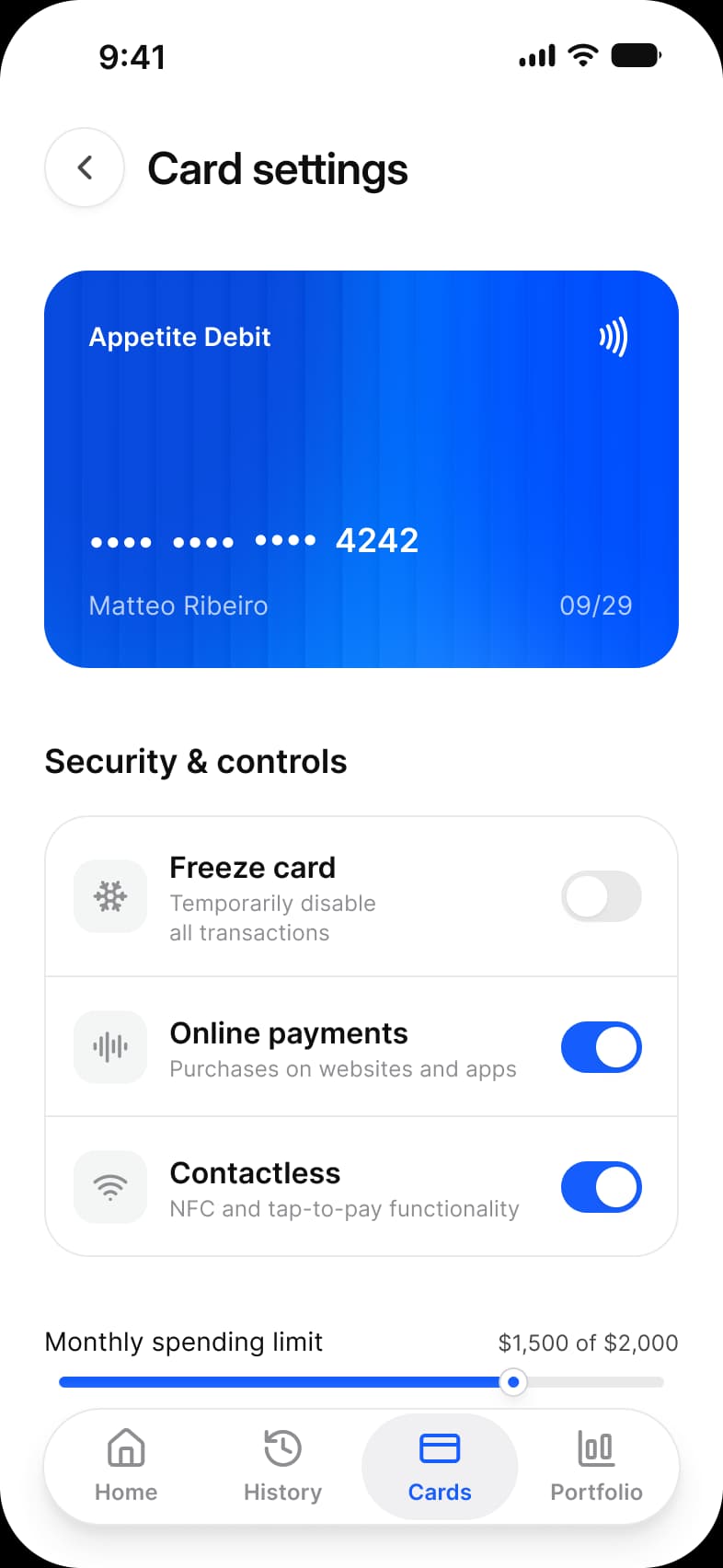
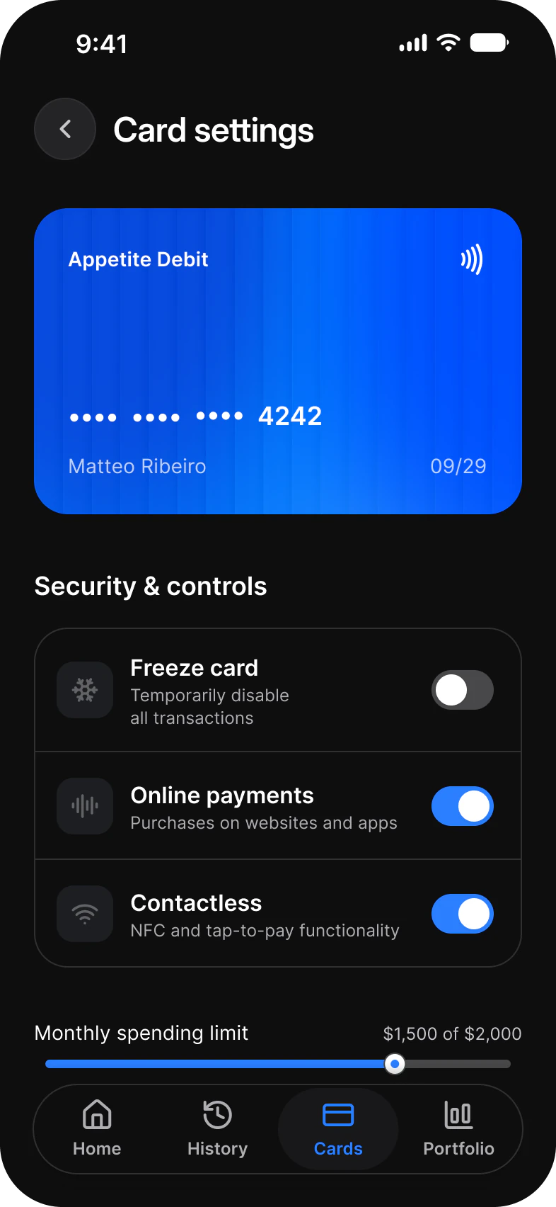
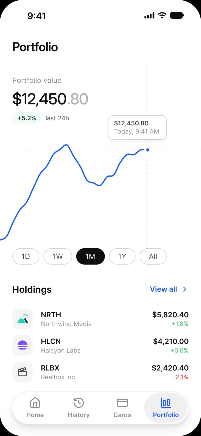
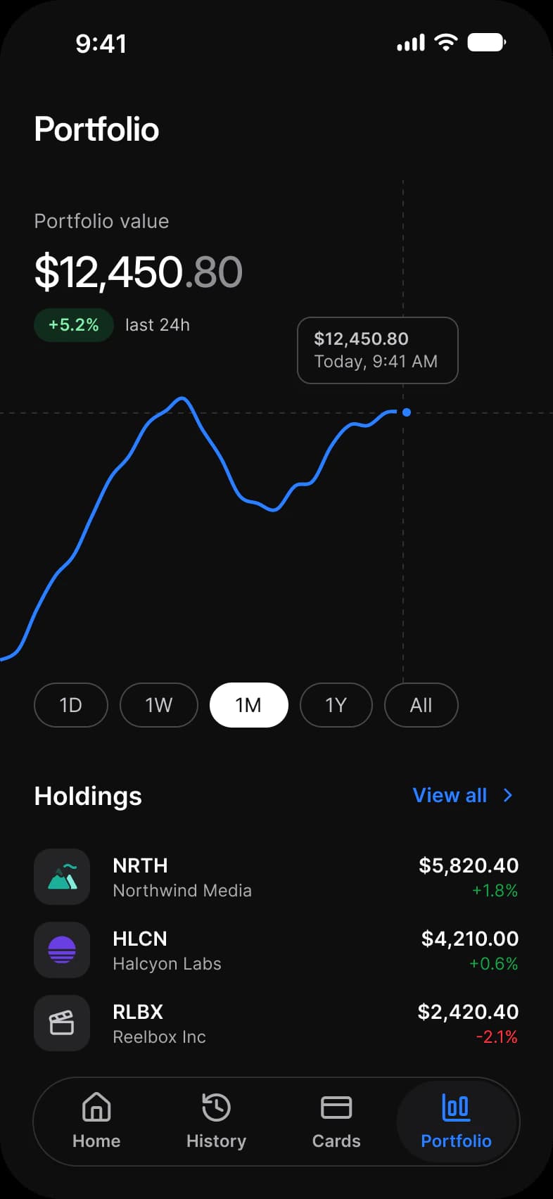
Dashboard, History, Card settings, Portfolio, Pay and Cards, each in Light and Dark. Card settings keeps the Cards tab selected, and Pay is a sheet without a tab bar.
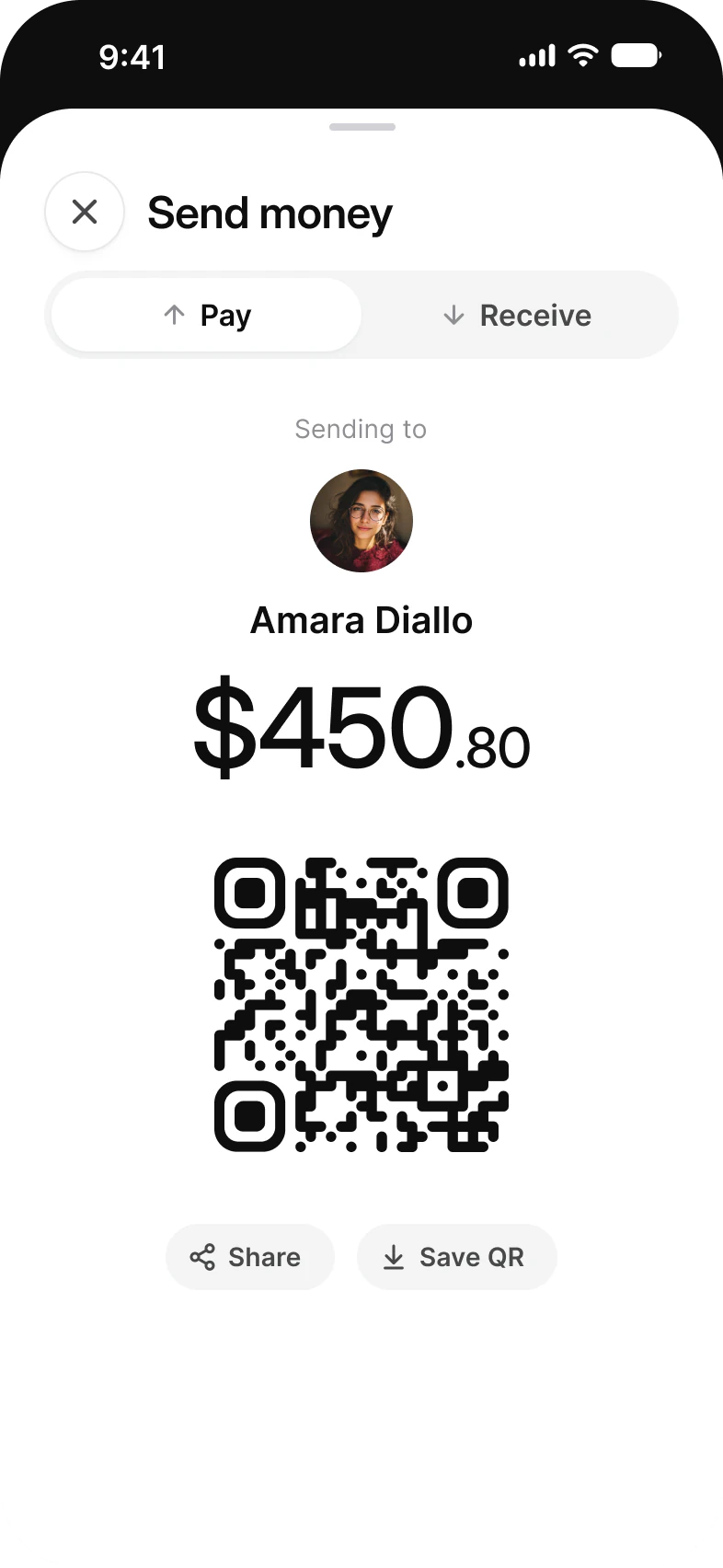
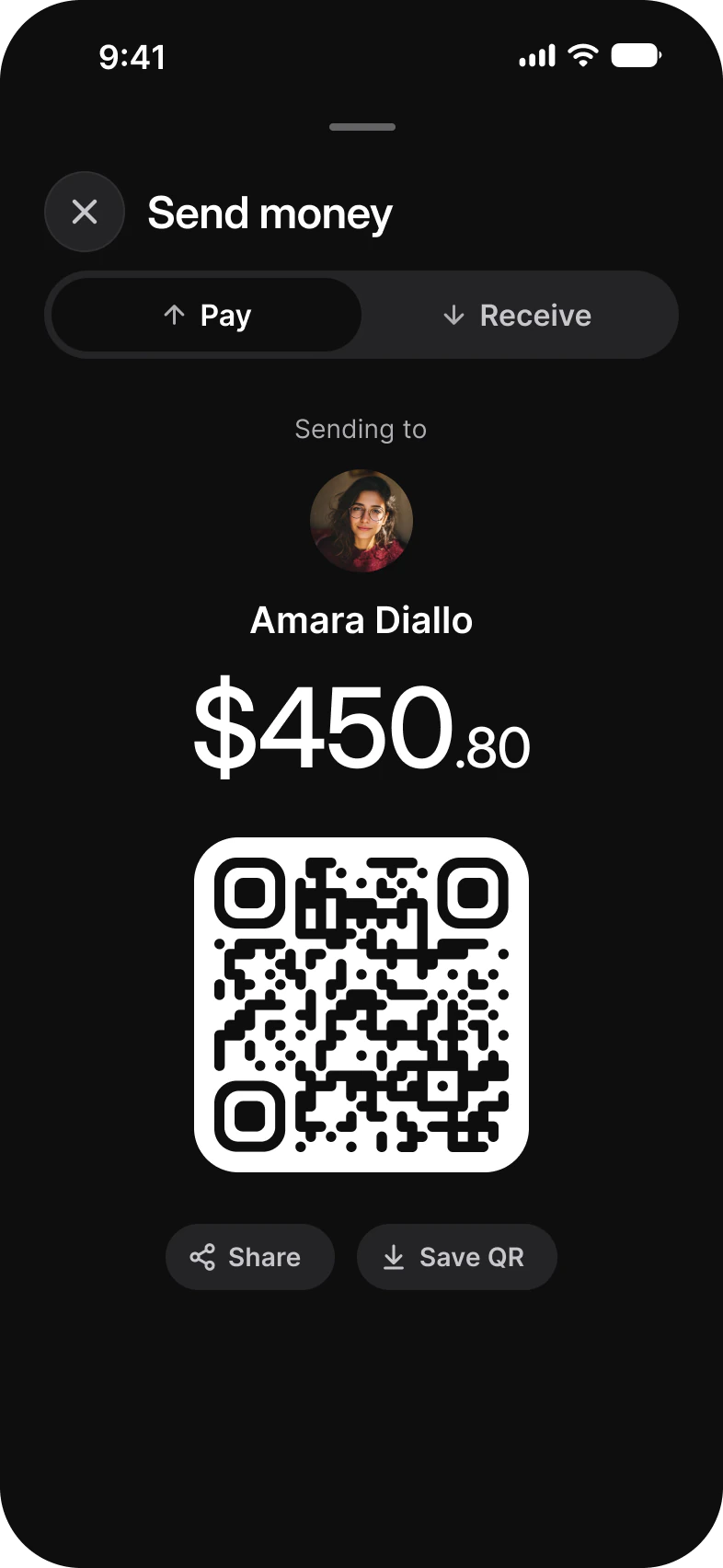
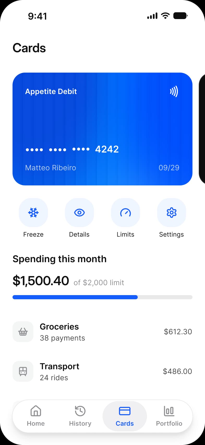
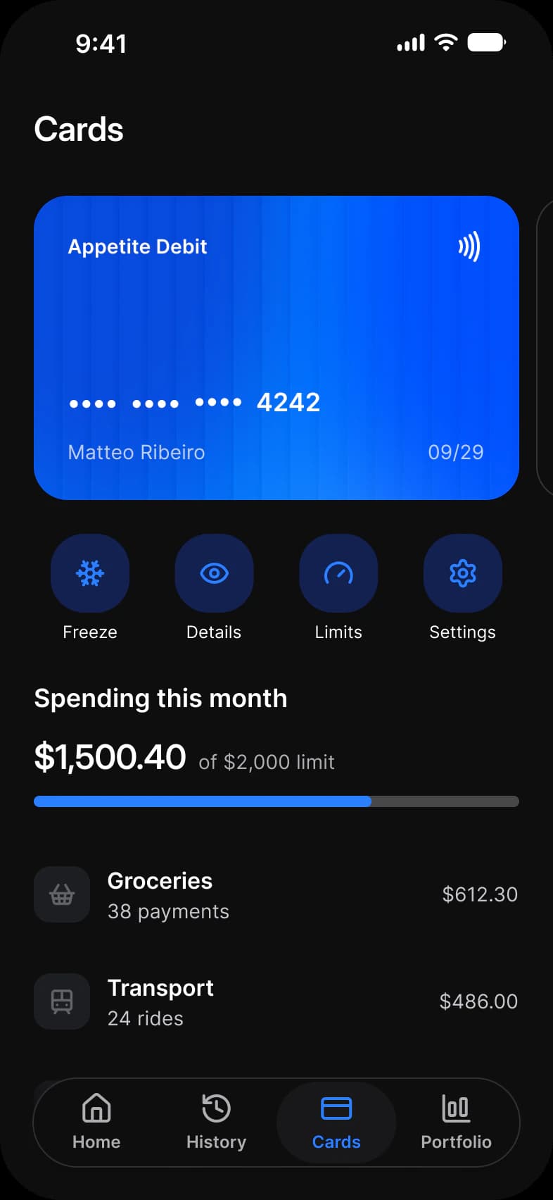
| Screen | What it shows | Built from |
|---|---|---|
| Dashboard | Total balance, four quick actions and the latest transactions | Search, Avatar, Button, Quick Action Button, Section Header, Navigation |
| History | Transactions by day, with a period switch and category chips | Top Bar, Tab, Chip, Navigation |
| Card settings | The card and the switches and limit that control it | Top Bar, List, Toggle, Slider, Section Header |
| Portfolio | Portfolio value, a price chart and the holdings behind it | Top Bar, Badge, Chip, Section Header, Navigation |
| Pay | A sheet that sends money to a person or shows a QR code | Top Bar, Segmented Control, Avatar, Button |
| Cards | The card, four card actions and spending by category | Top Bar, Quick Action Button, Progress Bar, List, Navigation |
Which components build the Finance screens?
Navigation, Chip, Button, List and Quick Action Button carry most of the screens, and every row that shows a merchant uses Company Logo.
A banking app is a tab bar, a list of rows and a handful of controls. On the light frames 158 instances sit on each row of the Finance page: 96 are Appetite UI components and 62 are Lucide icons with 33 different names. The dark row holds the same instances, so every number below is per row.
| Component | Per row | Where |
|---|---|---|
| Navigation | 26 | Five tab bars with four labels each, and a sixth bar on Pay, hidden behind the sheet and without labels |
| Chip | 10 | History and Portfolio, five each |
| Button | 8 | Dashboard 2, History 1, Card settings 1, Portfolio 1, Pay 3 |
| Quick Action Button | 8 | Dashboard 4, Cards 4 |
| Status Bar | 6 | Every screen |
| Company Logo | 6 | Dashboard, History and Portfolio, two each |
| List | 6 | Card settings 3, Cards 3 |
| Top Bar | 5 | Every screen but Dashboard |
| Tab | 5 | History, one set and four selectors |
| Section Header | 4 | Dashboard, Card settings, Portfolio, Cards |
| Toggle | 3 | Card settings, one per row |
| Segmented Control | 3 | Pay, one control and two selectors |
| Avatar | 2 | Dashboard, Pay |
| Search | 1 | Dashboard |
| Badge | 1 | Portfolio, the change over the last day |
| Slider | 1 | Card settings, the spending limit |
| Progress Bar | 1 | Cards, spend against the limit |
The Portfolio line chart and the Pay QR code are drawn on the frame: the table holds no chart, and the QR code is a single vector. Merchant marks are Company Logo instances, so a merchant changes in one place.
Counted on October 2, 2026 with a Plugin API script over the six light frames of the Finance page in the Appetite UI Figma file. Nested and hidden instances count, parts such as navigation labels are grouped with their family, and an icon is an instance named in lowercase.
What does a money screen need to get right?
Amounts that line up, a balance that keeps its weight from screen to screen, and a color that appears only where it means something.
Every amount is right aligned and carries two decimals, so the decimal points stack down a column whatever the length. A debit and a credit share one text style and differ by color alone. Only the credit takes a color, so ordinary spending reads as ordinary and the error red stays free for an error.
| Element | How it is set | Color |
|---|---|---|
| Amount, debit | Right aligned, sm/emphasized, 14 Semi Bold | text/strong-950 |
| Amount, credit | Identical style, color is the only change | state/success/base-500 |
| Balance | 60 Medium (6xl/emphasized), the cents set smaller | White over the blue header |
| Portfolio value | 30 Medium, the cents in a lighter tone | Primary text |
| Card number | Bullets and the last four digits, 18 Semi Bold | White on the card |
History groups its rows under Today, Yesterday and Earlier.
How do the Finance screens switch between light and dark?
Each frame pins Color Tokens to Light or Dark and Platform to ios-md, so the dark row is the light layout with one mode changed.
Nothing is left to inherit: a frame dropped into another file arrives in the theme it was drawn in. A frame set to Dark resolves every token against the Dark mode of Color Tokens, so the dark row is the same layout with the other values.
The six light frames hold 387 solid fills and strokes bound to 36 different variables, and none is unbound. Five fills are pictures: the Dashboard header, two avatars and two card faces. Five more are gradients, the tab bar fade. The rest of the frame is Appetite UI components, whose own paints are bound the same way. A few alpha paints bind a Foundations primitive directly, the white alpha 72 on the card, the gray alpha 10 behind the tab bar labels and the black alpha 24 on Dashboard.
| Token | Where it lands | Paints |
|---|---|---|
text/strong-950 | Top Bar titles, Quick Action Button and List labels, Section Header titles, amounts and merchant names | 54 |
text/soft-500 | Dates, supporting lines in List rows, inactive tab labels | 39 |
bg/white-0 | Chip fills, the tab bar and the surface behind it, List rows | 34 |
brand/base | Active tab label, Section Header links, Quick Action icons, switches that are on, the slider and progress fill, the Portfolio line | 31 |
static/static-white-0 | Text and marks over the Dashboard header picture and on the card faces, the switch handle and the slider thumb | 27 |
text/sub-700 | Chip labels, Tab options, supporting lines in category rows | 23 |
fg/strong-950 | The Status Bar on four screens | 20 |
bg/weak-50 | Merchant plates, the Segmented Control track, the Pay buttons | 17 |
fg/soft-500 | Tab bar icons at rest | 17 |
border/soft-100 | Tab bar outline, Top Bar buttons, List dividers | 15 |
fg/sub-700 | Merchant glyphs, Top Bar and Pay button icons | 13 |
state/feature/base-500, state/stable/base-500, state/stable/dark-950, state/stable/light-200 | The shapes of the merchant marks | 12, 6, 3, 3 |
border/sub-200 | Chip outlines, the Portfolio tooltip, the slider thumb | 10 |
brand/lighter | Quick Action Button icon plates | 8 |
state/faded/lighter-50, state/faded/base-500 | The icon plate and glyph of List and category rows | 6, 6 |
colors/alpha/white/alpha-72 | Holder and expiry on the card | 6 |
colors/alpha/gray/alpha-10 | The wash behind each tab bar label | 5 |
state/success/base-500 | Credit amounts and positive changes | 5 |
text/on-color/strong | The Status Bar on Pay, over its dark presenting screen | 5 |
bg/raised | The Top Bar container and its buttons | 3 |
bg/soft-100 | The off track of a switch, the slider track, the progress track | 3 |
static/static-black-950 | The QR code, the Pay presenting screen, a card face | 3 |
bg/strong-950, text/white-0 | The selected Chip, fill and label | 2, 2 |
colors/alpha/black/alpha-24 | The dim behind the Search field and the card button on Dashboard | 2 |
state/success/lighter-50, state/success/dark-950 | The change Badge on Portfolio | 1, 1 |
state/error/base-500 | A negative change on Portfolio | 1 |
text/disabled-400 | The cents of the portfolio value | 1 |
bg/sub-200 | The grabber of the Pay sheet | 1 |
icon/on-color | The QR code background | 1 |
colors/alpha/white/alpha-16 | The outline of the card face | 1 |
| Style | Uses | Screens |
|---|---|---|
sm/emphasized | 35 | 6 |
xs/default | 32 | 5 |
sm/default | 27 | 6 |
xs/emphasized | 26 | 5 |
base/emphasized | 12 | 4 |
lg/emphasized | 8 | 4 |
2xl/emphasized | 6 | 5 |
3xl/emphasized | 3 | 2 |
6xl/emphasized | 2 | 2 |
4xl/emphasized | 1 | 1 |
xl/emphasized | 1 | 1 |
dropShadow/xs | 5 | 4 |
dropShadow/lg | 4 | 4 |
dropShadow/sm | 3 | 3 |
backdropBlur/md | 2 | 1 |
Paints are every visible solid fill and stroke on the light frames, inside instances included, counted by bound variable name on October 3, 2026. Where a token appears as both a fill and a stroke the two counts are added. A style row counts a text layer or a node that carries the style, and the Pay amount, which mixes 6xl and 3xl, counts once for each.
| Collection | Modes | What it drives here |
|---|---|---|
Color Tokens | Light, Dark | Every color, pinned on each frame |
Platform | ios-md, ios-lg, android, ios-duo-outer, ios-duo-inner | Status bar and platform metrics, pinned to ios-md |
Foundations | Default | Spacing, radius and control sizing |
Typography | Default | The 11 text styles above |
Platform Bridge | Brand, System | Not pinned on the frames, so the default mode applies |
Motion | Default | Not used on these screens |
On iOS the minimum touch target is 44 pt. The frames pin Platform to ios-md, where platform/min-touch-target reads 44, so a tap target on these screens starts there. Android would read 48.
Which patterns do these screens show?
The same screens by what they do, beside the other apps of the kit, with the iOS and Material values of each pattern.
- DashboardFinance app dashboard
- HistoryFinance app transaction history
- CheckoutFinance app payment screen
- All appsDashboard screens
- All appsSettings screens
- All appsCheckout and payment screens
Start from these screens.
Every frame on this page is part of the Appetite UI file, drawn from its components and bound to its variables, so one brand edit moves every screen in light and dark.
The file holds 589 variables in 6 collections and exports its token values to SwiftUI, Jetpack Compose, Flutter and CSS. Solo covers one designer and Team up to ten people. You pay once and keep lifetime updates. Price goes up Nov 1
The read-only Figma preview opens the whole file, every screen and every variable, before you buy.