Updated
Tab bar
A tab bar is the row of top level destinations at the bottom of an app. Apple calls it a tab bar; Material 3 calls the same thing a navigation bar.
Updated
On this page
In the kit
Where it appears in Appetite UI: Food delivery app, Home, and the components live. The theme switch shows the dark frame.
Quick Action Button
Navigation, four tabs
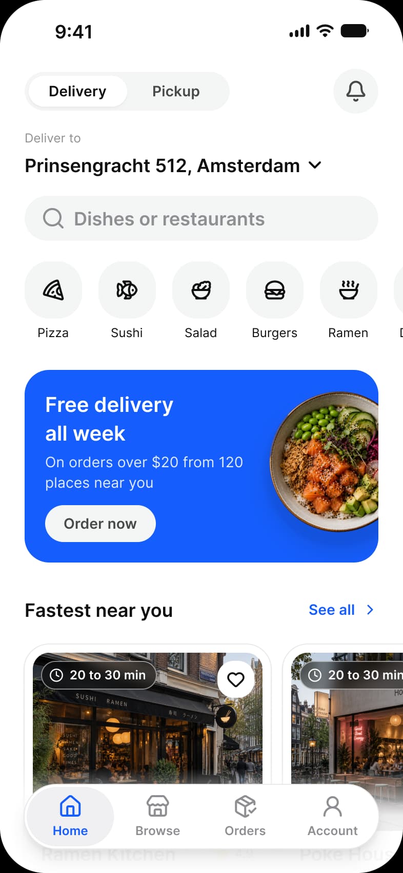
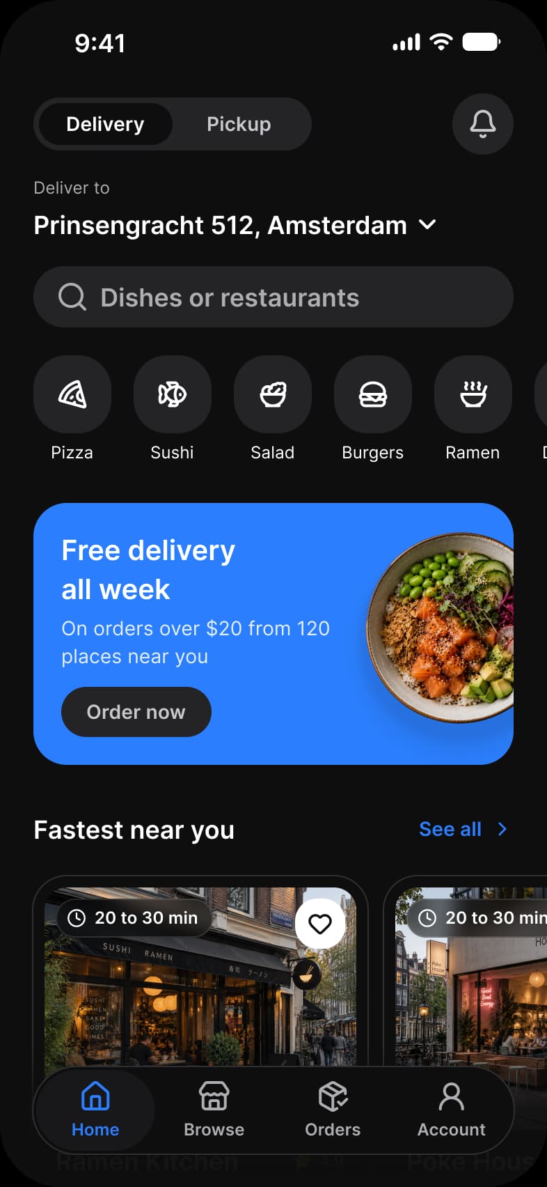
What does each system call it?
The same idea under its Apple, Material 3 and Appetite UI name.
| System | Name |
|---|---|
| Apple | Tab bar |
| Material 3 | Navigation bar |
| Appetite UI | Navigation |
What value does it take on iOS and Android?
Read from the kit’s Platform collection and its Material 3 pages, as the docs print them.
| Variable | iOS (ios-md) | Android |
|---|---|---|
platform/bar/bottom-height | 49 | 64 |
| Component | iOS | Material 3 | What differs |
|---|---|---|---|
| Navigation | iOS / Tab Bar, floating capsule 62 high, two to five tabs | M3 / Navigation bar, 412 × 80, three to five items | Material is a full width bar with a separate 24 high Gesture Navigation component, iOS floats on glass |
In practice
Three to five destinations is the rule on both systems; more belong in a list. The selected tab is the only one in the accent color.
In Appetite UI it is the Navigation component, a floating capsule on iOS and a full width bar on Material. Its height comes from platform/bar/bottom-height, 49 on iOS and 64 on Android.