iOS vs Material 3: what changes per component
iOS and Material 3 differ most in navigation, the primary action, sheets and snackbars. Per component: SwiftUI and Compose names, touch targets and sizes.

On this page
iOS and Material 3 agree on what most mobile components do, and disagree on what they are called in code, where they sit and how big they are. The differences gather in the frame of the screen: the bars at the top and the bottom, the primary action, sheets and short messages. Controls inside the content, such as a switch, a radio group or a progress indicator, change size and shape more than behavior.
I design Appetite UI. Appetite UI is a Figma UI kit for iOS and Android apps, built like a design system. One token source drives Apple and Material components in light and dark mode, and exports to SwiftUI, Jetpack Compose, Flutter and CSS. The Appetite UI docs carry one page per component with the native name on each platform, and most of the SwiftUI and Compose names below come from those pages. Every platform rule is quoted from Apple's Human Interface Guidelines, Google's Material 3 site or the Android developer docs, read on September 24 and 26, 2026, and linked under Sources.
The first column links to the Appetite UI docs page that draws both versions, and the components page lists every component in both mirrors. The last column is what a reviewer from the other platform notices first.
| Component | SwiftUI | Compose | What changes |
|---|---|---|---|
| Top bar | NavigationStack toolbar | TopAppBar | Apple also calls it a navigation bar |
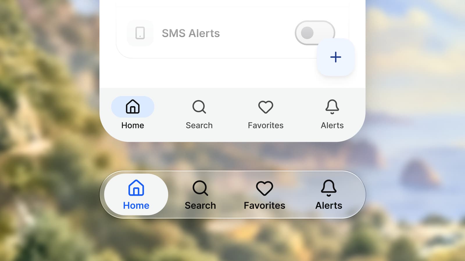
| Bottom navigation | TabView | NavigationBar with NavigationBarItem | A glass tab bar; Material wants three to five destinations |
| Primary action | A toolbar button, prominent style | FloatingActionButton | Trailing toolbar button against a FAB over the content |
| Sheet | .sheet with presentationDetents | ModalBottomSheet | Detents and a grabber; a drag handle and a scrim |
| Action sheet | confirmationDialog | ModalBottomSheet | Native on iOS only |
| Short message | None, a custom overlay | Snackbar in a SnackbarHost | Material only, one at a time |
| Context menu | .contextMenu | DropdownMenu on long press | iOS lifts the pressed object above the menu |
| Switch | Toggle, switch style | Switch | iOS keeps it to list rows; Material grows the handle |
| One of many | Picker, inline style | RadioButton group | Apple's radio buttons are macOS only |
| Segmented control | Picker, segmented style | SegmentedButton in a single-choice row | Expressive prefers a connected button group |
| Progress | ProgressView | CircularProgressIndicator, LinearProgressIndicator | Expressive adds a loading indicator |
| Date | DatePicker, graphical style | DatePicker | iOS adds compact and wheels styles |
| Divider | Divider | HorizontalDivider, VerticalDivider | Compose names the orientation |
| Disclosure | DisclosureGroup | Expandable ListItem | Both animate their own height |
| Badge | .badge on a tab item | Badge in a BadgedBox | Apple keeps badges for critical information |
| Card | LazyVGrid cell or List row | Card, ElevatedCard, OutlinedCard | SwiftUI has no card view |
| File picker | fileImporter | GetContent | Both open the system picker |
| Rating | None | None | Neither platform ships one |
Checked on , against Apple's and Google's own design and developer documentation.
Apple sizes an interface in points, Android in density-independent pixels. Both describe a size before the screen's density multiplies it, which is why Google's accessibility page can print Apple's recommendation as "44 x 44dp" beside its own. Apple lists 44 by 44 pt as the default control size on iOS and 28 by 28 pt as the minimum. Material asks for touch targets of "at least 48 x 48dp", which it says "results in a physical size of about 9mm, regardless of screen size".
The other numbers below mix published rules with values the Appetite UI file decides. The last column says which; a value the file decides lives in a variable you can change.
| Metric | iOS, pt | Android, dp | Set by |
|---|---|---|---|
| Touch target | 44 × 44 | 48 × 48 | Apple, Google |
| Body text | 17 | 16 sp, body large | Apple, Google |
| Switch track | 51 × 31 | 52 × 32 | The file; Google |
| Sheet corner | 12 | 28 | The file; Google |
| List row | 44 | 56 | The file |
| Top bar | 44 | 64 | The file |
| Control corner | 8 | Fully round | The file |
| Safe area, top | 59 or 62 | Edge to edge | The file; SDK 35 |
The iOS values are documented on the iOS mirror page, the Android ones on the Material 3 mirror page and the Platform Bridge page. Android 15 draws an app behind the system bars once it targets SDK 35, so an Android frame starts at the top edge of the screen and keeps its content clear of the status bar with insets.
On iPhone, a toolbar across the top holds the title, the back button and the actions. Apple notes that "in iOS, a navigation-specific toolbar is sometimes called a navigation bar", and asks for the standard Back and Close buttons with no text label that says Back or Close. A large title shrinks to a standard one as people scroll. The tab bar at the bottom moves between top-level sections and, since the Liquid Glass redesign, "floats above content at the bottom of the screen". Apple asks you to keep it visible in every section and to limit the cases where a More tab collects the tabs that do not fit.
Material splits the same jobs differently. The top app bar's leading button is "a back arrow, which returns to the previous screen", and the navigation bar holds "three to five destinations". With fewer than three, Material says to use tabs; with more than five, tabs inside a page or a navigation rail behind a menu icon. Back is also a system gesture: from Android 15, apps that opt in to predictive back get the system's back-to-home and cross-activity animations, so the screen behind a pushed one is part of the design.
In Appetite UI the top bar maps to the NavigationStack toolbar on iOS and the TopAppBar on Android, and the Platform collection holds the bar height per platform in one variable, platform/: 44 on iOS, 64 on Android. The navigation bar takes two to five destinations, so on Android keep it at three or more.
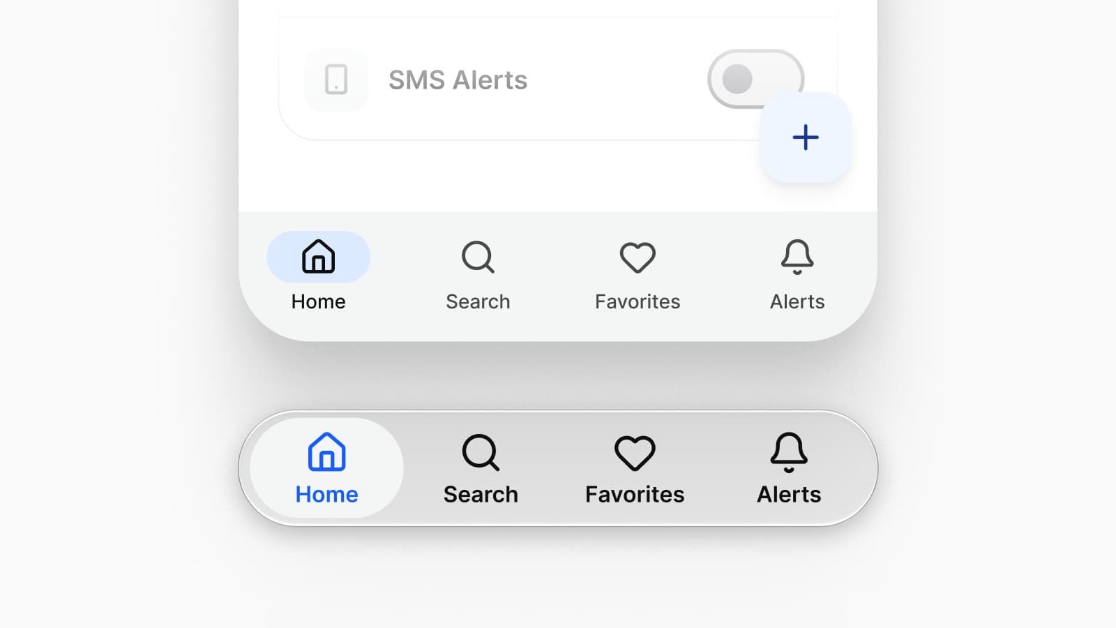
Apple puts the key action of a screen in the toolbar: "Use the .prominent style for key actions such as Done or Submit." And: "Only specify one primary action, and put it on the trailing side of the toolbar." Material puts it over the content: "Use a FAB for the most important action on a screen; it appears in front of all other content."
Material 3 Expressive, announced in May 2025, changed both halves. The small FAB is "no longer recommended" and the medium FAB is "recommended for most situations". The bottom app bar gave way to a docked toolbar and a floating toolbar that can pair with a FAB, and Material says a toolbar should not show at the same time as a navigation bar.
The Appetite UI toolbar draws the rule once for both: the primary is the only filled thing on the bar, and on Android it is the FAB. The FAB itself is marked Android-native, with a toolbar action as its iOS answer.
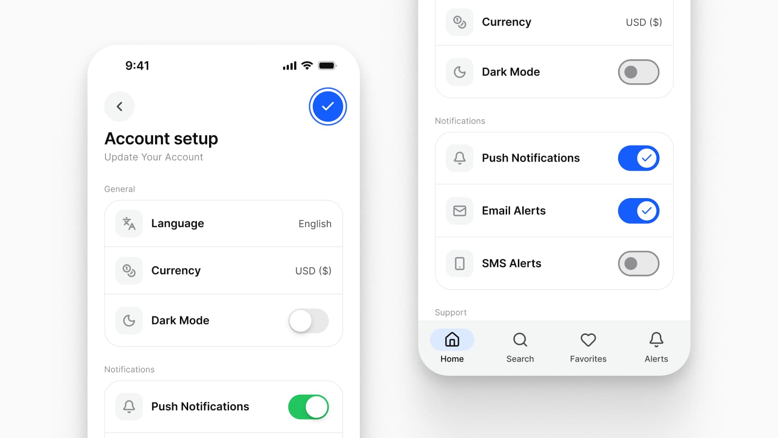
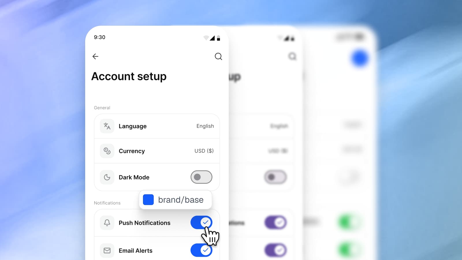
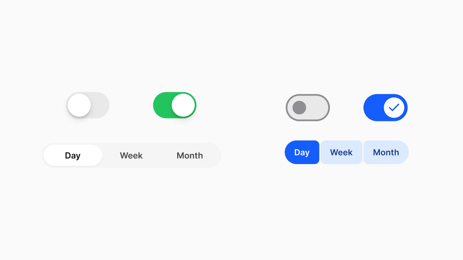
A switch does the same job on both platforms under different rules. Apple says to "use the switch toggle style only in a list row", and outside a list to use a button that behaves like a toggle. The iOS switch is green by default, and Apple suggests changing that color "only if necessary". Material's switch has a 52 by 32 dp track, can carry an icon in its handle, and shows the on state with a larger handle. In a settings row, both end the row with the switch:
Form {
    Toggle("Face ID", isOn: $faceID)
        .toggleStyle(.switch)
}ListItem(
headlineContent = { Text("Face ID") },
trailingContent = {
Switch(checked = faceID, onCheckedChange = { faceID = it })
},
)One choice out of a visible set splits further. Apple's guidelines describe radio buttons and checkboxes under macOS; on iPhone the same job is a Picker in the inline style. Material keeps the RadioButton for "a single option in a list" and checkboxes for several.
The segmented control is where the two systems now point in different directions. Apple recommends "no more than about five segments on iPhone" and a tab bar for switching between separate sections. Google's Material 3 site says segmented buttons "are no longer recommended in the Material 3 expressive update" and points to the connected button group, although Compose still ships SingleChoiceSegmentedButtonRow. The Appetite UI segmented control is the iOS pill in a groove, capped at five.
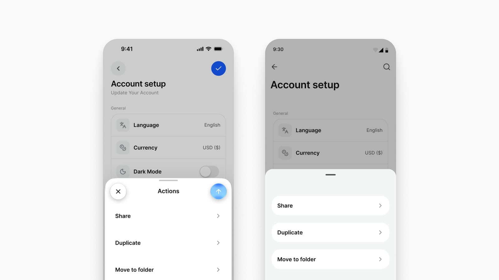
An iOS sheet rests at detents: "large is the height of a fully expanded sheet and medium is about half of the fully expanded height". Apple asks for a grabber on a resizable sheet, a swipe down to dismiss it, and Cancel on the leading edge of its toolbar with Done on the trailing edge; in SwiftUI the heights are set with presentationDetents. A Material modal bottom sheet has a 28 dp top corner radius, an optional drag handle with a 48 dp hit target, a scrim behind it and a maximum width of 640 dp; in Compose it is a ModalBottomSheet. The Appetite UI modal page draws both.
The action sheet is iOS only. Apple defines it as "a modal view that presents choices related to an action people initiate", with the destructive choice at the top and Cancel at the bottom; in SwiftUI it is a confirmation dialog. On Android, Material says modal bottom sheets "can be used instead of menus to present additional actions", which is what the Action Sheet page recommends for the Android half.
The snackbar runs the other way. "Snackbars show short updates about app processes at the bottom of the screen", "only one snackbar may be displayed at a time", and it "can contain a single action". iOS has no system snackbar, so the Appetite UI toast is a custom overlay there. Material adds a rule worth keeping on both platforms: information in a snackbar that dismisses itself must also be shown inline or near the action that triggered it.
iOS type is a set of text styles that scale with Dynamic Type. The default text size on iOS is 17 pt, the minimum 11 pt, and Large is the default Dynamic Type setting. Material 3 has "one type scale containing two sets of type styles: 15 baseline and 15 emphasized", with Roboto as the default face. The ramps do not line up step for step, so the Appetite UI typography page maps both to one scale:
| Step | Apple text style | Material 3 role |
|---|---|---|
| 6xl, 60 | None | displayLarge |
| 5xl, 48 | None | displayMedium |
| 4xl, 36 | largeTitle | displaySmall |
| 3xl, 30 | title1 | headlineLarge, headlineMedium |
| 2xl, 24 | None | headlineSmall |
| xl, 20 | title2, title3 | titleLarge |
| lg, 18 | headline, body | None |
| base, 16 | callout | titleMedium, bodyLarge |
| sm, 14 | subheadline | titleSmall, bodyMedium, labelLarge |
| xs, 12 | footnote, caption1, caption2 | bodySmall, labelMedium, labelSmall |
That is the file's Brand mode. Its System mode returns each platform's own published size, Apple's 17 pt body and Material's 57 sp displayLarge among them.
Color differs in model as well as in hue. iOS works from a tint and dynamic system colors that "automatically adapt to both light and dark contexts", and to vibrancy and accessibility settings. Material works from color roles, 32 of which the file maps, and signals hover, focus, press and drag with state layers: a fixed opacity of 8, 10, 10 and 16 percent over the content color, and 38 percent for a disabled state. The file keeps those opacities on the Material side only; the iOS mirror has no slot for them.
| Slot | iOS, System | M3, System | Brand, both |
|---|---|---|---|
| Accent | #007AFF | #6750A4 | #155DFC |
| Primary text | #000000 | #1D1B20 | #0E0E0F |
The accent is iOS/, Apple's systemBlue, and M3/; in Brand mode both read brand/. Primary text is iOS/ and M3/, and in Brand mode both read text/.
Apple added Liquid Glass to the Materials page of its guidelines on June 9, 2025. It describes the material as a functional layer for controls and navigation, tab bars and sidebars among them, that "floats above the content layer", and says: "Don't use Liquid Glass in the content layer." Standard SwiftUI and UIKit components pick up the material when an app is built with the latest SDK, and Apple's design kits for iOS 27, out on June 23, 2026, list "Updates to Liquid Glass" first. A Figma file can only hint at it: Appetite UI ships glass styles measured from Apple Design Resources, a surface tier for sheets, alerts and menus and a control tier for buttons and toolbar items, and treats the toolbar's flat fill as a placeholder the SDK replaces.
Material 3 Expressive arrived on May 13, 2025, with "fourteen new or updated components", a new shape library with shape morphing, and new corner radii of 20, 32 and 48 dp. Google is explicit that "M3 Expressive isn't a new version of the system", yet it changes what Material recommends on a phone: the shorter flexible navigation bar replaces the baseline one, flexible medium and large app bars replace the old ones, and the docked toolbar replaces the bottom app bar.
| Component | iOS | Android |
|---|---|---|
| Action sheet | Native, a confirmation dialog | A modal bottom sheet |
| Floating action button | A toolbar action | Native |
| Snackbar | A custom overlay | Native |
| Segmented control | Native | A connected button group |
| Radio button and checkbox | Described for macOS | Native |
| Rating | None | None |
Decide each missing component once and write the decision next to the component, so the second platform does not inherit the first one's answer by accident.
This is how I split the work in Appetite UI. When the two platforms disagree about a number, the number becomes a variable with one value per platform: the Platform collection has three modes, ios-md, ios-lg and android, and platform/ reads 44, 44 and 48, so one list row obeys both without a second copy. When they disagree about a component, the component is drawn once in each mirror: 21 pattern pages on the iOS side and 17 on the Material side.
Both mirrors read their colors through the Platform Bridge, 52 Apple slots and 60 Material slots on two modes: Brand points both platforms at your tokens, and System returns Apple's and Google's published values. The step-by-step setup is in How to design one app for iOS and Android in Figma, which official kit to start from is in Apple's iOS kit, Google's Material 3 kit or Appetite UI: which to start from, and the platforms page shows both mirrors side by side.
What is the difference between iOS and Material Design?
iOS and Material Design describe the same jobs with different components and measures. iOS follows Apple's Human Interface Guidelines and, since the Liquid Glass redesign, floats its bars on a glass layer; Android apps follow Material 3, updated by Material 3 Expressive in May 2025. The largest differences are in navigation, the primary action, sheets and short messages; controls inside the content mostly differ in size and shape.
Is 44 pt the same size as 48 dp?
No. Points and dp are both density-independent, so the numbers compare directly: Apple's default control size on iOS is 44 by 44 pt, and Material asks for touch targets of at least 48 by 48 dp. Google's accessibility page writes Apple's recommendation as 44 x 44dp next to its own 48.
Should an iOS app use a floating action button?
Not by default. The floating action button is Material's pattern. Apple's guidelines put the key action on the trailing side of the toolbar in the prominent style, and ask for only one primary action per toolbar. Appetite UI marks its FAB Android-native and draws a toolbar action for iOS.
What is the iOS equivalent of a Snackbar?
iOS has no system snackbar. Use a custom overlay for short feedback that goes away on its own, as the Appetite UI toast does, and an alert when the person has to act. Keep Material's rule on both platforms: information in a message that dismisses itself must also be shown inline or near the action that triggered it.
Does Material 3 have a segmented control?
Material 3 has segmented buttons, and Material 3 Expressive no longer recommends them. Google's Material 3 site recommends the connected button group, while Jetpack Compose still ships SingleChoiceSegmentedButtonRow and MultiChoiceSegmentedButtonRow. The segmented control with a sliding pill is Apple's.
- Apple HIG: Tab bars, read September 26, 2026
- Apple HIG: Toolbars, read September 24, 2026
- Apple HIG: Toggles, read September 24, 2026
- Apple HIG: Segmented controls, read September 24, 2026
- Apple HIG: Sheets, read September 24, 2026
- Apple HIG: Action sheets, read September 24, 2026
- Apple HIG: Accessibility, read September 24, 2026
- Apple HIG: Typography, read September 24, 2026
- Apple HIG: Color, read September 24, 2026
- Apple HIG: Materials, read September 26, 2026
- Apple HIG: Pickers, read September 24, 2026
- Apple Developer: Adopting Liquid Glass, read September 24, 2026
- Apple Developer News: Design kits for iOS, iPadOS, and macOS 27 are here, read September 24, 2026
- SwiftUI: presentationDetents, read September 24, 2026
- SwiftUI: confirmationDialog, read September 24, 2026
- Material 3: Navigation bar, read September 24, 2026
- Material 3: App bars, read September 24, 2026
- Material 3: Floating action button, read September 24, 2026
- Material 3: Toolbars, read September 24, 2026
- Material 3: Switch specs, read September 24, 2026
- Material 3: Switch guidelines, read September 24, 2026
- Material 3: Segmented buttons, read September 24, 2026
- Material 3: Bottom sheets, read September 24, 2026
- Material 3: Snackbar, read September 24, 2026
- Material 3: Accessibility, designing, read September 24, 2026
- Material 3: Type scale and tokens, read September 24, 2026
- Material 3: State layers, read September 24, 2026
- Material 3: Shape, read September 24, 2026
- Material Design: Start building with Material 3 Expressive, read September 24, 2026
- Android Developers: Material Components in Compose, read September 24, 2026
- Android Developers: Display content edge-to-edge, read September 24, 2026
- Android Developers: Predictive back gesture, read September 24, 2026