Settings screen design for iOS and Android
iOS settings are a grouped inset list with chevrons and switches; Android settings are a Material 3 list under a top app bar. Measured sizes and patterns.

An iOS settings screen is a grouped inset list under a large title, with chevron rows, switches that apply at once and, in many apps, a Log out and Delete account pair at the foot; an Android settings screen is a Material 3 list under a 64 dp top app bar, with headings between groups, switches that can carry a check in the handle and, by Google's own guidance, no account management and no version line. The data is the same, language, notifications, privacy and the account. The anatomy around it is not.
Appetite UI is a Figma UI kit for iOS and Android apps, built like a design system. One token source drives Apple and Material components in light and dark mode, and exports to SwiftUI, Jetpack Compose, Flutter and CSS. I build it, so the sizes below are read from its file on October 8, 2026, and where the file draws one platform only, the text says so.
How do the two settings screens differ part by part?
They differ in how the list is contained, how tall a row is, what leads a row and where the title goes. The Appetite UI file draws a full Settings screen only on the iOS side, as the example on its iOS List page. The Material 3 side is a set of parts, a top app bar and a list item, so the table below compares parts and does not claim a second finished screen. The touch target, bar height and row minimums of both platforms are in iOS vs Material 3: what changes per component; these rows are the ones that article does not carry.
| Part | iOS mirror | Material 3 mirror |
|---|---|---|
| Title | Large title, 34 / 41 Bold, below the status bar | Small top app bar, 360 × 64, headline 20 / 28 Semi Bold in the bar |
| Group | Inset grouped: 20 side margin, container radius 24 | No container in the list item set; items run flush on the surface |
| Row height | Regular 52, Tall 68 | One line 56, two lines 72, three lines 88 |
| Row padding | 16 each side, 0 above and below | 8 above and below, 16 leading, 24 trailing in the file; 10 above and below, 16 leading and trailing in the token files |
| Leading | A 29 × 29 symbol tile, radius 8, with an 18 glyph | A bare icon, 24 × 24 |
| Trailing | Detail text, chevron, both, checkmark or switch | An icon of 24 × 24; the chevron drawn is 6 × 12 |
| Divider | 1 pt line inside the container, starting at 57 when a tile leads and at 16 otherwise | None drawn; the token file has a 1 px divider inset 16 on both sides |
| Group heading | 12 / 18 in capitals above the container, inset 16; footer 12 / 18 below | No heading component in the file; Google asks for "headings between groups" |
Checked on , against the Appetite UI file, Material Web tokens 34.0.21, Apple's and Google's guidelines.
Read from the iOS List page (Inset Grouped, _List Row, the Settings example) and the Material 3 List, App Bar and Switch pages of the Appetite UI file on October 8, 2026. Token values: Material Web, Material 3 version 34.0.21.
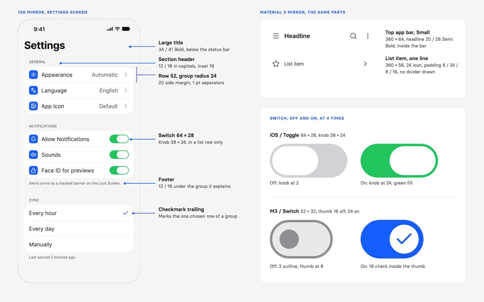
Apple's own page for lists and tables names the iOS look: "In iOS and iPadOS, for example, the grouped style uses headers, footers, and additional space to separate groups of data." It also says "iOS Settings uses a hierarchy of lists to help people choose options", and "use a disclosure indicator accessory control" to drill into a row's subviews, which is the chevron. A table that lists options briefly highlights a row and then adds an image such as a checkmark to show the selection, which is the Sync group at the foot of the example screen.
Google puts it differently: "Group settings in smaller relevant groups. Use visual or intrinsic containment and headings between groups instead of individual items." A settings section is built "by using the list or list-detail layout", and the screen's title lives in the top app bar.
Why does one switch have three sizes?
The file draws three switches because three systems own them: Apple's, Google's and Appetite UI's own Toggle, which sits on the brand color and is the one the Settings screens use. The numbers differ in every column:
| Switch | Track | Handle | Frame | On state |
|---|---|---|---|---|
| iOS / Toggle | 64 × 28 | Knob 38 × 24, at 2 off and 24 on | 64 × 28 | Green fill, #22C55E |
| M3 / Switch | 52 × 32 | Thumb 16 off, 24 on with a 16 check; 28 pressed in the tokens | 52 × 32; state layer 40 in the tokens | Primary fill, the check in the thumb |
| Appetite UI Toggle | 44 × 28 | Circle 22, at 3 off and 19 on | 52 × 44 | brand/ fill |
iOS and Material 3 rows from the Toggle and Switch pages of the file, October 8, 2026; Material 3 handle and state layer sizes from the Material Web switch tokens. Appetite UI row from the Toggle page, same day.
Apple's toggle guidance is short for iOS: "Use the switch toggle style only in a list row. You don't need to supply a label in this situation because the content in the row provides the context for the state the switch controls." And, for color: "The default green color tends to work well in most cases, but you might want to use your app's accent color instead." Appetite UI's Toggle takes that second route. The Toggle page of the docs adds a rule that the HIG excerpt above does not state: a toggle takes effect the moment it moves, so there is nothing to save and nothing to confirm. If a change needs a Save step, use a checkbox instead.
State needs more than a color. Apple: "Avoid relying solely on different colors to communicate state, because not everyone can perceive the differences." The iOS switch answers with the knob moving 22 points across the track, Material 3 with a thumb that grows from 16 to 24 and carries a check. Material Web lists the check as an option: "Icons can be used to visually emphasize the switch's selected state." The Material switch in the file draws it, so design with it on. The switch page lists the Appetite UI states, and its iOS and Material 3 section lists the same two native sets.
What belongs on a settings screen on each platform?
Both platforms ask for few settings with good defaults. They disagree on two things that shipped apps put on the screen anyway: the account and the version line. Quotes are Apple's and Google's own words.
| Topic | Apple | |
|---|---|---|
| Defaults | "Aim to provide default settings that give the best experience to the largest number of people." | "Represent the default most users would choose." |
| How many | "Minimize the number of settings you offer." | "For 15 or more settings, group related settings under a subscreen." |
| Account | Apps "might offer options related to people's accounts" in general settings | "Avoid account management." |
| App information | No rule on the Settings page | "Avoid information about the app, such as a version number or licensing information in settings." |
| System settings | "avoid including redundant versions of them" | "Avoid replicating preferences available at the device settings level." |
| Where it lives | A custom settings area for "general, infrequently changed settings" | After all other items except Help & Feedback, named Settings, not "Options" or "Preferences" |
| Choices | A switch only in a list row | A switch or checkbox for on and off; radio buttons "in a dialog or child screen" |
Checked on , against Apple HIG Settings, Lists and tables, Toggles, Managing accounts; Android Developers, Settings pattern.
Two consequences for a file that serves both platforms. First, the account block is a placement decision per platform: on iOS it can head the screen, on Android Google's page offers another home, "You can combine settings with other destinations, such as Account if the taxonomy makes sense", and asks that settings "are always accessible, even in a signed out state". Second, Google's naming rule is about the navigation label. Appetite UI's Selection screen is titled Preferences and sits under a Settings menu, so the rule does not touch it, but a top level Android entry should say Settings.
The three Appetite UI Settings screens are built from List, Toggle and Top Bar: a menu with rows in three groups, an account form and a preferences list. They are drawn on the iOS side with the product List, a card shaped row, rather than with the iOS or Material mirror list. 17 of the 29 instances placed on them are List rows, and the Settings screens page lists the rest, in light and dark. The set draws no destructive row; the only destructive paint on the List page is the Delete swipe action, state/, #FB2C36.
How do shipped apps structure their settings?
In the apps I read, account and notification rows come before the legal links, and Log out and Delete account close the screen. I searched Mobbin on October 8, 2026 for iOS settings screens with an account block and a delete row, so the sample shows that pattern and claims nothing wider. Mobbin's search offers iOS and web, which is why every app here is an iOS app. The screens are as Mobbin recorded them, some caught mid scroll, and may differ from the current release.
| App | Top of the screen | Foot of the screen |
|---|---|---|
| Satispay | Personal information, Notifications, Security, App settings, each with a second line and a chevron | Log out, Delete account in red, then the version |
| Jomo | Other: Restore purchases, What's new, Terms of use, Privacy policy | A group headed Danger Zone with Log out and Delete account side by side, then the user ID and the version |
| ShopBack | An Account group: Account and security, Privacy, Language, Notification settings | Version, then Log out as a text link |
| Coffee Meets Bagel | Notification switches for likes, chats and customer service | Privacy Policy and Terms of Service, a units control, a Log out button, a Delete account link, the version |
| Spotify for Creators | Show, then an Account group: Personal info, Push notifications, Email notifications, Theme | Log out as an outlined button, the version, the legal links |
| Rodeo | Social links, a Get Support group, an Extras group | Log Out, a red Delete Account, the version |
| MLS | Privacy links that open outside the app, then Account | Request Account Deletion, which opens a web page, then Log out |
| Opal | My Account: occupation, age, email, phone, Sign in with Apple | Sign out, a red Delete My Account with a note on what is lost |
| Stardust | Delete Your Account as the first, red button | Feedback, links, the app version, Log Out |
Seven of the screens I read end with a version line, and seven offer account deletion in some form; Stardust puts it at the top, and MLS sends people to a web page. Every one has a Log out or Sign out. The delete flows Mobbin keeps in full are short, three screens each for Rodeo, Bevel, Hatch Sleep and Vocabulary and four for Numo, and each includes a confirmation alert that restates the loss, worded "Are you sure?" in Vocabulary and Bevel.
That is what Apple's Managing accounts page asks for: "If you help people create an account within your app or game, you must also help them delete it, not just deactivate it", and "Provide a clear way to initiate account deletion within your app or game. If people can't perform account deletion within your app, you must provide a direct link to the webpage on which people can do so." MLS follows the second sentence. Google's settings page names no destructive row, and it asks to keep account management and the version out of the list altogether. A shared file therefore holds the destructive row as a component with a platform decision written beside it.
Which Platform variables carry the differences?
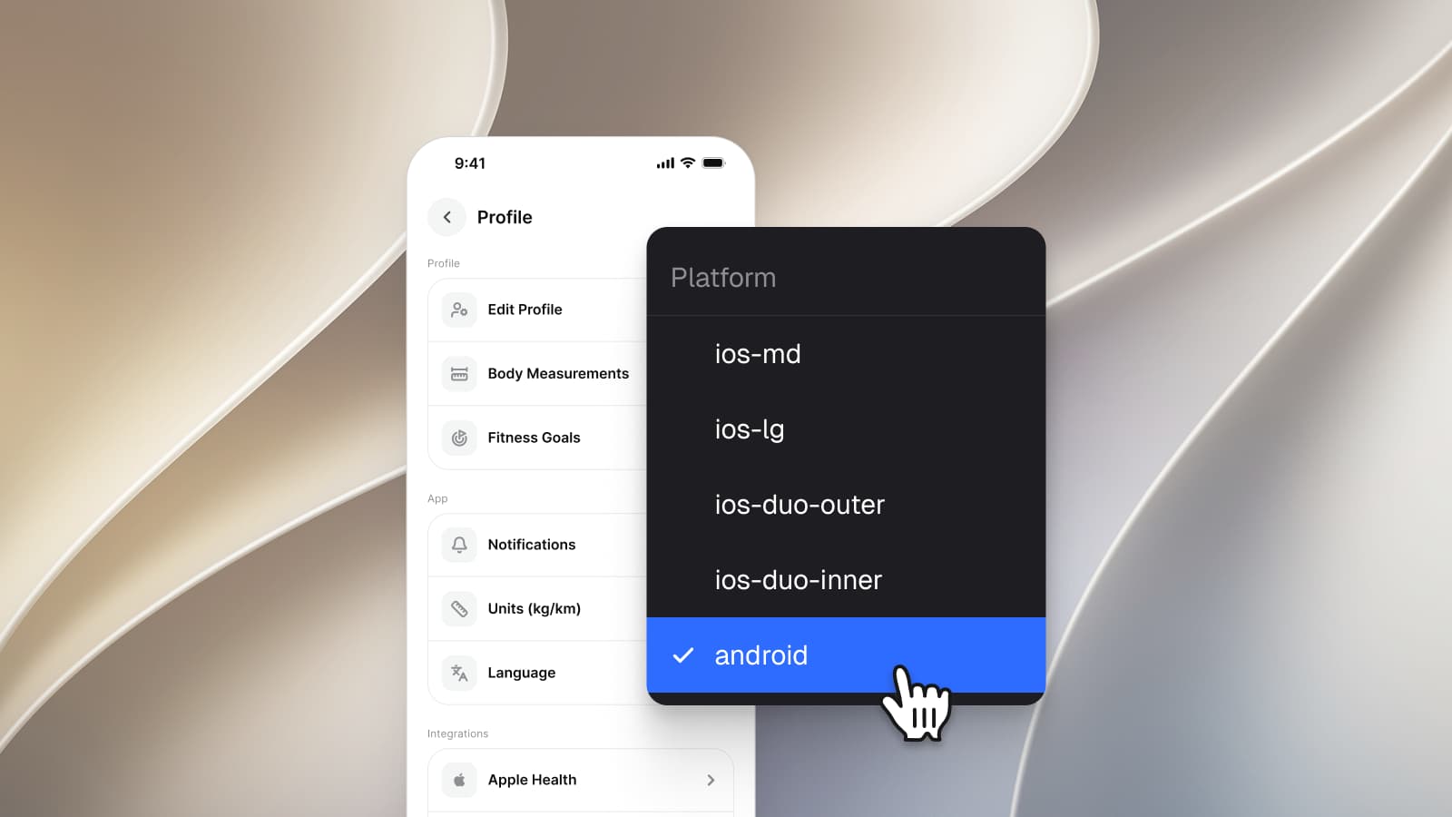
The Platform collection holds 20 variables on five modes, ios-md, ios-lg, ios-duo-outer, ios-duo-inner and android, which is the menu on the cover with android selected. These are the ones a settings screen reads:
| Variable | ios-md | ios-lg | android | ios-duo-outer | ios-duo-inner |
|---|---|---|---|---|---|
platform/ | 44 | 44 | 48 | 44 | 44 |
platform/ | 44 | 44 | 64 | 44 | 44 |
platform/ | 49 | 49 | 64 | 0 | 0 |
platform/ | 44 | 44 | 56 | 44 | 44 |
platform/ | 8 | 8 | 9999 | 8 | 8 |
platform/ | 12 | 12 | 12 | 12 | 12 |
platform/ | 12 | 12 | 28 | 12 | 12 |
platform/ | 64 | 64 | 52 | 64 | 64 |
platform/ | 28 | 28 | 32 | 28 | 28 |
platform/ | 16 | 16 | 16 | 16 | 16 |
grid/ | 59 | 62 | 52 | 24 | 24 |
grid/ | 34 | 34 | 24 | 24 | 24 |
Read value by value from the Platform collection of the Appetite UI file on October 8, 2026. The touch target of 44 and 48 and the Material 3 mirror are described in How to design one app for iOS and Android in Figma.
Three readings from the table. The switch track is the one variable pair where the iOS modes and android are two shapes: 64 × 28 against 52 × 32. The card corner stays 12 on every mode, while the group radius of 24 on the iOS List page belongs to the component, so the variable describes a platform card and the screen's list uses a bigger radius. And the iPhone Duo modes keep every iOS number except the bottom bar and the safe areas, which is why a settings list there needs no new row sizes.
One limit: Platform is pinned to ios-md on the three Settings frames, and I found no node in them bound to a Platform variable. The same holds for the List, Toggle and Top Bar components and for the iOS and Material switch and list pages. Switching these frames to android therefore moves nothing today. The modes are the specification a build reads, in SwiftUI and Compose, and they drive the Duo frames, whose safe areas are bound. For an Android settings screen, start from the M3 / Top app bar and M3 / List Item, set the row to 56 and the switch to 52 × 32, and keep the destructive row and the version line out of the list.
Decide what the settings are
Few, with defaults most people would choose. Drop what the system already offers.
Choose the container per platform
Inset groups with headers and footers on iOS, a flush list with headings between groups on Android.
Pick the switch for the platform
The 64 × 28 switch in a list row on iOS, the 52 × 32 switch with its check on Android.
Place the account block on purpose
Near the top on iOS; on Android a separate Account destination, as Google's page allows.
Give deletion a path
A destructive row with a confirmation on iOS, or a direct link to the web page that deletes the account.
Set the mode and check the sizes
Platform on ios-md or android, Color Tokens on Light and Dark, and read every row against 44 or 48.
The Settings screens page lists every component and token on the three screens, the screens overview shows them beside the other apps, the read-only preview opens the file, and pricing lists what each license includes. For the other first screens of an app, read Mobile onboarding screen patterns for iOS and Android.
Questions
How should an iOS settings screen be structured?
As a grouped list: rows in inset groups, each group with a header and, where it helps, a footer. Apple writes that "the grouped style uses headers, footers, and additional space to separate groups of data". Rows that open a screen end in a chevron, a group of choices marks the picked row with a checkmark, and a switch appears only in a list row.
Where does Delete account go in an iOS app?
In the apps I read, it sits at the foot of the settings or account screen, after Log out, in red, with a confirmation alert. Apple's Managing accounts page requires that people who can create an account in the app can also delete it, and that the app either starts the deletion itself or links directly to the web page that does.
How tall is a settings row on iOS and on Android?
In the Appetite UI file the iOS row is 52 high, 68 in the Tall style, and the Material 3 list item is 56, 72 or 88 by lines of text. The Platform collection sets the minimum at 44 on the iOS modes and 56 on android.
What is the difference between an iOS toggle and a Material 3 switch?
Size and state. The iOS toggle in the file is 64 × 28 with a 38 × 24 knob and a green on state; the Material 3 switch is 52 × 32 with a thumb that grows from 16 to 24 and shows a check when it is on. Apple asks to use the switch only in a list row.
Should an Android settings screen include account management?
Google's settings pattern says to avoid it, along with app information such as a version number, and to keep settings reachable even when signed out. Put the account in its own destination, or combine it with settings only if the structure makes sense.
Can one Figma settings screen serve iOS and Android?
Only in part. The list, the switch and the bar differ in size and anatomy, and the account and version rules differ too. The Appetite UI Settings screens are drawn once on the iOS side; the Platform collection holds the numbers for both, and the Material 3 parts exist as a top app bar, a list item and a switch.
Sources
- Apple Human Interface Guidelines: Settings, read October 8, 2026
- Apple Human Interface Guidelines: Lists and tables, read October 8, 2026
- Apple Human Interface Guidelines: Toggles, read October 8, 2026
- Apple Human Interface Guidelines: Managing accounts, read October 8, 2026
- Android Developers: Settings pattern, read October 8, 2026
- Material Web: switch tokens, Material 3 version 34.0.21, read October 8, 2026
- Material Web: list and divider tokens, Material 3 version 34.0.21, read October 8, 2026
- Material Web: switch component guide, read October 8, 2026
- Material Web: top app bar tokens, Material 3 version 34.0.21, read October 8, 2026
- Mobbin, iOS settings screens and account deletion flows, read on Mobbin October 8, 2026