Mobile onboarding screen patterns for iOS and Android
Six onboarding screen patterns that shipped iOS apps use, which one to pick, what Apple and Google advise, and the Appetite UI screens that implement them.

Shipped apps build their first run from a small set of screen patterns, and six of them cover everything I read: a short value carousel with a way to skip, permission priming just before the system alert, progressive profiling that asks a little at a time, sign-in options led by Apple and Google, goal selection, and a later link that never closes the way in. Pick by what the app needs before it can show anything useful: an account, a permission or a profile. If it needs none of them, show the app first.
Appetite UI is a Figma UI kit for iOS and Android apps, built like a design system. One token source drives Apple and Material components in light and dark mode, and exports to SwiftUI, Jetpack Compose, Flutter and CSS. I build it, so the screens below are read from its file on October 8, 2026. Its Onboarding group covers the Welcome and the account patterns and leaves the others to you; the text says which is which.
Which onboarding screen patterns do shipped apps use?
Six, and each one answers a different request that the app makes of a person. The table names an iOS app for each, the length of its flow in Mobbin's count, what the pattern asks of the person, and the Appetite UI screen that implements it, if there is one. I read the flows on Mobbin on October 8, 2026, and describe a screen only where its preview showed it.
| Pattern | Shipped app (screens in its flow) | What it asks of the person | Appetite UI screen |
|---|---|---|---|
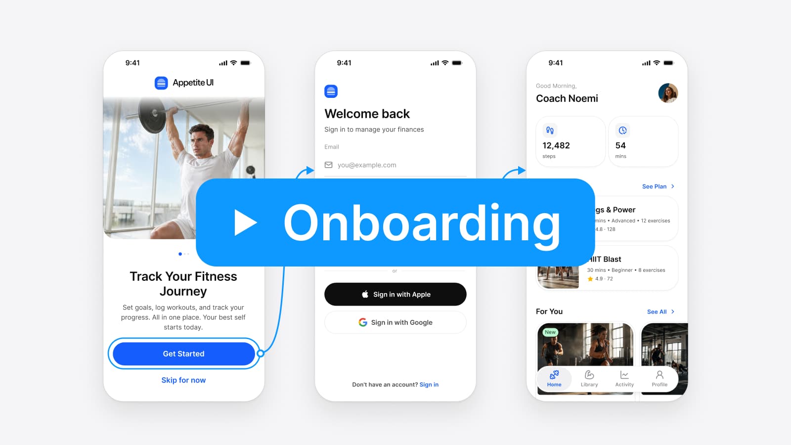
| Value carousel with skip | Klima (6) | Swipe through slides, or tap Skip Introduction; the last slide offers Sign up | Welcome: one slide, three pager dots, Get started and Skip for now |
| Permission priming | HelloFresh (3), Strava (12) | Read one reason, tap Continue or Choose permissions, then answer the system alert | None. The system alert is drawn on the iOS pages |
| Progressive profiling | Finimize (13) | Give a first name on a screen of its own, then finish the setup | Sign Up: optional phone, a password hint, a consent line |
| Sign-in options | Raycast (9), Finimize (13) | Pick Apple, Google or another provider, or use an email | Sign In, social first and form first, and Sign Up |
| Goal selection | Finch (6), Strava (12) | Choose areas of support, several at once, or one training level | None. Build it from Chip or List with a Radio or Checkbox |
| Skip or later | IKEA (12), Klima (6) | Tap Log in, or the Maybe later link under it, or Skip Introduction | Skip for now on Welcome |
Checked on , against flows read on Mobbin October 8, 2026, and the Appetite UI file.
Screen counts are Mobbin's count of each flow: Klima 6, HelloFresh 3, Raycast 9, Apple Health 8, Strava 12, Finch 6, IKEA 12, Finimize 13, Tiimo 19, Letterboxd 10 and The Outsiders 10. Previews are a spread of a flow, so a screen not named here may exist. Mobbin's search offers iOS and web, which is why every app is an iOS app.
What each flow showed, in my words:
- Klima. The introduction runs on a pager with a Skip Introduction pill on its slides and a back and a close button at the top; the last slide offers Sign up.
- HelloFresh. The priming screen is headed Allow notifications and answers the question it expects, "Why should I allow notifications now?", before a single Continue.
- Strava. One training level, Beginner to Pro, in four cards; then a Don't miss a thing screen with a Choose permissions button and a note to tap Allow on the next step; later the rest of the setup becomes a four item checklist on Home.
- Finimize. It asks "What should we call you?" alone, then offers Continue with Apple and Sign up with Google above an email form.
- Raycast. Apple, GitHub and Google under a "Create your account" title.
- Finch. Areas of support picked with check marks, three of five chosen in the preview.
- IKEA. Log in with a Maybe later link under it.
- Apple Health. Six fields on one form headed Set up Health Details.
- The Outsiders. A single Connect to Health button with the line "Your health data will never leave this device."
- Letterboxd. A swipeable intro, then a Join form with two consent check boxes.
The flows are not short. These flows run from 3 frames at HelloFresh to 19 at Tiimo, and the median is 10. That is a sample from my queries and measures nothing about the market; it says only that the patterns above are usually combined: Tiimo, for one, puts a permission step in a sheet over the home screen, headed "Step 2/3" and "Enable daily reminders", with Enable notifications and a No thanks link.
Which pattern should you use when?
Choose by what the first screen of the app needs, and add a pattern only when that need exists. Apple and Google give the same order: show the value, then ask.
| If the app | Use | The platform says |
|---|---|---|
| Can show content before anyone signs in | No carousel; sign in later | Apple: "Delay sign-in for as long as possible." |
| Needs an account before it shows anything | A Welcome, then sign-in options | Google: the welcome placement "is ideal when your app requires user registration to gain access to content" |
| Needs one permission for one feature | Priming at that feature | Google: "Ask for a permission in context, when the user starts to interact with the feature that requires it." |
| Cannot work without a permission | Priming in the first run | Apple: put the request "into your onboarding flow", otherwise ask "when people first access the specific function" |
| Opens on a screen that depends on a choice | Goal selection with progress | Google: "Show the user's progress. You can use components like steppers, pagers, or a progress indicator." |
| Has features a first screen cannot show | A short carousel with skip | Google: "always ensure there is a clear and persistent option to skip or login immediately" |
Checked on , against Apple Human Interface Guidelines, Android Developers.
Two rules sit under that table. Apple asks that onboarding stays out of the way of the app: "Postpone nonessential setup flows or customization steps." And a skipped tutorial stays skipped: "If you let people skip the tutorial when they first launch your app or game, don't present it again on subsequent launches, but make sure it's easy for people to find if they want to view it later." Google asks for the same from the other side: "Provide a way to skip and resume later, like caching progress."
What do Apple and Google ask of the screens themselves?
Their rules reach down to single controls. The ones that decide how a screen is drawn:
| Control | Apple | |
|---|---|---|
| Screen before a system alert | "Include only one button and make it clear that it opens the system alert", titled like "Continue" or "Next", never "Allow" | A rationale that explains "what data your app is trying to access and what benefits the app can provide" |
| Pager | "Center a page control at the bottom of the view or window"; more than about 10 dots "are hard to count at a glance" | Steppers, pagers or a progress indicator, not "an illustration that changes with each step" |
| Sign-in buttons | Sign in with Apple "no smaller than other sign-in buttons", and no scrolling to reach it | Passkeys and single sign-on "for a frictionless entry" |
| Form | "Don't ask people to supply a password" after Sign in with Apple | "Avoid creating long, scrolling forms"; "Break up long onboarding into smaller steps" |
| Recovery and rules | An account only "if your core functionality requires it" | "Provide recovery, like Forgot password in an accessible location"; show password requirements |
Checked on , against Apple HIG Privacy, Sign in with Apple, Managing accounts, Page controls; Android Developers, Authentication and Onboarding.
The first row has a consequence for design files. Apple's pre-alert rule bars a close or cancel route on that screen: "don't provide a way for people to leave the screen or window without viewing the system alert". HelloFresh and Strava draw one button; Apple writes that rule for camera, microphone, location, contact, calendar and tracking requests. Notifications are not on its list, and Tiimo's sheet for them adds a No thanks link. Google's Android page allows a rationale that the app shows only "if the system determines that your app should show a rationale", so on Android the screen may never appear, and the design needs both paths.
Which Appetite UI screens implement which pattern?
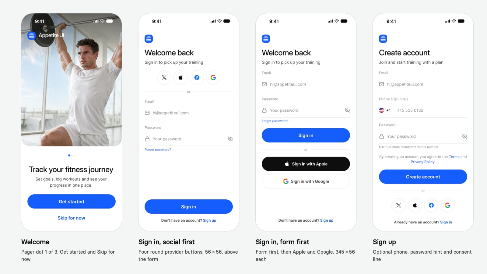
The Onboarding page of the file holds 4 screens, each in Light and Dark, with Color Tokens set on the frame, so eight frames in all. Their states are narrow, and the table says exactly which.
| Screen | States drawn | Pattern |
|---|---|---|
| Welcome | Slide 1 of a three dot pager, the active dot 8 × 8 and the others 5 × 5; a Get started and a Skip for now button, each 345 wide | Value carousel with skip |
| Sign In, social first | Four round provider buttons, 56 × 56, above an Email and Password form; Forgot password as a hint | Sign-in options |
| Sign In, form first | The form, a Sign in button, then Sign in with Apple and Sign in with Google, 345 × 56 each | Sign-in options |
| Sign Up | Email, an optional Phone with a country flag, Password with the hint "Use 8 or more characters with a number", a consent line, four providers | Sign-in options, light profiling |
Read from the Onboarding page of the Appetite UI file on October 8, 2026, light frames; the dark frames hold the same instances on the other Color Tokens mode.
Four things the group does not draw, and you build. Slides two and three of the carousel: the Welcome frame is one state of a pager. Any permission screen: the system alert exists on the iOS pages in six kinds, Photos, Tracking, Camera, Microphone, Contacts and Location, but the screen before it does not. Goal selection: Chip and Progress Steps are the parts. And the error states of the form: the Text Input has Error among its five states, but no frame shows it filled in. The page also draws no prototype connections; the blue arrows on the cover are drawn for the cover, so wire Get started to Sign In yourself.
Where the file follows a rule above, it can be measured. Both Sign In layouts draw the Apple button at the size of the Google button, as Apple asks, and the social first layout draws all four providers at 56 × 56. The Welcome pager is centered above the headline with three dots, well under Apple's limit of about ten. Forgot password sits under the password field, and Sign Up shows the password rule before the person types, which matches Google's two recovery lines. The iPhone Duo pair of the same app opens on the Welcome on the outer display and a Sign Up form beside a photograph on the inner display, described in How to design for iPhone Duo in Figma. The touch targets are 44 on the iOS modes and 48 on android, as in How to design one app for iOS and Android in Figma.
List what the first screen needs
An account, a permission, a profile choice, or nothing. Each need is one pattern.
Show the value before the ask
A real screen, or at most a short carousel that skips from every slide.
Prime permissions at the feature
One reason, one button titled Continue or Next, then the system alert.
Offer sign-in with equal buttons
Apple and Google at the same size, a form for the rest, recovery and rules visible.
Ask for little and show progress
A name first, the rest later, with a stepper or a pager where steps repeat.
Draw skip, light and dark, and both platforms
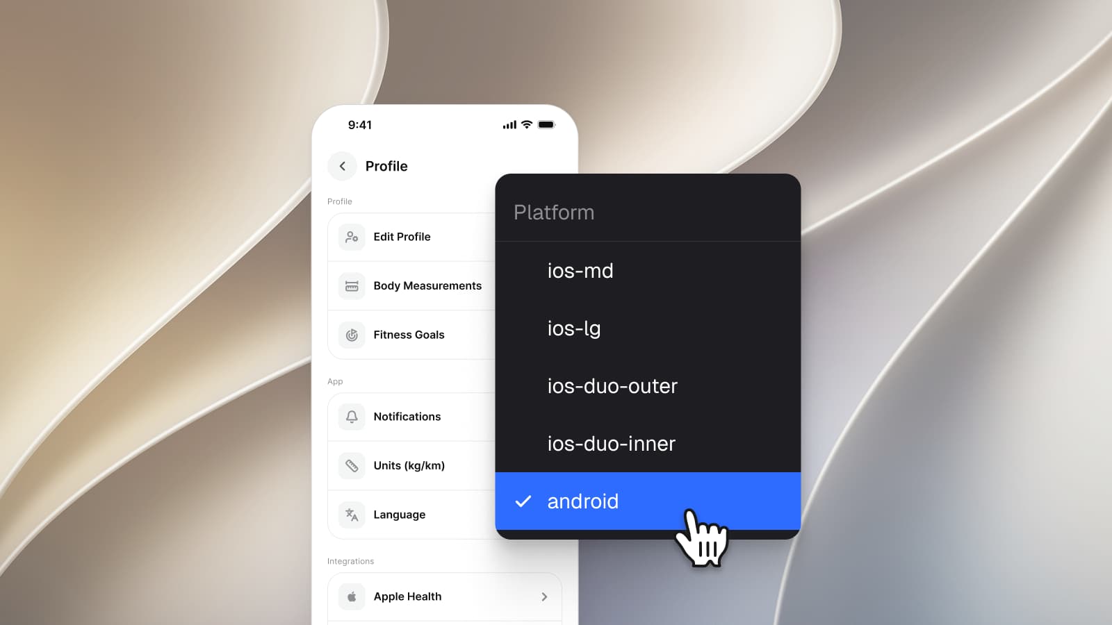
Platform on ios-md or android, Color Tokens on Light and Dark, and every control at 44 or 48.
The Onboarding screens page lists every component and token on the four screens, the screens overview shows them beside the other apps, the read-only preview opens the file, and pricing lists what each license includes. For the screen that follows a first run, read Settings screen design for iOS and Android, and for the component names on both platforms, iOS vs Material 3: what changes per component.
Questions
How many screens should a mobile onboarding flow have?
As few as the app needs; Apple asks for a flow that is "fast, fun, and optional". The iOS flows listed under the first table run from 3 to 19 frames, with a median of 10, and Google asks to "break up long onboarding into smaller steps" and to show progress. Count what the app must collect, not what it can explain.
When should an app ask for notification permission?
When the feature that needs it is first used, unless the app cannot work without it. Apple says to request when people first access the specific function, and Google to "ask for a permission in context". A screen before the system alert should hold one button, titled Continue or Next, never Allow.
Should an onboarding flow include Sign in with Apple?
If you offer it, Apple asks that its button is no smaller than the other sign-in buttons and that people need not scroll to reach it. Both Appetite UI sign-in layouts draw Apple and Google at the same size, 56 high in the form first layout and 56 × 56 in the social first layout.
Can people skip onboarding?
They should be able to. Apple calls good onboarding optional, and Google asks that a walkthrough always has "a clear and persistent option to skip or login immediately". A skipped tutorial should not return on the next launch, but should stay findable in a help or settings area.
Which onboarding screens does Appetite UI include?
A Welcome, two Sign In layouts and a Sign Up, 4 screens in light and dark, built from Button, Social Button, Text Input, Divider, Pagination and Logo. It draws no permission, goal selection or profile screen, and the Welcome frame is the first slide of a three dot pager.
Does onboarding differ between iOS and Android?
The patterns are the same; the system pieces differ. iOS adds Sign in with Apple and passkeys, Android relies on passkeys and single sign-on, and a rationale on Android is shown only when the system asks for one. Touch targets are 44 on iOS and 48 on Android, and Google publishes an Android Onboarding Figma Kit.
Sources
- Apple Human Interface Guidelines: Onboarding, read October 8, 2026
- Apple Human Interface Guidelines: Privacy, read October 8, 2026
- Apple Human Interface Guidelines: Managing accounts, read October 8, 2026
- Apple Human Interface Guidelines: Sign in with Apple, read October 8, 2026
- Apple Human Interface Guidelines: Page controls, read October 8, 2026
- Android Developers: Authentication and onboarding, read October 8, 2026
- Android Developers: Request runtime permissions, read October 8, 2026
- Mobbin, iOS onboarding and account setup flows, read on Mobbin October 8, 2026