Updated
Sign in and sign up screens
The way into an app, drawn as one welcome screen and three forms in Appetite UI, a Figma UI kit for iOS and Android apps built like a design system. The two sign in layouts hold the same parts in the opposite order, so the choice between them is a choice of which way in you expect most people to take.
Updated
Screens
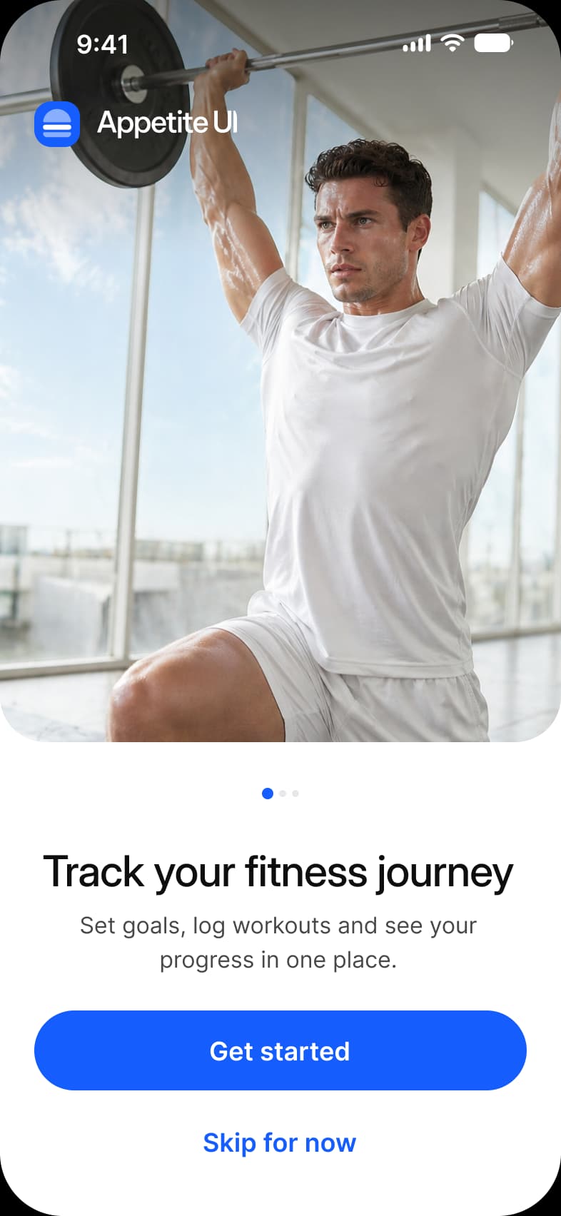
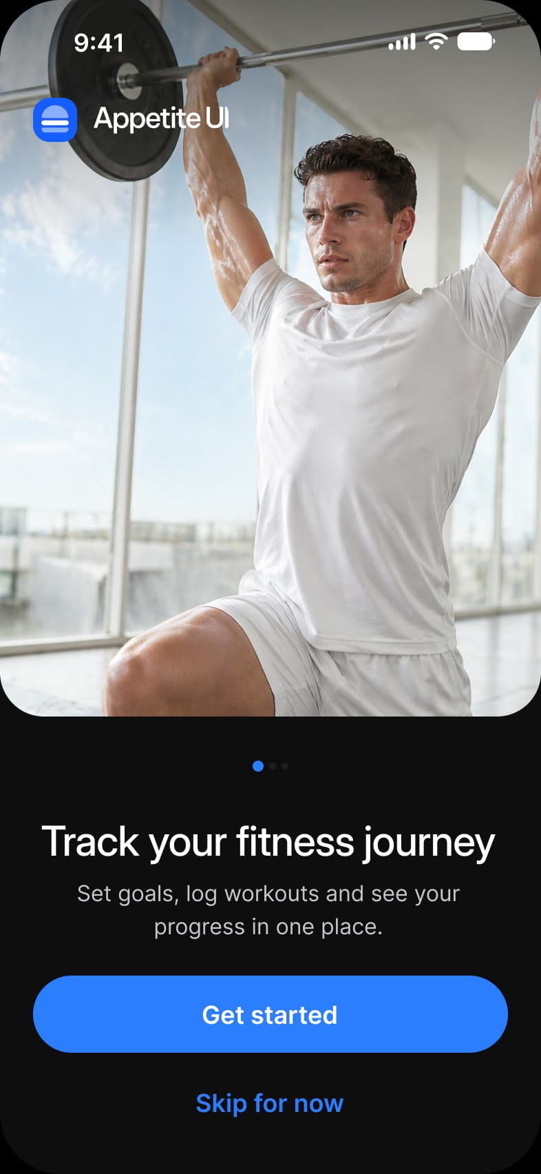
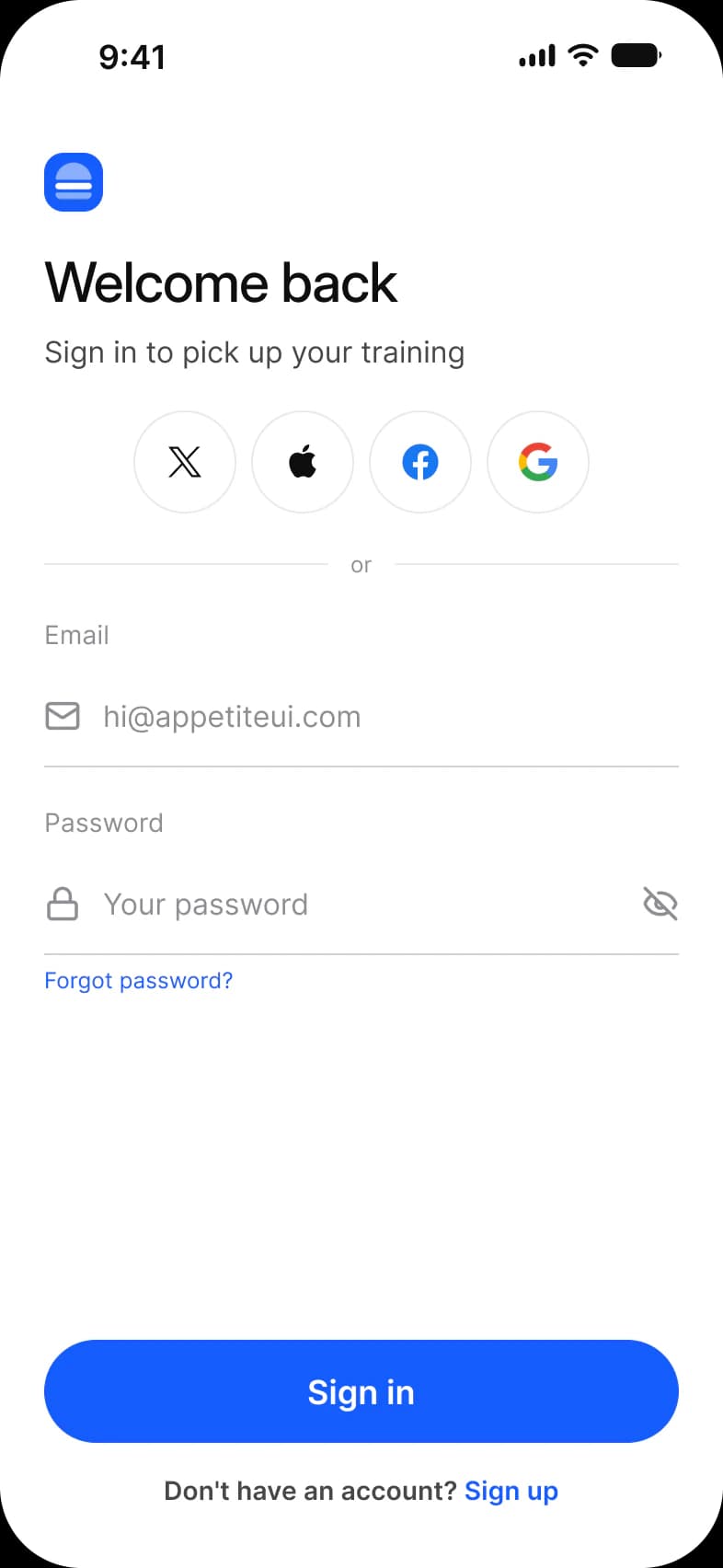
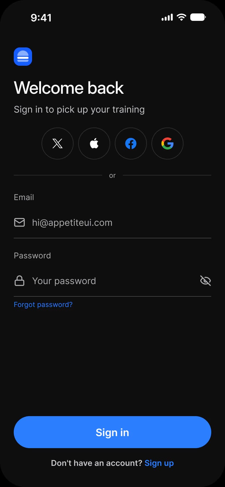
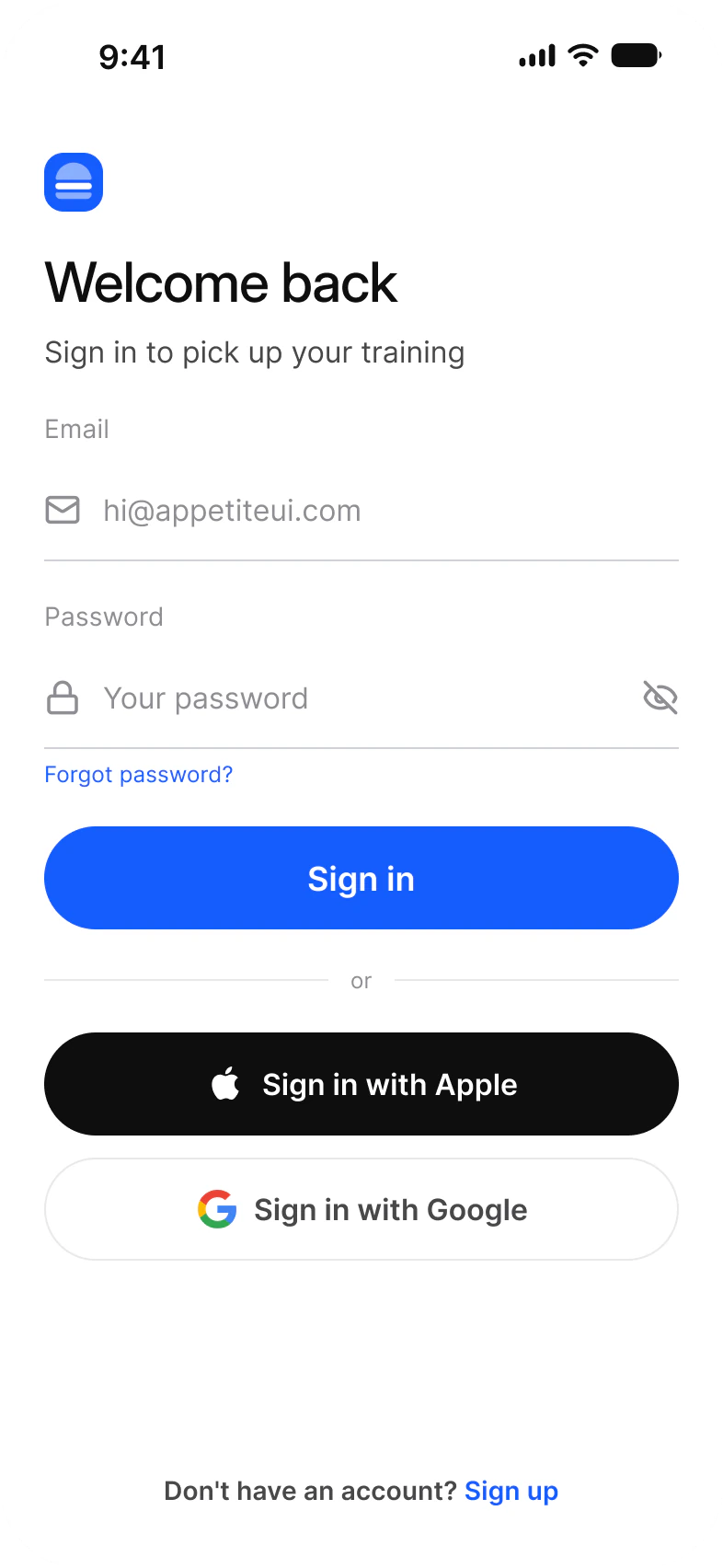
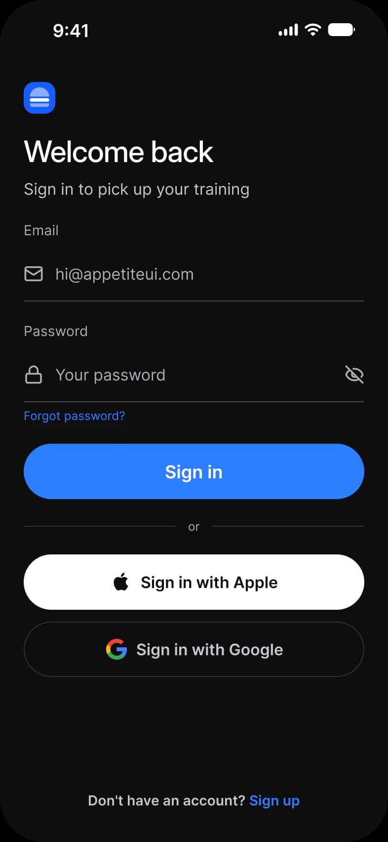
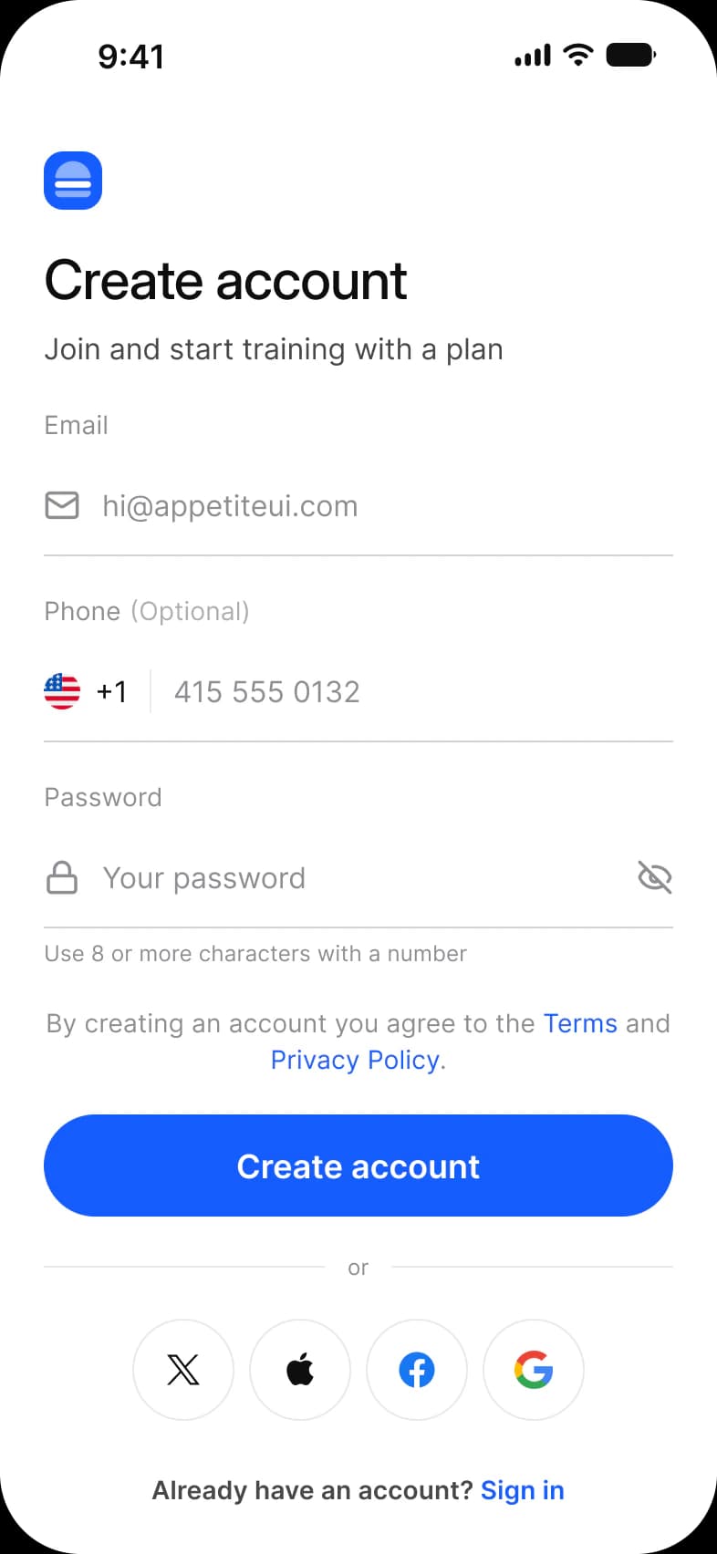
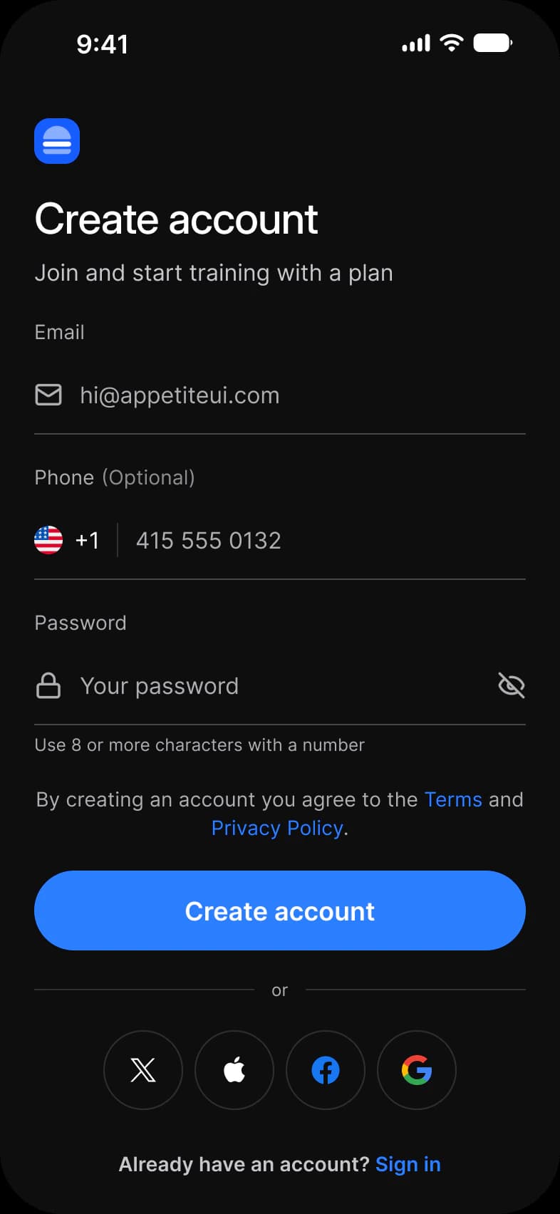
Every screen of the Appetite UI Figma file that shows the pattern, light and dark. The theme switch shows the dark frames.
| App | Screen | What it shows | Page |
|---|---|---|---|
| Onboarding | Welcome | A photograph with the logo on it, a headline, pagination dots and a way in or past | Docs |
| Onboarding | Sign in, social first | Four round provider buttons above the email and password form | Docs |
| Onboarding | Sign in, form first | The form and a Sign in button, then Apple and Google as wide buttons | Docs |
| Onboarding | Sign up | Email, an optional phone number and a password with a hint, the Terms line and four provider buttons | Docs |
Which components carry the sign in pattern?
Drawn live from the kit's tokens, at the kit's geometry. Tap them: they behave as the Figma prototype does.
Text Input, Email
Social Button, icon only
Button, Fill and Link
What does every sign in screen do?
The rules the screens above share. Each app's page says how its screen applies them.
| Rule | Why |
|---|---|
| Pick the first way in | Social first puts the provider buttons above the form, form first puts email and password above them. The order says which one most people should use. |
| One divider, one choice | An or divider separates the two ways in. Nothing else sits between them, so the screen never reads as two forms. |
| Recovery and the other path stay visible | Forgot password sits under the password field and the link to the other form sits under the button, on every variant. |
What changes between iOS and Material?
The frames are drawn in the ios-md Platform mode. Switch a frame to android and these variables take the Material values.
| Variable | iOS (ios-md) | Android |
|---|---|---|
platform/control/corner | 8 | Full (9999) |
platform/min-touch-target | 44 | 48 |
| Component | iOS | Material 3 | What differs |
|---|---|---|---|
| Text field | iOS / Text Field | M3 / Text Field, Filled or Outlined, 56 high | Material has Enabled, Focused, Error and Disabled states |
Start from these screens.
Every frame on this page is part of the Appetite UI file, drawn from its components and bound to its variables, so one brand edit moves every screen in light and dark.
The file holds 589 variables in 6 collections and exports its token values to SwiftUI, Jetpack Compose, Flutter and CSS. Solo covers one designer and Team up to ten people. You pay once and keep lifetime updates. Price goes up Nov 1
The read-only Figma preview opens the whole file, every screen and every variable, before you buy.