Updated
Booking
A booking app UI kit for Figma, drawn as Eleven screens for one stays app, from a capsule search and a price map to dates, guests, payment and a trip list, in light and dark. Every control is an instance of an Appetite UI component, so one token change moves every screen.
Updated
Preview
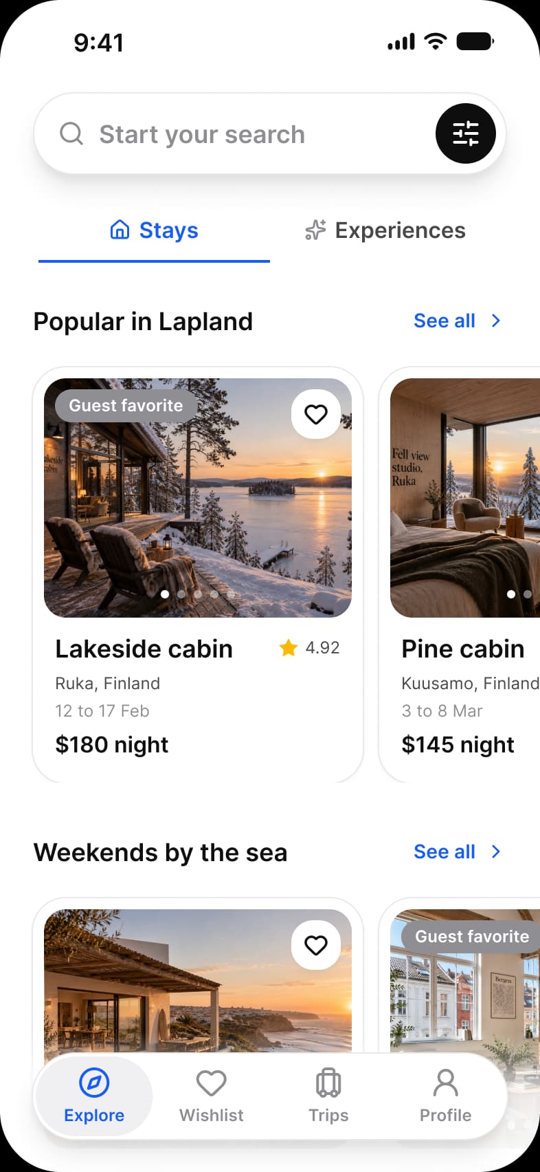
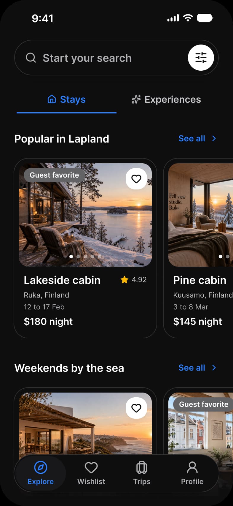
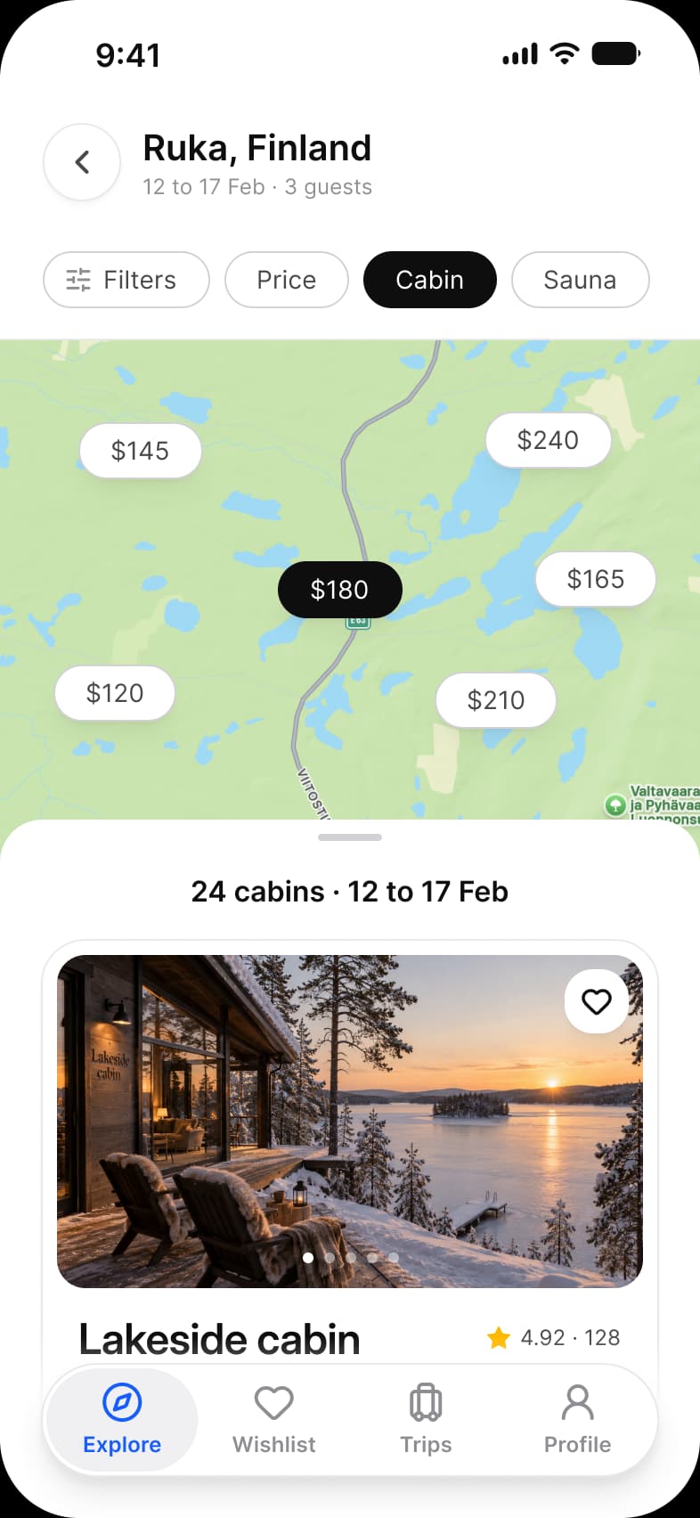
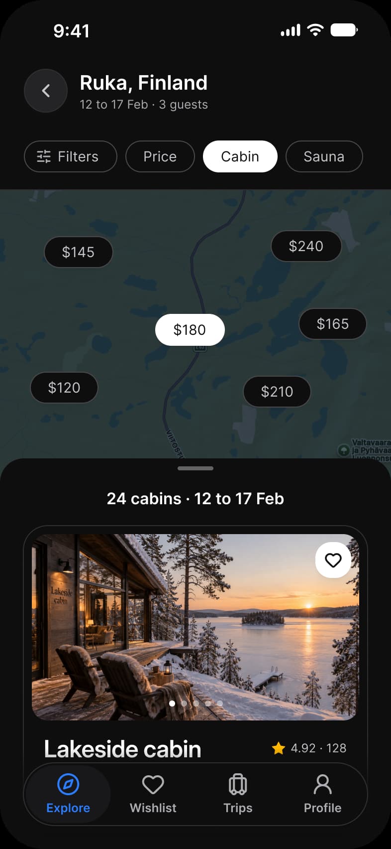
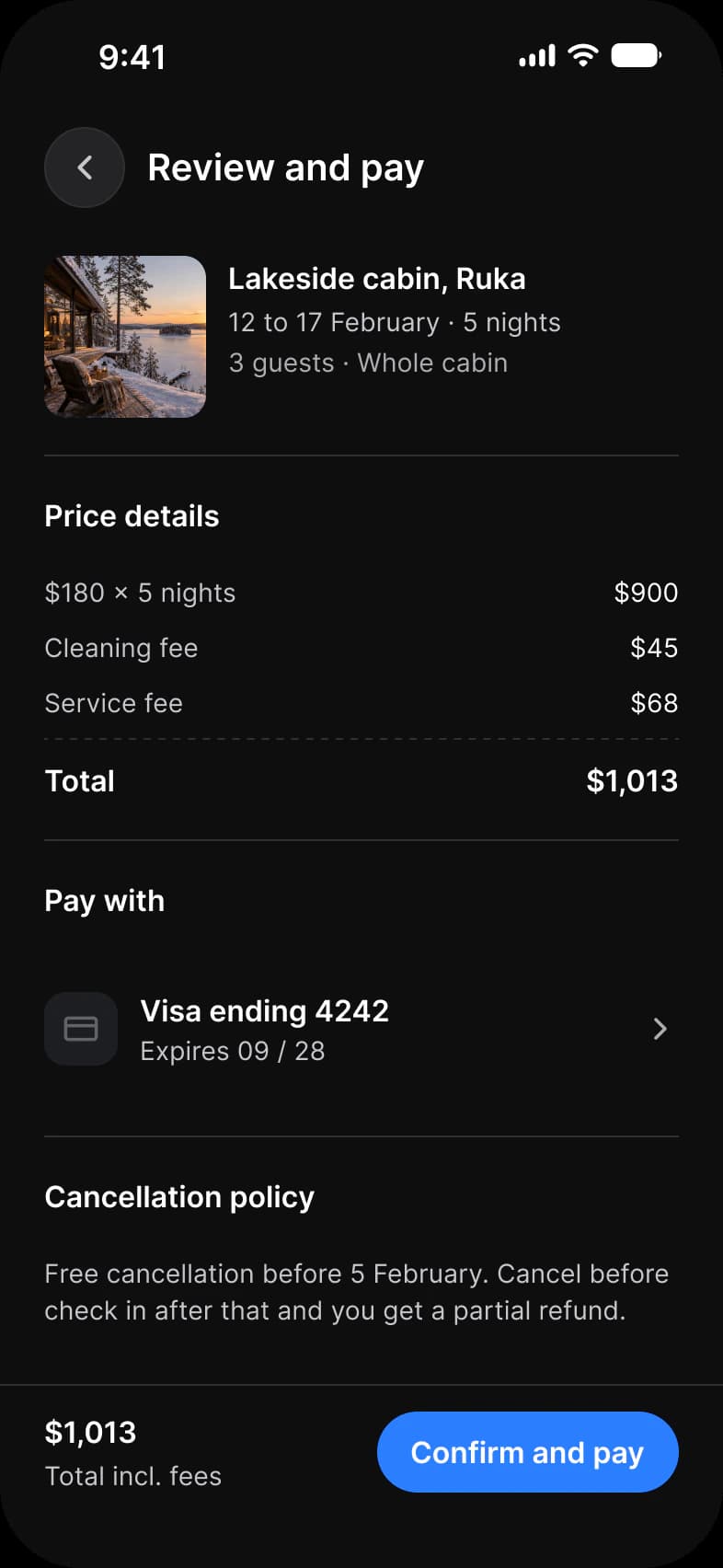
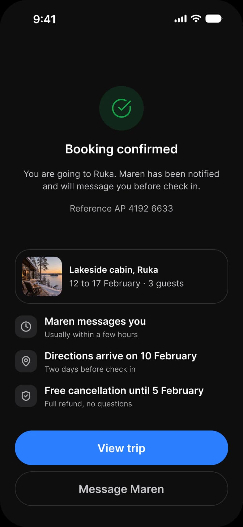
Eleven screens follow one stay from search to a confirmed trip: Explore, Results, Filters, Listing, Dates, Guests, Review and pay and Confirmed, then Trips, Trips empty and Profile. Each screen is drawn in Light and in Dark.
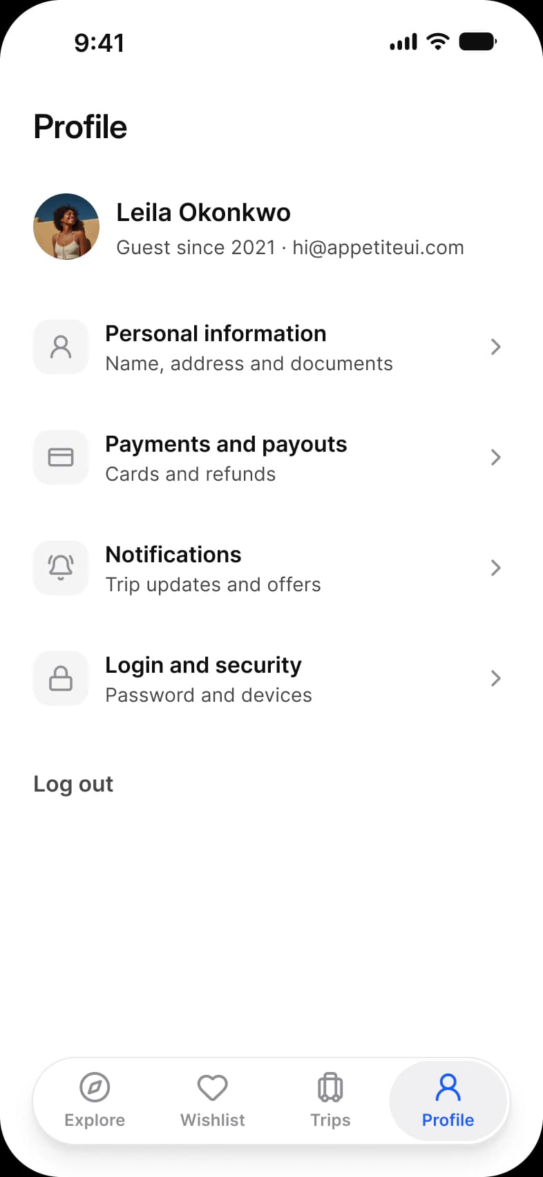
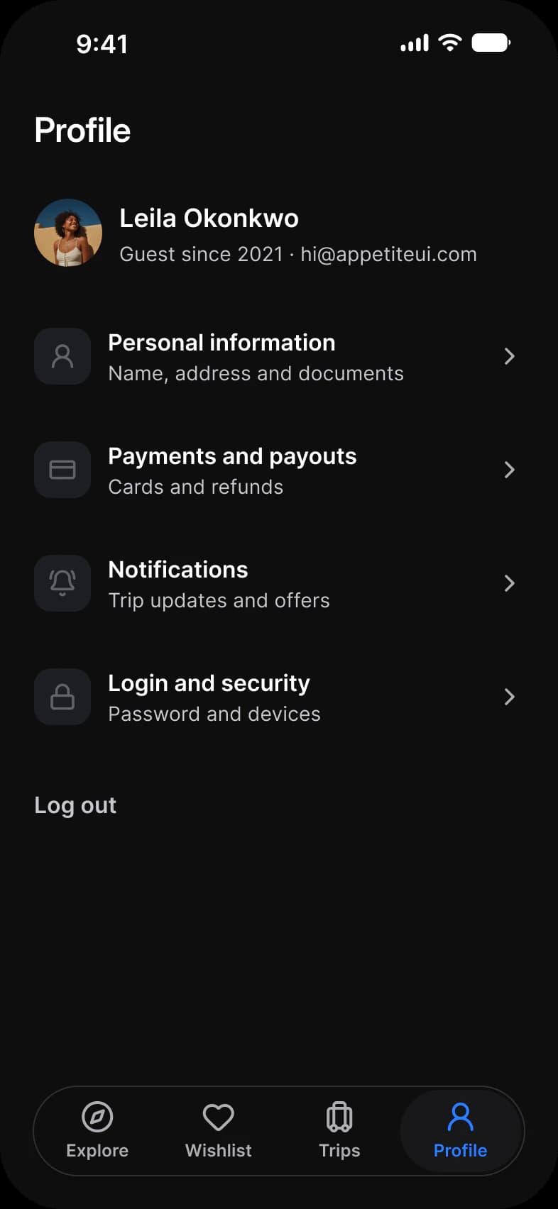
| Screen | What it shows | Built from |
|---|---|---|
| Explore | A capsule search, Stays and Experiences tabs and two rows of stay cards | Search, Tabs, Section Header, Vertical Card, Navigation |
| Results | A map with price pins and a sheet of results | Top Bar, Chip, Vertical Card, Navigation |
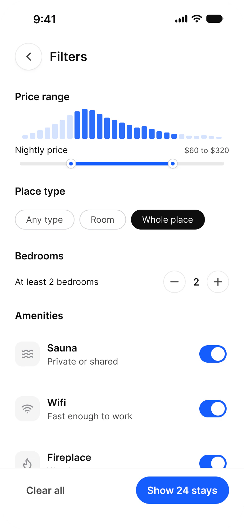
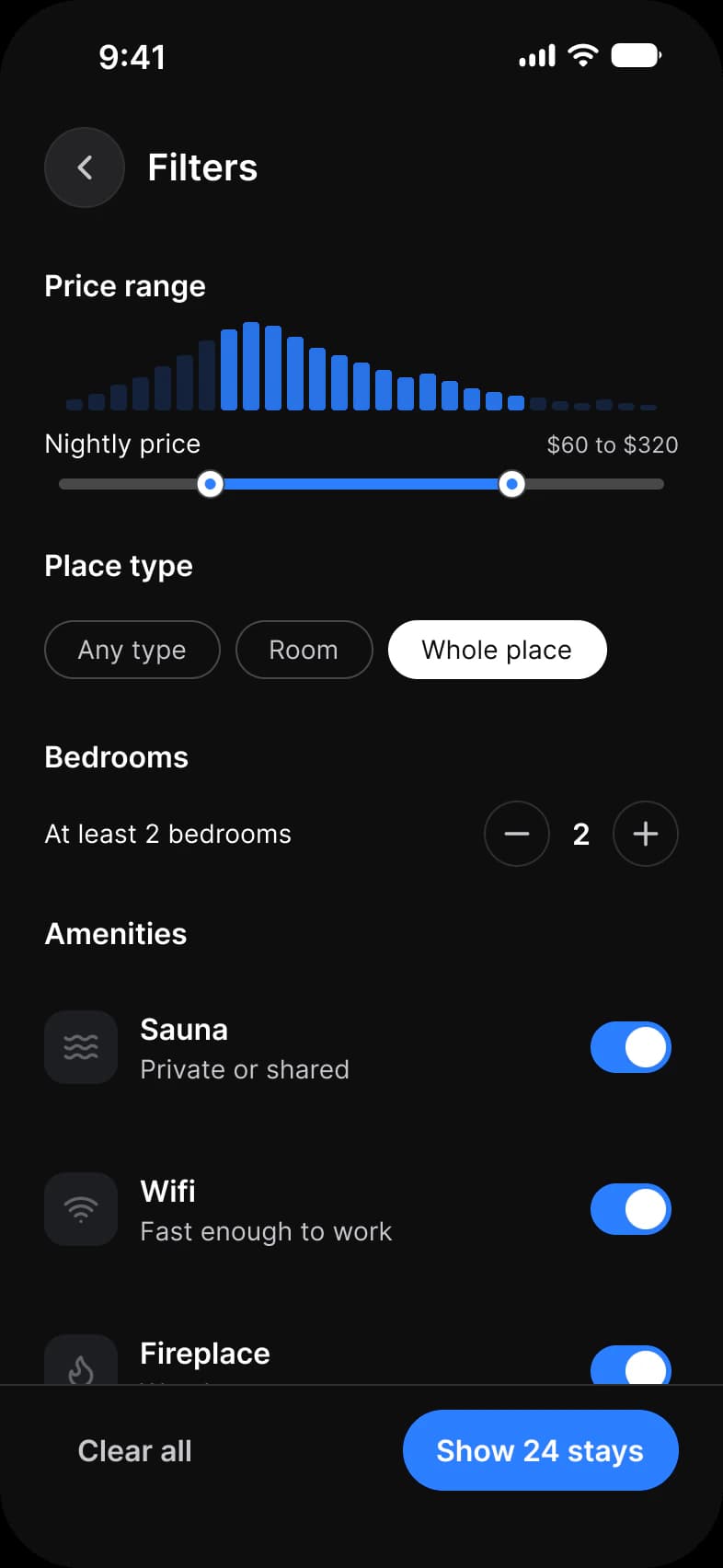
| Filters | Price range, place type, bedrooms and amenities | Top Bar, Range Slider, Chip, Stepper, List, Button |
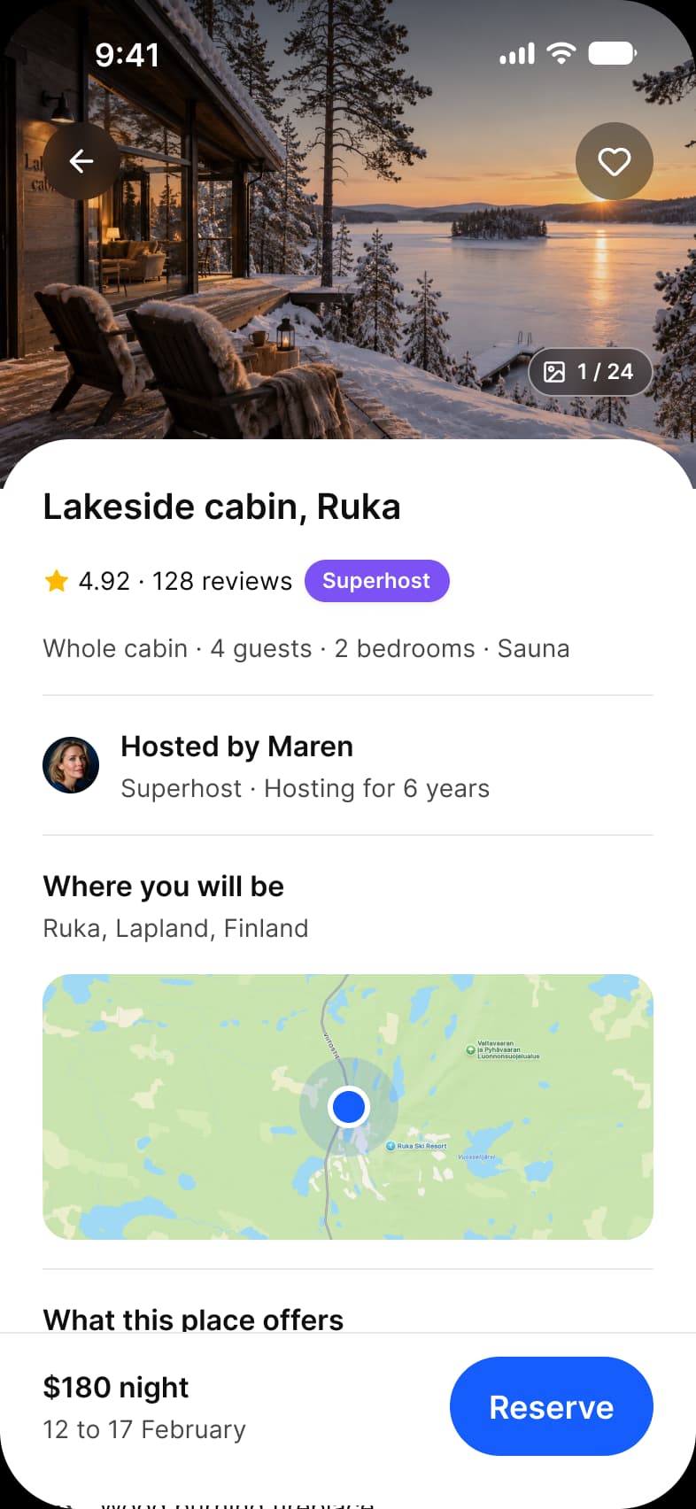
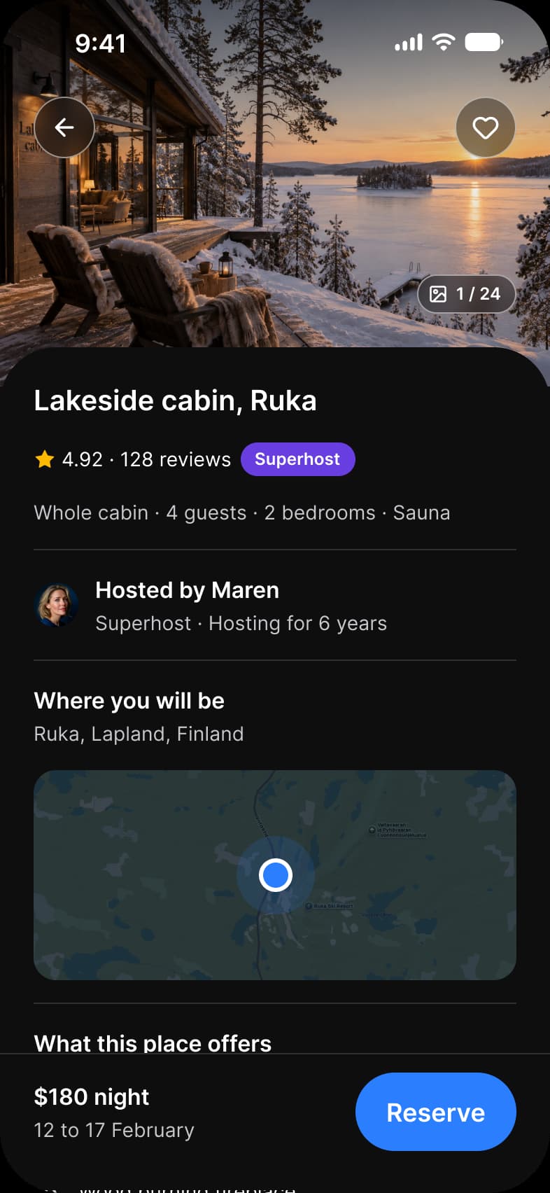
| Listing | One stay: photo, rating, host, map, amenities and a Reserve bar | Badge, Badge / Overlay, Button / Overlay, Rating / Score, Avatar, Button |
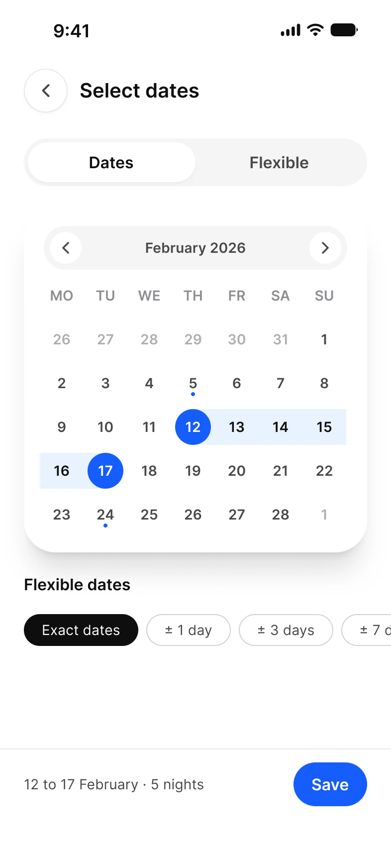
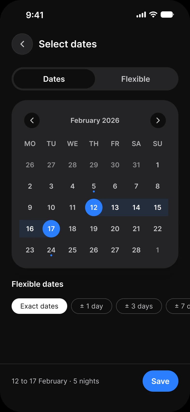
| Dates | A range on a calendar and flexible date chips | Top Bar, Segmented Control, Date Picker, Chip, Button |
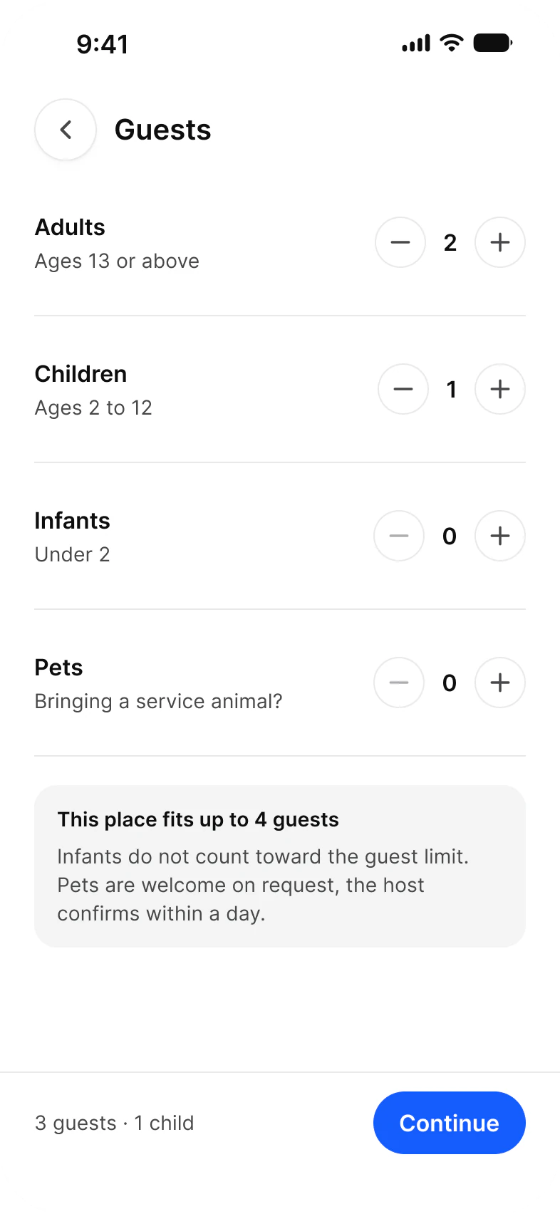
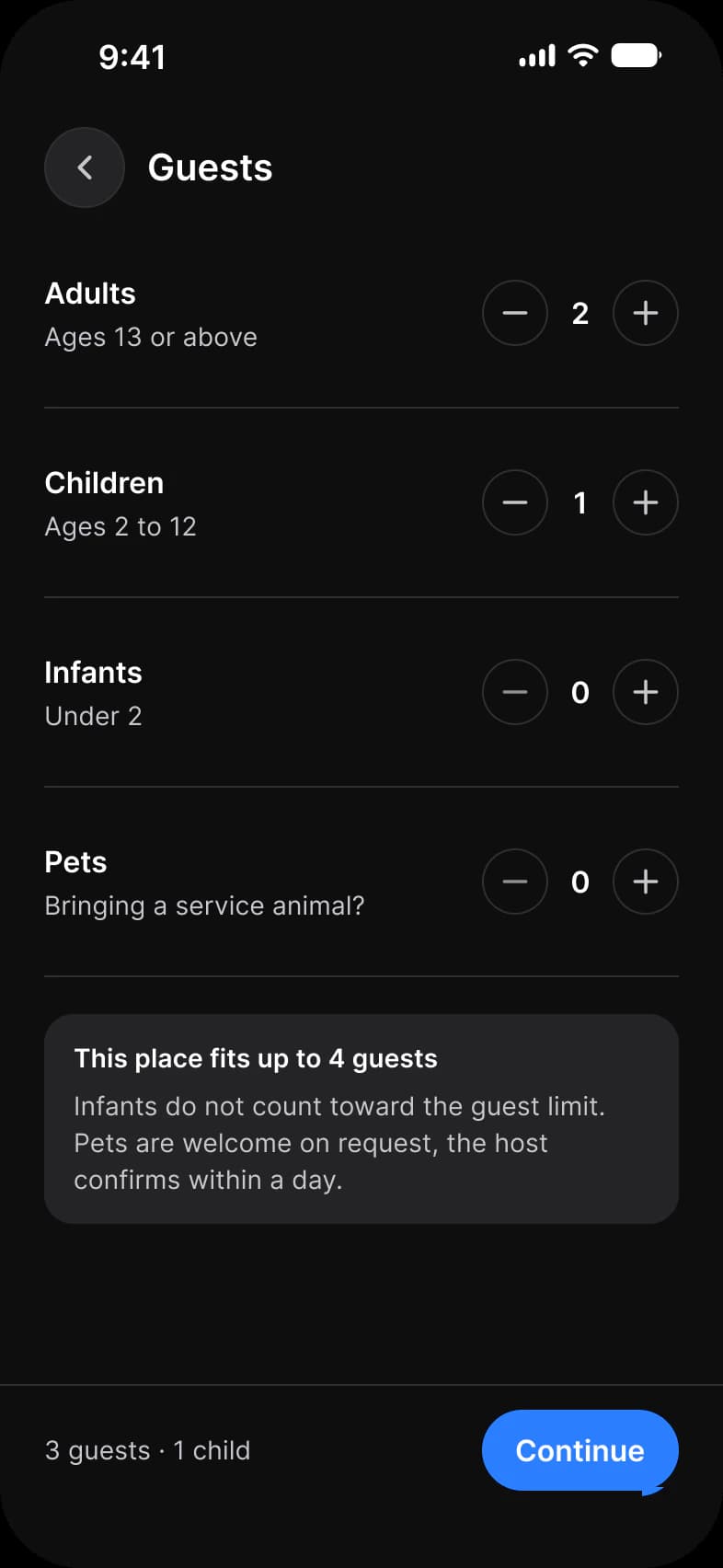
| Guests | Four counters and a capacity note | Top Bar, Stepper, Button |
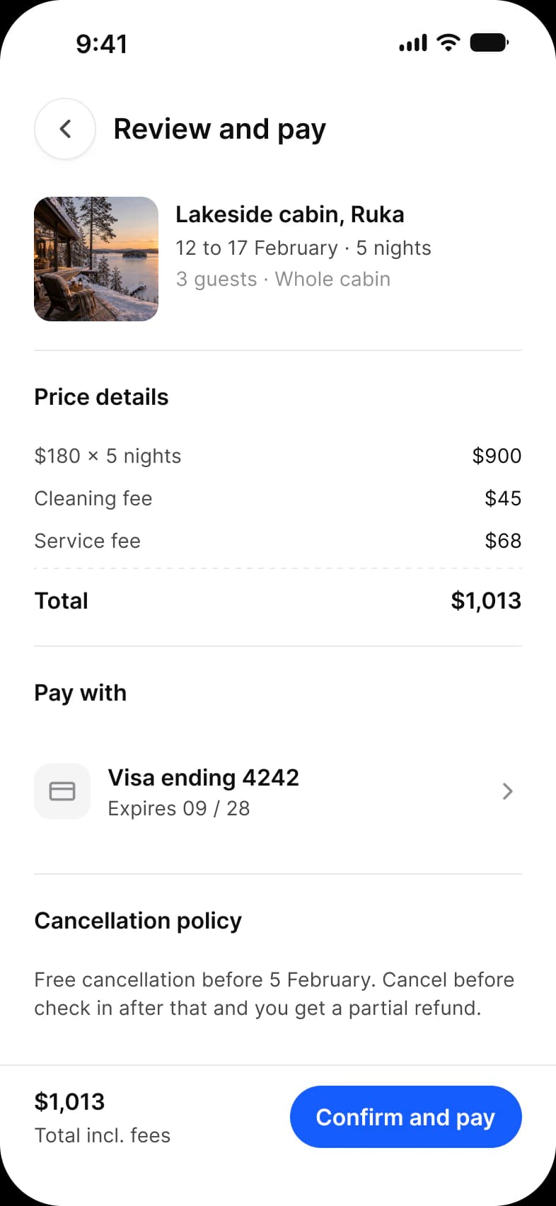
| Review and pay | The stay, a price breakdown, the card and the cancellation terms | Top Bar, Price Row, List, Button |
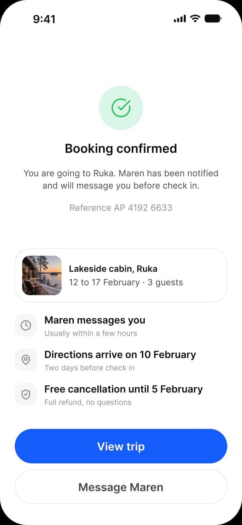
| Confirmed | A confirmation, a reference and the next three steps | Button, Lucide icons |
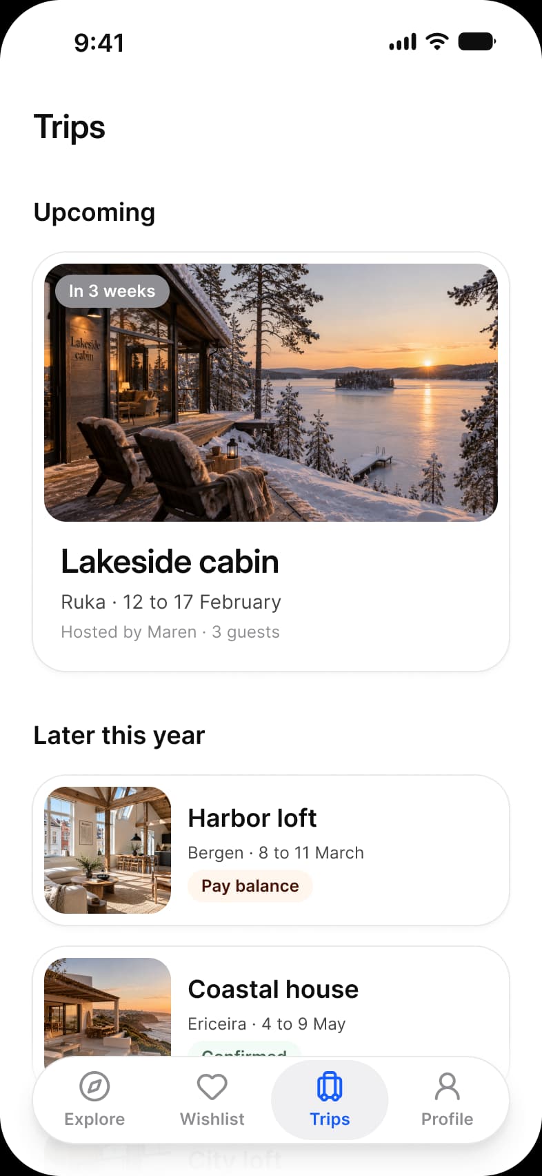
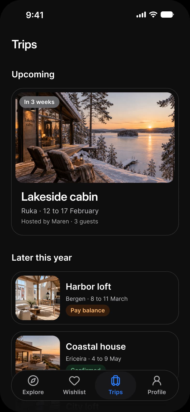
| Trips | An upcoming trip as a large card and later trips as rows | Top Bar, Section Header, Vertical Card, Horizontal Card, Navigation |
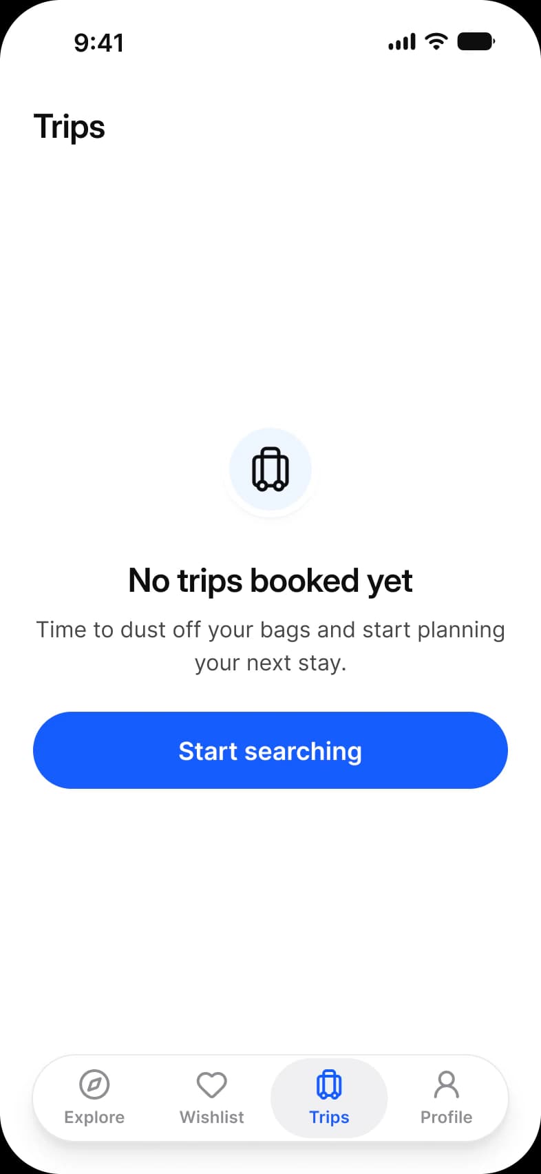
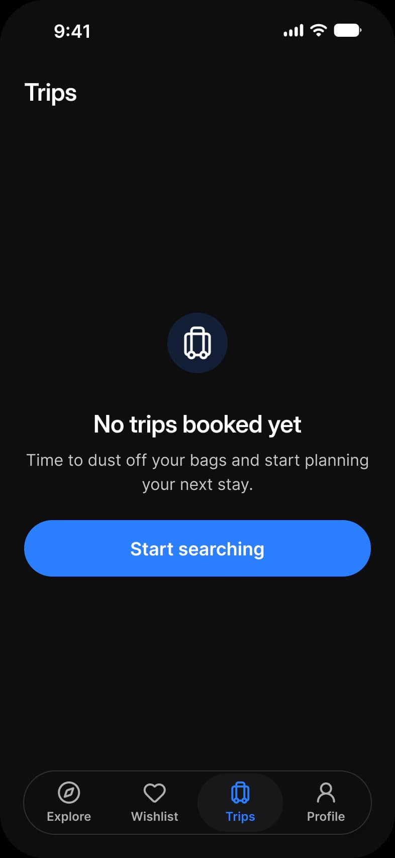
| Trips empty | The state of a traveler with no bookings | Top Bar, Empty State, Navigation |
| Profile | The account rows and a Log out button | Top Bar, Avatar, List, Button, Navigation |
What does a stays booking flow need from a component library?
A search that sits above a feed, cards that carry a photo and a price, controls for narrowing, picking dates and counting guests, and a short path to pay.
A stays app needs a search field, a card for one stay, chips to narrow the list, a calendar that selects a range, counters for guests and a row that shows a price. Here the search is Search, the card is Vertical Card, the calendar is Date Picker and the counters are Stepper, so a stays flow draws on the library as it ships. The price pins on the Results map are Chip instances, one per pin.
| Need | Component | Where it appears |
|---|---|---|
| Start a search | Search, Tabs | Explore |
| Browse stays | Vertical Card, Horizontal Card, Section Header | Explore, Results, Trips |
| Mark a place on a map | Chip | Results, six price pins |
| Narrow the results | Chip, Range Slider, Stepper, List | Filters |
| Pick a range of dates | Date Picker, Segmented Control, Chip | Dates |
| Count guests | Stepper | Guests, and bedrooms on Filters |
| Show a price and a total | Price Row, List | Review and pay |
| Pay and confirm | Button | Listing, Review and pay, Confirmed |
| Hold a trip list and its empty state | Horizontal Card, Empty State | Trips, Trips empty |
| Move around the app | Navigation, Top Bar | Five screens carry the tab bar, eight a top bar |
The tab bar floats over the content on its five screens, and a short fade behind it keeps scrolled content from showing next to the bar. Dates is the screen to open for the calendar: its range is the Range Start, Range Middle and Range End states of the Date Picker day cell (see Picker).
On iOS the minimum touch target is 44 pt. The frames pin Platform to ios-md, where platform/min-touch-target reads 44, so that is the size a tap target on these screens starts from. Android would read 48.
How do the Booking screens follow one stay?
Booking is drawn as a stays app, and its screens share one trip.
Explore opens on a capsule search with Stays and Experiences tabs and rows of cards, Results is a map with price pins and a sheet, and Trips leads with one large card for the next stay. The whole flow reads 12 to 17 February for 3 guests, from the Results header to the Review and pay total, so the screens agree with each other.
What are the Booking screens built from?
Every instance on the eleven light frames, counted once, by the component it comes from. The dark row holds the same instances, so each number is per row.
287 instances sit on the frames. 95 of them are placed directly as Appetite UI components from 22 component sets, and 7 are Lucide icons. Another 185 sit inside those. Placed counts an instance that is not inside another instance, nested counts one that is, and a component is counted by its set name, so every Button variant is a Button. An icon is any instance named in lowercase.
| Component | Placed | Where it appears |
|---|---|---|
| Chip | 17 | Results 10 (four filters, six price pins), Filters 3, Dates 4 |
| iOS / Status bar | 11 | Every screen |
| Button | 9 | Listing 1, Filters 2, Dates 1, Guests 1, Review and pay 1, Confirmed 2, Profile 1 |
| Top Bar | 8 | Every screen except Explore, Listing and Confirmed |
| Vertical Card | 8 | Explore 6, Results 1, Trips 1 |
| List | 8 | Filters 3, Review and pay 1, Profile 4 |
| Navigation | 5 | Explore, Results, Trips, Trips empty, Profile |
| Stepper | 5 | Guests 4, Filters 1 |
| Section Header | 4 | Explore 2, Trips 2 |
| Price Row | 4 | Review and pay |
| Horizontal Card | 3 | Trips |
| Avatar | 2 | Listing, Profile |
| Button / Overlay | 2 | Listing, the back and favorite buttons on the photo |
| Badge | 1 | Listing, Superhost |
| Badge / Overlay | 1 | Listing, the photo count |
| Rating / Score | 1 | Listing |
| Search | 1 | Explore |
| Tabs | 1 | Explore |
| Segmented Control | 1 | Dates |
| Date Picker | 1 | Dates |
| Range Slider | 1 | Filters |
| Empty State | 1 | Trips empty |
| Lucide icons | 7 | Listing 3 (wifi, waves, flame), Confirmed 4 (circle-check-big, clock, map-pin, shield-check) |
Of the nested instances, 76 are icons inside other components, 78 are helper parts of larger components, and 31 are Buttons, Badges, Toggles and Compact Buttons inside bars, steppers, cards and rows.
| Part | Nested | Inside |
|---|---|---|
| Date Picker day cells | 35 | Date Picker on Dates, five weeks of seven |
| Navigation labels | 20 | Navigation, four labels on each of five bars |
| Card images | 11 | Vertical Card and Horizontal Card, one in each of the eleven cards |
| Date Picker day labels | 7 | Date Picker on Dates, Monday to Sunday |
| Tab and segment selectors | 4 | Tabs on Explore, two, and Segmented Control on Dates, two |
| Date Picker month selector | 1 | Date Picker on Dates |
| Component | Nested | Inside |
|---|---|---|
| Button | 19 | Larger components such as Top Bar and Stepper |
| Badge | 7 | Cards and rows |
| Toggle | 3 | The three amenity rows of Filters |
| Compact Button | 2 | Stepper |
Not everything is an instance. 51 shapes are drawn by hand. Ten sit behind the tab bar on five screens, 27 are the bars of the price histogram behind the Range Slider on Filters, and the other 14 sit on Listing, Guests and Review and pay.
Counted on October 2, 2026 with a Plugin API script over the eleven light frames of the Booking page in the Appetite UI Figma file. Hidden layers count. No third party asset is placed on these screens.
Which tokens do the Booking screens use?
No solid fill or stroke on these frames is a raw color. Each one resolves through a variable, which makes the dark row a mode switch.
The eleven light frames hold 679 solid fills and strokes bound to 37 different variables, and none is unbound. Photographs and six gradients are the only paints that are not a solid color. Every frame sets its modes explicitly, Color Tokens = Light or Dark and Platform = ios-md, so a frame dropped into another file arrives in the theme it was drawn in. The dark frames bind the same variables and differ only in the Color Tokens mode they pin, so a rebrand at Color Tokens moves all eleven screens.
| Token | Where it lands | Paints |
|---|---|---|
text/sub-700 | Descriptions and secondary lines | 92 |
text/strong-950 | Titles, stay names and prices | 86 |
bg/white-0 | The screen and its cards | 77 |
brand/base | Primary buttons, the active tab and the selected date | 63 |
border/soft-100 | Row hairlines and card outlines | 52 |
fg/strong-950 | Primary icons | 51 |
text/soft-500 | Captions and meta lines | 46 |
static/static-white-0 | Text and icons over photographs | 38 |
brand/alpha-10 | The band between the two ends of the selected date range | 6 |
colors/yellow/400 | The rating star, a Foundations primitive | 8 |
| Style | Uses | Screens |
|---|---|---|
sm/default | 58 | 9 |
base/emphasized | 53 | 9 |
sm/emphasized | 47 | 4 |
xs/default | 29 | 5 |
xs/emphasized | 29 | 6 |
lg/emphasized | 19 | 6 |
xl/emphasized | 7 | 7 |
2xl/emphasized | 6 | 4 |
base/default | 1 | 1 |
dropShadow/xs | 22 | 8 |
dropShadow/sm | 10 | 4 |
dropShadow/lg | 6 | 5 |
dropShadow/md | 6 | 1 |
dropShadow/2xl | 2 | 2 |
backdropBlur/md | 3 | 1 |
| Collection | Modes | What it drives here |
|---|---|---|
Color Tokens | Light, Dark | Every paint above, pinned on each frame |
Platform | ios-md, ios-lg, android, ios-duo-outer, ios-duo-inner | Frame width, radius, inset and the 44 pt touch target, pinned to ios-md |
Foundations | Default | The primitive ramps every other collection points at |
Typography | Default | The 9 text styles above |
Platform Bridge | Brand, System | Not pinned on the frames, so the default mode applies |
Motion | Default | Not used on these screens |
Which patterns do these screens show?
The same screens by what they do, beside the other apps of the kit, with the iOS and Material values of each pattern.
- Search and filtersBooking app search and filters
- CheckoutBooking app checkout
- Order trackingBooking app confirmation
- All appsDashboard screens
- All appsProfile screens
- All appsCheckout and payment screens
- All appsSearch and filter screens
- All appsEmpty state screens
- All appsDetail screens
Start from these screens.
Every frame on this page is part of the Appetite UI file, drawn from its components and bound to its variables, so one brand edit moves every screen in light and dark.
The file holds 589 variables in 6 collections and exports its token values to SwiftUI, Jetpack Compose, Flutter and CSS. Solo covers one designer and Team up to ten people. You pay once and keep lifetime updates. Price goes up Nov 1
The read-only Figma preview opens the whole file, every screen and every variable, before you buy.