Updated
Empty state screens
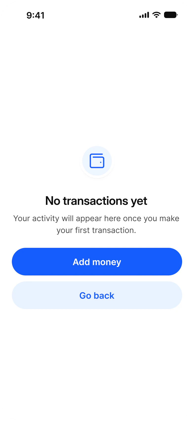
What a screen shows when it has nothing to show, drawn in Appetite UI, a Figma UI kit for iOS and Android apps built like a design system. All four use one Empty State component: an icon, a headline, one line and the action that fills the screen.
Updated
Screens
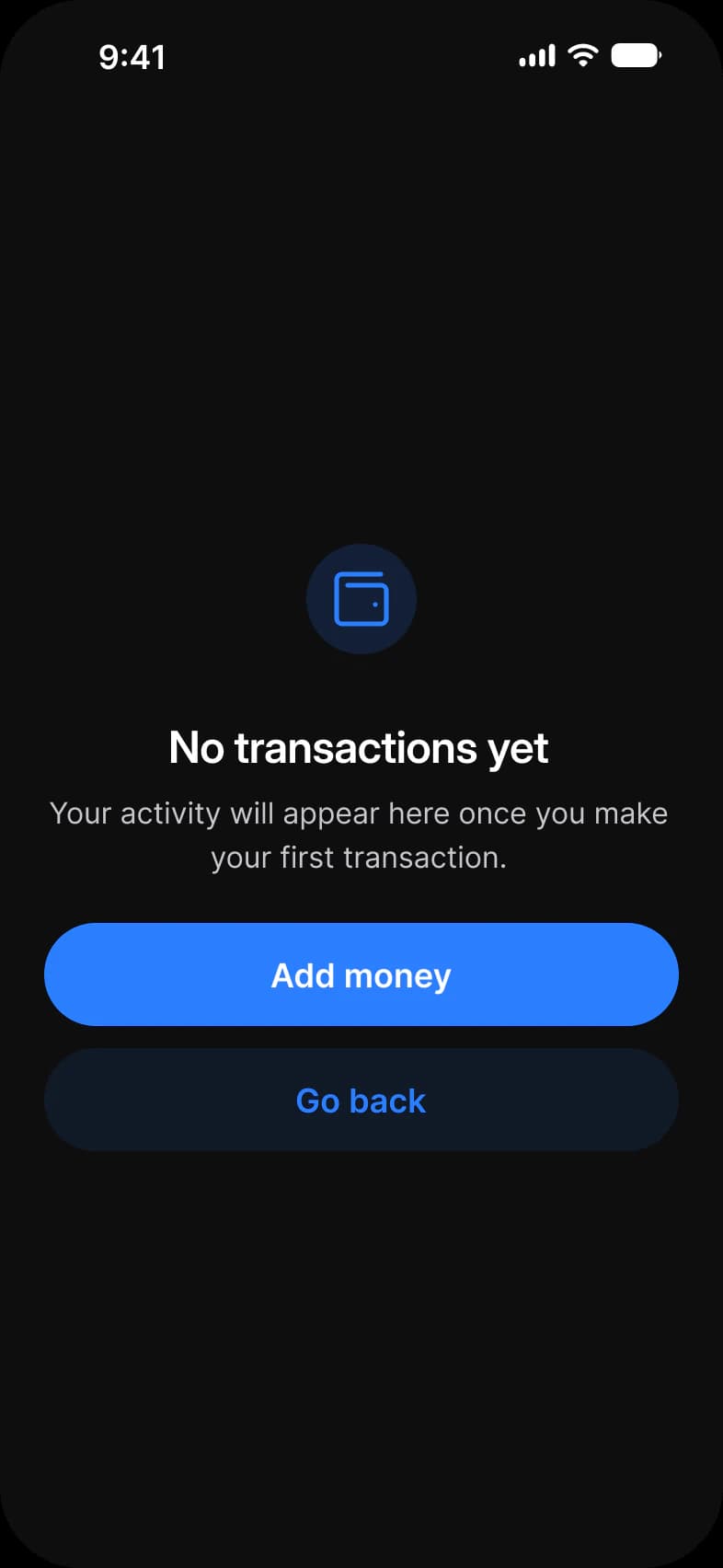
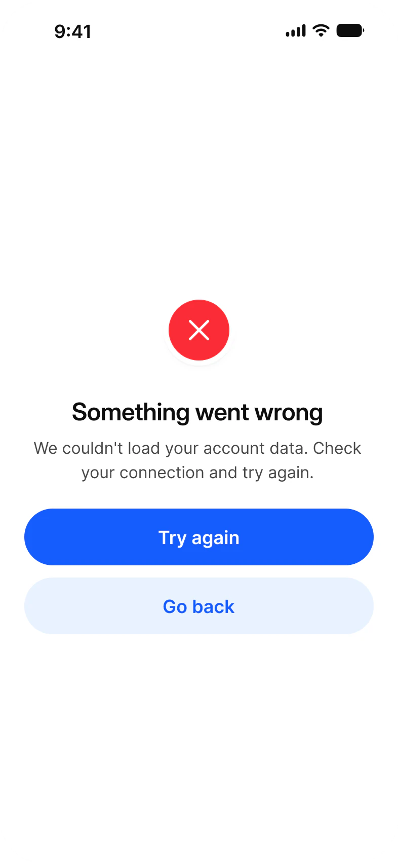
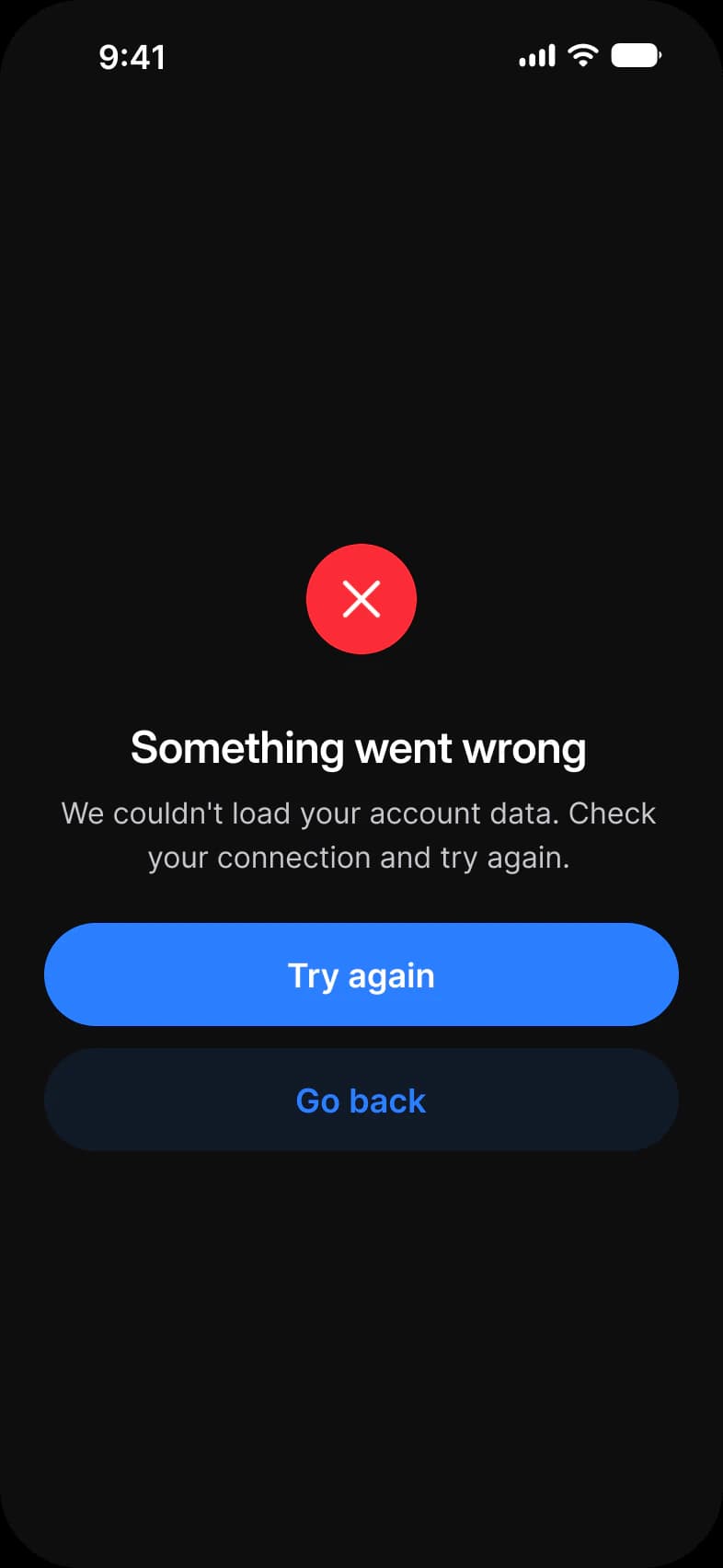
Every screen of the Appetite UI Figma file that shows the pattern, light and dark. The theme switch shows the dark frames.
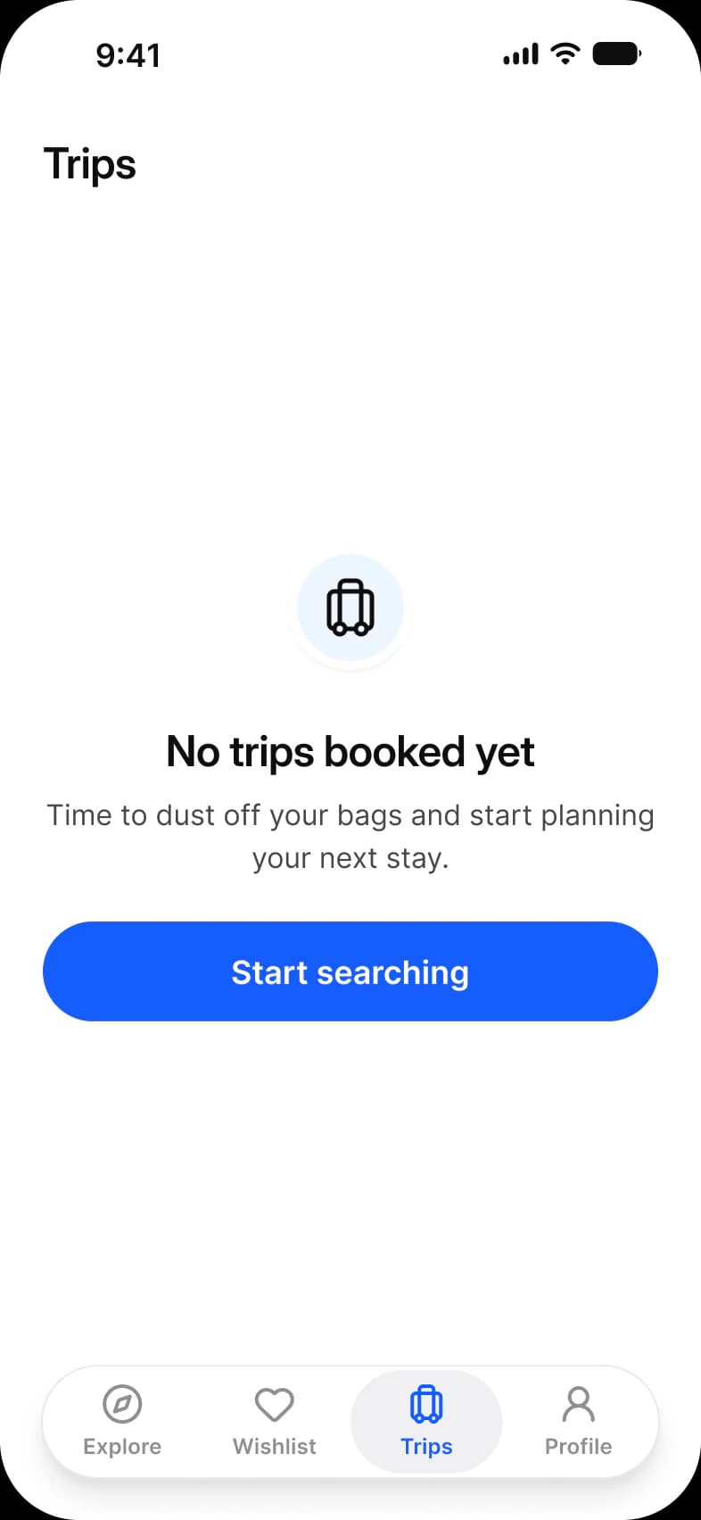
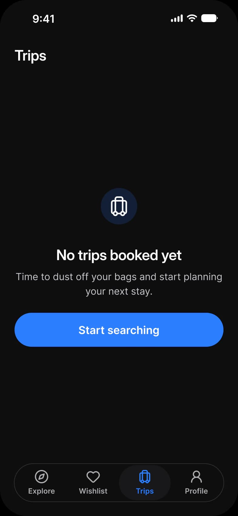
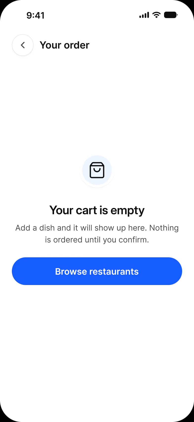
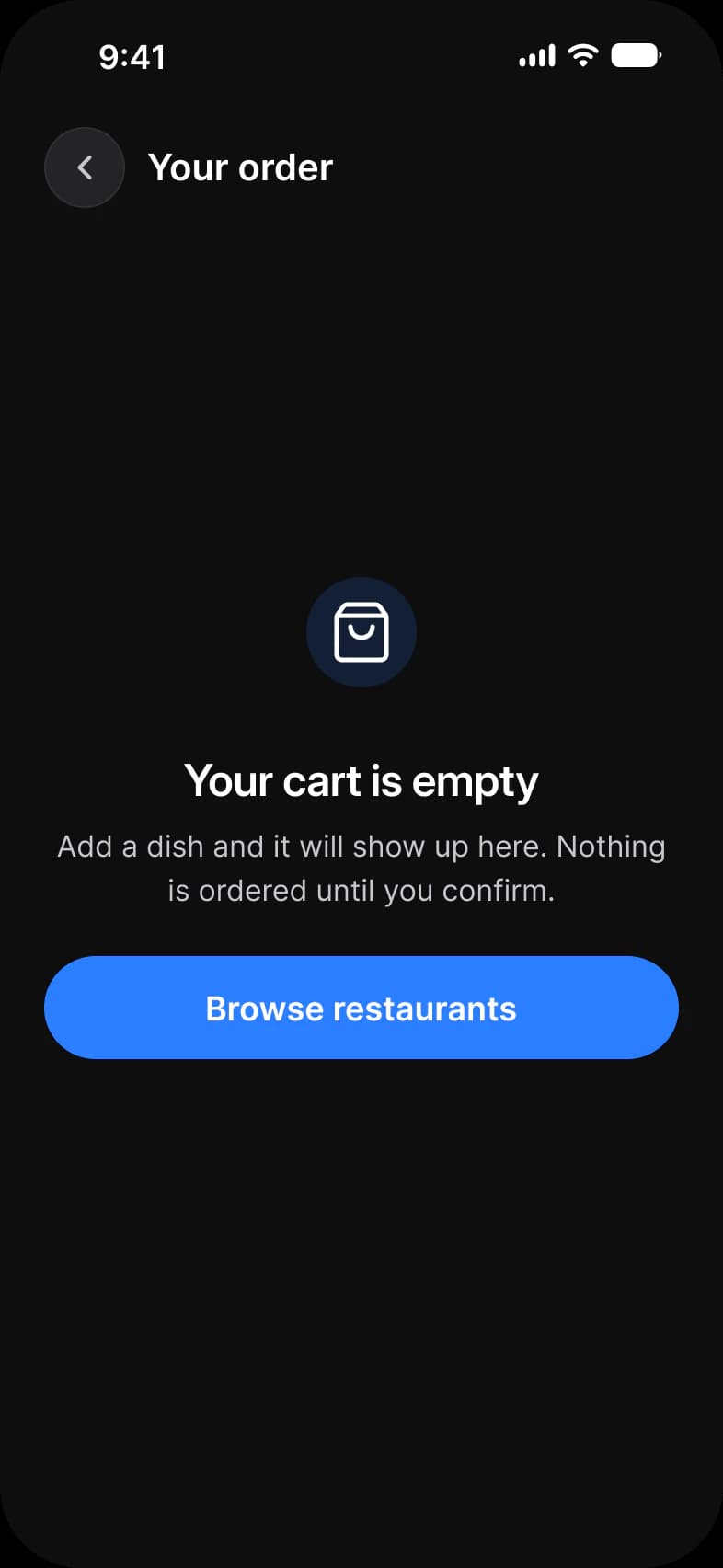
| App | Screen | What it shows | Page |
|---|---|---|---|
| Booking app | Trips empty | The state of a traveler with no bookings | Docs |
| Food delivery app | Cart empty | The state of a cart with nothing in it | Food delivery app cart |
| Empty state | Add money | Nothing has happened yet and one action fixes that | Docs |
| Empty state | Error | A request failed and the user can retry or go back | Docs |
Which components carry the empty state pattern?
Drawn live from the kit's tokens, at the kit's geometry. Tap them: they behave as the Figma prototype does.
Empty State, Info
Empty State, Error
What does every empty state screen do?
The rules the screens above share. Each app's page says how its screen applies them.
| Rule | Why |
|---|---|
| Say what is missing, then what fills it | No trips booked yet, then Start searching. The headline names the empty thing and the button is the first step to change it. |
| Keep the frame | An empty list keeps its top bar and tab bar, so people know where they are and how to leave. |
| An error is an empty state with a retry | A failed request uses the same component in its error type, with Try again first and Go back second. |
What changes between iOS and Material?
The frames are drawn in the ios-md Platform mode. Switch a frame to android and these variables take the Material values.
| Variable | iOS (ios-md) | Android |
|---|---|---|
platform/min-touch-target | 44 | 48 |
platform/bar/bottom-height | 49 | 64 |
| Component | iOS | Material 3 | What differs |
|---|---|---|---|
| Dialog | iOS / Alert, 300 wide at radius 32 | M3 / Basic dialog, 304 wide at radius 24 | Material has Basic, List and Scrollable list dialogs, iOS draws the alert as glass |
Start from these screens.
Every frame on this page is part of the Appetite UI file, drawn from its components and bound to its variables, so one brand edit moves every screen in light and dark.
The file holds 589 variables in 6 collections and exports its token values to SwiftUI, Jetpack Compose, Flutter and CSS. Solo covers one designer and Team up to ten people. You pay once and keep lifetime updates. Price goes up Nov 1
The read-only Figma preview opens the whole file, every screen and every variable, before you buy.