Updated
Social
A social app UI kit for Figma, drawn as screens for an iOS app in light and dark: a feed, explore and search, a chat list and a thread, a profile and its followers, stories and a new post. Every control that has a component is an instance of it, so one token change moves every screen.
Updated
Preview
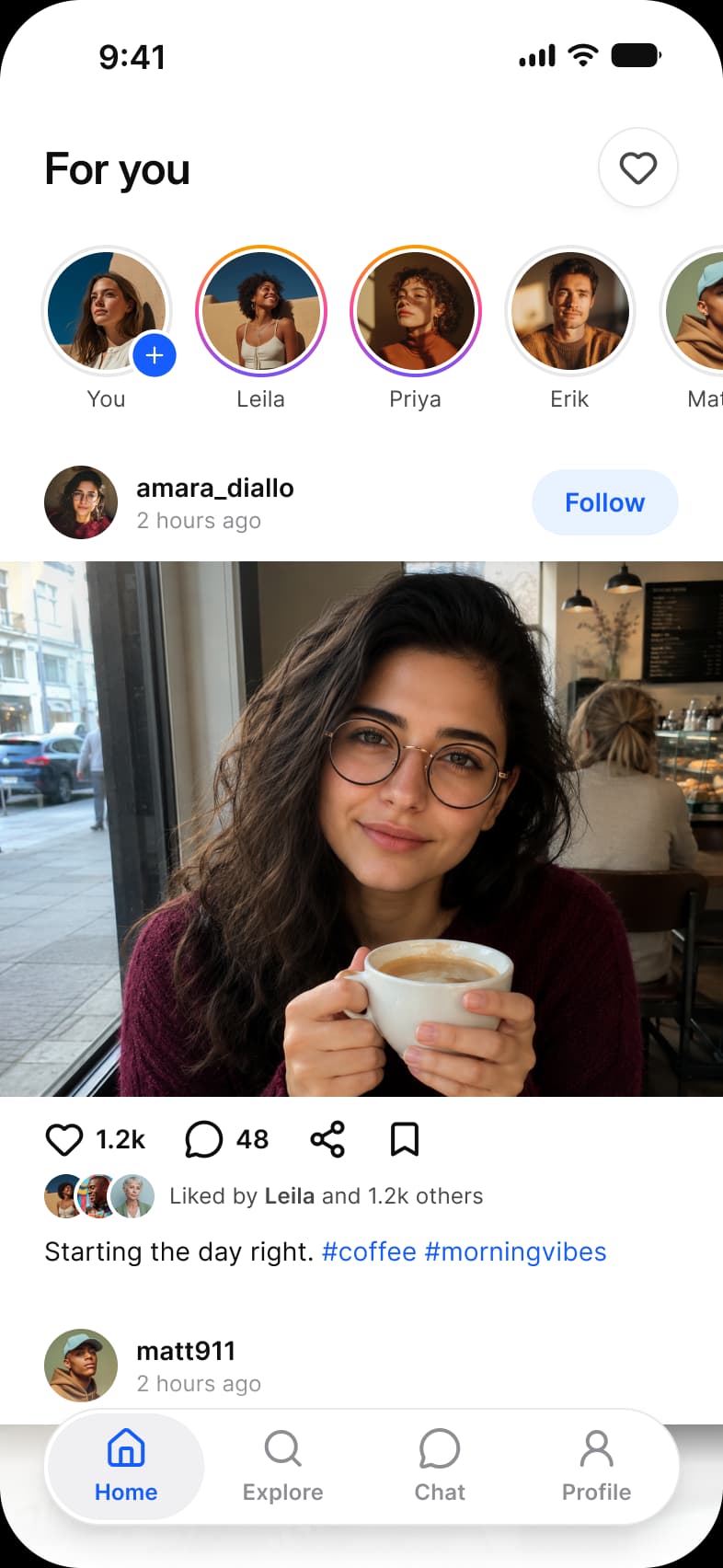
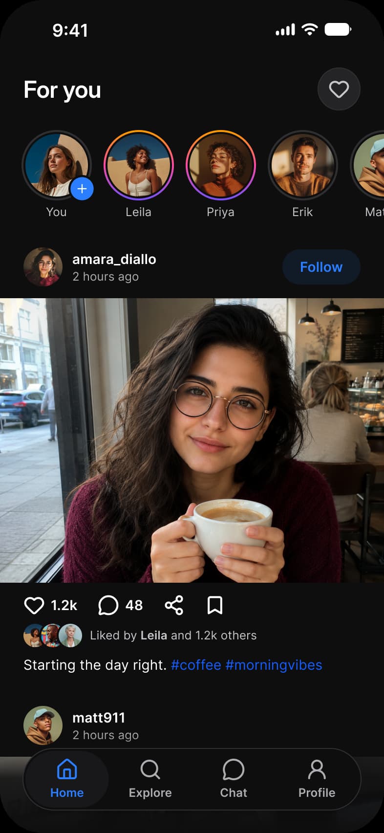
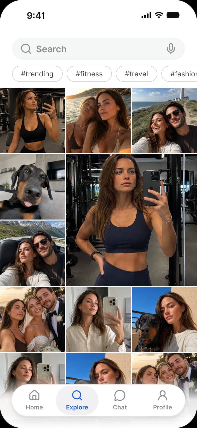
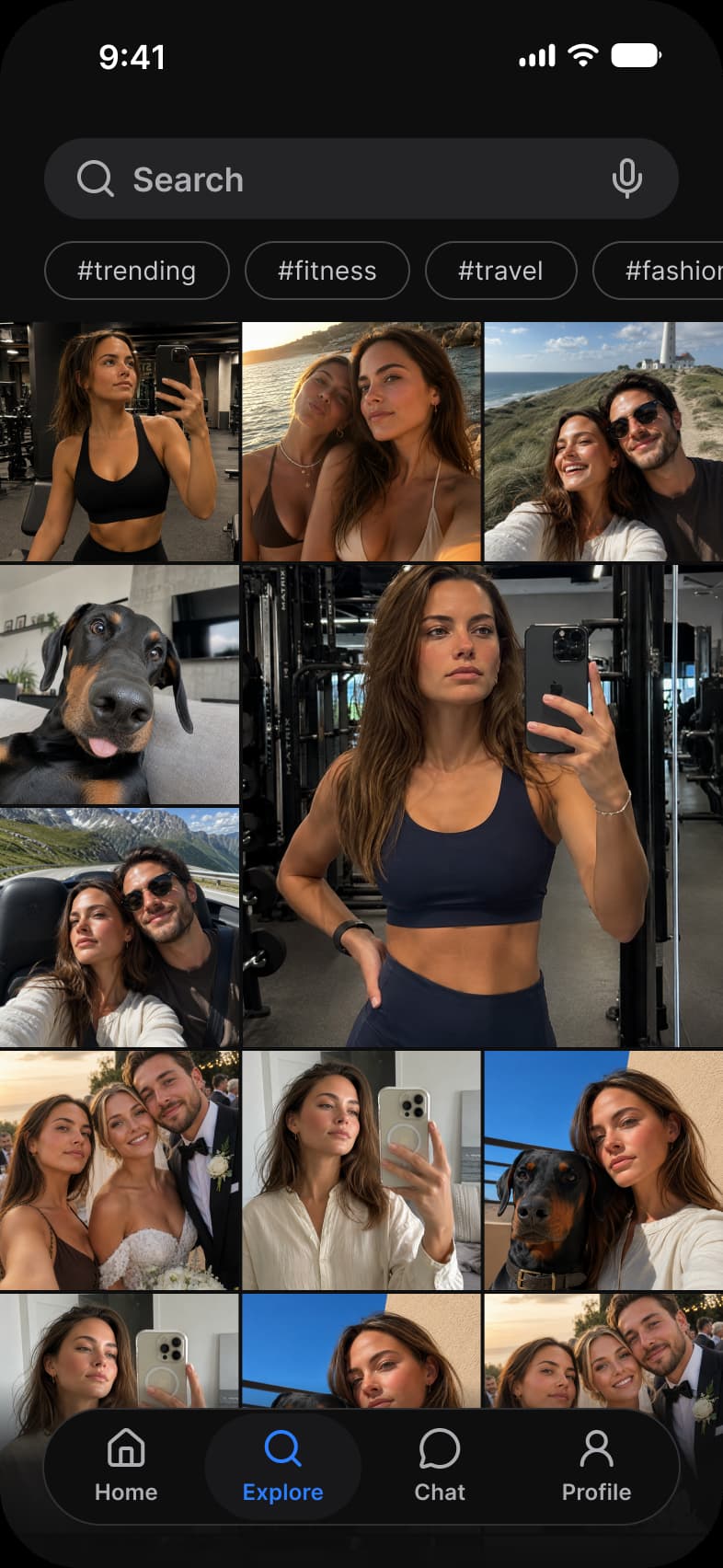
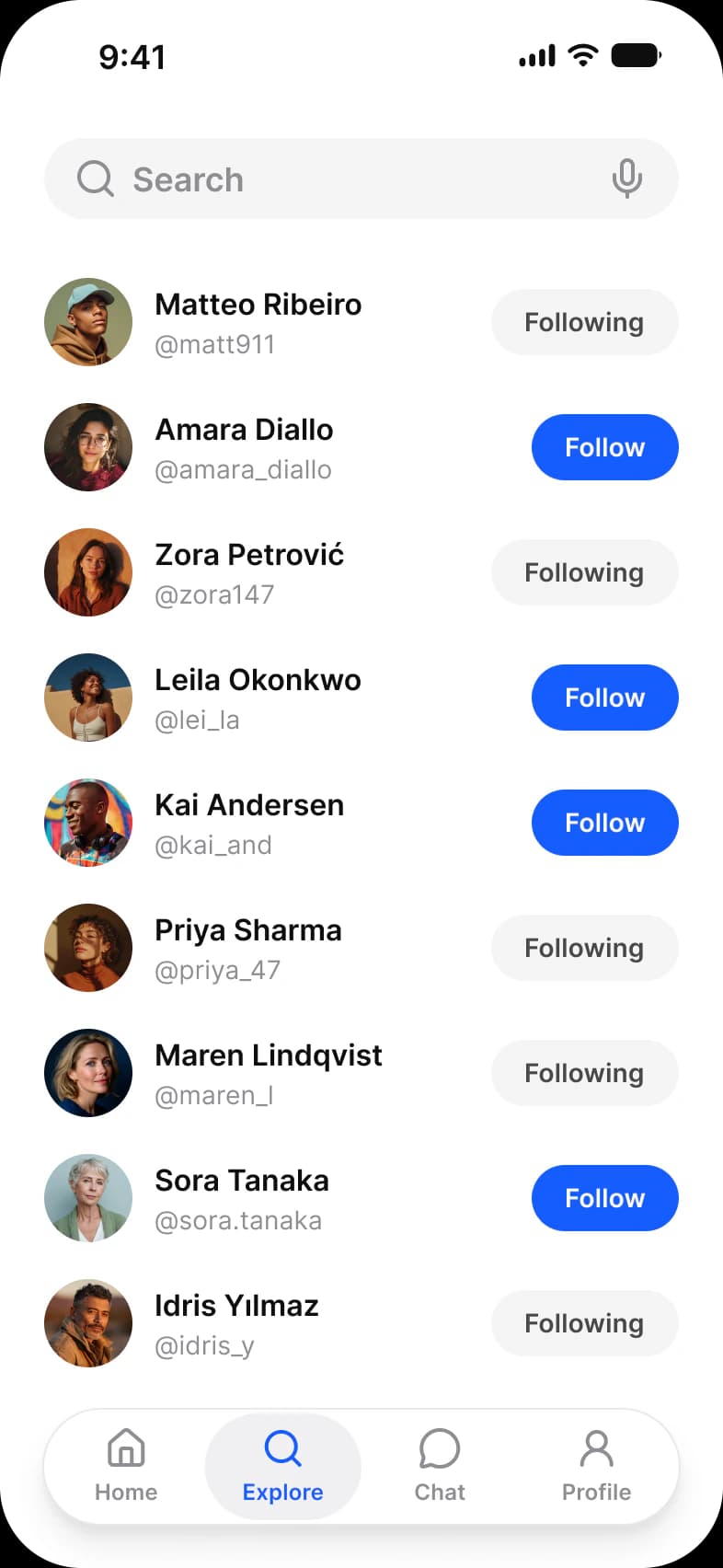
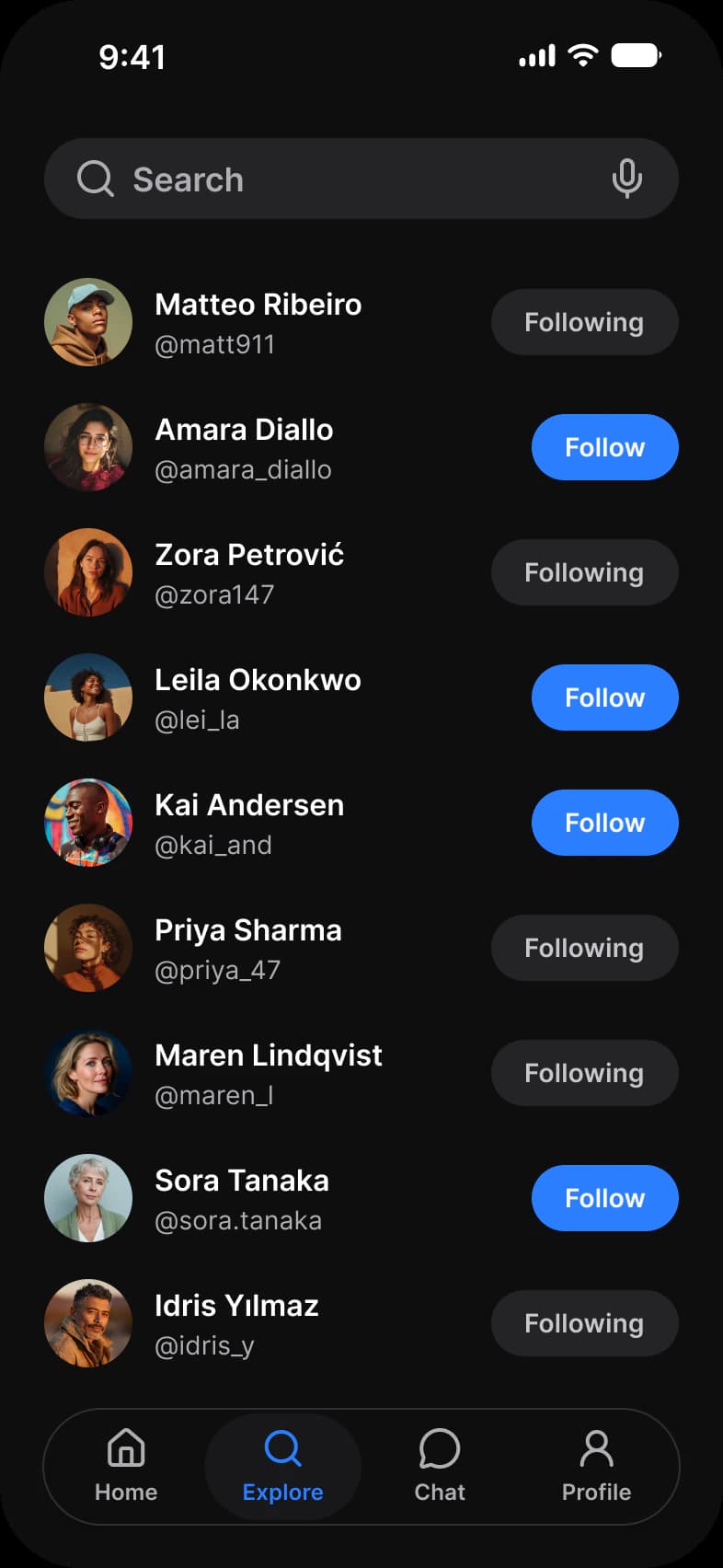
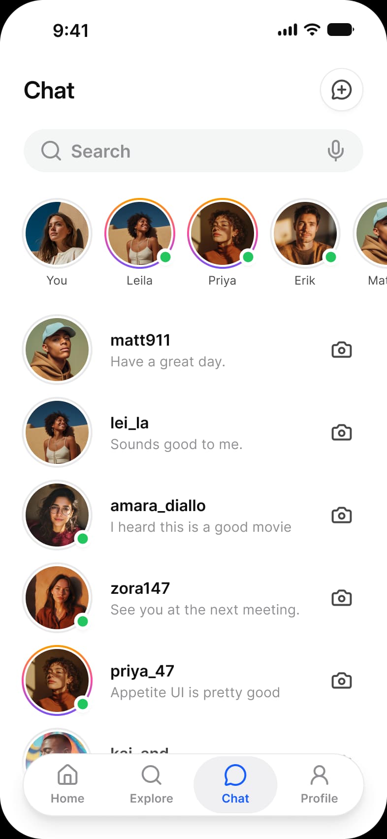
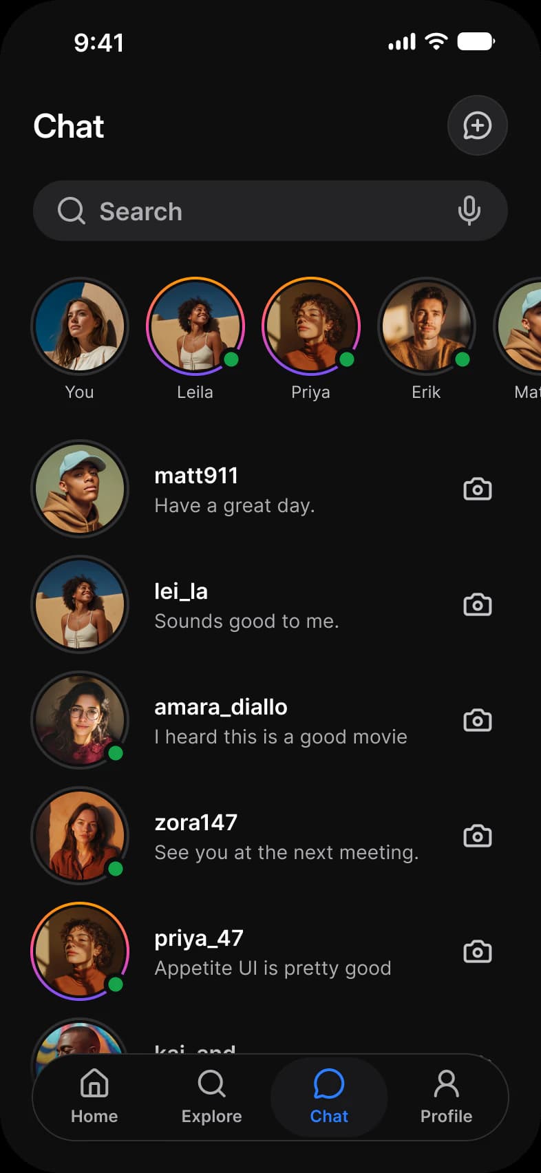
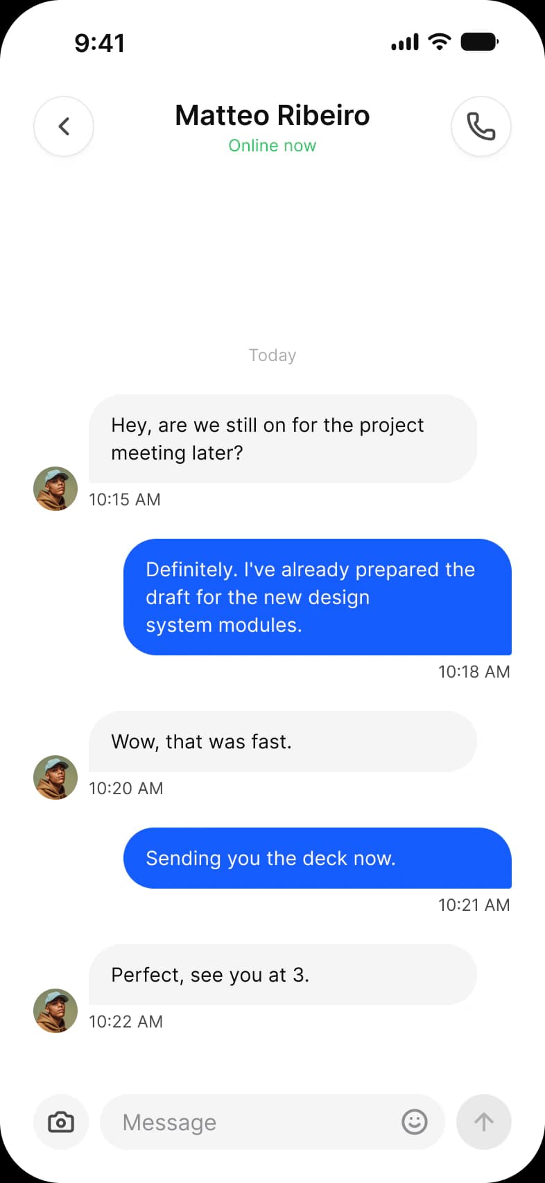
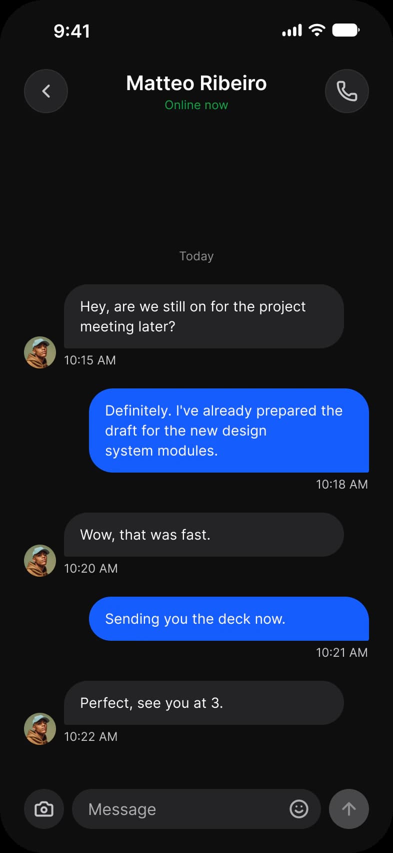
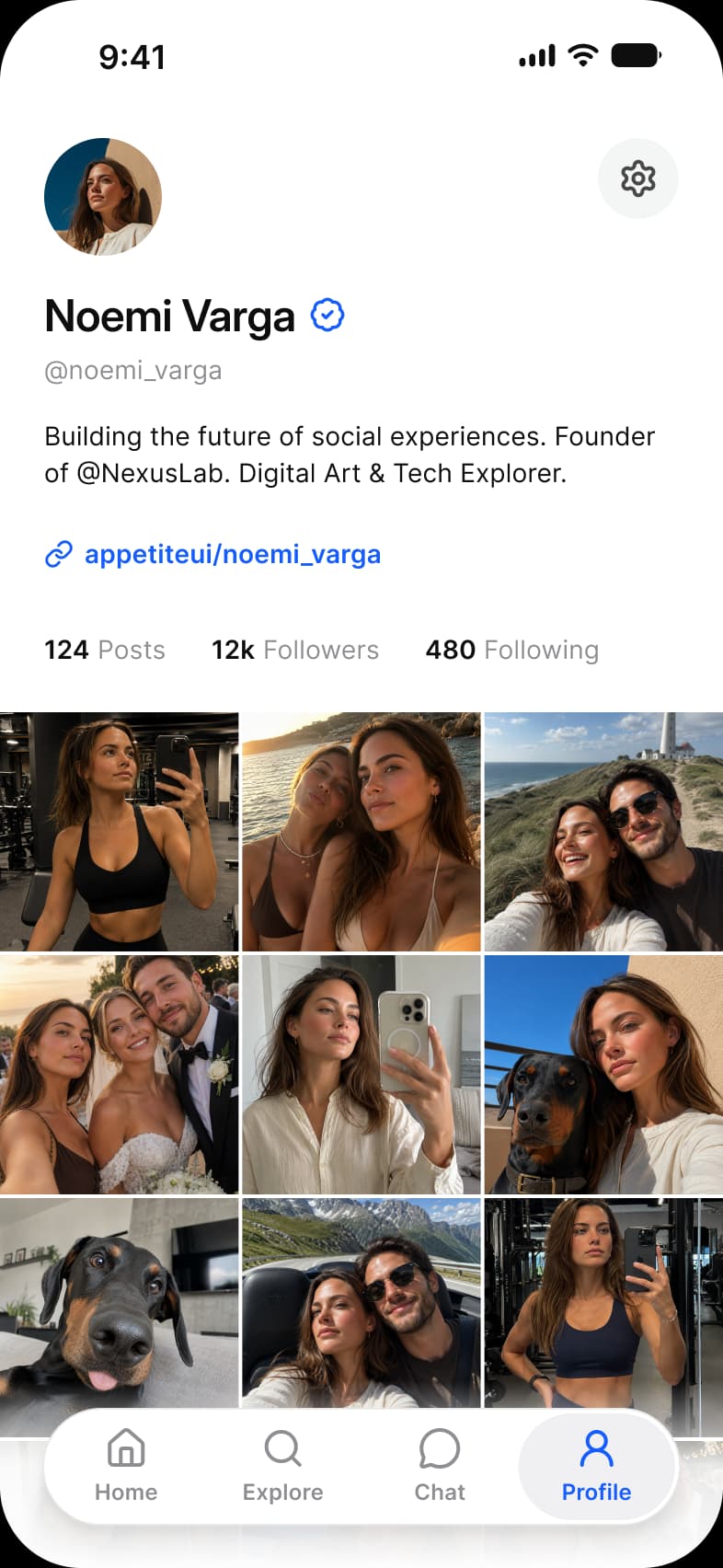
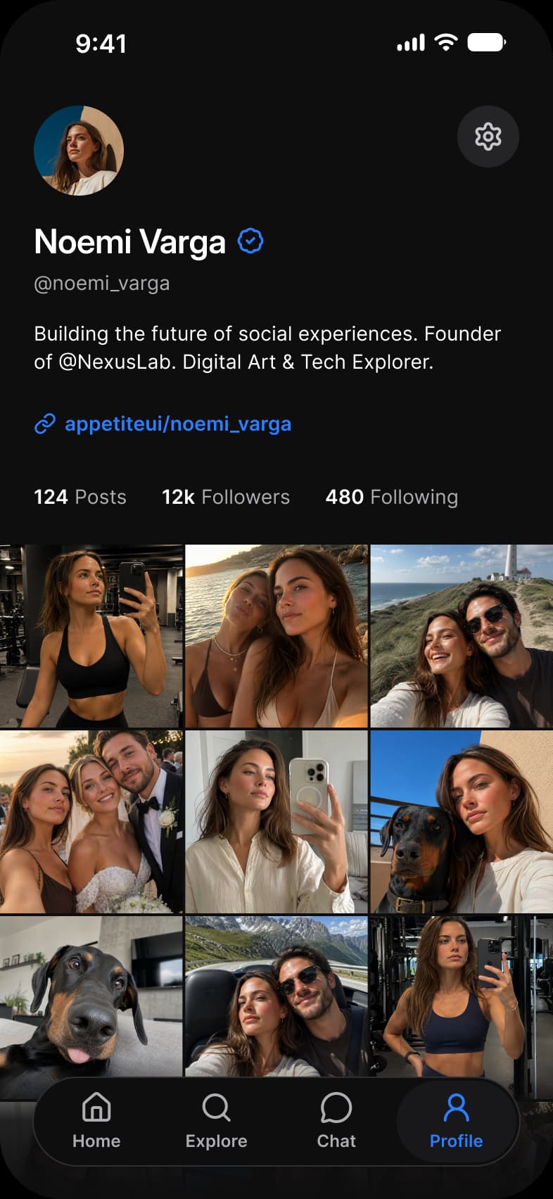
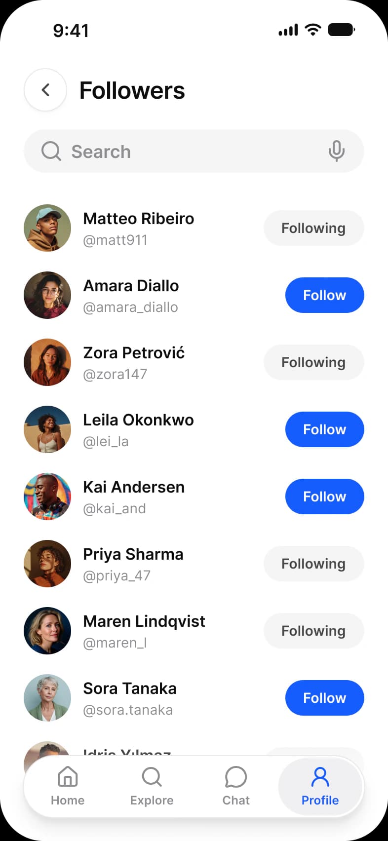
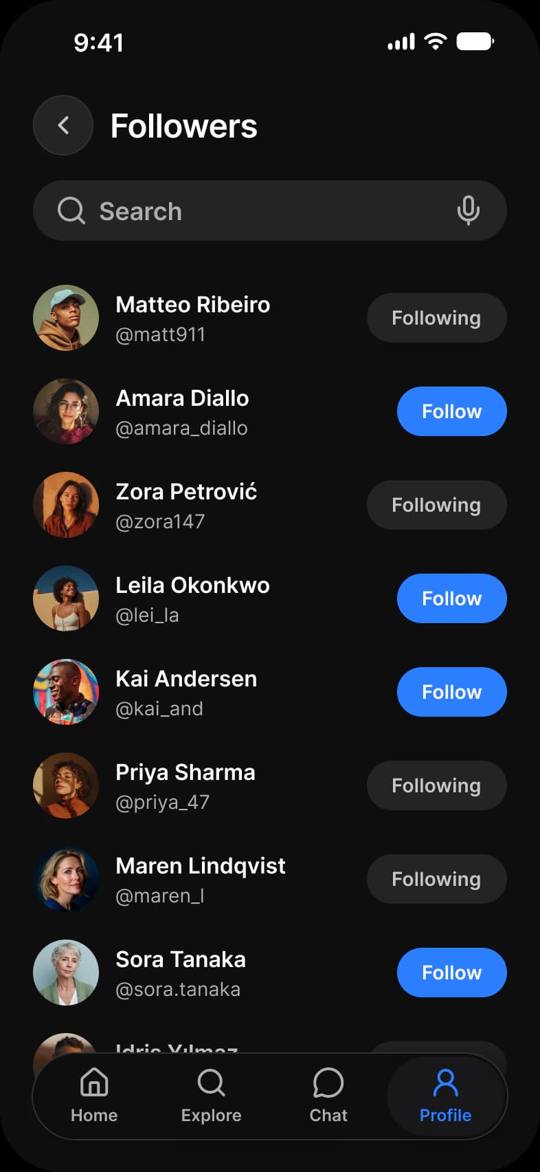
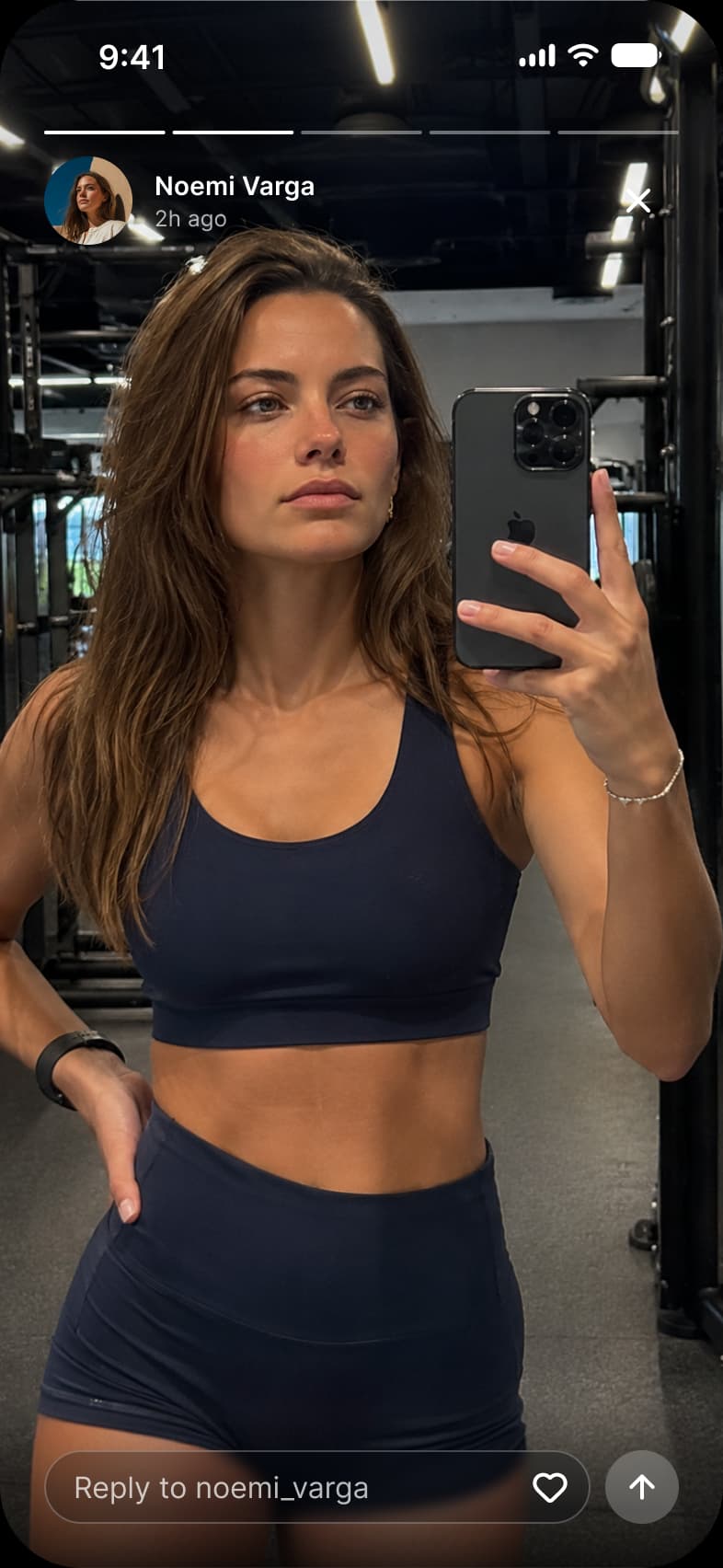
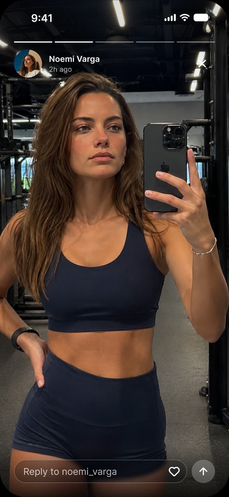
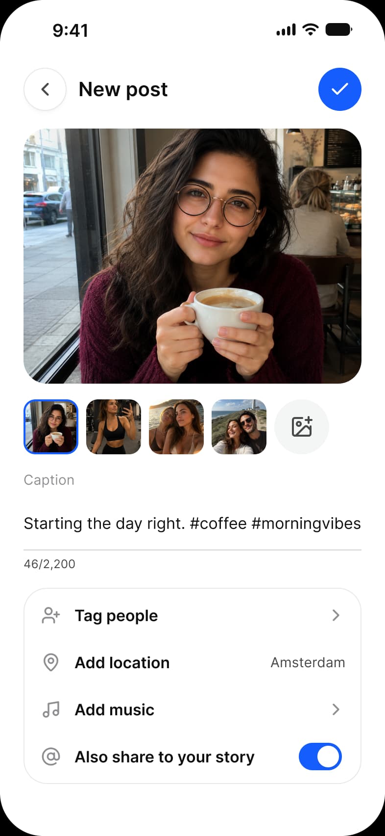
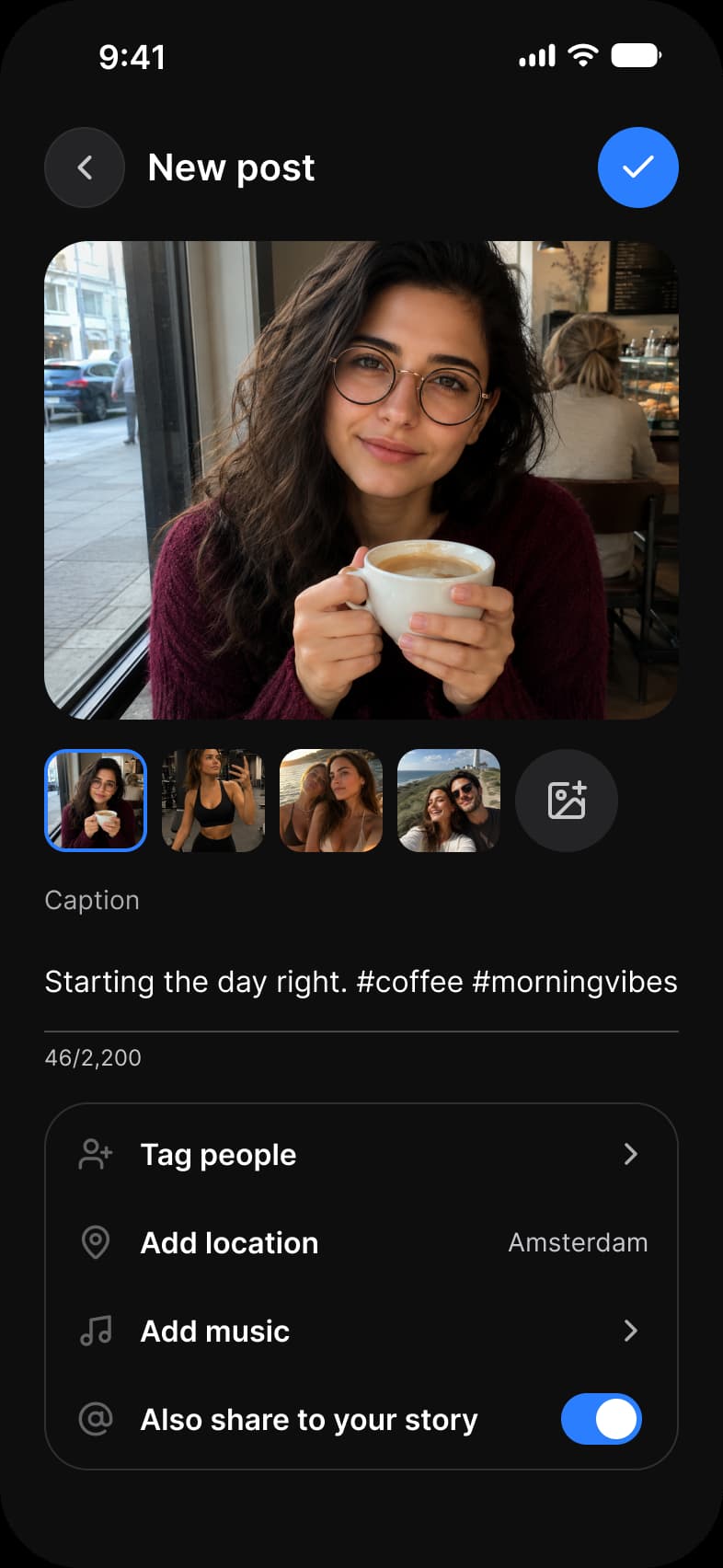
Home, Explore, Search, Chats, Chat, Profile, Followers, Story and New post, each in Light and Dark. Six screens carry the tab bar, and Chat, Story and New post are full screen.
| Screen | What it shows | Built from |
|---|---|---|
| Home | Stories and the feed, titled For you | Top Bar, Avatar, Button, Navigation |
| Explore | A photo grid under search and topic chips | Search, Chip, Navigation |
| Search | People matching a search, each with a Follow button | Search, Avatar, Button, Navigation |
| Chats | Stories with online dots and the list of conversations | Top Bar, Search, Avatar, Button, Navigation |
| Chat | One conversation and its reply field | Top Bar, Avatar, Button, Composer (Input) |
| Profile | A profile header, counts and a photo grid | Avatar, Button, Navigation |
| Followers | The people who follow an account | Top Bar, Search, Avatar, Button, Navigation |
| Story | One story with a progress bar and a reply field | Avatar, Button, Composer (Input) |
| New post | A photo, a caption and the options for posting it | Top Bar, Button, Text Area (Input), List, Toggle |
Which components build the Social screens?
Avatar, Button and Navigation carry most of the screens, and Search, Chip, List, Composer and Text Area cover the rest.
A social app is faces, follow buttons and a tab bar. On the light frames 218 instances sit on each row of the Social page: 148 are Appetite UI components from 11 sets and 70 are Lucide icons with 26 different names. The dark row holds the same instances, so every number below is per row.
| Component | Per row | Where |
|---|---|---|
| Avatar | 51 | Every screen but Explore and New post, including seven presence dots on Chats |
| Button | 37 | Every screen but Explore, nine each on Search and Followers |
| Navigation | 30 | Six tab bars with four labels each |
| Status Bar | 9 | Every screen |
| Top Bar | 5 | Home, Chats, Chat, Followers, New post |
| Search | 4 | Explore, Search, Chats, Followers |
| Chip | 4 | Explore |
| List | 4 | New post, the four option rows |
| Composer | 2 | Chat and Story, the reply field |
| Text Area | 1 | New post, the caption |
| Toggle | 1 | New post, Also share to your story |
Counted on October 2, 2026 with a Plugin API script over the nine light frames of the Social page in the Appetite UI Figma file. Nested and hidden instances count, parts such as navigation labels are grouped with their family, and an icon is an instance named in lowercase.
Which parts of the Social screens are drawn by hand?
Message bubbles, the Story progress segments and the photographs. Everything with a component is placed as one.
The table holds no message bubble and no progress component, so the bubbles on Chat and the five progress segments on Story are drawn on the frame. The photographs on Home, Explore, Profile, Story and New post are content and belong there.
How do the Social screens switch between light and dark?
Each frame pins Color Tokens to Light or Dark and Platform to ios-md, so the dark row is the light layout with one mode changed.
Nothing is left to inherit: a frame dropped into another file arrives in the theme it was drawn in. A frame set to Dark resolves every token against the Dark mode of Color Tokens, so the dark row is the same layout with the other values.
The nine light frames hold 412 solid fills and strokes bound to 27 different variables, and none is unbound. Everything else is a picture or a gradient: the photographs and avatars, the story ring gradient and its bound stops, the tab bar fade and the dark scrim at the foot of Story. A few alpha paints bind a Foundations primitive directly, as on the Composer over the Story photograph, and the avatar background binds one of the yellow primitives.
| Token | Where it lands | Paints |
|---|---|---|
text/soft-500 | Tab bar labels at rest, search placeholders, timestamps | 56 |
fg/strong-950 | The Status Bar on eight screens and primary icons | 48 |
text/strong-950 | Top Bar titles, counts, names and the Home captions | 47 |
bg/white-0 | The tab bar and the surface behind it, the ring around an avatar status | 40 |
text/sub-700 | Button labels on user rows, bubble timestamps, Chip labels | 32 |
brand/base | Follow buttons, the active tab label, links | 28 |
fg/soft-500 | Tab bar icons at rest | 27 |
static/static-white-0 | Button labels on brand, story progress segments, text over photographs | 27 |
border/soft-100 | Story and chat row rings, tab bar outline | 24 |
bg/weak-50 | User row buttons, the Search bar, message bubbles | 21 |
fg/sub-700 | Camera icons, Top Bar icons | 15 |
state/success/base-500 | The online mark of an avatar and a caption | 7 |
bg/raised | Top Bar containers and buttons | 6 |
colors/alpha/gray/alpha-10 | The wash behind each tab bar label | 6 |
border/sub-200 | Chip outlines and the Text Area field | 5 |
state/faded/base-500 | The icon glyphs of the New post rows | 4 |
state/information/base-500 | The sent bubbles on Chat and the hashtags in the Home captions | 4 |
colors/yellow/200 | Avatar backgrounds | 3 |
bg/strong-950 | Message text on Chat | 3 |
colors/alpha/white/alpha-24 | The Composer field and send button over the Story photograph | 2 |
colors/alpha/black/alpha-24, colors/alpha/white/alpha-72 | The Composer field and its placeholder over the Story photograph | 1, 1 |
text/on-color/strong | An avatar glyph on Home | 1 |
brand/alpha-10 | The wash on a post header Button | 1 |
bg/soft-100, fg/disabled-400 | The send button on Chat, fill and icon | 1, 1 |
text/disabled-400 | A timestamp on Chat | 1 |
| Style | Uses | Screens |
|---|---|---|
sm/default | 42 | 8 |
sm/emphasized | 28 | 5 |
base/emphasized | 28 | 4 |
xs/emphasized | 27 | 6 |
xs/default | 22 | 5 |
2xl/emphasized | 4 | 4 |
lg/emphasized | 4 | 4 |
base/default | 3 | 3 |
xl/emphasized | 2 | 2 |
dropShadow/xs | 6 | 5 |
dropShadow/lg | 6 | 6 |
backdropBlur/sm | 2 | 1 |
Paints are every visible solid fill and stroke on the light frames, inside instances included, counted by bound variable name on October 3, 2026. Where a token appears as both a fill and a stroke the two counts are added. A style row counts a text layer or a node that carries the style, and a text layer that mixes two colors or two styles counts once for each.
| Collection | Modes | What it drives here |
|---|---|---|
Color Tokens | Light, Dark | Every color, pinned on each frame |
Platform | ios-md, ios-lg, android, ios-duo-outer, ios-duo-inner | Status bar and platform metrics, pinned to ios-md |
Foundations | Default | Spacing, radius and control sizing |
Typography | Default | The 9 text styles above |
Platform Bridge | Brand, System | Not pinned on the frames, so the default mode applies |
Motion | Default | Not used on these screens |
On iOS the minimum touch target is 44 pt. The frames pin Platform to ios-md, where platform/min-touch-target reads 44, so a tap target on these screens starts there. Android would read 48.
Which patterns do these screens show?
The same screens by what they do, beside the other apps of the kit, with the iOS and Material values of each pattern.
- DashboardSocial media app feed
- ProfileSocial media app profile
- ChatSocial media app chat
- All appsDashboard screens
- All appsProfile screens
- All appsChat screens
- All appsSearch and filter screens
Start from these screens.
Every frame on this page is part of the Appetite UI file, drawn from its components and bound to its variables, so one brand edit moves every screen in light and dark.
The file holds 589 variables in 6 collections and exports its token values to SwiftUI, Jetpack Compose, Flutter and CSS. Solo covers one designer and Team up to ten people. You pay once and keep lifetime updates. Price goes up Nov 1
The read-only Figma preview opens the whole file, every screen and every variable, before you buy.