Updated
Social media app profile
A public profile in Appetite UI, a Figma UI kit for iOS and Android apps built like a design system: Noemi Varga with a verified mark, a bio and a link, 124 posts, 12k followers and 480 following, and a grid of photos. Followers opens the people behind the count, each with Following or Follow.
Updated
Preview
Profile, Followers, from the Social page of the Appetite UI Figma file. The theme switch shows the dark frames.
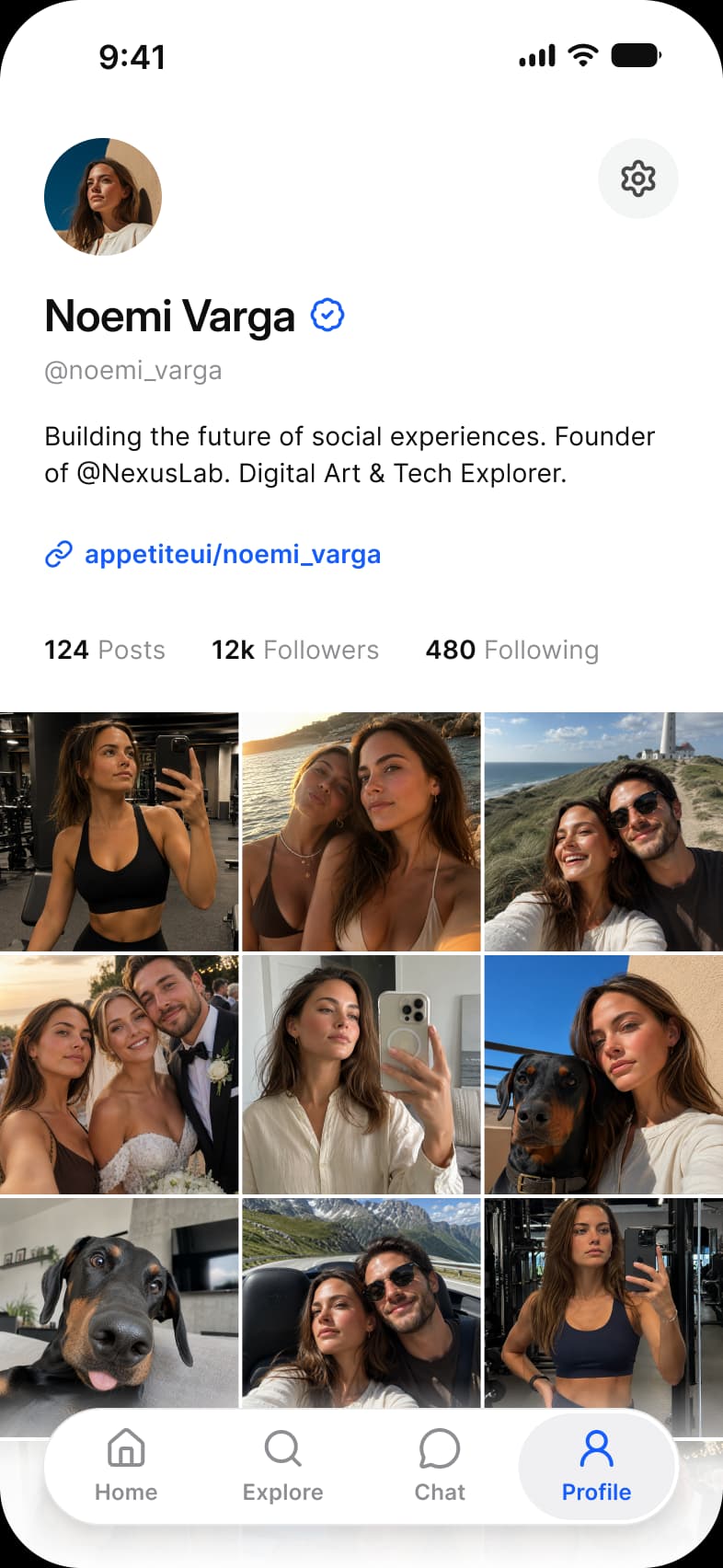
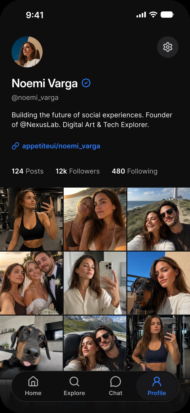
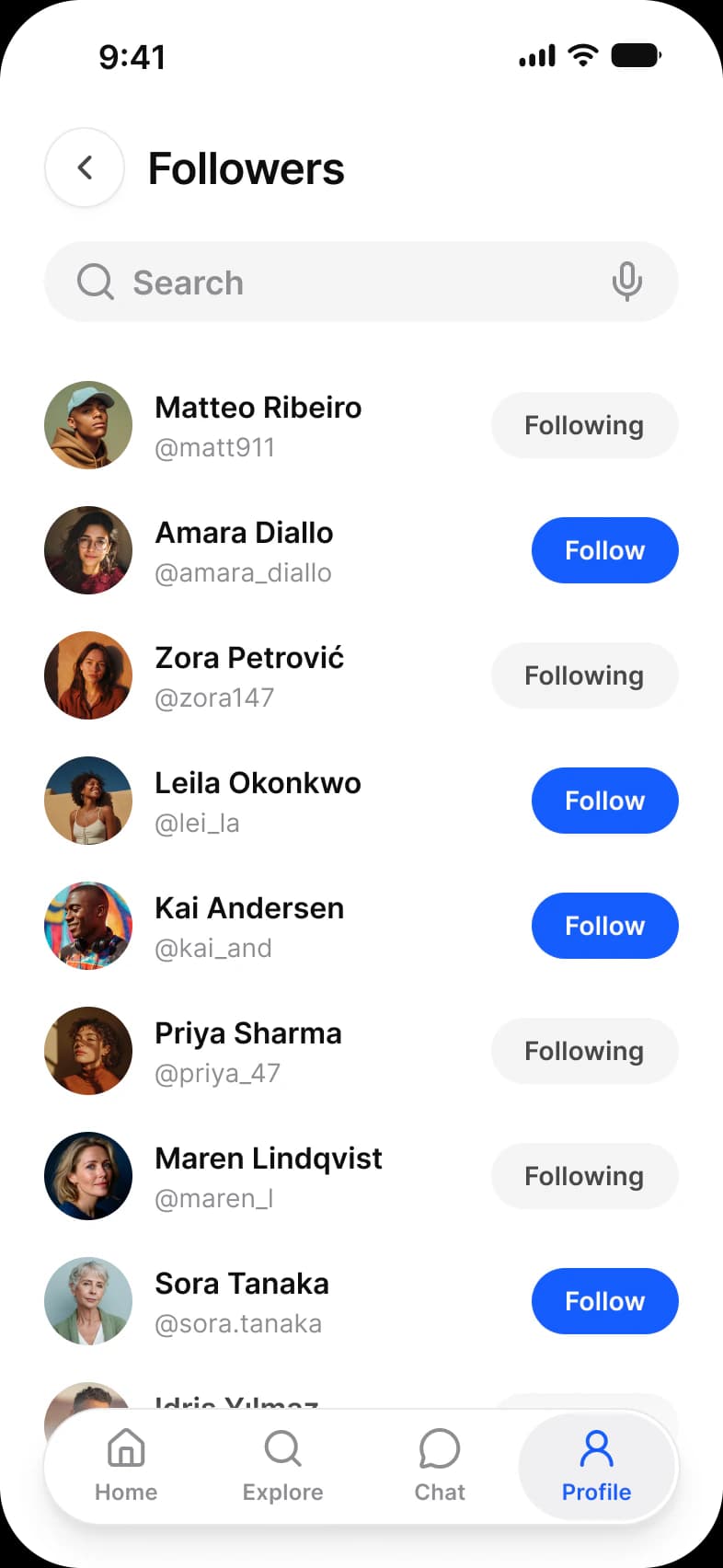
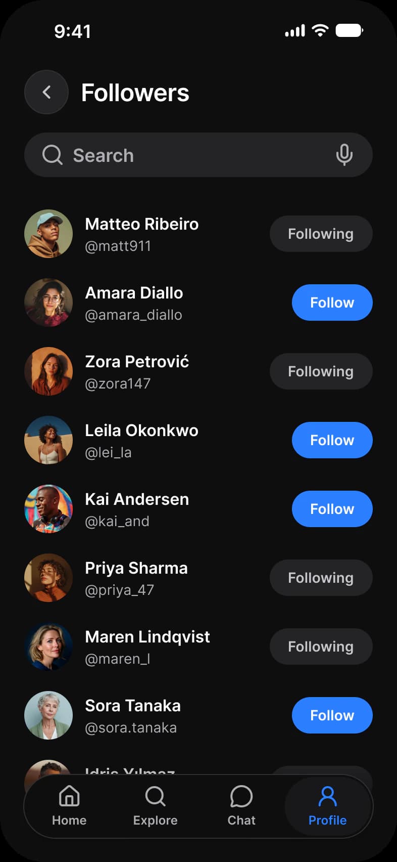
| Screen | What it shows |
|---|---|
| Profile | A profile header, counts and a photo grid |
| Followers | The people who follow an account |
Which components carry the profile pattern?
The kit's components, drawn live from the same tokens as the frames. Tap them: they behave as the Figma prototype does.
Avatar, photo
List, chevron and toggle
Button, Weak
How does this screen follow the profile pattern?
The rules every profile screen in the kit follows, and what this one does with each.
| Rule | On the social media app |
|---|---|
| Decide who the screen is for | This profile is for visitors, so it leads with the person and her work and carries no settings rows at all. |
| Settings are list rows | The followers list is rows of an Avatar, a name and a handle with a Button, under a back button and a Search field. |
| Log out is a button, not a row | Follow and Following are two styles of one Button, so the state of a relationship is the button itself, with no separate badge. |
What is it built from?
Every control with a component is an instance of it, so one token change moves these screens with the rest of the file.
| Component | Screens |
|---|---|
| Avatar | Profile, Followers |
| Button | Profile, Followers |
| Navigation | Profile, Followers |
| Top Bar | Followers |
| Search | Followers |
What changes between iOS and Material?
The frames are drawn in the ios-md Platform mode. Switch a frame to android and these variables take the Material values; the components below are where the two systems draw the same need differently.
| Variable | iOS (ios-md) | Android |
|---|---|---|
platform/list-row/min-height | 44 | 56 |
platform/bar/top-height | 44 | 64 |
platform/min-touch-target | 44 | 48 |
| Component | iOS | Material 3 | What differs |
|---|---|---|---|
| List | iOS / List with a 44 minimum row | M3 / List Item, 56, 72 or 88 high by Lines | Material sets the row height by lines of text, iOS sets only a minimum |
| Top bar | iOS / Toolbar on a 44 high top bar | M3 / Top app bar, Small 64 high, Medium 112, Large 152 | Material has four bar types: Small, Center-aligned, Medium and Large |
Start from these screens.
Every frame on this page is part of the Appetite UI file, drawn from its components and bound to its variables, so one brand edit moves every screen in light and dark.
The file holds 589 variables in 6 collections and exports its token values to SwiftUI, Jetpack Compose, Flutter and CSS. Solo covers one designer and Team up to ten people. You pay once and keep lifetime updates. Price goes up Nov 1
The read-only Figma preview opens the whole file, every screen and every variable, before you buy.