Updated
iOS
Apple's iOS 27 patterns, rebuilt as Figma components that read the same tokens as the rest of the system. A screen carries your brand or returns to the untouched platform values without being redrawn.
Updated
On this page
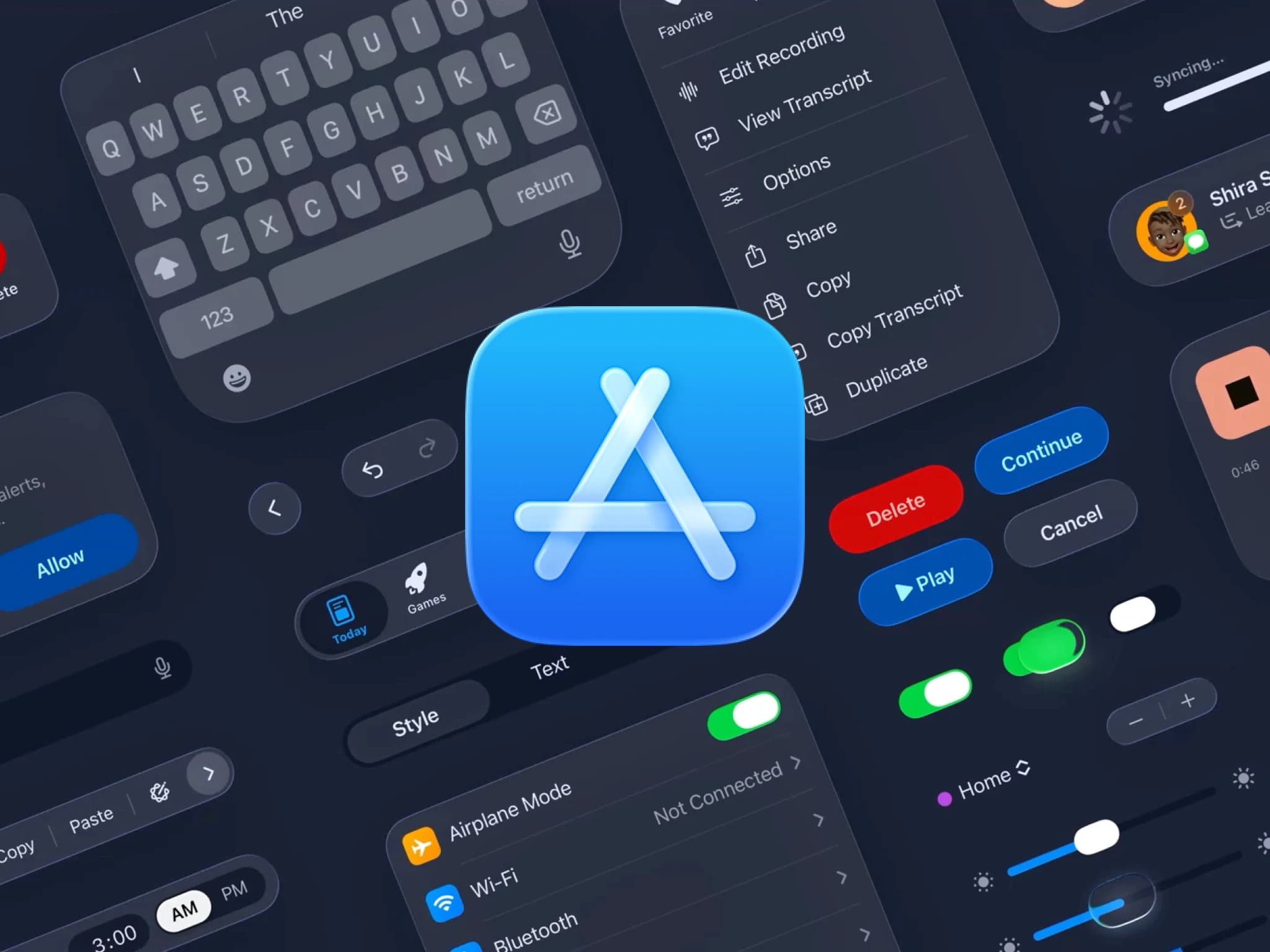
Appetite UI redraws the Apple patterns on your tokens and puts your brand inside them. The structure stays Apple: the same anatomy, the same spacing, the same behavior a user already knows. Color, type, radius and elevation come from your system, so a Toolbar or a Sheet reads as native and as yours at the same time.
How does Appetite UI support iOS 26 and 27?
The Apple pages follow the iOS 27 patterns: 20 pattern pages, 67 variant sets and 419 variants. Liquid Glass, which arrived in iOS 26, comes at the three transparency levels of iOS 27, and iPhone Duo has its own chrome.
| Component | What it is | Measured |
|---|---|---|
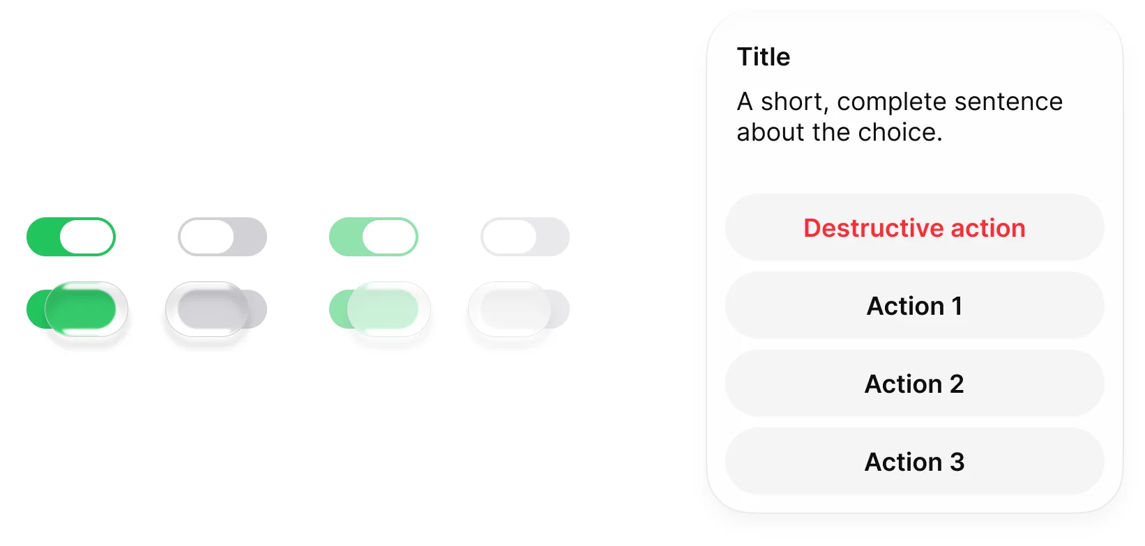
| Toggle | A wider track with a capsule knob. While pressed, the knob turns into a glass lens. | Track 64 × 28, knob 38 × 24, pressed lens 58 × 38 |
| Slider | A thin track with a capsule knob and optional tick marks, at 0, 25, 50, 75 and 100 percent. | Track 6 high, knob 38 × 24, 320 wide |
| Tab Bar | A floating glass capsule. The selected tab sits on a capsule fill. Search Role and Minimized variants. | Bar 62 high at padding 4, tab 54 high, component 402 × 95 |
| Status Bar | Two sizes, one per device class, plus a vertical Duo version. | 402 × 62 on ios-lg, 402 × 59 on ios-md |
| Action Sheet | A glass card with a left aligned title and message over full width capsule actions. A destructive action comes first, in systemRed. | Card 300 × 362 at radius 32, action row 272 × 48 |
The selected tab label reads iOS/tintColor and the others iOS/label, the selection capsule reads iOS/systemFill, and the label is 12 in Brand mode and 10 in System mode (iOS/sys/typography/tabBarLabel).
Measured in the Figma file on October 2, 2026: iOS / Toggle, iOS / Slider, iOS / Tab Bar, iOS / Status Bar and iOS / Action Sheet.
How do Brand and System mode differ?
Brand mode resolves the Apple roles to Appetite UI tokens, and System mode resolves the same roles back to Apple's own values. Platform Bridge holds 53 iOS roles and each one resolves twice.
Nothing in the Apple mirror is filled with a hex. Set the mode on a frame and the whole screen re-resolves: geometry and structure hold, only the values move. One swap on one collection means there is no second set of screens to keep in sync.
- Brand mode
iOS/tintColorbrand/basecolors/blue/500#155DFC - System mode
iOS/tintColorplatform/ios/tint#007AFF
iOS / Segmented Control, Size Large, is 370 × 50 with padding 2, gap 4 and segments 46 high, in both modes. Its track reads iOS/tertiarySystemFill: flat gray in Brand, translucent in System.
Which Apple patterns are covered?
20 pattern pages in the Apple mirror, one row each, with 67 variant sets and 419 variants in total, counted in the Figma file.
| Pattern page | Sets | Variants |
|---|---|---|
| Action Sheet | 1 | 2 |
| Activity View | 2 | 14 |
| Alert | 6 | 28 |
| Button | 7 | 118 |
| Controls | 6 | 33 |
| Dynamic Island | 4 | 42 |
| Face ID | 1 | 2 |
| Keyboard | 13 | 55 |
| List | 3 | 28 |
| Live Activity | 1 | 6 |
| Menu | 3 | 16 |
| Notification | 1 | 3 |
| Page Control | 2 | 5 |
| Picker | 3 | 9 |
| Sheet | 2 | 4 |
| Status Bar | 2 | 4 |
| Tab Bar | 5 | 25 |
| Text Field | 1 | 4 |
| Toggle | 1 | 8 |
| Toolbar | 3 | 13 |
| Total | 67 | 419 |
Button and Keyboard carry the largest matrices because both cross size with state.
Counted in the Figma file on October 2, 2026. A set is every component set on the page, helper sets included, and a variant is a component inside one of those sets. Loose single components are not counted.
What are Passkey, Permission Alert and Review Prompt?
They are the three system dialogs most apps show in their first minutes: saving a passkey, asking for a permission and asking for an App Store rating. Each is a component set on the Alert page, with copy you edit and the button verbs Apple uses.
| Component | Property | Type | Options | Default |
|---|---|---|---|---|
| Passkey | Flow | Variant | Create | Sign In | Cross-Device | Security Key | Create |
| Passkey | State | Variant | Prompt | Verifying | Success | Prompt |
| Permission Alert | Kind | Variant | Photos | Tracking | Camera | Microphone | Contacts | Location | Camera |
| Review Prompt | State | Variant | Default | Input Rating | Rating Submitted | Default |
| Review Prompt | Title | Text | Any text | Enjoying Appetite? |
| Review Prompt | Description | Text | Any text | Tap a star to rate it on the App Store. |
The three sets hold 12 Passkey variants, 6 Permission Alert variants and 3 Review Prompt variants. Title and body of Passkey and Permission Alert are editable text layers on each variant.
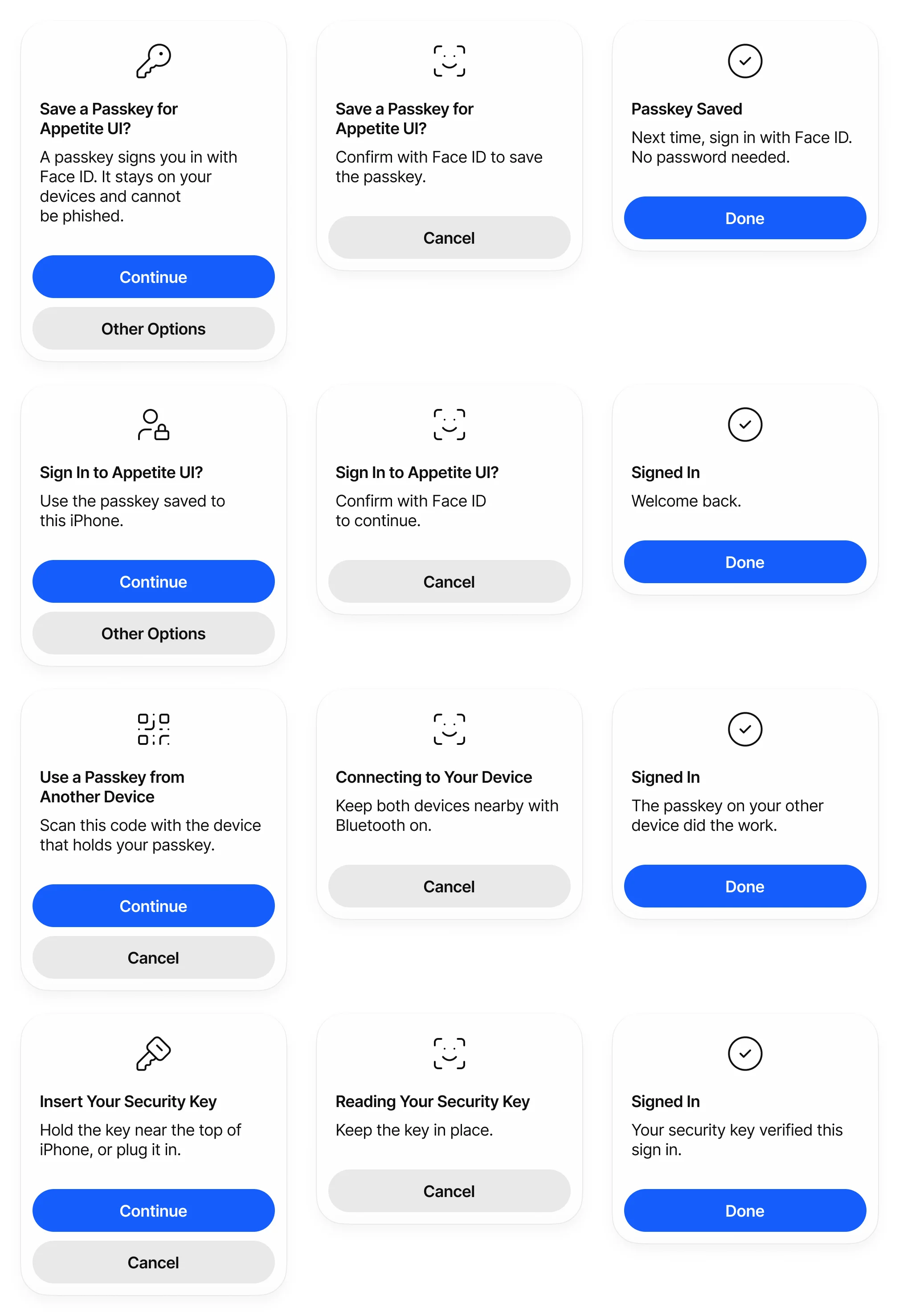
| Flow | Prompt actions | Success title |
|---|---|---|
| Create | Continue, Other Options | Passkey Saved |
| Sign In | Continue, Other Options | Signed In |
| Cross-Device | Continue, Cancel | Signed In |
| Security Key | Continue, Cancel | Signed In |
Verifying waits on Face ID and offers Cancel only. Success offers Done. Heights run from 238 to 384 with the copy.
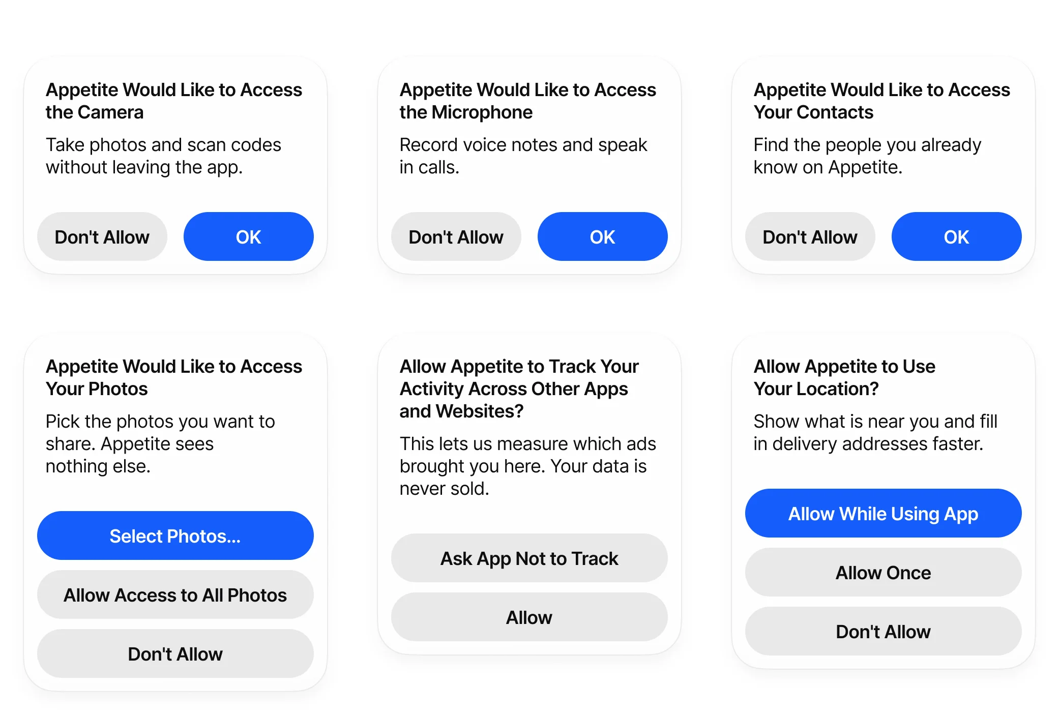
| Kind | Actions | Layout |
|---|---|---|
| Camera | Don't Allow, OK | Side by side |
| Microphone | Don't Allow, OK | Side by side |
| Contacts | Don't Allow, OK | Side by side |
| Photos | Select Photos, Allow Access to All Photos, Don't Allow | Stacked |
| Tracking | Ask App Not to Track, Allow | Stacked |
| Location | Allow While Using App, Allow Once, Don't Allow | Stacked |
Two short actions sit side by side. Three actions, or a label that does not fit beside another, force the stacked layout, the same rule iOS follows. Tracking has no primary action on purpose: Apple styles both tracking choices alike so the dialog does not steer the answer.
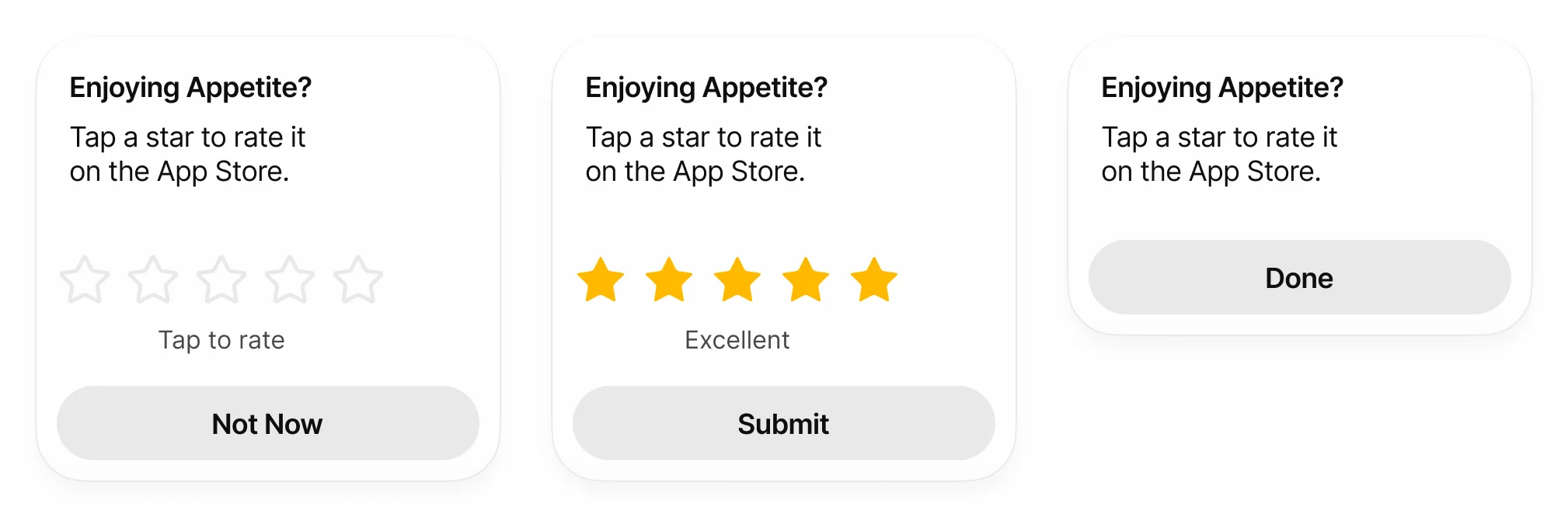
Review Prompt reuses the Rating component for the stars, with a caption under them. Default and Input Rating are 300 × 288, and Rating Submitted drops the stars and shrinks to 300 × 194.
What is the Dynamic Island component?
The Dynamic Island is the pill at the top of iPhone that grows into live information. Appetite UI draws it as three sets on one black pill: the four presentations of one activity, 23 system presentations and 10 expanded layouts.

| State | Size | Radius | What it shows |
|---|---|---|---|
| Idle | 125 × 37 | 18.5 | The sensor cutout at rest |
| Minimal | 170 × 37 | 18.5 | An attached pill with a detached 37 capsule |
| Compact | 201 × 37 | 18.5 | A leading icon and a trailing label around the cutout |
| Expanded | 371 × 130 | 44 | Title, subtitle, trailing value, progress and times |
Expanded is 371 wide on the 393 pt device class and 408 wide on the 430 pt class, and Apple allows 84 to 160 tall. The radius of 44 is the value Apple publishes.
| Property | Type | Options | Default |
|---|---|---|---|
State | Variant | Idle | Minimal | Compact | Expanded | Idle |
Icon | Instance swap | Any component | Company Logo, Tidal |
Detached Icon | Instance swap | Any component | Company Logo, Sundial |
Compact Label | Text | Any text | 2:14 |
Title | Text | Any text | Weightless |
Subtitle | Text | Any text | Arlo Vance |
Trailing Value | Text | Any text | Now playing |
Elapsed | Text | Any text | 1:12 |
Remaining | Text | Any text | -2:48 |
The apps behind the island are Company Logo placeholders, from the twelve placeholder companies in Assets: Tidal, Sundial, Relay, Northwind, Pinpoint and Orbital appear across the sets. Replace the Icon swap with your own mark.
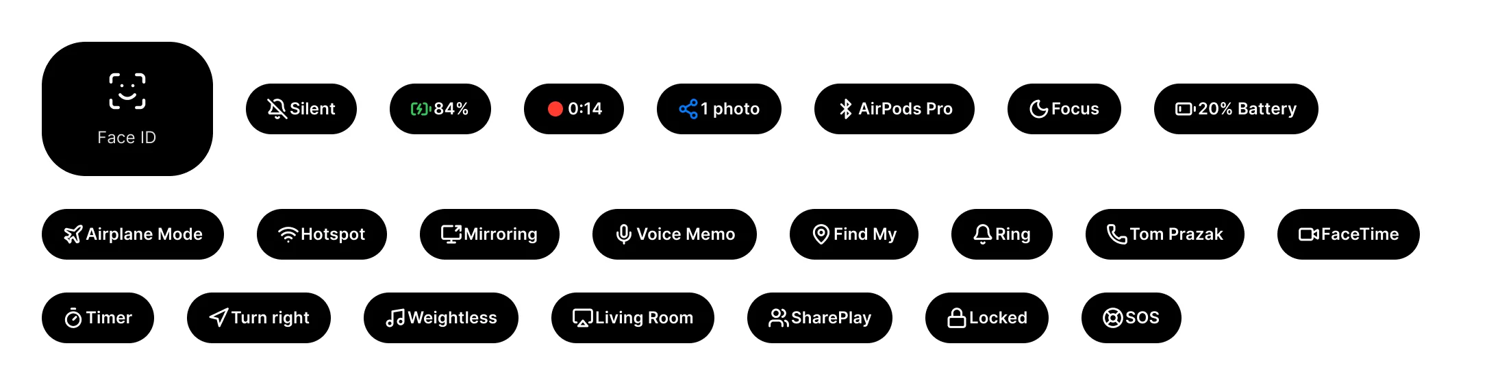
| Type | Label width | Type | Label width |
|---|---|---|---|
| Face ID | 125 × 98 panel at radius 32 | Find My | 94 |
| Silent | 81 | Ring | 74 |
| Charging | 74 | Call | 116 |
| Recording | 73 | FaceTime | 104 |
| AirDrop | 91 | Timer | 82 |
| Connected | 117 | Navigation | 105 |
| Focus | 83 | Now Playing | 113 |
| Low Battery | 120 | AirPlay | 119 |
| Airplane | 133 | SharePlay | 106 |
| Hotspot | 95 | Lock | 90 |
| Mirroring | 102 | SOS | 73 |
| Voice Memo | 120 |
System presentations are what the island shows without an app running a Live Activity. Every pill follows one rule: the icon sits 14 from the leading edge, the label ends 15 from the trailing edge and the sensor cutout fills the middle, so a pill is 142 plus the label width.
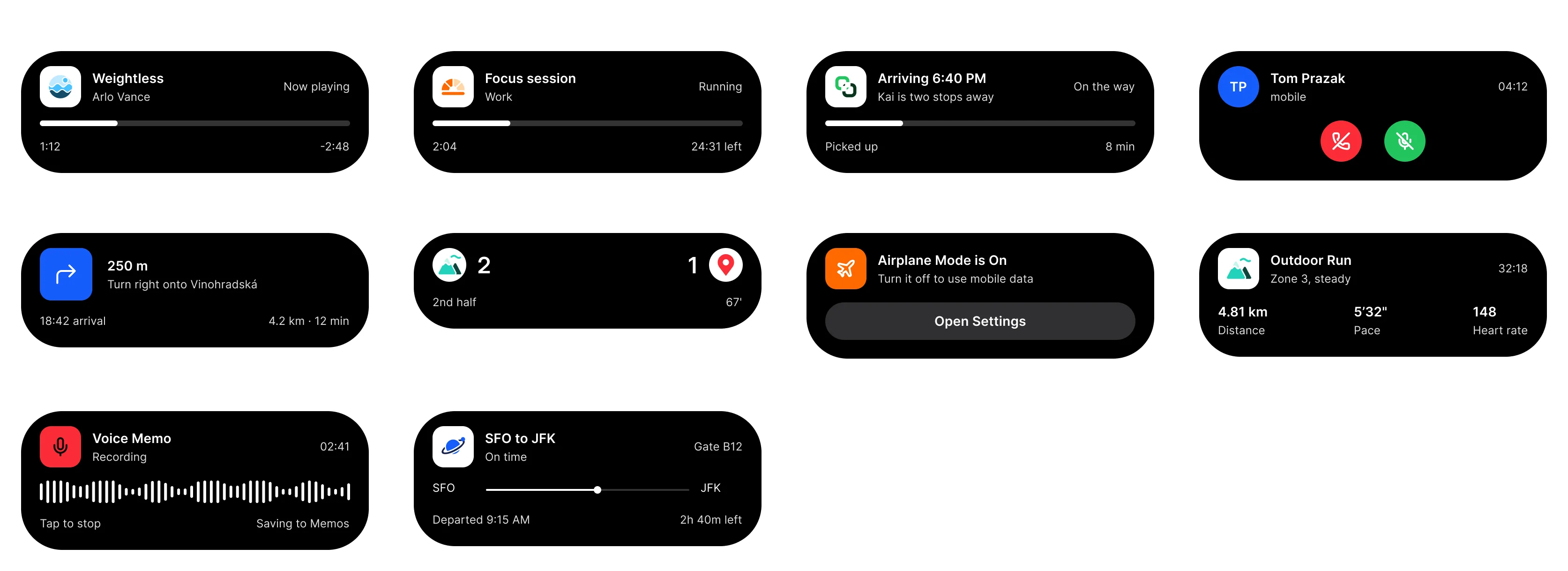
| Layout | Height |
|---|---|
| Media | 130 |
| Timer | 130 |
| Delivery | 130 |
| Call | 138 |
| Navigation | 122 |
| Score | 102 |
| Alert | 134 |
| Workout | 132 |
| Recording | 148 |
| Flight | 144 |
| Set | Property | Type | Options | Default |
|---|---|---|---|---|
| Dynamic Island - System | Type | Variant | 23 types, listed above | Face ID |
| Dynamic Island - Expanded | Layout | Variant | 10 layouts, listed above | Media |
| Dynamic Island - Expanded | Action | Text | Any text | Open Settings |
| Dynamic Island - Expanded | Icon, Detached Icon, Compact Label, Title, Subtitle, Trailing Value, Elapsed, Remaining | As in the main set | As in the main set | As in the main set |
| _DI Progress | Value | Variant | 0 | 25 | 50 | 75 | 100 | 0 |
| Live Activity | Trailing | Variant | Value | Thumbnail | Value |
| Live Activity | Footer | Variant | None | Progress | Actions | None |
| Live Activity | App, Caption, Title, Subtitle, Value | Text | Any text | Appetite Delivery, now, Arriving in 12 min, Idris is 3 stops away, 12:24 |
| Live Activity | App Glyph | Instance swap | Any component | package icon |
Media, Timer and Delivery share one header, progress and meta scaffold, and only Alert uses the Action text. The progress track is the helper set _DI Progress, 331 × 6 at radius 3. The Lock Screen side of the same activity is iOS / Live Activity, 361 wide and up to 154 high with its footer.
The main set carries a morph prototype: pressing an island changes it to the next presentation, Idle to Compact to Expanded and back to Idle. The transition is Smart Animate over 320 ms, the motion/duration/slow variable, on motion/easing/emphasized, cubic-bezier(0.05, 0.7, 0.1, 1).
Read from the Figma reactions on October 2, 2026.
How does the iPhone Duo chrome work?
iPhone Duo moves the status bar, toolbar and tab bar off the horizontal edges onto a 96 pt control rail beside the content. Appetite UI draws the rail as Duo versions of Status Bar, Toolbar, Tab Bar, List, Keyboard and Sheet, and two Platform modes, ios-duo-outer and ios-duo-inner, set the geometry.
The screens that use them are on the iPhone Duo screens page, 8 apps on an outer and an inner display.
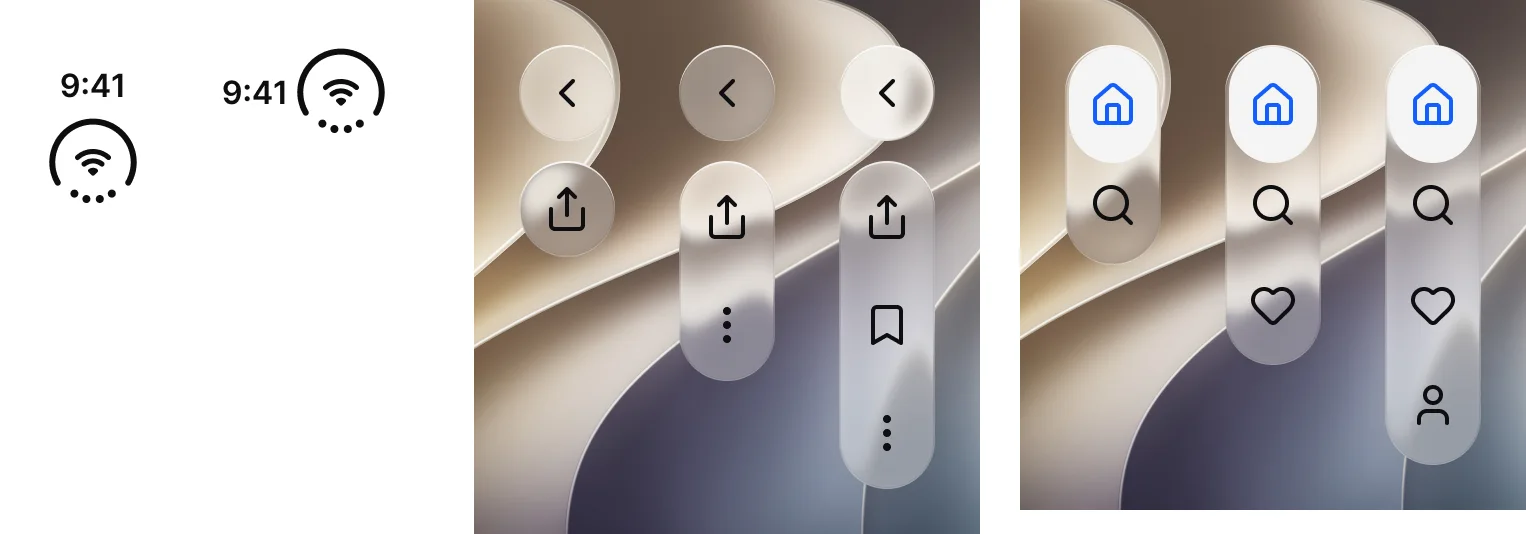
| Component | Property | Variants | Size |
|---|---|---|---|
| Status Bar - Duo | Layout | Rail, Compact | 48 × 86, 92 × 48 |
| Toolbar - Duo | Actions | 1, 2, 3 | 48 × 106, 168, 222 |
| Tab Bar - Duo | Tabs | 2, 3, 4 | 48 × 110, 160, 210 |
| Glass Group | Orientation, Items | Horizontal or Vertical, 1 to 3 | 48 × 48, 92, 136 along the axis |
| List - Duo | Rows | 2, 3, 4 | 669 × 136, 204, 272 |
| Keyboard - Duo | Display | Inner landscape, Outer | 934 × 218, 450 × 258 |
| Sheet - Duo | None | Single component | 652 × 802 |
The toolbar carries the navigation pill on top and one to three actions below, and items overflow from the bottom up. The tab bar is icon only, with 48 wide cells, and each tab has a Default and a Selected state. The toolbar actions are 36 inside their capsule. Glass Group is the shared glass surface for both, one to three targets.
The Platform collection does the layout work. Duo status bar and tab bar leave the horizontal axis, so the top and bottom safe areas shrink to 24 and the bottom bar height becomes 0. The trailing safe area is 96 for the rail, and the inner display adds a 262 wide sidebar. All values are in the Platform table under Tokens and metrics.
How is Liquid Glass built?
Liquid Glass is an effect style on a background layer, never on a frame that holds content. The iOS components use three styles, liquidGlass/Regular, liquidGlass/Tinted and liquidGlass/Clear, the stops of the iOS 27 transparency slider.

| Style | Refraction | Dispersion | Frost | Light intensity |
|---|---|---|---|---|
liquidGlass/Regular | 0.7 | 0.2 | 6 | 0.25 |
liquidGlass/Tinted | 0.6 | 0.15 | 12 | 0.25 |
liquidGlass/Clear | 0.8 | 0.25 | 2 | 0.35 |
Regular is the default stop, for bars, buttons, menus and sheets. Tinted is the fully tinted end, for busy backgrounds and Reduce Transparency. Clear lets content show through and keeps only refraction and rim light.
All three share depth 30, splay 0.2 and light angle 0, plus a soft drop shadow, a one pixel edge shade and a white rim light. They differ in the inner tint: white at 32 percent for Regular, a near white at 86 percent for Tinted and white at 6 percent for Clear.
The shared surface is _Glass - Control, a private set with Style Regular, Clear or Tinted and State Default or Primary. Primary drops the glass and uses a solid fill, the way iOS draws a prominent glass button. The glass buttons are iOS / Button - Liquid Glass - Text, with Style Glass or Glass Prominent and Size Small, Medium or Large, and iOS / Button - Liquid Glass - Symbol at 50 × 50.
Tokens and metrics
Device geometry lives in its own collection, one mode per device class, and the minimum touch target is 44 on every iOS mode and 48 on android. The iOS half of Platform Bridge is 53 roles.
| Variable | ios-md | ios-lg | ios-duo-outer | ios-duo-inner |
|---|---|---|---|---|
grid/safe-area/top | 59 | 62 | 24 | 24 |
grid/safe-area/bottom | 34 | 34 | 24 | 24 |
grid/safe-area/trailing | 0 | 0 | 96 | 96 |
grid/columns | 4 | 4 | 4 | 6 |
platform/min-touch-target | 44 | 44 | 44 | 44 |
platform/bar/top-height | 44 | 44 | 44 | 44 |
platform/bar/bottom-height | 49 | 49 | 0 | 0 |
platform/list-row/min-height | 44 | 44 | 44 | 44 |
platform/control/corner | 8 | 8 | 8 | 8 |
platform/card/corner | 12 | 12 | 12 | 12 |
platform/sheet/corner | 12 | 12 | 12 | 12 |
platform/dialog/corner | 12 | 12 | 12 | 12 |
platform/switch/track-width | 64 | 64 | 64 | 64 |
platform/switch/track-height | 28 | 28 | 28 | 28 |
platform/screen-padding | 16 | 16 | 16 | 16 |
platform/duo/sidebar-width | 0 | 0 | 0 | 262 |
platform/duo/device-corner | 48 | 48 | 48 | 48 |
platform/duo/pane-corner | 26 | 26 | 26 | 26 |
grid/columns is 4 on every mode except ios-duo-inner, which has 6, the same counts as the grid styles on the Dimensions page. The switch track is 64 by 28 on every iOS mode, the size of the iOS / Toggle set. ios-md and ios-lg differ in one variable, grid/safe-area/top, 59 on ios-md and 62 on ios-lg. The android mode sits in the same collection and is listed on the Material 3 page. Apple publishes the 44 pt target and the 11 pt minimum text, and every other number is an Appetite UI decision. Both font variables read Inter.
Collection of 20 variables on five modes, read on October 2, 2026.
| Role | Brand | System |
|---|---|---|
iOS/tintColor | #155DFC | #007AFF |
iOS/label | #0E0E0F | #000000 |
iOS/secondaryLabel | #48484A | #3C3C43 at 60% |
iOS/separator | #E9E9EA | #3C3C43 at 18% |
iOS/systemGreen | #22C55E | #34C759 |
iOS/systemFill | #F4F5F5 | #787880 at 16% |
iOS/glassThick | #FFFFFF at 92% | #FFFFFF at 75% |
| Role | Brand | System |
|---|---|---|
iOS/tintColor | #2B7FFF | #0A84FF |
iOS/label | #FFFFFF | #FFFFFF |
iOS/secondaryLabel | #C7C7CC | #EBEBF5 at 60% |
iOS/separator | #2F2F31 | #545458 at 65% |
iOS/systemGreen | #16A34A | #30D158 |
iOS/systemFill | #242427 | #787880 at 36% |
iOS/glassThick | #242426 at 88% | #1A1A1A at 92% |
| Shape and type | Brand | System |
|---|---|---|
iOS/sys/shape/corner-small | 8 | 10 |
iOS/sys/shape/corner-large | 24 | 26 |
iOS/sys/shape/corner-glass | 32 | 34 |
iOS/sys/typography/body | 18 | 17 |
iOS/sys/typography/subheadline | 14 | 15 |
iOS/sys/typography/footnote | 12 | 13 |
iOS/sys/typography/tabBarLabel | 12 | 10 |
A sample of the 53 roles, resolved in Light and Dark, read in the Figma file on October 2, 2026.
iOS, SwiftUI, SF Pro and SF Symbols are trademarks of Apple Inc, Material Design of Google LLC. Appetite UI is not affiliated with, endorsed by or sponsored by either; platform names describe compatibility. No Apple artwork, symbol or typeface is included. Every layer is Appetite UI's own geometry on its own tokens, in Inter with Lucide icons.