How to design a Live Activity and the Dynamic Island in Figma
Apple's Dynamic Island and Live Activity sizes, the 2026 changes its table misses, a Figma build for all four presentations, and Android 16 Live Updates.

On this page
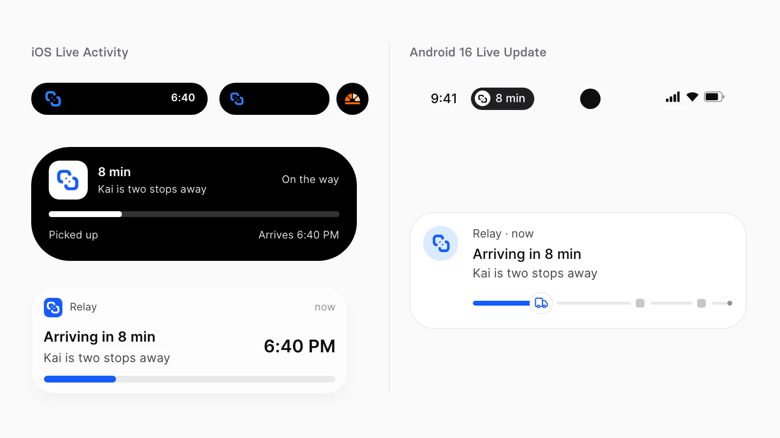
To design a Live Activity in Figma, draw the same activity four times: compact and minimal in the Dynamic Island, expanded for when someone touches and holds it, and the Lock Screen presentation. Build each on Apple's published sizes. On the 393 × 852 point class the island is 230 points wide in compact or minimal, the expanded presentation is 371 wide and 84 to 160 tall, the corner radius is 44, and the Lock Screen presentation keeps a 14 point margin. On Android 16 the same activity is a Live Update: a promoted notification with a chip in the status bar, filled into a system template instead of drawn as your own layout.
Appetite UI is a Figma UI kit for iOS and Android apps, built like a design system. One token source drives Apple and Material components in light and dark mode, and exports to SwiftUI, Jetpack Compose, Flutter and CSS. I design it; the kit measurements below were read in its Figma file today, and Apple's and Google's rules are quoted from their own pages, linked under Sources.
Where does a Live Activity show?
A Live Activity shows on the Lock Screen, on the Home Screen, in the Dynamic Island and in StandBy on iPhone, and the system carries it to the Mac menu bar, the Apple Watch Smart Stack and the CarPlay Dashboard. Apple's Live Activities page lists the places:
| Platform | Location |
|---|---|
| iPhone and iPad | Lock Screen, Home Screen, in the Dynamic Island and StandBy on iPhone |
| Mac | The menu bar |
| Apple Watch | Smart Stack |
| CarPlay | CarPlay Dashboard |
You design four of these by hand. Apple says a Live Activity "must support" the compact, minimal, expanded and Lock Screen presentations, and the system builds the rest from them: the two compact elements are combined "into a single view for Apple Watch and in CarPlay". For custom layouts Apple lists 240 × 78, 240 × 100 and 170 × 78 points in CarPlay and 152 × 69.5 to 191 × 81.5 in the Smart Stack.
Two rules decide the content before any drawing. Apple scopes Live Activities to "tasks and events that have a defined beginning and end" that "don't exceed eight hours", and ActivityKit enforces it: after eight hours the activity ends and leaves the Dynamic Island, and it can stay on the Lock Screen up to four more hours, 12 at most. And: "Don't use a Live Activity to display ads or promotions."
What sizes does Apple publish for the Dynamic Island?
Apple publishes sizes for two screen classes, 393 × 852 and 430 × 932 points, plus the island's width per device, a 44 point corner radius and a 14 point Lock Screen margin. This is Apple's table, read on October 4, 2026, turned so each presentation is a row, with the values unchanged:
| Presentation | 393 × 852 | 430 × 932 |
|---|---|---|
| Compact leading | 52.33 × 36.67 | 62.33 × 36.67 |
| Compact trailing | 52.33 × 36.67 | 62.33 × 36.67 |
| Minimal, width a range | 36.67 to 45 × 36.67 | 36.67 to 45 × 36.67 |
| Expanded, height a range | 371 × 84 to 160 | 408 × 84 to 160 |
| Lock Screen, height a range | 371 × 84 to 160 | 408 × 84 to 160 |
Apple's second table gives the island's width per iPhone, grouped here with the values unchanged:
| iPhone | Compact or minimal | Expanded |
|---|---|---|
| 14 Pro, 15, 15 Pro, 16, 16 Pro, 17, 17 Pro | 230 | 371 |
| 14 Pro Max, 15 Plus, 15 Pro Max, 16 Plus, 16 Pro Max, Air, 17 Pro Max | 250 | 408 |
Apple's numbers are points. Every iPhone in the table draws at 3x, so in pixels the compact island on iPhone 17 Pro is 690 × 110 and the expanded one is 1,113 wide. Apple does not print the width of the island at rest, but its numbers give it: 230 minus two compact slots of 52.33 leaves 125.34 points, and 250 minus two slots of 62.33 leaves the same 125.34. That is the camera region every presentation has to work around.
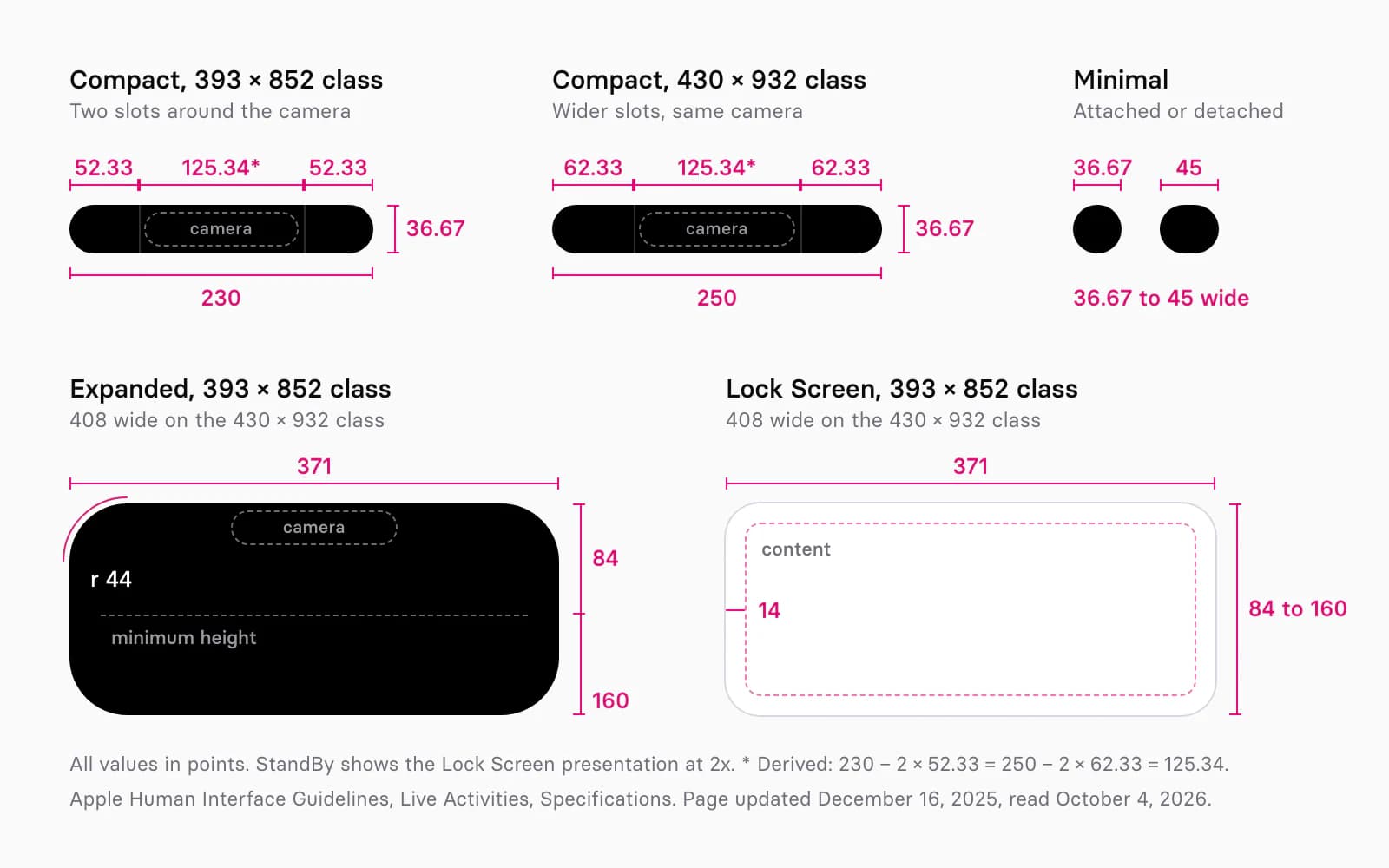
Appetite UI's Dynamic Island set draws Idle at 125 × 37, the rest width those numbers imply, and Expanded at 371 × 130 with Apple's 44 radius. Two frames are narrower than Apple's table: Compact is 201 × 37 against 230, and the Lock Screen card, iOS / Live Activity, is 361 wide against 371, with Apple's 14 point margin inside. Where the two differ, draw to Apple's number.
What changed in 2026?
Three things changed after Apple's table was last updated: iOS 27 shows compact and minimal presentations in landscape, iPhone 18 Pro has a smaller island that shows up to three Live Activities, and iPhone Duo moves the island to the side of the display. Apple has published no geometry for any of them.
| Change | Where | Published size | What to draw |
|---|---|---|---|
| Compact and minimal in landscape | iOS 27 | None | A narrow compact variant |
| A smaller island, up to three activities | iPhone 18 Pro, 18 Pro Max | None | Content inside the published slots |
| The island on the side | iPhone Duo | None | Placement only |
At WWDC26 Apple said that "in iOS 27, the Dynamic Island compact and minimal views are visible in both portrait and landscape", and that in landscape compact views "don't have room to grow in width". The new isDynamicIslandLimitedInWidth value tells a view when to shrink. On September 9, 2026 Apple wrote that iPhone 18 Pro models have "a smaller and even more useful Dynamic Island" that "can now show three Live Activities at once". Its table still ends at the iPhone 17 family.
On iPhone Duo, "the Dynamic Island is also redesigned to fit vertically on the side of the outer and inner displays". Apple's Duo page lists the side controls from top to bottom as the Dynamic Island, the status bar, the toolbar and the tab bar, and its design talk says the island "expands vertically as Live Activities arrive". Appetite UI's Duo screens draw the island at rest as a 37 point camera cutout at the top of the control rail; the iPhone Duo screens show it on 8 apps.
How do you draw the four presentations in Figma?
Build one component per presentation on Apple's frame sizes, bind the island's fill to a black that never switches with the theme, and put a locked camera layer in every island frame so no content lands under the TrueDepth camera. The island ignores the theme: "Live Activities in the Dynamic Island use a black opaque background". Appetite UI binds the fill to static/, #000000 in Light and in Dark.
Add the key line yourself: in Dark Mode "a key line appears around the Dynamic Island", tinted to match your content. Draw it as a thin inside stroke on a variable that is transparent in Light; developers set the color with keylineTint(_:).
Draw the camera as a 125.34 × 36.67 rectangle at the top center of each frame, set to Ignore auto layout so it stays "excluded from an auto layout flow". In compact, push leading content against the camera from the left and trailing content from the right; Apple says "don't add padding between content and the TrueDepth camera".
Build the expanded presentation as a vertical auto layout frame 371 wide (408 on the 430 class) with a minimum height of 84 and a maximum of 160; Figma lets you "set minimum or maximum width and height to any auto layout frame and its children". Inside, mirror SwiftUI's four positions. Leading and trailing sit "next to the TrueDepth camera" and wrap below it, center sits "below the TrueDepth camera", and bottom sits "below the leading, trailing, and center content".
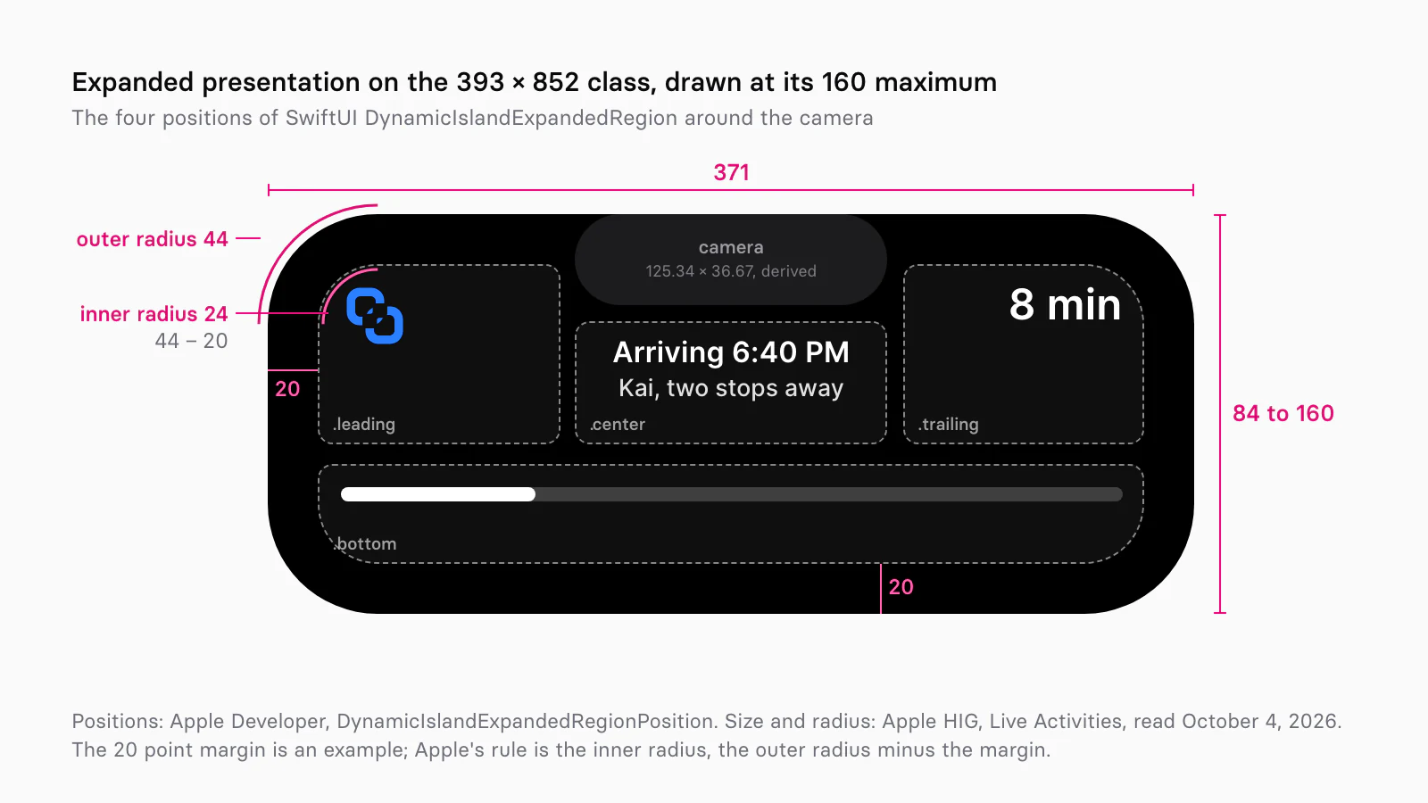
Keep margins concentric. Apple's rule is to match an inner corner to the outer radius "by subtracting the margin", so a 20 point margin gives inner corners of 24. For text, Apple asks for "large, heavier-weight text", "a medium weight or higher". The Lock Screen frame is 371 × 84 to 160 with a 14 point padding, and it is the one surface where the background is yours: set it with activityBackgroundTint(_:) and check it in Dark Mode and on a dimmed Always On display.
What goes in each presentation?
Each presentation carries less than the one above it: the Lock Screen and expanded presentations hold the full status, compact holds one value beside your mark, and minimal holds one glyph or number. In compact, Apple asks you to "focus on the most important information". In minimal, "display updated information rather than just a logo", the way Timer shows the time left. The expanded presentation is "an enlarged version of the compact or minimal presentation", and on the Lock Screen: "Don't replicate notification layouts."
Appetite UI's expanded set holds 10 layouts, every one inside Apple's 84 to 160 height range:
| Layout | Height | What it shows |
|---|---|---|
| Media | 130 | Track, artist, progress |
| Timer | 130 | A running session |
| Delivery | 130 | Courier status, progress |
| Call | 138 | Caller, two buttons |
| Navigation | 122 | Next turn, arrival |
| Score | 102 | Two scores, the minute |
| Alert | 134 | A status, one button |
| Workout | 132 | Three figures |
| Recording | 148 | Waveform and time |
| Flight | 144 | Route, gate, time left |
Each layout starts with a header row 16 points from the top, beside a 44 point artwork. Add the camera layer before you ship one: a title longer than about 47 points runs into the camera band. A separate set draws 23 system presentations, such as Face ID and Silent. The Lock Screen card takes a value or a thumbnail and an optional progress or actions footer, 106 to 154 tall. If you add a button, Apple's advice is to "prefer limiting it to a single element".
How should a Live Activity move?
Keep each animation inside a Live Activity under two seconds and expect none on a dimmed screen: Live Activities use animations "with a maximum duration of two seconds", and "the system doesn't perform animations on Always-On displays with reduced luminance". The expand and contract transitions belong to the system. Your budget is for content: Apple suggests the default content-replace transition, custom transitions using "scale, opacity, and movement", and numeric content transitions for changing numbers such as a score.
To show the morph in a prototype, use Smart Animate, which "looks for matching layers, recognizes differences, and animates layers between frames". Keep the logo and the value under the same layer names in every presentation, so they travel instead of fading. Appetite UI's Dynamic Island set is wired this way: pressing it changes Idle to Compact, Compact to Expanded and Expanded back to Idle, with Smart Animate over 320 ms on cubic-bezier(0.05, 0.7, 0.1, 1), the kit's motion/ and motion/ from the Motion page. The Progress Bar uses the same timing. With Reduce Motion on, swap the travel for a fade and keep the state change.
What does Android 16 offer instead?
Android 16 offers Live Updates: ongoing notifications the system promotes to "the top of the notification drawer and the lock screen, and as a chip in the status bar". Where iOS gives you a canvas, Android gives you a template. A Live Update must use one of five styles, Standard, BigTextStyle, CallStyle, ProgressStyle or MetricStyle, must be ongoing with a content title, and must not set a custom content view, so no RemoteViews and no setColorized(true). MetricStyle arrived with API level 37, Android 17, which also adds semantic colors for safe, caution, danger and info states.
The promoted card is "expanded by default" and "uncollapsible". The chip "always includes an icon, and optionally includes text", has "a maximum width of 96dp", and shows the whole text when it is under 7 characters; setShortCriticalText suggests 7 at most. Google lists navigation, calls, rideshare and food delivery as uses, and ads, chat, alerts and package tracking as misuses. Android 16's compatibility rules make devices on API level 36.1 or higher show the card prominently on the lock screen and, when several run, at least one as a chip.
| Topic | iOS Live Activity | Android 16 Live Update |
|---|---|---|
| Layout | Your own SwiftUI views, four presentations | One of five system styles, no custom views |
| Background | Black in the island, yours on the Lock Screen | The system's; setColorized not allowed |
| Published size | Points per presentation and device | Chip at most 96 dp wide |
| Short text | Compact trailing slot, 52.33 points | About 7 characters in the chip |
| At once | Two in the island, three on iPhone 18 Pro | At least one chip when several run |
| Time limit | 8 hours, 12 on the Lock Screen | While the activity runs |
| Not allowed | Ads and promotions | Ads, promotions, chat, alerts, upcoming events, package tracking |
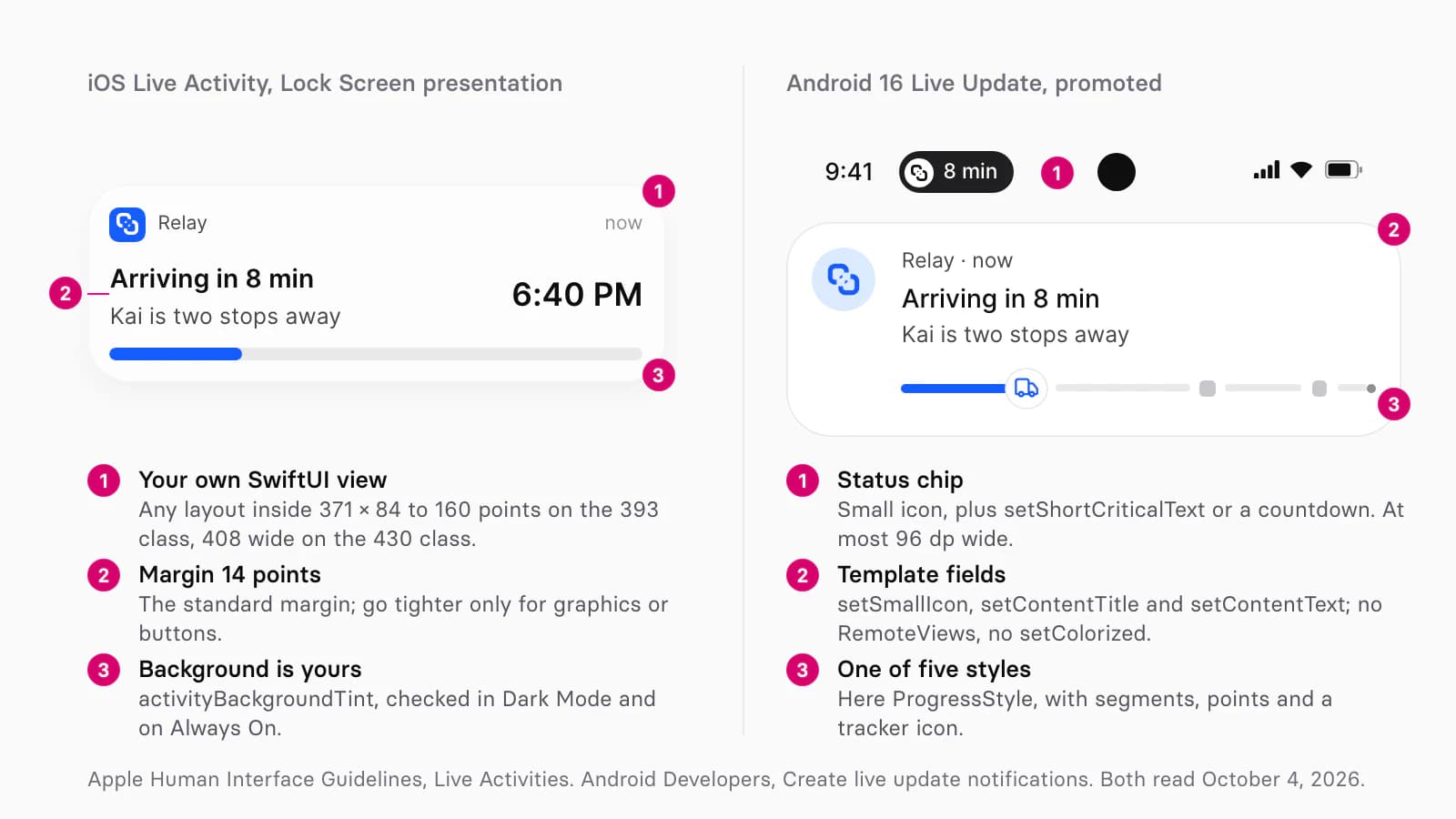
Appetite UI's Material 3 mirror has no notification or Live Update component, so the Android side of these pictures is a schematic.
How do you keep one activity consistent on both platforms?
Write the activity once as a set of fields, then map each field to a slot on each platform: the same mark, one short value, one status line, one detail and one progress value feed every presentation.
| Field | Dynamic Island | iOS Lock Screen | Android Live Update |
|---|---|---|---|
| Mark | Leading, a logo mark without a container | Header | Small icon and large icon |
| Short value | Compact trailing and minimal | Value | Chip text |
| Status line | Expanded leading or center | Title | Content title |
| Detail | Expanded center or bottom | Subtitle | Content text |
| Progress | Expanded bottom | Footer bar | ProgressStyle |
Write the short value first
It has to fit a 52.33 point compact slot and an Android chip of 7 characters: 6:40 or 8 min.
Draw compact and minimal on Apple's sizes
230 or 250 wide, the camera layer locked, plus a narrow variant for landscape.
Draw expanded and Lock Screen in the same order of fields
Keep the fields in one order in both, so the activity grows without moving its parts.
Fill the Android template with the same fields
ProgressStyle for a journey with milestones and the short value in the chip.
Check light, dark and Always On
The island stays black; both cards follow the appearance and must hold on a dimmed Always On screen.
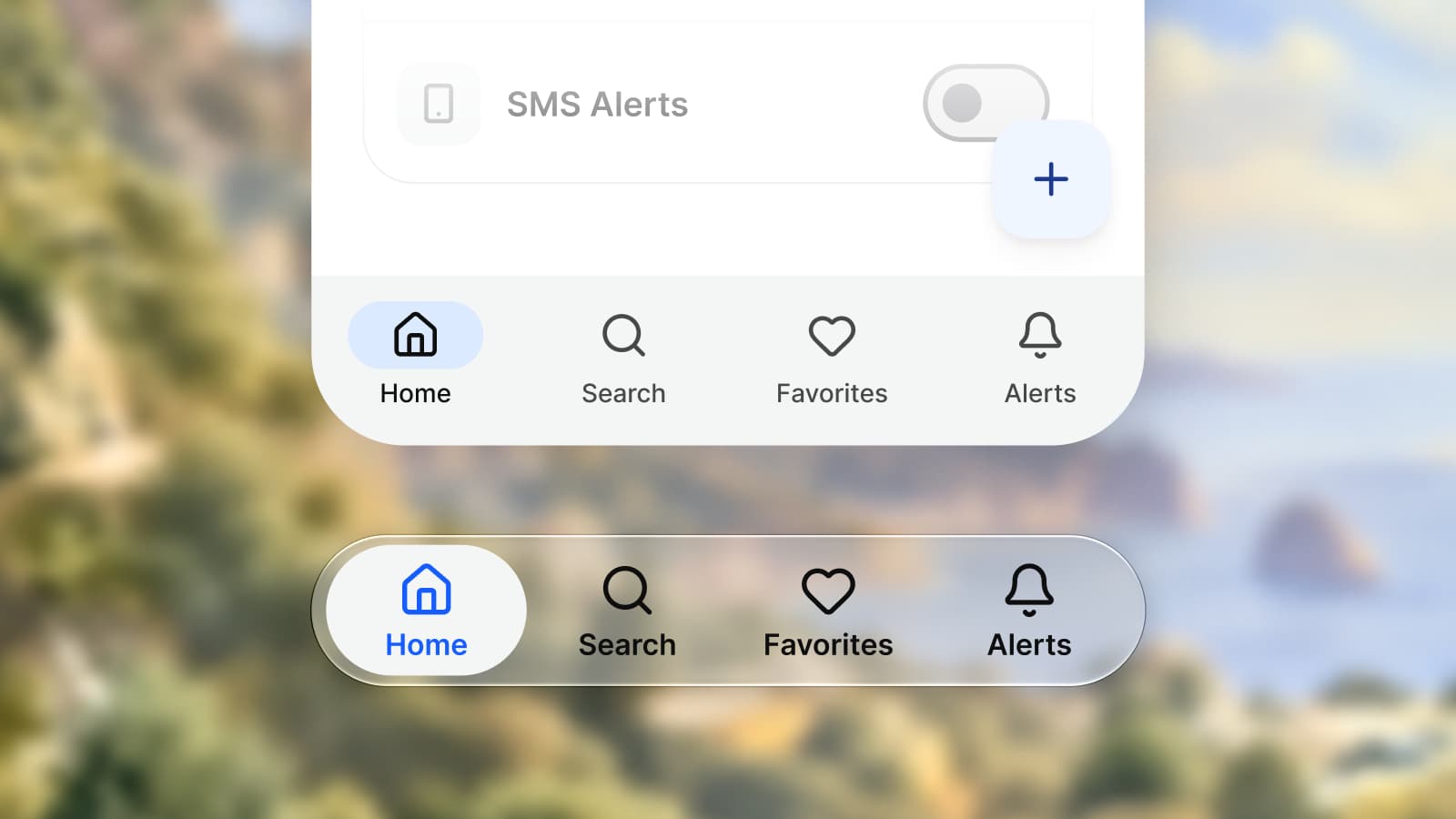
The iOS mirror documents every island set, and the platforms page shows both mirrors side by side. The per component differences are in iOS vs Material 3, the file setup in one app for iOS and Android, the Duo rail in designing for iPhone Duo, and the glass behind the kit's Lock Screen card in Liquid Glass in Figma.
Questions
What size is the Dynamic Island in points?
On the 393 × 852 class, which includes iPhone 17 and iPhone 17 Pro, Apple lists the island at 230 × 36.67 points in compact or minimal and 371 wide and 84 to 160 tall when expanded. On the 430 × 932 class, which includes iPhone 17 Pro Max and iPhone Air, it is 250 and 408. At 3x, 230 points are 690 pixels. Apple has published no sizes for iPhone 18 Pro or iPhone Duo.
What corner radius does the Dynamic Island use?
44 points, which Apple says matches the shape of the TrueDepth camera. Inside the island, give a rounded element near a corner the outer radius minus your margin: 24 points with a 20 point margin.
How many Live Activities can show at once?
Two in the Dynamic Island on iPhone 17 and earlier models: one attached to the island and one detached, both in the minimal presentation. Apple says iPhone 18 Pro and iPhone 18 Pro Max can show up to three. On Android 16, when several Live Updates run, the device shows at least one of them as a chip in the status bar.
Can I change the Dynamic Island's background color?
No. Apple's documentation says you can't change the background color of Live Activities in the Dynamic Island, which stays black. You can tint the key line that appears around it in Dark Mode with keylineTint, and you can give the Lock Screen presentation its own background with activityBackgroundTint.
Does Android have Live Activities?
Not by that name. Android 16 has Live Updates: ongoing notifications the system promotes to the top of the notification drawer, the lock screen and a status bar chip at most 96 dp wide. They use one of five system styles, such as ProgressStyle, and cannot carry a custom layout.
Sources
- Apple Human Interface Guidelines: Live Activities, read October 4, 2026
- Apple Design: What's new, read October 4, 2026
- Apple Developer: Displaying live data with Live Activities, read October 4, 2026
- Apple Developer: Creating custom views for Live Activities, read October 4, 2026
- Apple Developer: DynamicIslandExpandedRegionPosition, read October 4, 2026
- Apple Developer: isDynamicIslandLimitedInWidth, read October 4, 2026
- Apple Developer, WWDC26: Live Activities essentials, read October 4, 2026
- Apple Newsroom: Apple debuts iPhone 18 Pro and iPhone 18 Pro Max, read October 4, 2026
- Apple Newsroom: Apple unveils iPhone Duo, read October 4, 2026
- Apple Human Interface Guidelines: Designing for iPhone Duo, read October 4, 2026
- Apple Developer, tech talk: Design for iPhone Duo, read October 4, 2026
- Use Your Loaf: screen sizes of the iPhone 17 models, read October 4, 2026
- Android Developers: Create live update notifications, read October 4, 2026
- Android Developers: Progress-centric notifications, read October 4, 2026
- Android Developers: Notification.Builder, read October 4, 2026
- Android Developers: Notification.MetricStyle, read October 4, 2026
- Android Developers: Android 17 features and APIs, read October 4, 2026
- Android Open Source Project: Android 16 Compatibility Definition, read October 4, 2026
- Figma Learn: Create advanced animations with smart animate, read October 4, 2026
- Figma Learn: Guide to auto layout, read October 4, 2026