How to make Liquid Glass in Figma for iOS 27
Figma Glass settings for the Clear, Regular and Tinted looks of iOS 27, the rules that make glass render, where Apple puts it, and what it becomes in code.

On this page
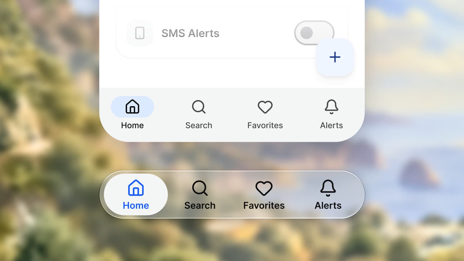
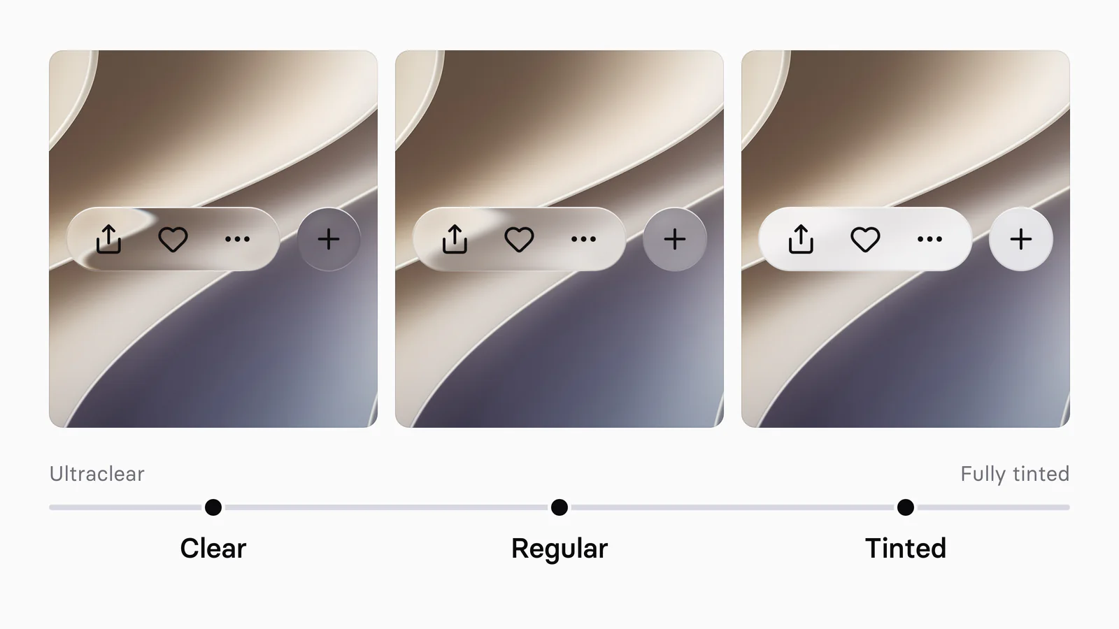
To make Liquid Glass in Figma, draw the control's background as its own layer with no fill, add Figma's Glass effect to that layer, and keep the icons and labels in sibling layers above it. For the range of looks iOS 27 lets people choose, Appetite UI ships three effect styles: Clear at refraction 0.8 and frost 2, Regular at 0.7 and 6, and Tinted at 0.6 and 12, each over its own tint token, with depth 30, splay 0.2 and a light angle of 0 on every one. They are the kit's tuned values, not numbers taken from Apple.
Appetite UI is a Figma UI kit for iOS and Android apps, built like a design system. One token source drives Apple and Material components in light and dark mode, and exports to SwiftUI, Jetpack Compose, Flutter and CSS. I design it, so every kit value below was read from its file on October 4, 2026, and Apple's and Figma's rules are quoted from their own pages, linked under Sources.
What is Liquid Glass, and what did iOS 27 change?
Liquid Glass is Apple's material for the controls and navigation that float above an app's content, and iOS 27 lets each person set how it looks with a slider from ultraclear to fully tinted. Apple's guidelines say the material "forms a distinct functional layer for controls and navigation elements", and it comes in two variants, regular and clear.
Apple's iOS 27 page promises "more uniform refraction and improved contrast" and says "a new slider lets you easily customize how Liquid Glass looks, from ultraclear to fully tinted". The iPhone User Guide for iOS 27 puts it under Settings, Appearance, Liquid Glass: drag right for more tint, left for more clear. With Reduce Transparency or Increase Contrast on, the guide says to turn them off before the look can change.
For developers the opt-out has closed: Apple's documentation says the system ignores the UIDesignRequiresCompatibility key, which kept an app on the previous design, "when you build for iOS 27 or later".
| When | What changed | Source |
|---|---|---|
| June 9, 2025 | Apple introduces Liquid Glass with iOS 26 | Apple Newsroom |
| iOS 26.1 | Settings adds a tinted look beside the default clear one | Apple Support |
| January 27, 2026 | Figma's Glass leaves beta and takes variables | Figma Forum |
| June 8, 2026 | Apple announces the slider from ultra-clear to fully tinted | Apple Newsroom |
| June 23, 2026 | Apple's iOS 27 design kits for Figma ship with updates to Liquid Glass | Apple Developer |
| September 14, 2026 | iOS 27 starts rolling out | Apple Newsroom |
Checked on , against Apple's and Figma's own pages.
How does Figma's Glass effect work?
Figma's Glass is a layer effect that bends, frosts and lights whatever sits beneath the layer, set by seven properties: light angle, light intensity, refraction, depth, dispersion, frost and splay. Figma defines refraction as "the degree of optical distortion along the curved edge", depth as "how far the curved edge extends inward from the object's border" and frost as "the amount of background blur present on the glass".
Since Glass left beta on January 27, 2026, you can "add Glass to anything including any object, shape, or text, not just a frame" and "apply variables to Glass properties", and Figma lists the effect as available on any plan. When glass does not show, one of these limits from Figma's help page is almost always the reason:
| Limit | What Figma says | What to do |
|---|---|---|
| A fill at 100% opacity | "Glass will not be visible on objects with a fill set to 100% opacity" | Leave the layer without a fill, or keep its alpha under 100 |
| A second glass effect | One glass effect per layer | Split the control into sibling layers |
| A background blur on or above it | Only the first effect renders, and a blur layer on top "will prevent the glass effect from rendering" | Use frost, the glass's own blur |
| Glass over glass | "The background glass will not factor into the rendering of the foreground glass" | Keep one glass layer per spot |
| SVG export and Figma Sites | Glass is supported in neither | Export a PNG for review |
Appetite UI adds one rule of its own: the style goes on the background layer of a control, never on a frame that holds content, because "on a frame with content it recolors the children too", as the effects docs put it.
Which settings give Clear, Regular and Tinted?
In Appetite UI the Clear, Regular and Tinted styles share depth 30, splay 0.2 and a light angle of 0, and differ in refraction, frost, dispersion, light intensity and the tint token under the glass. These are the kit's tuned values, read from the file on October 4, 2026. They are not Apple's numbers, and this article does not compare them with Apple's iOS 27 kit for Figma.
| Setting | Clear | Regular | Tinted |
|---|---|---|---|
| Refraction | 0.8 | 0.7 | 0.6 |
| Frost | 2 | 6 | 12 |
| Dispersion | 0.25 | 0.2 | 0.15 |
| Light intensity | 0.35 | 0.25 | 0.25 |
| Depth, splay, light angle | 30, 0.2, 0 | 30, 0.2, 0 | 30, 0.2, 0 |
| Tint token | glass/ | glass/ | glass/ |
| Tint in Light | white, 6% | white, 32% | #F7F7FA, 86% |
| Tint in Dark | white, 8% | #4D4D52, 45% | #38383D, 86% |
Read each row as a move along the slider: frost and tint rise, so the content behind fades, while refraction and dispersion fall, so the bent, colored edge that carries Clear is quieter under Tinted. The file calls Regular the "default stop on the iOS 27 transparency slider, for bars, buttons, menus and sheets".
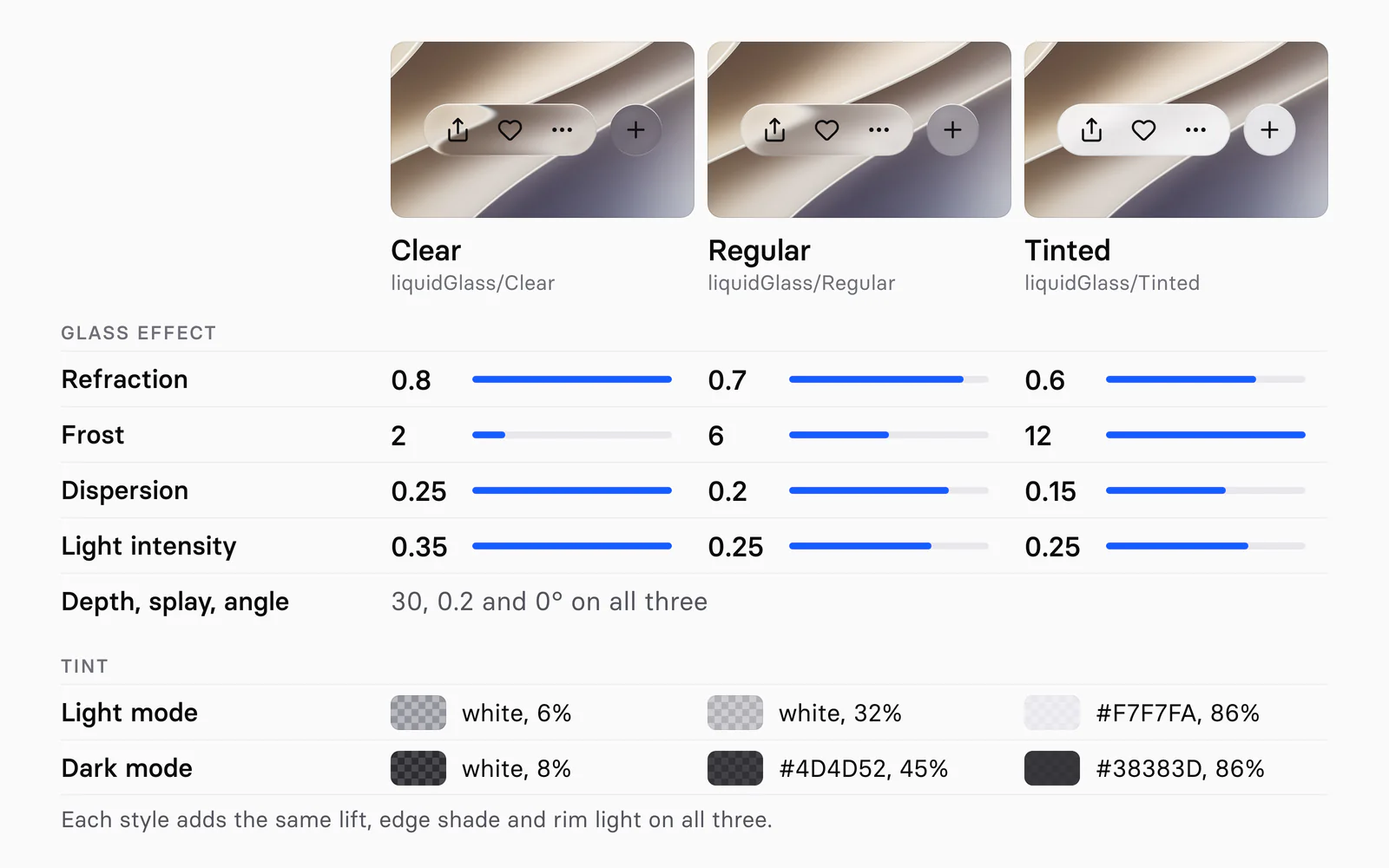
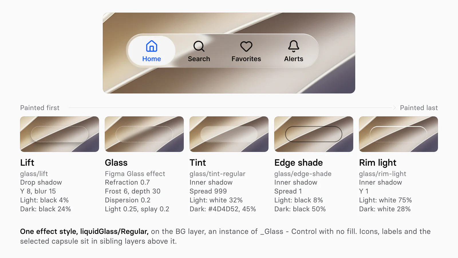
The tint is not a fill. Each style draws it as an inner shadow with a spread of 999, which covers the whole shape, so the layer keeps no fill and the glass still renders. Every style adds the same three layers, listed with the other glass roles on the color docs:
| Layer | How it is drawn | Token | Light | Dark |
|---|---|---|---|---|
| Lift | Drop shadow, y 8, blur 15 | glass/ | black, 4% | black, 24% |
| Edge shade | Inner shadow, spread 1 | glass/ | black, 8% | black, 50% |
| Rim light | Inner shadow, y 1 | glass/ | white, 75% | white, 28% |
How do you build an editable glass control?
Build the material as a small component with a style variant, place it under the control's content, and expose it, so one dropdown changes the look of a whole bar. Appetite UI's iOS / Tab Bar works this way: its capsule holds BG, an instance of the private set _Glass - Control, under the tab items. BG is an exposed nested instance, so its Style (Clear, Regular or Tinted) and State (Default or Primary) show in the tab bar's own properties. The set's description says it in one line: "The level lives in the effect style on the Glass Effect layer."
- Draw a rectangle the size of the control, with no fill and the control's corner radius.
- Add a Glass effect and the tint, edge and rim inner shadows, bind the shadow colors to variables, and save an effect style for each look.
- Turn the rectangle into a component set with one variant per style.
- Place an instance under the icons and labels of a bar or button, and expose it.
State Primary lays a Tint layer in brand/ over the glass, as in Apple's prominent styling, where "the system applies the app accent color to the background in prominent buttons". The kit's iOS / Button - Liquid Glass sets carry Style Glass and Glass Prominent, and the button docs compare them with the rest of the family.
The toggle works differently. Apple notes that "for controls like sliders and toggles, the knob transforms into Liquid Glass during interaction". The kit's iOS / Toggle has a 64 × 28 track and a 38 × 24 knob; pressed, the knob becomes a 58 × 38 lens with its own recipe, refraction 0.8 at depth 7 with no frost, over a fill at 9 percent, so the track stays sharp under it. The cross-platform Toggle has no lens.
Where does glass belong?
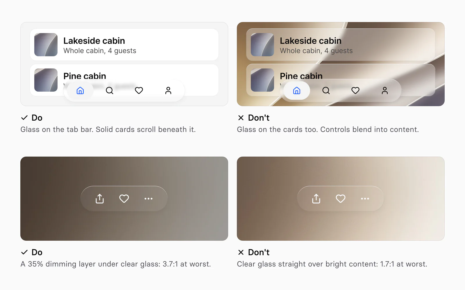
Glass belongs on the functional layer, the tab bars, toolbars, sidebars, sheets, menus and the controls on them, and not on cards, rows or backgrounds in the content. Apple is direct: "Don't use Liquid Glass in the content layer." The exception is "a transient interactive element like sliders and toggles", which takes on the material while someone touches it.
Clear is for media: "Only use clear Liquid Glass for components that appear over visually rich backgrounds", and "if the underlying content is bright, consider adding a dark dimming layer of 35% opacity". Brand color goes under the glass too. Apple's Branding guidelines, refined on September 9, 2026, suggest "moving it into the content layer, where it scrolls beneath Liquid Glass controls and gets picked up dynamically", and on glass itself Apple's color guidance says to "apply color to the background rather than to symbols or text" for a primary action.
| Surface | Glass | In Appetite UI |
|---|---|---|
| Tab bar, toolbar, iPhone Duo rail | Yes, Regular by default | BG instance of _Glass - Control on liquidGlass/ |
| Alert, sheet, action sheet | Yes, Regular, so the text on it reads | liquidGlass/, as on the Passkey and Permission Alert cards |
| Button over a photo or video | Clear, over a dimming layer if the photo is bright | liquidGlass/ |
| Toggle or slider knob | Only while it is touched | the iOS / Toggle pressed lens |
| Card, list row, app background | No | a solid surface such as bg/ |
The kit writes the rule into its tokens: the description of bg/ reads "Floating chrome only: sheets, alerts, notifications, toolbars. Never a content surface."
How do you check legibility?
Check every glass control over white, black and a busy photo, at Clear, Regular and Tinted, then with Reduce Transparency and Increase Contrast on, and measure the weakest spot behind each glyph. Apple's Accessibility Inspector uses WCAG Level AA: 4.5:1 for text up to 17 points, and 3:1 at 18 points or in bold. WCAG 2.2 asks 3:1 for the parts of a control and for icons.
On the kit's own renders over its wallpaper, the same glyph lands far apart:
| Style | Light, black glyph | Dark, white glyph |
|---|---|---|
| Clear | 3.1:1 | 4.1:1 |
| Regular | 6.1:1 | 9.0:1 |
| Tinted | 15:1 | 11.6:1 |
WCAG 2 ratio of each glyph against the weakest pixel around it, measured on 4x Figma renders of the kit's toolbar and button specimens on October 4, 2026.
Clear in Light just clears the 3:1 target for icons and would fail the 4.5:1 target for text, which is why the kit's Tinted style is described as being "for busy backgrounds and Reduce Transparency". In the bottom panels of the figure above, white glyphs on clear glass measured 1.7:1 over bright content and 3.7:1 over a 35% dimming layer. On a brighter crop of the same wallpaper the layer reached only 2.8:1, so treat 35% as a start and measure the brightest frame you ship.
What happens in code?
In code the material belongs to the system: SwiftUI's glassEffect(_:in:) takes a Glass value, regular by default or clear, with an optional tint and an interactive flag, and UIKit's UIGlassEffect takes a style, a tintColor and isInteractive. Neither reads Figma's refraction or frost. Standard bars, sheets and controls "automatically adopt this material", in the words of Apple's adoption guide.
| In Appetite UI | SwiftUI | UIKit |
|---|---|---|
liquidGlass/ | Glass, the default of glassEffect() | UIGlassEffect(style: |
liquidGlass/ | Glass | UIGlassEffect(style: |
liquidGlass/ | No variant: it previews the tinted end of the slider | No style |
| _Glass - Control, State Primary | .buttonStyle(, or a tint on the glass | tintColor on the effect |
SwiftUI
Wrap neighboring glass controls in a GlassEffectContainer, which Apple says improves "rendering performance" and lets the shapes "morph into one another".
GlassEffectContainer(spacing: 12) {
    HStack(spacing: 12) {
        Button("Share", systemImage: "square.and.arrow.up") { share() }
            .labelStyle(.iconOnly)
            .padding(14)
            .glassEffect(.regular.interactive(), in: .circle)
        Button("Add", systemImage: "plus") { add() }
            .labelStyle(.iconOnly)
            .padding(14)
            .glassEffect(.regular.tint(.accentColor).interactive(), in: .circle)
    }
}
CSS
The web has blur but no refraction: backdrop-filter, Baseline since September 2024, applies "blurring or color shifting to the area behind an element". The glass colors reach the web as custom properties in the kit's code output, such as --ap-glass-tint-regular, with their Dark values in the dark block, so a fallback rebuilds every layer of the style except the bend:
.glass-regular {
  backdrop-filter: blur(6px);                            /* frost 6 */
  box-shadow:
    inset 0 1px 0 var(--ap-glass-rim-light),
    inset 0 0 0 1px var(--ap-glass-edge-shade),
    inset 0 0 0 999px var(--ap-glass-tint-regular),
    0 8px 15px var(--ap-glass-lift);
}

@media (prefers-reduced-transparency: reduce) {
  .glass-regular {
    backdrop-filter: none;
    background: var(--ap-bg-glass-thick);                /* white at 92% in Light */
  }
}
Treat blur(6px) as a start, and note that MDN marks prefers-reduced-transparency as experimental. Figure 03 is drawn with this recipe; the other outputs are in How one Figma token becomes SwiftUI, Compose, Flutter and CSS.
Android
Android has no Liquid Glass. Android's Compose documentation says "Material 3 represents elevation mainly using tonal color overlays", and Material 3 Expressive, announced on May 13, 2025, blurs the system shade rather than app components: "we even subtly blur the shade background to provide a sense of depth", Google wrote. The component by component split is in iOS vs Material 3: what changes per component.
How does glass work on iPhone Duo and in dark mode?
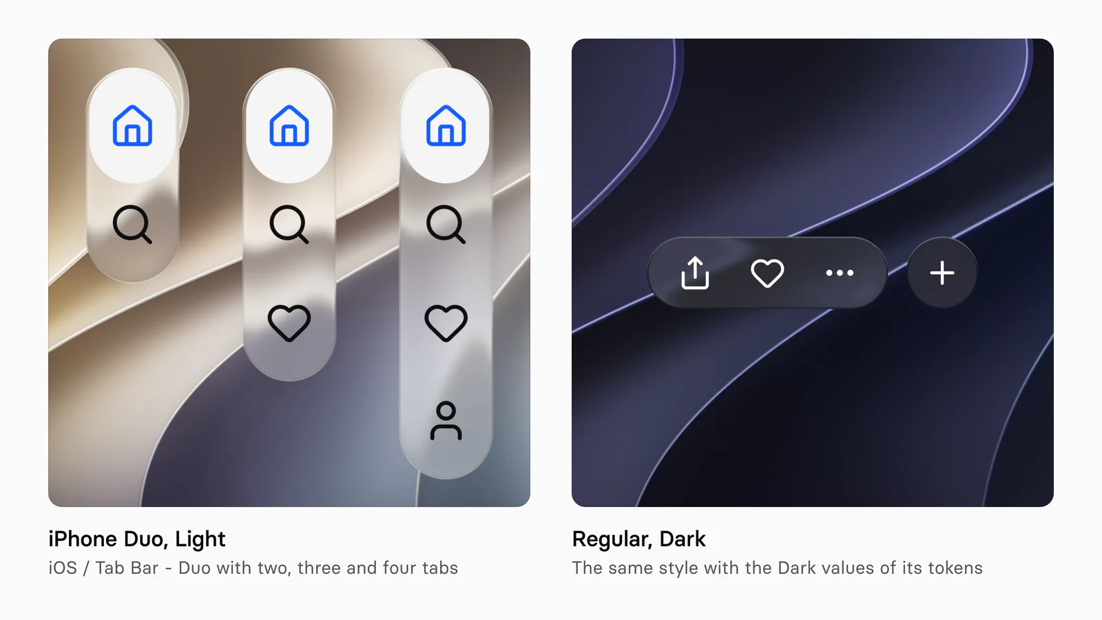
On iPhone Duo the kit's side rail uses the same liquidGlass/ style, and in Dark every glass token switches to its Dark value, so one style serves both modes. On the outer display, Apple's guidelines say, "the system places toolbars and tab bars on the side to maximize the vertical space for content". In Appetite UI, the Duo toolbar, tab bar and Glass Group sit on the shared _Glass - Control surface, shown in the iPhone Duo screens docs. Sizes, poses and the rail are in How to design for iPhone Duo in Figma, and the Dynamic Island, which Apple puts at the top of that side column, in How to design a Live Activity and the Dynamic Island in Figma.
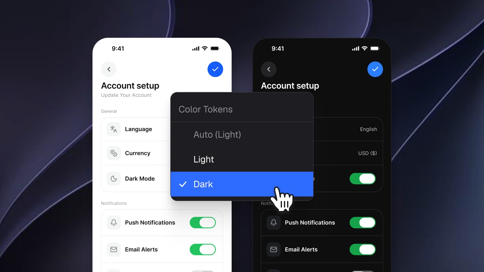
In Dark the Regular tint turns from white at 32% to #4D4D52 at 45%, the lift deepens from 4 to 24 percent black, the edge shade from 8 to 50 percent, and the rim light drops from 75 to 28 percent white, so the edge is drawn by shade rather than light. In Figma the glyphs follow the frame's Color Tokens mode, whatever sits behind the glass, while on iOS "the system can adapt Liquid Glass between a light and dark appearance in response to the underlying content" for small elements like tab bars. Design both; Dark mode with Figma variables, not duplicate frames shows how a frame switches.
A glass control is ready for handoff when it passes these checks.
The glass layer has no opaque fill
No fill, or one with an alpha under 100, and no background blur beside the glass.
The content sits above the glass
Icons, labels and selection shapes are sibling layers, not children of the glass layer.
The look is a style bound to tokens
The Glass effect and its tint, edge and rim shadows live in one effect style with bound colors.
It reads across the slider
Clear, Regular and Tinted, over white, black and a busy photo.
It passes contrast at the weakest spot
4.5:1 for small text, 3:1 for icons.
Clear over bright media has dimming
Start at 35% black and measure the brightest frame.
The handoff names variants
Regular, clear, tint and prominent go to the developer. Refraction and frost stay in Figma.
The effects docs list every style, the tokens page shows the token source, and the read-only preview opens the whole file before you buy.
Questions
How do I make Liquid Glass in Figma?
Draw the control's background as its own layer with no fill, add a Glass effect, and keep icons and labels in sibling layers above. Start from Appetite UI's Regular style: refraction 0.7, frost 6, dispersion 0.2, light intensity 0.25, depth 30, splay 0.2 and a white tint at 32%.
Why doesn't my glass effect show in Figma?
The layer most likely has a fill at 100% opacity, which Figma says hides glass. The other causes are a background blur on the same layer or above it, glass stacked on glass, and SVG export, which does not support glass.
What is the difference between clear and regular Liquid Glass?
Regular blurs and adjusts the luminosity of what is behind it to keep text legible, and most system components use it. Clear is highly translucent, for components over photos and video. In Appetite UI, Clear has frost 2 and a white tint at 6%, Regular frost 6 and 32%.
Can I export Figma's glass effect to CSS?
Not as glass. Figma does not export glass to SVG and CSS has no refraction, so the web version is a backdrop-filter blur with inset shadows for the tint, edge and rim. Appetite UI's code output carries those glass colors as CSS custom properties.
Is there Liquid Glass on Android?
No. Material 3 separates surfaces mainly with tonal color, and Material 3 Expressive blurs Android's system shade, not app components. Draw Android bars on Material's surfaces and keep glass to the iOS frame.
Sources
- Apple Human Interface Guidelines: Materials, read October 4, 2026
- Apple Human Interface Guidelines: Color, read October 4, 2026
- Apple Human Interface Guidelines: Branding, read October 4, 2026
- Apple Human Interface Guidelines: Accessibility, read October 4, 2026
- Apple Human Interface Guidelines: Designing for iPhone Duo, read October 4, 2026
- Apple: iOS 27, read October 4, 2026
- Apple Newsroom: Apple introduces a delightful and elegant new software design, read October 4, 2026
- Apple Newsroom: Apple unveils next generation of Apple Intelligence, Siri AI, and more, read October 4, 2026
- Apple Newsroom: Major updates for Apple's software platforms are now available, read October 4, 2026
- Apple Support: Adjust iPhone display and text settings, iOS 27, read October 4, 2026
- Apple Support: About iOS 26 Updates, read October 4, 2026
- Apple Developer: Adopting Liquid Glass, read October 4, 2026
- Apple Developer: glassEffect(_:in:), read October 4, 2026
- Apple Developer: Glass, read October 4, 2026
- Apple Developer: GlassEffectContainer, read October 4, 2026
- Apple Developer: glassProminent, read October 4, 2026
- Apple Developer: UIGlassEffect, read October 4, 2026
- Apple Developer: UIDesignRequiresCompatibility, read October 4, 2026
- Apple Developer News: Design kits for iOS, iPadOS, and macOS 27 are here, read October 4, 2026
- Figma Learn: Apply effects to layers, read October 4, 2026
- Figma Forum: Glass is officially out of beta, read October 4, 2026
- W3C: Understanding WCAG 2.2, Non-text Contrast, read October 4, 2026
- MDN: backdrop-filter, read October 4, 2026
- MDN: prefers-reduced-transparency, read October 4, 2026
- Android Developers: Material Design 3 in Compose, read October 4, 2026
- Google: Android and Wear OS are getting a big refresh, read October 4, 2026