How one Figma token becomes SwiftUI, Compose, Flutter and CSS
One Figma variable, brand/base, followed into CSS, SwiftUI, Compose and Flutter: where each code name comes from, what a mode becomes, what cannot translate.

On this page
One Figma variable, brand/, becomes var(--ap-brand-base) in CSS, Color in SwiftUI, AppetiteTheme in Jetpack Compose and apBrandBase in Flutter. All four come from one JSON file in the W3C Design Tokens format, compiled by Style Dictionary v5, and three of the four names are stored on the variable in Figma, so the name a designer picks is the name a developer types.
Appetite UI is a Figma UI kit for iOS and Android apps, built like a design system. One token source drives Apple and Material components in light and dark mode, and exports to SwiftUI, Jetpack Compose, Flutter and CSS. This article follows one of its tokens through that export, with the values the code output docs print.
A design token is a named value that lives in one place and is read everywhere else: a variable in Figma, and a custom property, a static constant or a theme field in code. #155DFC in a handoff note says nothing about where it belongs. brand/ says what the value is for, and when the value changes, nothing that reads the name has to change.
In Appetite UI, brand/ is a semantic token that points at a primitive, colors/. Components bind to semantic tokens only, so a component never names a color (introduction).
| Where | Name |
|---|---|
| Figma, Color Tokens | brand/ |
| CSS | var(--ap-brand-base) |
| SwiftUI | Color |
| Jetpack Compose | AppetiteTheme |
| Flutter | apBrandBase |
The token file is JSON in the format of the W3C Design Tokens Community Group. Its first stable version, 2025.10, was published as a Final Community Group Report on October 28, 2025, and the announcement lists Figma, Style Dictionary, Tokens Studio and Penpot among the tools that support it.
The specification is split into modules. The Format Module defines a token as an object with a $value, a $type unless its group already sets one, an optional $description, and an optional $extensions object where tools may keep data of their own. A reference to another token is its path in curly braces, {colors. Themes such as light and dark live in a second document, the Resolver Module, which describes them as modifiers with named contexts.
Style Dictionary, the build tool the export runs on, has had first-class support for the format since version 4. Its own page says full support for 2025.10 is still work in progress in v5. One difference shows in the sample below: the file writes a color as a hex string, the form Style Dictionary v5 compiles, while the 2025.10 report defines a color as an object with a color space, its components and an optional hex.
The docs print the smallest file that shows the whole idea: one primitive, one semantic token and one reference between them.
{
  "colors": {
    "blue": {
      "500": { "$type": "color", "$value": "#155DFC" }
    }
  },
  "brand": {
    "base": { "$type": "color", "$value": "{colors.blue.500}" }
  }
}
colors is the only place #155DFC is written. brand holds a reference to it. Figma writes the same path with slashes, brand/, and the JSON writes it with dots: the same token in two notations, and the export is where they meet.
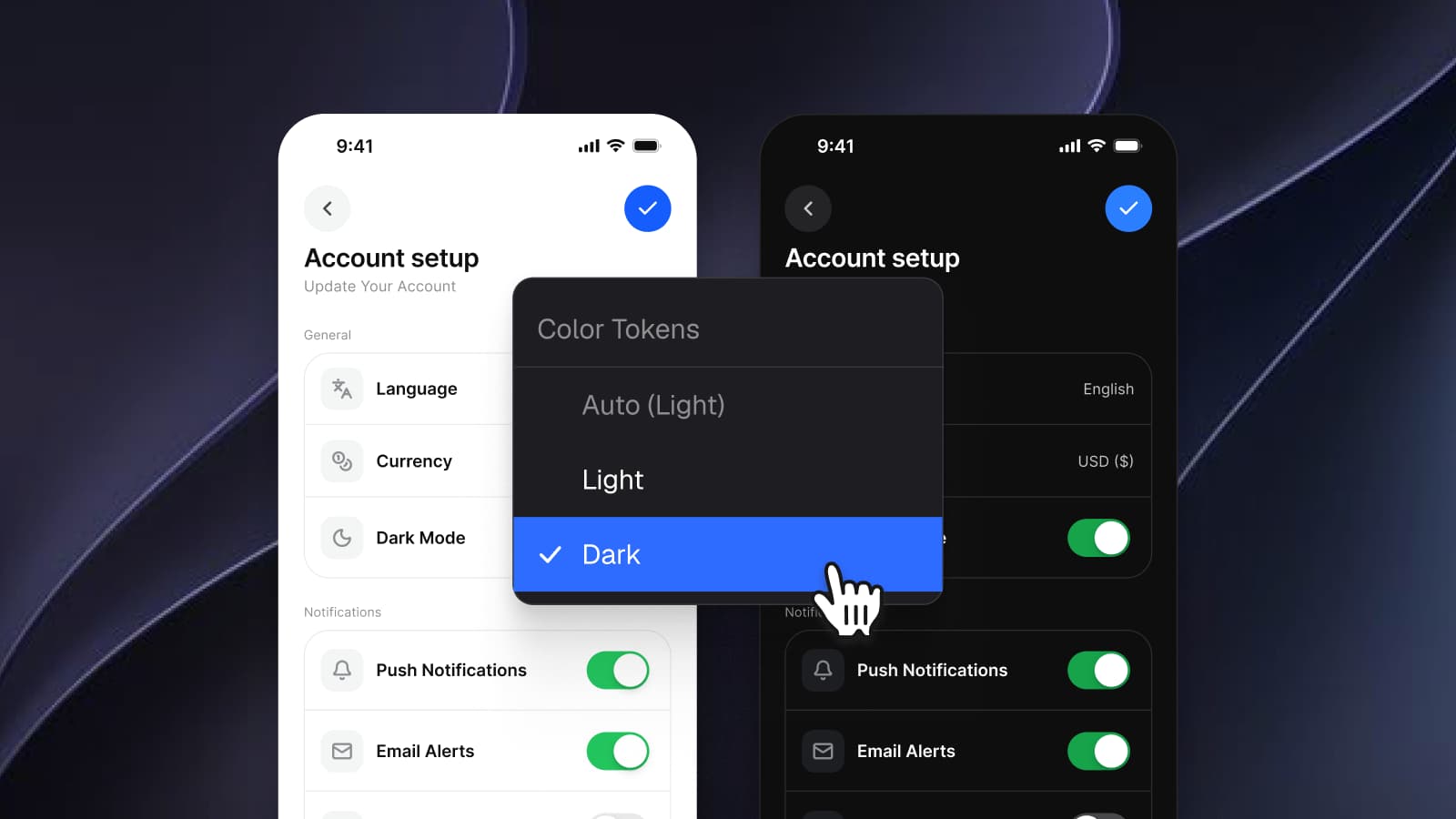
The full source carries the file's 6 collections, each with its own modes. A mode is a second value on the same token, which is why Light and Dark, Brand and System, and the three device modes all fit in one source:
| Collection | Variables | Modes |
|---|---|---|
| Foundations | 196 | Default |
| Color Tokens | 161 | Light, Dark |
| Typography | 28 | Default |
| Motion | 31 | Default |
| Platform | 16 | ios-md, ios-lg, android |
| Platform Bridge | 112 | Brand, System |
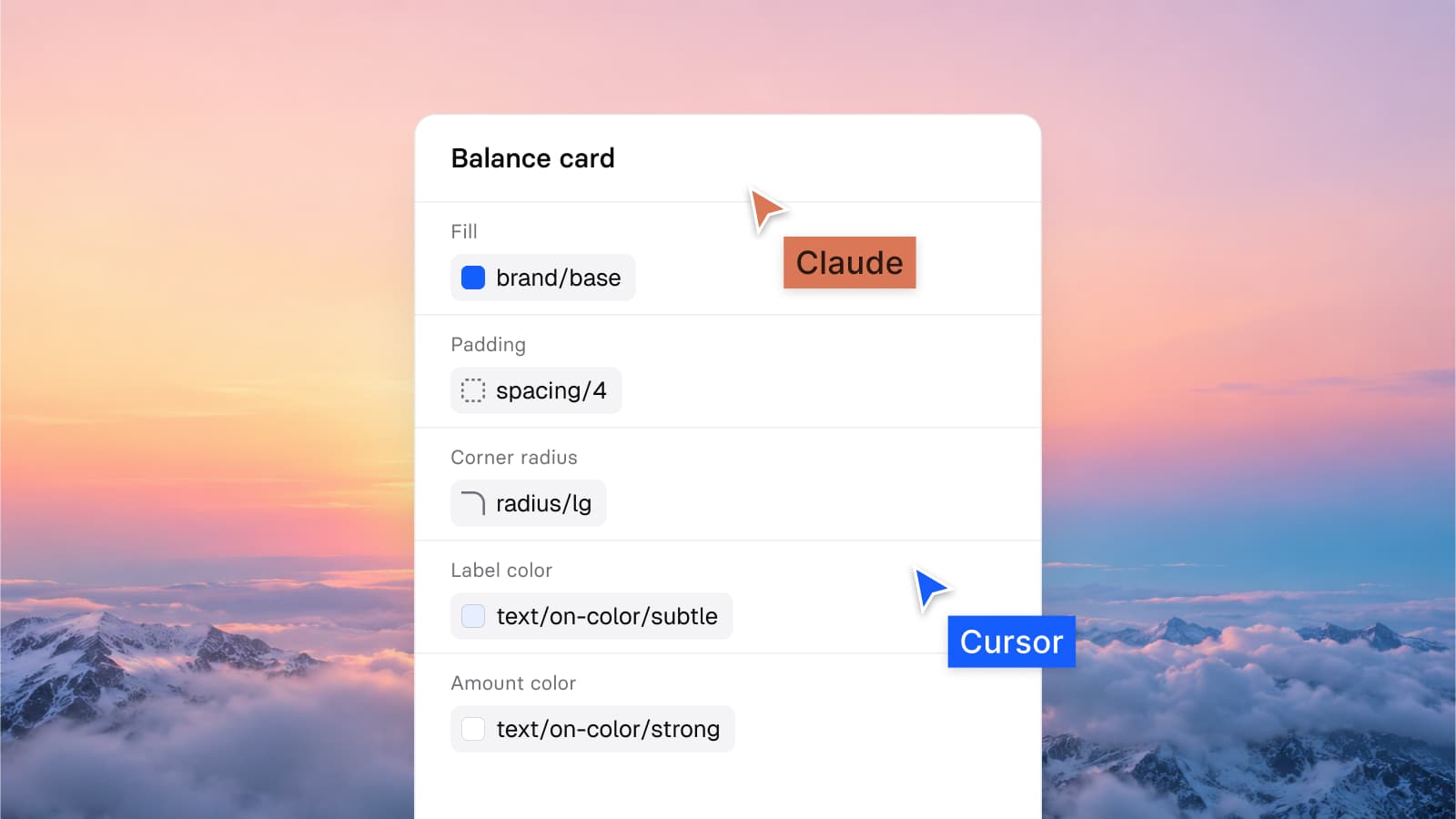
Figma lets a variable carry code syntax: one name per platform, Web, Android and iOS, entered in the Edit variable dialog. Dev Mode prints those names in its code snippets, which Figma supports for variables in CSS, SwiftUI and Compose.
Every variable in Appetite UI stores its own code name for all three platforms, and the export reads the names off the variable. AppetiteTheme reads like Compose because it was written as Compose, once, on the variable. Since release 2.4 the Platform Bridge roles, the Apple and Material slots, carry SwiftUI, Compose and CSS syntax too (changelog).
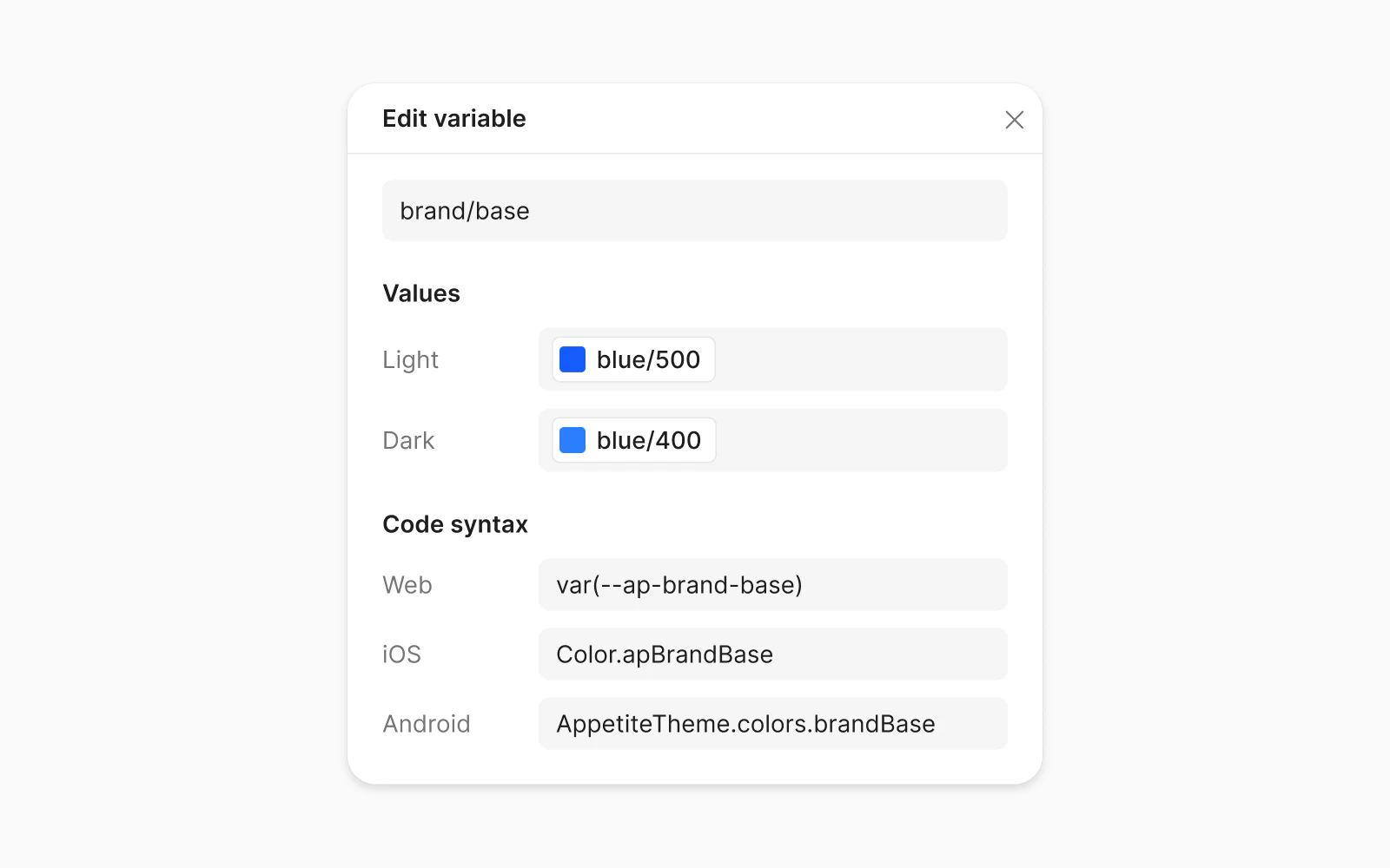
Figma has no slot for Dart, so the Flutter name, apBrandBase, is the one name in the set that the export derives instead of reading it off the variable.
I keep the names on the variables so there is one place to change them. When a name changes, the next export carries it, Dev Mode shows it the same day, and nobody maintains a mapping table between the design file and the codebase.
Style Dictionary reads the JSON, resolves every reference to its final value and writes one output per platform. The code output docs and the tokens page cut the output to three tokens so the four languages sit side by side: a color, a spacing step and a duration.
:root {
  --ap-brand-base: #155DFC;
  --ap-space-4: 16px;
  --ap-duration-fast: 120ms;
}extension Color {
static let apBrandBase = Color(
red: 0.082, green: 0.365, blue: 0.988)
}
enum AppetiteSpacing { static let space4: CGFloat = 16 }
enum AppetiteMotion { static let durationFast = 0.12 }internal val BrandBase = Color(0xFF155DFC)
internal val Space4 = 16.dp
internal val DurationFast = 120
// read as AppetiteTheme.colors.brandBaseconst apBrandBase = Color(0xFF155DFC);
const apSpace4 = 16.0;
const apDurationFast = Duration(milliseconds: 120);The rows below are brand/, spacing/ and motion/: the same three values, each in the platform's own unit.
| Token | CSS | SwiftUI | Compose | Flutter |
|---|---|---|---|---|
| Brand color | #155DFC | red 0.082, green 0.365, blue 0.988 | 0xFF155DFC | 0xFF155DFC |
| Spacing step | 16px | 16 points, a CGFloat | 16 | 16 logical pixels |
| Fast duration | 120ms | 0 seconds | 120 milliseconds | 120 milliseconds, a Duration |
SwiftUI writes a color as three components between 0 and 1: 0x15 divided by 255 is 0.082, 0x5D is 0.365 and 0xFC is 0.988. Compose and Flutter write the same hex with the alpha first, FF for fully opaque. The spacing step stays 16 everywhere because each platform counts in its own density-independent unit: CSS pixels, points on iOS, dp on Android and logical pixels in Flutter. The duration changes its number, because SwiftUI animations take seconds and Compose takes milliseconds.
The samples above show one value per token, the Light one. With both modes, the CSS output keeps one custom property and writes the Dark value into a prefers-color-scheme block:
:root {
  --ap-brand-base: #155DFC;
}

@media (prefers-color-scheme: dark) {
  :root { --ap-brand-base: #2B7FFF; }
}
brand/ points at colors/ in Light and at colors/ in Dark, and the export writes both hexes under the one property. Nothing that reads --ap-brand-base knows it has two values: the browser picks one from the system setting, which MDN describes as the user's request for "light or dark color themes".
Each platform keeps a second value in a place of its own, and a color with two modes has to arrive there to follow the system setting:
| Platform | Where both values live | What picks one |
|---|---|---|
| CSS | :root and a prefers-color-scheme block | the system setting, read by the browser |
| SwiftUI and UIKit | a Color Set with light and dark appearances | the color object, each time it draws |
| Jetpack Compose | lightColorScheme and darkColorScheme | isSystemInDarkTheme() |
| Flutter | theme and darkTheme on MaterialApp | themeMode |
Apple puts the SwiftUI and UIKit row in one sentence: a color object created from a color asset "loads the color variant that matches the current environment settings". How a mode is designed in Figma, and why the Dark value of brand/ is a different blue, is in Dark mode with Figma variables, not duplicate frames.
Each platform already has a model for type and motion, and the output writes into it. The SwiftUI output sets type on Dynamic Type text styles, and the Compose output includes a ready Material 3 typography object (FAQ). Apple defines a text style as "a dynamic text style to use for fonts": its size follows the reader's text size setting at runtime, which a Figma file cannot show. The typography docs read every size as the default size class for that reason.
In the file, the Platform Bridge points iOS body at fontSize/, 18, and Material bodyLarge at fontSize/, 16. It carries the size only: line height, weight and tracking stay on the Appetite UI side (Platform Bridge).
Easing curves need the least translation. motion/ holds cubic-bezier(0: CSS reads it as written, and the same four numbers are the arguments of SwiftUI's timingCurve, Compose's CubicBezierEasing and Flutter's Cubic. Durations change their number, as the table above shows, and springs are the part the web cannot take (motion docs).
A token set that exports to four platforms holds values one of them cannot express. Appetite UI marks four kinds where a developer will look:
| Tokens | In Figma | In code |
|---|---|---|
Liquid Glass, liquidGlass/, liquidGlass/ and their layers | a Glass effect with a refraction of 0.7, 0.8 on the keyboard | no web equivalent, because CSS has no refraction; the docs mark every glass layer that way |
Backdrop blur, backdropBlur/ to xl | blur radius 8, 16, 24 and 40 | approximated as blur(8px) to blur(40px); the file keeps them as Figma values, because the two radii were never measured against each other |
Material state opacity, M3/ | hover 8, focus 10, pressed 10, dragged 16, disabled 38 and 12, scrim 32 | the same bare numbers in both Platform Bridge modes, for the state layer Material draws |
Springs, motion/, default and bouncy | response 0.30, 0.40 and 0.50, damping 0.90, 0.80 and 0.65 | no CSS equivalent; they stay in the native outputs, and the web takes the easing curves |
The effects docs give the instruction for the first row in one line: "Use liquidGlass in the file, reach for the platform's own glass material in code, and treat the token as a Figma instruction rather than a web spec." The state opacities are numbers on purpose. They describe a layer Material draws over a component, and iOS has no such layer to give them to.
A variable in the file carries a written description of its job next to its value. brand/ says "Primary buttons, active states, links. Maps to iOS tint and M3 primary." The file you buy ships a context pack, tokens and tokens, and the Appetite UI Core Skill, included with it, tells Claude, Cursor or any agent that reads project instructions which token to reach for (AI).
A generated screen and a compiled build then read the same names from the same source. The longer version, with the Core Skill and the Figma MCP, is in How Appetite UI works with AI agents: Claude, Cursor and the Core Skill.
What is the W3C Design Tokens format?
The W3C Design Tokens format is a JSON format for design tokens from the W3C Design Tokens Community Group, stable since version 2025.10 of October 28, 2025. A token is an object with a $value, a reference is a path in curly braces, and light and dark themes belong to the separate Resolver Module.
Can Figma export variables to DTCG JSON without a plugin?
Figma's native variable export was still reaching accounts in December 2025, when Figma's community support wrote on the Figma forum that it was "still being rolled out". Figma is also on the W3C list of tools that support the format, so check the file menu of your own account. Appetite UI does not depend on it, because the token source and its four outputs ship in the file you buy.
Does Style Dictionary output SwiftUI and Jetpack Compose?
Yes. Style Dictionary's predefined formats include ios-swift/, ios-swift/ and ios-swift/ for Swift, which import UIKit by default, with a color/ transform for SwiftUI colors; compose/ for Compose and flutter/ for Flutter sit next to css/. A team that wants another shape, such as a SwiftUI Color extension, writes a custom format.
How do design tokens handle dark mode in SwiftUI and Compose?
Design tokens reach dark mode through each platform's own theme switch: a Color Set with two appearances on Apple platforms, and a theme function that picks lightColorScheme or darkColorScheme from isSystemInDarkTheme() in Compose. In the token file both values sit on one token as two modes.
Do the token outputs come with Appetite UI?
Yes. The DTCG token source and its CSS, SwiftUI, Jetpack Compose and Flutter outputs ship in the file you buy, with the context pack an agent reads. The code output docs show what each output contains.
Can React Native use the same tokens?
Yes, with one more build. Appetite UI ships CSS, SwiftUI, Compose and Flutter outputs, and no React Native one. The source is DTCG JSON, so a Style Dictionary build with one of its JavaScript formats, such as javascript/, can compile it for a React Native project.
- W3C Design Tokens Community Group: Design Tokens specification reaches first stable version, read September 26, 2026
- Design Tokens Format Module 2025.10, read September 26, 2026
- Design Tokens Resolver Module 2025.10, read September 24, 2026
- Style Dictionary: DTCG, read September 26, 2026
- Style Dictionary: Predefined formats, read September 26, 2026
- Style Dictionary: Predefined transforms, read September 26, 2026
- Figma Learn: Create and manage variables and collections (code syntax), read September 26, 2026
- Figma Forum: Native variable export feature, read September 26, 2026
- MDN: prefers-color-scheme, read September 24, 2026
- Apple Developer: Supporting Dark Mode in your interface, read September 24, 2026
- Apple Developer: Font.TextStyle, read September 24, 2026
- Android Developers: Material Design 3 in Compose, read September 24, 2026
- Flutter API: MaterialApp.darkTheme, read September 24, 2026