How to rebrand a mobile app in Figma with variables
Repoint one brand variable and a mobile app follows in light, dark, iOS and Android. Counted in a real Figma file, with what stays and an orange contrast check.

On this page
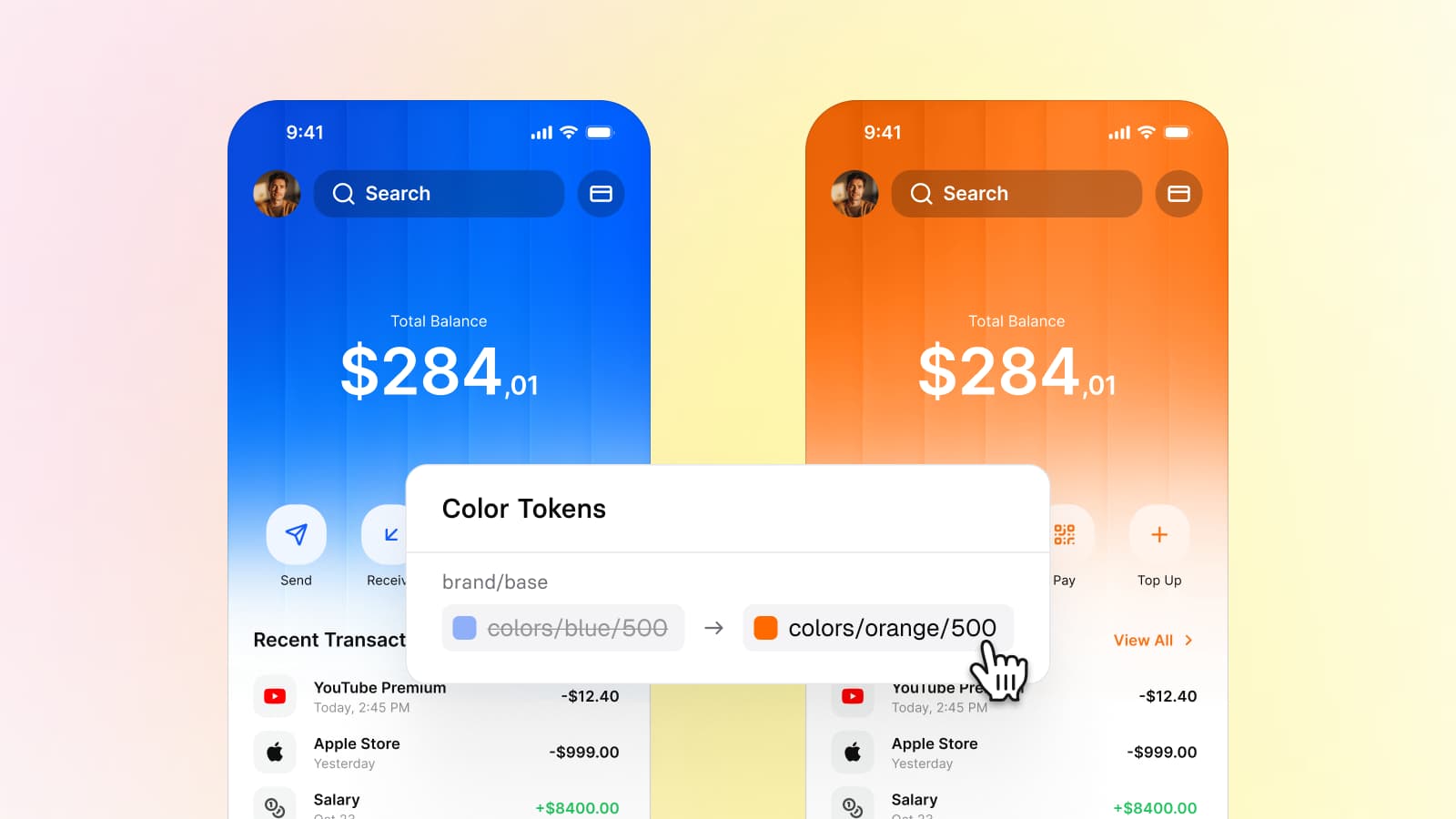
To rebrand a mobile app in Figma with variables, repoint the variable the brand color lives in and let every layer bound to it follow. In the Appetite UI file that variable is brand/: moving it from colors/ to colors/ recolors 1,110 layers across components, app screens and charts, in Light and in Dark. The rest of the brand ramp is separate variables, so a complete rebrand repoints ten more tokens, and anything not bound to a variable stays as drawn.
Appetite UI is a Figma UI kit for iOS and Android apps, built like a design system. One token source drives Apple and Material components in light and dark mode, and exports to SwiftUI, Jetpack Compose, Flutter and CSS. I build it, so the counts below come from its file, read with a script that changes nothing, and the tables say what each number counts.
Why can one variable recolor a whole app?
Because the color is written down once, and everything else holds a pointer to it. Figma calls the pointer an alias: "A variable can reference another variable. That is, you can apply a variable to another variable. Also called, 'aliasing,' this gives you the ability to implement design tokens." Appetite UI uses three levels of it.
| Level | Collection | Example | Modes |
|---|---|---|---|
| Primitive | Foundations, 202 variables | colors/, #155DFC | Default |
| Semantic token | Color Tokens, 190 variables | brand/ points at colors/ in Light and at colors/ in Dark | Light, Dark |
| Platform slot | Platform Bridge, 113 variables | iOS/ points at brand/ | Brand, System |
| Layer | Any component or screen | A button fill, a focus ring, a progress bar bound to brand/ | Follows the frame |
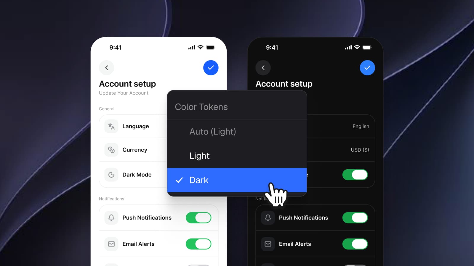
The hex #155DFC exists in one place. Repoint brand/ and the semantic level moves, the platform slots that point at it move, and every layer bound to it moves, with each mode keeping its own target. How this two-mode setup is built is the subject of Dark mode with Figma variables, not duplicate frames; this article starts where that one ends, with the brand color already on a token.
To make the pointer in Figma, open the Variables modal, right-click a variable's value and select Create alias, as Figma's help describes.
What does brand/ reach in the Appetite UI file?
It reaches 1,110 layers. I counted every page of the Appetite UI file (release 2.5) on October 8, 2026, entering every node except the insides of instances, which take their colors from the component they come from, and reading which variable each fill, stroke and effect color is bound to.
| Part of the file | Pages | Layers bound to brand/base | Components and variants holding one |
|---|---|---|---|
| Core components | 38 | 409 | 277 |
| Apple components | 20 | 27 | 20 |
| Material 3 components | 17 | 149 | 132 |
| App screens | 11 | 260 | not counted, they hold instances |
| Together | 845 | 429 |
Checked on , against the Appetite UI file (release 2.5), read with a script that changes nothing.
The app screens hold 2,506 instances at their top level, and each takes its color from the component it comes from. That is why a screen needs no edit of its own: 260 layers on the screens are bound to brand/ themselves, and everything else on them arrives through components.
Three other variables point at brand/, and a rebrand reaches their layers too:
| Variable | Points at | Layers bound |
|---|---|---|
iOS/ | brand/ in Brand mode | 67 |
M3/ | brand/ in Brand mode | 107 |
M3/ | brand/ in Brand mode | 12 |
chart/ | brand/ in both modes | 79 |
845 plus 186 plus 79 is 1,110. The focus ring is among them: the Focused variants of Button, Chip and Input draw it as a 4 point shadow in brand/, and the Neutral buttons do too, so a focus ring follows the brand even where the button fill does not. No token in Color Tokens is named for a link or an action. Components bind the brand color itself, which is the reason one variable is enough for them.
Which tokens change when you swap the whole ramp?
Eleven tokens, because the brand has more than one step. brand/ is the solid color. Beside it the file keeps a lighter, a light, a dark, a darker and a pressed step, three translucent tints that alias the blue alpha set, and two stronger translucent steps typed as raw values. Move only brand/ and 403 layers stay blue: hover and pressed states, soft tints, selected backgrounds. That is just over a quarter of the layers that use the brand family.
| Token | Light, before to after | Dark, before to after | Layers bound |
|---|---|---|---|
brand/ | blue/ to orange/, #EFF6FF to #FFF7ED | blue/ to orange/, #132150 to #441306 | 48 |
brand/ | blue/ to orange/, #DBEAFE to #FFEDD4 | blue/ to orange/, #0D2673 to #7E2A0C | 61 |
brand/ | blue/ to orange/, #155DFC to #FF6900 | blue/ to orange/, #2B7FFF to #FF8904 | 845 |
brand/ | blue/ to orange/, #193CB8 to #CA3500 | blue/ to orange/, #82BFFF to #FFB86A | 8 |
brand/ | blue/ to orange/, #1C398E to #9F2D00 | blue/ to orange/, #BEDBFF to #FFD6A7 | 0 |
brand/ | blue/ to orange/, #193CB8 to #CA3500 | blue/ to orange/, #155DFC to #FF6900 | 10 |
brand/, alpha-16, alpha-24 | colors/ to colors/, #2B7FFF to #FF6900 at 10, 16 and 24 percent | the same in both modes | 203, 10, 16 |
brand/, alpha-72 | typed values, #2B7FFF at 48 and 72 percent, to #FF6900 at the same alphas | the same in both modes | 22, 25 |
Checked on , against the Appetite UI file (release 2.5), Foundations and Color Tokens.
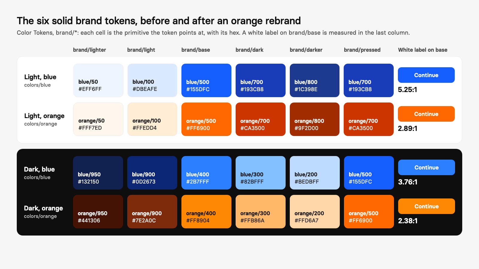
Three things in that table are worth reading twice.
- Dark is its own column.
brand/points atbase blue/in Dark, so its orange equivalent is400 orange/. Copying the Light step across is the first thing a rushed rebrand gets wrong, and the reasons for a separate Dark step are in the dark mode article.400 - The last row is the one a ramp edit cannot find.
brand/andalpha-48 brand/hold the color as a raw value instead of an alias, so retype them. The color docs mark roles like these as direct.alpha-72 - Some steps have no layers.
brand/binds nothing outside the documentation pages, so on screens it changes only through the Material roles that alias it.darker
How do you make the edit in Figma?
Duplicate the file, then open the Variables modal
Work on a copy. Open the Variables modal and check that the ramp you are moving to exists in the primitive collection with the same steps, here
colors/toorange/ 50 colors/.orange/ 950 Repoint the solid steps in Light
In Color Tokens, right-click the Light value of each brand token and select Create alias, then choose the matching step of the new ramp, as in the table above. Figma's help describes the action as "Right-click a variable's value and select Create alias."
Repoint the same tokens in Dark
Use the Dark column of the table, not the Light step. The Dark targets are lighter, so the brand keeps its contrast on a near-black ground.
Repoint the tints and retype the raw values
Point
brand/,alpha-10 alpha-16andalpha-24at the new alpha set, then type the two stronger steps by hand.Check both modes and both platforms
Set a frame to Dark with Apply variable mode in the Appearance section of the right sidebar, and check one screen in Brand mode on each platform mirror.
Sweep for what did not move
Select one layer that should have changed and still shows the old color. Figma's Edit menu lets you select all other layers with the same fill, stroke or effect; bind the selection to the right token with Apply styles and variables, as Figma's help describes, or redraw it.
Run the contrast check and export
The next sections cover contrast and code. Then regenerate the outputs from the source.
What does not follow a variable?
Anything that is not bound to one. A variable recolors fills, strokes and effects that reference it, and nothing else. These are the cases to look for, with the numbers I found in the Appetite UI file where the file has them.
| What stays | Why | How to find it |
|---|---|---|
| Photos, illustrations and raster brand art | A picture has no variable | Look for image fills in the Layers panel and decide per picture whether to redraw it |
| A fill or stroke typed as a hex | Only bound values follow | Select a layer that stayed old, then select all with the same fill from the Edit menu |
| Gradients whose stops are not bound | Each stop is a color of its own | Check every gradient fill on a brand surface |
| Icons and logos from other sets | Their colors live inside the vector | Recolor the vector or bind its fill |
| Other semantic colors that happen to be blue | They are separate decisions | In Appetite UI, state/ binds 70 layers and colors/ and / bind 54 avatar layers, and none follow |
| System mode values | System returns what Apple and Google publish | Platform Bridge in System mode keeps #007AFF and #6750A4 |
| The app icon, store art and website | Outside the Figma variables | Redraw them from the new color |
The Information status stays blue on purpose. A brand that turns orange does not make an informational banner orange, and a rebrand that did would blur the status colors, a point Apple makes about color generally: "Avoid using the same color to mean different things." Decide that one deliberately, token by token.
Do the iOS tint color and Material primary follow?
Yes in Brand mode, and no in System mode, by design. The Platform Bridge names the Apple and Material slots and points each one at a token. Twelve slots end on the brand family; three of them point at brand/ itself.
| Slot | Brand mode, blue to orange (Light) | System mode, unchanged | Layers bound |
|---|---|---|---|
iOS/ | brand/, #155DFC to #FF6900 | #007AFF | 67 |
iOS/ | brand/, #193CB8 to #CA3500 | #0051D5 | not counted |
M3/ | brand/, #155DFC to #FF6900 | #6750A4 | 107 |
M3/ | brand/, #155DFC to #FF6900 | #7D5260 | 12 |
M3/ | brand/, #EFF6FF to #FFF7ED | #EADDFF | not counted |
Checked on , against the Appetite UI file (release 2.5), Platform Bridge collection.
Seven more Material slots follow the same way through brand/, brand/, brand/ and brand/: on-primary-container, secondary, secondary-container, on-secondary-container, tertiary-container, on-tertiary-container and inverse-primary. The slot names are the platforms' own, which is the point: Apple's tint and Material's primary are where each platform expects the brand to arrive, and the Platform Bridge docs list all 113 slots.
Both platforms document where a brand color goes. Apple documents the tintColor of a view as: "The first nondefault tint color value in the view's hierarchy, ascending from and starting with the view itself." Its color guidelines add that the system applies the app accent color to the background in prominent buttons. Google's Material 3 documentation says "Primary is the base color, used for main components like prominent buttons, active states, and the tint of elevated surfaces." One brand edit lands in both, because both slots end on brand/.
What does the same edit look like in code?
One reference changes. In the token source, a semantic token holds a reference to a primitive, and the code docs print the smallest file that shows it. The orange edit swaps the primitive that brand points at:
{
  "colors": {
    "orange": {
      "500": { "$type": "color", "$value": "#FF6900" }
    }
  },
  "brand": {
    "base": { "$type": "color", "$value": "{colors.orange.500}" }
  }
}
The full source carries Light and Dark as two values on the same token, so the Dark value moves to colors in the same edit. The outputs are generated from the source, and the code docs say to change a value there and leave the outputs alone. Regenerate, and the CSS output, in the structure the docs print, carries the new values:
:root {
  --ap-brand-base: #FF6900;
}

[data-theme="dark"],
.dark {
  --ap-brand-base: #FF8904;
}

@media (prefers-color-scheme: dark) {
  :root:not([data-theme="light"]):not(.light) {
    --ap-brand-base: #FF8904;
  }
}
The names stay: var(--ap-brand-base) in CSS, Color in SwiftUI, AppetiteTheme in Compose and apBrandBase in Flutter. A developer receives new values under names the code already uses, so a rebrand reaches the project as a regenerated file and needs no search through the code. The code output docs print all four outputs, and How one Figma token becomes SwiftUI, Compose, Flutter and CSS follows one token through them.
Will the new brand color pass contrast?
Not automatically, and an orange is the case that shows it. The label of a filled brand button is bound to static/, which is white in Light and in Dark, and its fill to brand/. White on the default blue measures 5.25:1; on colors/ it measures 2.89:1.
| Pair | Ratio |
|---|---|
White label on colors/, #155DFC (Light today) | 5.25:1 |
White label on colors/, #FF6900 | 2.89:1 |
White label on colors/, #F54900 | 3.60:1 |
White label on colors/, #CA3500 | 5.22:1 |
White label on colors/, #2B7FFF (Dark today) | 3.76:1 |
White label on colors/, #FF8904 (Dark after) | 2.38:1 |
Near-black label, #0E0E0F, on colors/ | 6.68:1 |
colors/ as text on the near-black ground, #0E0E0F | 8.11:1 |
Checked on , against hex values read from the Appetite UI file (release 2.5), ratios computed with the WCAG 2 formula.
WCAG 2.2 asks for "a contrast ratio of at least 4.5:1" for standard text and at least 3:1 for large-scale text, which is at least 18 point or 14 point bold. Apple's accessibility guidelines give the same pair of numbers for iOS: 4.5:1 for text up to 17 points in all weights, 3:1 at 18 points and for bold text. A white label at 2.89:1 fails both, and the default blue in Dark, at 3.76:1, meets the large text threshold only. The swap is therefore two decisions in one: pick the step, then check the label on it.
Three ways out. Point brand/ in Light at orange/, a token edit, which gives white a ratio of 5.22:1 on a deeper orange. Keep orange/ and rebind the label of the filled brand variants to a near-black color, which gives 6.68:1 but is an edit to the components, since the label is bound to the white primitive and not to the brand. Or keep the bright orange for large text and graphics, and use a darker step wherever a small label sits on it. The first choice moves every screen with one variable, which is the property that made the rebrand a one-variable job.
For the dark ground, the numbers go the other way: colors/ as text on #0E0E0F measures 8.11:1, a lighter and more legible brand there than the blue it replaces.
What to take from the file
A rebrand is as short as the file is wired. In this file the brand arrives at the layers through one semantic token, the platform slots alias that token, and the other steps of the brand are named and counted, so the work is eleven edits and a contrast decision instead of a sweep through 1,513 layers. Check any file the same way before you promise a client a one-day rebrand: open the Variables modal, follow the brand color to the layers, and list what is typed in by hand.
The color docs show every ramp and role in both modes, the tokens page switches the same chain on a phone screen, the platforms page shows the two mirrors side by side, the read-only preview opens the whole file, and pricing lists what each license includes.
Questions
How do I change the brand color across a whole Figma file?
Put the brand color on a variable, bind every component to it, and change the variable. In Figma, open the Variables modal, right-click the variable's value and select Create alias to point it at a new color; every layer bound to the variable follows. Layers with a typed hex do not, so sweep for them afterwards.
Do I need a paid Figma plan to rebrand with variables?
Variables are available on any plan, according to Figma's help. Modes need a paid plan: Education, Professional, Organization or Enterprise. A rebrand of one theme works without modes, and a file with Light and Dark needs two.
How do I find the layers that did not change after a rebrand?
Select a layer that still shows the old color, then use the Edit menu to select all other layers with the same fill, stroke or effect, as Figma's help documents. Bind the selection to a variable with Apply styles and variables, or redraw it. In Appetite UI the usual leftovers are typed alpha values, avatar colors that bind the blue ramp directly, and pictures.
Does changing the brand variable change the iOS tint and Material primary?
In Appetite UI's Brand mode, yes. iOS/, M3/ and M3/ all point at brand/, and nine more Material and iOS slots end on the other brand steps. In System mode the slots return Apple's #007AFF and Google's #6750A4 and stay put.
Does white text pass contrast on an orange brand color?
Not on the bright orange. White on colors/, #FF6900, measures 2.89:1 against the 4.5:1 WCAG asks for at standard sizes. White on colors/, #CA3500, measures 5.22:1, and a near-black label on colors/ measures 6.68:1.
Can one Figma file hold several brands?
Yes, in two ways. Modes in one collection store one value per brand and switch a whole frame. On the Enterprise plan, extended collections let each brand extend a parent collection and override only the values that differ, while inheriting the rest.
Sources
- Figma Learn: Create and manage variables and collections, read October 8, 2026
- Figma Learn: Overview of variables, collections, and modes, read October 8, 2026
- Figma Learn: Modes for variables, read October 8, 2026
- Figma Learn: Extending variable collections, read October 8, 2026
- Figma Learn: Apply variables to designs, read October 8, 2026
- Figma Learn: Select layers and objects, read October 8, 2026
- Apple Human Interface Guidelines: Color, read October 8, 2026
- Apple Human Interface Guidelines: Accessibility, read October 8, 2026
- Apple Developer: UIView.tintColor, read October 8, 2026
- Android Developers: Material Design 3 in Compose, read October 8, 2026
- W3C: Understanding WCAG 2.2, Contrast (Minimum), read October 8, 2026