How to design one app for iOS and Android in Figma
Keep one token set, share the components that behave alike, draw bars and sheets once per platform, and switch touch targets with a Figma variable mode.

On this page
To design one app for iOS and Android in Figma, keep one token set for color, type, spacing and radius, and share the components that behave the same on both platforms. Draw the platform frame (bars, back, the primary action and sheets) once per platform, and switch the numbers that differ, such as touch targets, bar heights and safe areas, with a variable mode instead of a second library. Appetite UI is a Figma UI kit for iOS and Android apps, built like a design system. One token source drives Apple and Material components in light and dark mode, and exports to SwiftUI, Jetpack Compose, Flutter and CSS.
I design Appetite UI, and its file is built this way, so the examples below come from it: its Platform collection, its Platform Bridge and its two platform mirrors. The platform rules are quoted from Apple, Google, the Android, Flutter, React Native and Kotlin docs and from Figma's help, read on September 24, 2026, and linked under Sources.
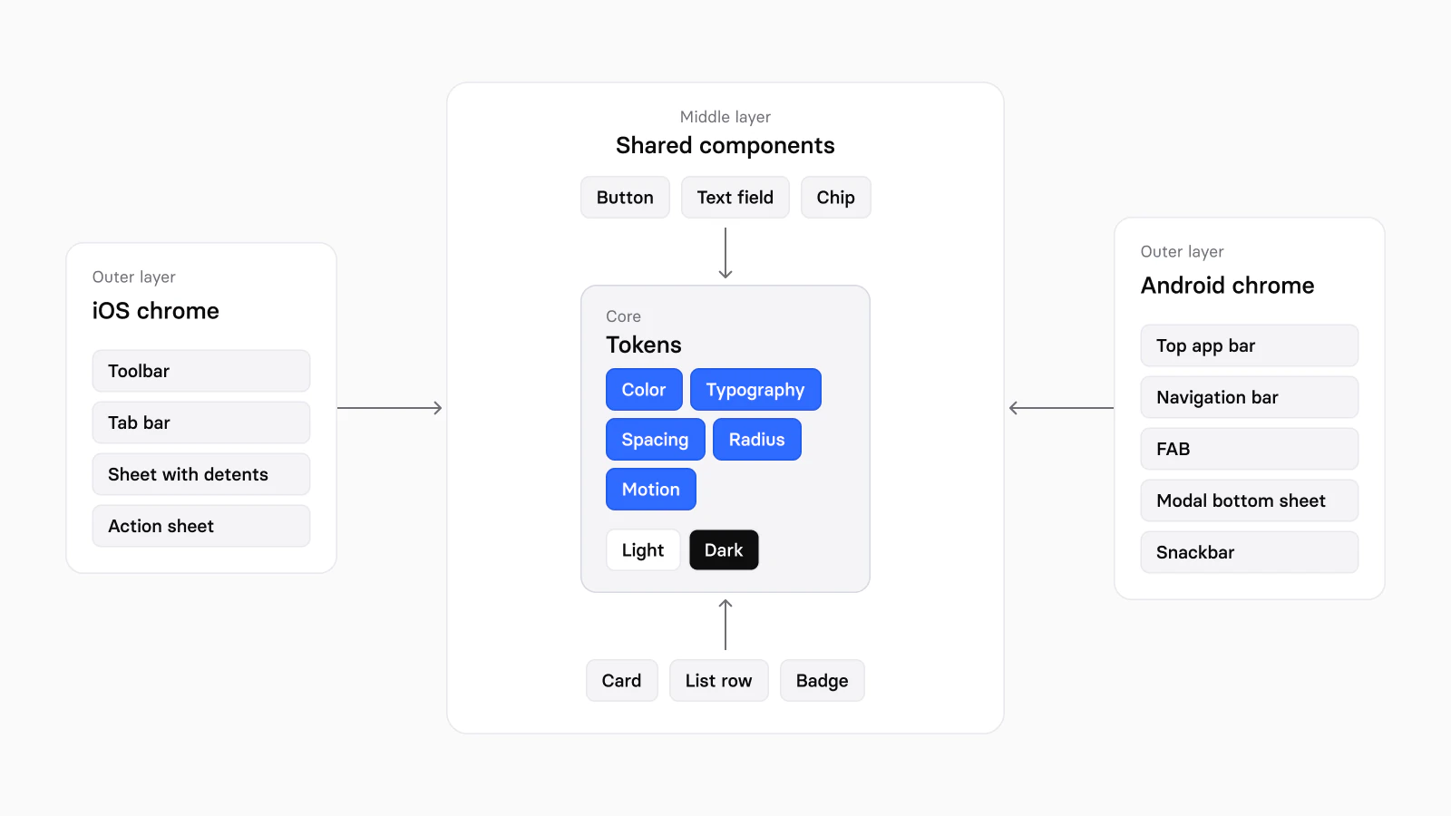
Two setups are common, and both double something. Two libraries, one per platform, keep every component twice and let the brand drift between them. One library with an iOS and an Android variant on every component doubles the variants, including on components that look the same on both. Splitting the file by what really differs keeps the doubling to the parts that differ:
| Layer | What lives there | Per platform |
|---|---|---|
| Tokens | Color, type, spacing, radius and motion, in light and dark | One set |
| Shared components | Button, text field, chip, card, list row, avatar, badge, progress, skeleton | Drawn once; measures come from variables |
| Platform frame | Top bar, bottom navigation, primary action, sheets, short messages, switch, pickers | Drawn once for each platform |
Danny Banks, writing about multi-platform design systems from his work at Amazon, names the goal: "Instead of consistency, I use cohesion. You can use platform-specific components and conventions and still feel cohesive across platforms." The token layer carries the cohesion; the platform frame carries the conventions.
Apple asks you to "determine layout based on size classes, not device type or orientation". Android's window size classes say the same from the other side: a width under 600 dp is compact, the class of "99.96% of phones in portrait", and "most apps can build an adaptive UI by considering only the width window size class". Draw each screen at one width per platform, then check the narrowest and the widest you support.
| Device | Frame | Source |
|---|---|---|
| iPhone 17 and iPhone 17 Pro | 402 × 874 pt | Use Your Loaf |
| iPhone Air | 420 × 912 pt | Use Your Loaf |
| iPhone 17 Pro Max | 440 × 956 pt | Use Your Loaf |
| Android phone, portrait | Under 600 dp wide | Android developers, window size classes |
Safe areas change with the device. On iPhone 17 the top inset is 62 points and the bottom 34. Android 15 draws every app edge to edge once it targets SDK 35, so the Android frame starts at the top of the screen and keeps its content clear of the status bar and the navigation bar with insets. Figma's help itself suggests variable modes to "account for multiple device sizes", which is the next step.
Shared components have the same anatomy on both platforms: a button, a text field, a chip, a card, a list row. What changes is a number, such as a 44 or a 48 target, and a number belongs in a variable. The frame of the screen changes in kind:
| Part of the frame | iOS | Android |
|---|---|---|
| Top bar | Toolbar, large title, back chevron | Top app bar, back arrow |
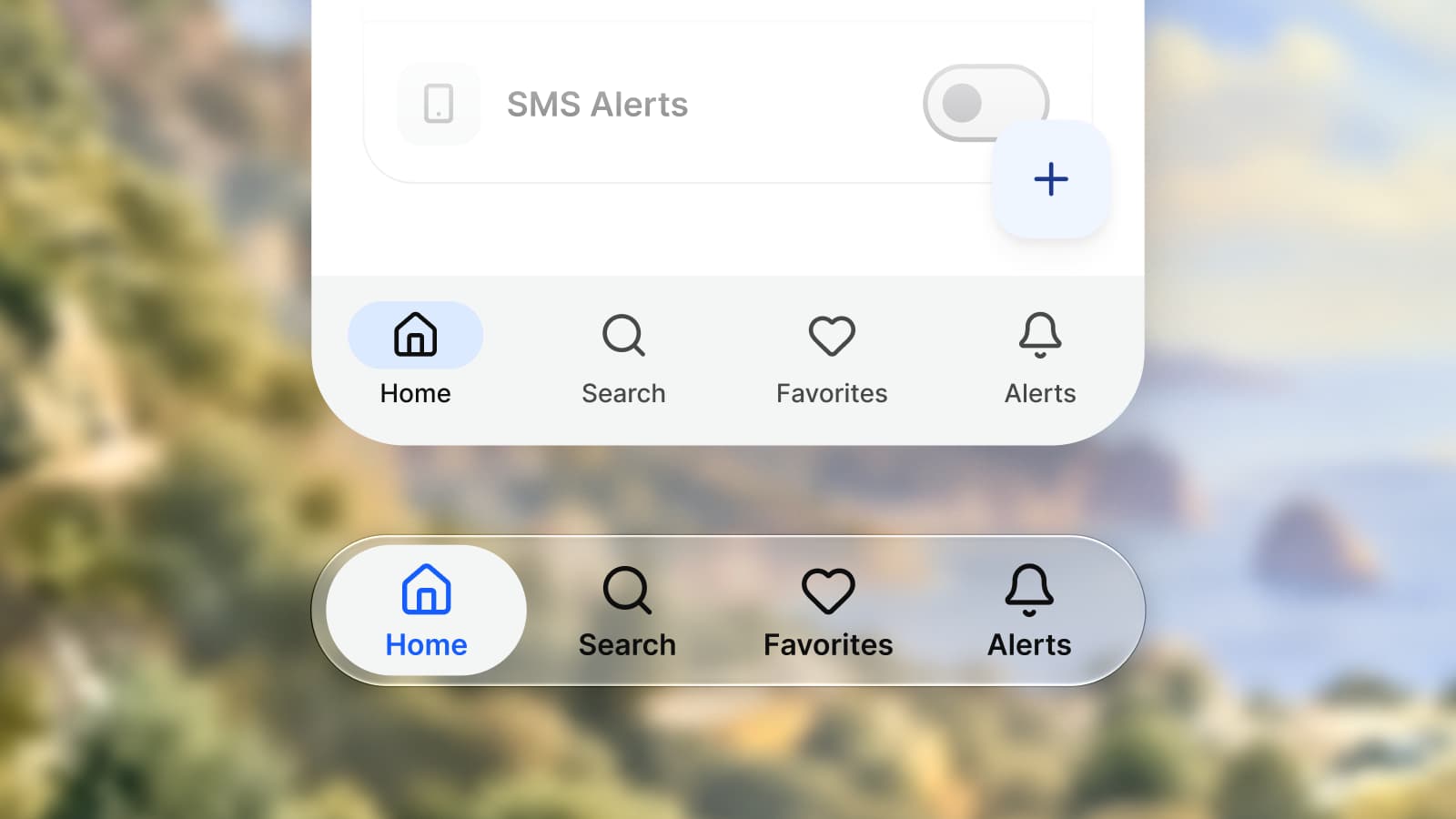
| Bottom navigation | Tab bar floating on Liquid Glass | Navigation bar, three to five destinations |
| Primary action | Prominent toolbar button, trailing | Floating action button |
| Sheet | Detents and a grabber | Modal bottom sheet, drag handle and scrim |
| Choices after an action | Action sheet | Modal bottom sheet |
| Short message | A custom overlay | Snackbar |
In Appetite UI the frame lives in two mirrors, 21 pattern pages on the iOS side and 17 on the Material side. The per-component detail, with SwiftUI and Compose names, is in iOS vs Material 3: what changes per component.
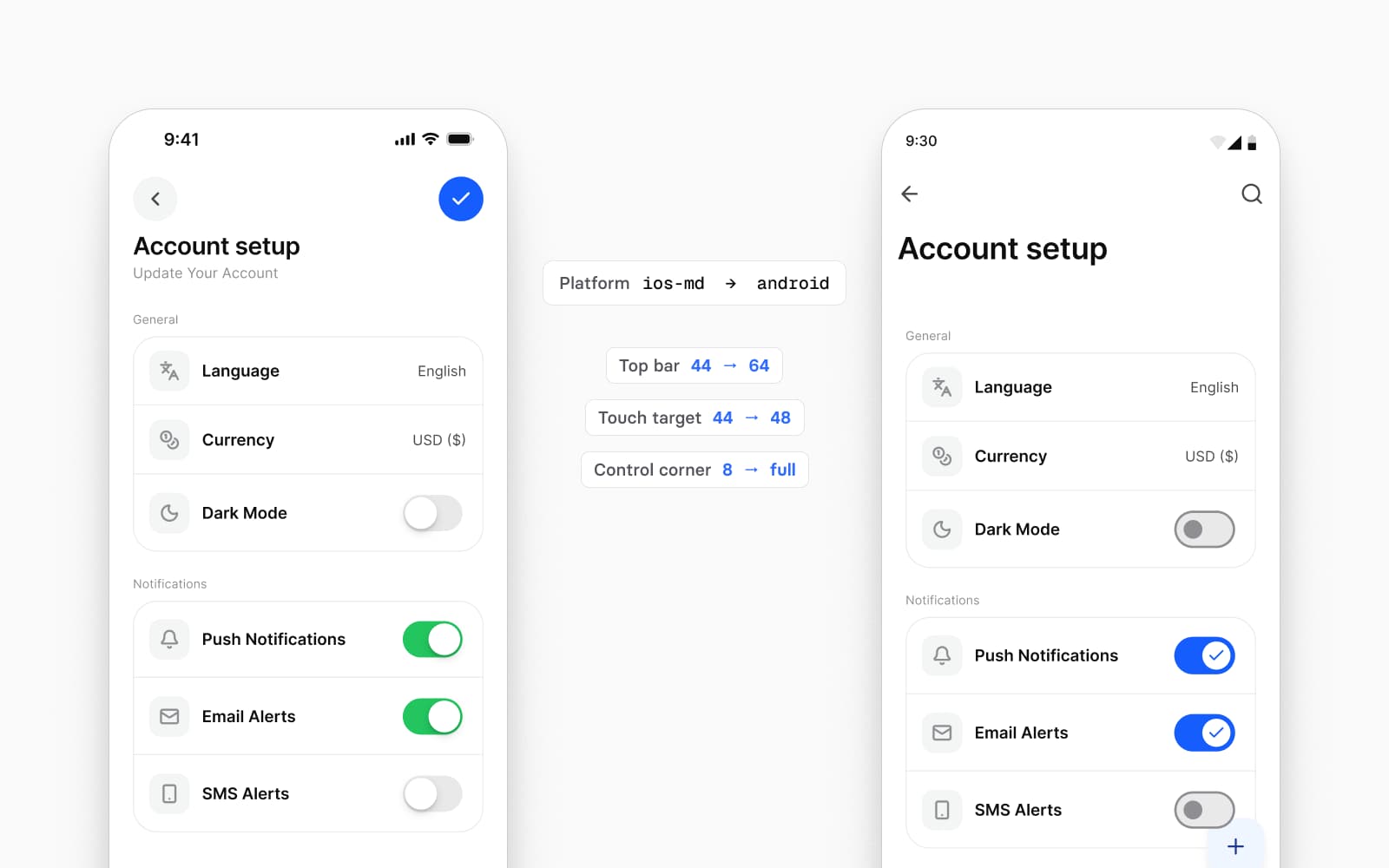
A number that differs by platform goes into a collection with one mode per platform. Appetite UI's Platform collection holds 16 variables on three modes, ios-md, ios-lg and android. Set the mode on a frame and every component inside it takes the platform's numbers:
| Variable | ios-md | ios-lg | android |
|---|---|---|---|
platform/ | 44 | 44 | 48 |
platform/ | 44 | 44 | 64 |
platform/ | 44 | 44 | 56 |
platform/ | 8 | 8 | 9999 |
platform/ | 51 | 51 | 52 |
platform/ | 31 | 31 | 32 |
The two iOS modes differ in one variable, grid/, at 59 and 62. Apple publishes the 44 pt target, and Google the 48 dp target and the 52 by 32 dp switch track; the other values are the file's decisions, and they sit in variables so you can change them in one place. The Platform Bridge page documents the collection.
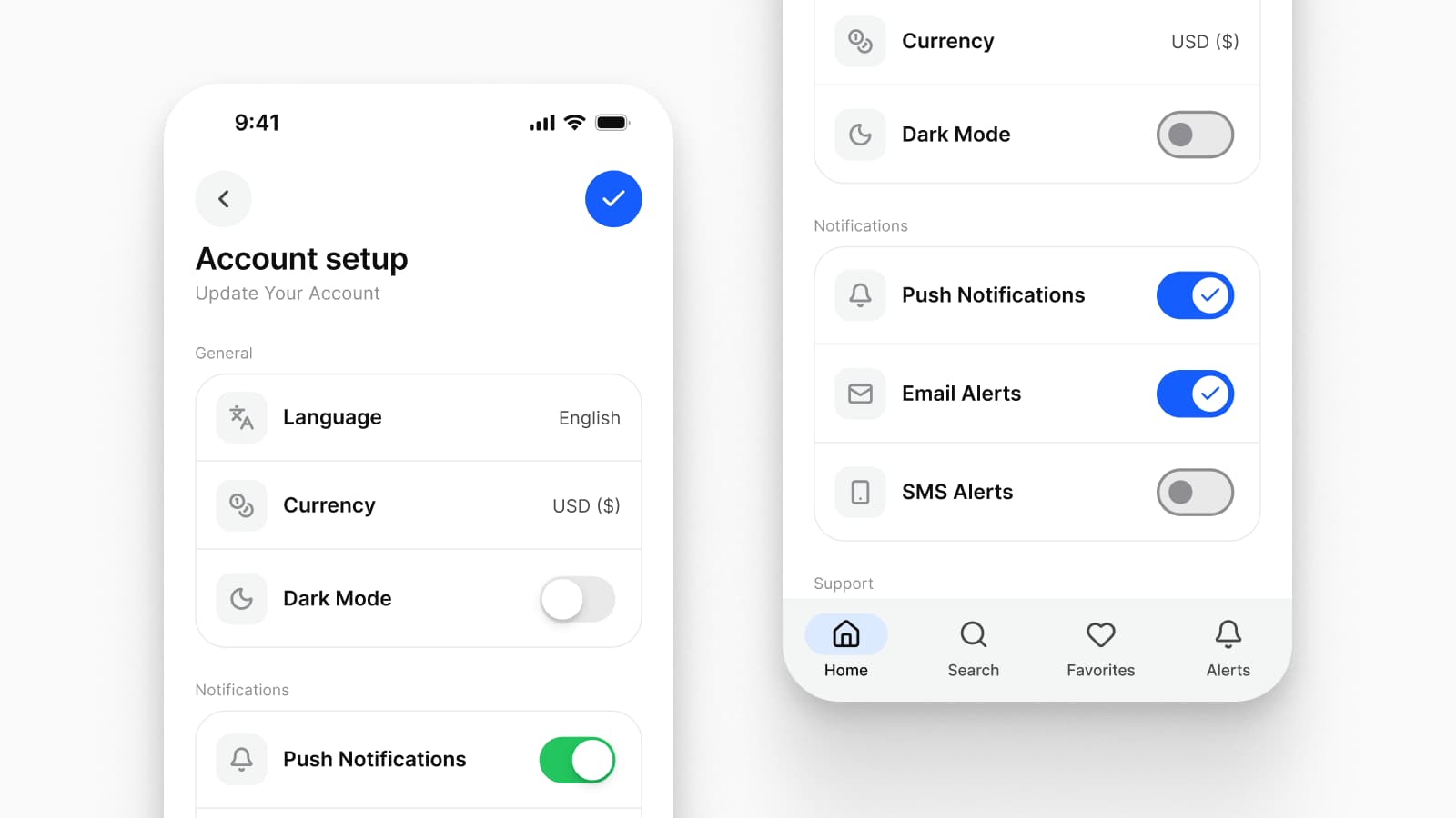
On iOS the tab bar switches top-level sections and stays visible in every one of them, and the toolbar at the top carries the back button, which Apple asks you to keep as the standard symbol with no text label. On Android the navigation bar holds three to five destinations, the top app bar's leading button is "a back arrow, which returns to the previous screen", and back is also a system gesture. Predictive back "lets users preview where the back swipe takes them", and from Android 15 apps that opt in get the system's back-to-home and cross-activity animations.
The glyph differs too. Flutter's docs note that the back button "is a simple chevron on iOS and has a stem/shaft on Android". Draw back and navigation once per platform, and draw the screen underneath a pushed one for Android's predictive back.
Apple's system colors "can automatically adapt to vibrancy and accessibility settings", and Apple asks you to avoid "redefining the semantic meanings of dynamic system colors". A component filled with a hex forgets which role it plays. A component that reads a role name keeps it, and the developer can map iOS/ to Apple's own secondaryLabel, which adapts in code.
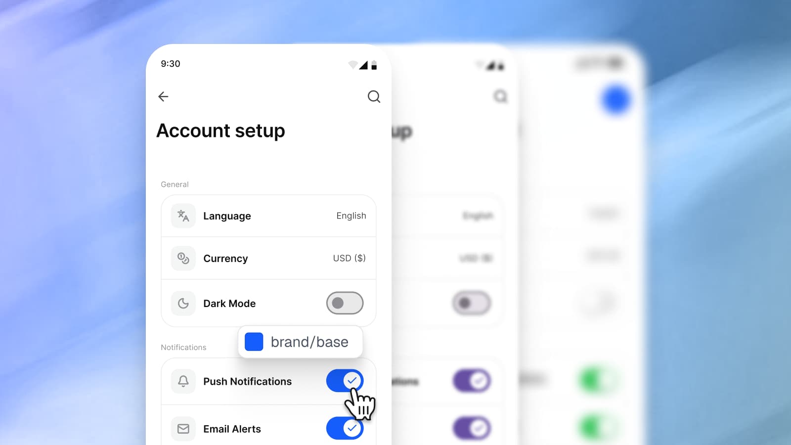
Appetite UI does this in the Platform Bridge, 112 variables on two modes. In Brand mode, iOS/ points at brand/, which points at colors/, and M3/ ends on the same primitive, so one edit moves an iOS screen and an Android screen together. In System mode the same slots return the values Apple and Google publish, #007AFF and #6750A4, stored once and never retyped into a component.
The Bridge carries type size as well. Every Apple text style and every Material type role points at a step of one Appetite UI scale in Brand mode and returns the platform's published size in System mode: iOS body is 18 in Brand and 17 in System, and Material's body large is 16 in both. Only the size moves; line height, weight and tracking stay on the Appetite UI side, as the typography page lists.
Dynamic Type and Material's text scaling happen at runtime, so read every number in the file as the default size. Apple's guidelines say what to plan for: at larger sizes, "horizontally adjacent views may need to stack vertically", and rows may need to grow so text is not cropped. Draw one screen of each flow at a large text size before handoff.
A shared codebase does not decide the design for you. Flutter ships Material widgets and Cupertino widgets, which Flutter describes as "high-fidelity widgets that align with Apple's Human Interface Guidelines". It adapts some behavior of the operating system by itself, such as scrolling, page transitions and the default font, but for app conventions "Flutter bundles the means to produce the appropriate effects of the platform conventions but doesn't adapt automatically when app design choices are needed". Its docs add that "the San Francisco font license limits its usage to software running on iOS, macOS, or tvOS only".
React Native renders native views: "At runtime, React Native creates the corresponding Android and iOS views for those components." Compose Multiplatform shares one UI across Android and iOS and, in JetBrains' words, "supports familiar APIs like state management, layout, and animations as well as Material components". Whichever you ship with, the file has to say which frame each platform gets.
Apple's Figma UI kit for iOS 27 and iPadOS 27 is published on the Apple Design Resources page under a license. Section 2B of that license reads:
The grants set forth in this License do not permit you to, and you agree not to, install, use or run the Apple Design Resources for the purpose of creating mock-ups of user interfaces to be used in software products running on any non-Apple operating system software.
The quote is from the License Agreement for Apple Design Resources, LYL142, dated 06/21/2023 and read on September 24, 2026. For Android, Google publishes its own Material 3 Design Kit, and Apple's iOS kit, Google's Material 3 kit or Appetite UI: which to start from compares the two official kits with Appetite UI. Appetite UI includes no Apple artwork, symbol or typeface: every layer is its own geometry on its own tokens, in Inter with Lucide icons.
Switch the platform colors to System
Set the Platform Bridge to System on a finished screen and compare it with Apple's and Google's own kits. Then switch back to Brand.
Switch the Platform collection to android
Check that nothing clips when targets grow to 48, the top bar to 64 and list rows to 56.
Walk the frame of every flow on both platforms
Top bar and back, bottom navigation, the primary action, sheets and short messages, once as iOS and once as Android.
Switch Light and Dark
Every screen, in both platform modes. People set the appearance in the system settings on both platforms, so each screen is seen both ways. The setup is in Dark mode with Figma variables, not duplicate frames.
Hand over token names
A developer who receives
brand/finds it in the code output asbase var(--ap-brand-base)in CSS,Colorin SwiftUI,.apBrandBase AppetiteThemein Compose and.colors .brandBase apBrandBasein Flutter, all generated from the one token source. How one token becomes four is in How one Figma token becomes SwiftUI, Compose, Flutter and CSS.
The platforms page shows both mirrors side by side, the read-only preview opens the whole file, and pricing lists what each license includes.
Should I design iOS or Android first?
Design the platform your launch targets first, with its measures already in variables. The second platform is then a mode switch for the shared components and a second drawing of the frame: bars, back, the primary action, sheets and short messages.
What frame size should I use for iOS and Android in Figma?
Use 402 by 874 points for iPhone 17 and iPhone 17 Pro, 420 by 912 for iPhone Air and 440 by 956 for iPhone 17 Pro Max. For Android, any width under 600 dp is compact, the class Android's documentation gives for 99.96% of phones in portrait; pick one width inside it and check the narrowest you support.
Can one Figma component work on both iOS and Android?
Yes, when only the component's measures differ. Put the touch target, row height, bar height and corner in variables with one mode per platform, and the same button or list row follows both. Components whose behavior differs, such as the tab bar and the navigation bar or the sheet and the modal bottom sheet, are drawn once per platform.
Do I need two design systems for iOS and Android?
No. One token set, one set of shared components and a platform frame for each platform cover both. A second system would copy the tokens and the shared components too, and the brand would drift between the copies.
How do Flutter apps handle iOS and Android design differences?
Flutter handles part of them by itself. It adapts scrolling, page transitions, the default font and some icons to the platform, and ships Material and Cupertino widgets. For conventions that are app design choices, Flutter's docs say it "doesn't adapt automatically", so the design has to specify both.
- Apple HIG: Layout, read September 24, 2026
- Apple HIG: Tab bars, read September 24, 2026
- Apple HIG: Toolbars, read September 24, 2026
- Apple HIG: Color, read September 24, 2026
- Apple HIG: Accessibility, read September 24, 2026
- Apple Design Resources, read September 24, 2026
- License Agreement for Apple Design Resources, PDF, read September 24, 2026
- Use Your Loaf: screen sizes of the iPhone 17 models, read September 24, 2026
- Android Developers: Use window size classes, read September 24, 2026
- Android Developers: Display content edge-to-edge, read September 24, 2026
- Android Developers: Predictive back gesture, read September 24, 2026
- Material 3: Navigation bar, read September 24, 2026
- Material 3: App bars, read September 24, 2026
- Material 3: Accessibility, designing, read September 24, 2026
- Figma Help: Modes for variables, read September 24, 2026
- Danny Banks: An Introduction to Multi-Platform Design Systems, read September 24, 2026
- Flutter: Cupertino widgets, read September 24, 2026
- Flutter: Automatic platform adaptations, read September 24, 2026
- React Native: Core Components and Native Components, read September 24, 2026
- JetBrains: Compose Multiplatform, read September 24, 2026