Android screen sizes in Figma: design by window size class, not by device
Android designs by window size class: compact under 600 dp, medium 600 to 839, expanded 840 to 1199. The Figma frames to keep and the navigation for each class.

On this page
Android designs by window size class, not by device: a window under 600 dp wide is compact, 600 to 839 dp is medium and 840 to 1199 dp is expanded, and an app that opts in adds large at 1200 to 1599 dp and extra large from 1600 dp. Height has its own three classes, compact under 480 dp, medium 480 to 899 dp and expanded from 900 dp, and Google says to decide on width first and adjust for height. In Figma that means one frame per class you support, plus the edge widths to test.
Appetite UI is a Figma UI kit for iOS and Android apps, built like a design system. One token source drives Apple and Material components in light and dark mode, and exports to SwiftUI, Jetpack Compose, Flutter and CSS. Its android mode sets the phone's geometry, and this article lists what it sets and what it leaves to you.
I build Appetite UI, so the frames and the mode below are read from its file, and where the file doesn't cover a class the text says so.
What are Android's window size classes?
A window size class is a breakpoint on the width or the height of the app's window, in dp. Google defines three widths, compact, medium and expanded, plus large and extra large for apps that opt in, and three heights. The table is Google's, with its own estimates of which devices fall into each class.
| Width class | Width in dp | Google's note on devices |
|---|---|---|
| Compact | Under 600 | 99.96% of phones in portrait |
| Medium | 600 to 839 | 93.73% of tablets in portrait, most large unfolded inner displays in portrait |
| Expanded | 840 to 1199 | 97.22% of tablets in landscape, most large unfolded inner displays in landscape are at least expanded |
| Large | 1200 to 1599 | Large tablet displays |
| Extra large | 1600 and up | Desktop displays |
| Height class | Height in dp | Google's note on devices |
|---|---|---|
| Compact | Under 480 | 99.78% of phones in landscape |
| Medium | 480 to 899 | 96.56% of tablets in landscape, 97.59% of phones in portrait |
| Expanded | 900 and up | 94.25% of tablets in portrait |
Android Developers, "Use window size classes", last updated September 22, 2026 and read on October 8, 2026. Google writes the bounds as 600 dp or more and under 840 dp; the 839 and 1199 here are the largest whole dp below the next class. Large and extra-large widths appear only when currentWindowAdaptiveInfo is called with supportLargeAndXLargeWidth set to true.
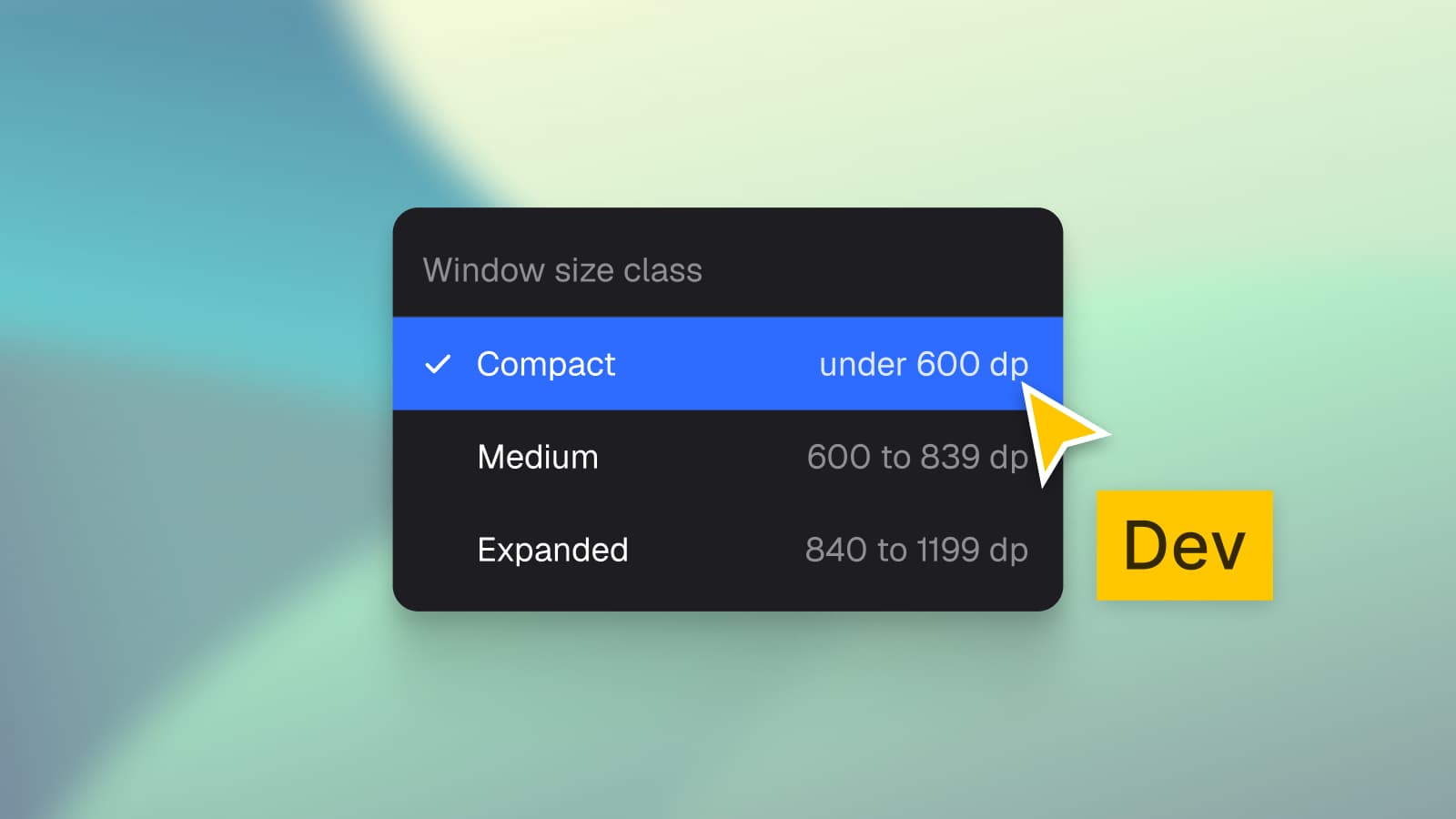
The three-option menu on this article's cover lists the first three classes. Two things follow from the table. A phone turned sideways keeps a compact height but gains width, so a landscape phone is a height question, and a tablet in portrait is a medium-width window. And a class never names a device: Google's own page says to "avoid using physical hardware values for making layout decisions", because the space the app gets, not the product name, is what the layout reads.
Which Figma frames does an Android app need?
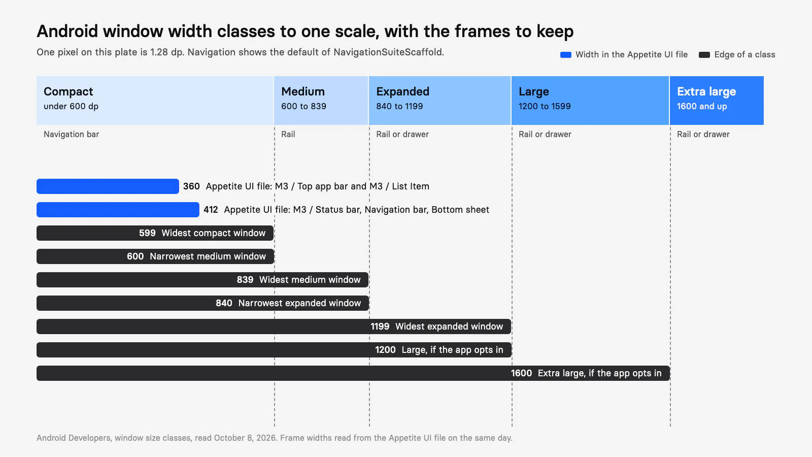
An Android app needs one frame in each width class it supports, drawn at a width inside the class, and a check at the class edges. Google publishes the class boundaries, not a list of device widths in dp, so the frames below are the boundaries plus the two widths the Appetite UI file draws for compact phones.
| Frame width in dp | Class | What it stands for | Where the number comes from |
|---|---|---|---|
| 360 | Compact | The narrow end of phones; the width of M3 / Top app bar and M3 / List Item | Appetite UI file, Google Material 3 Platform |
| 412 | Compact | The phone frame of the Material mirror: status bar, navigation bar and bottom sheet are 412 wide | Appetite UI file, Google Material 3 Platform |
| 599 | Compact | The widest compact window; one pane must still fit | Edge of Google's class |
| 600 | Medium | The narrowest medium window, a tablet or an unfolded inner display in portrait | Edge of Google's class |
| 839 | Medium | The widest medium window | Edge of Google's class |
| 840 | Expanded | The narrowest expanded window, a tablet or an unfolded inner display in landscape | Edge of Google's class |
| 1199 | Expanded | The widest expanded window | Edge of Google's class |
| 1200 and 1600 | Large, extra large | Only if the app opts in: large tablets and desktop windows | Edge of Google's class |
Class edges from Android Developers, read on October 8, 2026. The 360 and 412 widths are layers in the Appetite UI file, read on the same day.
Draw 412, 600 and 840 as the three main frames, switch their contents between classes and check the five edges by resizing the same frames. Height is a second check: a 480 dp and a 900 dp tall frame show where the height class changes, which matters for a phone held sideways and a tablet held upright.
How do device pixels become dp?
Divide pixels by the density and multiply by 160. Android's "Grids and units" page gives the formula, dp = pixels × 160 / density, with 160 dpi as the reference where one dp is one pixel. Google's Pixel pages list pixels and pixels per inch, not dp, and the density a phone runs at is a system setting, so the conversion needs an assumption.
Pixel 11 has a 1080 × 2424 pixel display at 422 ppi. If it runs at the 420 dpi density bucket, 1080 pixels are 411 dp and 2424 pixels are 923 dp, close to the 412 the Material mirror draws, and a compact width. I assume the bucket; read the real width from the device with WindowMetrics or from an emulator before you fix a frame to it. The same arithmetic isn't safe for a foldable, whose inner display Google says lands in medium in portrait and at least expanded in landscape for most large unfolded displays: measure the window the device reports.
Which layout and navigation fit each class?
Compact windows get one pane and a navigation bar, medium and wider windows get a navigation rail, and the panes multiply as the window grows. Google's canonical layouts, list-detail, supporting pane and feed, come from Material Design, and its adaptive navigation page sets the default component by class.
| Class | List-detail | Supporting pane | Feed | Navigation default |
|---|---|---|---|---|
| Compact | List or detail, one at a time | Below the main content or in a bottom sheet | Single column | Navigation bar |
| Medium | List or detail, one at a time | Space split equally between main and supporting | Several columns | Navigation rail |
| Expanded | List and detail side by side | Side by side, the main pane about two thirds | Several columns | Navigation rail, or a drawer if you choose |
| Large and extra large | Panes, with content width capped | Panes | Several columns | Navigation rail, or a drawer if you choose |
Android Developers, "Canonical layouts", "Build adaptive navigation" and "Adaptive layouts", last updated September 22, 2026 where dated, read on October 8, 2026. The large row follows Google's note that large and extra-large windows suit multiple panes and a maximum content width.
The navigation default is a rule you can quote: NavigationSuiteScaffold shows a navigation bar "if the width or height is compact or if the device is in tabletop posture", and a navigation rail "for everything else". Google's own example forces a navigation drawer from the expanded class up, so the rail is the default and the drawer an override.
Appetite UI's file draws the compact side of this table. Its Material mirror has the M3 navigation bar, 412 × 80 with three to five items, and its own Navigation Drawer is 300 × 852; it has no navigation rail, list-detail or supporting pane component. Draw those from the same list items, cards and buttons, in the frames above.
What does Appetite UI's android mode set?
The android mode of the Platform collection sets the geometry of a Material phone in the compact class. The collection holds 20 variables on five modes, ios-md, ios-lg, android, ios-duo-outer and ios-duo-inner, and a frame takes one of them. The table is the android mode against ios-lg, read from the file.
| Variable | android | ios-lg | What it sets |
|---|---|---|---|
grid/ | 52 | 62 | Status bar, the 412 × 52 M3 / Status bar |
grid/ | 24 | 34 | Gesture navigation, the 412 × 24 M3 / Gesture Navigation |
grid/ | 4 | 4 | Columns of the grid style |
platform/ | 48 | 44 | Smallest tappable square |
platform/ | 64 | 44 | Top bar, the Small top app bar is 64 |
platform/ | 64 | 49 | Bottom bar |
platform/ | 56 | 44 | One line list item |
platform/ | 9999 | 8 | Fully rounded controls |
platform/ and platform/ | 28 | 12 | Sheets and dialogs |
platform/ and platform/ | 52 and 32 | 64 and 28 | The Material switch track |
platform/ | 16 | 16 | Edge of the screen to content |
Read from the Platform collection of the Appetite UI file on October 8, 2026. The android grid style is 4 columns with a 16 gutter and a 16 margin.
Four things the mode doesn't set. It has no frame width, so a frame is 412 or 600 or 840 because you resize it. It has no window size class, no medium or expanded mode and no change in column count: grid/ is 4 in every mode but the second Duo mode. It leaves the navigation rail and the pane layouts to you. And the bottom bar variable, 64, differs from the 80 dp high M3 / Navigation bar the file draws: take the frame from the component and treat the variable as the file's own value.
That makes the mode a start for the compact class, not a ladder of three. Set the Platform mode to android on every Android frame, so touch targets, corners and bars read the Material values, and change the width and the layout by hand for medium and expanded. Platform Bridge explains the two modes of the other collection, Brand and System, which move color and type and leave this geometry alone, and the Dimensions page lists every mode.
How do foldables and tablets fit?
A foldable moves between classes as it opens: Google says foldable devices "can shift between compact, medium, and expanded window size classes instantly". A closed foldable's cover display is a compact window, an unfolded inner display in portrait is mostly medium and in landscape at least expanded, and a half-open fold adds a posture, book or tabletop, on top of the class. NavigationSuiteScaffold already treats tabletop posture like compact and shows the navigation bar.
So the frames above cover a foldable without a device list: the cover display is 412, the inner display is 600 or 840 depending on its pose, and the fold itself is a constraint you read from Jetpack WindowManager, not a Figma frame. The same question on Apple's side, with the frame sizes in points and a vertical bar instead of a rail, is answered in How to design for iPhone Duo in Figma; its section on Android foldables compares the two. For the frames of an iPhone in points, see iPhone screen sizes in Figma.
What should you hand to developers?
Hand over the class a frame stands for, not the device it resembles, and the layout rule for each class. Developers read the class from the window, so a frame named "Pixel" tells them nothing the width doesn't.
Name frames by class and width
"Compact 412", "Medium 700", "Expanded 1000". The width is a sample inside the class, and the class is the rule.
Draw the edges
Resize the frames to 599, 600, 839, 840 and 1199 and check that nothing clips at either side of a boundary.
Pick the navigation per class
A navigation bar in compact, a rail in medium and expanded, a drawer only if you want it, and say which.
Pick the panes per class
List-detail, supporting pane or feed, and what each class shows: one pane, two, or a bottom sheet.
Check the height class
A short frame under 480 dp stands for a phone held sideways, a tall one at 900 dp and over for a tablet held upright.
Test in the resizable emulator
Android Studio's resizable emulator switches the display mode between common device types, and the window can be resized in between.
In code the branch is short. The library reads the class from the window and the layout follows:
val windowSizeClass = currentWindowAdaptiveInfo(
    supportLargeAndXLargeWidth = true
).windowSizeClass

when {
    windowSizeClass.isWidthAtLeastBreakpoint(WindowSizeClass.WIDTH_DP_EXPANDED_LOWER_BOUND) -> ExpandedLayout()
    windowSizeClass.isWidthAtLeastBreakpoint(WindowSizeClass.WIDTH_DP_MEDIUM_LOWER_BOUND) -> MediumLayout()
    else -> CompactLayout()
}
The Dimensions page lists the Platform modes and grid styles, the Material 3 page lists every Material pattern in the file, the platforms page shows both mirrors, the read-only preview opens the whole file, and pricing lists what each license includes. The component by component differences between the platforms are in iOS vs Material 3: what changes per component, and the one-file setup for both in How to design one app for iOS and Android in Figma.
Questions
What are the Android screen sizes in dp?
Android groups window widths into classes: compact under 600 dp, medium 600 to 839 dp, expanded 840 to 1199 dp, and, when an app opts in, large 1200 to 1599 dp and extra large from 1600 dp. Google documents the classes, not a list of device widths.
What are the Android window size class breakpoints?
Width breakpoints are 600, 840, 1200 and 1600 dp. Height breakpoints are 480 and 900 dp: compact under 480, medium 480 to 899 and expanded from 900. Google says to read width first and then adjust for height.
What frame size should I use for an Android phone in Figma?
Use a compact width, under 600 dp. The Appetite UI file draws its Material phone parts 412 dp wide, and the top app bar and list items of the same mirror 360 wide. Check the real width of your target device on the device, because dp depends on the density it runs at.
When does Android use a navigation rail instead of a navigation bar?
NavigationSuiteScaffold shows a navigation bar when the width or height is compact or the device is in tabletop posture, and a navigation rail for everything else. Medium and expanded windows therefore get a rail by default, and a drawer is an override.
Are large and extra-large window size classes official?
Yes, in the Compose adaptive library: large is 1200 to 1599 dp and extra large is 1600 dp and up. They are off by default and turn on with supportLargeAndXLargeWidth set to true in currentWindowAdaptiveInfo.
Sources
- Android Developers: Use window size classes (adaptive apps), read October 8, 2026
- Android Developers: Use window size classes (Compose), read October 8, 2026
- Android Developers: Support different display sizes, read October 8, 2026
- Android Developers: Canonical layouts, read October 8, 2026
- Android Developers: Build adaptive navigation, read October 8, 2026
- Android Developers: Adaptive layouts (design), read October 8, 2026
- Android Developers: Grids and units, read October 8, 2026
- Android Developers: Support trifolds and landscape foldables, read October 8, 2026
- Android Developers: Test on a resizable emulator, read October 8, 2026
- Pixel Phone Help: Pixel hardware tech specs, read October 8, 2026