How to design for iPhone Duo in Figma
iPhone Duo frame sizes in points, the vertical bar for toolbars and tab bars, layouts for both displays, reserved regions and Figma variable modes.

On this page
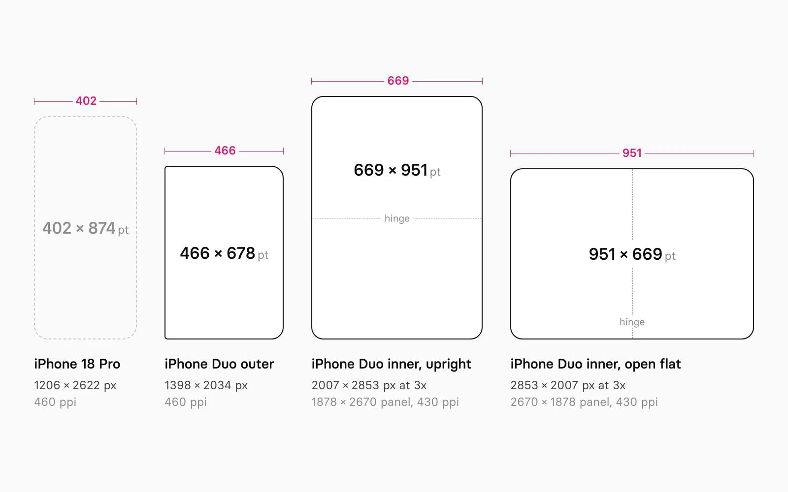
To design for iPhone Duo in Figma, draw every screen on two frames: 466 × 678 points for the outer display and 951 × 669 points for the inner display opened flat, plus 669 × 951 for the inner display held upright. Stack the status bar, toolbar and tab bar in a vertical bar on the trailing edge in every pose except the upright inner display, keep content clear of the cameras and the fold, and put the values that change between the displays in a variable mode.
Appetite UI is a Figma UI kit for iOS and Android apps, built like a design system. One token source drives Apple and Material components in light and dark mode, and exports to SwiftUI, Jetpack Compose, Flutter and CSS. Its file draws 8 apps on both iPhone Duo displays, and those pairs are the worked examples below.
I build Appetite UI, so the frames, rail and variables below are read from its file. Where the kit's value isn't Apple's, the text says so.
What changes when an iPhone folds?
iPhone Duo gives one app two displays and six poses: a 5.4-inch outer display for the closed phone and a 7.6-inch inner display that opens like a book, each with its own front camera. Apple announced it on September 9, 2026; pre-orders open on October 16, and it ships on October 23 with iOS 27.1.
Apple's guidelines reduce the poses to two layouts: "A compact width layout for the outer display and a regular width layout for the inner display give you the fundamentals for every pose." And "you're still designing for iPhone", so iOS patterns hold. What moves is the frame around the content: bars go to the side, and two cameras and a fold take space.
The number a Figma file starts from, the frame size in points, is on none of Apple's guideline pages:
| Material | Where | What it gives you |
|---|---|---|
| Display pixels and density | iPhone Duo tech specs | 1398 × 2034 at 460 ppi outside, 1878 × 2670 at 430 ppi inside |
| Design guidance | Human Interface Guidelines, September 9 | Poses, size classes, vertical controls, reserved regions |
| Developer guidance | A technology overview, six tech talks | Bar rules, reserved region and arrangement APIs |
| Screenshot sizes | App Store Connect | 1398 × 2034 and 2007 × 2853 pixels |
| Figma components | iOS and iPadOS 27 UI kit, version 27.1.0 | Duo bars, sheets, keyboards and example frames |
| Bezels | Apple Design Resources, September 18 | Photoshop and PNG |
| Point sizes | No guideline page | Arithmetic from the pixels, matched by Apple's kit |
What size are the iPhone Duo displays in points?
The outer display is 466 × 678 points and the inner display 951 × 669 points open flat, or 669 × 951 upright. Apple publishes pixels, so these are arithmetic at 3x, the scale that makes iPhone 18 Pro's 1206 × 2622 pixels a 402 × 874 point frame. The Layout page of the guidelines added device sizes every September from 2022 to 2025; since its September 9, 2026 update it lists none.
| Display | Panel pixels | Density | Screenshot pixels | Points at 3x |
|---|---|---|---|---|
| iPhone Duo outer, 5.4-inch | 1398 × 2034 | 460 ppi | 1398 × 2034 | 466 × 678 |
| iPhone Duo inner, 7.6-inch | 1878 × 2670 | 430 ppi | 2007 × 2853 | 669 × 951 |
| iPhone 18 Pro, 6.3-inch | 1206 × 2622 | 460 ppi | 1206 × 2622 | 402 × 874 |
Pixels and densities from Apple's tech specs, screenshot sizes from App Store Connect, read on October 4, 2026. Points are the screenshot pixels divided by three.
Some pages give the inner display as 626 × 890 points, the panel's 1878 × 2670 pixels divided by three. App Store Connect asks for 2007 × 2853 pixel screenshots of that display, more than the panel holds; the one reading that fits both is a 669 × 951 point layout drawn at 3x and scaled down about 6.4 percent. Apple's app preview specifications list the same arrangement for the 5.5-inch Plus iPhones, 2208 × 1242 rendered pixels on a 1920 × 1080 panel, and Apple's Figma kit draws the inner display at 669 × 951.
The scaling keeps one physical size: 153.3 points per inch outside and 153.2 inside. A 44 point target measures about 7.3 mm on both displays.
Next to iPhone 18 Pro, the outer display is 64 points wider and 196 shorter, with 90 percent of its area, the figure in Apple's announcement. The inner display holds twice the points of the outer one.
Which frames does one screen need?
One screen needs two frames you design, 466 × 678 and 951 × 669, and four you check: the closed phone turned sideways, the inner display upright, the inner display partly folded, and Split View. Apple says the poses don't need layouts of their own: "Supporting the device's various poses doesn't mean designing a custom layout for each one."
| Pose | Display | Frame in points | Width and height class | Bars |
|---|---|---|---|---|
| Closed | Outer | 466 × 678 | Compact, regular | Vertical, trailing edge |
| Closed, sideways or as a tent | Outer | 678 × 466 | Compact, compact | Vertical, trailing edge |
| Open wide | Inner | 951 × 669 | Regular, regular | Vertical, trailing edge |
| Open tall | Inner | 669 × 951 | Regular, regular | Horizontal, top and bottom |
| Partly folded like a book | Inner | 951 × 669 | Regular, regular | Vertical; buttons move off the fold |
| Folded like a laptop | Inner | 669 × 951 | Regular, regular | Horizontal; controls in the bottom half |
| Split View | Inner | Half of 951 per app | Set by the system | Vertical, on each app's outer edge |
Apple's kit draws its examples on the same frames, plus an Inner (Folded) state at 951 × 669. Appetite UI draws the two design frames for every app; the other states are your checks. Keep both at one zoom level, since a point is the same size on both displays.
Where do the bars go, and how do you build the rail?
The status bar, toolbar and tab bar stack in one vertical bar on the trailing edge in every pose except the upright inner display, where horizontal bars return. Apple lists what shares that edge, top to bottom: "the Dynamic Island, the status bar, the toolbar (including navigation buttons), and the tab bar."
- Order. "Reserve the top of the vertical axis for primary navigation controls, like Back or Close, followed by prominent actions, like Done." The tab bar stays at the bottom.
- Symbols only. Title-only items, custom views, text buttons and segmented controls stay horizontal.
- Overflow. Items overflow from bottom to top; navigation views compress the toolbar first, task views the tab bar.
- Containers. In a split view only the detail column goes vertical. Inspectors stay horizontal, and inner display sheets too, unless placed trailing.
- Hardware edge. The bar keeps its side in right-to-left languages, so mirror the content, not the bar. In Split View each app uses its outer edge.
Vertical bars "allow flexible item height and have a fixed width": in Figma, a vertical auto layout frame of fixed width with a top and a bottom group. Appetite UI's rail is 96 points wide, 24 + 48 + 24, its groups 24 from the top, bottom and edge. Status Bar - Duo is 48 × 86, Toolbar - Duo a back button over one to three actions at 48 × 106, 168 or 222, and Tab Bar - Duo two to four tabs at 48 × 110, 160 or 210. The touch target stays 44.
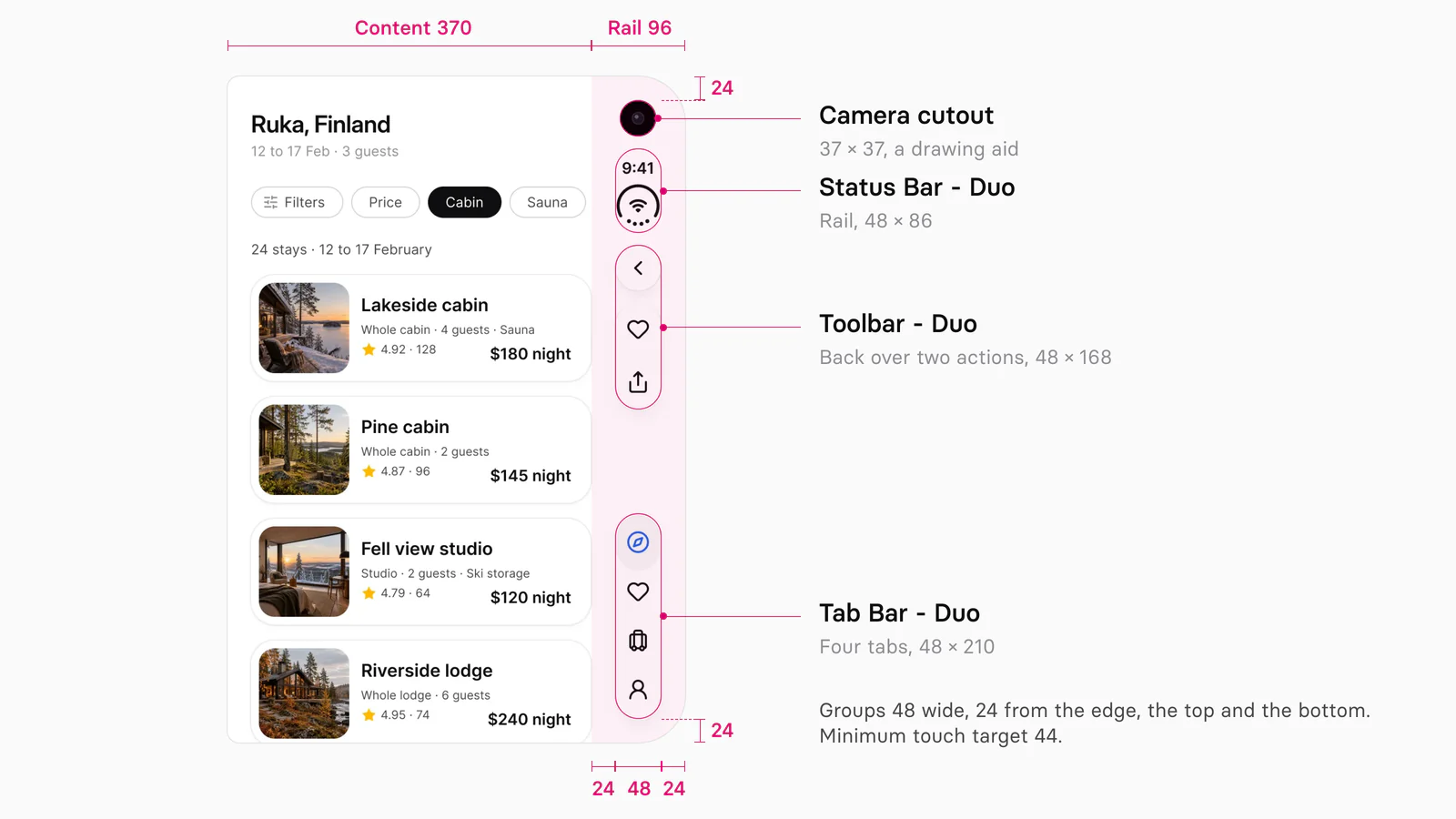
Apple's kit places the groups identically and reserves less around them:
| Part | Apple's iOS and iPadOS 27 kit | Appetite UI |
|---|---|---|
| Bar groups | 48 wide, 24 from the edge, top and bottom | 48 wide, 24 from the edge, top and bottom |
| Inset at the bar edge | 84: 48 plus 12 inside and 24 outside | 96: 48 plus 24 on each side |
| Status bar, vertical | 48 × 86 | 48 × 86 |
| Tab bar, vertical | 2 to 5 tabs, 48 × 110 to 260, minimized 48 × 48 | 2 to 4 tabs, 48 × 110 to 210 |
| Outer camera | 37 point lens | 37 point cutout, a drawing aid |
Checked on , against Apple's iOS and iPadOS 27 kit for Figma, version 27.1.0, and the Appetite UI file.
Appetite UI's 96 is a design reserve, 12 points wider than Apple's inset; take the real inset from the system in code. Upright inside, use the standard iOS / Tab Bar and iOS / Toolbar with the Duo status bar's Compact layout, 92 × 48. The iOS mirror page lists every Duo set.
How should a screen change between displays?
Keep the same functions and state on both displays, and let the inner display add one level of hierarchy. Apple's rule: "Keep functionality and the state of elements the same between displays. Maintain your app's information hierarchy, but show an additional level of hierarchy on the larger inner display if it makes sense for your content." Mail shows a list or a message when closed and both when open. Apple's designers also offer two columns or the tab bar as a sidebar, and warn: "You don't want just a stretched out iPhone app."
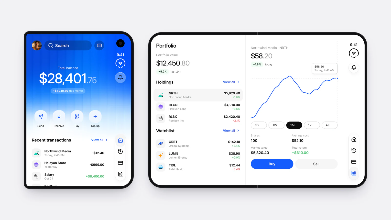
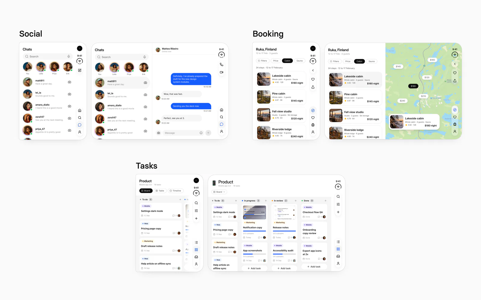
Appetite UI's pairs use split panes and a wider board:
| App | Outer display, 370 beside the rail | Inner display, 951 wide |
|---|---|---|
| Onboarding | Welcome screen | Photo 421 beside a sign-up form 530 |
| AI | One conversation | Recents sidebar 316 beside the conversation 634 |
| Finance | Home dashboard | Holdings 421 beside a position chart 530 |
| Fitness | Exercise library | Library 421 beside the running exercise 529 |
| Booking | List of stays | List 421 beside a map 529 |
| Foodie | Nearby restaurants | List 421 beside the restaurant page 529 |
| Social | Chats and stories | Chat list 421 beside the conversation 529 |
| Tasks | Board, two columns in view | Board, four columns, 855 beside the rail |
Read from the iPhone Duo page of the Appetite UI file on October 4, 2026. The right pane runs under the 96 point rail.
Six pairs keep the person's place and add the next level: the chat list gains the conversation, the stays gain a map. Finance and Onboarding open a different screen inside, the portfolio tab and sign-up. That suits a showcase; in a product, open on the screen the person left.
How do safe areas and reserved regions work?
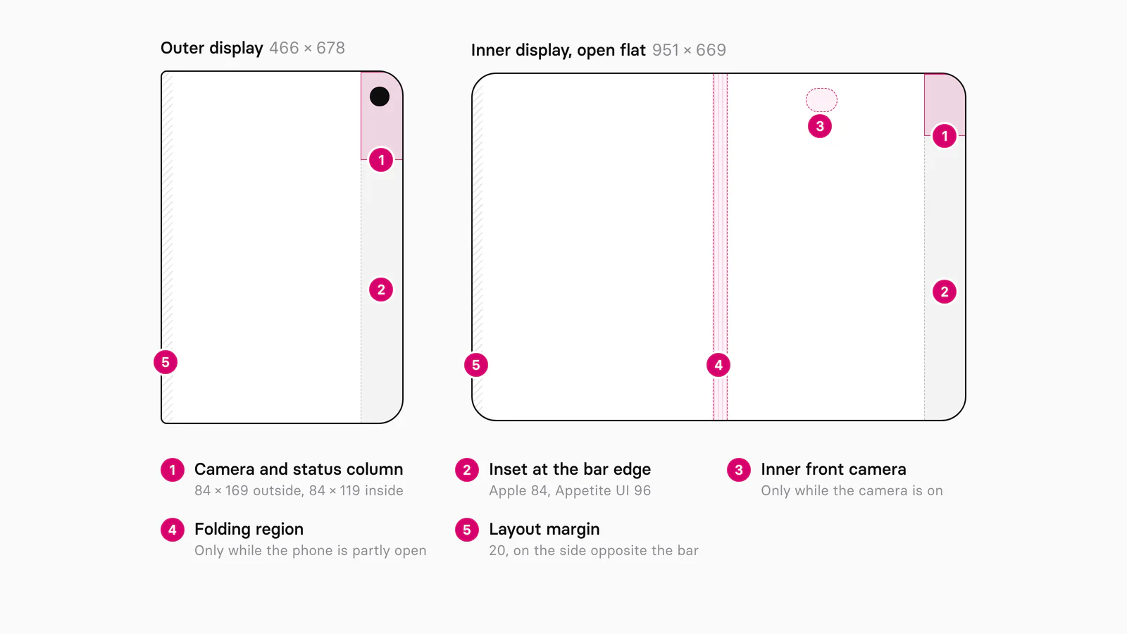
Safe areas keep content clear of the bars, and reserved regions keep it clear of hardware: the outer camera always, the inner camera while it is on, and the fold while the phone is partly open. In Apple's API an occlusion covers part of a view, like a camera, and a division cuts an area in two, like the fold.
| Region | Display | Kind | When it is there |
|---|---|---|---|
| Outer front camera | Outer | Occlusion | Always; it grows into the Dynamic Island for Live Activities |
| Inner front camera | Inner | Occlusion | Only while the camera is active |
| Folding region | Inner | Division | While the phone is partly open |
Insets are asymmetric: Apple tells developers to "avoid assuming that insets on opposite sides are equal", since vertical buttons can sit on the left in landscape and Split View. Apple's kit draws this as overlays: an 84 point inset at the bar edge, a 20 point layout margin opposite, and Reserved Region shapes of 84 × 169 outside and 84 × 119 inside. Do the same: one top layer group per frame with the cameras, the fold and the insets as tinted shapes, hidden before export.
Apple publishes no width for the folding region. Draw it as a band centered on the hinge, 475.5 points from the leading edge of the 951 frame, and keep buttons out of it; scrollable content "doesn't need to avoid this region". Appetite UI's top and bottom safe areas of 24 in the Duo modes are design reserves too, content margins rather than hardware clearance.
Which layouts survive the fold?
Layouts that split into even halves survive the fold: a split view, a split or overlay arrangement, and a grid with an even number of columns. When the phone folds, Apple's split view goes to an even split, and alerts, menus and sheets slide off the fold. For custom layouts, iOS 27.1 adds ArrangementView in SwiftUI and UIArrangementViewController in UIKit:
- A split arrangement sets its two views side by side when it is wider than tall, and stacks them when it is taller.
- An overlay arrangement layers the primary view over the secondary one, and moves them to each side of the fold when the phone is partly open.
In Figma, a split arrangement is a horizontal auto layout frame whose two children fill it; draw the folded state as a second frame where they meet at the hinge. For grids Apple says "prefer an even number of columns so content divides cleanly", and for every change, "favor small adjustments over rearrangement".
Appetite UI's grid styles use 6 columns inside and 4 outside, with a 16 point gutter and margin. The inner grid sits on the 855 point content frame beside the rail, so in the flat pose its middle gutter is at 427.5, left of the hinge at 475.5. In a folded frame, let the columns follow the two halves of the display.
The outer display takes other counts too: Apple's Calculator uses five columns of four keys there, against four columns of five on iPhone 16.
How do both displays stay on one token set?
Both displays read the same color, type, radius and motion tokens; only geometry changes, so it belongs in a variable collection with one mode per display. Appetite UI's Platform collection holds 20 variables on five modes: ios-md, ios-lg, android, ios-duo-outer and ios-duo-inner. Against ios-lg, the Duo modes change this:
| Variable | ios-lg | ios-duo-outer | ios-duo-inner |
|---|---|---|---|
grid/ | 62 | 24 | 24 |
grid/ | 34 | 24 | 24 |
grid/ | 0 | 96 | 96 |
platform/ | 49 | 0 | 0 |
grid/ | 4 | 4 | 6 |
platform/ | 0 | 0 | 262 |
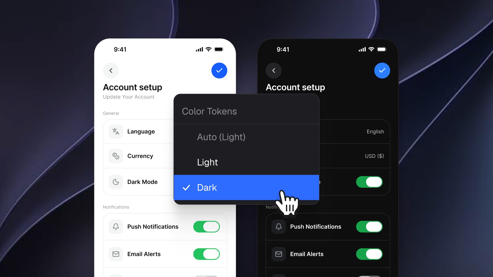
Everything else keeps its ios-lg value, such as the 44 point touch target and the 48 point device corner. The two Duo modes differ only in the column count and the sidebar width, so a component built once reflows when its frame switches from outside to inside. A dark frame adds Color Tokens = Dark beside the Platform mode, the setup in Dark mode with Figma variables, not duplicate frames, and Platform Bridge keeps your brand on the Apple slots. Apple's kit has no variable mode for iPhone Duo: its Duo frames are drawn, not switched.
How do Android foldables compare?
Android describes the same hardware with window size classes and postures: a window under 600 dp wide is compact, 600 to 840 dp medium and 840 to 1200 dp expanded, and a half-opened fold is a book or tabletop posture. Google puts "most large unfolded inner displays in portrait" in the medium class, and in landscape at least expanded. Jetpack WindowManager reports the fold as a FoldingFeature with a state, FLAT or HALF_OPENED, an orientation, and whether it separates or occludes the display.
| Aspect | iPhone Duo | Android foldables |
|---|---|---|
| Layout signal | Size classes: compact outside, regular inside | Window size classes at 600 and 840 dp |
| Half-open fold | Partly folded; the fold is an active division | HALF_OPENED, book or tabletop posture |
| Fold in code | ReservedRegion, UIView.ReservedRegion | FoldingFeature |
| Navigation when wide | Tab bar in the vertical bar, or a sidebar | Navigation rail |
| Navigation on a table | Horizontal bars, controls in the bottom half | Navigation bar |
Google's NavigationSuiteScaffold shows a navigation bar when the window is compact or in tabletop posture, and a navigation rail otherwise; iPhone Duo's vertical bar carries toolbar, tab bar and status bar together on the hardware edge. Appetite UI draws no Material adaptive layout: an Android foldable starts from the android mode and the M3 / Navigation bar. More in iOS vs Material 3: what changes per component, How to design one app for iOS and Android in Figma and on the platforms page.
What can't Figma show?
Figma shows fixed frames, so the fold, the move between displays and the insets iOS reports have to be checked in Xcode's iPhone Duo simulator or on the phone:
- The fold. A frame marks the region, not the curve, the crease or the moment it turns active.
- Resizing mid-task. Content moves between displays as the phone opens, and its state must survive; a prototype only jumps between frames.
- The main screen. On a device with two displays Apple calls a main screen reference "ambiguous" and says it "will be deprecated in a future release".
- The build. "When you build with Xcode 26 and earlier, your app doesn't extend under the status bar and camera." With the iOS 27.1 SDK it reaches the edge, and Xcode 27.1's Device Hub simulator opens, closes, rotates and folds the phone.
Before handoff:
Draw the two design frames
466 × 678 and 951 × 669, at one scale, from the same components.
Add the four check frames
678 × 466, 669 × 951 with horizontal bars, the folded inner display, and half of it for Split View.
Order the vertical bar
Back or Close, then Done, then the other actions, the tab bar at the bottom. Give every item a symbol and a title.
Overlay the reserved regions
Cameras and fold where they apply, hidden before export.
Switch the modes
Platform to ios-duo-outer or ios-duo-inner, Color Tokens to Light and Dark; check that nothing clips.
Hand over the insets as intent
Mark which margins are design reserves and which come from the system, then test the build in Device Hub.
The iPhone Duo screens page lists every rail part and pane, the screens overview shows the pairs beside the other apps, the read-only preview opens the whole file, and pricing lists what each license includes.
Questions
What is the iPhone Duo screen size in points?
The outer display is 466 × 678 points and the inner display 951 × 669 points open flat, or 669 × 951 upright. Apple publishes pixels, 1398 × 2034 outside and 1878 × 2670 inside; the inner points come from App Store Connect's 2007 × 2853 pixel screenshots at 3x, and Apple's Figma kit uses the same frames.
What Figma frame size should I use for iPhone Duo?
Use 466 × 678 for the outer display and 951 × 669 for the inner display open flat, plus 678 × 466 and 669 × 951 for the rotated poses. Skip 626 × 890: it divides the inner panel's pixels by three and ignores the scaling iOS applies there.
Does Apple have an iPhone Duo Figma template?
Yes, inside its iOS and iPadOS 27 UI kit for Figma rather than as a separate file. Version 27.1.0 of the kit, dated September 13, 2026, added iPhone Duo keyboards, toolbars, tab bars, status bars, sheets and example frames. Apple's license limits the kit to mock-ups of software for Apple's own operating systems.
Where do the tab bar and toolbar go on iPhone Duo?
On a vertical bar at the trailing edge, under the Dynamic Island and the status bar, in every pose except the inner display held upright. Back or Close sits at the top, then Done and the other toolbar items, and the tab bar stays at the bottom. Text-only items stay in a horizontal bar.
Will an existing iPhone app work on iPhone Duo without changes?
Yes, but it won't use the whole display. Apple says an app works without rebuilding: closed, it uses the space left of the status bar and camera, and open, it keeps a familiar size and aspect ratio. Built with the iOS 27.1 SDK, it reaches the edge and its standard bars turn vertical.
Sources
- Apple Newsroom: Apple unveils iPhone Duo, read October 4, 2026
- Apple: iPhone Duo technical specifications, read October 4, 2026
- Apple: iPhone 18 Pro technical specifications, read October 4, 2026
- Apple Human Interface Guidelines: Designing for iPhone Duo, read October 4, 2026
- Apple Human Interface Guidelines: Layout, read October 4, 2026
- Apple Developer: Preparing your app for iPhone Duo, read October 4, 2026
- Apple Developer: Get ready for iPhone Duo, read October 4, 2026
- Apple tech talk: Design for iPhone Duo, read October 4, 2026
- Apple tech talk: Prepare your app for iPhone Duo, read October 4, 2026
- Apple tech talk: Raise the bar with iPhone Duo, read October 4, 2026
- Apple tech talk: Strike a pose with adaptive layouts on iPhone Duo, read October 4, 2026
- App Store Connect Help: Screenshot specifications, read October 4, 2026
- App Store Connect Help: App preview specifications, read October 4, 2026
- Apple Design Resources, read October 4, 2026
- Apple Developer News: Build for iPhone Duo with new resources, read October 4, 2026
- Apple Design: What's new, read October 4, 2026
- Apple on Figma Community: iOS and iPadOS 27, version 27.1.0, read October 4, 2026
- Android Developers: Use window size classes, read October 4, 2026
- Android Developers: Make your app fold aware, read October 4, 2026
- Android Developers: Build adaptive navigation, read October 4, 2026
- Figma Learn: Modes for variables, read October 4, 2026