Touch target size on iOS and Android: 44 pt, 48 dp and the WCAG minimum
Touch target size is 44 × 44 pt on iOS, 48 × 48 dp on Android and 24 × 24 CSS px in WCAG 2.2, checked against one Figma file

On this page
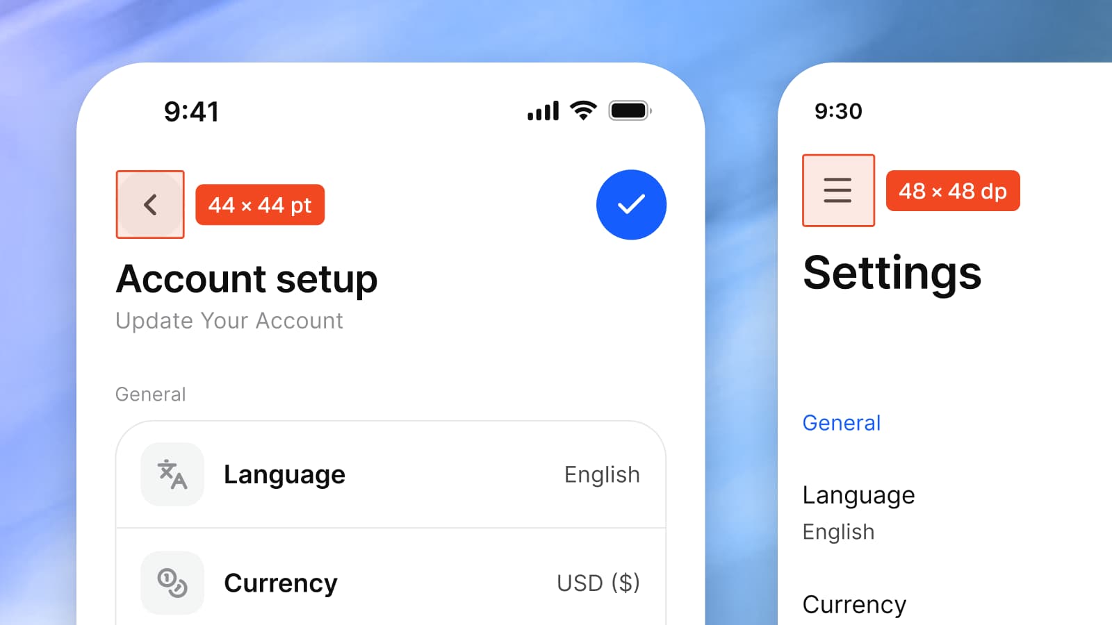
The minimum touch target is 44 × 44 points on iOS, 48 × 48 dp on Android and 24 × 24 CSS pixels in WCAG 2.2, with 44 × 44 CSS pixels as its stricter AAA level. Apple calls 44 points the hit region a button needs and the default control size on iPhone, and lists 28 × 28 points as the smallest control it accepts; Google asks for 48 dp "even if this extends past the UI element visual".
Appetite UI is a Figma UI kit for iOS and Android apps, built like a design system. One token source drives Apple and Material components in light and dark mode, and exports to SwiftUI, Jetpack Compose, Flutter and CSS. Its file draws both platforms' components, and the tables below measure them.
I build Appetite UI, so the measurements below are read from its file, with the shortfalls included. Where a number is mine and not a platform's, the text says so.
What is the minimum touch target size on iOS and Android?
On iOS the minimum is 44 × 44 points, on Android 48 × 48 dp. Apple's Buttons page says: "As a general rule, a button needs a hit region of at least 44x44 pt". Apple's Accessibility page gives a default control size of 44 × 44 points for iOS and iPadOS and a minimum control size of 28 × 28, so 44 is the size to design to and 28 is the floor Apple names. Google's Android guidance says: "we recommend that each interactive UI element have a focusable area, or touch target size, of at least 48dp x 48dp. Larger is even better."
| Source | Size | Level or status | What the source says |
|---|---|---|---|
| Apple, Buttons | 44 × 44 pt | General rule | "A button needs a hit region of at least 44x44 pt" |
| Apple, Accessibility | 44 × 44 pt default, 28 × 28 pt minimum | iOS and iPadOS | Table of default and minimum control sizes per platform |
| Android Developers | 48 × 48 dp | Recommendation | "At least 48dpx48dp. Larger is even better." |
| Android design guidance | 48 dp | Recommendation | "Ensure all touch targets are at least 48 dp, even if this extends past the UI element visual." |
| WCAG 2.2, 2.5.8 | 24 × 24 CSS px | Level AA | Target size for pointer inputs, with exceptions |
| WCAG 2.2, 2.5.5 | 44 × 44 CSS px | Level AAA | Target size for pointer inputs, with fewer exceptions |
Wording from Apple's Human Interface Guidelines, Android Developers and the W3C's Understanding pages, read on October 8, 2026.
The two platform numbers describe nearly the same fingertip. On iPhone 18 Pro, 460 pixels per inch at 3x, 44 points are 132 pixels, or 7.3 mm. Android defines dp relative to a 160 dpi screen, and 48 dp are then 7.6 mm. Google's accessibility help says "about 9mm", which the definition doesn't give; I use the definition. A point and a dp are different units, but the two minimums agree to within 0.3 mm.
What does WCAG 2.2 require, and where does it apply?
WCAG 2.2 requires targets for pointer inputs of at least 24 by 24 CSS pixels at level AA (success criterion 2.5.8, Target Size (Minimum)), and 44 by 44 CSS pixels at level AAA (2.5.5, Target Size (Enhanced)). Both are written for web content. A native app has no CSS pixels, so for an iOS or Android build the platform numbers decide, and WCAG is the number for the web view and the marketing site. The Understanding page points important controls at the stricter 2.5.5 as a best practice.
| Exception | 2.5.8 Minimum, AA, 24 × 24 CSS px | 2.5.5 Enhanced, AAA, 44 × 44 CSS px |
|---|---|---|
| Spacing | Undersized targets pass when a 24 CSS pixel circle centered on each one's bounding box doesn't intersect another target or another undersized target's circle | None |
| Equivalent | The function can be achieved through a different control on the same page that meets the criterion | The target is available through an equivalent link or control on the same page of at least 44 × 44 |
| Inline | The target is in a sentence or its size is otherwise constrained by the line height of non-target text | The target is in a sentence or block of text |
| User agent control | The size is determined by the user agent and isn't modified by the author | The same |
| Essential | A particular presentation is essential or legally required for the information conveyed | A particular presentation is essential to the information conveyed |
Quoted from the W3C Understanding pages for 2.5.8 and 2.5.5, read on October 8, 2026.
The spacing exception is the one that changes design. The Understanding page draws it with a toolbar: 20 × 20 pixel buttons with 4 pixels between them pass, because the 24 pixel circles don't touch, and the same buttons with no gap fail. A target below 24 pixels is allowed when nothing else sits within reach, and that is a rule about gaps, not about artwork.
Is a touch target the same as the visual size?
No. The visual size is the shape you draw, the touch target is the region that responds, and the rules measure the second. Google's design guidance allows the target to "extend past the UI element visual", and Compose does it for you: a clickable smaller than the minimum has its touch target expanded outside its bounds, and Material components such as Checkbox, RadioButton, Switch and Slider pad themselves to 48 dp once they can receive actions. Apple's Buttons page says the same of macOS image buttons: "An image button's edges define its clickable area even when they aren't visible."
Figma has no hit area property, so a design file shows the target in one of three ways:
- A bigger frame around a smaller shape. A 24 point box inside a 44 point frame. The frame is the target, and a developer can measure it.
- A transparent hit layer. A named layer, for example
Hit area, that extends past the drawn shape and overlaps nothing else. - Nothing. The shape is the only thing drawn, and the target depends on the developer remembering.
The third is the common case, and the tables below show how often a kit relies on it.
Which Apple controls are under 44 points?
In the iOS mirror of the Appetite UI file, the toolbar actions, the switch, the stepper, the small and medium buttons and the small segmented control are under 44; the back button, tab bar items, list rows and text field meet it. The mirror redraws Apple's iOS 27 patterns as Figma components, and the frame is what a developer measures.
| Control | Component | Drawn | Frame in the file | Against 44 pt |
|---|---|---|---|---|
| Back button | iOS / Toolbar - Duo, Back | 24 chevron | 44 × 44 inside a 48 × 48 capsule | Meets |
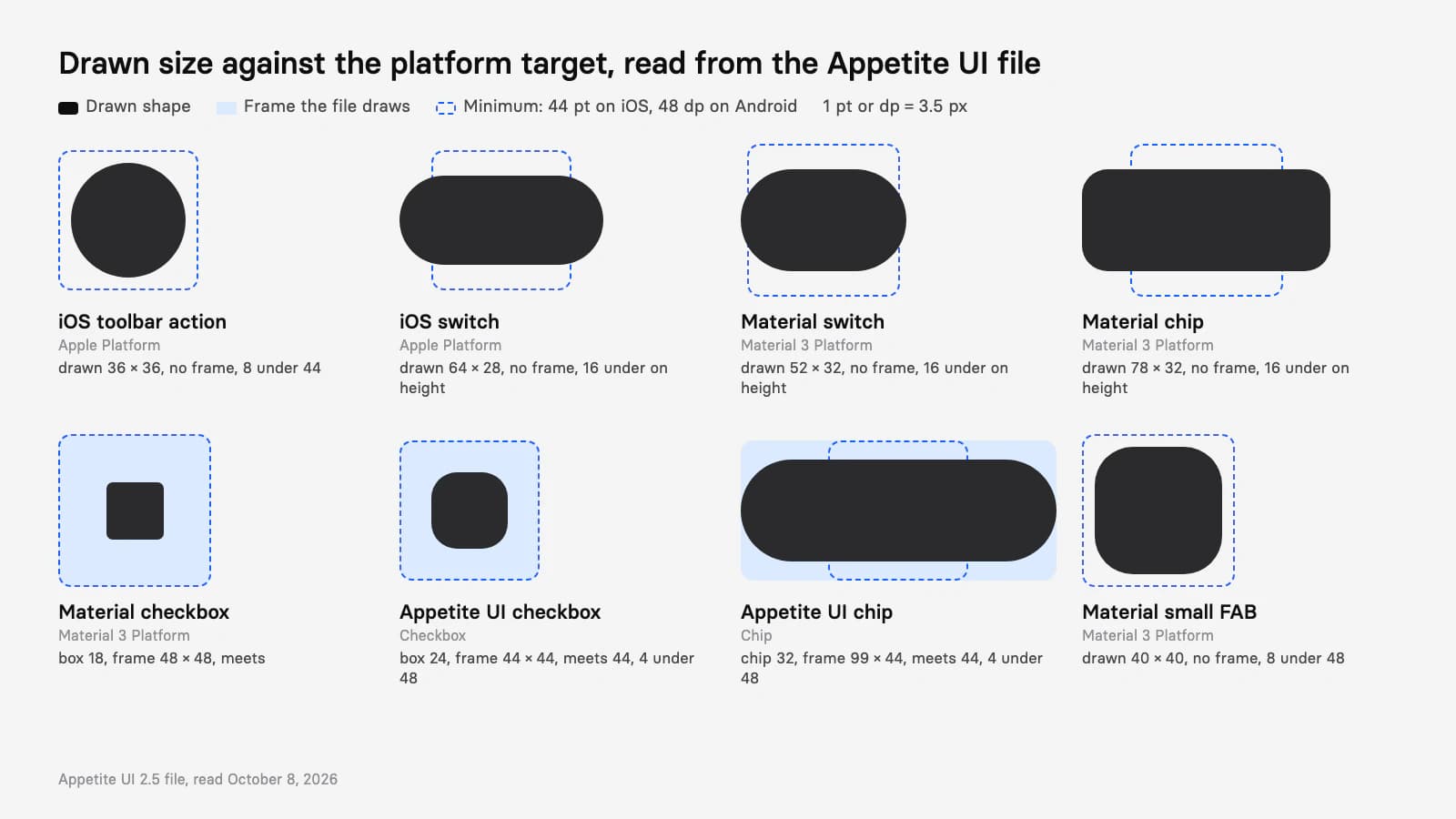
| Toolbar action | iOS / Toolbar, Action | 24 glyph | 36 × 36 inside a 48 high capsule, 54 between centers | Below by 8; no hit frame |
| Tab bar item | iOS / Tab Bar, 2 to 5 tabs | Icon and label | 54 high, 172 to 68.8 wide | Meets |
| Switch | iOS / Toggle | 64 × 28 track, 38 × 24 knob | 64 × 28 | Below by 16 on height; no hit frame |
| Segmented control | iOS / Segmented Control | Small 32 high, Large 50 | Segments 28 and 46 high | Small below by 16; Large meets |
| Stepper | iOS / Stepper | 92 × 32 | Two halves of 46 × 32 | Below by 12 on height |
| List row | _List Row | Regular 52, Tall 68 | Same | Meets |
| Text field | iOS / Text Field | 402 × 52 row | Same | Meets |
| Button, text | iOS / Button | Small 28, Medium 34, Large 50 high | Same | Small below by 16, Medium by 10; Large meets |
| Button, icon only | iOS / Button | 36 × 28, 34 × 34, 50 × 50 | Same | Small and Medium below; Large meets |
| Pop-up button | iOS / Pop-up Button | 120 × 44 | Same | Meets |
Read from the Apple Platform pages of the Appetite UI file on October 8, 2026. The frame is the layer's width and height; Apple's mirror draws no separate hit frame.
Two readings matter. The toolbar actions are 36 points, a size the mirror draws on purpose: 54 points between centers leave 10 points of room around each one, so a developer can extend each hit region to 44 without two regions overlapping. The file doesn't draw that region. The small button is 28 high, the same number as the minimum control size on Apple's Accessibility page, so it sits on the floor Apple names and 16 under the size it recommends.
Apple's mirror has no checkbox, radio, chip or floating action button, because iOS has none of them.
Which Material 3 controls are under 48 dp?
In the Material mirror of the Appetite UI file, the switch, the chip, the small FAB and the standalone icon button are under 48; the app bar buttons, checkbox, radio, navigation bar, list items, text field and larger buttons meet it. The mirror draws a 48 frame around the controls Material designs small, and leaves out the frame for others.
| Control | Component | Drawn | Frame in the file | Against 48 dp |
|---|---|---|---|---|
| Menu or back button | M3 / Top app bar, Leading | Icon of 24 | 48 × 48 | Meets |
| App bar action | M3 / Top app bar, Action | Icon of 24 | 48 × 48 each | Meets |
| Icon button | M3 / Icon button | 40 × 40 with an icon of 24 | 40 × 40 | Below by 8 |
| Navigation bar item | M3 / Navigation bar, 3 to 5 items | 64 × 32 indicator and a label | 51 high, 137.3 wide at 3 items | Meets |
| Switch | M3 / Switch | 52 × 32 track, 24 thumb | 52 × 32 | Below by 16 on height; no hit frame |
| Checkbox | M3 / Checkbox | 18 × 18 box | 48 × 48 | Meets |
| Radio | M3 / Radio | 20 ring, 10 dot | 48 × 48 | Meets |
| List item | M3 / List Item | 56, 72 or 88 high | Same | Meets |
| Floating action button | M3 / FAB | Small 40, Standard 56, Large 96 | Same | Small below by 8 |
| Extended FAB | M3 / Extended FAB | 142 × 56 | Same | Meets |
| Chip | M3 / Chip | 32 high, 78 wide for an assist chip | 78 × 32 | Below by 16 on height; no hit frame |
| Text field | M3 / Text Field | 56 high | 280 × 56 | Meets |
| Button, X-small and small | M3 / Button | Content 32 and 40 high | Frame 48 high | Meets through the frame |
| Button, medium to X-large | M3 / Button | 56, 96 and 136 high | Same | Meets |
Read from the Google Material 3 Platform pages of the Appetite UI file on October 8, 2026. The Material mirror has no segmented control.
Material's own components pad the smaller ones in code, so the shortfalls in this table are drawing choices, not behavior: the Compose page says a Switch or Checkbox adds the space itself once it can receive input. A design handed over with a 52 × 32 switch and nothing else leaves the developer to know it, and the mirror's checkbox shows the better habit: an 18 point box in a 48 point frame.
How do Appetite UI's own controls measure up?
Appetite UI draws its own controls at 44 or larger, except five. Most of them take a 44 frame around a smaller shape, which meets iOS and sits 4 under Android. The file shows where the target is built in, and where only code can add it.
| Control | Component | Drawn | Frame in the file | iOS 44 | Android 48 |
|---|---|---|---|---|---|
| Back button | Top Bars, Button md icon only | Icon of 22 | 44 × 44 | Meets | 4 under |
| Toolbar button | Toolbar, Button md icon only | Icon of 22 | 44 × 44, 4 apart | Meets | 4 under |
| Tab | Tabs, Default and Small | Label | Bar 48 or 36 high | Default meets, Small below | Default meets, Small below |
| Navigation item | Navigation | Icon of 24 and a label | 58 high, 168 wide at 2 tabs | Meets | Meets |
| Switch | Toggle | 44 × 28 control | 52 × 44 | Meets | 4 under on height |
| Checkbox | Checkbox | 24 × 24 box | 44 × 44 | Meets | 4 under |
| Radio | Radio | 18 control in a 22 disc | 44 × 44 | Meets | 4 under |
| Segmented control | Segmented Control | Selectors 40 and 30 high | Bar 48 and 38 high | Default meets, Small below | Default meets, Small below |
| List row | List, Default and Compact | 76 and 48 high | Same | Meets | Meets |
| Floating action button | Floating Action Button | 56 circle | 56 × 56 | Meets | Meets |
| Chip | Chip | 32 high capsule | 99 × 44 hit frame | Meets | 4 under |
| Text field | Input, Text Input | 56 high field | Same | Meets | Meets |
| Composer | Input, Composer | 40 high bar | 361 × 40 | Below by 4 | Below by 8 |
| Button | Button, sm, md and lg | 36, 44 and 56 high | Same | sm below, md and lg meet | sm and md below, lg meets |
| Compact button | Compact Button | 32 × 32 | Same | Below by 12 | Below by 16 |
Read from the Appetite UI file on October 8, 2026. The docs pages for Checkbox, Toggle, Chip and Button say the same.
Counting the table, five controls are below even the iOS 44 in at least one size: the small tab, the small segmented control, the composer, the small button and the compact button. Seven draw a 44 frame that is 4 under Android: back and toolbar buttons, switch, checkbox, radio, chip and the medium button. The navigation item, list row, floating action button, text field and large button clear both. The docs pages say what to do about each shortfall: the small button, the composer and the compact button take a hit area in code; the 44 frames take 4 dp more on Android.
How much space should sit between targets?
Leave enough space that a finger aimed at one target can't land on its neighbor. The platforms give three numbers, each for a different reason:
- WCAG 2.2, 24 CSS pixels. Undersized targets are allowed when 24 pixel circles centered on them don't intersect.
- Apple, 12 and 24 points. The Accessibility page says "about 12 points of padding around elements that include a bezel" and about 24 points around the visible edges of an element without one.
- Google, 8 dp. The Accessibility Help page recommends 48 × 48 dp targets "separated by 8dp of space or more".
Spacing and size trade against each other. The iOS mirror's 36 point toolbar actions at a 54 point pitch can each take a 44 point hit region with 10 points between regions; Appetite UI's Rating stars are 36 at a gap of 8, which makes a 44 point repeat, so on iOS the regions tile exactly, and on Android the row widens to a 48 pitch. Adjacent 44 point buttons with a 4 point gap, as in the Appetite UI toolbar, meet the Android number for spacing only if the gap grows to 8.
What should you hand to developers?
Hand over two numbers per control, the drawn size and the target size, and say which mode the target was checked in. A developer who gets one number guesses the other, and a design with only a drawn 36 points reads as a 36 point button.
Draw the target as a frame
Put the control inside a frame the size of its target, 44 on iOS and 48 on Android, and keep the drawn shape smaller inside it. Name the layer so it is found in Dev Mode.
List the shortfalls
Where a control is drawn under the minimum and has no frame, write it in the handoff: "Toolbar action: drawn 36, target 44, extend the hit region". The tables above are the shape of that list.
Check both platforms' numbers
A 44 frame passes iOS and sits 4 under Android. Say "add 4 dp" in the notes, or draw the 48 frame for the Android build.
Check the gaps
Measure the space between neighboring targets: 8 on Android, 12 around a bezeled element on iOS, and enough that a 24 pixel circle on an undersized web target touches nothing.
Test on a device
A frame shows the intent, and only a build shows whether the region responds. Tap the controls with a thumb, one handed, near the screen edge.
In code, the target is a modifier or a frame on top of the drawn shape:
Button(action: close) {
    Image(systemName: "xmark")
}
.frame(minWidth: 44, minHeight: 44)
.contentShape(Rectangle())Box(
Modifier
.minimumInteractiveComponentSize()
.clickable(onClick = close)
) {
Icon(Icons.Default.Close, contentDescription = "Close")
}Compose's own IconButton already does this; the modifier is for a custom clickable. A mode on the frame in Figma, the setup in How to design one app for iOS and Android in Figma, carries the 44 or the 48 once a layer is bound to the variable, and the component by component differences are in iOS vs Material 3: what changes per component.
The Dimensions page lists the Platform variables, Platform Bridge explains the modes, the iOS and Material 3 pages list every pattern measured here, the read-only preview opens the file, and pricing lists what each license includes.
Questions
What is the minimum touch target size on iOS?
44 × 44 points. Apple's Buttons page says a button needs a hit region of at least 44 × 44 points, and its Accessibility page gives 44 × 44 as the default control size on iOS and iPadOS, with 28 × 28 as the minimum control size.
What is the minimum touch target size on Android?
48 × 48 dp. Android Developers recommends a touch target of at least 48dp by 48dp, "larger is even better", and the Accessibility Help page adds 8dp of space between targets. The target may extend past the visible element.
Is 44 pt the same as 48 dp?
Nearly. A point and a dp are different units, but 44 points on an iPhone 18 Pro are 7.3 mm and 48 dp, at 1 dp = 1/160 inch, are 7.6 mm. Google's help says about 9 mm for 48 dp, which its own dp definition doesn't give.
What does WCAG 2.2 say about target size?
Success criterion 2.5.8 requires targets of at least 24 by 24 CSS pixels at level AA, with exceptions for spacing, equivalent controls, inline links, user agent controls and essential presentation. Criterion 2.5.5 asks for 44 by 44 CSS pixels at level AAA.
Can an icon be smaller than the touch target?
Yes. The icon is the visual and the target is the frame that responds, as in a 24 point icon inside a 44 or 48 square. Compose expands the target of a smaller clickable by itself, and on iOS you set a frame and a content shape.
Sources
- W3C: Understanding Success Criterion 2.5.8, Target Size (Minimum), read October 8, 2026
- W3C: Understanding Success Criterion 2.5.5, Target Size (Enhanced), read October 8, 2026
- W3C: Web Content Accessibility Guidelines 2.2, read October 8, 2026
- Apple Human Interface Guidelines: Accessibility, read October 8, 2026
- Apple Human Interface Guidelines: Buttons, read October 8, 2026
- Apple: iPhone 18 Pro technical specifications, read October 8, 2026
- Android Developers: Make apps more accessible, read October 8, 2026
- Android Developers: Accessibility for design, read October 8, 2026
- Android Developers: API defaults for accessibility in Compose, read October 8, 2026
- Android Developers: Grids and units, read October 8, 2026
- Android Accessibility Help: Touch target size, read October 8, 2026