AI chat screen design for iOS and Android, part by part
The anatomy of an AI chat screen on iOS and Android: header, model picker, messages, composer, files, streaming, errors and the empty state, in light and dark.

On this page
An AI chat screen has seven parts: a header with the model picker, the message list, the composer, attachments, a streaming state, an error state and an empty state. Neither iOS nor Android ships it as one component, so each part is built from controls the platforms do have, and the two states a finished reply never shows, streaming and failure, need the most design.
This guide walks the parts in the order a person meets them, with the kit's own AI chat screens in light and dark, and says where Apple's and Google's guidance decide the answer. I build Appetite UI, so the screens and the measurements are from its file and its code; where a choice is the kit's and not a platform's, the text says so.
What are the parts of an AI chat screen?
A chat screen is a header, a scrolling thread and a composer pinned to the bottom, plus the overlays that open from them: a history drawer and a tools menu. The thread holds two kinds of rows, the person's message and the assistant's reply, and each reply has three states: finished, still arriving and failed.
Neither platform has a component for it. Android's index of Compose components lists text fields, search, menus, chips, navigation drawers and snackbars, and no chat, message or prompt input. Apple covers generative AI with guidance rather than a control. So the parts map to platform pieces like this:
| Part | What it does | iOS | Android, Material 3 | In the Appetite UI file |
|---|---|---|---|---|
| Header | Opens history, switches the model, starts a new chat | Navigation bar with a centered title | Top app bar with a navigation icon | Two icon buttons and a title with a chevron |
| History | Lists recent chats and sections | A sidebar or a pushed list | Navigation drawer | Navigation Drawer |
| Message | The person's words | A bubble | A bubble | AI / Message, Role User |
| Reply | The model's answer with tables, sources and actions | Plain text in the reading width | The same | AI / Message, Role Assistant |
| Composer | Text, tools, send and stop | Text field in a raised card | Text field in a raised card | AI / Prompt Composer |
| Tools | Files, images, research modes | A menu | A menu | Context Menu |
| States | Empty, streaming, error, attachment | Drawn by the app | Drawn by the app | Variants of Message and Composer |
Android's pieces from its Compose pages under Sources; the kit's parts from the AI screens docs page, read on November 13, 2026.
The kit draws the chat as 11 screens, each in light and dark, and every solid color on them is bound to a variable. That last part decides more of the design than it seems:
- Solid fills and strokes on the light frames, all bound to variables
- 511
- Different variables behind those paints
- 22
- Paints in the brand color: send, stop and two buttons
- 7
What goes in the header?
The header holds three controls: a button that opens the history, the model picker in the middle and a button that starts a new chat. The model's name is the title, with a chevron that says it opens a choice, so the person always sees which model answers.
On iOS that is a navigation bar with a centered title; on Android, a top app bar whose navigation icon opens a drawer. Android's documentation calls the navigation drawer "a slide-in menu that lets users navigate to various sections of your app", opened by a swipe from the side or a tap on a menu icon. The kit's History screen does exactly that: Library, Projects, Agents, Explore, Scheduled and Images above a Recents list, with a Chat button at the foot.
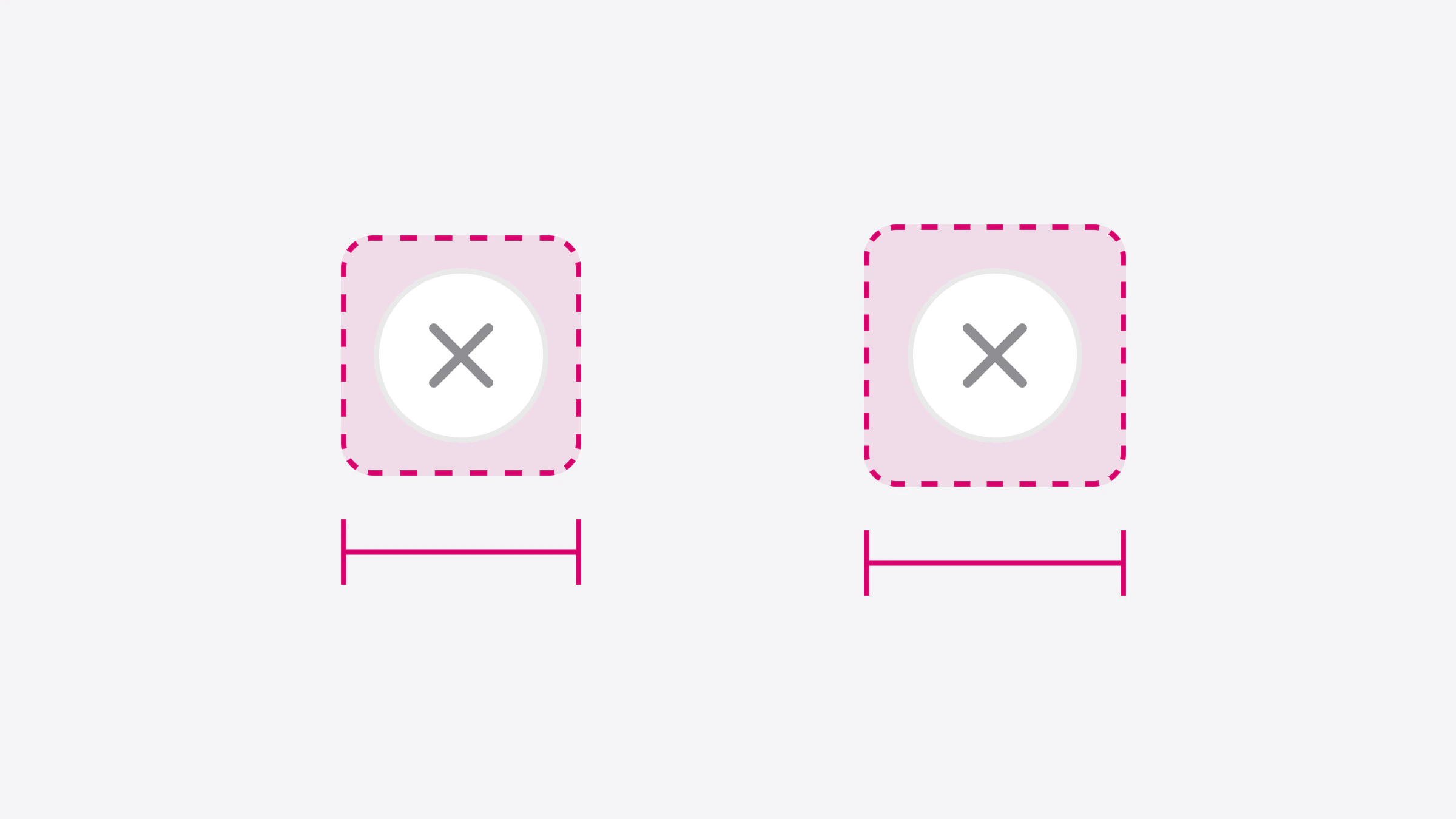
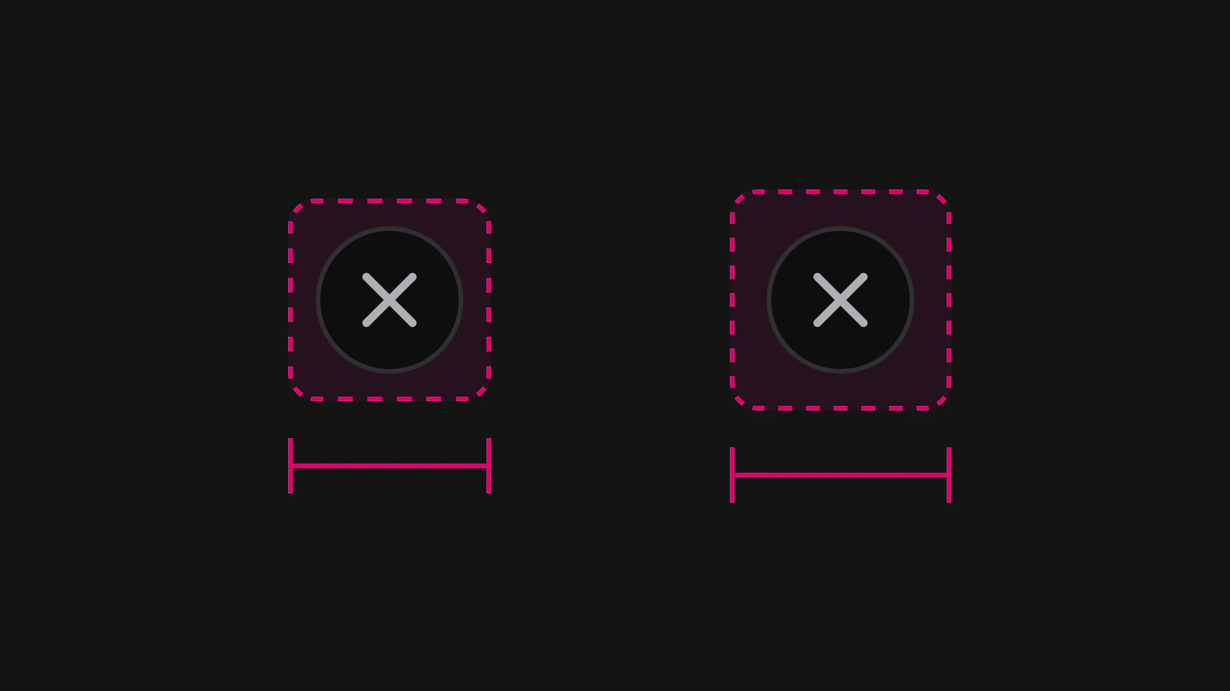
Two details carry over to code. The header buttons are icon only, so each needs a label a screen reader speaks, "Open history" and "New chat", not "Button". And each needs a target of 44 points on iOS and 48 dp on Android: Apple says "a button needs a hit region of at least 44x44 pt", and Google recommends "at least 48dpx48dp". The sizes are compared control by control in Touch target size on iOS and Android: 44 pt, 48 dp and the WCAG minimum.
How should messages and replies be laid out?
Put the person's message in a bubble on the trailing side and the reply as plain text across the reading width. A reply is often a table, a list, a picture or a row of sources, and a bubble would squeeze all of them into a shape made for one sentence.
The kit's user bubble is 280 points wide, filled with bg/, with corners of 20 except a 6 at the bottom right, the corner that points to the sender. The reply has no container at all: text in text/, a table, two source cards that name where a figure came from, and a row of four actions under it, copy, like, dislike and retry.
Those actions answer two of Apple's points for generative features. Retry gives people a way to "revert or retry" output they don't agree with, part of Apple's rule to "Keep people in control." Like and dislike are feedback, which Apple asks to be voluntary, suggesting "simple thumbs-up and thumbs-down buttons". In Appetite UI Code, the reply's text is selectable on both platforms, so a person can copy one figure instead of the whole answer.
What does the composer need?
The composer needs a text field, a tools button, a send button that becomes a stop button, and room for a file above the text. It stays at the bottom in every state, so a person's thumb never has to look for it.
The kit draws it as a raised card with a 32 point radius, the placeholder "Ask anything", a round plus button on the left and a round send button on the right. Send is grey while the field is empty and turns the brand color once there is text; in code it is announced as disabled until then. Both buttons are drawn at 32 points and answer a 44 point or 48 dp square, larger than they look.
An attachment is a row inside the composer: a tile with a paperclip, the file's name, its type and size, and a small remove button that also gets the full target.
On Android the composer also has to clear the keyboard. Compose does it with the imePadding() modifier on the content, which Android's keyboard guide shows on a list and a floating button, so the composer rides up with the keyboard instead of hiding under it.
How do you show a reply that is still arriving?
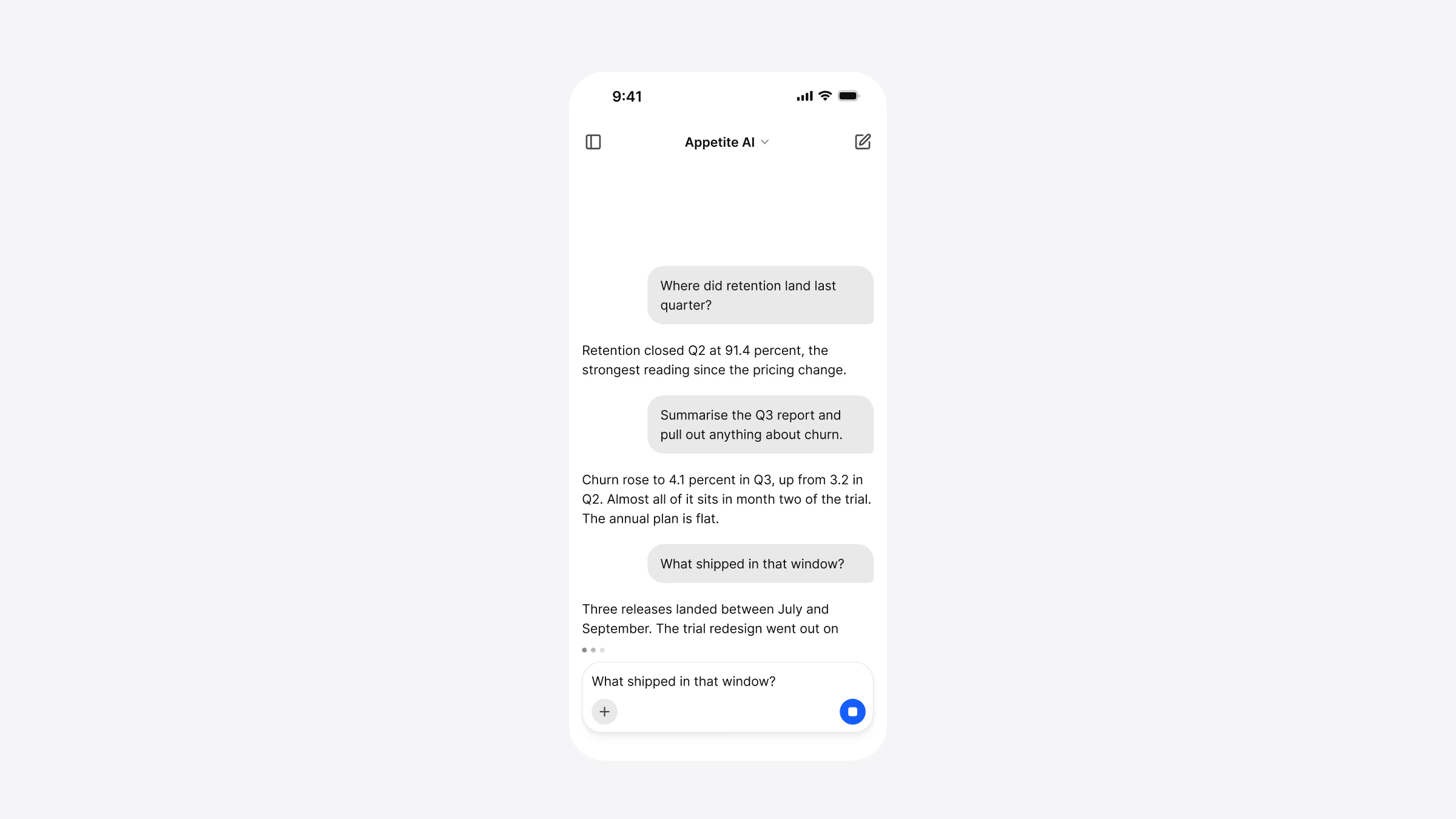
Show that the model is working before the first word, let the text grow in place, and turn send into stop for the whole time. The person must always be able to end a reply they no longer want.
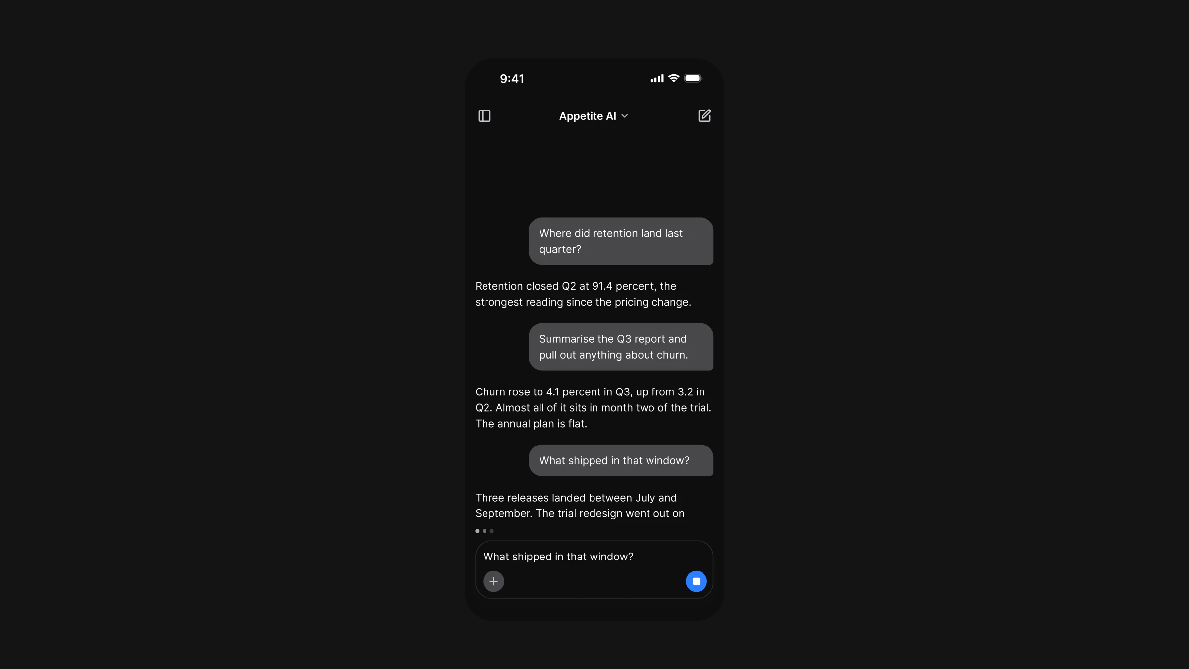
The kit's Generating screen does three things at once: the last reply stops mid sentence above a row of three small dots, the send button becomes a blue stop button with a square in it, and the composer stays where it was, ready for the next question. Apple's guidance asks for the same: models "typically take longer to produce a result", so design the wait, and a message that names what is happening is "more helpful than a vague status message". "Searching your board deck" beats "Thinking".
Streaming is also where accessibility goes wrong most often. A screen reader that announces every new word turns an answer into noise. WCAG 2.2 asks that status messages be announced without moving focus, at level AA, and Android's documentation warns that live regions "shouldn't be used on content that updates frequently". So announce the state once, "Generating", and the finished reply once; in Appetite UI Code the three dots are one element with one label for that reason.
What should an error look like in a chat?
An error is a row in the thread where the reply would have been: a warning icon, one sentence that says what happened, and a Try again button. The rest of the conversation stays, and so does the composer, so the person can retry, rephrase or move on.
describe what happened in plain language and offer a clear next step
The kit's Error screen says "The request timed out before a full answer came back", which names the cause, and offers one action. It is drawn in the error tokens, state/ behind and state/ for the text, in a 12 point rounded box. In code the icon and the text are one element announced as an alert, a polite live region on Android, and the button is a separate element after it, so a screen reader user hears the problem and then finds the way out.
Two things to avoid: a toast that disappears before the person reads it, and an error that clears what they typed.
What belongs on the empty state?
A new chat needs a greeting, a few suggestions and the composer, already focused or one tap away. The suggestions teach what the assistant can do better than a description of it would, and they turn an empty field into a first tap.
Apple suggests "curated suggestions that make it easy to get started" for open prompts, and diverse example inputs that hint at what is possible. The kit's New chat screen shows four chips, Summarize a PDF, Brainstorm names, Research a topic and Draft an email, under "Good morning, Maren". Apple also asks apps to "Clearly identify when and where you use AI": in a chat app the whole screen is the AI, so the header's model name does that job, and an assistant inside another app should say so in its title or first line.
How does dark mode work on a chat screen?
Dark mode is the same screen with every color resolved against a second set of values, so nothing is redrawn. The bubble, the composer and the error banner keep their tokens; the tokens change what they point to, and the screen follows the system setting.
Apple's advice is to "Avoid offering an app-specific appearance setting", because people expect an app to follow the choice they made for the whole device. Android lists System default as "the recommended default option" when an app does offer a choice. Both ask for contrast in every appearance: Apple sets 4.5:1 as the minimum and 7:1 as the aim for small custom text.
A chat screen is mostly text and grey, which makes dark mode easier than on most screens and puts the weight on a few tokens. On the kit's light frames, the brand color is 7 of 511 paints:
Where the color goes on the AI chat screens, by token
How one set of variables holds both modes is in Dark mode with Figma variables, not duplicate frames.
How do you build a chat screen that works for everyone?
Check the screen with the settings people actually use: a screen reader, large text, Reduce Motion and Dark. Most chat bugs show up only there, because the default screenshot never streams, never fails and never grows its text.
Label every icon button
Sidebar, model picker, new chat, plus, send, stop, copy, like, dislike, retry and remove each get a spoken label that names the action.
Give every button its target
44 points on iOS and 48 dp on Android, even where the drawing is 32 or 20.
Announce states, not tokens
Say "Generating" once and the finished reply once. Announce an error as an alert, and put the retry after it.
Let text grow
Apple asks apps to let people enlarge text "by at least 200 percent". Check that the bubble wraps, the composer grows and the header title truncates instead of overlapping.
Respect Reduce Motion and Dark
The typing dots can stand still, and every color should come from a token with a light and a dark value.
How do you go from these screens to an app?
Start from screens whose states are already drawn, so the design review covers streaming and failure before a developer meets them. In the Appetite UI file the AI screens are instances of the kit's components, so a change to the composer or the message reaches every screen.
The AI chat app page shows the chat screens in light and dark, the AI screens docs list what each is built from, and the AI component docs give the Message and Prompt Composer variants. On the code side, Appetite UI Code has both as React Native components, AIMessage and AIPromptComposer, and its App Starter includes an AI example app built from them; see the Code page. How the settings screen of the same kit follows each platform is in Settings screen design for iOS and Android.
The read-only preview opens the whole file before you buy, the screens overview shows the other apps, and pricing lists what each license includes.
Questions
What are the main parts of an AI chat app UI?
A header with a history button, the model picker and a new chat button; a thread of user messages and replies; and a composer with tools, send and stop. Around them sit a history drawer, a tools menu, and the empty, streaming, error and attachment states.
Should AI replies be in chat bubbles?
User messages read well as bubbles. Replies usually don't, because they carry tables, lists, pictures, sources and actions, which need the full reading width. The Appetite UI file draws the user's message in a 280 point bubble and the reply as plain text.
How should a chatbot show that it is generating a reply?
Show a sign of work before the first word, such as three dots, let the reply grow in place, and turn the send button into a stop button until it finishes. Announce the state to screen readers once, not on every new word.
How should a chat app handle errors?
Put the error in the thread where the reply would be, say what happened in plain words and offer one next step, such as Try again. Keep the conversation and the text the person typed.
Does iOS or Material 3 have a chat component?
No. Android's index of Compose components has text fields, search, menus and drawers but no chat or prompt input, and Apple covers generative AI with guidance rather than a control. The thread and the composer are built by the app.
Should a chat app have its own dark mode switch?
Apple advises against an app-specific appearance setting, so follow the system. If you offer a choice, Android recommends System default as the default option, next to Light and Dark.
Sources
- Apple Human Interface Guidelines, read November 13, 2026Generative AI
- Apple Human Interface Guidelines, read November 13, 2026Dark Mode
- Apple Human Interface Guidelines, read November 13, 2026Accessibility
- Apple Human Interface Guidelines, read November 13, 2026Buttons
- Android Developers, read November 13, 2026Compose components
- Android Developers, read November 13, 2026Navigation drawer
- Android Developers, read November 13, 2026Semantics in Compose
- Android Developers, read November 13, 2026Keyboard animations
- Android Developers, read November 13, 2026Implement dark theme
- Android Developers, read November 13, 2026Make apps more accessible
- W3C, read November 13, 2026Understanding Success Criterion 4.1.3, Status Messages
Facts last verified .