iOS 27 Figma components: what changed in Apple's kit and in Appetite UI's iOS mirror
What changed in the iOS 27 Figma components, Apple's kit 27.0.0 to 27.1.0, and how Appetite UI's iOS mirror compares component by component.

Apple's iOS and iPadOS 27 kit for Figma rebuilt many of its components around slots and fewer variants in version 27.0.0 on June 23, 2026, added pressed and disabled states to toggles and sliders, and added iPhone Duo bars, keyboards, status bars and sheets in 27.1.0 on September 13. Apple's written guidance for the tab bar and toolbar moved little in iOS 27, because their Liquid Glass design arrived with iOS 26, so most of what changed is how the components are built.
Appetite UI is a Figma UI kit for iOS and Android apps, built like a design system. One token source drives Apple and Material components in light and dark mode, and exports to SwiftUI, Jetpack Compose, Flutter and CSS. Its iOS mirror redraws Apple's patterns on those tokens, and the table below sets each one against Apple's kit.
I build Appetite UI, so the mirror column is read from its file on October 8, 2026. Apple's side is read from the change log inside its own kit and from its guideline pages, and a row I could not read is marked as not compared.
What changed in the iOS 27 components compared with iOS 26?
The kit changed much more than the look. Its Community page says it "was fully overhauled to support iOS and iPadOS 27 changes including updates to Liquid Glass, layout, sidebar colors, scroll edge effects, and more", and its change log, a page inside the file, lists the work version by version. The log is not on the Community page, which says only "See change log for details".
| Version | Date | What the log says changed |
|---|---|---|
| 27.0.0 | June 23, 2026 | The overhaul. Liquid Glass components redrawn, links to the glass appearance mode collection and the increased contrast mode removed. Slots replace variant counts in alerts, action sheets, keyboard accessory bars, menus, segmented controls, tab bars and toolbars. New states: pressed and disabled on toggles and sliders, disabled and tapped on segmented controls. Sheets for iPhone merged into one component with three detents. Sidebars go edge to edge. |
| 27.0.1 | June 24, 2026 | Sheets: updated linking to the new sheets. |
| 27.0.2 | July 16, 2026 | Tab bars: several unlinked Light and Dark variable bindings fixed, the fifth tab and the backgrounds. |
| 27.0.3 | August 14, 2026 | Sheets: iPad toolbar button insets from 16 to 10 points, iPad sheet radius from 38 to 32, iPhone sheet radius linked to a variable, grabber from 58 to 60 points wide. |
| 27.1.0 | September 13, 2026 | iPhone Duo symbols for keyboards, toolbars, tab bars, status bars and sheets. Product bezels for iPhone Duo, iPhone 18 Pro and iPhone 18 Pro Max. All app icons updated. |
Read on October 8, 2026 from the Change log page of Apple's iOS and iPadOS 27 kit, in the file the Figma Community page serves, without opening it in Figma. Apple dates the same kit three ways: September 13 in the log, "Updated September 15, 2026" on the Community page, and September 17 in its design news.
Apple's guidance changed in a few places, all dated. On March 24, 2026 the Sheets page got "Updated guidance for button placement". On June 8, 2026 four pages moved: Tab bars ("Updated terminology and art"), Search fields (search as a tab in iOS), Menus (menu item icons) and Sidebars (sidebar icon colors and the adaptable sidebar). Scroll views got "Updated guidance for scroll edge effects" the same day, and on September 9 the Duo page appeared. The look of Liquid Glass and its new transparency slider are in How to make Liquid Glass in Figma for iOS 27.
What did the tab bar, toolbar and sheet change?
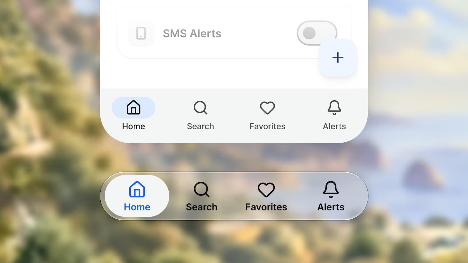
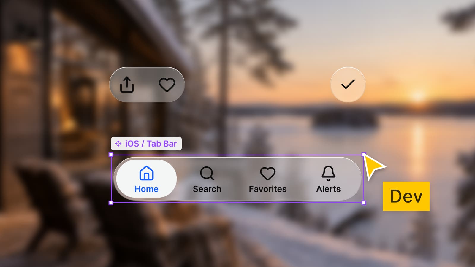
Their structure changed in the kit, not their design in the guidelines. A tab bar still "floats above content at the bottom of the screen", with its items on a Liquid Glass background, and can minimize when an accessory such as the MiniPlayer in Music is attached. A toolbar's guidance last changed on December 16, 2025.
What the kit changed is how you build them:
- Tab bar. Slots set how many tabs show, the type "Separate Search" is now "Prominent Tab", the minimized bar gets a diamond symbol, and the component has fewer variants. The iPhone bar is 402 × 95 and the minimized one 402 × 88.
- Toolbar. The bottom bar's two to six button variants became one button group in a slot. The back button's "Label" is "Title" and its chevron is semibold, and the title links to the Subheadline style. The iPhone bottom bar is 402 × 84.
- Sheet. One iPhone component with Medium, Large and Large (Stacked). In 27.0.3 the grabber went from 58 to 60 points wide and the iPad sheet radius from 38 to 32.
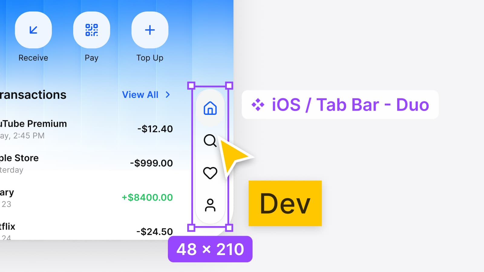
- iPhone Duo. From 27.1.0 the tab bar and toolbar have vertical versions: the Duo tab bar is 48 wide and 110, 177, 210 or 260 high for two to five tabs, and the pose rules are in How to design for iPhone Duo in Figma.
Search is the one place where guidance and kit meet. Apple's search page names two styles of search tab, a standard tab and a button appearance, and the kit's tab bar offers three types: Default, Search Role and Prominent Tab. I did not map the second names onto the first, because neither page does.
How does Apple's kit compare with Appetite UI's iOS mirror, component by component?
Where a row says Same, a number in Appetite UI's file equals the number in Apple's kit. Where it says Differs, the structure or the name is not the same. The table holds sizes, properties and states.
| Component | Apple's kit, 27.x | Appetite UI's iOS mirror | Match |
|---|---|---|---|
| Tab bar | Slots set the tab count. Types Default, Search Role, Prominent Tab. 402 × 95, minimized 402 × 88 | iOS / Tab Bar: Tabs 2 to 5 as variants, Types Default and Search Role, Minimized, every variant 402 × 95 | Differs |
| Toolbar | Bottom buttons in a slot group. Bottom bar 402 × 84 | iOS / Toolbar: Items 2 to 5 as variants, 402 × 84 | Size same, build differs |
| Sheet | Medium, Large and Large (Stacked) in one component. Grabber 60 × 4 | iOS / Sheet - Full Screen: the same three detents and a Content slot. _Grabber is 58 × 4 | Detents same, grabber differs |
| Alert | Buttons in a slot, "Description" renamed "Message", button weight Medium to Semi-Bold | iOS / Alert: Button Layout Stacked or Side-by-Side, text layer still named Description, button labels Semi Bold | Weight same, build differs |
| Action sheet | Buttons in a slot, "Description" renamed "Message", 10 point gap removed | iOS / Action Sheet: one component, 300 × 362, rebuilt in 2.5 as the glass card with capsule actions | Differs |
| Toggle | Pressed and disabled states. Switch 64 × 28 | iOS / Toggle: State Idle or Pressed, Is On, Is Enabled, 64 × 28 | Same |
| Slider | Pressed and disabled states | iOS / Slider: State Idle or Disabled, values 0 to 100 percent, optional ticks. No pressed state | Differs |
| Segmented control | Slots in place of segment variants, disabled and tapped states, a large size. Tracks 370 × 32 and 370 × 50 | iOS / Segmented Control: Size Small or Large, Segments 2 to 5, 370 × 32 and 370 × 50. No disabled or tapped state | Sizes same, states missing |
| Progress bar | Determinate bar from 6 to 4 points | iOS / Progress Bar: 370 × 4 | Same |
| Glass buttons | Style Glass or Glass Prominent, small, regular and large, disabled states | iOS / Button - Liquid Glass - Text: Style Glass or Glass Prominent, Size Small, Medium or Large, Is Enabled | Same, Medium for Regular |
| Menu | iPhone and iPad types removed, items in slots, Quick Actions renamed Control Group | iOS / Menu: Items 3, 4 or 5, Quick Actions True or False | Differs |
| Keyboard | Accessory bar buttons in a slot group in place of two to six variants | iOS / Keyboard: ten types, Show accessory bar. _Accessory Bar - Toolbar has one to six symbols as variants | Differs |
| Status bar | Duo status bars added in 27.1.0 | iOS / Status Bar: ios-lg 402 × 62, ios-md 402 × 59. iOS / Status Bar - Duo: Rail 48 × 86, Compact 92 × 48 | Not compared |
| Duo tab bar | Tabs 2 to 5, 48 × 110, 177, 210 and 260 | iOS / Tab Bar - Duo: Tabs 2 to 4, 48 × 110, 160 and 210 | Two and four tabs same, three tabs differs, no fifth tab |
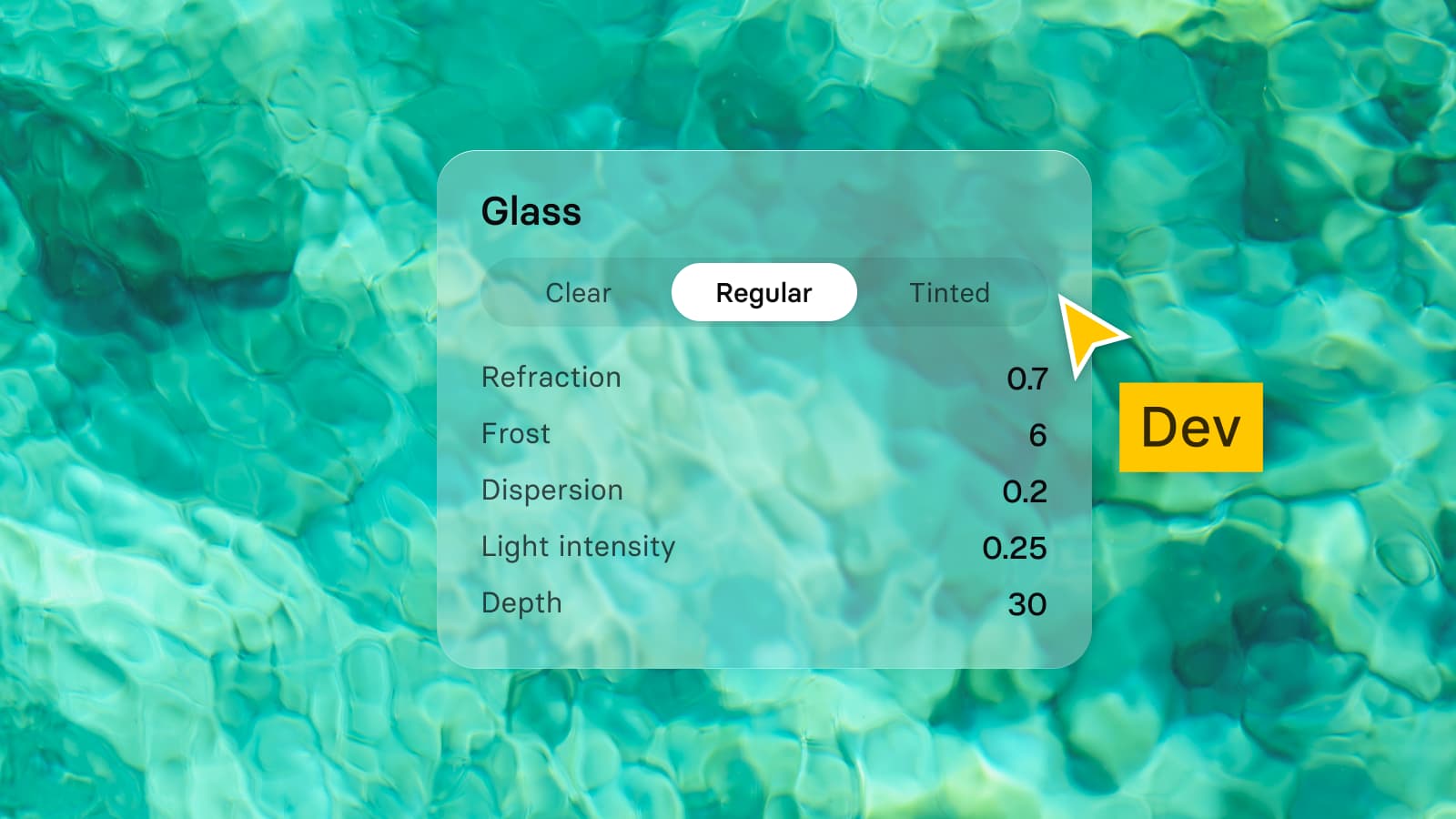
| Liquid Glass | Components redrawn. Regular has a Prominent boolean in place of State. Tinted drawn as a background | _Glass - Control: Style Regular, Clear or Tinted, State Default or Primary | Named differently |
| Sidebar | Edge to edge, new material, glass buttons, tinted symbols | No Sidebar set among the iOS pattern pages | Not mirrored |
Checked on , against Apple's iOS and iPadOS 27 kit for Figma, version 27.1.0, and the Appetite UI file for release 2.5.
Two rows deserve a note. The slider and the segmented control are the two places where the mirror lacks a state Apple's log names, pressed on one and disabled and tapped on the other. And the Duo tab bar with three tabs is 160 high in Appetite UI and 177 in Apple's kit, while the bars with two and four tabs are the same height on both sides.
Apple renamed several properties in 27.0.0, which breaks overrides in a file that updates from the iOS 26 kit. Where the mirror uses the old name, the table below says so:
| Apple's kit, before | Apple's kit, 27.0.0 | Appetite UI's file |
|---|---|---|
| Tinted, on glass buttons | Style, with Glass and Glass Prominent | Style, with Glass and Glass Prominent |
| State, on button labels | Is Enabled, True or False | Is Enabled, True or False |
| Separate Search, a tab bar type | Prominent Tab | Search Role, no Prominent Tab |
| Quick Actions, in menus | Control Group | Quick Actions |
| Description, in alerts and action sheets | Message | Description |
| Show Label, on the back button | Show Title | Not compared |
I did not compare the following, because I did not read the component or Apple's log has no line for it: text and search fields, page control platters, list swipe actions, notifications, widgets, the home screen, windows, scroll edge effects and date pickers. The kit's log names changes to most of them, and they are not in the table because a row without both sides is a guess.
What changed in Appetite UI's iOS mirror for 2.5?
Release 2.5 follows the iOS 27 patterns on its 20 Apple pattern pages, and adds surfaces the iOS 26 mirror did not have. The iOS mirror page lists each with its measurements, and the changelog states them in one place.
- iPhone Duo. The Duo versions of Status Bar, Toolbar, Tab Bar, List, Keyboard and Sheet, two Platform modes, and 8 apps on both displays.
- Liquid Glass in three styles. Clear, Regular and Tinted effect styles, matching the iOS setting, replaced the separate surface and control tiers across the file.
- iOS 27 parity. The status bar glyphs, Toggle, Slider and Tab Bar follow the iOS 27 kit: a 64 by 28 switch whose knob turns to glass while pressed, a 38 by 24 slider knob, and Apple's 10 point tab label in System mode. The Action Sheet is rebuilt as the glass card.
- System dialogs. Passkey, Permission Alert and Review Prompt on the Alert page.
- Brand and System mode. Platform Bridge resolves each Apple role twice, so a screen can carry your brand or return to Apple's values. The 10 point label above is the System value; Brand mode reads 12.
The mirror is Appetite UI's own drawing, on its tokens, in Inter with Lucide icons, and no Apple artwork is inside it.
Which one do you open for an iOS 27 screen?
Use Apple's kit if you ship on iOS only and want Apple's exact components. Use Appetite UI when the same app also ships on Android, or when your brand has to sit on top of the system. The table is the checklist for the first case, since it names what you give up by working from the mirror: slots, the Prominent Tab type, the sidebar and two states. Platform Bridge, the one-file approach to two platforms and iOS vs Material 3: what changes per component cover the second.
The screens overview shows the mirror in use, the read-only preview opens the file, and pricing lists what each license includes.
Questions
What changed in the iOS 27 Figma components?
Apple's iOS and iPadOS 27 kit for Figma was overhauled in version 27.0.0 on June 23, 2026: redrawn Liquid Glass components, slots in place of variant counts, pressed and disabled states on toggles and sliders, and one iPhone sheet with three detents. Version 27.1.0 on September 13 added iPhone Duo keyboards, toolbars, tab bars, status bars and sheets.
Did the iOS 27 tab bar change?
Its design did not. The tab bar still floats above content on a Liquid Glass background, and Apple's guideline page changed on June 8, 2026 only with "Updated terminology and art". The Figma kit changed its build: slots set the number of tabs, Separate Search became Prominent Tab, and the minimized bar gained a diamond symbol.
Where is the change log of Apple's iOS 27 Figma kit?
Inside the file. The Community page says "See change log for details", and the log is a page named Change log in the kit, listing versions 27.0.0 to 27.1.0 with dates from June 23 to September 13, 2026. Apple's Community page itself says the kit was updated on September 15.
Does Appetite UI follow the iOS 27 kit?
In the places the table lists as Same. The switch is 64 × 28 with pressed and disabled states, the progress bar is 4 points, the tab bar is 402 × 95 and the toolbar 402 × 84, matching Apple's kit. It builds tab counts, toolbar items and segments as variants, not slots, and it has no pressed slider state and no sidebar set.
Is the iPhone Duo tab bar the same in Appetite UI and Apple's kit?
Partly. Apple's kit draws Duo tab bars for two to five tabs, 48 wide and 110, 177, 210 and 260 high. Appetite UI draws two to four tabs, 110, 160 and 210 high, so the bars with two and four tabs match in height, and the one with three tabs and the fifth tab do not.
Sources
- Apple on Figma Community: iOS and iPadOS 27, version 27.1.0, change log page read from the file, read October 8, 2026
- Apple Design: What's new, read October 8, 2026
- Apple Human Interface Guidelines: Tab bars, read October 8, 2026
- Apple Human Interface Guidelines: Toolbars, read October 8, 2026
- Apple Human Interface Guidelines: Sheets, read October 8, 2026
- Apple Human Interface Guidelines: Search fields, read October 8, 2026
- Apple Human Interface Guidelines: Menus, read October 8, 2026
- Apple Human Interface Guidelines: Sidebars, read October 8, 2026
- Apple Human Interface Guidelines: Designing for iPhone Duo, read October 8, 2026
- Appetite UI docs: iOS mirror, read October 8, 2026
- Appetite UI changelog: release 2.5, read October 8, 2026