Updated
Settings
A settings app UI kit for Figma: a settings menu, an account form and a preferences list with switches, drawn light and dark. 17 of the 29 instances placed on them are List rows, so one change to List reaches the whole settings area.
Updated
Preview
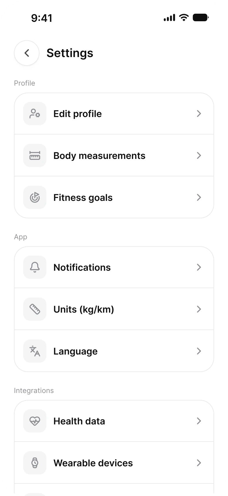
Three screens for the part of an app nobody demos: a menu that groups its rows, an account form, and a preferences list that carries switches.
| Screen | What it shows | Built from |
|---|---|---|
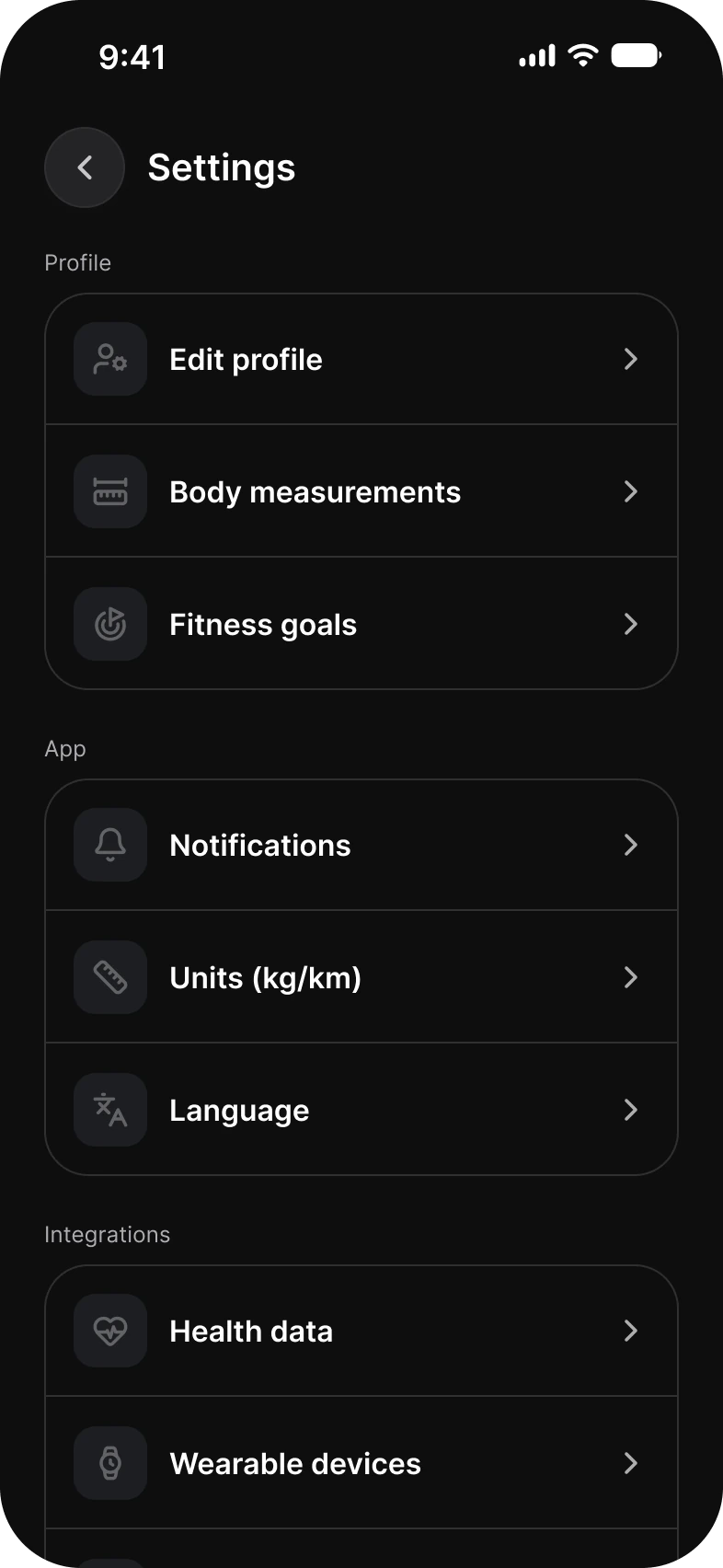
| Menu | Nine rows in three groups, Profile, App and Integrations, the last one cut off at the bottom edge | Top Bar, List |
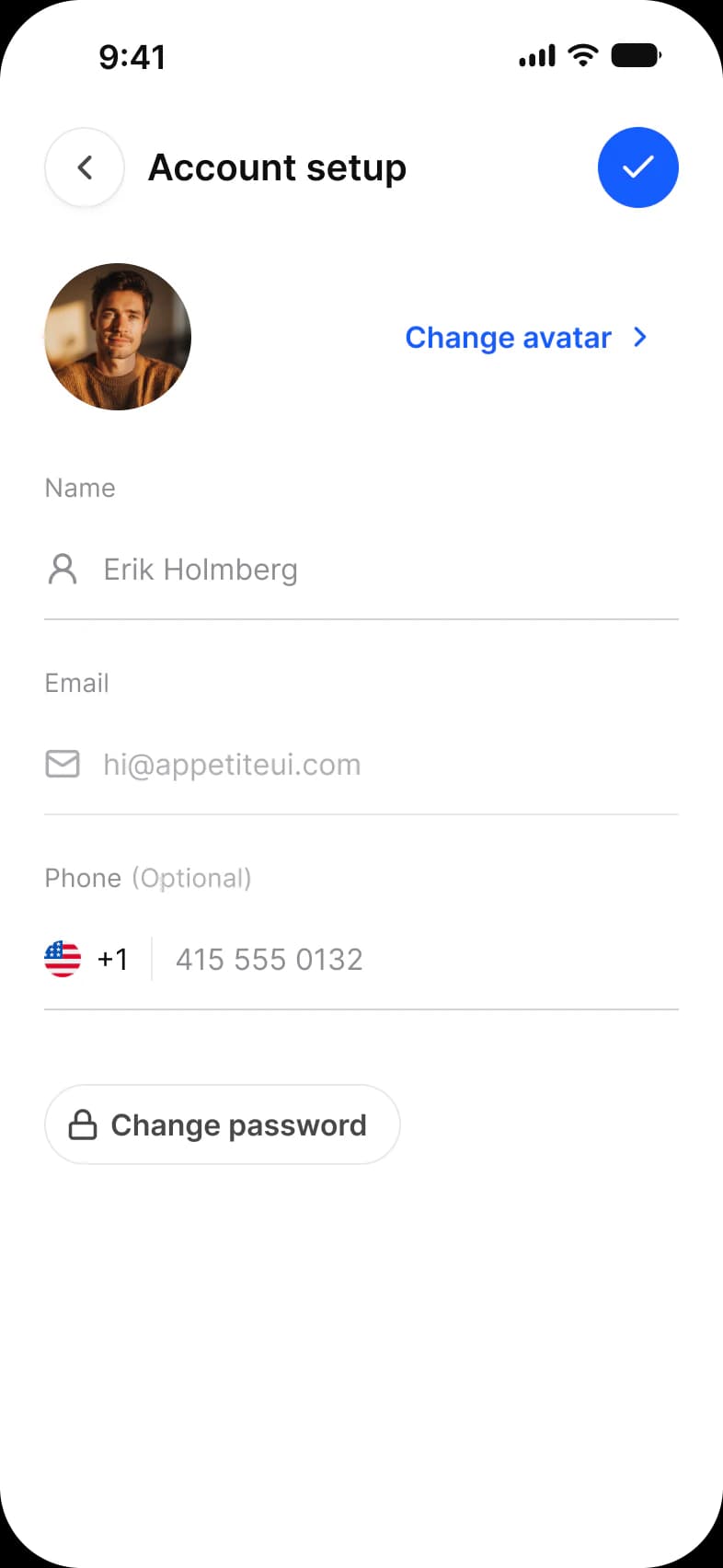
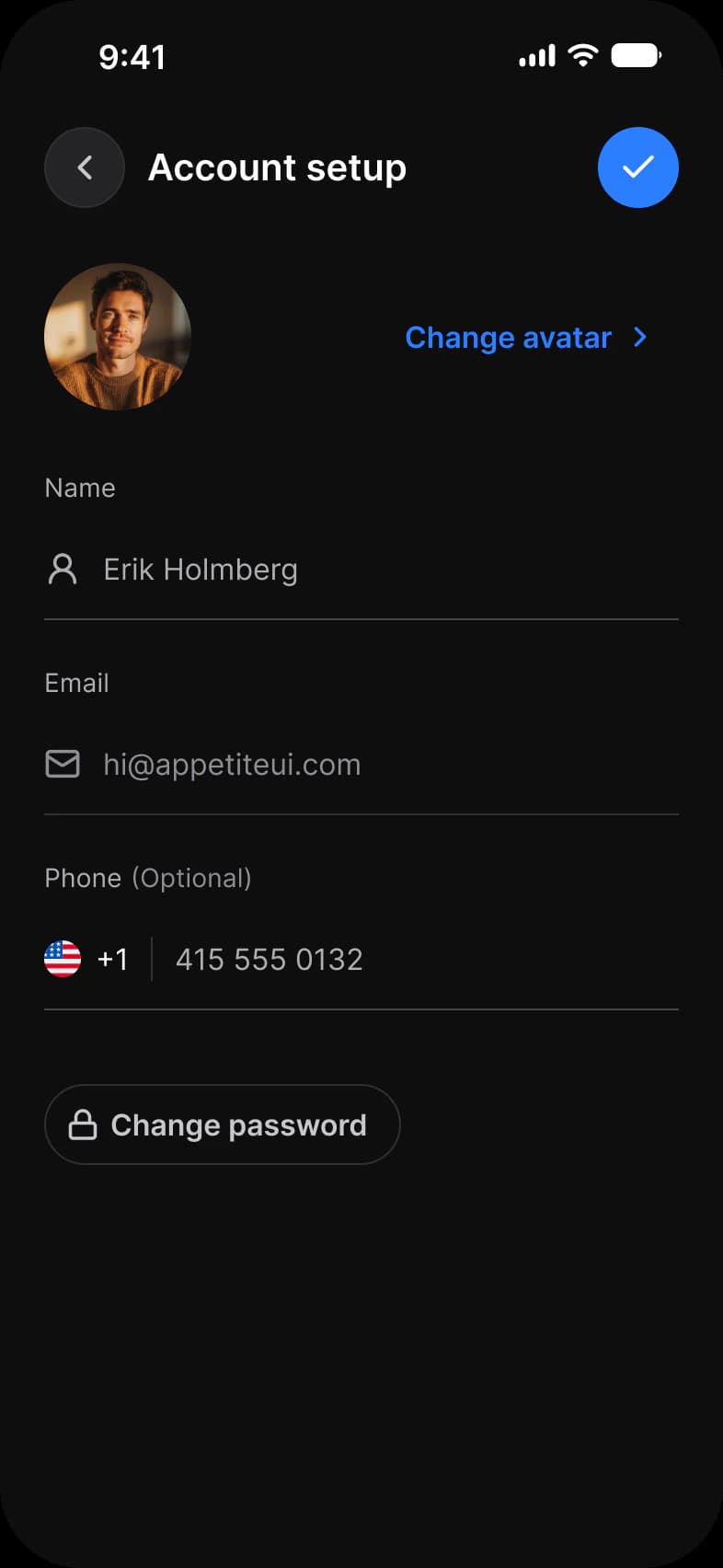
| Account setup | A photo, three fields and a Change password button | Top Bar, Avatar, Text Input, Button |
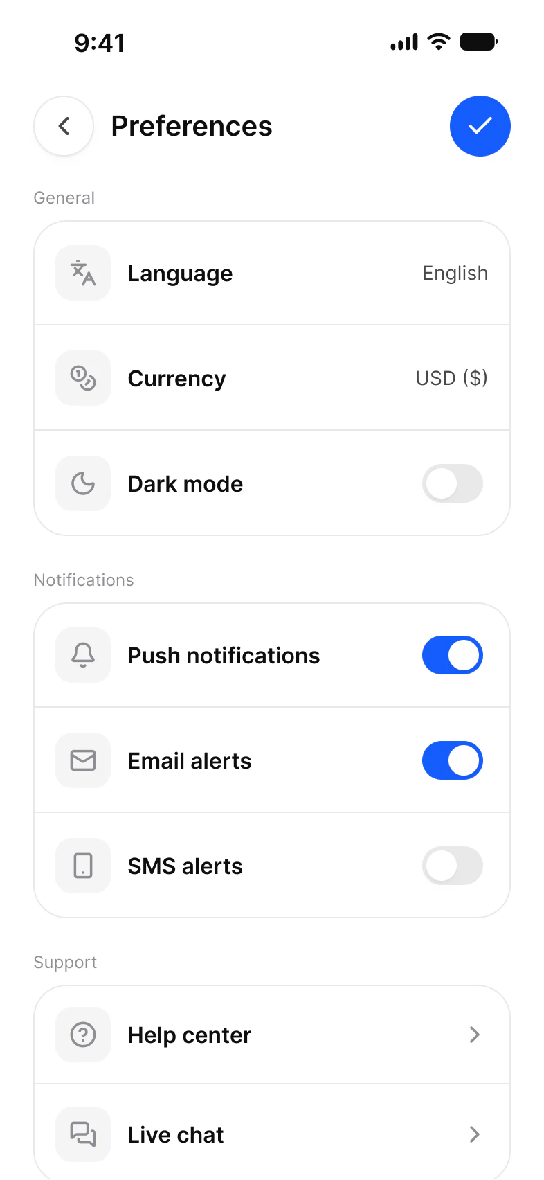
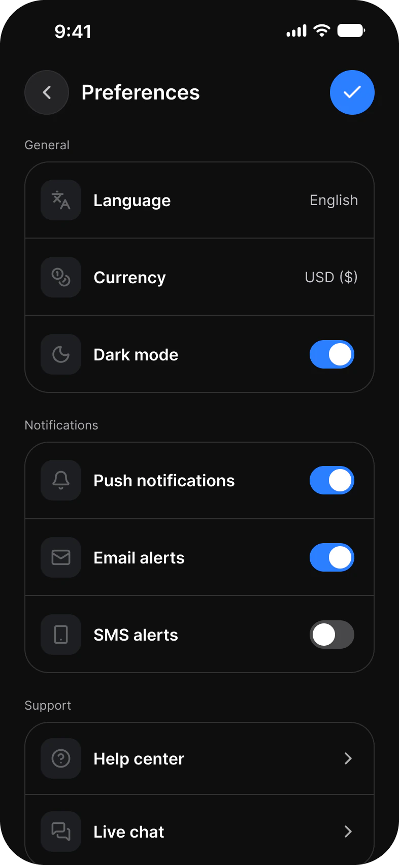
| Selection | The Preferences list: values, four switches and two links to help | Top Bar, List, Toggle |
Each screen is drawn in Light and in Dark, with Color Tokens set on the frame itself, so the dark screens are the same instances resolved against the other mode. On Selection the Dark mode switch is off in the light screen and on in the dark one.
What does a settings screen need from a component library?
Rows that group, a switch for every yes or no choice, a top bar that goes back and confirms, and fields for the account.
A settings screen needs grouped rows, a switch for each yes or no choice, a top bar with back and confirm, and form fields. In this set those are List, Toggle, Top Bar and Text Input, and List alone is 17 of the 29 instances placed on the three screens.
| Need | Component | Where it appears |
|---|---|---|
| Group rows under a heading | List | Menu, nine rows in three groups, and Selection, eight rows in three groups |
| Switch a setting on or off | Toggle inside a List row | Selection: Dark mode, Push notifications, Email alerts and SMS alerts |
| Go back and confirm | Top Bar with two Buttons | All three screens, a confirm button on Selection and Account setup |
| Edit account details | Text Input | Name, Email and Phone on Account setup |
| Show who is signed in | Avatar | Account setup |
The minimum touch target on iOS is 44 pt. The frames pin Platform to ios-md, where platform/min-touch-target reads 44. The android mode of the same variable reads 48 dp.
What are the Settings screens built from?
76 instances across the 3 screens. 38 are Appetite UI components, 37 are Lucide icons with 20 different names, and the last is a flag asset in the phone field. 7 components carry the whole set.
29 instances sit directly on the frames and the rest sit inside them. Placed counts an instance that is not inside another instance. Nested counts one that is, which is where the Toggles, the Top Bar buttons and every glyph live. A component is counted by its set name, and an icon is an instance named in lowercase. The dark row holds the same instances as the light row.
| Component | Placed | Nested | Where |
|---|---|---|---|
| List | 17 | 0 | Menu 9, Selection 8 |
| iOS / Status Bar | 3 | 0 | All three screens |
| Top Bar | 3 | 0 | All three screens |
| Text Input | 3 | 0 | Account setup |
| Button | 2 | 5 | Placed on Account setup, Change avatar and Change password. Nested in the Top Bar as the back button on all three screens and the confirm button on two |
| Toggle | 0 | 4 | Selection, one in each of four List rows |
| Avatar | 1 | 0 | Account setup |
| Lucide icons | 0 | 37 | Seventeen leading glyphs and eleven chevrons in List rows, the Top Bar buttons, and four on Account setup |
| Country Flags | 0 | 1 | Account setup, in the Phone field |
List carries 17 of the 29 placed instances, and the Toggles and the row glyphs sit inside it. That is the point in one number: change List and the settings area changes, because a settings screen is a set of content decisions. The only parts drawn by hand are 13 lines named Divider, each 345 wide with its stroke bound to border/soft-100, 6 on Menu and 7 on Selection.
Counted on October 2, 2026 with a Plugin API script over the three light frames of the Settings page in the Appetite UI Figma file. Lucide supplies 20 different icons 37 times.
Which tokens do the Settings screens use?
Every solid fill and stroke resolves through a variable except the flag in the phone field, which makes the dark row a mode switch.
The three light frames hold 171 solid fills and strokes that are bound, spread over 17 different variables. The only unbound solid paints are 6 vectors of the country flag, the colors of a flag and not a token.
| Token | Where it lands | Paints |
|---|---|---|
border/soft-100 | The 13 Divider lines, the group outlines, the back button outline and the Change password outline | 25 |
bg/white-0 | Every List row, the group cards and the screen | 24 |
text/soft-500 | Group headings, input labels and the chevrons in List rows | 22 |
text/strong-950 | Row titles, screen titles and entered text | 21 |
state/faded/lighter-50 | The leading tile of each List row | 17 |
state/faded/base-500 | The glyph inside each leading tile | 17 |
fg/strong-950 | Status Bar glyphs | 15 |
brand/base | The confirm button, switched on Toggle tracks and the Change avatar link | 6 |
static/static-white-0 | Toggle knobs and the check glyph in the confirm button | 6 |
fg/sub-700 | The back button chevron and the lock glyph | 4 |
bg/raised | The back button fill | 3 |
text/sub-700 | Row values such as English and USD, and the Change password label | 3 |
bg/soft-100 | Switched off Toggle tracks | 2 |
border/sub-200 | The Text Input underline | 2 |
text/disabled-400 | Hints and the empty phone number in Text Input | 2 |
fg/soft-500, fg/disabled-400 | Text Input glyphs | 1 each |
| Style | Uses | Screens |
|---|---|---|
base/emphasized | 19 | 3 |
xs/default | 6 | 2 |
sm/default | 6 | 2 |
base/default | 4 | 1 |
xl/emphasized | 3 | 3 |
dropShadow/xs | 3 | 3 |
| Collection | Modes | What it drives here |
|---|---|---|
Color Tokens | Light, Dark | Every bound paint above, pinned on each frame |
Platform | ios-md, ios-lg, android, ios-duo-outer, ios-duo-inner | Status bar and platform metrics, pinned to ios-md |
Foundations | Default | Row height, group spacing and radius |
Typography | Default | Row titles, values and group headings |
Platform Bridge | Brand, System | Not pinned on the frames, so the default mode applies |
Motion | Default | Not used on these screens |
Paints are every visible solid fill and stroke on the three light frames, inside instances included, counted by bound variable name on October 2, 2026.
Which patterns do these screens show?
The same screens by what they do, beside the other apps of the kit, with the iOS and Material values of each pattern.
- All appsSettings screens
Start from these screens.
Every frame on this page is part of the Appetite UI file, drawn from its components and bound to its variables, so one brand edit moves every screen in light and dark.
The file holds 589 variables in 6 collections and exports its token values to SwiftUI, Jetpack Compose, Flutter and CSS. Solo covers one designer and Team up to ten people. You pay once and keep lifetime updates. Price goes up Nov 1
The read-only Figma preview opens the whole file, every screen and every variable, before you buy.