Updated
Booking app confirmation
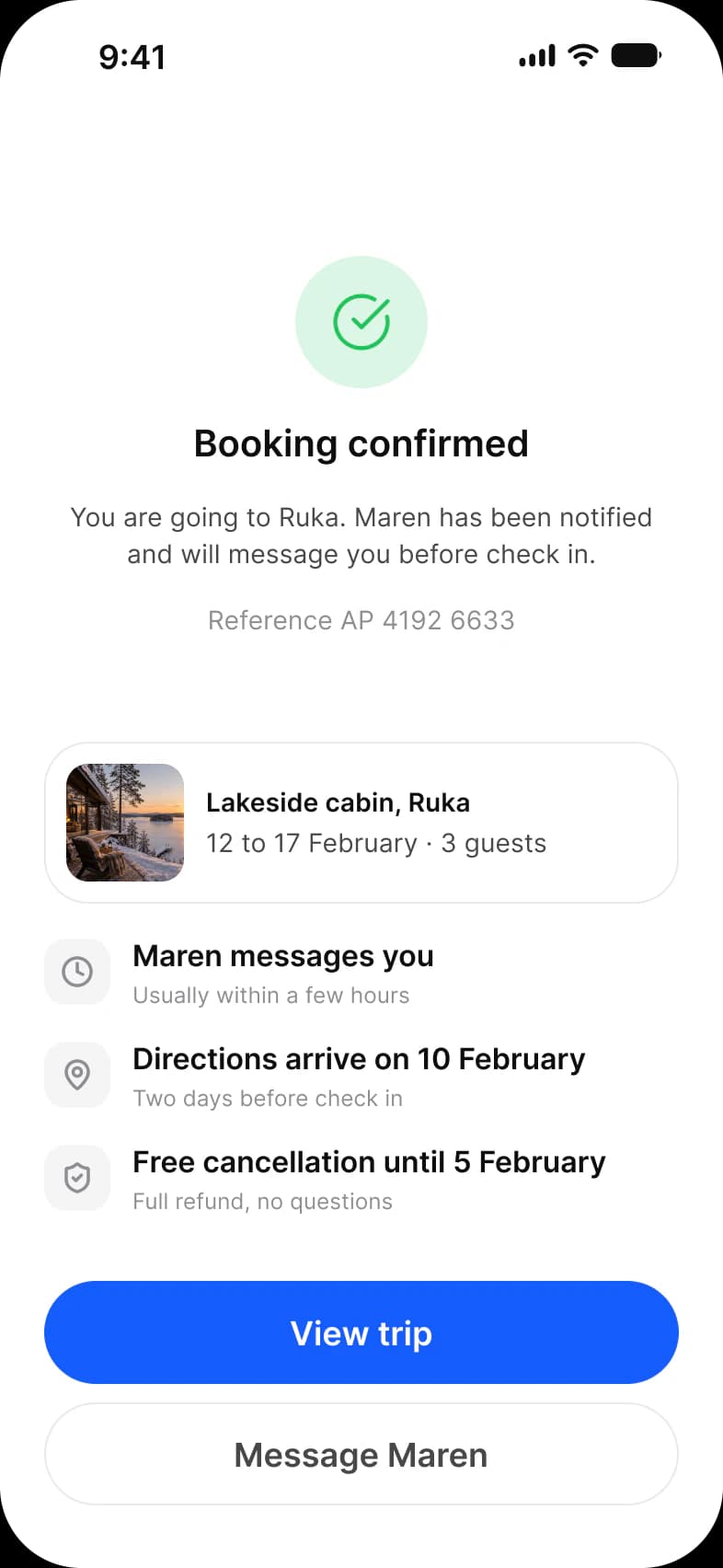
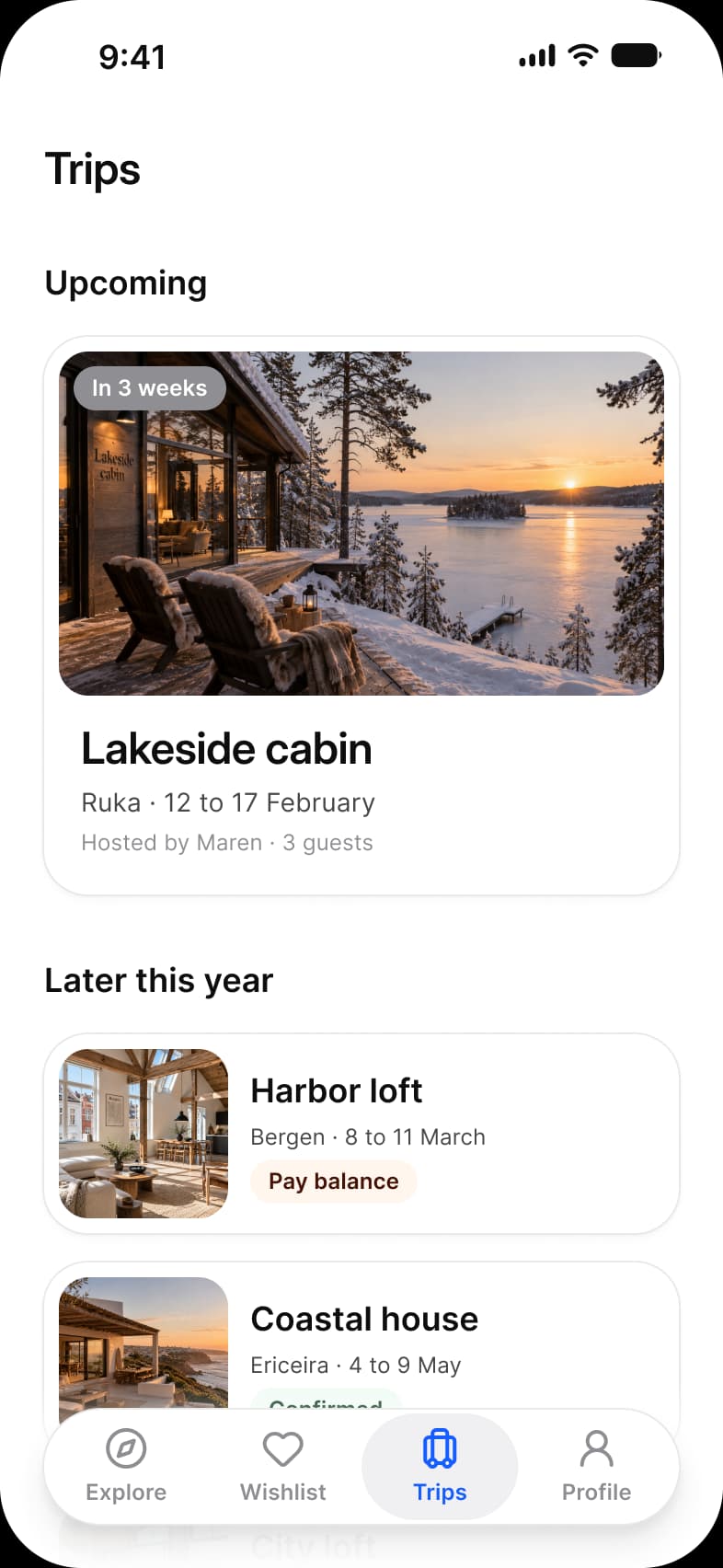
What a traveler sees after paying, drawn in Appetite UI, a Figma UI kit for iOS and Android apps built like a design system: a green check, Booking confirmed with a reference number, a trip summary card, three next-step rows, and View trip and Message Maren. Trips then holds the stay as an Upcoming card, In 3 weeks.
Updated
Preview
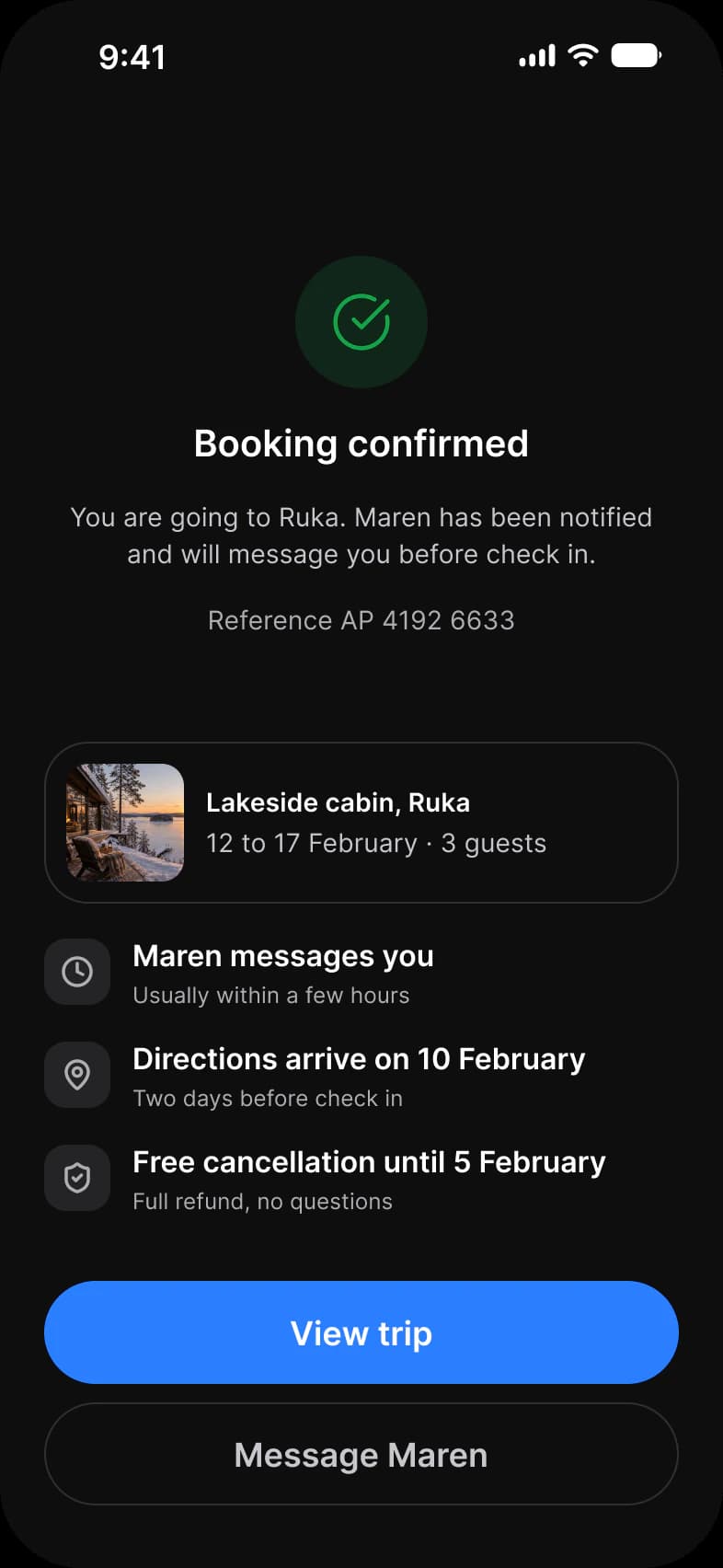
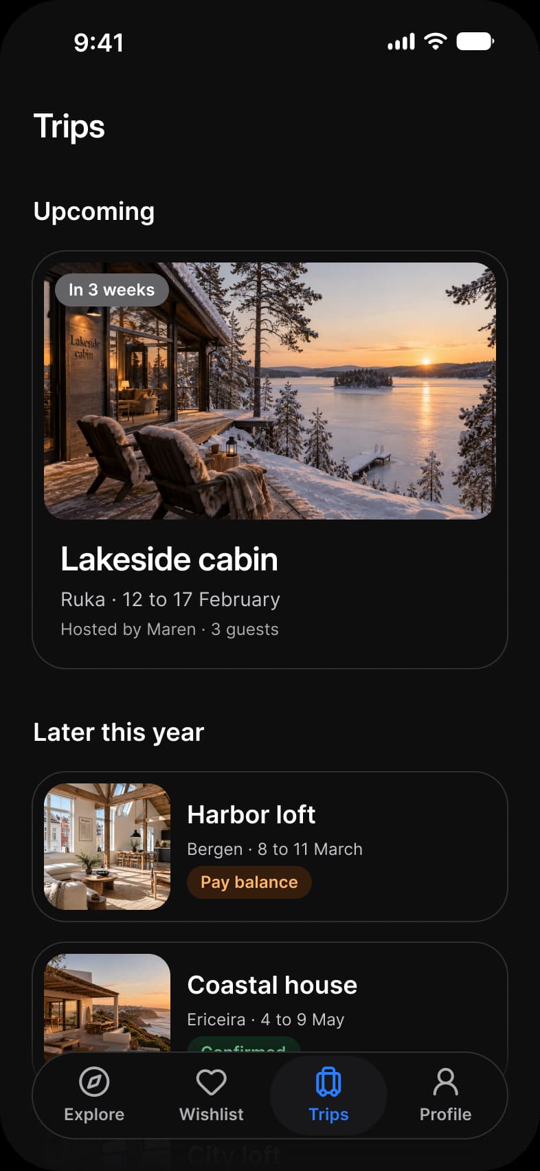
Confirmed, Trips, from the Booking page of the Appetite UI Figma file. The theme switch shows the dark frames.
| Screen | What it shows |
|---|---|
| Confirmed | A confirmation, a reference and the next three steps |
| Trips | An upcoming trip as a large card and later trips as rows |
Which components carry the order tracking pattern?
The kit's components, drawn live from the same tokens as the frames. Tap them: they behave as the Figma prototype does.
Progress Steps, step 3 of 4
Button, Fill and Weak
How does this screen follow the order tracking pattern?
The rules every order tracking screen in the kit follows, and what this one does with each.
| Rule | On the booking app |
|---|---|
| Lead with the arrival time | Booking confirmed leads the screen in place of an arrival time: the reference sits right under it, the thing a traveler is asked for later. |
| Steps, not a percentage | Three next-step rows say what happens now instead of a bar of progress, each one a sentence. |
| The person is one tap away | Message Maren puts the host one tap away, beside View trip, before the traveler has to look for her. |
What is it built from?
Every control with a component is an instance of it, so one token change moves these screens with the rest of the file.
| Component | Screens |
|---|---|
| Button | Confirmed |
| Lucide icons | Confirmed |
| Top Bar | Trips |
| Section Header | Trips |
| Vertical Card | Trips |
| Horizontal Card | Trips |
| Navigation | Trips |
What changes between iOS and Material?
The frames are drawn in the ios-md Platform mode. Switch a frame to android and these variables take the Material values; the components below are where the two systems draw the same need differently.
| Variable | iOS (ios-md) | Android |
|---|---|---|
platform/min-touch-target | 44 | 48 |
| Component | iOS | Material 3 | What differs |
|---|---|---|---|
| List | iOS / List with a 44 minimum row | M3 / List Item, 56, 72 or 88 high by Lines | Material sets the row height by lines of text, iOS sets only a minimum |
Start from these screens.
Every frame on this page is part of the Appetite UI file, drawn from its components and bound to its variables, so one brand edit moves every screen in light and dark.
The file holds 589 variables in 6 collections and exports its token values to SwiftUI, Jetpack Compose, Flutter and CSS. Solo covers one designer and Team up to ten people. You pay once and keep lifetime updates. Price goes up Nov 1
The read-only Figma preview opens the whole file, every screen and every variable, before you buy.