Updated
Task manager app board
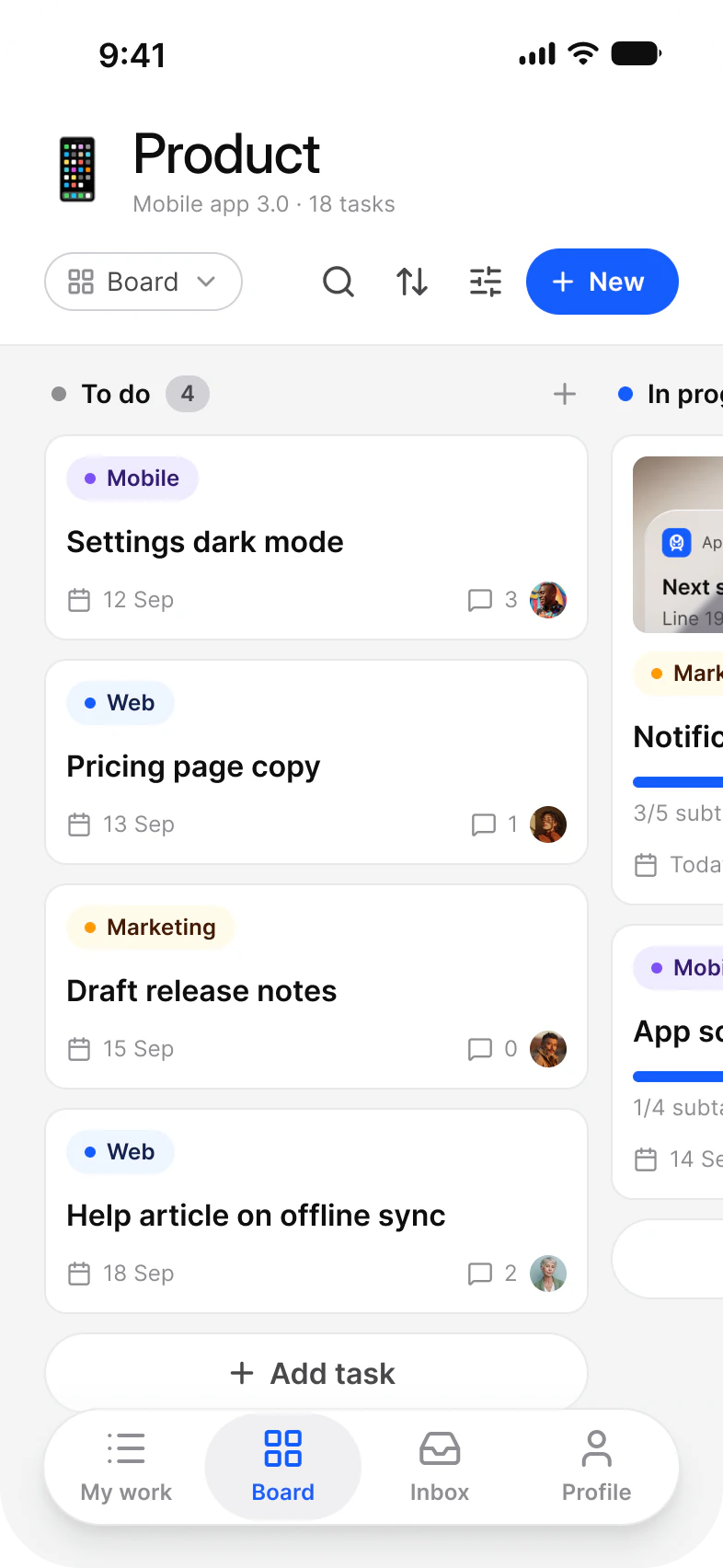
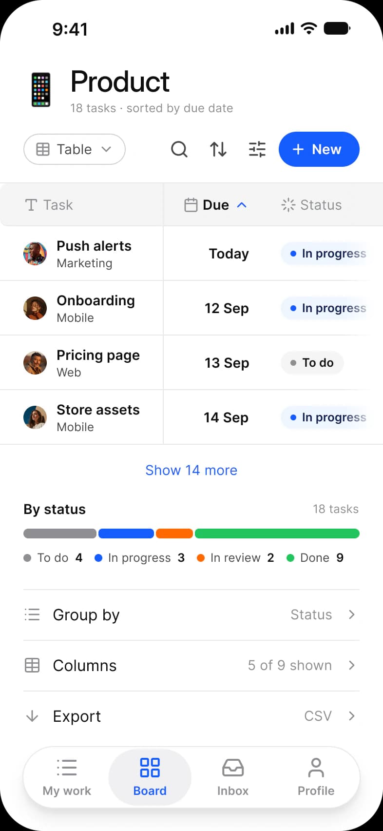
One project three ways in Appetite UI, a Figma UI kit for iOS and Android apps built like a design system: the Product project as To do and In progress columns of cards, the same tasks as a table with Due and Status and a status split, and as bars across the week of 8 September.
Updated
Preview
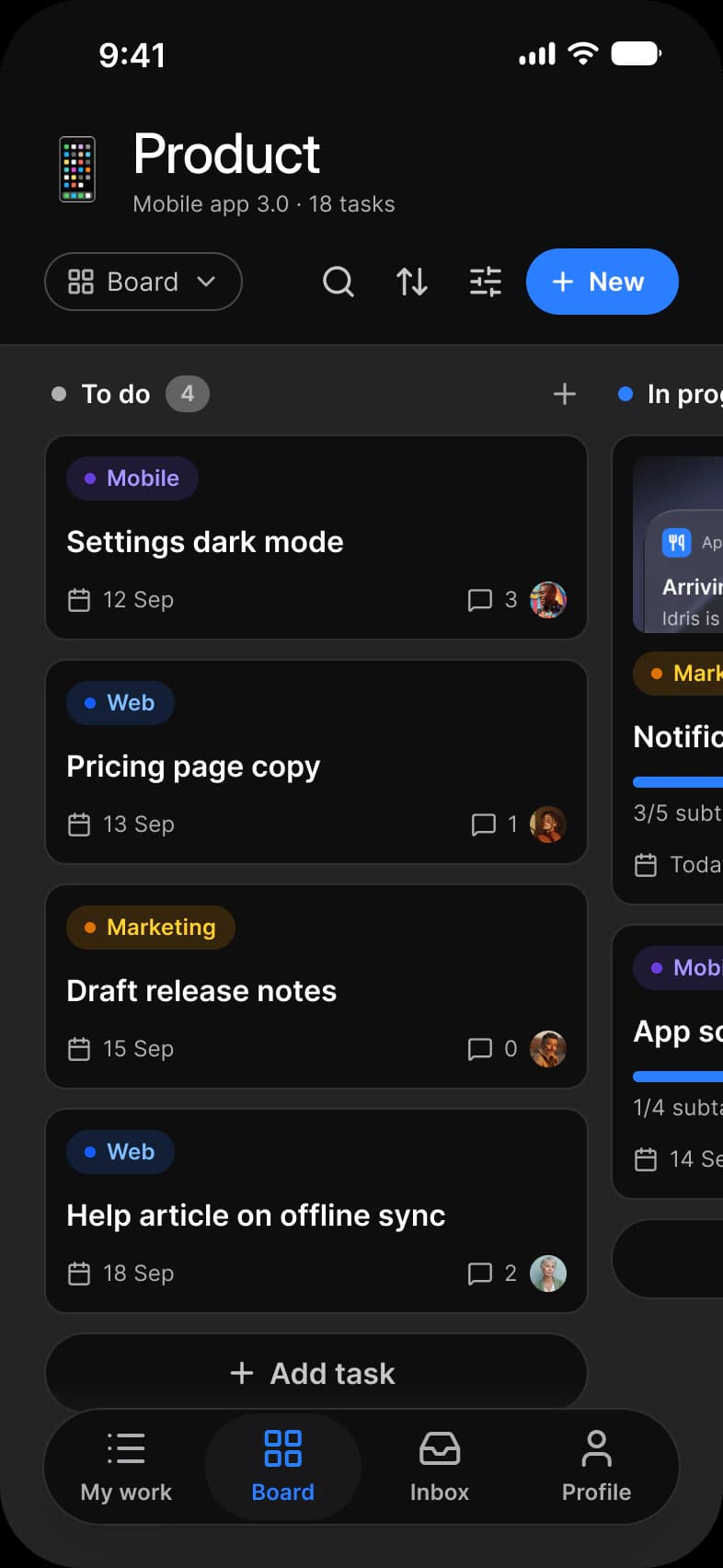
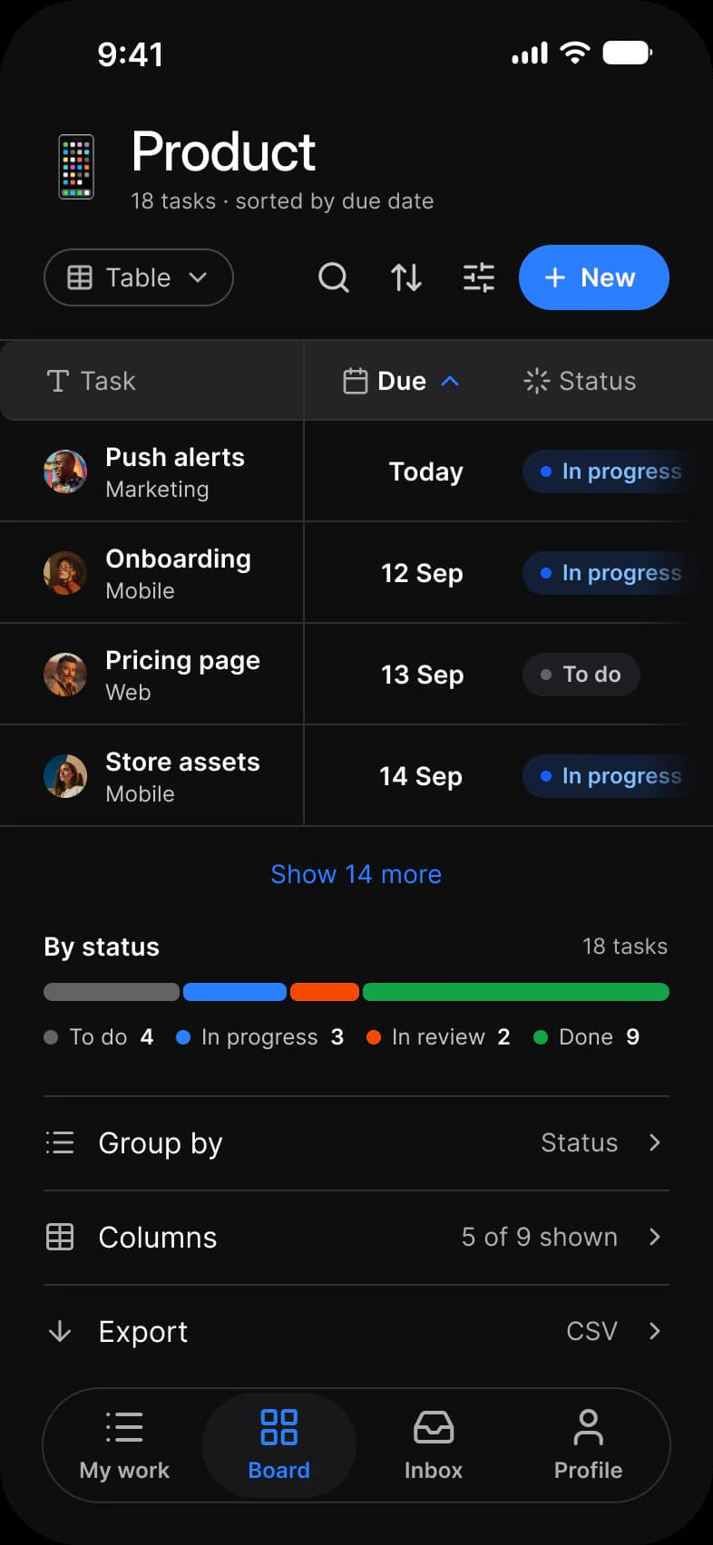
Board, Table, Timeline, from the Tasks page of the Appetite UI Figma file. The theme switch shows the dark frames.
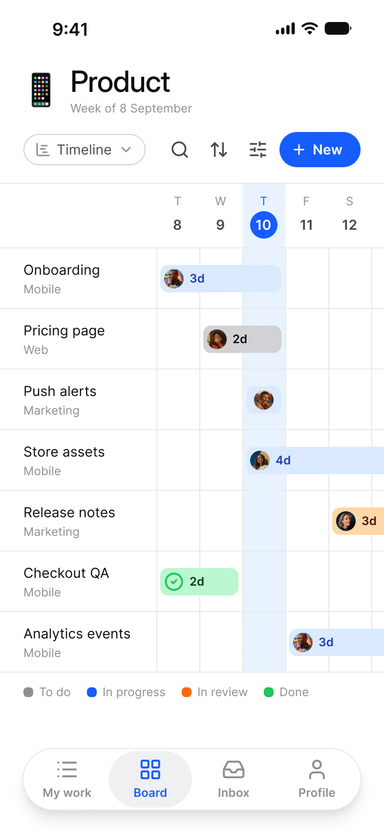
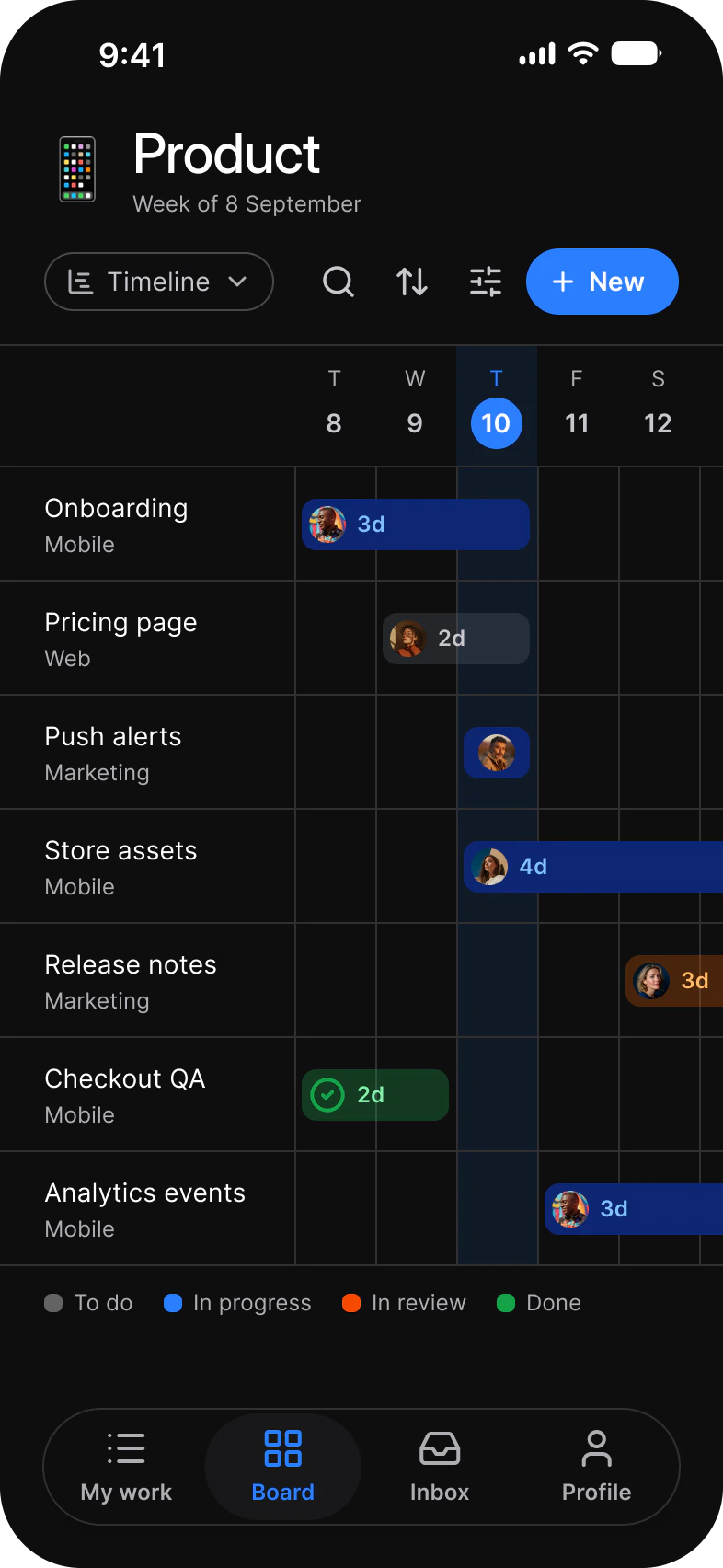
| Screen | What it shows |
|---|---|
| Board | The Product project as columns of task cards |
| Table | The same tasks as rows with Due and Status, plus a status split |
| Timeline | The same tasks as bars across a week |
Which components carry the board pattern?
The kit's components, drawn live from the same tokens as the frames. Tap them: they behave as the Figma prototype does.
Badge, labels
Checkbox
Segmented Control
How does this screen follow the board pattern?
The rules every board screen in the kit follows, and what this one does with each.
| Rule | On the task manager app |
|---|---|
| One task set, three views | Board, Table and Timeline are three views of the same tasks; the view switch in each toolbar names the view that is open. |
| Status, label and owner on every card | Every card carries its label and due date as Badges and its owner as an Avatar, and the table keeps the same status as a column. |
| The view switch names the view | New sits in the toolbar beside search, sort and filter, and Add task at the foot of the columns, so a task starts where it will live. |
What is it built from?
Every control with a component is an instance of it, so one token change moves these screens with the rest of the file.
What changes between iOS and Material?
The frames are drawn in the ios-md Platform mode. Switch a frame to android and these variables take the Material values; the components below are where the two systems draw the same need differently.
| Variable | iOS (ios-md) | Android |
|---|---|---|
platform/min-touch-target | 44 | 48 |
| Component | iOS | Material 3 | What differs |
|---|---|---|---|
| Chip | No counterpart | M3 / Chip, 32 high at radius 8 | The Apple pages have no chip |
Start from these screens.
Every frame on this page is part of the Appetite UI file, drawn from its components and bound to its variables, so one brand edit moves every screen in light and dark.
The file holds 589 variables in 6 collections and exports its token values to SwiftUI, Jetpack Compose, Flutter and CSS. Solo covers one designer and Team up to ten people. You pay once and keep lifetime updates. Price goes up Nov 1
The read-only Figma preview opens the whole file, every screen and every variable, before you buy.