Comparison
Phone or web? The rest follows.
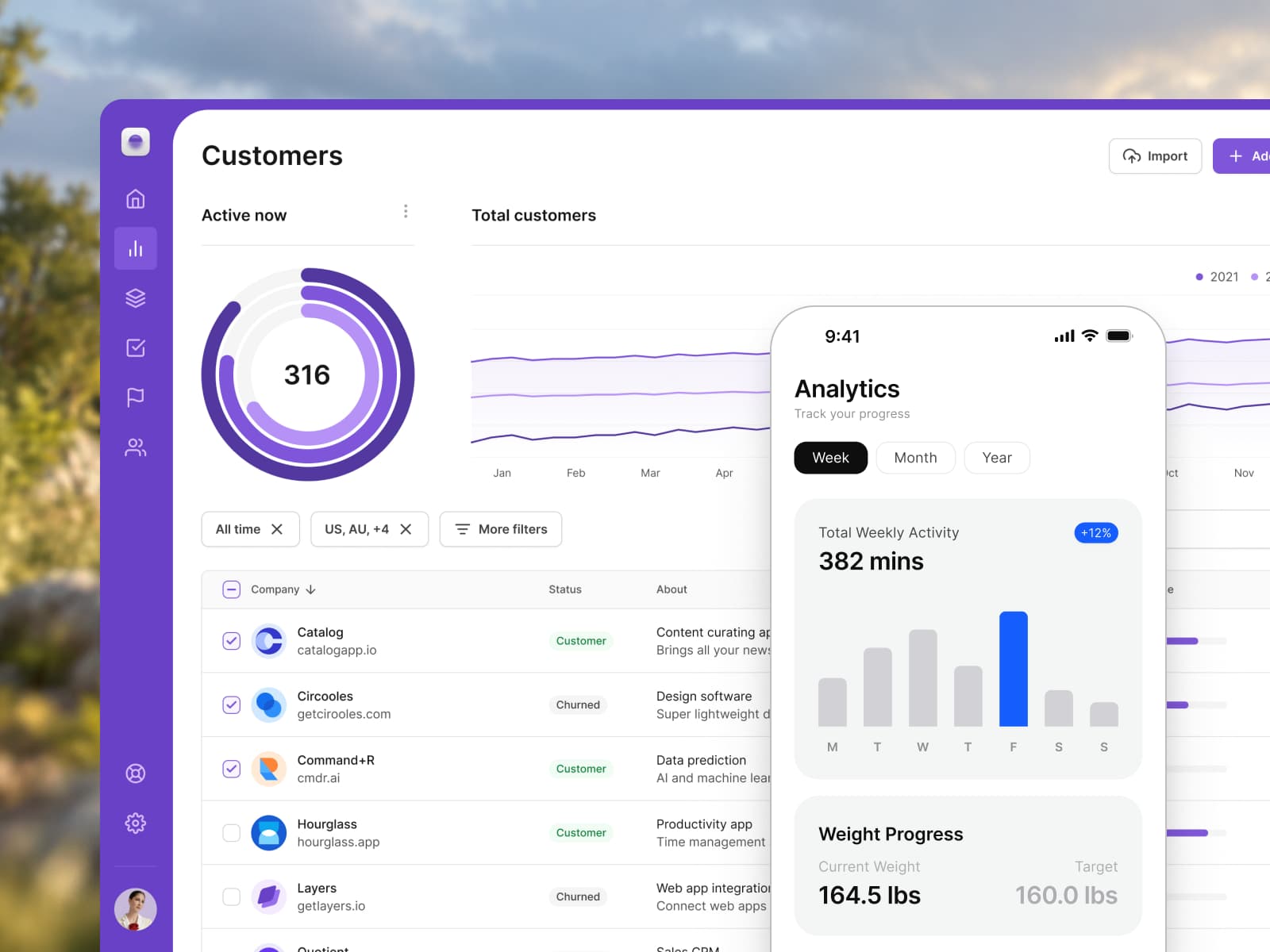
Untitled UI is built for web apps, dashboards and marketing sites. Appetite UI is built for iOS and Android apps.Checked on against untitledui.com
Verdict
The screen you ship picks the file.
Use Untitled UI if
You ship a web app, a dashboard or a marketing site.
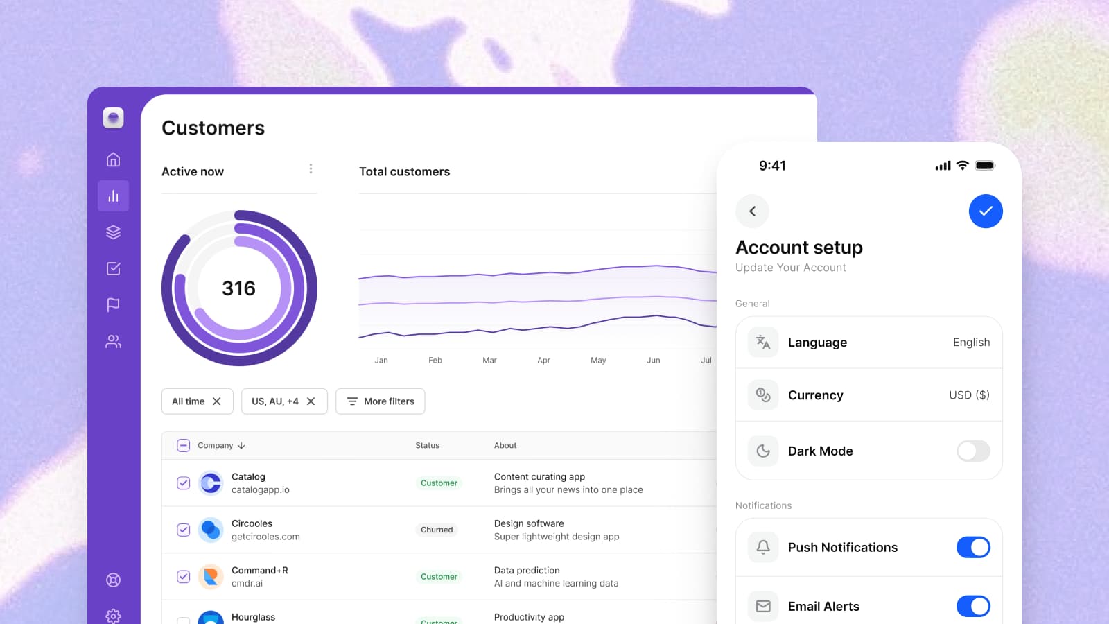
In its own words it is a Figma UI kit and a React component library for modern UI and websites, with website and dashboard examples.Your developers build it in React.
Its components ship as React code, built with React Aria and styled with Tailwind CSS, in its own words.
Use Appetite UI if
You ship an app on iOS, Android or both.
Apple and Material components live in one file and read one token set, so the second platform starts from the values of the first.Your developers build in SwiftUI, Compose or Flutter.
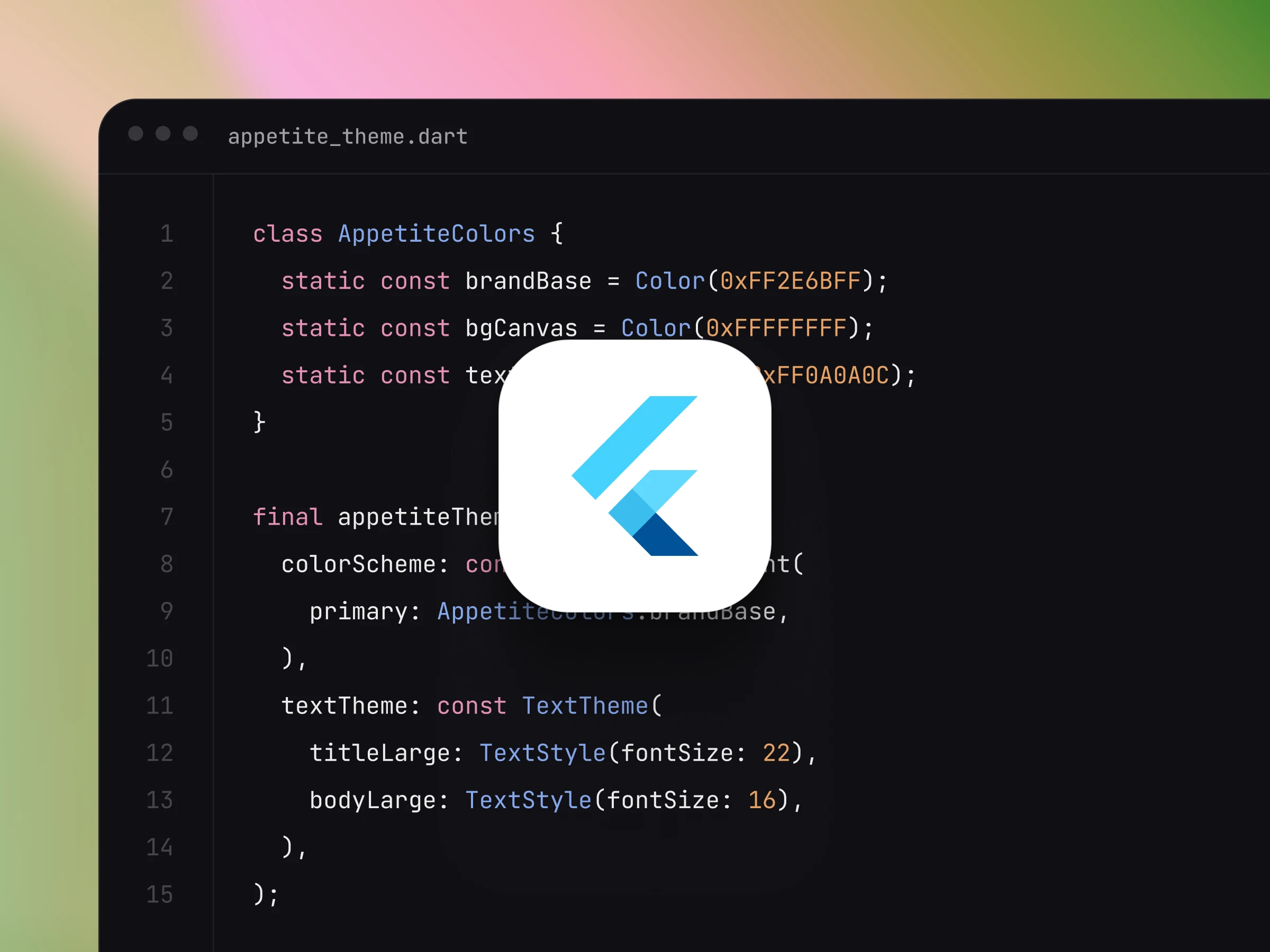
The token source exports to SwiftUI, Jetpack Compose, Flutter and CSS, so the app reads the values you designed with.
Use both when you ship a web product and an app. Each file then covers the screen it was drawn for.
Side by side
The same rows for both files.
The left column is what this file decided. The right column is what Untitled UI says about itself on untitledui.com.
| Criterion | Appetite UIThis file | Untitled UIuntitledui.com |
|---|---|---|
| What it isHow each describes itself. | A Figma UI kit for iOS and Android, built like a design system. | A Figma UI kit and a React component library. |
| Built forThe screens it was drawn for. | iOS and Android apps, drawn at phone widths. | Modern UI and websites, with website and dashboard examples. |
| Platform conventionsApple's and Google's own components and colors. | Apple and Material components in one file, with 15 Apple system colors and 32 Material 3 roles, each pointing at a token you control. | iOS and Android conventions are not stated on its site. Its examples are desktop and mobile pages. |
| Light and darkHow the second mode is made. | Light and Dark modes on one semantic token set, so a screen switches with the system. | Dark mode variables: "Switch designs to dark mode with one click." |
| Beside the Figma fileWhat your developers receive. | The DTCG token source and its SwiftUI, Jetpack Compose, Flutter and CSS outputs, in the file you buy. The outputs carry the values; your developers keep their own components. | React components, built with React Aria and styled with Tailwind CSS. |
| Use it ifThe short answer. | You ship an app on iOS, Android or both. | You ship a web app, a dashboard or a marketing site. |
Checked on . The Untitled UI column is read from untitledui.com and goes no further: this site states no price, count or rating of another product.
On a phone
What only a phone asks for.
A web kit draws forms, centered modals and a theme switch in the product. A phone app needs these objects in their place, each drawn here for iOS and for Material.
Settings
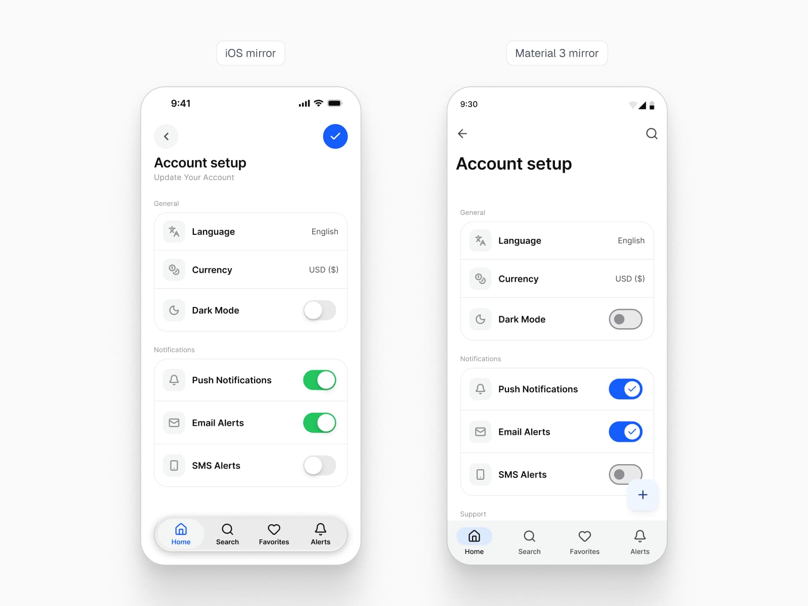
Grouped lists that save as they change
Rows with chevrons, headers between the groups, switches that commit the moment they move and a destructive row at the foot. iOS and Material part on the corner radius and the header case.
Sheets
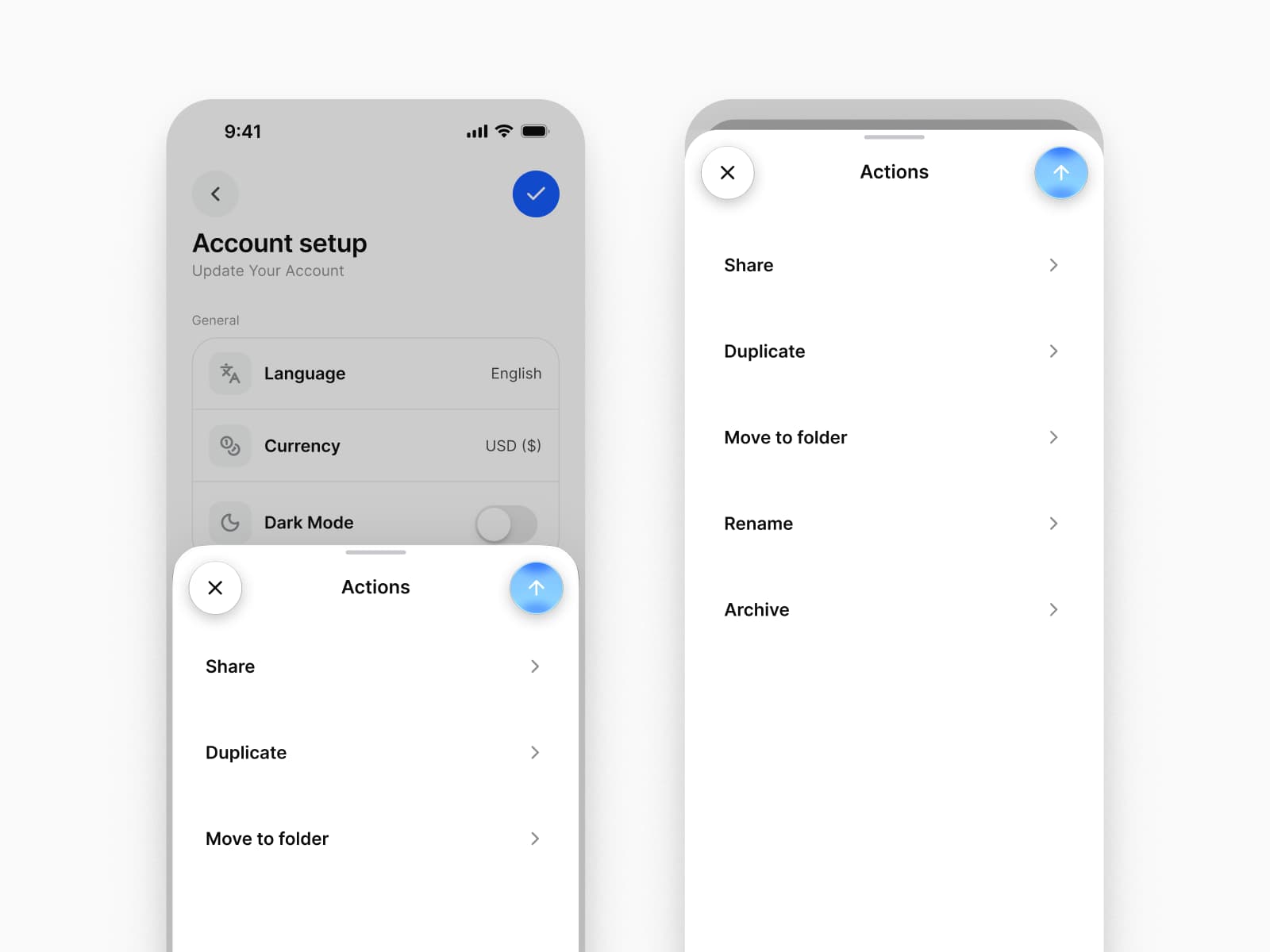
Sheets that rise from the bottom edge
A sheet rests at its detents, can be dragged between them and keeps the screen behind it in view. An action sheet lists its choices where the thumb already is.
Dark mode
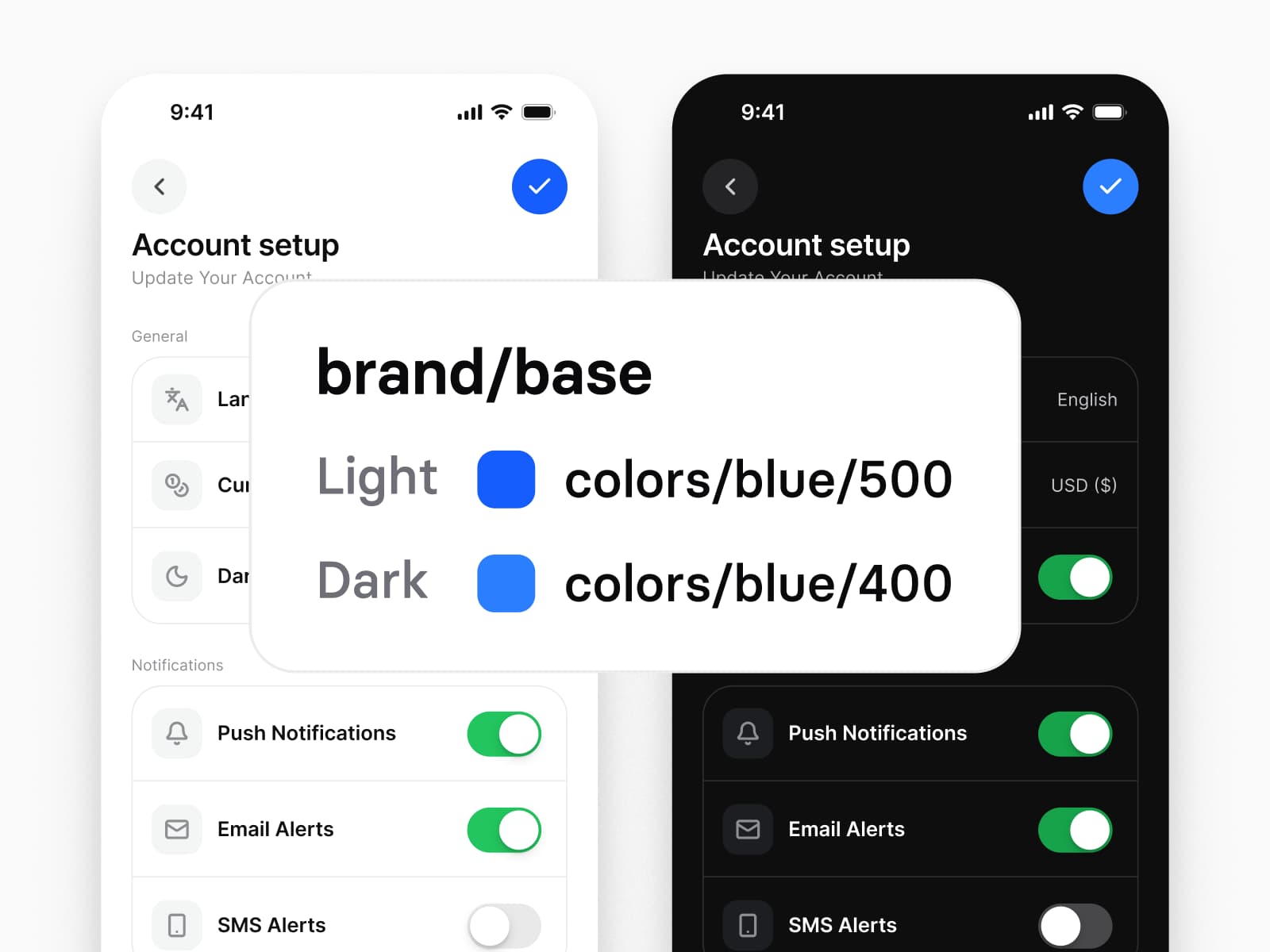
A second mode the phone switches
The system setting decides, so every component carries Light and Dark through the same semantic tokens, and the iOS mirror keeps Apple's system colors with their accessibility behavior.
Keep reading
The long answer and the rest of the field.
The longer answer
Appetite UI vs Untitled UI for a mobile app, screen by screen
Every kit on one table
Figma UI kits for mobile apps
Side by side
Appetite UI and Dynamic Layer
Your next rebrand is one edit.
One-time payment, Lifetime updates, Unlimited client projects