Comparison
Same phone. Different handoff.
Dynamic Layer pairs Figma with Flutter code. Appetite UI stays code-agnostic: the same tokens export to SwiftUI, Compose, Flutter or CSS.Checked on against dynamiclayer.io
Verdict
Your codebase picks the file.
Use Dynamic Layer if
You build in Flutter and want the components as code.
In its own words it is a mobile app UI kit and component library for Figma and Flutter, with Flutter code for the components.An agent builds your Flutter prototype.
Its page says it is built for Claude Code workflows: the agent customizes screens and connects flows on its Figma and Flutter foundation.
Use Appetite UI if
Your apps are SwiftUI, Compose, Flutter or all three.
One W3C DTCG source generates the values for each, so a native iOS app, a native Android app and a Flutter app read what you designed with.A rebrand and a second platform have to stay one edit.
Apple and Material components read the same semantic tokens, so a new brand color is set once for both platforms and both modes.
Before you buy either file, ask how many places you edit when the brand changes. The read-only Figma preview lets you count it for this one.
Side by side
The same rows for both files.
The left column is what this file decided. The right column is what Dynamic Layer says about itself on dynamiclayer.io.
| Criterion | Appetite UIThis file | Dynamic Layerdynamiclayer.io |
|---|---|---|
| What it isHow each describes itself. | A Figma UI kit for iOS and Android, built like a design system. | A mobile app UI kit and component library. |
| Built forThe apps it was drawn for. | iOS and Android apps, with Apple and Material components in one file. | iOS, Android or hybrid apps, built with Figma and Flutter. |
| Beside the Figma fileWhat your developers receive. | The DTCG token source and its SwiftUI, Jetpack Compose, Flutter and CSS outputs, in the file you buy. The outputs carry the values; your developers keep their own components. | Flutter code for the components. |
| A brand changeWhat one new brand color costs. | One primitive edit. Every semantic alias, both platform mirrors and both modes follow it. | Custom fonts and colors. How a change travels through the file is not stated on its site. |
| Light and darkHow the second mode is made. | Light and Dark modes on one semantic token set, so a screen switches with the system. | Automatic dark mode. |
| AI agentsWhat an agent is given to work from. | The Core Skill, included with the file, tells an agent which token to use. | Built for Claude Code workflows. |
| Use it ifThe short answer. | You want one token source for SwiftUI, Compose, Flutter or CSS. | You build in Flutter and want the components as code. |
Checked on . The Dynamic Layer column is read from dynamiclayer.io and goes no further: this site states no price, count or rating of another product.
One source
Where one source pays off.
A rebrand, a second platform and a developer handoff are where a Figma file holds or drifts. From one token source, all three read the same values.
Rebrand
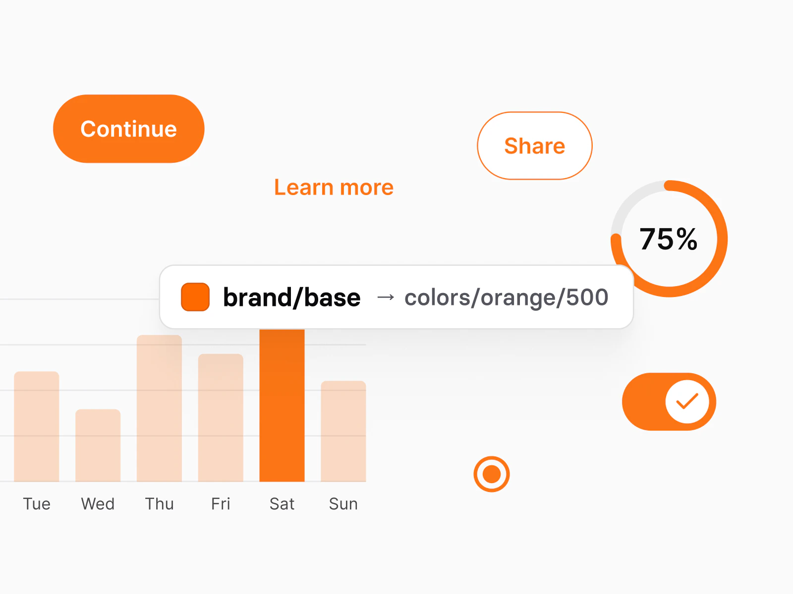
Change one primitive
Point brand/base at a new color once. Every semantic alias that reads it follows, in light and dark, on the iOS and the Material mirror, in the same edit.
Second platform
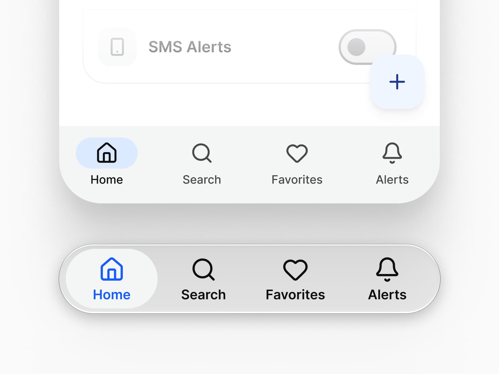
Both mirrors read the same tokens
The Apple mirror carries 15 system colors and the Material mirror 32 roles, both bound through Platform Bridge, whose System mode returns the file to the untouched platform defaults.
Handoff
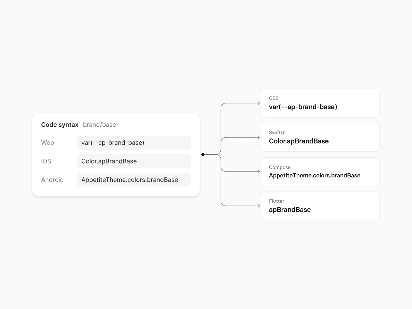
Developers read the values
Style Dictionary turns the W3C DTCG source into SwiftUI, Compose, Flutter and CSS in one build. The SwiftUI output keeps Dynamic Type, and the Compose output carries a Material 3 typography object.
Keep reading
The long answer and the rest of the field.
The longer answer
Alternatives to Dynamic Layer for Figma mobile design
Every kit on one table
Figma UI kits for mobile apps
Side by side
Appetite UI and Untitled UI
Your next rebrand is one edit.
One-time payment, Lifetime updates, Unlimited client projects