How to choose a Figma UI kit for an iOS app
Choose by where the app ships, then variables, rebrand, handoff and license. Ten questions with a five-minute Figma test each, and when not to buy a kit.

On this page
To choose a Figma UI kit for an iOS app, decide where the app ships first, then check what the kit gives your developers, whether the brand can change in one edit, and whether its components follow the platform. For an app that runs only on iPhone and iPad, Apple's iOS and iPadOS 27 UI kit is the official starting point; for Android it is Google's Material 3 Design Kit. A commercial kit earns its price by beating them on something you can test in five minutes.
Appetite UI is a Figma UI kit for iOS and Android apps, built like a design system. One token source drives Apple and Material components in light and dark mode, and exports to SwiftUI, Jetpack Compose, Flutter and CSS. I build it, so one kit in this guide is mine; the checklist below applies to it as well, and the last table answers each question for it.
Which Figma UI kit is the official starting point for an iOS app?
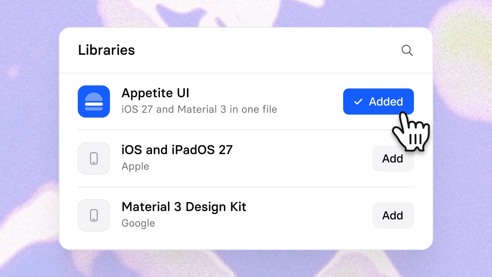
Apple's iOS and iPadOS 27 UI kit. It is listed on Apple's Design Resources page for Figma and for Sketch, and Apple's developer news of June 23, 2026 says the design kits for iOS, iPadOS and macOS 27 are available with these changes: "Updates to Liquid Glass", "Expanded component and state support", "Naming changes to better align with code" and "Improved resizing". For Android the starting point is Google's Material 3 Design Kit on Figma Community. Details of both are in Apple's iOS kit, Google's Material 3 kit or Appetite UI: which to start from, and the Appetite UI comparison with Apple's kit and with the Material 3 kit hold the short versions.
The platform question comes first because of Apple's license. Its Design Resources license, LYL142 of June 21, 2023, grants "a limited, non-transferable, non-exclusive license to use the Apple Design Resources solely for creating mock-ups of user interfaces designed for use in software products that run only on Apple's macOS, iOS, watchOS, tvOS, and/or visionOS operating system software", and the license adds "you agree not to, install, use or run the Apple Design Resources for the purpose of creating mock-ups of user interfaces to be used in software products running on any non-Apple operating system software." An iPhone-only app sits inside that. An app that also ships on Android does not, so the Android screens need a different base, and two bases means two systems to keep in step.
For many readers the right answer is short: use Apple's kit if you ship on iOS only and want Apple's exact components. Use Appetite UI when the same app also ships on Android, or when your brand has to sit on top of the system. The field of other kits is in The best Figma UI kits for mobile apps in 2026, and every alternative on one page is at Appetite UI alternatives.
What do other buyer's guides ask you to check?
Setproduct's guide, "The full guide on choosing the proper iOS design kit", published June 9, 2023, gives five criteria. It is a seller's guide, written by a kit maker, which is also the position of this article.
| Setproduct's criterion, as headed | What it asks | Where this guide covers it |
|---|---|---|
| (A) Consider the needs of your project | Complexity, audience flow, special requirements | Question 1, then the section on when not to buy |
| (B) Read reviews and compare cost | Reviews from other designers; price against budget | Question 8, the license, and question 10, a preview you can test |
| (C) Verify if a kit meets Apple's HID guidelines | Review the kit's documentation for compliance | Questions 5 and 6, tested against Apple's own kit file |
| (D) Ensure the level of UI customization | Flexible system or rigid kit | Questions 2, 3 and 4: variables, modes, a rebrand |
| (E) Check the compatibility to be coded | Does it support your framework | Question 7, what a developer receives |
| Not in the guide | Dark mode, tokens, a rebrand, the license, update dates, Apple's own kit, Android |
Checked on , against Setproduct's buyer's guide, read in full on its own page.
The strings variable, dark, token, Android and license do not occur in the guide's text, which is a statement about 2023 as much as about Setproduct. Figma variables, Liquid Glass and Android parity are what separates a kit in 2026, so the ten questions below are built around them.
Which ten questions should you ask of any Figma UI kit?
Ask them of the kit's own page and, above all, of its Figma file. Each test below takes about five minutes and needs nothing but the file or its preview.
| # | Question | Five-minute test | A good answer |
|---|---|---|---|
| 1 | Which platforms does it draw? | Read the kit's page for the words iOS and Android, then open its Button and compare the two platforms' controls. | Both platforms named on the page, with their own controls instead of one drawing for both. |
| 2 | Does it use Figma variables? | Open the Variables modal in the file and look at the collections. | Color in a collection, with primitives and semantic tokens separate and linked by aliases. |
| 3 | Is dark mode a mode, a variant or a copy? | Select a screen, open Apply variable mode in the Appearance section and choose Dark. | One frame switches. If nothing changes, dark mode lives in variants or duplicate frames. |
| 4 | Does a rebrand take one edit? | Click the primary button, read its fill in the right sidebar, then follow that variable in the Variables modal. | The fill is a variable that points at a primitive, and the platform tint points at the same variable. |
| 5 | Does it carry Apple's current components? | Put the kit's tab bar, sheet and button beside Apple's iOS and iPadOS 27 versions in one frame. | Nothing Apple changed for 27 is missing: Liquid Glass bars, states, sizes. |
| 6 | Are the tap targets the platform's size? | Select a button and read its height. | 44 points on iOS and 48 dp on Android, or one variable that switches between them. |
| 7 | What does a developer receive besides the file? | Find the sentence on its page about code, tokens or handoff. | Named plainly, with the design names matching the code names. |
| 8 | Does the license cover your clients and your team? | Open the license and find the definition of a seat and of a team library. | A seat defined in a sentence you can quote to a client. |
| 9 | How is it updated, and can you see when? | Find a dated changelog and compare the last date with Apple's June 23, 2026 release of the 27 kits. | A dated history, with recent entries and a stated policy for future releases. |
| 10 | Can you try it before paying? | Open the preview or the sample file and run questions 2 to 5 in it. | A preview of the real file, not of a cover. |
Some of the answers need more than a table row.
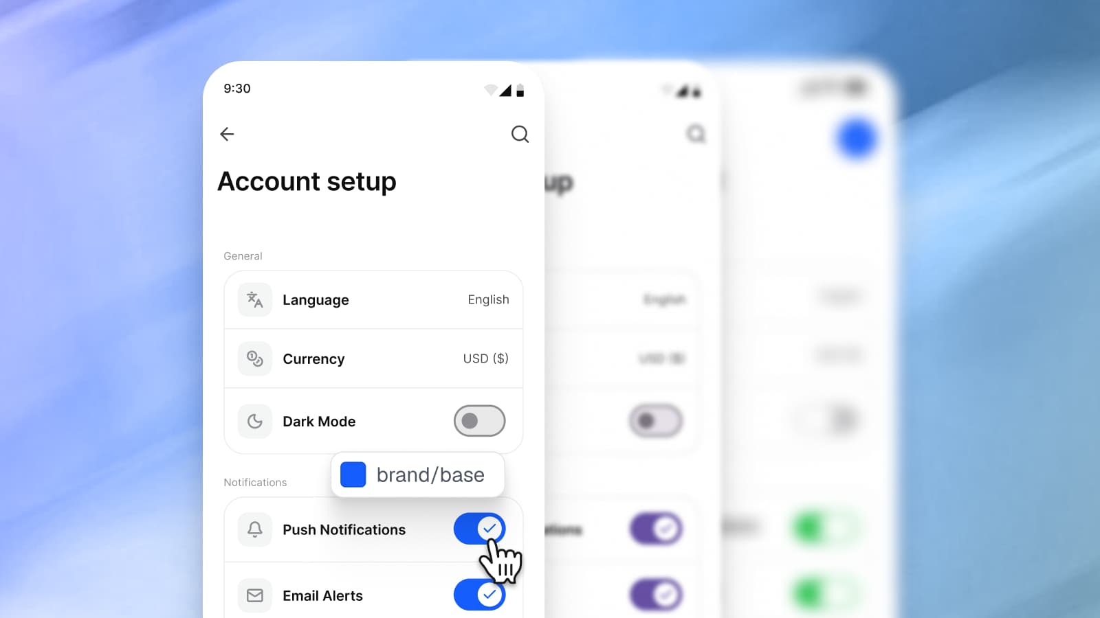
The variables question (2, 3 and 4). These are one test in three steps, and they are where kits differ most. Setproduct's Mobile X page states its approach in four words: "Dark theme made with Variants", with "Easy to toggle theme for each component". In Figma, that is a Light and a Dark variant on each component, set per instance, where a variable mode switches a whole frame from one place. Untitled UI's Figma kit lists "Advanced color, spacing and radius variables" and "Dark mode variables" with the line "Switch designs to dark mode with one click." Neither approach is a flaw in itself; they are different answers to question 3, and you should know which one you are buying. How a mode works is in Dark mode with Figma variables, not duplicate frames. How a rebrand follows a variable, with the layers counted in a real file, is in How to rebrand a mobile app in Figma with variables. There, the brand color reaches 1,110 layers through one variable, and that is the number question 4 asks a kit to produce.
Apple's current components (5). Compare, do not trust. Apple's kit is Apple's own drawing, so a kit that redraws the controls will not be identical to it. The test is whether anything Apple changed in 27 is missing, which is a short list of obvious parts: bars and sheets in Liquid Glass, the states of a control, the sizes. Appetite UI's iOS pages mirror Apple's iOS 27 patterns in 20 pattern pages and draw them in Inter with Lucide icons, without Apple artwork, SF Symbols or the San Francisco typeface; the Liquid Glass settings are in How to make Liquid Glass in Figma for iOS 27.
Tap targets (6). Apple's accessibility guidelines give a table of control sizes: for iOS and iPadOS the default is 44x44 pt and the minimum 28x28 pt. Android's documentation recommends "that each interactive UI element have a focusable area, or touch target size, of at least 48dpx48dp." A kit that draws 44 everywhere is right for iPhone and short on Android. Appetite UI holds both in one variable, platform/, which is 44 in the four iOS modes and 48 in android.
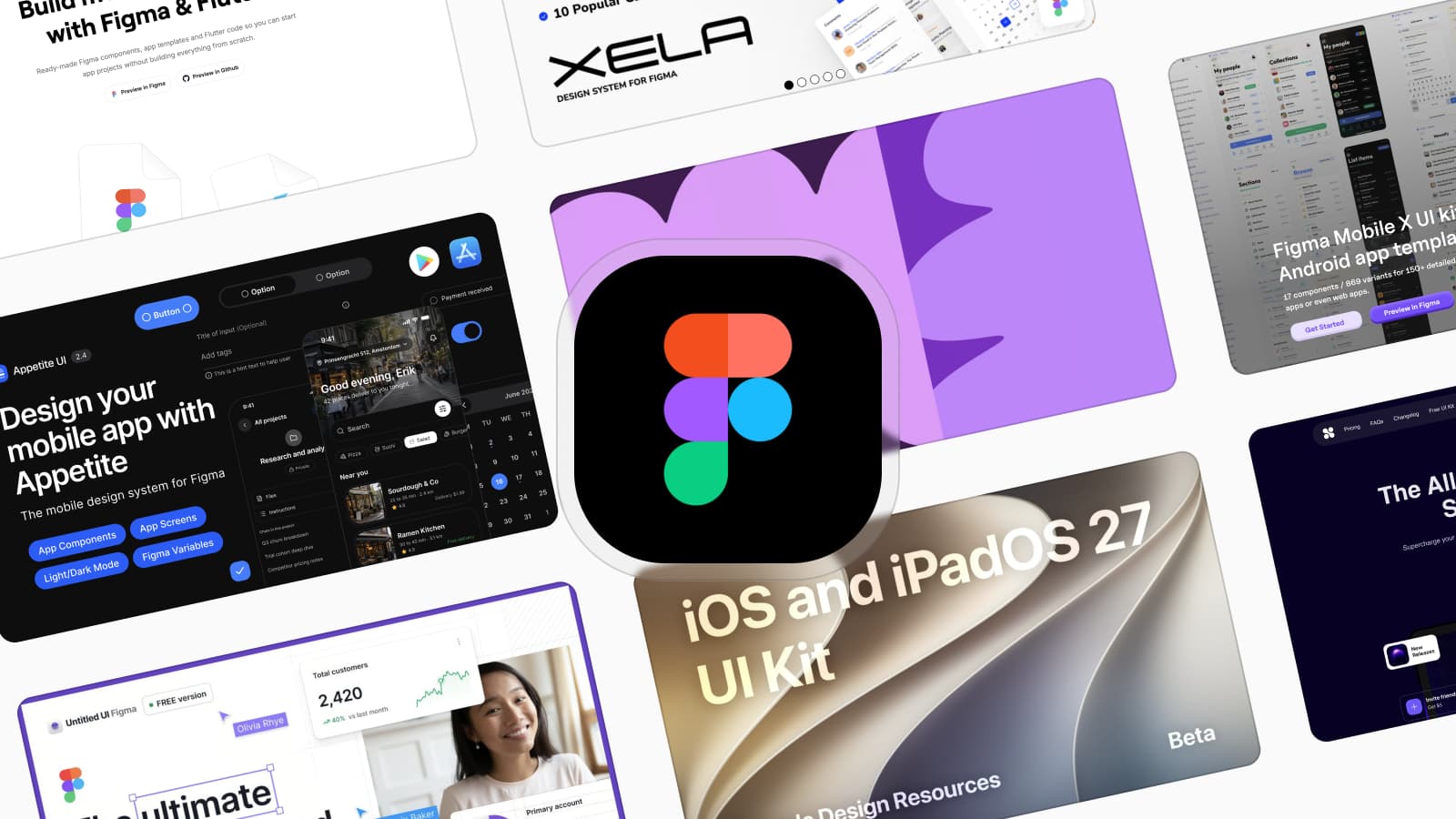
The preview (10). A cover image shows the best frame, and the variables live behind it. Setproduct's Mobile X page offers "Preview in Figma", Untitled UI's page offers "Preview in Figma" beside several of its versions, and Dynamic Layer's page offers "Get free preview". Appetite UI has a read-only preview of the whole file. Run questions 2 to 5 in it before you pay.
How do the pages I read answer the license and update questions?
They define a seat in different words, which is the reason to read them. Everything below is quoted from the kit's own page on October 8, 2026, and prices and terms change, so read the page again before you buy.
| Kit | License, in its words | Price model and updates |
|---|---|---|
| Apple's iOS and iPadOS 27 kit | "solely for creating mock-ups of user interfaces designed for use in software products that run only on Apple's macOS, iOS, watchOS, tvOS, and/or visionOS operating system software" | Design kits announced June 23, 2026 with Liquid Glass updates. No price on Apple's resources page. |
| Setproduct Mobile X | "Individual license" is "for freelancers, indie developers, or solopreneurs working on a single project." "Business license" is "for startups or enterprise organizations to use for a local team or publish in Figma library." | "Pay once & use forever this well-crafted Figma mobile library to design for iOS / Android 3x faster." "Buy now $98". No update policy stated. |
| Dynamic Layer | "Personal licenses are for individual users only. If Dynamic Layer is shared within a team, used as a Figma team library, added to an internal repository or used across client projects by an agency, an Agency License is required." | The Personal License is listed as "€ 149" with "One-time payment", and "Lifetime updates" is listed under it and under the Team License. A free preview is offered. |
| Untitled UI | For its Figma kit: "From $129 for a single-user license." | "Pay once, use forever in unlimited projects." and "Free lifetime updates". |
| Appetite UI | Personal, client and commercial projects, unlimited. You cannot resell, sublicense or redistribute the system, or share the file outside your licensed team. Solo covers one designer, so design teams and agencies need a Team license. | One payment, $79 for Solo, no subscription, and every future release included. Pricing has the plans. |
Checked on , against each kit's own page, quoted to the letter.
Note the difference in the middle rows. Setproduct counts users in Figma and names a published library as the Business case. Dynamic Layer names a Figma team library and an agency working across client projects as the case that needs the Agency License. If your team shares the kit as a library, which is how most teams use a kit, those two sentences decide the price before the feature list does.
When should you not buy a kit?
When a free official kit or your own system already answers the ten questions. Each of these is a case where I would tell you to keep your money:
- An iPhone-only app that should look exactly like Apple's. Apple's kit is drawn by Apple, updated with the platform, and it fits inside the license. Anything between you and it adds drift.
- An Android-only app on Google's baseline. Use the Material 3 kit.
- A team that already keeps its own variables. If your brand sits on an alias chain, a kit adds a second system to reconcile. Take its screens as reference only if they save you time.
- A web product. A mobile kit draws phone widths. For a web app, a dashboard or a marketing site, look at a web kit, as The best Figma UI kits for mobile apps in 2026 sorts them.
- A team without a paid Figma plan, if the kit relies on modes. Figma's help lists modes for Education, Professional, Organization and Enterprise plans. A kit that switches Light and Dark, or iOS and Android, by mode needs one of them. Appetite UI is such a kit.
- A developer who wants components as code. Appetite UI ships token values for SwiftUI, Jetpack Compose, Flutter and CSS, and your developers keep their own components. If you want coded components, look at the kits that sell them.
The reverse also holds, and it is the approved line for the Material side: use the Material 3 kit for an Android app on Google's baseline, and use Appetite UI when Material roles need to carry your brand and the same app ships on iOS.
Where does Appetite UI stand on the ten questions?
| # | Question | Appetite UI |
|---|---|---|
| 1 | Platforms | iOS and Android in one file, on five Platform modes: ios-md, ios-lg, android, ios-duo-outer and ios-duo-inner. |
| 2 | Variables | 589 variables in 6 collections: Foundations, Color Tokens, Platform, Typography, Platform Bridge and Motion. |
| 3 | Dark mode | A mode. Color Tokens has Light and Dark, and one frame switches. |
| 4 | A rebrand | One alias chain from brand/ to the layers and to iOS/ and M3/. A complete swap is 11 tokens. |
| 5 | Apple's current components | Mirrors Apple's iOS 27 patterns, redrawn in Inter with Lucide icons. It is not Apple's file, so test it against Apple's. |
| 6 | Tap targets | platform/ is 44 in the iOS modes and 48 in android. |
| 7 | Handoff | The token source and its SwiftUI, Jetpack Compose, Flutter and CSS outputs come in the file you buy. They are values and carry no component code. |
| 8 | License | Solo for one designer, Team for design teams and agencies; personal, client and commercial projects. |
| 9 | Updates | Releases 2.0 to 2.5 are listed on the changelog, and every future release is included. |
| 10 | Preview | A read-only preview of the whole file. |
Checked on , against the Appetite UI file (release 2.5), its docs and its pricing page.
Two answers in that table are limits. The components are drawn in Inter with Lucide icons, so the Apple mirror is a redrawing of Apple's controls and no copy of Apple's file, and modes need a paid Figma plan. The docs state every token and component, the platforms page shows the two mirrors, and pricing lists what each license includes.
Questions
What is the best Figma UI kit for an iOS app?
For an iPhone and iPad app that should look like Apple's, Apple's iOS and iPadOS 27 UI kit, from Apple Design Resources. If the same app also ships on Android, or the brand has to sit on top of the system, Appetite UI holds both platforms on one token source. Run the ten questions in this guide before you pick either.
Is Apple's iOS UI kit enough for an iOS app?
Yes for an app that should look like Apple's and runs only on Apple's operating systems. Apple's developer news lists Liquid Glass updates, expanded component and state support, and improved resizing for the 27 kits. It is Apple's own drawing, so it matches the platform and changes when Apple changes it.
Can I use Apple's iOS UI kit for an Android app?
Not under its license. Apple grants the use of its Design Resources "solely for creating mock-ups of user interfaces designed for use in software products that run only on Apple's macOS, iOS, watchOS, tvOS, and/or visionOS operating system software", and the same section says you agree not to use them to make mock-ups for software running on any non-Apple operating system.
How do I check whether a Figma UI kit uses variables?
Open the Variables modal in the kit's file, or in its preview. A kit that uses variables has collections for color, usually with primitives and semantic tokens separate. Then click the primary button and read its fill in the right sidebar: a variable name means the button is bound, and a hex value means it is not.
Should I buy a UI kit or build my own?
Build your own if the design system is the product you sell, or if your team already keeps brand variables you do not want to reconcile with someone else's. Buy when the app is the product and the work that repeats in every mobile project, platform components, dark mode and the token export, is not where your time should go.
How often should a Figma UI kit be updated?
At least with every platform release. Apple announced its iOS and iPadOS 27 design kits on June 23, 2026, so a kit that claims iOS 27 support should show a dated update from around that date. Ask for a changelog, and for the policy on future releases in writing.
Sources
- Setproduct: Countdown to launch, how Figma iOS kits can help design your next mobile app faster, published June 9, 2023, read October 8, 2026
- Apple Design Resources, read October 8, 2026
- Apple Developer News: Design kits for iOS, iPadOS, and macOS 27 are here, June 23, 2026, read October 8, 2026
- License Agreement for Apple Design Resources, PDF, LYL142, 06/21/2023, read October 8, 2026
- Apple Human Interface Guidelines: Accessibility, read October 8, 2026
- Android Developers: Concepts and Jetpack Compose implementation, read October 8, 2026
- Figma Learn: Modes for variables, read October 8, 2026
- Figma Learn: Create and manage variables and collections, read October 8, 2026
- Figma Mobile X UI kit, Setproduct, read October 8, 2026
- Dynamic Layer, read October 8, 2026
- Untitled UI, read October 8, 2026