Comparison
Android only, or both? The file follows.
Use the Material 3 kit for an Android app on Google's baseline. Use Appetite UI when Material roles need to carry your brand and the same app ships on iOS.Checked on against Figma Community
Verdict
The platforms you ship pick the file.
Use the Material 3 kit if
You ship an Android app on Google's baseline.
In its own words, an introduction to Material Design 3 with styles and components, built to work with the Material Theme Builder plugin.
Use Appetite UI if
Material roles need to carry your brand and the same app ships on iOS.
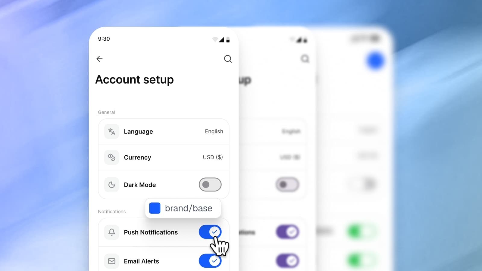
brand/base is one color that the Material primary role and the iOS tint both resolve to, and System mode returns each platform to its published value.
Use both when Google's kit is your reference for the Android baseline.
Side by side
The same rows for both files.
Google's column is what its pages say, read on its Figma Community page and the Material 3 pages.
| Criterion | Appetite UIThis file | Google's Material 3 Design KitFigma Community |
|---|---|---|
| What it is | A Figma UI kit for iOS and Android, built like a design system. | An introduction to Material Design 3, with styles and components to help you get started, built to work with the Material Theme Builder plugin. |
| Built for | iOS and Android apps, drawn at phone widths. | Android apps, built for Jetpack Compose. |
| iOS and Android conventions | Apple and Material components in one file, with 15 Apple system colors and 32 Material 3 roles, each pointing at a token you control. | Material 3 on Android. Its page describes no iOS version. |
| Light and dark | Light and Dark modes on one semantic token set, so a screen switches with the system. | Light and dark color styles backed by variables, switched with the Material Theme Builder plugin. |
| A new brand color | One edit. Both platforms and both modes follow it. | Material Theme Builder: "Colors will be shifted to generate accessible colors within the same color space as dynamic colors." |
| What developers get | Token values exported to SwiftUI, Jetpack Compose, Flutter and CSS, in the file you buy. Your developers keep their own components. | Jetpack Compose code snippets in the file, and a code export of the theme from Material Theme Builder. |
| License and price | $79 for Solo and $149 for Team, paid once, with lifetime updates. | No price on its page. Licensed under CC BY 4.0. |
| Use it if | Material roles need to carry your brand and the same app ships on iOS. | You ship an Android app on Google's baseline. |
Checked on . Google's kit page states no price and licenses the file under CC BY 4.0. Counts and ratings are left to its page.
Two platforms
What a second platform adds.
Three things this file draws that a one platform kit does not, each with the page that shows it in full.
iOS
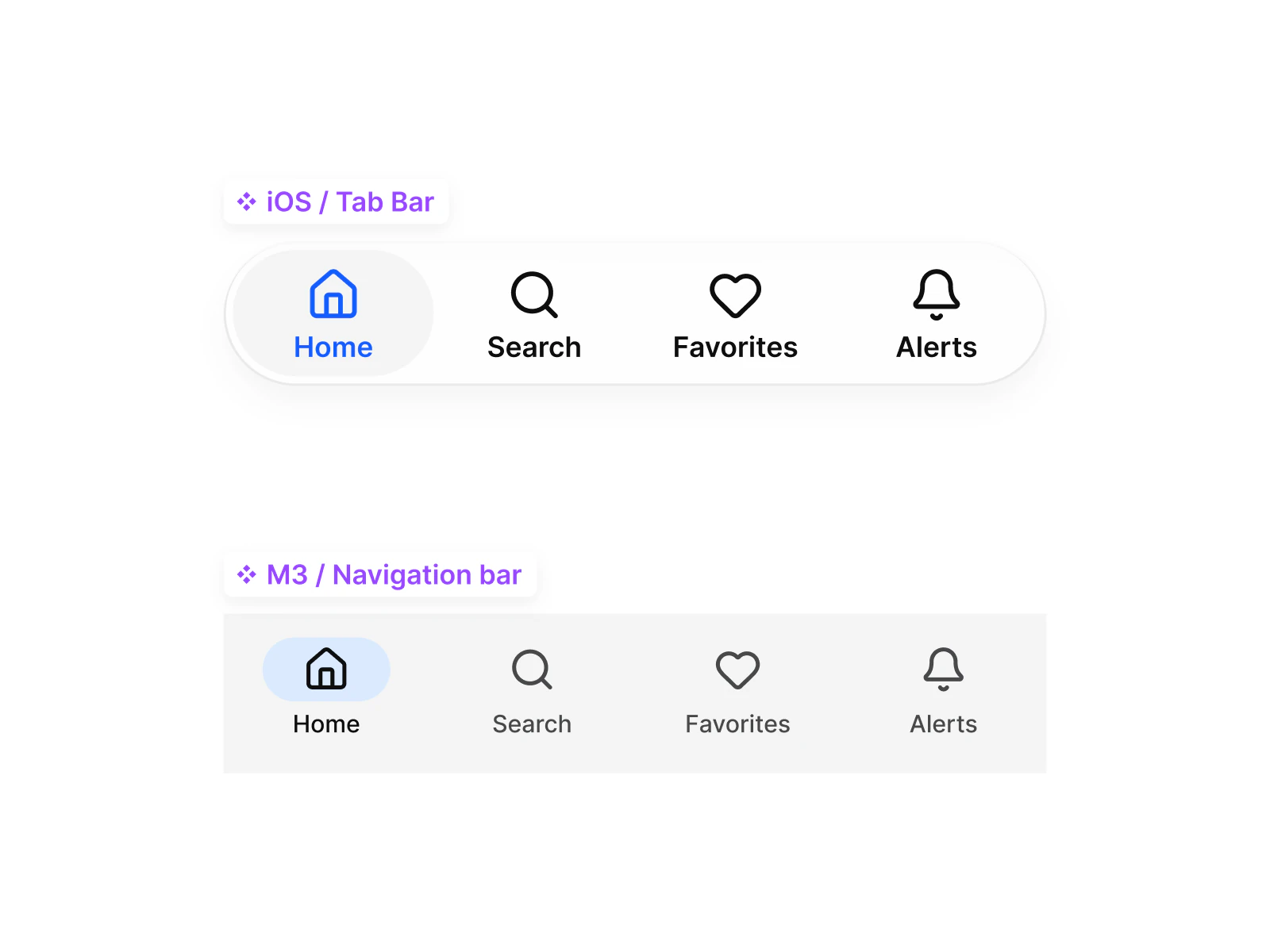
The same screen on iOS
Switch the Platform mode to ios-lg and the screen takes 44 point targets, a 44 point top bar and 8 point corners.
Brand
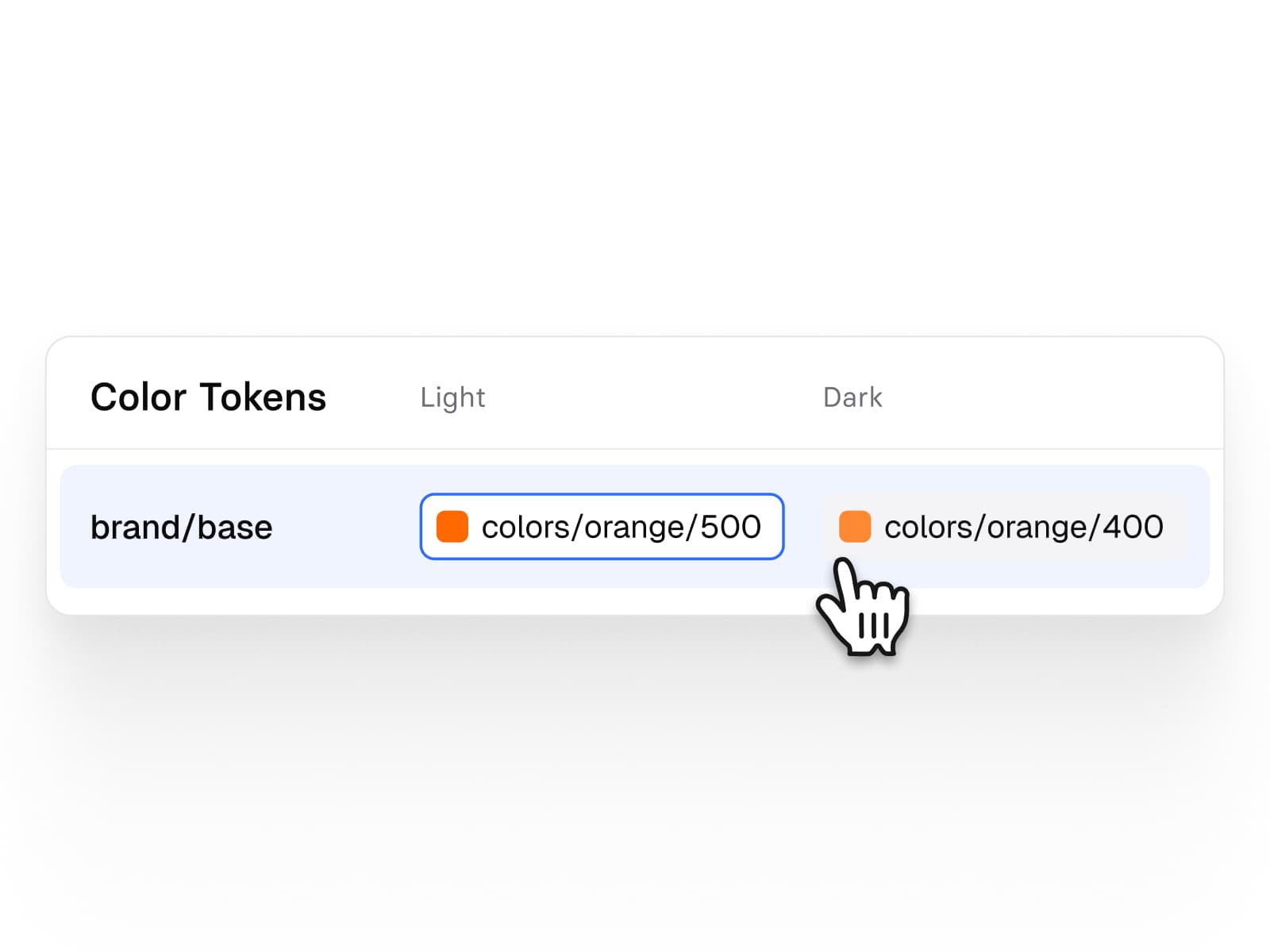
One variable, not a generated theme
The Material primary role resolves to brand/base as you set it, and System mode returns the published value.
Handoff
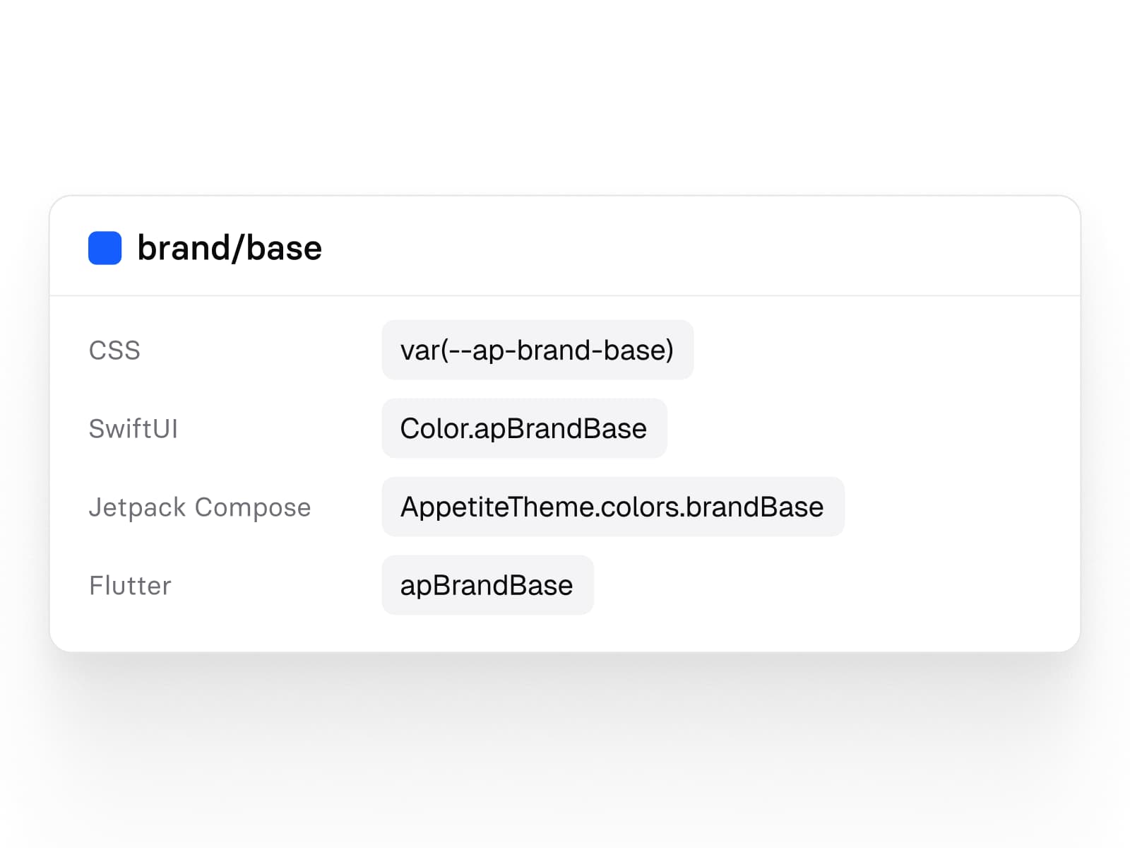
The same name in four codebases
One variable arrives as a CSS property, a SwiftUI color, a Compose theme value and a Flutter constant.
Keep reading
The long answer and the rest of the field.
The longer answer
Apple's iOS kit, Google's Material 3 kit or Appetite UI: which to start from
Side by side
Appetite UI and Apple's iOS 27 UI kit
Every kit on one table
Figma UI kits for mobile apps
Your next rebrand is one edit.
One-time payment, Lifetime updates, Unlimited client projects