Alternatives to Dynamic Layer for Figma mobile design
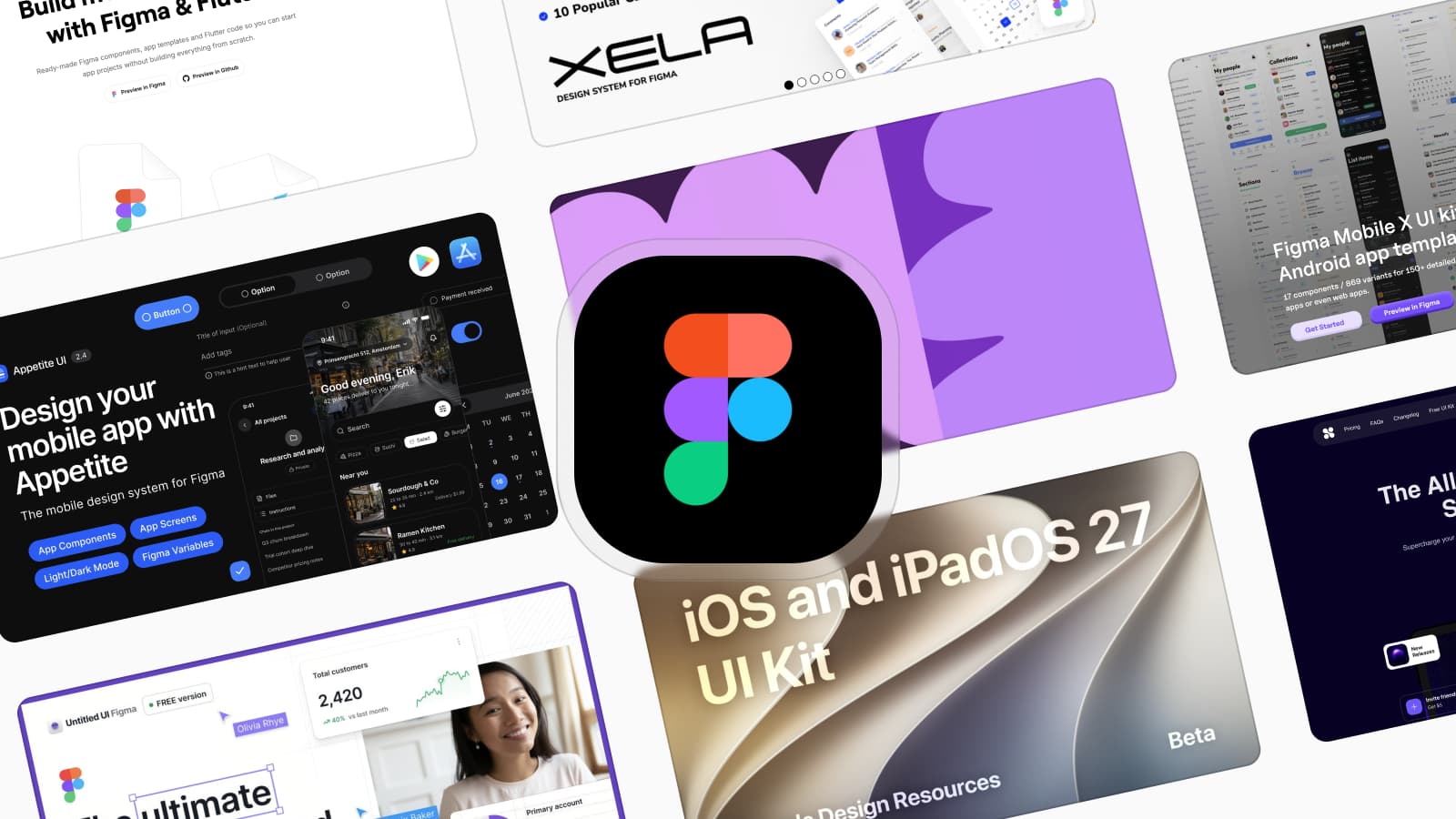
The main Dynamic Layer alternatives are Appetite UI, Xela UI, Mobile X, Nucleus UI and Apple's and Google's free kits, sorted by what ships beside each file.

On this page
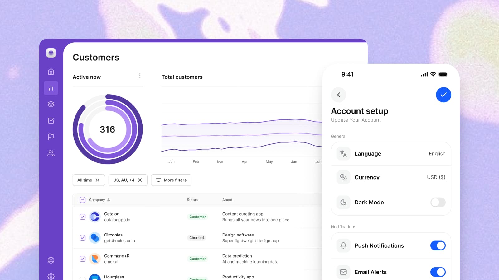
The main alternatives to Dynamic Layer for designing a mobile app in Figma are Appetite UI, Xela UI, Setproduct Mobile X and Nucleus UI, with Apple's iOS and iPadOS 27 UI kit and Google's Material 3 Design Kit as the free references for one platform each. Appetite UI is a Figma UI kit for iOS and Android apps, built like a design system. One token source drives Apple and Material components in light and dark mode, and exports to SwiftUI, Jetpack Compose, Flutter and CSS. Which kit fits depends on three costs you meet after the purchase: the rebrand, the second platform and the handoff to your developer.
I design Appetite UI, one of the kits on this list. So every other kit here is described in its maker's own words, from its own page, with the date I read it under Sources, and this page states no other kit's price, count or rating. Those move, and the page they come from is one click away.
If Dynamic Layer and Appetite UI are already your last two, Appetite UI vs Dynamic Layer puts them side by side, and the alternatives page says when this file is the wrong buy. The wider field, web kits included, is in the best Figma UI kits for mobile apps.
| Kit | Code it names | Best for |
|---|---|---|
| Appetite UI | Tokens for SwiftUI, Jetpack Compose, Flutter and CSS | One app on iOS and Android, one brand |
| Dynamic Layer | Flutter | A Flutter app, prototyped with Claude Code |
| Xela UI | React, Flutter, Jetpack Compose and SwiftUI | Components already coded for your stack |
| Setproduct Mobile X | None stated | iOS and Android screen templates to start from |
| Nucleus UI | None stated | Mobile and web screens in one kit |
| Apple's iOS and iPadOS 27 kit | None stated | An iOS-only app with Apple's exact components |
| Google's Material 3 Design Kit | Jetpack Compose code snippets, per its changelog | An Android app on Google's baseline |
Checked on , against each product's own public pages.
The code column is the code each maker names beside its Figma file, in its own words and linked under Sources. The last column is this article's verdict.
Dynamic Layer's home page calls it a "Mobile App UI Kit & Component library" and promises to "Build mobile apps faster with Figma & Flutter". It says the kit is "Built for Claude Code workflows" and puts the workflow in one sentence: "Use Dynamic Layer as your Figma & Flutter foundation, then let Claude Code customize screens, connect flows, and build working app prototypes faster." The same page offers "polished iOS and Android screen templates" and "Automatic Dark Mode".
If your app is written in Flutter and you want widget code beside the design, that is a direct answer, and it belongs near the top of your list. Dynamic Layer pairs Figma with Flutter code. Appetite UI stays code-agnostic: the same tokens export to SwiftUI, Compose, Flutter or CSS.
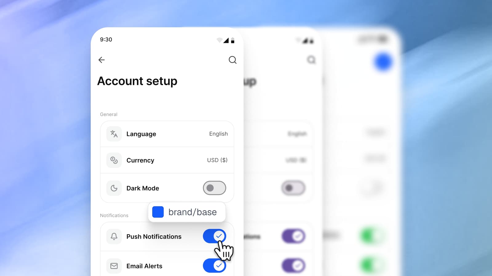
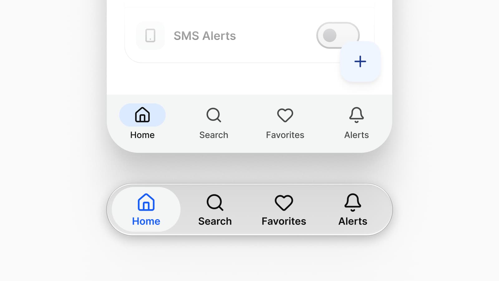
Appetite UI keeps both platforms in one file. The Platform Bridge points 15 Apple system colors and 32 Material 3 roles at the tokens that carry your brand, and one dropdown returns every slot to the value Apple or Google publishes. A brand change is one primitive edit, followed in light and dark on the iOS mirror and the Material mirror alike.
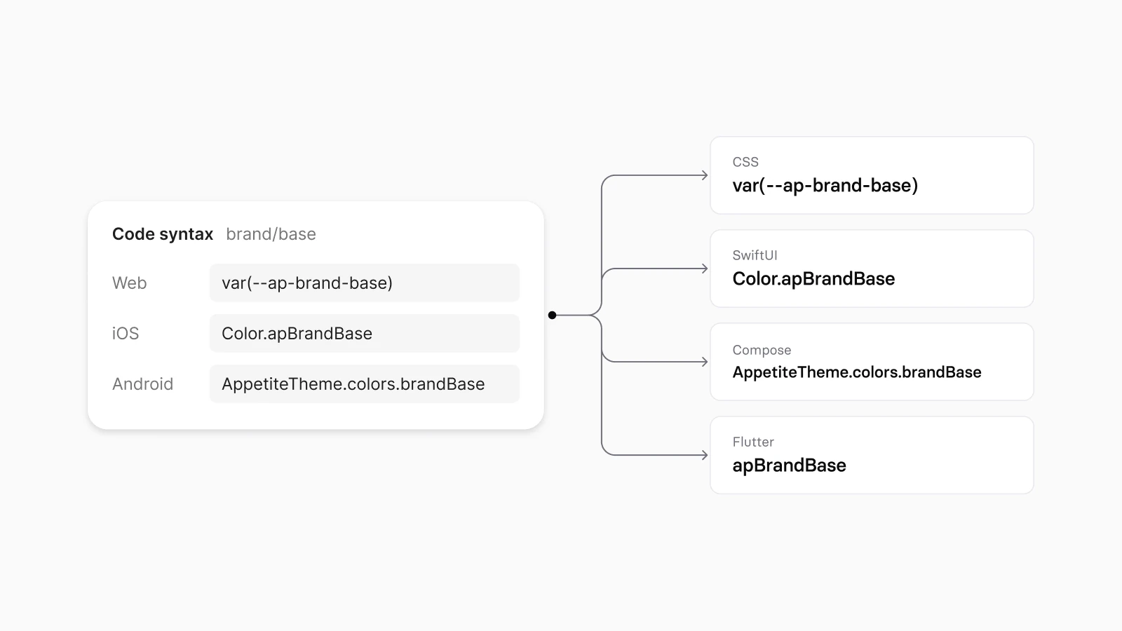
What comes with the purchase, beside the Figma file, is token code. The W3C Design Tokens source exports colors, spacing, type and motion to SwiftUI, Jetpack Compose, Flutter and CSS, under the code names each variable stores for web, iOS and Android, as Code output shows. Your developer builds the views from those names. The file does not ship prebuilt SwiftUI, Compose or Flutter views, and a list of alternatives is the place to say so plainly.
Xela UI is sold on Setproduct's site as a "Xela UI kit for Figma & Flutter" for "desktop & mobile apps". Its page lists code versions beside the Figma file: Xela for React, Xela for Flutter, Xela for Android in Jetpack Compose and Xela for Swift in SwiftUI, and says the kit can "Toggle between dark & light". If your team wants components already written for its stack, ask for the version that matches it.
Setproduct Mobile X calls itself a Figma kit of "iOS & Android app templates", says "Templates are based on iOS specs adopted for 8dp Android grid", and ships its dark mode as a "Dark theme made with Variants". Nucleus UI calls itself "The All-in-one Figma Design System and UI Kit", with templates "From mobile apps to web UI kits for dashboards, e-commerce, and marketing pages", and says its "Built-in variables make switching between light and dark mode easy".
Both lead with the screens you start from, and neither names code that ships beside the file. If one kit has to cover the app and the website around it, Nucleus UI names both. Appetite UI is narrower on purpose: mobile only, with its app screens assembled from the same components and tokens as everything else in the file.
Apple says its iOS and iPadOS 27 UI kit for Figma "helps you quickly and easily create highly accurate iPhone and iPad design comps and user flows", and that it "contains components for all common controls and views, design templates, text styles, color styles, and materials". Its Figma Community page was updated on September 15, 2026. Google describes the Material 3 Design Kit as "a comprehensive introduction to the design system, with styles and components to help you get started", built to work with the Material Theme Builder plugin, and the latest entry in the changelog on its Figma Community page says: "Use this design kit for Jetpack Compose."
Choose Apple's kit if
You ship on iOS only and want Apple's exact components.
It is Apple's own drawing of its controls, free on Figma Community.
Choose the Material 3 kit if
You ship an Android app on Google's baseline.
It is Google's own introduction to Material 3, free on Figma Community.
Choose Appetite UI if
The same app ships on iOS and Android, or your brand has to sit on top of the system.
Material roles and Apple's system colors carry your brand, and System mode returns both official baselines inside one file.
The two official kits and Appetite UI are compared row by row in Apple's kit, Google's kit or Appetite UI.
Every kit above looks right on the day you buy it. Ask each one these three questions, this one included, before you do.
How many places do you edit when the brand color changes?
In a file where components carry their own values, every screen, and the old color turns up months later on a state nobody checked. In a file with two levels, one primitive: every semantic alias that points at it follows, in light and dark, on both platform mirrors. Appetite UI holds 544 variables in 6 collections this way, and Colors draws the chain.
Do both platforms read one source?
Most kits on this list name iOS and Android. What matters is whether the two share one set of tokens, or are two libraries in one file that need every edit twice. In Appetite UI the iOS and the Material mirror read the same primitives through the Platform Bridge.
What does your developer receive?
A specification is a document someone reads and retypes, and every retyped hex is a place where design and build drift apart. A token file is something a build reads. Appetite UI's source is in the W3C Design Tokens format, and Style Dictionary compiles it to CSS, SwiftUI, Jetpack Compose and Flutter in one run; How one Figma token becomes SwiftUI, Compose, Flutter and CSS follows one token through all four.
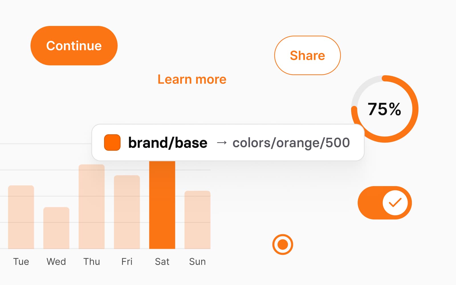
None of this shows in a gallery of screens. Appetite UI's read-only Figma preview opens the whole file, and the color docs list every token with the primitive it points at in Light and in Dark: follow one primitive into its semantic aliases and out into both platform mirrors, and you will know in a few minutes whether the structure is there.
Do the same with any alternative that offers a free file or a preview. If a kit gives you the values, the modes and one place to edit them, the rest is preference. What Appetite UI costs and what its license covers are on pricing, and the web side of the same decision is in the Untitled UI comparison.
What is Dynamic Layer?
Dynamic Layer calls itself a "Mobile App UI Kit & Component library" for Figma and Flutter, "Built for Claude Code workflows" (dynamiclayer.io, read September 24, 2026). Its page offers "polished iOS and Android screen templates" and "Flutter code for the components".
Which Dynamic Layer alternative ships SwiftUI and Jetpack Compose code?
Xela UI lists code versions for SwiftUI and Jetpack Compose, beside React and Flutter, on its own page (read September 24, 2026). Appetite UI exports its design tokens to SwiftUI, Jetpack Compose, Flutter and CSS, and your developer builds the views from them.
Does Appetite UI include Flutter code?
Appetite UI includes Flutter token values, and no Flutter widgets. The token source exports to Flutter beside SwiftUI, Jetpack Compose and CSS. Figma stores a code name for web, iOS and Android only, so the Flutter names follow the same transform as the others. Your developer builds the widgets from those values.
What is a free alternative to Dynamic Layer?
For one platform, the official kits are the free alternatives to Dynamic Layer: Apple's iOS and iPadOS 27 UI kit for iPhone and iPad, and Google's Material 3 Design Kit for Android. Both are free on Figma Community. Appetite UI is paid and has a read-only preview of the whole file, and Dynamic Layer's own page offers a free preview "with selected components".
Is Appetite UI a good fit for a Flutter app?
Yes, when the Flutter app ships on iOS and Android. Appetite UI draws the iOS and the Material conventions a Flutter app can follow on each platform, and its tokens arrive as Flutter values. If you want Flutter widgets already written, Dynamic Layer and Xela UI list Flutter code on their own pages.
- Dynamic Layer, home page, read September 24, 2026
- Xela UI, product page on Setproduct, read September 24, 2026
- Setproduct Mobile X, product page, read September 24, 2026
- Nucleus UI, home page, read September 24, 2026
- Apple Design Resources, read September 24, 2026
- Apple, iOS and iPadOS 27 on Figma Community, read September 24, 2026
- Google, Material 3 Design Kit on Figma Community, read September 24, 2026