Appetite UI vs Untitled UI for a mobile app, screen by screen
Untitled UI is built for web apps and dashboards, Appetite UI for iOS and Android apps. The settings list, the sheet and dark mode show where each one fits.

On this page
Untitled UI is built for web apps, dashboards and marketing sites; it describes itself as a Figma UI kit and React component library. Appetite UI is a Figma UI kit for iOS and Android apps, built like a design system. One token source drives Apple and Material components in light and dark mode, and exports to SwiftUI, Jetpack Compose, Flutter and CSS. So the choice follows where your product opens. In a browser, start from Untitled UI. On a phone, start from Appetite UI.
Untitled UI's home page does advertise "desktop and mobile page examples", and its pricing page calls them "website and dashboard examples". Neither page names iOS or Android. The question underneath is whether you need web pages that fit a phone screen, or an app that follows the conventions of iOS and Material.
The short answer, as a table and two verdicts, is on Appetite UI vs Untitled UI, and the wider field is in The best Figma UI kits for mobile apps in 2026. This page is the longer answer, screen by screen.
On the web, a settings page is a form: labels on the left, inputs on the right and a save button at the bottom. A web kit draws that well, because that is the shape a browser asks for.
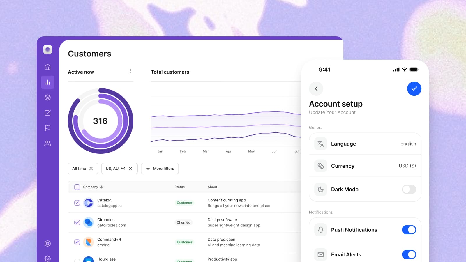
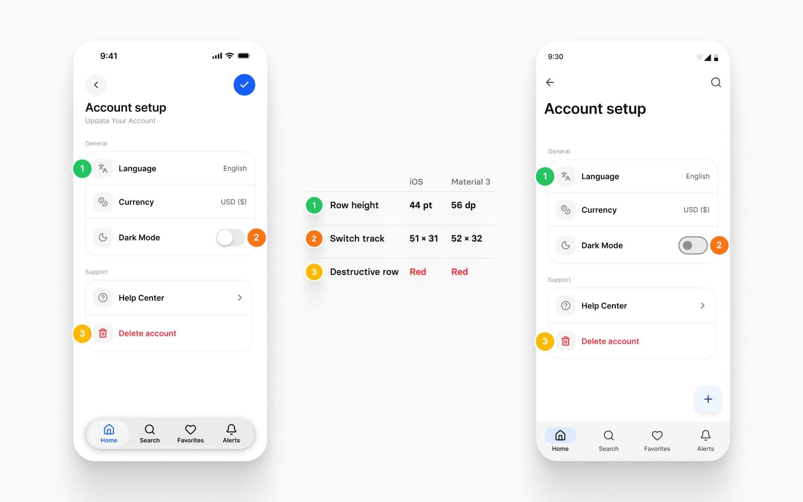
On a phone, settings is a grouped list. Each row carries a leading icon, a label and one trailing control, and Apple's guidelines say where the switch lives: "Use the switch toggle style only in a list row." A switch applies its change as soon as it is touched, so the screen has nothing to save.
The settings screens in Appetite UI are built from the List row, and the row's trailing control is the promise it makes: a chevron drills in, a toggle flips something now, a radio picks one of several, a value label only reports. Change List and the whole settings area follows, on the iOS and the Material mirror alike.
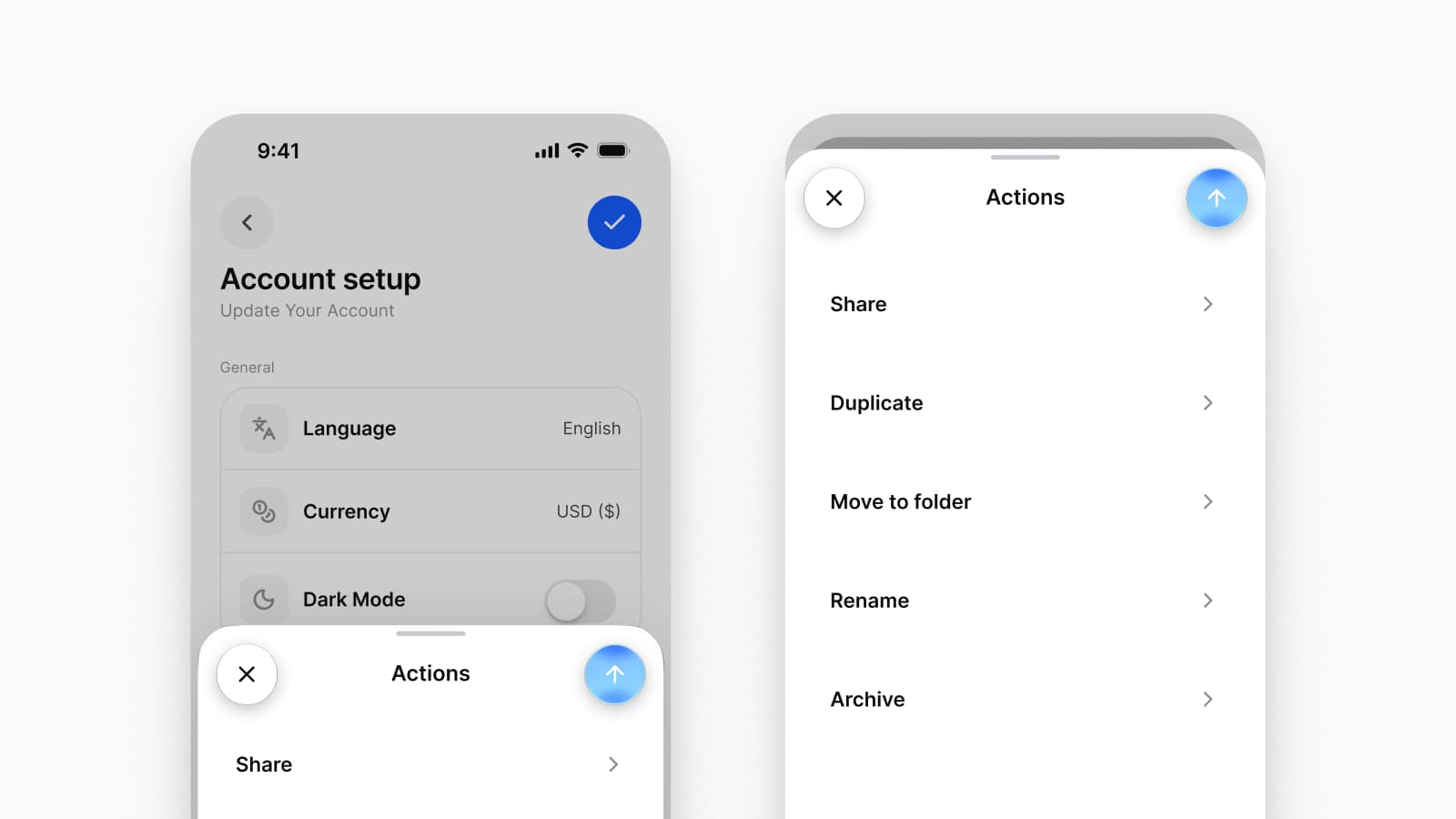
On the web, a modal is a box in the middle of the viewport with an overlay behind it. On a phone, a sheet rises from the bottom edge, and Apple defines where it stops: "large is the height of a fully expanded sheet and medium is about half of the fully expanded height." The reader drags it between the two, and the screen behind stays in view.
Round a web modal's corners and pin it to the bottom of a phone frame, and it looks close and behaves wrong. The first drag that does nothing gives it away.
So the Modal page draws two components. The dialog interrupts with a decision. The Modal Sheet carries secondary flows and pickers, as a sheet with detents on iOS and a ModalBottomSheet on Android, the composable Android's own documentation names for a bottom sheet. The screen header that carries the back button, compact or large, is its own component on Top bars.
Apple calls Dark Mode "a systemwide appearance setting" and asks apps to follow it: "Avoid offering an app-specific appearance setting." The reader chooses once, in the system, and expects your app to change in the same frame. A web product more often offers dark mode as a switch inside the product, and a web kit ships a theme for that switch.
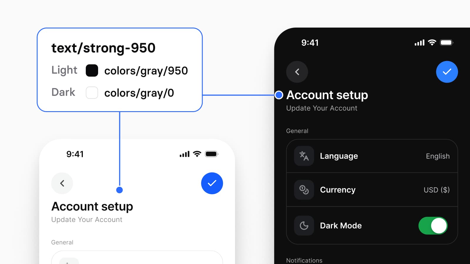
Appetite UI stores the two appearances as two modes of the same token. The token brand/base resolves to colors/blue/500 in Light and to colors/blue/400 in Dark, and every component reads the token, never the color. There are 544 variables in 6 collections behind the file, and Color Tokens is the collection that holds the two values, documented on Colors. Change a primitive once and both appearances follow, in one edit. How that is built on Figma variables, step by step, is in the dark mode guide.
The platform mirrors keep Apple's own semantic colors one switch away instead of replacing them for good. Those colors react to the contrast settings a reader has turned on, settings you will not see on your own phone, and the iOS mirror returns to them in System mode.
Many mobile products start on one platform and add the second later. When it arrives, a web kit has nothing to add, because a browser renders one set of conventions. A phone app renders two, and they disagree on size.
The Platform Bridge keeps both in one file: 15 Apple system colors and 32 Material 3 roles, each pointing at a token you control. Beside it, the Platform collection holds the geometry each platform owns, one mode per device class.
| Measure | iOS | Android |
|---|---|---|
| List row, minimum height | 44 | 56 |
| Switch track | 51 by 31 | 52 by 32 |
| Touch target | 44 | 48 |
| Top bar height | 44 | 64 |
| Control corner | 8 | fully round |
Points on iOS and dp on Android, read from the file's Platform collection. The 44 point and 48 dp touch targets are the ones Apple and Google publish; the other values are the file's own decisions.
I built one switch into the Bridge for the check a native review asks for: does this screen look like the platform? Set the collection to System and every slot returns the value Apple or Google publishes, iOS/tintColor to systemBlue and the Material primary to Google's baseline. Set it back to Brand and your brand returns. Nothing is repainted and nothing is detached, and the Material 3 mirror reads from the same primitives as the iOS one. The platforms page shows the two mirrors side by side.
Every component the two platforms draw differently, from the top bar to the switch, is listed in iOS vs Material 3: what changes per component.
| Criterion | Appetite UI | Untitled UI |
|---|---|---|
| Category, in its own words | A Figma UI kit for iOS and Android apps, built like a design system | A Figma UI kit and React component library |
| What its pages show | iOS and Android app screens | Website and dashboard examples, desktop and mobile |
| iOS or Android named on its home and pricing pages | Both | Neither |
| Code beside the Figma file | Tokens exported to SwiftUI, Jetpack Compose, Flutter and CSS | React components, "Built with React Aria and styled with Tailwind CSS" |
| Dark mode | Light and Dark as two modes of one token set | "Dark mode variables": "Switch designs to dark mode with one click." |
| Best for | An app on iOS and Android | A web app, a dashboard or a marketing site |
Checked on , against each product's own public pages.
Choose Untitled UI if
Your product is a web app, a dashboard or a marketing site.
Dense tables, sidebars and a settings page with a save button are what a web kit is drawn for. A mobile file bought for them would be the mistake in the other direction.
Choose Appetite UI if
Your app opens on a phone, on iOS, on Android or on both.
Grouped lists, sheets with detents, platform bars and dark mode that follows the system are already drawn, on one token source.
Plenty of products are both: a web app for accounts and billing, and a phone app for everything a customer does every day. The two files do not overlap, so owning both duplicates nothing. Keep the brand primitive the same in each and the two surfaces stay one brand.
The part that matters in the second year does not show in a picture of either file. It shows the first time your brand color changes, and the first time a developer asks for values instead of a specification. In Appetite UI the rebrand is one primitive edit, and the developer receives the same tokens as SwiftUI, Compose, Flutter and CSS.
You can check that before you buy. The read-only Figma preview opens the whole file, and the color docs list every token with the primitive it points at in Light and in Dark, so you can follow one primitive into its semantic aliases and out into both platform mirrors and know in a few minutes whether this is the structure you want. Everything the file holds is in the documentation, including the app screens the components are already assembled into, from finance and booking to onboarding and settings. The license covers unlimited projects, and the plans are one payment each: $79 for Solo, one designer, and $149 for Team, up to ten people.
Can I design a mobile app with Untitled UI?
You can design web pages that fit a phone screen with Untitled UI: its home page lists "desktop and mobile page examples". For a native iOS or Android app, Untitled UI's home and pricing pages name neither platform (read September 24, 2026), so grouped settings lists, sheets with detents and platform bars have to come from somewhere else.
Does Untitled UI include iOS or Android components?
Not by its own description. Untitled UI's home and pricing pages mention neither iOS nor Android (read September 24, 2026). Appetite UI draws its platform components as an Apple mirror and a Material mirror, both reading one token set.
Can I use Untitled UI and Appetite UI together?
Yes. A team that ships a web product and an app can use Untitled UI for the browser and Appetite UI for the phone. The two files cover different surfaces, so nothing is drawn twice.
Which one exports design tokens to SwiftUI and Jetpack Compose?
Appetite UI. One W3C Design Tokens source exports to SwiftUI, Jetpack Compose, Flutter and CSS, and every variable stores its own code name for web, iOS and Android. Untitled UI describes its code as a React component library, "Built with React Aria and styled with Tailwind CSS".
Should I buy Appetite UI for a web dashboard?
No. Appetite UI is drawn for iOS and Android apps, with no web or desktop layouts. For a dashboard or a SaaS product, a web kit such as Untitled UI is the better buy.
- Untitled UI, home page, read September 24, 2026
- Untitled UI, pricing, read September 24, 2026
- Apple Human Interface Guidelines, Sheets, read September 24, 2026
- Apple Human Interface Guidelines, Toggles, read September 24, 2026
- Apple Human Interface Guidelines, Dark Mode, read September 24, 2026
- Android Developers, Bottom sheets in Jetpack Compose, read September 24, 2026