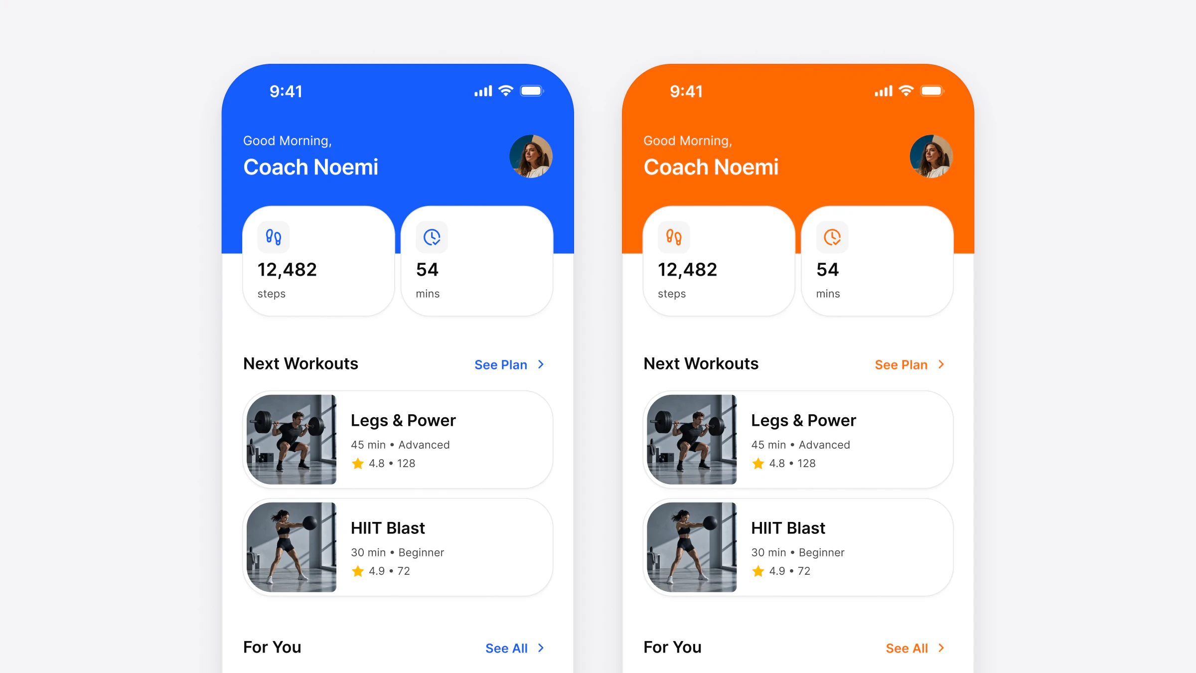
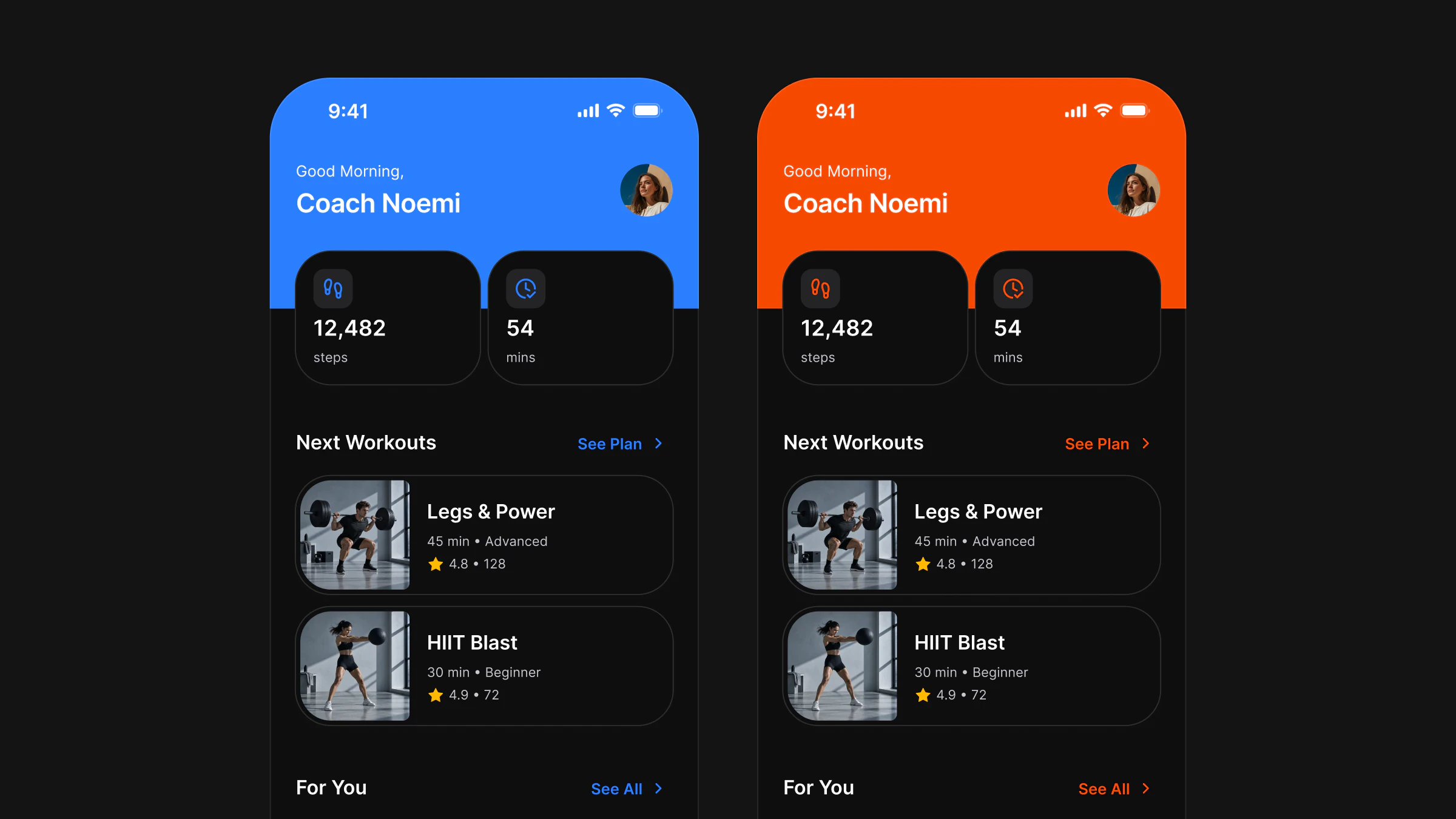
One design system in React Native, SwiftUI, Compose and Flutter, from one token file
The same segmented control in React Native, SwiftUI, Jetpack Compose and Flutter: how Figma token names map, what stays the same and what follows each platform.

On this page
One design system can run in React Native, SwiftUI, Jetpack Compose and Flutter when every stack reads the same token names, takes the same component props and draws the same pixels at rest. What changes per platform is only what the operating system owns: the touch target, press feedback, haptics, text scaling and the back gesture.
This article follows one component, the segmented control, through the four stacks of Appetite UI Code. The code is the code that ships: each sample was compiled in its own toolchain before the site was allowed to print it. I build Appetite UI and Appetite UI Code, so where a number is the product's and not a platform's, the text says so.
What does one design system look like in four codebases?
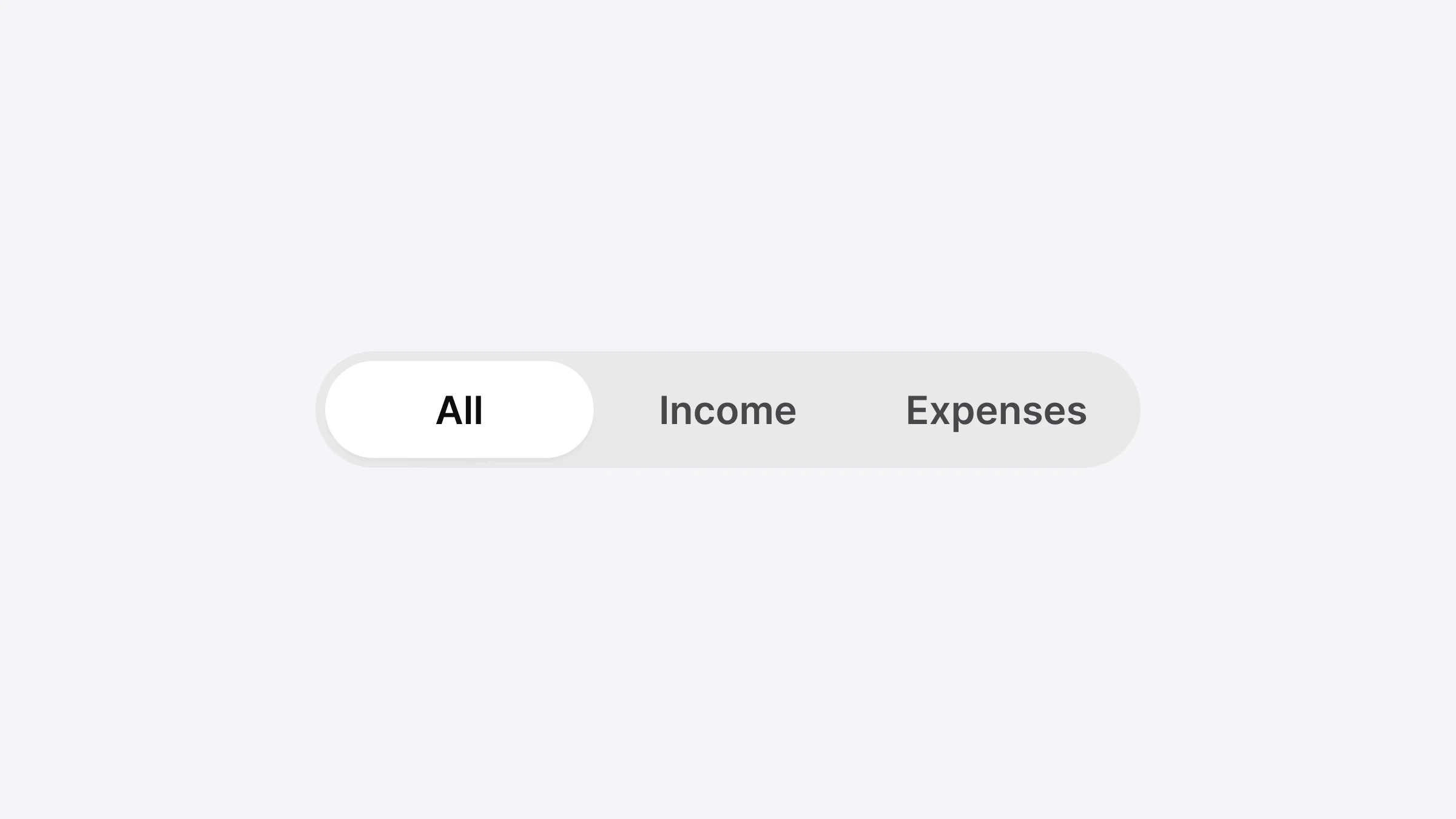
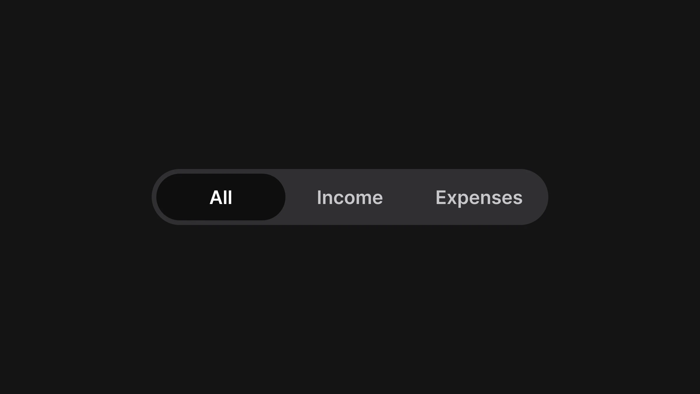
It looks like one component with four implementations that agree on names, props and pixels. The Figma Segmented Control has two properties, Size and Tabs; in code they become size and the number of options, the selected segment becomes value and onValueChange, and every stack reads the same tokens for the track, the pill and the label.
Apple describes a segmented control as "a linear set of two or more segments, each of which functions as a button". Material's counterpart is the segmented button, which Android's Compose documentation describes as a way to let people "choose from a set of options, side-by-side". The two platforms draw it differently: Material outlines each segment and marks the selected one with a check, iOS raises the selected segment inside a track. Appetite UI draws one brand control for both, a rounded track with a white pill under the chosen option, and leaves the platform the parts a person's hands expect.
| Figma | React Native | SwiftUI | Jetpack Compose | Flutter |
|---|---|---|---|---|
| Component | SegmentedControl | AppetiteSegmentedControl | AppetiteSegmentedControl | SegmentedControl |
| Size=Default | size="default" | size: | size = SegmentedControlSize | size: SegmentedControlSize |
| Tabs=3 | options with 3 labels | options with 3 labels | options with 3 labels | options with 3 labels |
| Selected segment | value, onValueChange | value and a trailing closure | value, onValueChange | value, onValueChange |
| Group label | accessibilityLabel | accessibilityLabel | contentDescription | semanticLabel |
From the Code 1.0 handoff for the website, the Figma variant Size=Default, Tabs=3. Read on November 13, 2026.
The label row is the one honest difference in the API. Each stack keeps its platform's own word for the text a screen reader speaks, so a SwiftUI developer writes what SwiftUI calls it and a Compose developer writes contentDescription.
How do Figma token names map to each platform?
Each Figma variable keeps one name with a platform spelling: kebab case with an --ap- prefix in CSS, an ap prefix in SwiftUI and Flutter, and plain camel case in Compose and React Native. The names come from the code syntax fields in Figma, and Flutter's are derived from the CSS names because Figma has no Dart field.
The source is one file in the W3C community format, the Design Tokens Format Module, published as a Final Community Group Report on 28 October 2025. It defines a token as "information associated with a human readable name", and that name is what survives the trip. Appetite UI's file holds 589 variables in 6 collections, exported from the Figma file, and a script writes the five outputs from it.
| Figma variable | SwiftUI | Jetpack Compose | Flutter | React Native |
|---|---|---|---|---|
bg/ | .apBgWeak50 | colors | colors | colors |
bg/ | .apBgWhite0 | colors | colors | colors |
text/ | .apTextStrong950 | colors | colors | colors |
text/ | .apTextSub700 | colors | colors | colors |
radius/ | Capsule() | RoundedCornerShape(50) | apRadiusFull | shapes |
platform/ | minTouchTarget | minTouchTarget | minTouchTarget | platform |
Read in the generated token outputs and the four Segmented Control sources of Appetite UI Code 1.0 on November 13, 2026. The CSS output names the same tokens --ap-bg-weak-50, --ap-radius-full and so on.
Two rows show where the names stop being the whole story. radius/ is a pill: CSS and React Native store 9999 as a sentinel value, while SwiftUI draws a Capsule() and Compose a corner of 50 percent, which is how each platform says "fully round" without a magic number. And platform/ is not a color or a size of the drawing at all. It has two values, 44 in the iOS modes and 48 in the Android mode, and the component reads it to size the area that answers a tap.
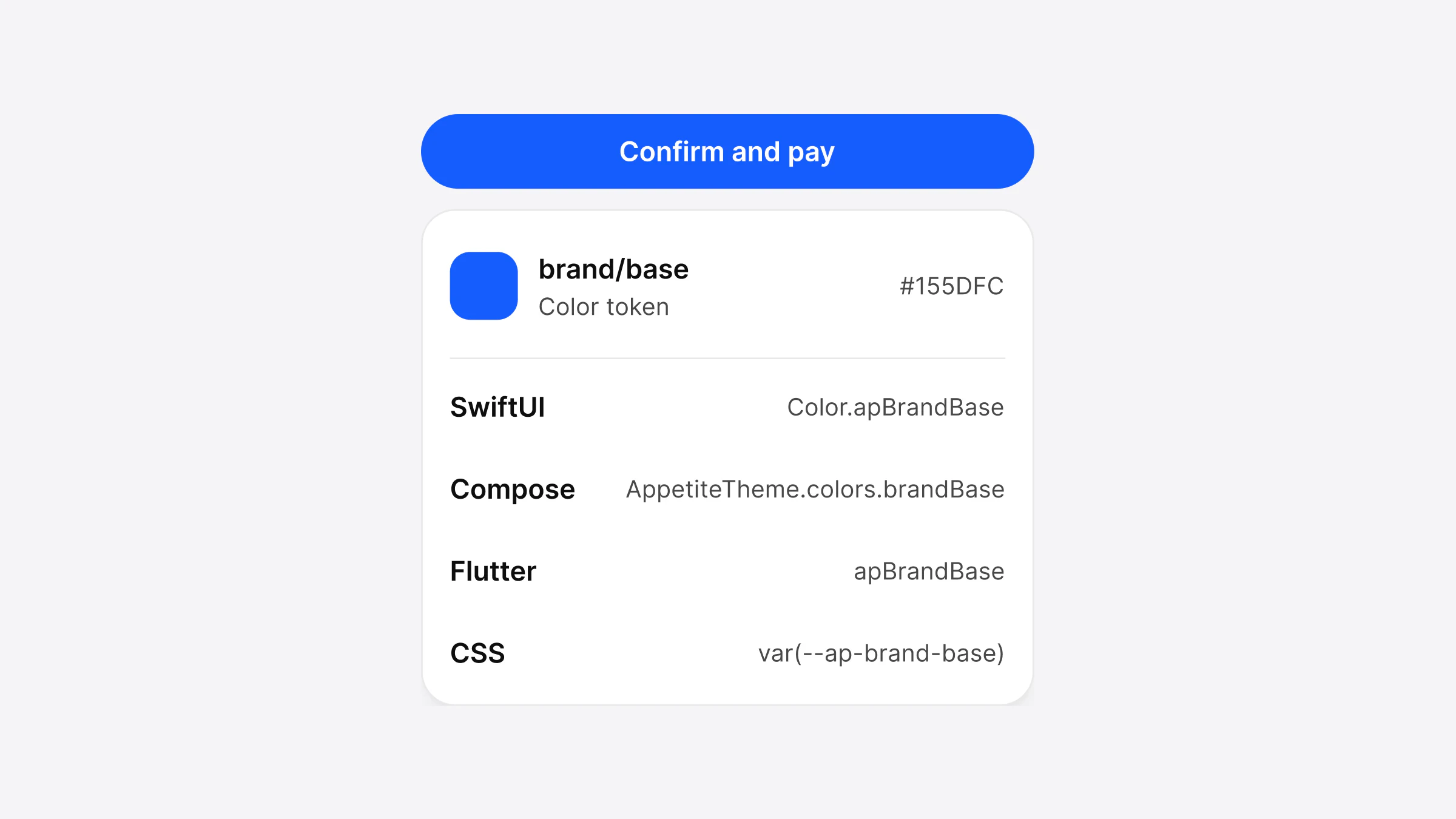
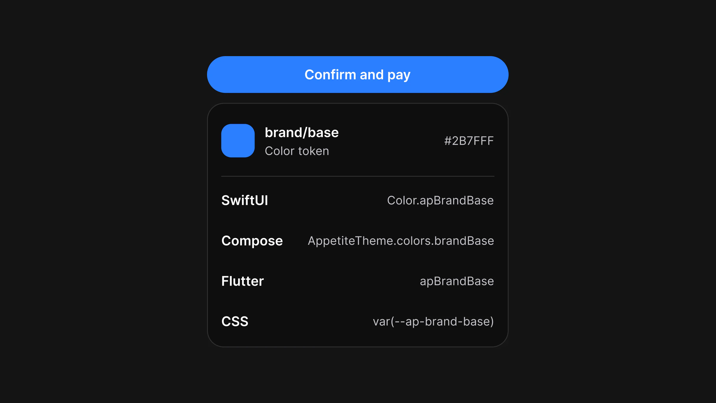
Light and Dark are one name with two values. brand/ is #155DFC in Light and #2B7FFF in Dark in every output, and the components never ask which mode is on. How one Figma variable becomes each of these names, modes included, is the subject of How one Figma token becomes SwiftUI, Compose, Flutter and CSS.
What does the same component look like in each language?
It looks like four short files that do the same thing: keep a selected range in state, pass three options and update the state on change. The samples below are a range picker with Day, Week and Month, the code the Appetite UI Code handoff lists for the website, each compiled in its own toolchain on 4 November 2026.
// React Native
import { useState } from 'react';
import { SegmentedControl } from '@appetite-ui/react-native';

export function RangePicker() {
  const [range, setRange] = useState('Week');
  return (
    <SegmentedControl
      options={['Day', 'Week', 'Month']}
      value={range}
      onValueChange={setRange}
      accessibilityLabel="Range"
    />
  );
}// SwiftUI (AppetiteSegmentedControl.swift copied into the app target)
import SwiftUI
import AppetiteCore
struct RangePicker: View {
@State private var range = "Week"
var body: some View {
AppetiteSegmentedControl(options: ["Day", "Week", "Month"], value: range, accessibilityLabel: "Range") { range = $0 }
}
}// Jetpack Compose
@Composable
fun RangePicker() {
var range by remember { mutableStateOf("Week") }
AppetiteSegmentedControl(listOf("Day", "Week", "Month"), range, { range = it }, contentDescription = "Range")
}// Flutter
import 'package:appetite_ui/appetite.dart';
import 'package:flutter/widgets.dart';
class RangePicker extends StatefulWidget {
const RangePicker({super.key});
@override
State<RangePicker> createState() => _RangePickerState();
}
class _RangePickerState extends State<RangePicker> {
String range = 'Week';
@override
Widget build(BuildContext context) {
return SegmentedControl(
options: const ['Day', 'Week', 'Month'],
value: range,
onValueChange: (v) => setState(() => range = v),
semanticLabel: 'Range',
);
}
}The Compose file lists no imports because the handoff gives them beside it: the runtime state functions and com. Each label is its own value, so the options need unique words; Figma writes "Option" on every segment, which code can't.
What stays the same on iOS and Android?
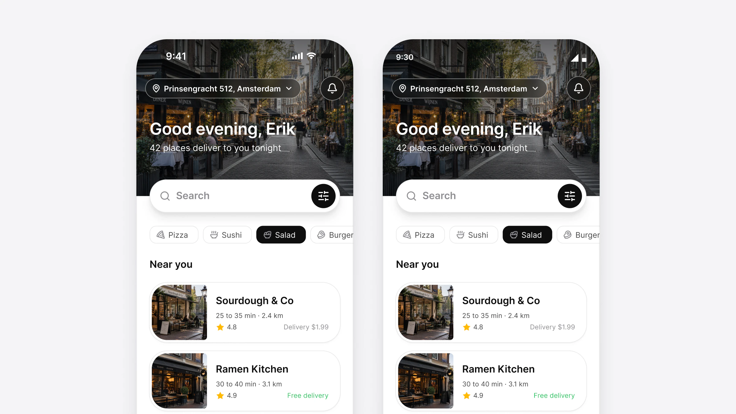
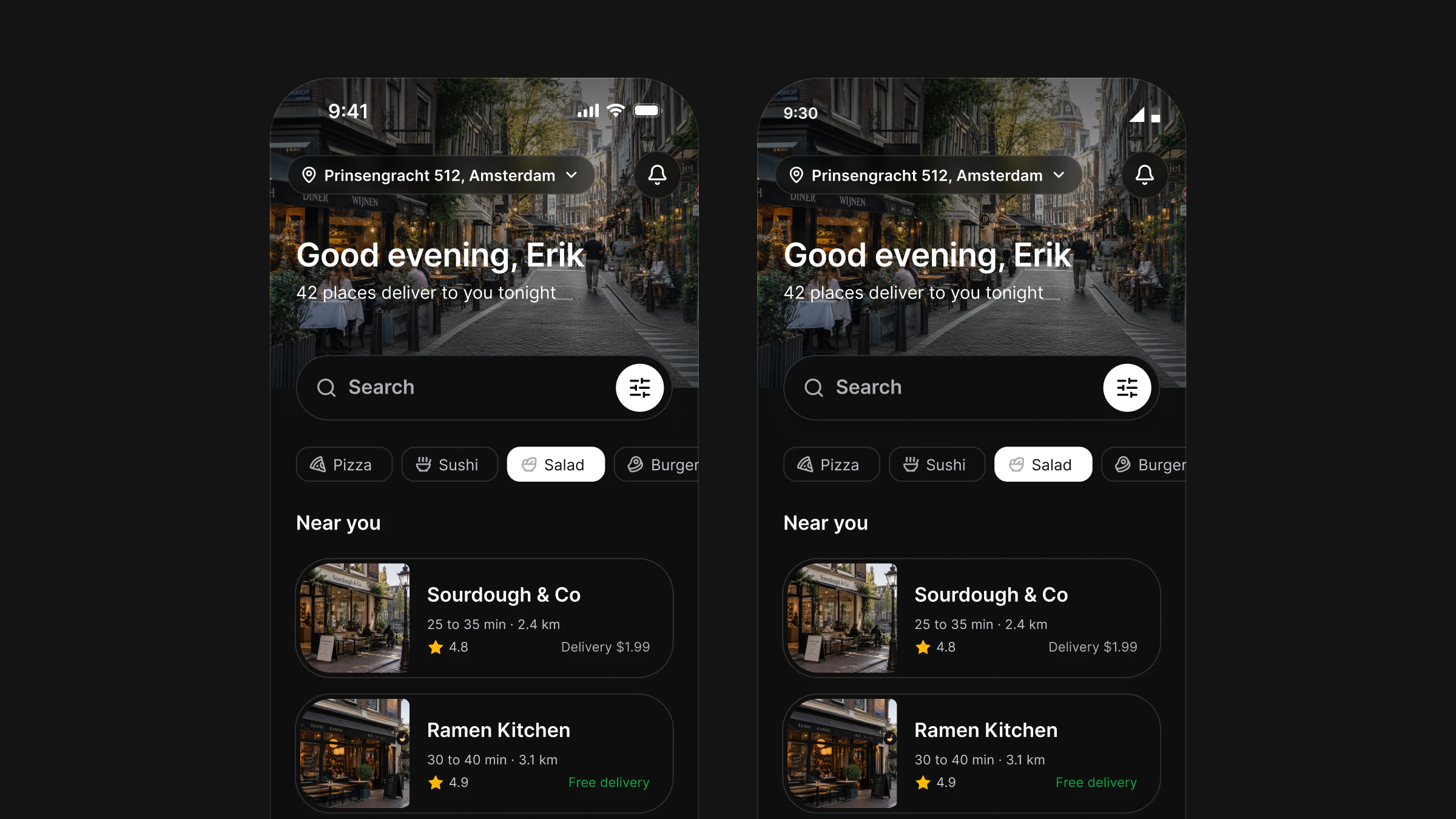
Everything a person sees at rest stays the same: the track, the pill, the padding, the type and the motion. The Figma component binds no platform value, so all four stacks draw the same control on both systems, and Appetite UI compares the code's renders with Figma's at 3x to hold them to it.
The numbers each source file states in its header comment are the same in all four:
- Track. 4 of padding on every side,
radius/, filled withfull bg/. At least 48 high in the Default size, bound toweak-50 spacing/, and 38 in Small.12 - Segments. Equal widths, 40 high in Default and 30 in Small, with 12 of horizontal padding for two to four options and 6 for five. Apple asks for the same balance: "all segments are usually equal in width".
- Selected pill.
bg/with thewhite-0 dropShadow/effect, the label inxs text/; the others instrong-950 text/with no fill.sub-700 - Label. Inter SemiBold 16 on 24 in Default, 14 on 20 in Small.
- Motion. The pill slides to the chosen segment on the kit's indicator spring and takes its width; a tap mid-flight retargets it. Under Reduce Motion it jumps, and the label colors still cross-fade.
Default track340 × 48 pt
Small track340 × 38 pt
iOS target, 4444 × 44 pt
Android target, 4848 × 48 pt
Apple's advice on count fits the control too: "no more than about five segments on iPhone". The component stops at five options, the most the Figma variants draw.
Text scaling is the one place where the same rule needed one decision for all four. Each stack caps the label at the same scale, 1.353, which SwiftUI expresses as Dynamic Type up to xxxLarge, and a label that no longer fits wraps to two lines and grows the track instead of being clipped.
What follows each platform?
The hit area, press feedback, haptics and the scale of text follow the platform, because people's hands and settings expect them. The rule in the codebase is short: a difference is allowed when the operating system offers it, when a user setting asks for it, or when every native control on that platform gives the same feedback.
That would be 'wrong' if a different behavior took place.
Flutter's documentation says this of behaviors of the operating system, such as text editing and scrolling, and separates them from conventions an app chooses, such as tabs on iOS. Appetite UI Code keeps two switches apart for it: the convention, iOS or Material, which a brand may set on purpose, and the capability of the device the app runs on, which code checks only for things that exist on one system, such as the Android ripple.
| Concern | iOS | Android |
|---|---|---|
| Hit area | Grows to 44 pt, Apple's "hit region of at least 44x44 pt" | Grows to 48 dp, Google's "at least 48dpx48dp" |
| Press feedback | None, because Figma draws no pressed state for this control | A ripple at the label color and Material's pressed opacity, clipped to the segment's pill |
| Haptics | Selection feedback when the value changes | The segment tick on Android 14 and later, a context click before |
| Text scale | Dynamic Type, capped at xxxLarge | The system font scale, capped at the same 1.353 |
| Reduce Motion | The pill jumps instead of sliding | The same |
From the Segmented Control sources of Appetite UI Code 1.0 and the platform pages under Sources, read on November 13, 2026.
In React Native the Android half is two props of the platform's own Pressable. React Native's documentation describes android_ripple as the prop that "enables the Android ripple effect", and hitSlop as "additional distance outside of element in which a press can be detected". The library uses both: the ripple sits in a rounded view so it stays inside the pill, and the slop is computed from platform so a 30 point Small segment still answers a 44 or 48 square. SwiftUI, Compose and Flutter do the same with their own tools, and the visual size never changes.
The minimum sizes themselves, and where other controls fall short of them, are in Touch target size on iOS and Android: 44 pt, 48 dp and the WCAG minimum.
How does one rebrand reach all four stacks?
Through one theme value per stack: a brand color, a radius scale and the fonts. React Native reads a brand file, SwiftUI an AppetiteBrand passed to a modifier, Compose an AppetiteBrand passed to AppetiteTheme, and Flutter an AppetiteBrand passed to AppetiteScope. Every component reads its colors from the theme, so nothing else is edited.
import type { AppetiteBrand } from '@appetite-ui/core';

export const brand: AppetiteBrand = {
  color: '#ca3500',
  radiusScale: 1, // radius/md is 8 at scale 1
  fonts: { body: 'Plus Jakarta Sans', heading: 'Plus Jakarta Sans' },
  fontFiles: {
    'Plus Jakarta Sans': {
      faces: {
        400: require('../../../assets/fonts/PlusJakartaSans-Regular.ttf'),
        500: require('../../../assets/fonts/PlusJakartaSans-Medium.ttf'),
        600: require('../../../assets/fonts/PlusJakartaSans-SemiBold.ttf'),
      },
      ascender: 1.038,
      descender: 0.222,
    },
  },
};let orangeBrand = AppetiteBrand(
color: "#ca3500",
radiusScale: 1,
bodyFont: "Plus Jakarta Sans",
headingFont: "Plus Jakarta Sans",
fontFiles: [
"Plus Jakarta Sans": AppetiteBrandFontFamily(
faces: [400: "PlusJakartaSans-Regular", 500: "PlusJakartaSans-Medium", 600: "PlusJakartaSans-SemiBold"],
ascender: 1.038,
descender: 0.222
),
]
)
ContentView()
.appetiteTheme(brand: orangeBrand)There is no setting called radius 8. radiusScale multiplies every radius except zero and full, and radius/, the default control radius, is already 8 at a scale of 1. The segmented control uses radius/, which no scale changes, so it stays a pill in every brand.
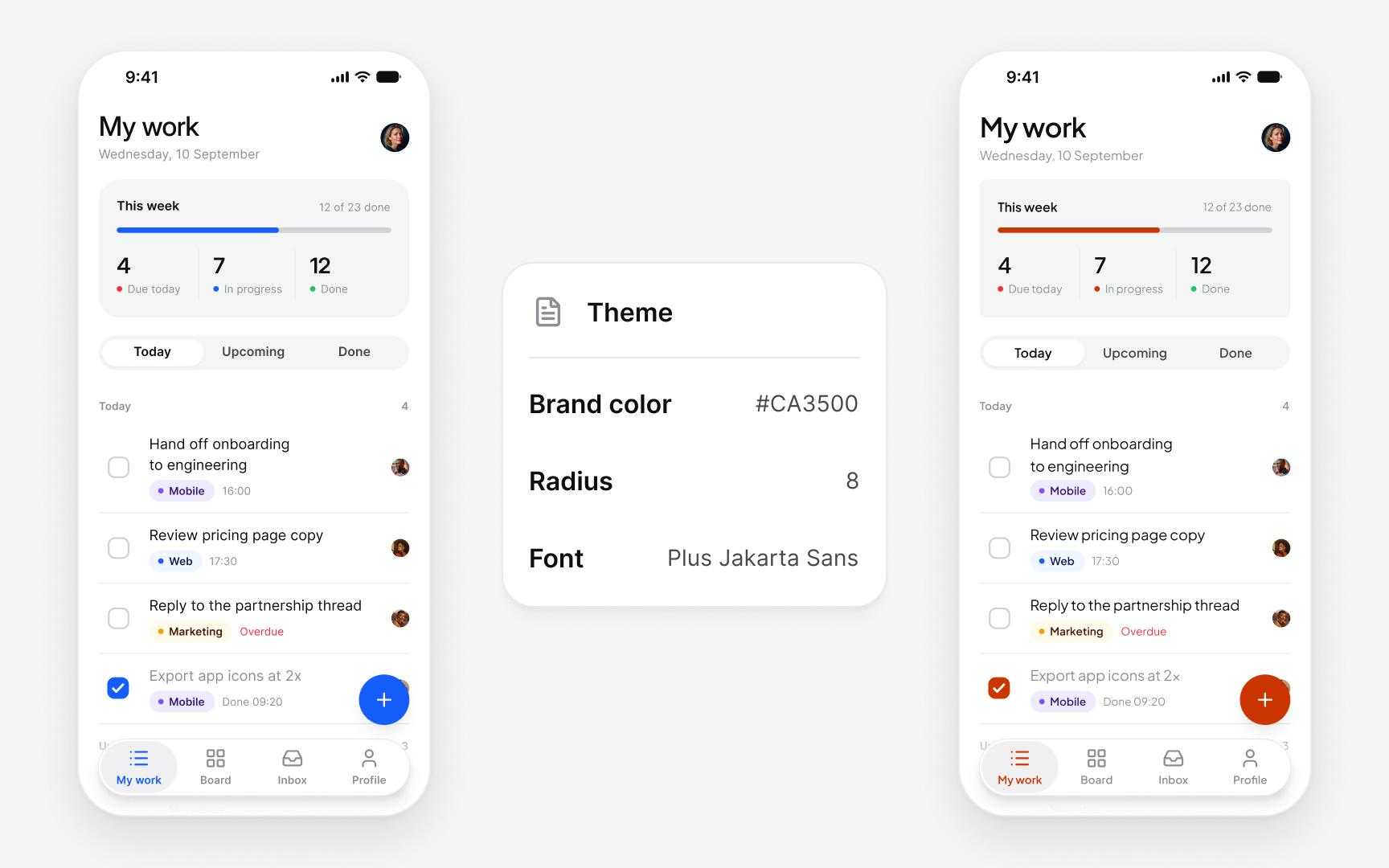
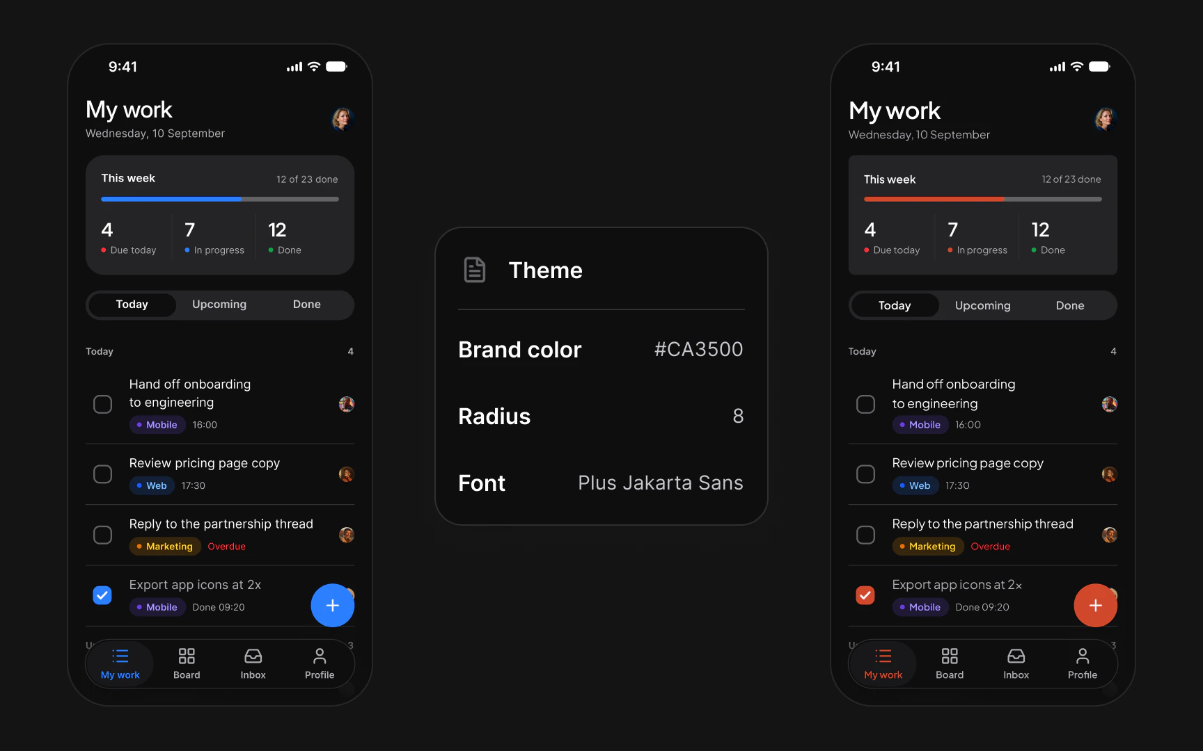
The color is checked before the app draws anything. Every stack computes the contrast of white labels on the derived brand colors and stops the app below 4.5:1, the WCAG AA minimum for body text. That is why the sample uses #CA3500 and not the brighter #FF6900 of an earlier mockup.
Contrast of a white label on brand/base, against the 4.5:1 minimum
The same edit in the Figma file, and what it moves there, is in How to rebrand a mobile app in Figma with variables.
How do you set up one component in your stack?
Add the tokens and the core, copy in the components you use, wrap the app in the theme and set the brand. The four stacks differ in packaging, not in steps, and each folder's README gives the exact commands.
Add the tokens and the core
React Native: two packed packages,
@appetite-ui/andcore @appetite-ui/, as file dependencies, then the Expo modules the README lists. SwiftUI: thetokens swiftuifolder as a local package, productAppetiteCore, iOS 17 or later. Compose: thecomposefolder with its:coreand:componentsmodules. Flutter: theflutterfolder as a path dependency namedappetite_ui.Copy in the component
The components are source you own. For the segmented control in SwiftUI that is
AppetiteSegmentedControland the shared helpers it lists; in React Native the library source goes into your app as.swift src/.appetite-ui/ Wrap the app in the theme
AppetiteProviderin React Native, the.appetiteTheme()modifier in SwiftUI,AppetiteTheme { }in Compose andAppetiteScopein Flutter. The theme carries the scheme, the convention and the brand.Set the brand
One color, a radius scale and fonts. Fonts other than the kit's Inter need their files in the app.
Check on a device
Turn on the largest text size, Reduce Motion and Dark, and tap the Small size near its edges.
What ships in Appetite UI Code?
Appetite UI Code ships the components as source: every component in React Native with Expo, 41 in all, and a core set of 15 in SwiftUI, Flutter and Jetpack Compose, the segmented control among them. The rest of the native set follows in 1.x updates, free for buyers.
Beside the components it ships the token outputs for the five targets, an App Starter with three example apps (Tasks, Foodie and AI) and an agent kit generated from the code: CLAUDE, AGENTS, a Cursor rule and a skill, so an assistant writing a screen uses AppetiteSegmentedControl instead of inventing one. How an agent reads the Figma side is in How Appetite UI works with AI agents: Claude, Cursor and the Core Skill.
The Code page shows the rebrand and the four stacks, the Segmented Control docs list its variants in Figma, Code output lists the token outputs and pricing sets out Code, the Figma file and Complete, which is both.
Questions
Can one design system work in React Native, SwiftUI, Compose and Flutter?
Yes, when the tokens come from one source and each component keeps the same props and the same drawing in every stack. Appetite UI Code does that from one DTCG token file, and lets the hit area, press feedback, haptics and text scale follow each platform.
How do Figma variables become React Native tokens?
Export them to a W3C DTCG token file and generate a TypeScript module from it. In Appetite UI Code the React Native names follow Figma's Android code syntax, so bg/ becomes colors, and Light and Dark are two values under one name.
Should a cross-platform component look the same on iOS and Android?
It depends on what the brand wants, and on which part. Appetite UI draws one brand component on both and adapts only what users' hands and settings expect: 44 pt or 48 dp targets, the Android ripple, haptics, text scaling and Reduce Motion.
Why is there no radius 8 setting in the theme?
The theme takes a radius scale, a multiplier on every radius except zero and full. radius/, the default control radius, is already 8 at a scale of 1, so radius 8 means the scale of 1.
Does Appetite UI Code include every component in SwiftUI, Flutter and Compose?
Not yet. React Native has every component; SwiftUI, Flutter and Jetpack Compose start with a core set of 15, the segmented control included, and the rest follows in 1.x updates, free for buyers.
What happens if the brand color is too light?
The app stops with an error. Each stack checks white labels on the brand color and its derived shades against 4.5:1 in Light and Dark, so #FF6900 fails at 2.89:1 in Light and #CA3500 passes at 5.22:1.
Sources
- Apple Human Interface Guidelines, read November 13, 2026Segmented controls
- Apple Human Interface Guidelines, read November 13, 2026Buttons
- Android Developers, read November 13, 2026Segmented button in Compose
- Android Developers, read November 13, 2026Make apps more accessible
- Flutter, read November 13, 2026Automatic platform adaptations
- React Native, read November 13, 2026Pressable
- Design Tokens Community Group, read November 13, 2026Design Tokens Format Module 2025.10
- W3C, read November 13, 2026Understanding Success Criterion 1.4.3, Contrast (Minimum)
Facts last verified .