React Native UI kit that matches your Figma file
What it takes for React Native components to match a Figma kit: the same names, variants as props, one token file, platform rules and a check against Figma.


On this page
A React Native UI kit matches your Figma file when a designer and a developer can name the same thing with the same word: the component, its variant, its color and its spacing. That needs four things on the code side, not one: components named after the Figma components, variants that become props, tokens generated from the same variables, and a check that the drawing on a phone is the drawing in Figma.
This guide goes through each of them, with how Appetite UI Code does it and what to ask of any kit you consider. I build Appetite UI and Appetite UI Code, so where a claim is about the product, it comes from its code and says so.
What does "matches the Figma file" mean for React Native?
It means five checks pass: the names agree, the variants are props, the tokens are the same variables, the platform differences are written down, and someone has compared the result with Figma. A kit that only looks similar in a screenshot fails the first one the day a designer writes "use the Small segmented control" in a handoff.
| Check | What to look for | Why it matters |
|---|---|---|
| Names | The Figma component and the code component have the same name | A handoff note and a prompt to an agent can name the part once |
| Variants | Each Figma property is a prop with the same values | Size=Small in Figma is size="small" in code, not a style override |
| Tokens | Colors, radii, spacing and type come from the Figma variables, with modes | Light and Dark, and a rebrand, change in one place |
| Platform | The kit says what differs on iOS and Android, and why | Hit areas, ripples and haptics are not in the Figma drawing |
| Proof | Each component names its Figma source and was compared with it | "Pixel perfect" is a claim, a comparison is a check |
The results for "react native ui kit figma" mix three kinds of product. Some are a Figma file sold with a React Native library. Some are web kits whose code is React for the browser, which a React Native app can't use. And some are open source React Native libraries with a Figma file made later or by the community. The table above works on all three, and the last two usually fail at the names or the tokens.
How do Figma component names map to React Native?
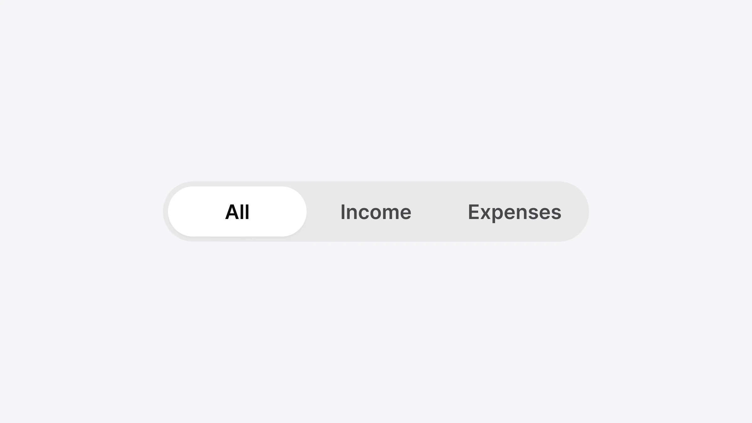
One to one, in Appetite UI Code: the Figma component is the React Native component, with the space taken out. The Segmented Control in Figma is SegmentedControl, Top Bars gives TopBar and SectionHeader, and the Input page gives TextInput, TextArea and Stepper. React Native has every component of the kit, 41 in all, plus a ToastProvider that shows toasts.
| Figma page | React Native components |
|---|---|
| Button | Button, FloatingActionButton |
| Segmented Control | SegmentedControl |
| Input | TextInput, TextArea, Stepper |
| Card | VerticalCard, HorizontalCard, IconCard |
| Modal | Modal, ModalSheet |
| Navigation | Navigation |
| Top Bars | TopBar, SectionHeader |
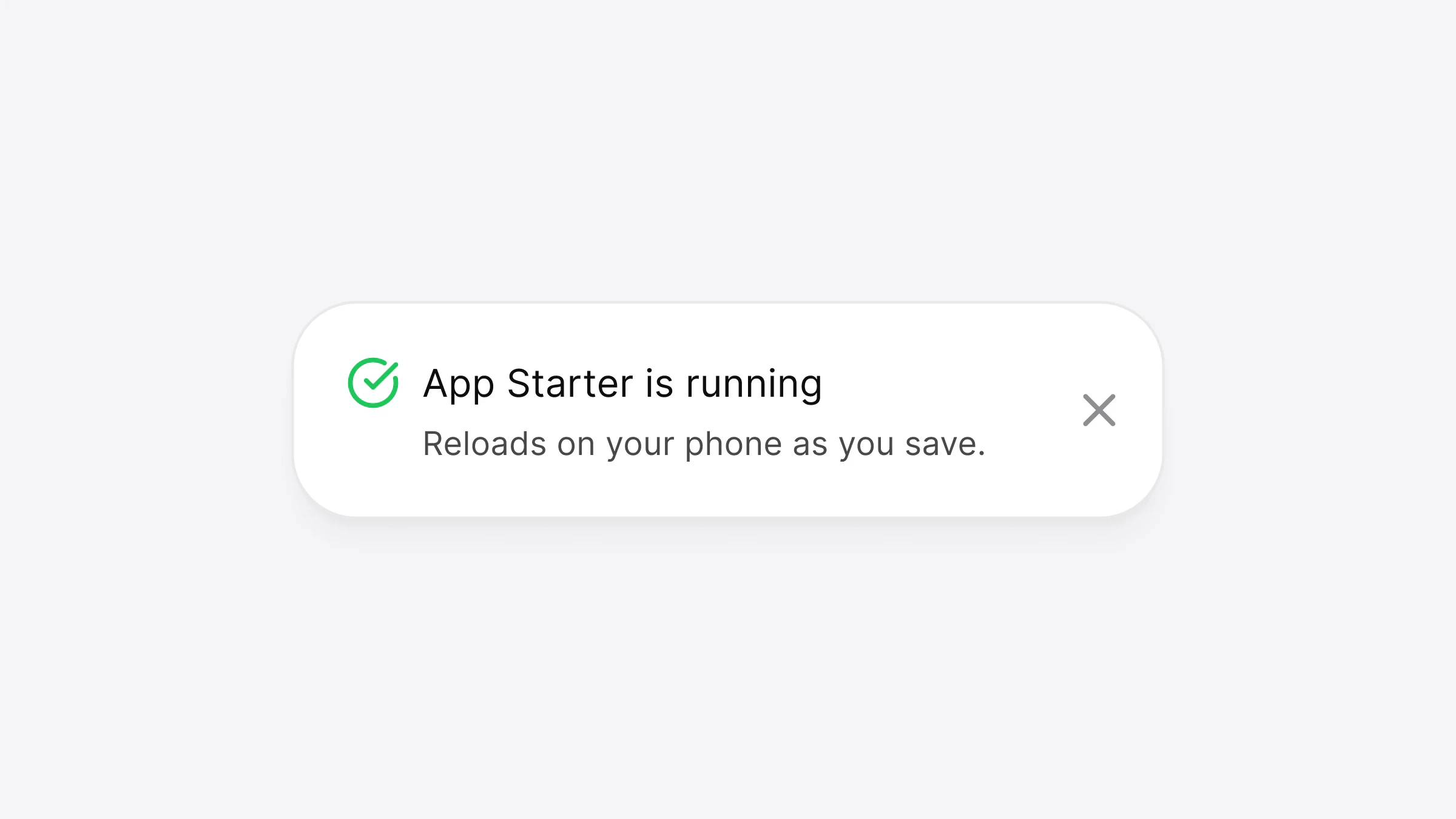
| Toast | Toast, ToastProvider |
From the component list of Appetite UI Code 1.0, the same data the docs pages print in their code tab. Read on November 14, 2026.
Where one Figma page holds several components, code splits them by what they do, and the docs page of each Figma component lists the code names under it. That's the page to send a developer to, not a screenshot.
How do Figma variants become props?
Each Figma property becomes a prop, and each of its values a value of that prop. The Figma Segmented Control has two properties, Size with Small and Default, and Tabs with 2 to 5. In code, Size is size, Tabs is how many options you pass, and the selected segment is value with onValueChange.
The Figma variant Size=Default, Tabs=3 is this line:
<SegmentedControl size="default" options={['Day', 'Week', 'Month']} value={value} onValueChange={setValue} />And in a screen, with its state and the label a screen reader speaks:
// React Native
import { useState } from 'react';
import { SegmentedControl } from '@appetite-ui/react-native';

export function RangePicker() {
  const [range, setRange] = useState('Week');
  return (
    <SegmentedControl
      options={['Day', 'Week', 'Month']}
      value={range}
      onValueChange={setRange}
      accessibilityLabel="Range"
    />
  );
}
Figma writes "Option" on every segment; code can't, because each label is its value. That's the one place where a variant and its code differ, and it's the app's words that fill it, not the kit's.
The types hold the match. size accepts only the sizes Figma draws, so a size="medium" that Figma doesn't have is a TypeScript error, not a silent fallback.
How do Figma variables become React Native tokens?
They're exported from Figma into one token file in the W3C community format, and a script writes a TypeScript module from it. The Design Tokens Format Module, a Final Community Group Report of 28 October 2025, defines a token as "information associated with a human readable name". The name is what survives: bg/ in Figma is colors in React Native.
| Figma variable | React Native | What it paints |
|---|---|---|
bg/ | colors | The track |
bg/ | colors | The selected pill |
text/ | colors | The selected label |
text/ | colors | The other labels |
radius/ | shapes | The pill shape |
platform/ | platform | The hit area, 44 on iOS and 48 on Android |
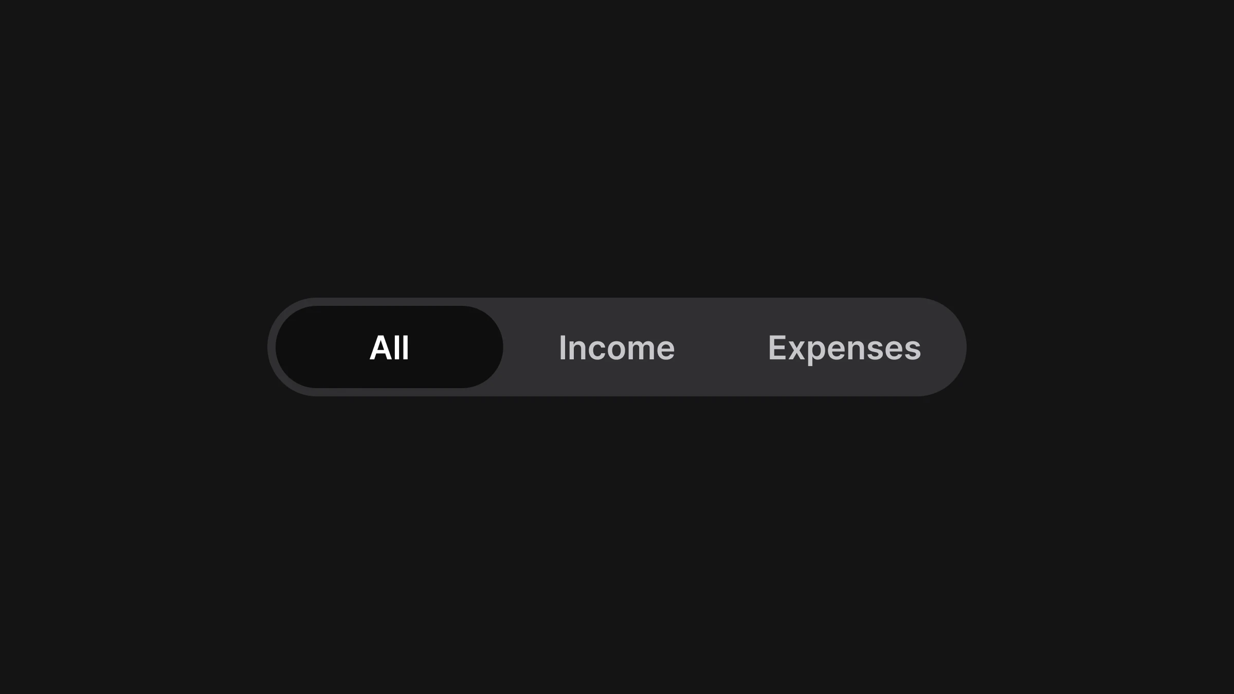
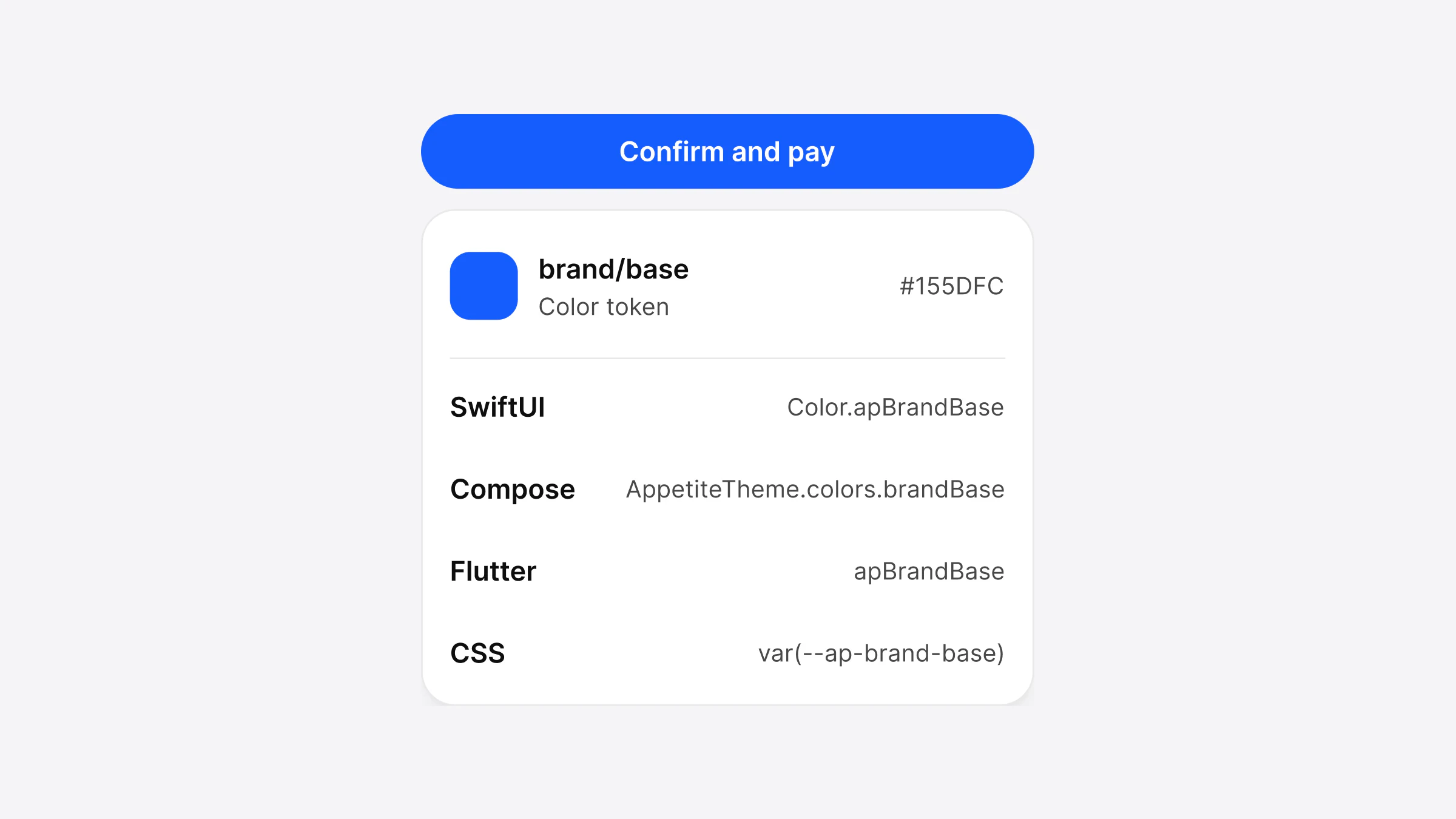
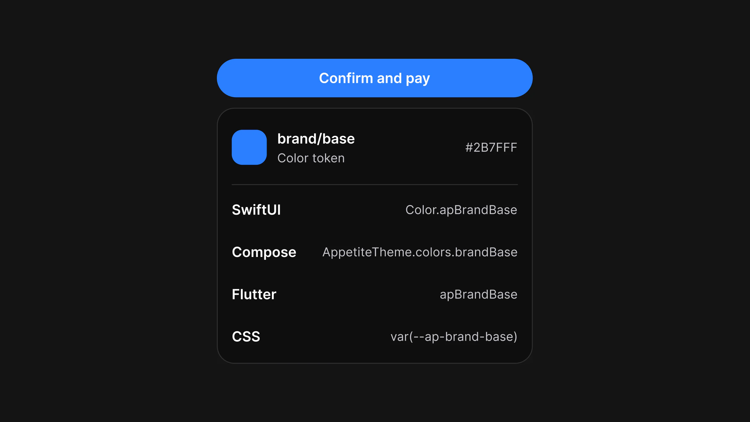
Light and Dark are one name with two values, as they are in Figma: brand/ is #155DFC in Light and #2B7FFF in Dark, and no component asks which mode is on. A rebrand is one file, brand, with a brand color, a radius scale and fonts; every component reads from the theme, so nothing else is edited. How the same token names read in SwiftUI, Compose and Flutter is in One design system in React Native, SwiftUI, Compose and Flutter, from one token file.
The components are styled with React Native's StyleSheet and a typed theme, with no NativeWind or Tailwind layer between the token and the style. If your team uses one of those, the tokens are still plain values you can feed it; the components don't need it.
What should follow iOS or Android instead of Figma?
What a person's hands and settings expect: the hit area, press feedback, haptics and text size. Figma draws one control; a phone has to answer a thumb. Appetite UI Code keeps one switch between iOS and Material conventions, and lets the device decide what exists on only one system, such as the Android ripple.
In React Native both halves use the platform's own Pressable. Its documentation describes android_ripple as the prop that "enables the Android ripple effect", and hitSlop as "additional distance outside of element in which a press can be detected". The segmented control computes its slop from platform, so a 30 point Small segment still answers a 44 point square on iOS and 48 on Android, while the drawing stays the Figma size.
A kit that matches Figma by drawing a 48 point segment everywhere has matched the wrong thing. The minimum sizes and where common controls fall short are in Touch target size on iOS and Android: 44 pt, 48 dp and the WCAG minimum.
How do you check that code matches Figma?
Compare a phone's screenshot with Figma's own render of the same node, at the same scale, in Light and Dark. Appetite UI Code's repo does that with a parity pipeline: it downloads Figma's render at 3x, captures the component on an iPhone simulator and an Android emulator, and counts the pixels that differ, with 2 percent as the most a target may differ.
Two smaller checks work on any kit you're evaluating:
- The source names its Figma node. Every React Native component file in Appetite UI Code opens with a comment that says why the component exists, the Figma node id it was drawn from and the numbers it takes from Figma: heights, padding, radii and the tokens behind its colors.
- The docs show both sides. A docs page that shows the Figma variants and the code for them on one page is a page someone kept in sync. The Segmented Control docs are one example.
Ask the seller for either before you buy. A kit that matches Figma can show you where.
How do you add the kit to a React Native app?
Start from the App Starter, or copy the library into your own Expo app. Appetite UI Code's React Native folder is built with Expo SDK 58, and the starter opens in Expo Go without a native build.
Add the core and the tokens
Copy the two packed packages from the ZIP into your app, for example into
vendor/, and add both todependencies.Install the Expo modules the components use
npx expo install expo-blur expo-haptics expo-font react-native-svg react-native-safe-area-context expo-status-barCopy in the components
Copy the component source into your app as
src/and mapappetite-ui/ @appetite-ui/to it inreact-native tsconfig. The components are source you own and can edit..json Wrap the app
Load the fonts with
useFonts(appetiteFonts)and wrap the app inAppetiteProvider.
"paths": { "@appetite-ui/react-native": ["./src/appetite-ui/index.ts"] }React Native's own documentation recommends this route for a new app: "if you're building a new app with React Native, we recommend using a Framework", and it names Expo. Running the starter in Expo Go, and when you need a development build instead, is in A UI kit for Expo: build an iOS and Android app in Expo Go. The full install for each stack is on Install the code.
What doesn't the kit cover?
System chrome and the platform replicas. The status bar, keyboard, Dynamic Island, widgets and Live Activities are drawn by the operating system, so Appetite UI Code doesn't draw them. The Apple and Material 3 reference components in the Figma file stay in Figma: they're there to design against, and the real ones come from SwiftUI and Compose.
The native stacks are the other limit. SwiftUI, Flutter and Jetpack Compose start with a core set of 15 components, and the rest follows in 1.x updates, free for buyers. React Native has them all today.
The Code page shows the components, the App Starter and the rebrand, and pricing sets out Code, the Figma file and Complete, which is both.
Questions
Is there a React Native UI kit with a matching Figma file?
Yes. Appetite UI Code ships every Appetite UI component in React Native, with the same names, variants and tokens as the Appetite UI Figma file. Each component names its Figma node in its source, and the repo compares phone screenshots with Figma's render.
How do Figma variants map to React Native props?
Each Figma property becomes a prop and each value a value of it. In Appetite UI Code the Segmented Control variant Size=Default, Tabs=3 is size="default" with three options, and a size Figma doesn't draw is a TypeScript error.
How do I turn Figma variables into React Native tokens?
Export the variables to a DTCG token file and generate a TypeScript module from it, keeping the names. In Appetite UI Code bg/ becomes colors, and Light and Dark are two values under one name.
Does the React Native kit work with Expo?
Yes. The React Native folder is built with Expo SDK 58 and uses only Expo modules that ship in Expo Go, so the App Starter opens in Expo Go without a native build.
Do I need the Figma file to use the code?
No. Appetite UI Code works on its own, and its docs list every component and token. With the Figma file as well, a designer and a developer read the same names, which is what Complete is for.
Does it use NativeWind or Tailwind?
No. The components use React Native's StyleSheet and a typed theme. The tokens are plain values, so a team that uses NativeWind can still read them in its own styles.
Sources
Facts last verified .