Why vibe-coded apps all look the same, and what a design system changes
A model fills every decision you left out with its most likely value. Where the sameness comes from, and how named tokens and platform rules change it.

On this page
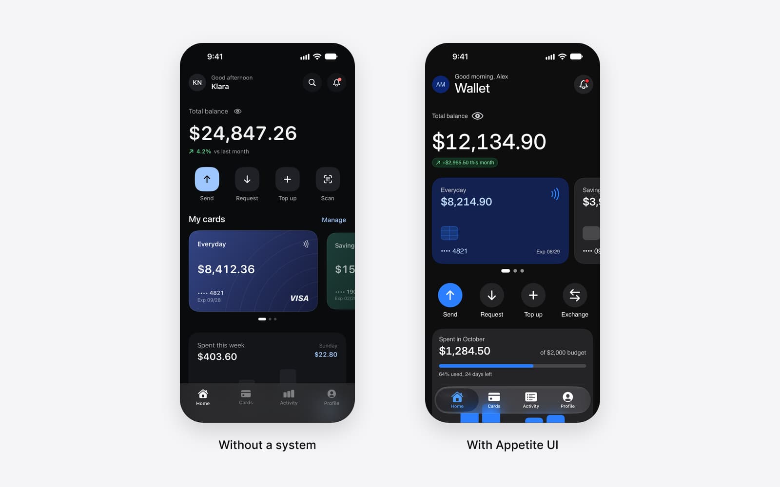
Vibe-coded apps look the same because a model fills every decision you did not write down with the value it has seen most often: the starter library's theme, a stock corner radius, a system blue, a grid of cards. The sameness is what an app looks like when nobody decided anything, and it fades when the agent is handed decisions it can read: named tokens, components with written descriptions, and rules for each platform.
Appetite UI is a Figma UI kit for iOS and Android apps, built like a design system. One token source drives Apple and Material components in light and dark mode, and exports to SwiftUI, Jetpack Compose, Flutter and CSS. The agent files that come with it, the Core Skill and a slop linter, are where I wrote those decisions down for a model to read, and this article quotes them.
A model fills every blank with the most likely value.
A prompt such as "build a wallet app with a balance card and recent transactions" names a handful of things. The screen that comes back sets far more: every padding, every corner, every text size, the color of each label in light and in dark mode. The prompt decided almost none of them. The model decided the rest, and a model decides by picking what is most probable given what it has read.
What it has read is public code and public interfaces. A large share of that is starter templates, tutorial projects and apps that kept the default theme of a popular library, because every tutorial begins on the defaults and many projects never leave them. So the most probable padding is the template's padding, and the most probable card is the template's card. Ask twice and you get the same answer twice. That is what probable means.
So the sameness is no flaw in the model, which did its job on the information it had. A designer given the same one sentence brief and ten seconds would reach for the safest version of everything too. The gap is in the input.
The app builders document the defaults they start from.
You do not have to guess where the starting point is, because the tools say so. v0's documentation states: "v0 uses Shadcn/ui as its default component system to generate high-quality, customizable UIs." The same page explains how to bring your own system through a registry, which "provides a structured way to share your components, blocks, and design tokens with v0."
The shadcn/ui theming page spells out what default means there. "The following is the full default neutral theme scaffold," it says, and in that scaffold --primary is oklch(0, a near black, and --radius is 0, 10 pixels at the usual root size. These are sensible values, and they are the values of every project that never changed them.
Figma Make makes the same point from the other side. Its help page on Make kits says: "When using a Make kit in Figma Make, it's critical to craft great guidelines." Every Make file has a guidelines/ folder for them, and the page even gives a style rule for writing them: "'Do not use small text for anything except captions' is better than 'Use small text sparingly'." A guideline that can be followed literally is a decision. One that asks for taste hands the choice back to the model, and the model's taste is the average. Both tools have a slot for your decisions; what most projects lack is something to put in it.
On a phone, a default can be the wrong platform.
On the web, a default makes an app look like other apps. On a phone, it can make an app look as if it belongs to the other operating system. A round button in the bottom corner is a common answer in public code to where the main action goes, so a model puts it there, on an iPhone too.
Each platform answers the question in its own documentation. Android's Compose guide describes the FAB as "a high-emphasis button that lets the user perform a primary action in an application" that "is typically found anchored to the bottom right of the screen." Apple's Human Interface Guidelines place frequent actions in a different element: "A toolbar provides convenient access to frequently used commands, controls, navigation, and search." There is no average of the two that is right on both. The answer depends on which platform the screen is for, and a prompt rarely says.
The Appetite UI Core Skill writes the choice down as a rule. It opens: "Primary action: iOS puts it in the bottom toolbar or in content. Android uses a FAB." Three more pairs follow, the action sheet against the Modal Sheet or menu, the toast without an action against the snackbar with one, and a Live Activity against an ongoing notification. The rule closes: "Keep the content area identical across platforms. Only the chrome changes." Its list of what not to do is shorter still: "Do not put a FAB on iOS or a chevron back button on Android."
The fix is decisions written where an agent reads them.
A design system already holds the decisions. The work is putting them in a form an agent opens before it writes the first line, and in Appetite UI that form is three kinds of text.
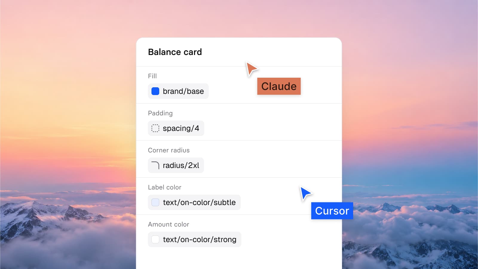
The first is the token file. Every color, size, radius and text setting has a name, a light value, a dark value and a code name for each platform, listed in tokens/ and tokens/. Each entry carries a description written for the reader who has to choose. brand/base reads "The brand color. Primary buttons, active states, links. Maps to iOS tint and M3 primary." text/sub-700 reads "Secondary text. Descriptions, list subtitles, captions." An agent that reads those lines does not need to guess which gray a subtitle takes.
The second is the Core Skill, skills/, which begins: "You are building inside a system. The values are already decided. Your job is to pick the right one, not to invent a new one." Its rules are written to be followed literally, in the sense Figma recommends. Rule 2: "Never type a hex value. Never type an rgba." Rule 3 ends: "Any value that is not on the scale is wrong." Rule 6: "If you typed a value, dark mode is already broken." Rule 15 covers the case every default exists to paper over: "When no token fits, stop and say so."
That last rule carries more weight than it looks. A model with no permitted way to say it does not know produces a value, and the value is the probable one.
The third is the platform rules above, plus AGENTS and cursor-rules, which carry a short version of all of it into tools that read project instructions at the repository root. All of these are included in the file you buy. How each tool picks them up is in How Appetite UI works with AI agents: Claude, Cursor and the Core Skill.
One card shows the difference property by property.
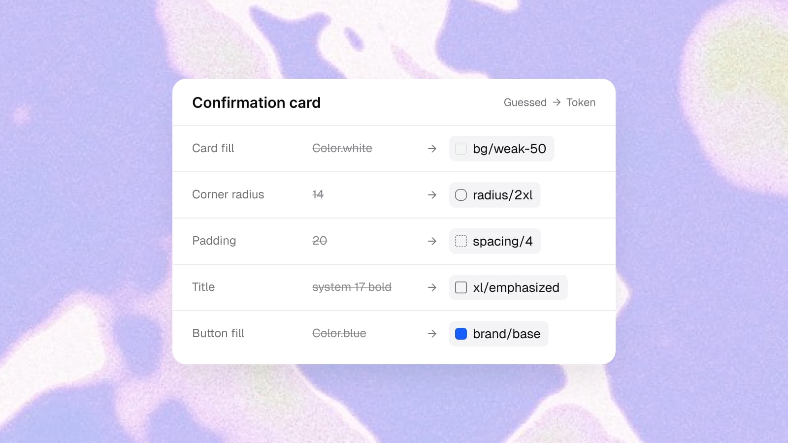
The Core Skill carries its own example, and I wrote it to show exactly this. The prompt: "Add a confirmation card to the checkout screen with a success badge and a primary button." The wrong answer is the one a model gives with nothing to read, a SwiftUI card the skill marks with "Six defects". The right answer takes every value from a token.
| Property | Default guess | Appetite UI token |
|---|---|---|
| Gap between the lines | 15 | dimensions/spacing/2 |
| Card padding | 20 | dimensions/spacing/4 |
| Card fill | Color.white | bg/weak-50 |
| Card corners | 14 | dimensions/radius/2xl |
| Title | system font, 17, bold | xl/emphasized, text/strong-950 |
| Subtitle color | #8E8E93 | text/sub-700 |
| Badge | white on Color.green | state/success/dark-950 on state/success/lighter-50, capsule |
| Button fill | Color.blue | brand/base, pressed brand/pressed |
| Button shape | 50 high, 10 corners | capsule, minimum height spacing/14 |
From the example in skills/appetite-core/SKILL.md, Appetite UI 2.5: the middle column is the skill's "Wrong" SwiftUI code, the right column its "Right" code, in which the same tokens read AppetiteSpacing.space4, AppetiteRadius.xl2 and Color.apBrandBase.
None of the guesses is absurd. 15 and 20 are reasonable numbers, #8E8E93 is a gray Apple ships, and green means success everywhere. Each is plausible, and together they belong to no system, which is why they slip through review. The badge is the one outright failure, and it fails on arithmetic. White on that green "measures 2.28:1 and fails AA", in the skill's words.
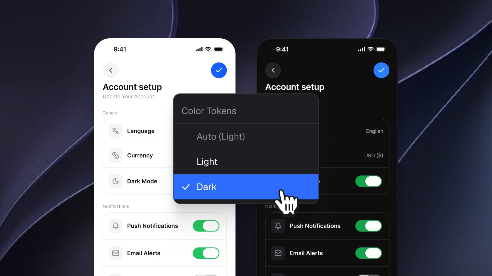
The token version changes one more thing the table cannot show. Every value in it has a dark counterpart, so the card switches modes with no second stylesheet. The guessed card has no dark version until someone invents one, and an invented dark palette is a second round of guesses. Dark mode with Figma variables, not duplicate frames shows how both modes sit on one variable.
The slop linter reports what still drifts, with the fix.
Rules reduce guessing without ending it, so the package carries a second skill, skills/, which audits a Figma selection or a code diff against the system. Its first line names what it hunts: "Generated UI drifts. Seven shades of blue, spacing that follows no scale, a 14px radius next to a 12px one, iOS patterns on Android."
The checks are grouped by severity. Blocking ones include raw-color, a fill or stroke with no variable binding, no-dark-mode and contrast-fail. Major ones include off-scale-space, off-scale-radius and hand-set-type. A separate Platform group catches fab-on-ios, snackbar-on-ios, chevron-back-on-android and shadow-on-ios-chrome, which are the mobile shapes a default takes when it leaks through.
The rule I care about most governs the report itself: "A finding with no replacement is not a finding, it is a complaint." Every line ends with the token that fixes it, so a padding of 15 arrives flagged together with spacing/4. The report also has to close on what is clean, because "A lint report that only lists faults hides whether the file is 5 percent or 95 percent on-system."
Shared values are fine once they are named.
There is a fair objection here. Appetite UI sets running text in Inter, which you will find in plenty of generated apps, and brand/base is a blue. If the values can overlap with the defaults, what changed?
What changed is that each value was chosen once, named, and tied to the rest. Inter for the small steps comes with Inter Display for the headlines, tracking set per size from -0.24 at 2xl to -1.2 at 6xl, and fixed weights across the 20 text styles. brand/base resolves to one blue in Light and a lighter one in Dark, and presses to brand/pressed, which is darker than brand/base in both modes. Change brand/base to your color and every screen built on the token follows, generated or drawn. A generated app on defaults has no such handle: its blue is typed wherever the model needed one, and replacing it means finding every place it was written slightly differently.
So the character of an app built this way comes from consistency, not from rare values, and the team notices it the first time the brand changes. How one Figma token becomes SwiftUI, Compose, Flutter and CSS follows a single name through all four outputs.
The agent's output tells you whether it decided or guessed.
Ask your agent for a screen you already have and read the code it returns. Literal numbers and hex values mean it guessed; token names mean it read something. Ask for the dark version and see whether it reuses the names or invents colors. Then ask for the same screen on iOS and on Android and look at where the primary action went.
How many new apps now reach the stores built this way is the subject of the App Store numbers behind vibe coding, and the Figma MCP server for mobile apps covers how an agent reads a frame from the canvas in the same workflow.
Without buying anything, an agent can read /tokens.json, /llms.txt and every docs page as Markdown at its address plus .md, such as /docs/button.md. The Core Skill, the slop linter and the full token source come with the file, and pricing lists what is in it. The AI page walks through a run with the Core Skill, and the read-only Figma preview shows every token and component the rules point to.
Questions
Why do AI-generated apps look generic?
A model fills every design decision a prompt leaves open with its most probable value, and the most probable values come from starter templates and default library themes. Two apps built from short prompts therefore land on the same spacing, corners, colors and layouts.
Is the sameness a flaw in the model?
No. The model picks the likeliest value when it has no decision to read. Given named tokens and written rules, it follows them, so the sameness comes from missing input.
Does a longer prompt fix it?
Partly. A prompt can name a few values, but a screen sets far more properties than a prompt mentions, and the rest fall back to defaults. A token file and rules the agent reads on every run cover the properties the prompt leaves out.
Can I give v0 or Figma Make my own design system?
Yes. v0 accepts a shadcn registry that shares your components, blocks and design tokens, and Figma Make reads guidelines from the guidelines/ folder every Make file has.
What does the Appetite UI slop linter check?
The Appetite UI slop linter checks a Figma selection or a code diff for raw colors, missing dark mode bindings, failing contrast, off-scale spacing and radii, hand-set type, detached instances, undersized touch targets and wrong-platform patterns such as a FAB on iOS. Every finding names the token that replaces it.
Are the Core Skill and the slop linter free?
No. The Appetite UI Core Skill and the slop linter are included in the file you buy. /tokens.json, /llms.txt and the docs as Markdown are public for any agent to read.
Sources
- v0 Docs, Design systems, read October 7, 2026
- shadcn/ui, Theming, read October 7, 2026
- Figma Learn, Write design system guidelines for Make kits, read October 7, 2026
- Android Developers, Floating action button, read October 7, 2026
- Apple Human Interface Guidelines, Toolbars, read October 7, 2026