Updated
Design tokens
A design token is a named design decision, such as a color, a spacing step or a radius, stored once and read by design files and code alike. Changing the token changes every place that reads it.
Updated
On this page
In the kit
Where it appears in Appetite UI: Finance app, Dashboard. The theme switch shows the dark frame.
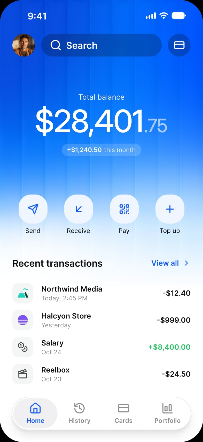
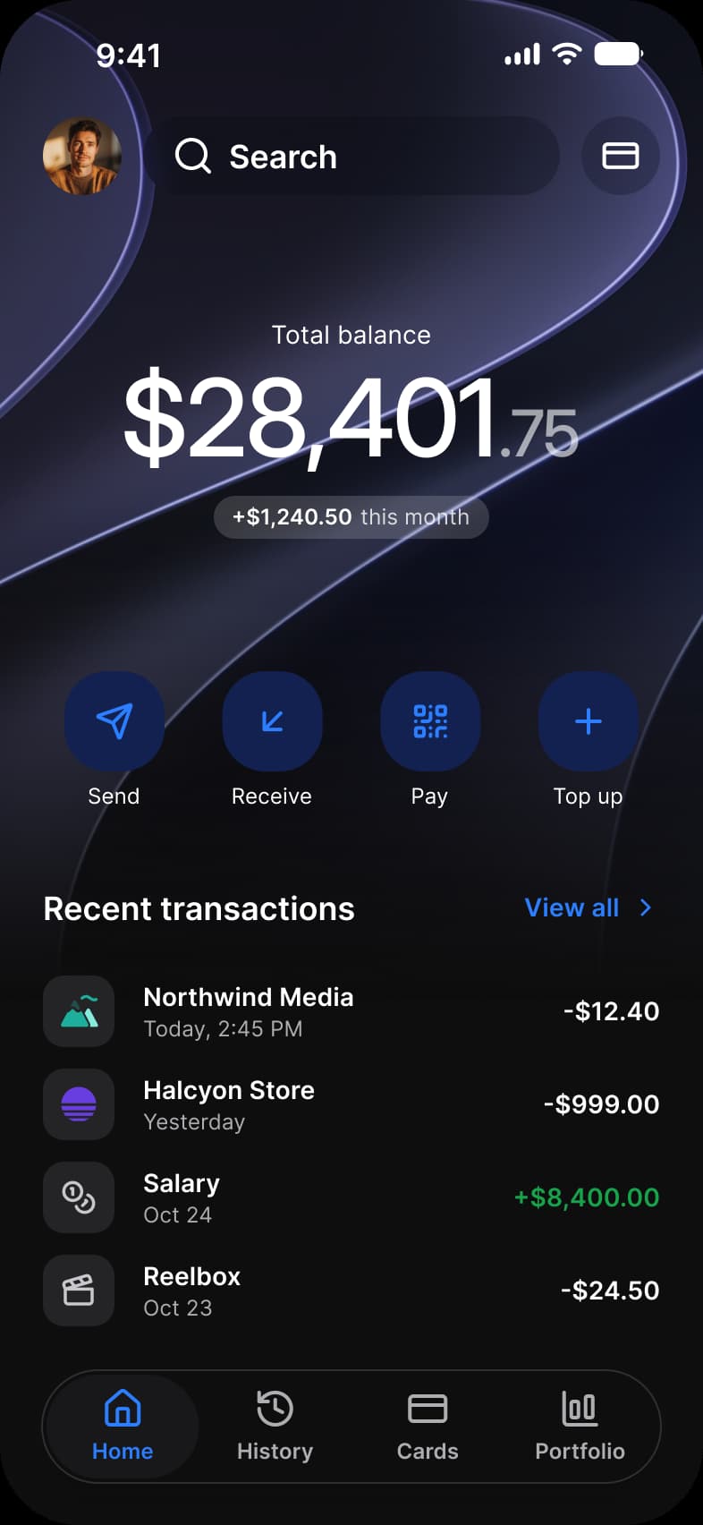
What does each system call it?
The same idea under its Apple, Material 3 and Appetite UI name.
| System | Name |
|---|---|
| Apple | No token system in the HIG; colors and metrics are named system values |
| Material 3 | Design tokens, such as md.sys.color.primary |
| Appetite UI | Figma variables in six collections, exported as DTCG |
In practice
In Figma a token is a variable; in code it is a constant or a CSS custom property with the same name. The name carries the meaning, brand/base or dimensions/spacing/4, so a designer and a developer talk about the same thing.
Appetite UI keeps its tokens in one W3C DTCG source that exports to SwiftUI, Jetpack Compose, Flutter and CSS. The public /tokens.json holds the tokens the docs previews draw, with light and dark values and the code name on each platform.