Updated
Food delivery app home
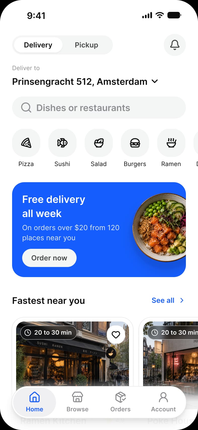
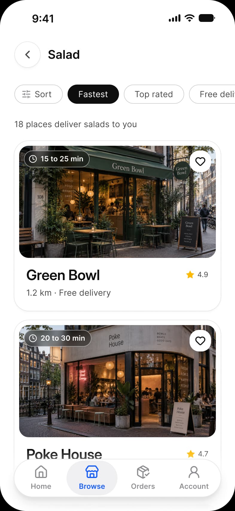
The first screen of a food delivery app in Appetite UI, a Figma UI kit for iOS and Android apps built like a design system: a Delivery and Pickup switch, the address, a Dishes or restaurants search field, cuisines from Pizza to Ramen, a Free delivery all week promo and Fastest near you. Category narrows it to one cuisine.
Updated
Preview
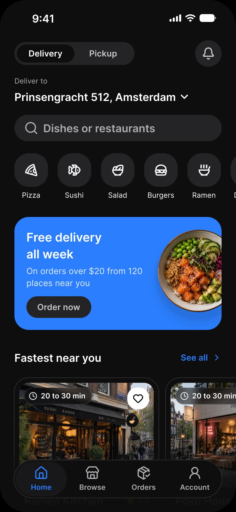
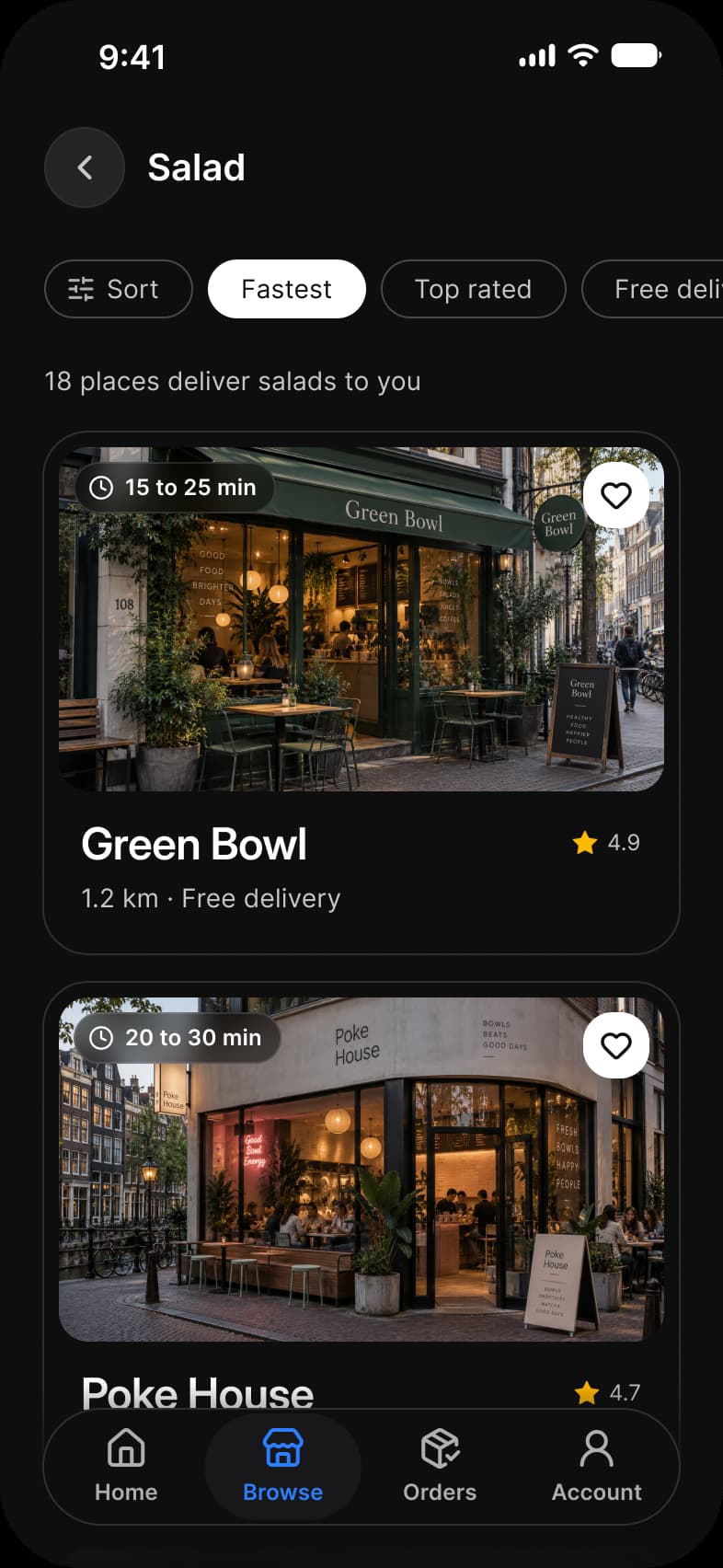
Home, Category, from the Foodie page of the Appetite UI Figma file. The theme switch shows the dark frames.
| Screen | What it shows |
|---|---|
| Home | A Delivery and Pickup switch, the address, a search field, cuisines, a promo card and nearby restaurants |
| Category | Restaurants for one cuisine with the delivery time on each photo |
Which components carry the dashboard pattern?
The kit's components, drawn live from the same tokens as the frames. Tap them: they behave as the Figma prototype does.
Quick Action Button
Navigation, four tabs
How does this screen follow the dashboard pattern?
The rules every dashboard screen in the kit follows, and what this one does with each.
| Rule | On the food delivery app |
|---|---|
| One thing leads | The address and the search field lead, because where the food goes and what someone wants decide every result under them. |
| Actions sit next to what they act on | Delivery and Pickup is a Segmented Control at the very top: it changes what every card below promises, so it sits above them all. |
| The tab bar is the way out | Home ends on the floating Navigation tab bar, and Category keeps it, adding Sort, Fastest, Top rated and Free delivery chips. |
What is it built from?
Every control with a component is an instance of it, so one token change moves these screens with the rest of the file.
| Component | Screens |
|---|---|
| Segmented Control | Home |
| Search | Home |
| Quick Action Button | Home |
| Section Header | Home |
| Vertical Card | Home, Category |
| Horizontal Card | Home |
| Navigation | Home, Category |
| Top Bar | Category |
| Chip | Category |
| Badge / Overlay | Category |
What changes between iOS and Material?
The frames are drawn in the ios-md Platform mode. Switch a frame to android and these variables take the Material values; the components below are where the two systems draw the same need differently.
| Variable | iOS (ios-md) | Android |
|---|---|---|
platform/bar/bottom-height | 49 | 64 |
platform/min-touch-target | 44 | 48 |
platform/screen-padding | 16 | 16 |
| Component | iOS | Material 3 | What differs |
|---|---|---|---|
| Navigation | iOS / Tab Bar, floating capsule 62 high, two to five tabs | M3 / Navigation bar, 412 × 80, three to five items | Material is a full width bar with a separate 24 high Gesture Navigation component, iOS floats on glass |
| Top bar | iOS / Toolbar on a 44 high top bar | M3 / Top app bar, Small 64 high, Medium 112, Large 152 | Material has four bar types: Small, Center-aligned, Medium and Large |
Start from these screens.
Every frame on this page is part of the Appetite UI file, drawn from its components and bound to its variables, so one brand edit moves every screen in light and dark.
The file holds 589 variables in 6 collections and exports its token values to SwiftUI, Jetpack Compose, Flutter and CSS. Solo covers one designer and Team up to ten people. You pay once and keep lifetime updates. Price goes up Nov 1
The read-only Figma preview opens the whole file, every screen and every variable, before you buy.